Phillip Island is located approximately 140km south-southeast from Melbourne. From my home it is about two hours drive. It was named after the first governor of New South Wales, Arthur Phillip. Phillip Island is pretty small: it has 9 kilometers at its widest, and is 26 km long, but it has about 97 kilometers of coastline, which allows for many photographic opportunities.
Recently I took a three day trip to Phillip island. As always I had my camera with me, and I’d like to share my experience with you my dedicated readers! 🙂
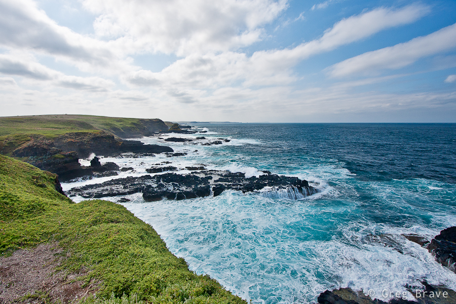
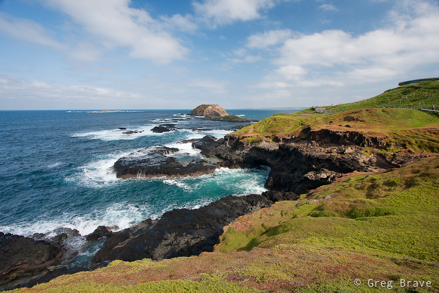
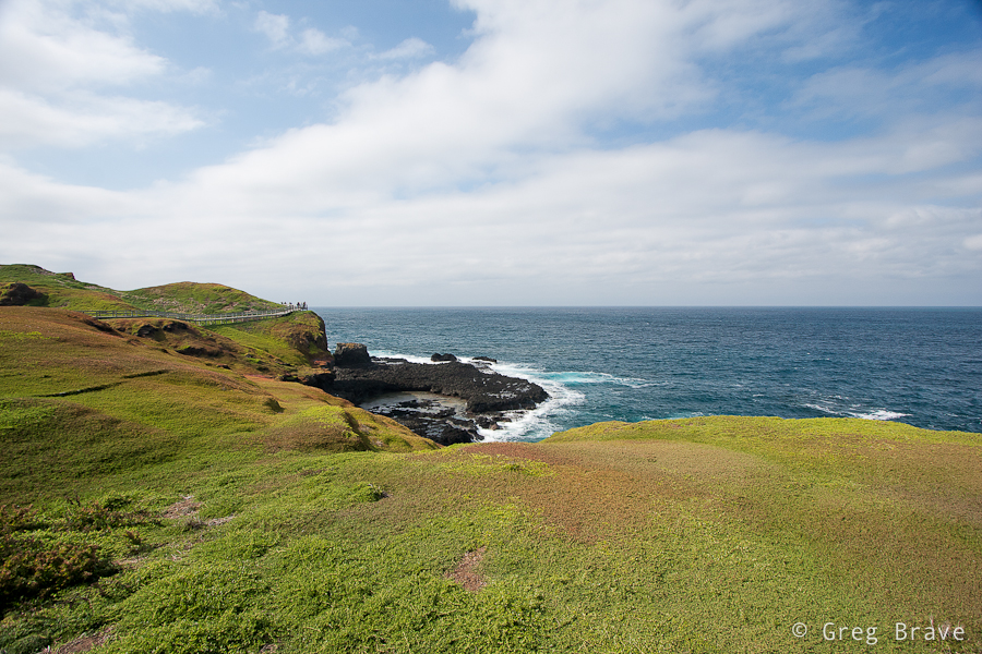
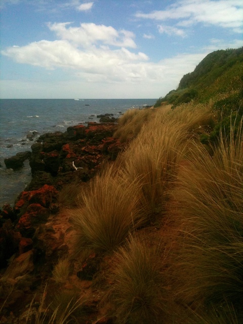
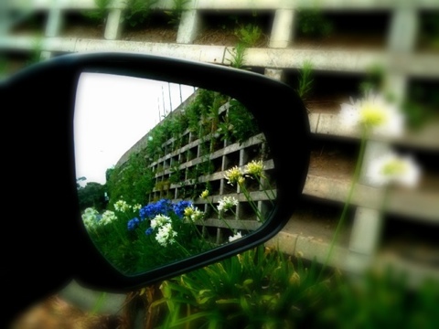
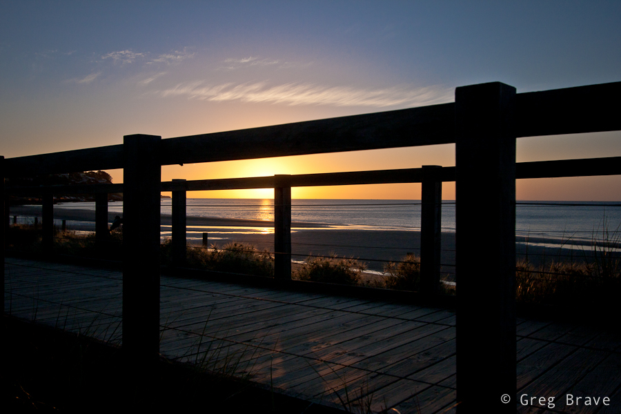
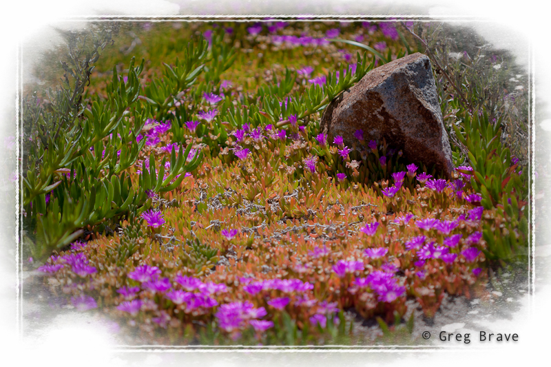
One of the first places I visited were “the Nobbies”. This area has spectacular coastal views, which you can experience from the boardwalks and lookout points set amongst natural sea bird gardens.
Click on the photo to enlarge.
The views were so magnificent that I couldn’t stop photographing. When I later saw my photos on the computer screen, the grass was so vividly green, as if I greatly increased the saturation. I even had to reduce saturation a little so the grass would look more natural! I really wanted to photograph this place on sunset, but the whole area closes before the sunset time due to wildlife activity in the twilight.
Click on the photo to enlarge.
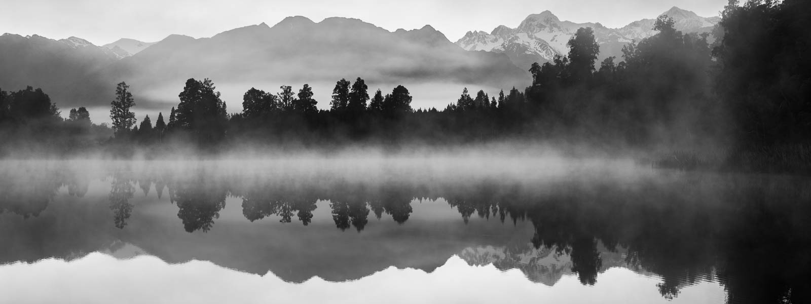
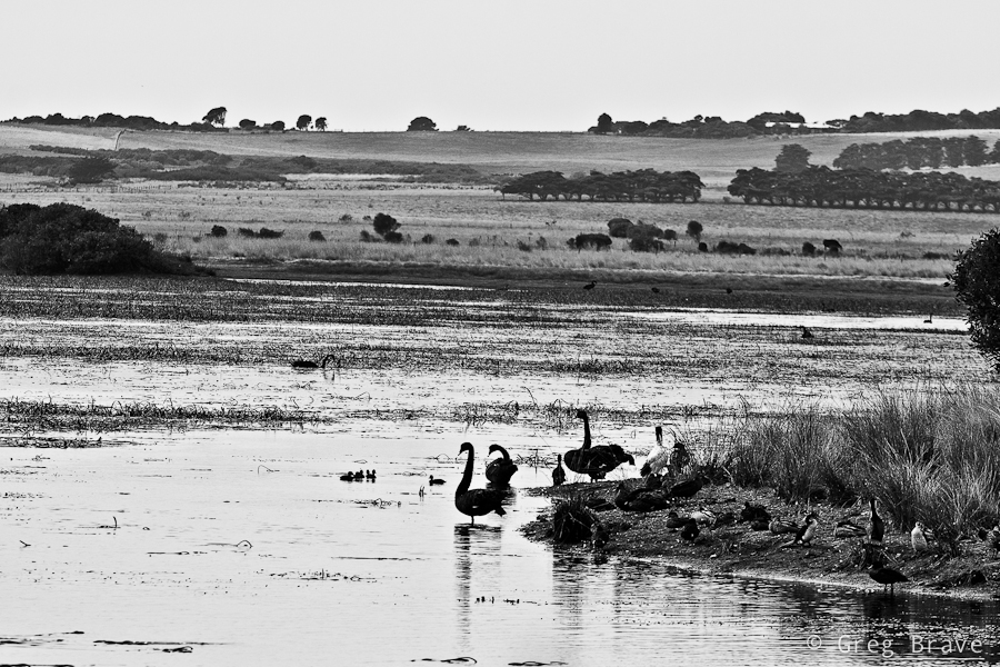
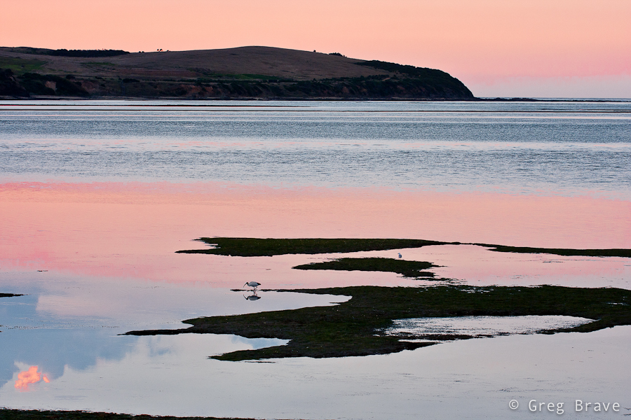
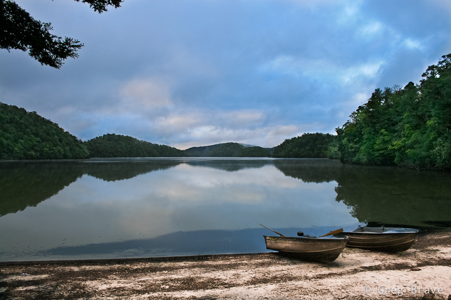
My next stop was the Swan Lake, the only permanent freshwater lake on the island. I didn’t see too many birds out there, but there still were a few, and I liked the “layered” view, which you can see in the photo below.
Click on the photo to enlarge.
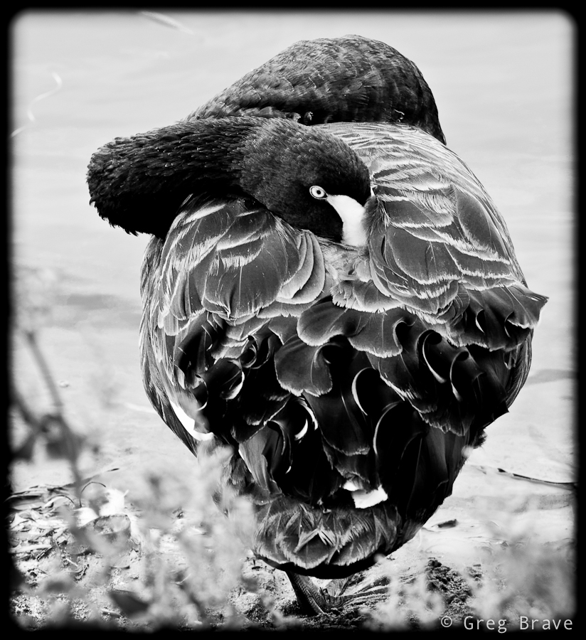
There was a boardwalk leading around the lake with small hideouts along the route for watching birds without disturbing them. The shot below was made from one of the hideouts. I am not sure if swans sleep with their eyes open, or he noticed my presence despite the hideout.
Click on the photo to enlarge.
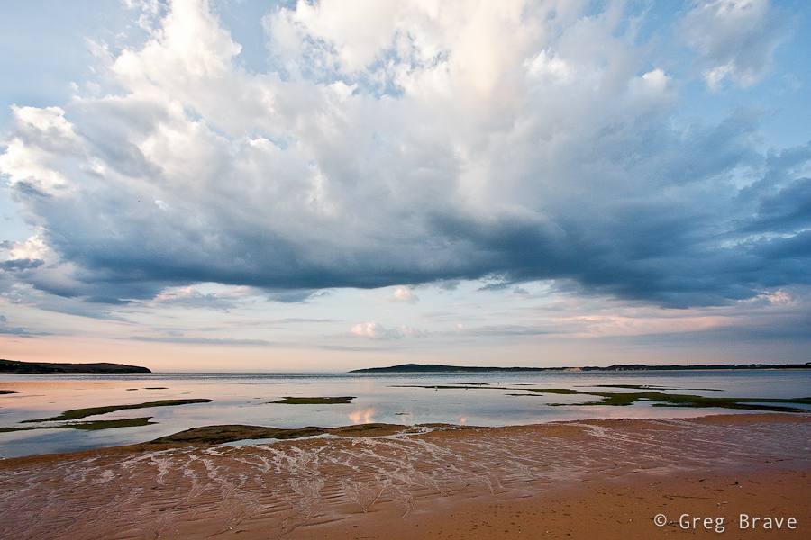
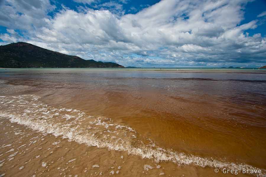
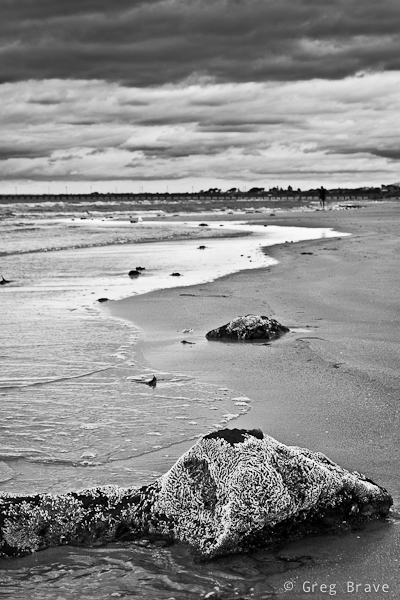
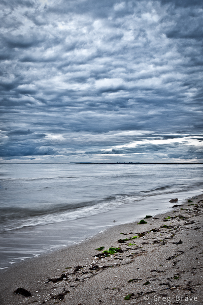
On my second day on Phillip Island, on late afternoo, I found this beach. It is very close to the bridge that connects the Island with mainland. The photo below was made on this beach, and somehow it reminds me of ancient Greek amphitheaters. I also decided to come back to this beach on the next day’s sunrise…
Click on the photo to enlarge.
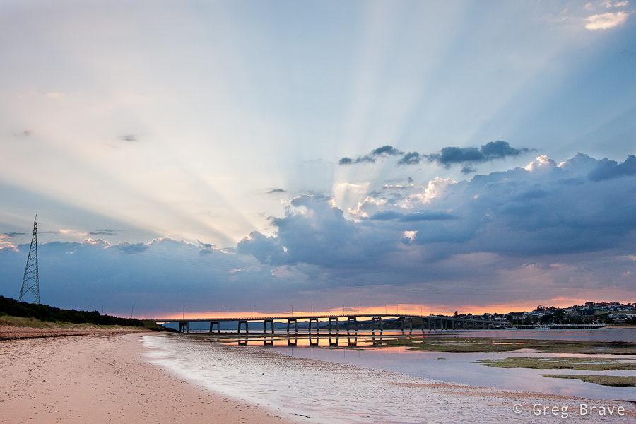
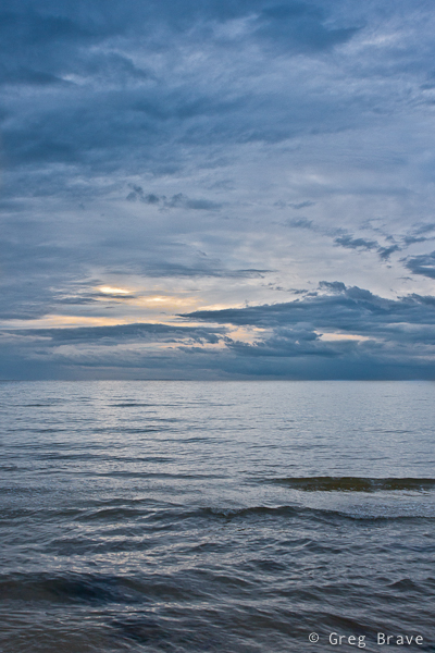
and then I drove to another beach to photograph Sunset… why? you ask me. The answer is pretty simple – the sun was setting on the other side of the island! So the next photo was taken from Surf Beach, which is located on the way to Cape Woolamai.
Click on the photo to enlarge.
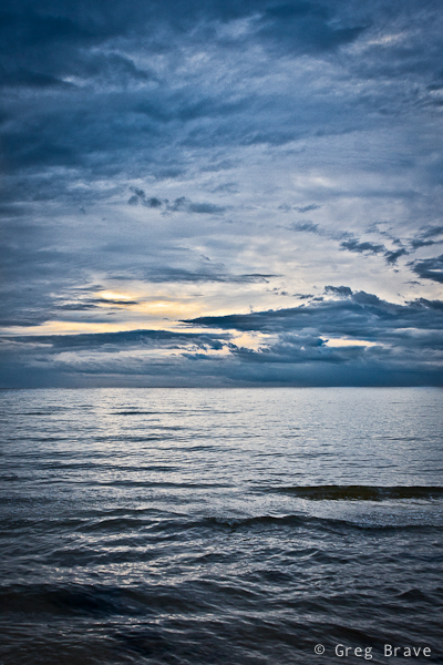
And we are back again, now at dawn to the same beach with the “amphitheater”. The land that you see in the distance is the mainland with small town of San Remo on it. Formed as a fishing village, San Remo’s economy nowadays mostly based around tourism.
Click on the photo to enlarge.
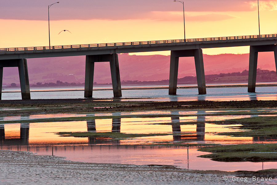
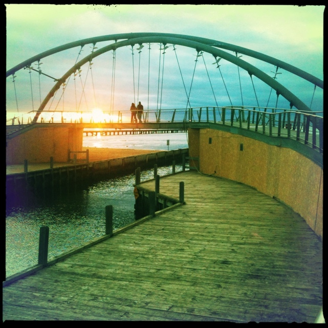
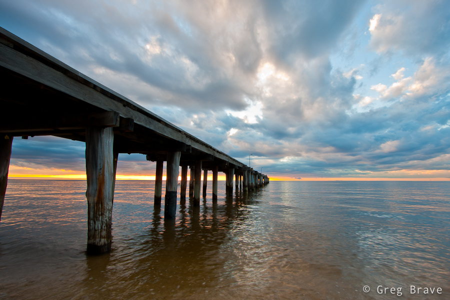
I think I already mentioned that Phillip Island is connected to the mainland by bridge. It is a 640 meter concrete bridge, which I found to be rather nice looking in sunrise colors.
Click on the photo to enlarge.
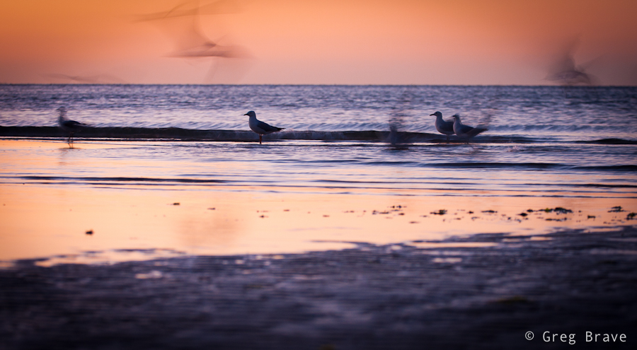
Unfortunately I have no idea what is the name of these birds but I find them very beautiful against the sunrise-pink colored water. For the shot below I used my Canon 70-200 f4 L lens and tripod.
Click on the photo to enlarge.
During the sunrise the clouds were moving pretty quickly so I was lucky enough to catch some pretty darn nice shots :), as you can see below
Click on the photo to enlarge.
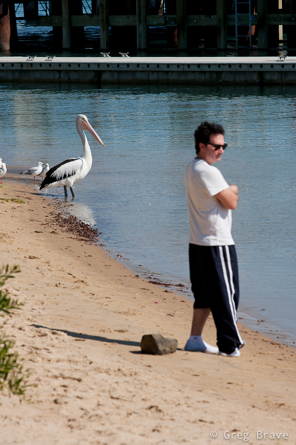
And finally I went to San Remo’s jetty to watch pelican feeding. Unfortunately that day feeding didn’t occur but, I snapped the photo below. Look, they are twins!
Click on the photo to enlarge.
That’s it for my photographic reportage from Phillip Island. I hope you liked my photographs, and
Recently I wrote a post about magnificent photographer Alexander Petrosyan. I was very impressed with his work, so I wrote him an email asking for an interview for my blog. And guess what? He kindly agreed!
Everybody, please welcome Alexander Petrosyan.
Click on the photo to enlarge.
Tell us a little about yourself. What is your occupation, how did you get interested in photography?
My introduction to photography was terribly banal: as well as many of my peers back in those years, I was presented with a camera named “Smena” on my birthday 🙂 Since then I periodically quit and came back to photography many times. Currently I am a full-time photojournalist for publishing house “Commersant”.
Photo by Alexander Petrosyan. Click on the photo to enlarge.
How many of your shots were initially conceived in your mind and then “materialized”?
I don’t have many such shots. Much more often happens the following scenario – I have an idea in my mind, but according to the situation this idea transforms into something else, which in turn on the photograph again looks different, and the viewer sees what he sees. That’s why the title of my blog is “In reality things are somewhat different than in real life… ”
Photo by Alexander Petrosyan. Click on the photo to enlarge.
What is the story behind your shot titled “Graduates” ?
Photo by Alexander Petrosyan. Click on the photo to enlarge.
This photo was made in the most ordinary way – I saw this couple, which was very different from the rest of the crowd of graduates, and I just ran in front of them shooting continuously. Technically it wasn’t an easy shot to get using Canon 20D, because its max ISO was 1600 while I had to shoot hand-held, running backwards in front of the girls. I nevertheless managed to get a fairly sharp shot.
How do you manage to be in the right place at the right time?
It doesn’t happen too often, at least not as often as I would like… in simple cases what helps is the analysis and prediction of the situation. In more complicated situations I just hope to get lucky.
Photo by Alexander Petrosyan. Click on the photo to enlarge.
Isaac Newton once said, “If I have seen further, it is by standing on the shoulders of giants”. Who are your giants?
The saying, which is actually closer to my perception is “Do not make yourself an idol”. There are not a lot of key figures in photography, and they are known to anyone interested in the subject. But to narrow the circle and take for example my colleagues from St. Petersburg, who I have met in person, I would name an urban photographer Boris Smelov, and photo-essayist Sergei Maximishin.
Photo by Alexander Petrosyan. Click on the photo to enlarge.
What are your thoughts about Cartier-Bresson’s work?
What do I think about Cartier-Bresson? Well, that’s like asking, for example, physicists, what do they think about Newton or Einstein 🙂
Photo by Alexander Petrosyan. Click on the photo to enlarge.
What equipment do you use and why?
I use whatever equipment is available to me. Currently it is a DSLRs from the publishing house where I work with a standard set of glass:16-35, 24-70, 70-200… nothing special, but it is sufficient for most of my work.
Photo by Alexander Petrosyan. Click on the photo to enlarge.
And last but not least my traditional question: if you could give just one piece of advice to a beginner photographer, what would it be?
My advice for beginners is not original, but it comes from my own experience: look at the works of masters, and shoot as much as you can experimenting a lot… and of course do not be embarrassed by critique or its absence and show your work to lots of different people… But, perhaps the most important thing is to shoot what you really love!
Photo by Alexander Petrosyan. Click on the photo to enlarge.
Thank you Alexander for your time, your knowledge, and your photographs!
If you liked Alexander’s work and want to see more of his great photographs check out the links below:
Here are the only two links to English resources with Alexander’s photos
Link 1 (Alexander is also known as Yan Petros, so don’t be surprised to see this name here)
You can also see Alexander’s photos on his LiveJournal stream, where he adds new photos as they come, and also on Nonstop Photos website. These two last resources are in Russian, but everyone understands the visual language of photography.
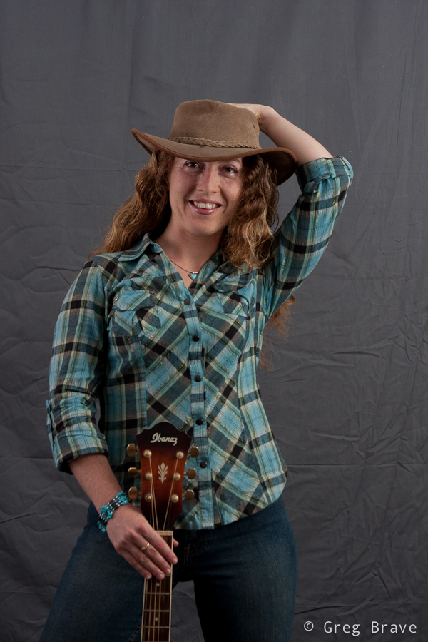
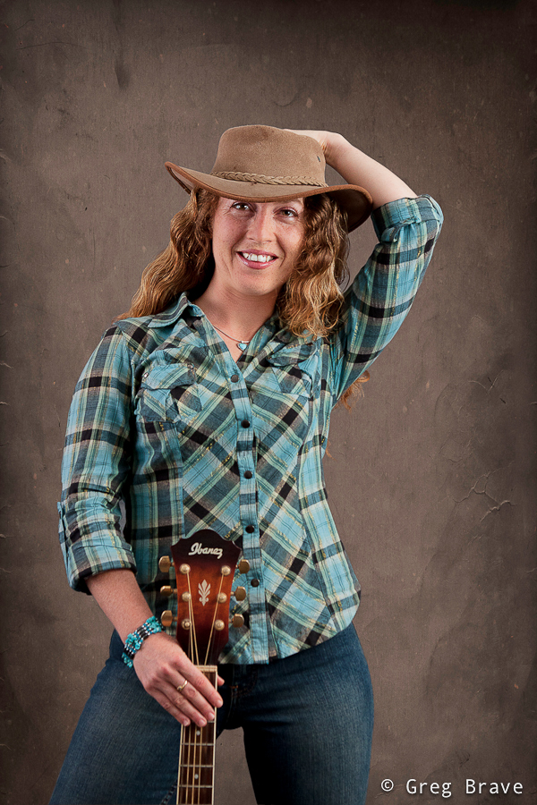
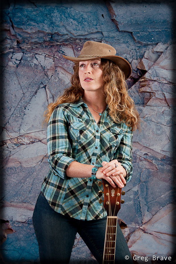
For quite some time now I wanted to shoot portraits, and finally I found a model to shoot!
Since photography is my hobby I don’t have a studio, so I had to improvise. I converted my living room into a studio for a day, and shot my model on gray muslin background. I bet everybody heard about these famous muslin backgrounds. But what the guys who sell them to you don’t mention is that you receive the muslin in a really crumpled state, and if it is 3 by 6 meters long, there is no way you can iron it by yourself. But I had no other choice than to use what I had.
My solution to this problem was in post processing – I had to “cut” the model from the original background and paste it onto another background in Photoshop. You can see before and after images in the example below.
Click on the photos to enlarge.
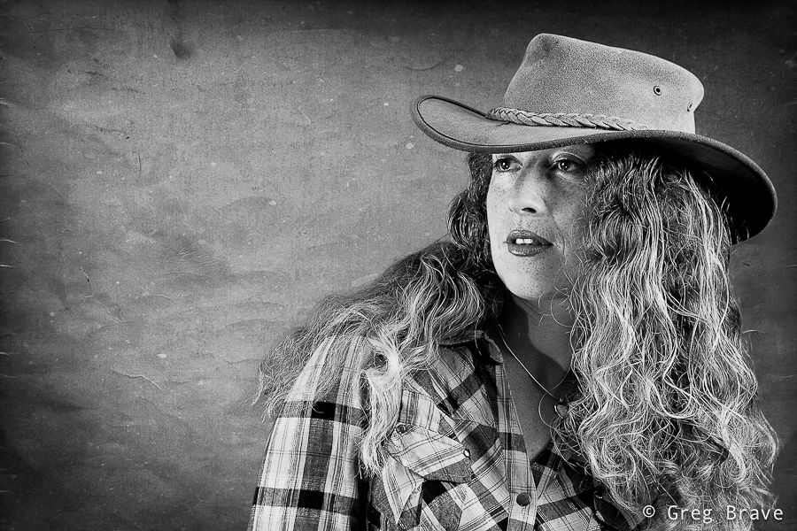
In order create precise selection of the model in Photoshop I used the pen tool. Many people don’t use this tool because they find it confusing just like I did before I saw this tutorial:
After getting used to the Pen tool, I promise you that you won’t ever go back to lasso or any other selection tool when you need to do a complex selection. After I selected the model using pen tool, I used the option “Refine Edge” to refine the edge of the selection in the areas with model’s hair. It is really important to make the hair look natural on the new background. My last step in the selection process was feathering the whole selection by 2 pixels to add a more seamless transition from the model to background.
Click on the photo to enlarge.
If you don’t want to cut and paste your model, and still use your crumpled muslin background, here is how you can do that:
If you have enough space, put your model far from the background, and use wide aperture – this will make the background go out of focus and its wrinkles won’t be visible. In addition to that, you can setup your lighting so that no significant light will fall on the background making it dark (you can use gobos for that).
Click on the photo to enlarge.
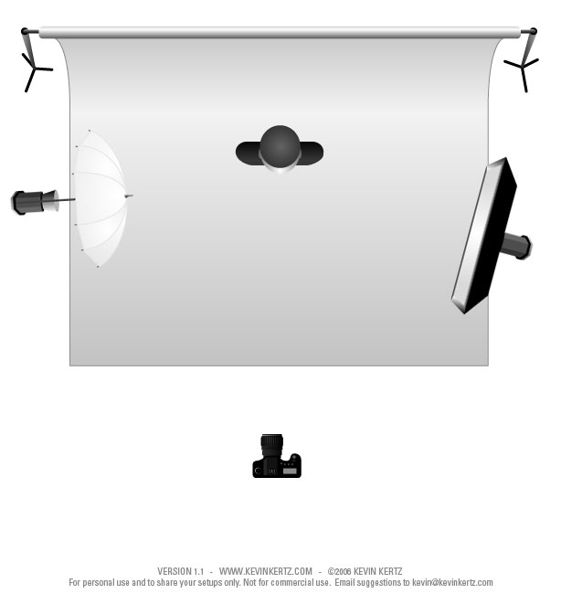
In all the photos you see here I used pretty much the same lighting setup, only slightly varying the position of my strobes and their strength. Here is my basic lighting setup diagram:
Click on the photo to enlarge.
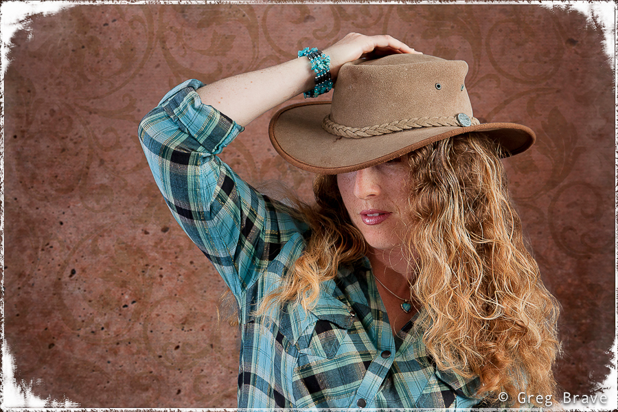
You probably wonder where I got backgrounds that I use on these photos, and it is no secret. You must have heard about OnOne software. I used one of their products named PhotoFrame. This product can work as a standalone application or as a plug-in for Photoshop and Lightroom. The primary aim of this product is to supply the user with lots of photo-frame templates, so you can choose and add nice framing to your images, but it also has a great collection of backgrounds. I downloaded their trial version here. In the image below you can also see the frame that I created with this plug-in.
Click on the photo to enlarge.
But it is the only frame that I used from PhotoFrame. Other “frames” that you can see in the photos here, are simply a creative use of vignetting feature in Lightroom, which is pretty easy to achieve – you simply reduce the roundness of the vignette somewhere around -90 to -100, set it’s midpoint between 0 and 15, and the amount slider is up to you.
Click on the photo to enlarge.
While most important aspects of portrait photography lie in the artistic sphere rather than technical, still in order to get acceptable results, all the technical details must be carried out correctly, and this is why I dedicated this article to them. Nevertheless after all the technical aspects are set and done, I forget about them and concentrate on the model and on my artistic perceptions of what I want to achieve from the shoot.
Click on the photo to enlarge.
If you have any questions regarding the issues brought up in this post, feel free to leave them in the comments below, and as always any other comments are highly appreciated.
There are a lot of great photographs and talented photographers out there, but there are a few that stand out. To me at least. And I don’t judge by the publicity of their names, only by the impact their work has on me. You all must know guys like Joe McNally, David Hobby, and David DuChemin – they are all over the place, and don’t understand me wrong, I read their blogs, check out their photographs, and learn from them, but there are photographers out there, who are not nearly as famous as these guys, but whose work is at least at the same level, and even better. Of course it is only my opinion, but then again – it is my blog 🙂
I would like to introduce you to one such photographer. His name is Alexander Petrosyan, and he lives in St. Petersburg, Russia. He is a street photographer mostly photographing in St. Petersburg. I don’t have to say much about his work – his photographs do it perfectly. His work reminds me of the famous Henri Cartier-Bresson. The situations that Alexander freezes in his photos tell their stories so vividly and so impressive.
Unfortunately most of his work displayed on Russian web sites, hence the titles of his photographs are in Russian, and in many cases the title adds an important bit of information to Alexander’s photos.
I don’t have Alexander permission to display his work on my blog, so I am just going to give you links to his work. If you would like to understand more about any specific photograph but struggle with the language barrier :), feel free to ask me in the comments to this post, and I’ll do my best to explain.
Here are the only two links to English resources with Alexander’s photos
Link 1 (Alexander is also known as Yan Petros, so don’t be surprised to see this name here)
You can also see Alexander’s photos on his LiveJournal stream, where he adds new photos as they come, and also on Nonstop Photos website. These two last resources are in Russian, but everyone understands the visual language of photography.
Sometimes I see a photograph, and I wonder how it was done, what tricks or special equipment (if at all) did the photographer use to achieve the result? In most cases there is no way of asking him, and I have to guess and speculate on how it was done.
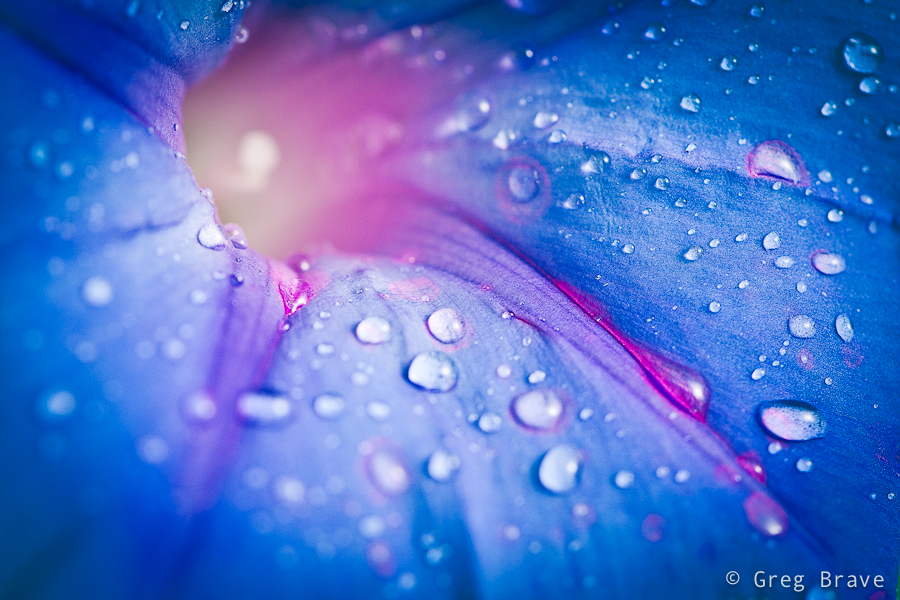
A few days ago I did a few flower macro shots, and posted one of them in a couple of forums. In the responses I’ve received I saw some questions as to how I did it, so I decided to write a post about it.
I used Canon 100 mm f2.8 Macro lens, a light tent, and two flashes – the main one from the right side, and another flash from the left side. I set the second flash to be much weaker, so it would make the back side of the flower just a little brighter.
I didn’t want big depth of field so I set my aperture to f5. On the contrary, I wanted to be able to control what exactly will be in focus.
The shutter speed was 1/200 of a second, but it is not important in this case because I didn’t use ambient light – only strobes.
Since I had total control of my lighting, and I could set it to be as bright as I wanted to, I used ISO of 100, the lowest ISO on my Canon 40D. As you probably know, the lower your ISO setting, the less noise you’ll get in your photo.
Of course I used tripod. This is an important point. You might think that shooting at speed of 1/200sec doesn’t require the use of tripod, and under certain circumstances you might be right. For example when using wide angle lens with fairly closed aperture. But in my case I used telephoto lens (100mm) with f5, which means that even the slightest movement will shift the focus from where I want it to be to another random location. So, the conclusion is that in macro shots tripod is almost always an essential piece of equipment.
As you can see on the shot I sprayed the flower with water. Water drops are a very nice touch to many natural subjects, not only flowers. Sometimes photographers photograph the water drops on their subject in such a way that a reflection of something would be visible in the drops, and it makes for great images. In my case I wanted to achieve the exact opposite – I didn’t want any reflections in the water drops in order to focus the attention of the viewer on the flower, and to achieve that I photographed my flower in a white light tent.
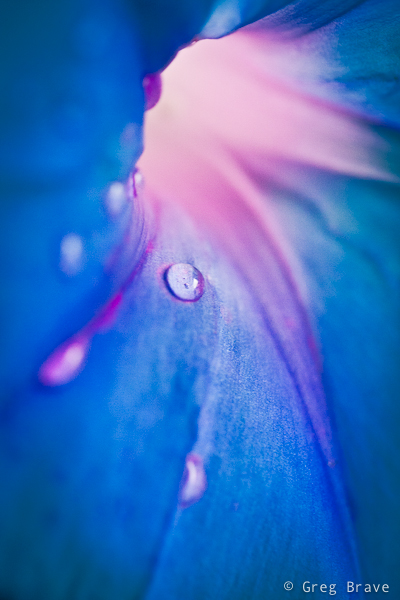
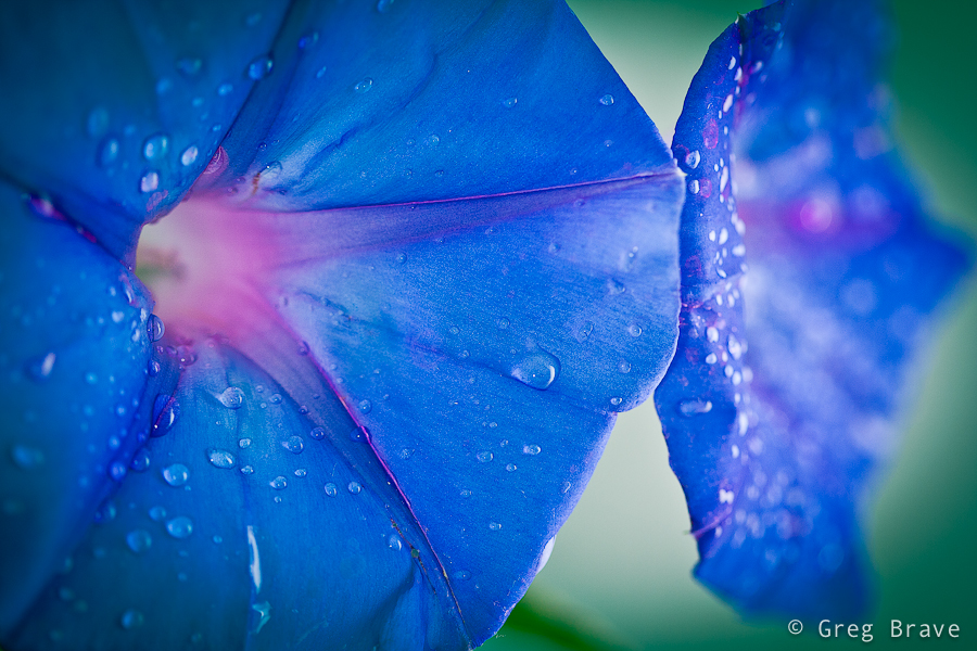
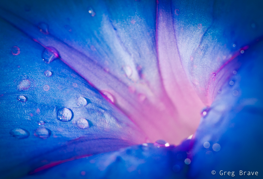
And finally, the background. In the shot above and in one of additional examples from that photo-shoot below you will see that my background wasn’t plain white. But what was it? It is easy – I used one of my calendars with colorful photos as the background. When shooting macro, DOF is so tiny that a photograph placed 30 cm behind the subject becomes totally indistinguishable collection of colorful splashes, which makes for a nice background.
Below you can see a few more examples from that shoot
>
I hope you learned something from my experience.
As always, feel free to share your thoughts and suggestions in the comments section.
Cheers,
Greg.
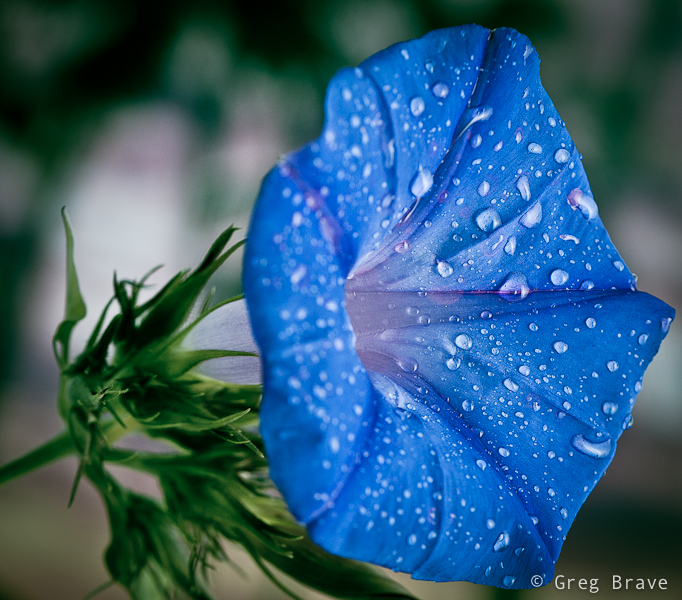
P.S. For those of you who wonder, the flower’s name is Morning Glory
Imagine that you need to photograph a large dark space, like a cave, or a church, but you only have a single flash. Is it even possible?
Quite some time ago I saw in a photography magazine photo of a big beautiful cave, perfectly lit, all the beautiful stalactites perfectly visible, and I thought to myself – there is no way photographer could bring powerful studio lighting equipment down there!
Fortunately there was a brief description to this photo – photographer put his camera on tripod and set it to long exposure, then during the exposure time he ran around the cave with small strobe flash and flashed all the areas of the cave. “Simple and Genious” I thought to myself back then.
Genious? Sure. Simple? Well, not really.
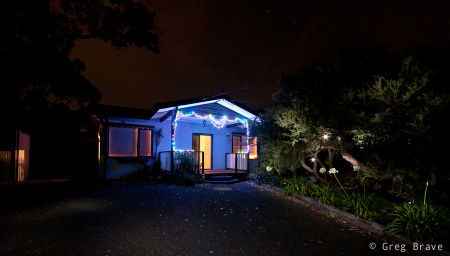
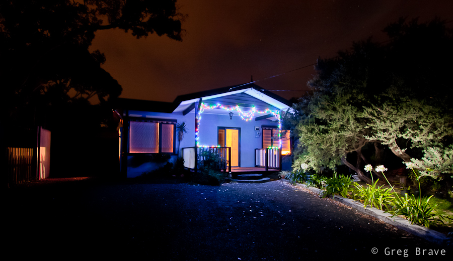
Recently I decided to photograph the front of my sister’s house decorated with shiny Christmas lights. Yes they still haven’t took them off, because my three year old nephew likes to turn them on every night before he goes to sleep :).
In order for Christmas lights to be visible, I had to do that after dark, and I only had one flash (not that it matters but it was Canon 430 EX). So I decided to try the technique described above, and it turned out not as simple as I first thought it would.
I’d like to share with you the tips that I learned from this experience, hoping they will make it easier for you should you decide to use this technique. I will do this in the form of step-by-step instructions how to perform this kind of shoot.
Here we go:
1. Set your camera on a tripod and compose your shot.
2. Choose the desired f-stop (here your guide should be only your artistic intentions, and not exposure considerations).
3. Focus your camera where you need to, then switch to manual focus. The reason for switching to manual focus is that in the dark it is hard for automatic focus to work, so each time you’ll press the shutter it may take a long time for camera to focus if at all.
4. Look at the scene and decide which areas need to be lit and which don’t.
5. Set your flash power to about 1/8th of its max power.
6. Press the shutter, and run around the scene with a flash in your hand flashing all the areas that need light. Flash ONCE each area.
7. Take a look at the result, and go over all the areas that needed to be lit. If they are too dark, next time you’ll flash them twice, or increase the flash power. Using low flash power and flashing several times the same area gives you more versatility in case you need different areas to be lit diferently.
8. Repeat the steps 6 and 7 until you are satisfied with the result.
In addition to this process you also need to have in mind the following:
When flashing hold the flash pointed outwards from your body, and as far from you as possible so that no light will spill on you (otherwise “ghosts” of you will be visible in the image).
Always point the flash away from the camera, so that no direct light from the flash will hit the lens (otherwise you’ll see bright points of light all across the image).
Remember that the longer the exposure time, the more noise you’ll have in the photo. Try to complete the shot as quickly as possible, unless you want the noise for artistic purposes.
Here are a few examples of the house that I photographed:
In the photo above, you can see that I deliberately flashed into the lens a couple of times to create lights in the tree. This is also a good example of what you’ll see in your image if you do it by chance.
And here is another example, this time without the lights, and with better lit right side.
Feel free to ask questions and share your experiences in the comment section below.
In our digital age, photography became much more accessible to everybody, and it is mostly a good thing. But there are few outcomes, which are not all positive.
I would like to talk about one such aspect in this post – how this technological advance affected professional photographers. In the old times, when people needed to cover an event, make family portraits, or anything else that had to be photographically documented, they would have to use professional photographer’s services, because there was no other choice. Nowadays, however, in order to save money, many prefer just asking a friend who has photography as a hobby, to drop by and take some shots. Of course, I am not talking here about mass media events, but for example small companies do that when they have all kind of social activities for their employees. When I was working at a high tech company, and they knew that photography is my hobby, they used to ask me to cover various company events and meetings… for free of course. A few years back they’d have to hire a professional photographer to do that.
Family portraits – I think the practice of gathering the whole family together and hiring a pro to shoot family portraits is almost extinct because everybody has a digital camera, and snaps tons of photos all the time, so people think there is no need to spend extra money on a pro.
And one of the most important events – weddings. Even though for many people wedding is an event of utmost importance they still try to cut costs by asking their friends-amateur-photographers to cover it. And even when people hire a professional wedding photographer they look for the cheapest prices, thinking that photography can’t cost “this” much, because it is so easy nowadays. And really good professional photographers have to lower their prices, which in turn affects the quality of their work because they still have to make a living, and now it means doing more work for the same money – thus spending less time on each assignment. I’ve turned down some of my friends requests to shoot their wedding because I don’t feel experienced enough, and it is way too much of a responsibility for me. I only shot one wedding, for my very close friends and only because they couldn’t afford to pay professional photographer. Doing that I realized that shooting weddings is a hard work!
After being involved in photography for a few years, I can say with confidence – a good photograph is still as hard too create as it was 10, 20, and 30 years ago. I am not talking about ‘color representation’ or ‘correct exposure’ or any other technical aspect for that matter. I am talking about ‘the photograph’ itself, you know, what it tells the viewer, and how it does that. Powerful, beautiful, tender, exciting, creative, breathtaking photographs are still as rare as they were before. It might not seem like that because you can see many beautiful photos on the internet, but that’s only because internet brought billions of people and many talented photographers among them into one place (the internet).
Lets go back to family portraits – a good family portrait made by professional photographer will capture the family, their feelings, the affection between family members the way that no snapshot ever will. Many years later, looking at that portrait you’ll remember what it was like back then, and it will be a pleasure to look at all your life.
Weddings – there can be no substitute for a good professional photographer. You really want you wedding day to be remembered in all its glory, and no inexperienced amateur can do that. And there are all kind of unexpected things that can happen. For example what if your friend’s camera breaks in the middle of the event? Or his batteries die? What then?
People, remember that good photography is hard to create, and it is a full time job, so don’t try to find the cheapest guy out there, which could mean that he won’t spend enough time on your assignment.
European award winning photographer Magnus Bogucki created a video describing how much time it takes to photograph wedding – from preparation, to the wedding day, to post processing and final wedding album. I highly recommend watching it. You will be surprised how much time it really takes, and how many different activities are required for a successful wedding shoot.
Surprised? I bet you are.
You can also visit Magnus’s website at www.magnusbogucki.com, he is a really good wedding photographer, and to prove that one of his photos won an award for being among the world’s 50 best wedding photos of year 2010 by Junebug!
So, now what do you think, should people pay professional photographers, or anyone can snap good photos with his digital camera?
Wilson Prom is a peninsula, which is the southernmost point of the Australian mainland. Its coastline is about 130km in length and it is framed by granite headlands, mountains, forests and fern gullies.
During my visit there it was very windy. Winds reached speeds of 65 km/h, which made it pretty difficult to photograph the place, but the ever-changing clouds created a very moody atmosphere.
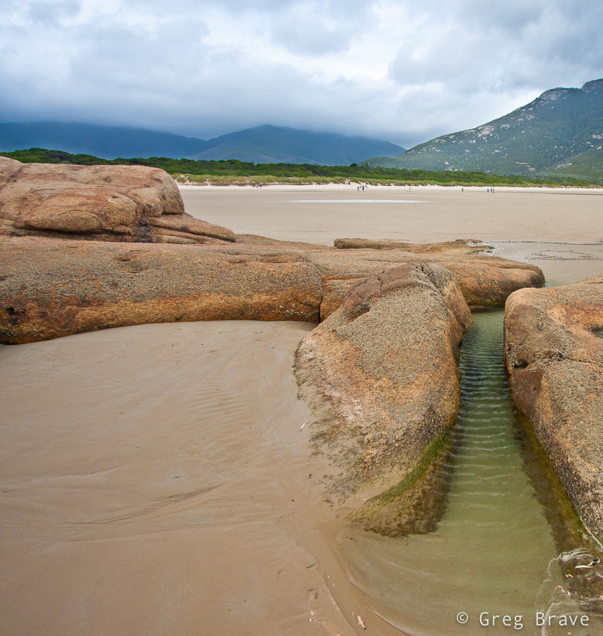
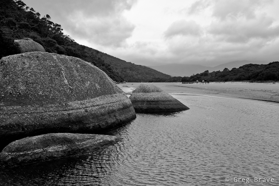
This photo was taken on the beach. I liked this small water canal and the ripples on it. If you look closely the rock on the left resembles head of a dolphin. Actually I didn’t notice that until my father saw this photo and pointed it out.
Click on the photo to enlarge.
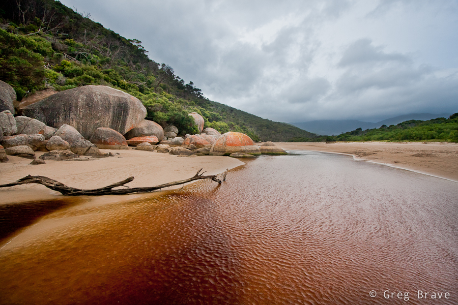
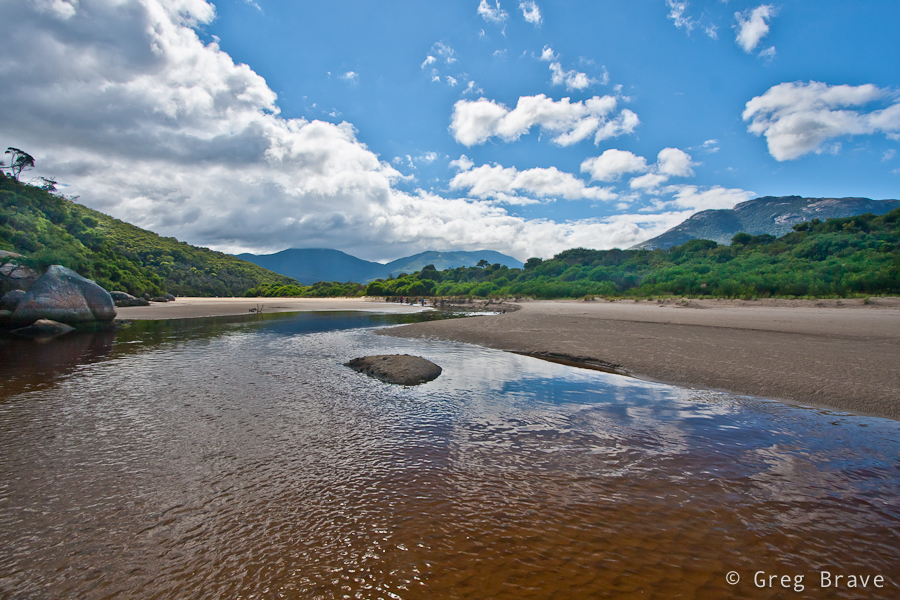
The river in the next photos named Tidal River. It is the main river in Wilson Promontory. It runs into Norman Bay and swells with the tide (hence the name). The river has a very interesting color, a purple-yellow. This is due to the large amount of tea trees in the area, which stain the water with tannin giving it a tea-like appearance.
Click on the photo to enlarge.
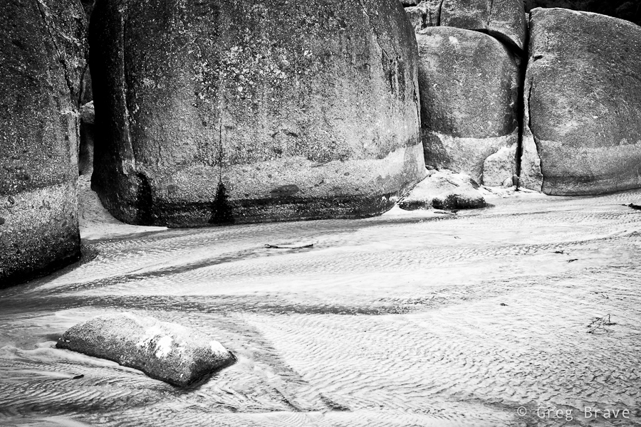
Here I wanted to emphasize the texture of the boulders, and I also wanted a minimalist look. Lack of color achieved it in my opinion.
Click on the photo to enlarge.
This is the famous whale rock. As you can see it resembles whale’s head.
Click on the photo to enlarge.
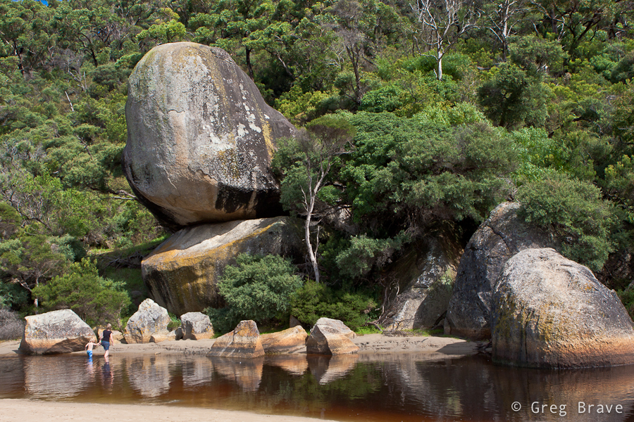
In about 100 meters from here forward Tidal River meets the ocean. The next photo and the rest of them was made on my second day at Wilson Prom. The winds weakened, and the weather improved a little. As a result you can see people swimming in the river.
Click on the photo to enlarge.
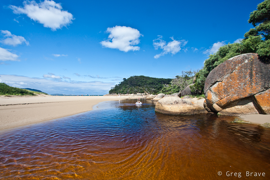
The photo below was pretty heavy processed. I shot it into into the sun, which made the lower part very under exposed, and I had to increase fill light to a horrible 87 percent in Lightroom! I must really start thinking of purchasing ND Grads… Nevertheless I really like the composition and feel of this photograph.
Click on the photo to enlarge.
I always loved to photograph the ocean. As you can see Tidal River gives its color to the ocean making it look very unusual but also very beautiful to me. Clouds add the final touch, and below you can see the result.
Click on the photo to enlarge.
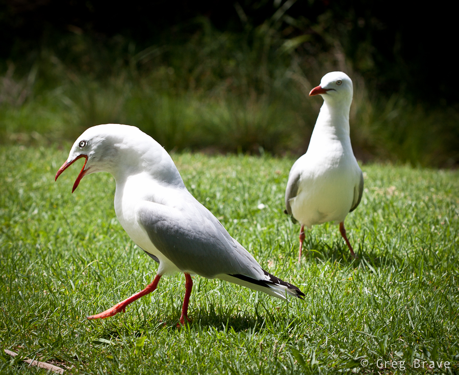
I’m convinced that photographers don’t give seagulls enough attention, and I’ve decided to fix that. In coastal Australia seagulls are everywhere, and they are not afraid of humans. On the contrary – they are always near, waiting for food. I found a nice location at one of the picnic areas, and took many shots of seagulls with the help of my 3 year old nephew who was throwing them food 🙂
Click on the photo to enlarge.
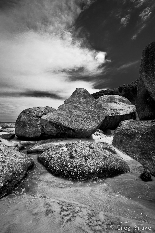
And last but not least two photos from the Squeaky Beach. The photo on the right is called “The Elephant Legs”. These rocks looked magnificent, and I want you, the viewers, to concentrate on their shapes and textures, hence the b&w.
Click on the photo to enlarge.
I used tripod for most of the photos you saw here. Just to give you an idea – I shot about 570 images in total, from them I deleted 520, and the photos you saw here were the chosen ten. If you liked these photos, you can see eight more on my Facebook page: www.facebook.com/photopathway
This is another photo-sharing post. Recently I had the time to revive my small home studio, so while I was at it, I took some photos… actually I took a lot of photos, most of which aren’t worthy of sharing.
Here’s the only two I liked:
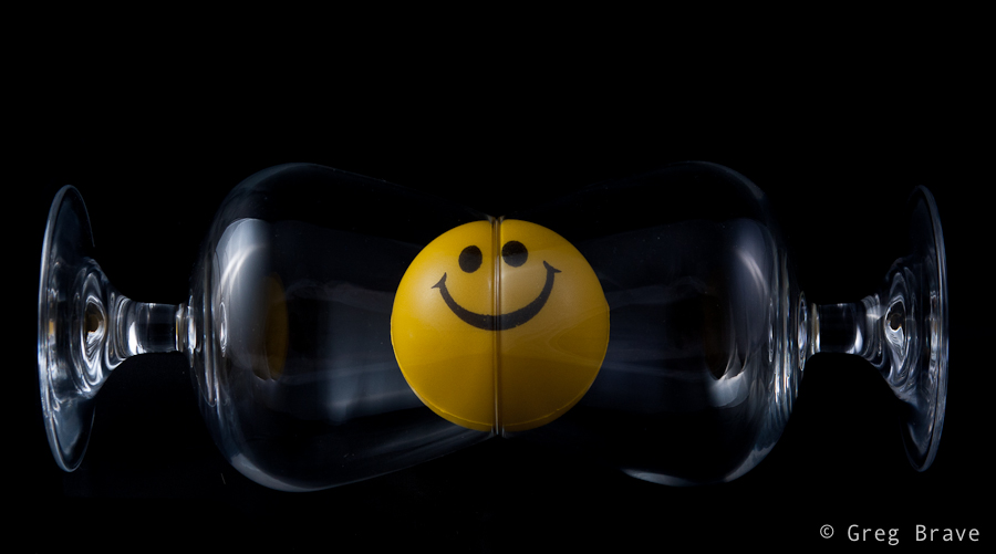
This photo was taken inside light tent with two flashes (one from each side). I call it “Almost Symmetrical”. Nothing much to it, just having fun 🙂
Click on the photo to enlarge.
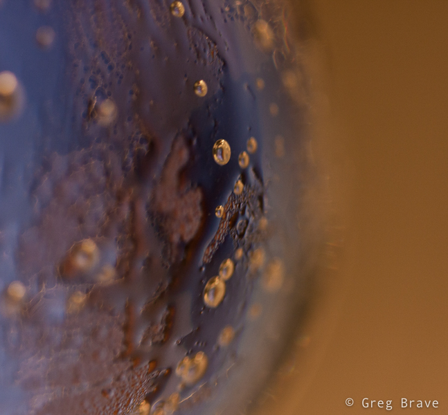
And I also liked this abstract photo, which is really a closeup of glass filled with cold bubbling mineral water, with yellow light in background.
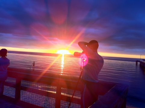
Those of you who frequently visit my blog probably know that I like shooting sunsets, so now I want to share some of my recent shots.
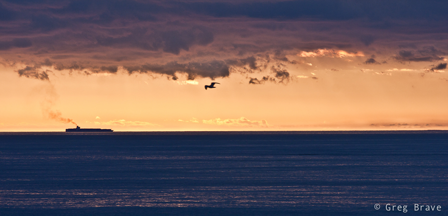
This one has strange colors, but I like it anyway. I was shooting sunset from the pier and suddenly in the far distance I saw this ship. I quickly changed to my telephoto lens, and made a few clicks. But something was missing… the photo was empty. Then a bird appeared in my viewfinder, and I got this shot.
Click on the photo to enlarge.
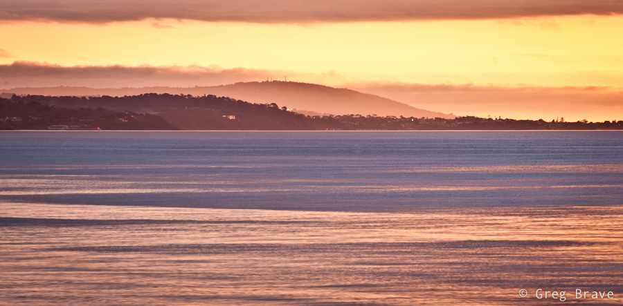
Here is one pretty simple photo. I like its simplicity, and I also like colors and reflections in this photo.
Click on the photo to enlarge.
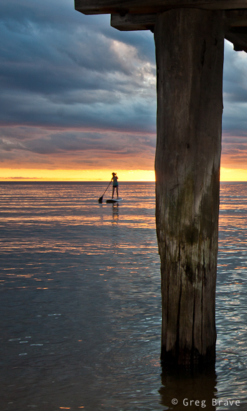
I wish the girl on the boat would come closer, but this is the best I could do under the circumstances 🙂
Click on the photo to enlarge.
This shot was also taken with my telephoto lens because I wanted to isolate a small part of the shoreline.
Click on the photo to enlarge.
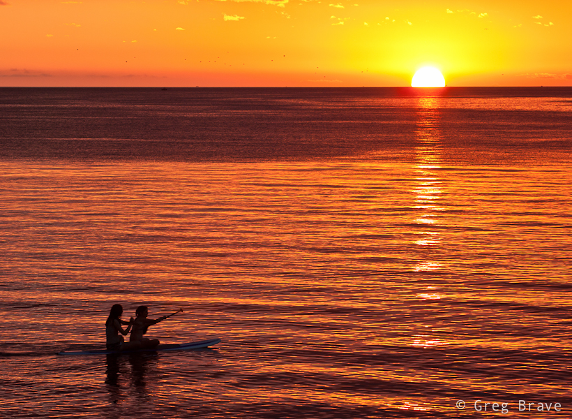
I call the photo below “classic sea sunset photograph” – setting sun, orange water, two silhouettes…
Click on the photo to enlarge.
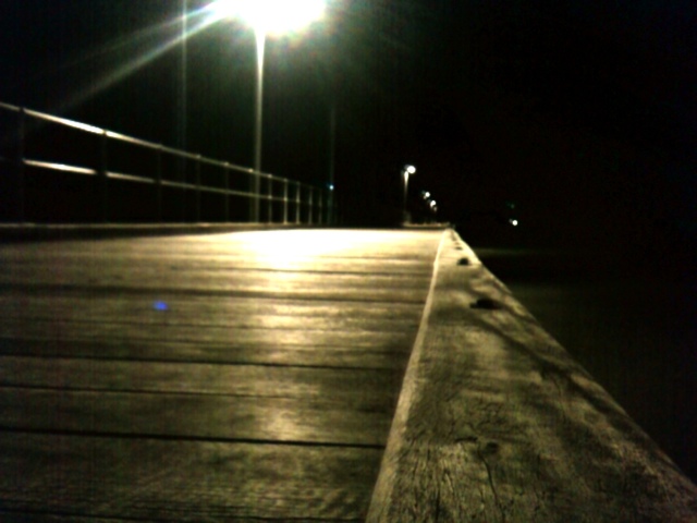
This collection wouldn’t be complete without a little humor. I was shooting standing under the pier (you can see photo from that location in this post), when two boys came and sat on it. I quickly turned and had time to take only one photograph. After a few moments one of the boys ran away, and it wasn’t that interesting anymore.
Click on the photo to enlarge.
I hope you liked the photos. Feel free to comment on them!
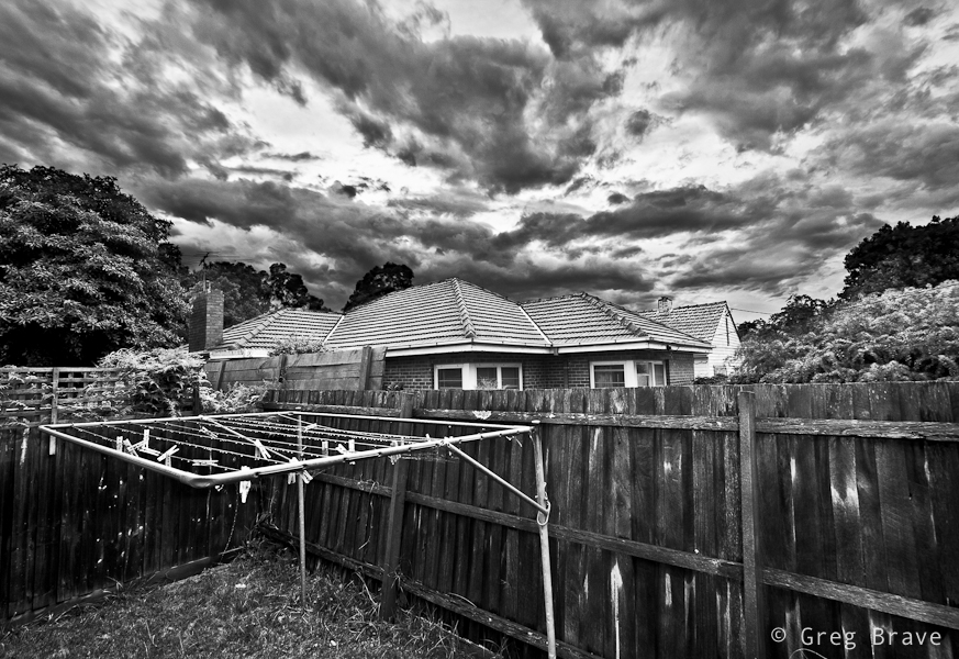
In one of my previous articles I wrote about shooting with intention for B&W (tip number 6), and not merely looking at your photos and trying to convert them to B&W to see if that looks good. Now I would like to add the concept “seeing in black and white”. It comes to you when you shoot a lot of b&w images – you then gain the ability to look at your composition and in your mind see how it would look in b&w. Sometimes, the weather is such that you don’t need this ability – the colors are simply black (dark gray) and white (light gray), but on other occasions the sky may be blue with white clouds and everything around you so colorful that imagining how it would look in b&w would be difficult. This is when the “seeing in black and white” skill comes handy.
Click on the photo to enlarge.
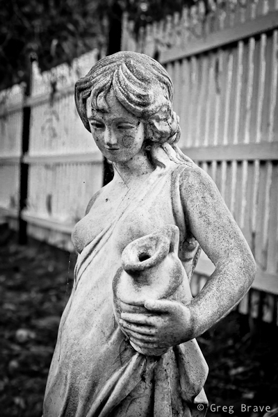
Sometimes the scene itself calls for b&w, as it was with this garden statue. This woman was standing in this garden for a long time and her skin turned from pearl white to muddy gray, the same happened to the color of the fence, and in any case the emphasis here is not on the color.
Click on the photo to enlarge.
Black and white in photography often helps to convey mood, and emphasize shapes and textures.
Click on the photo to enlarge.
Here is another example of emphasizing shapes by shooting in black ans white.
Click on the photo to enlarge.
Did I mention mood already? I just love it when the sky looks like it is going to rain any minute, and light is dim. These minutes before the rain are great for capturing photos such as this one. I wish there would be a bird sitting on the hanger at the foreground though…
Click on the photo to enlarge.
I hope you liked the photographs, and I’ll see you next time!
As always your comments, thoughts, and experiences are highly appreciated.
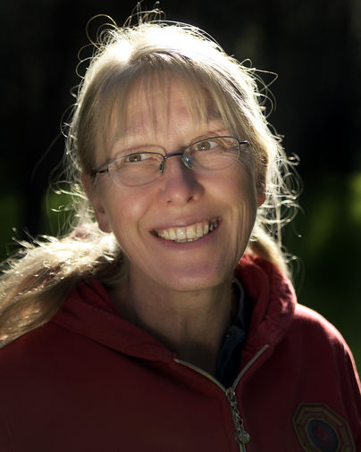
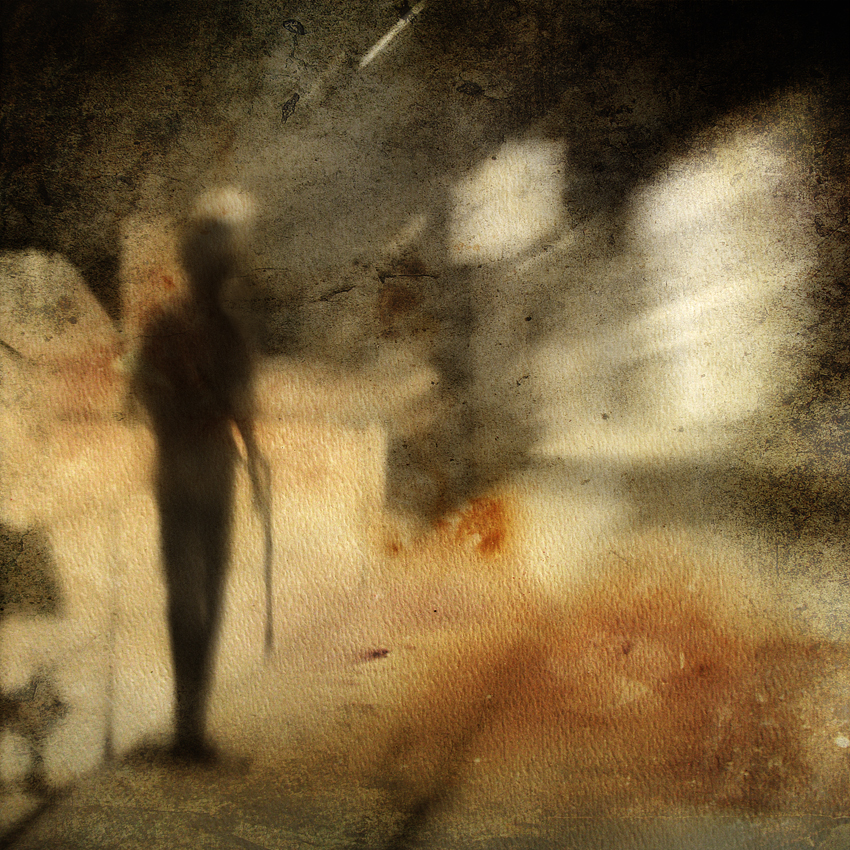
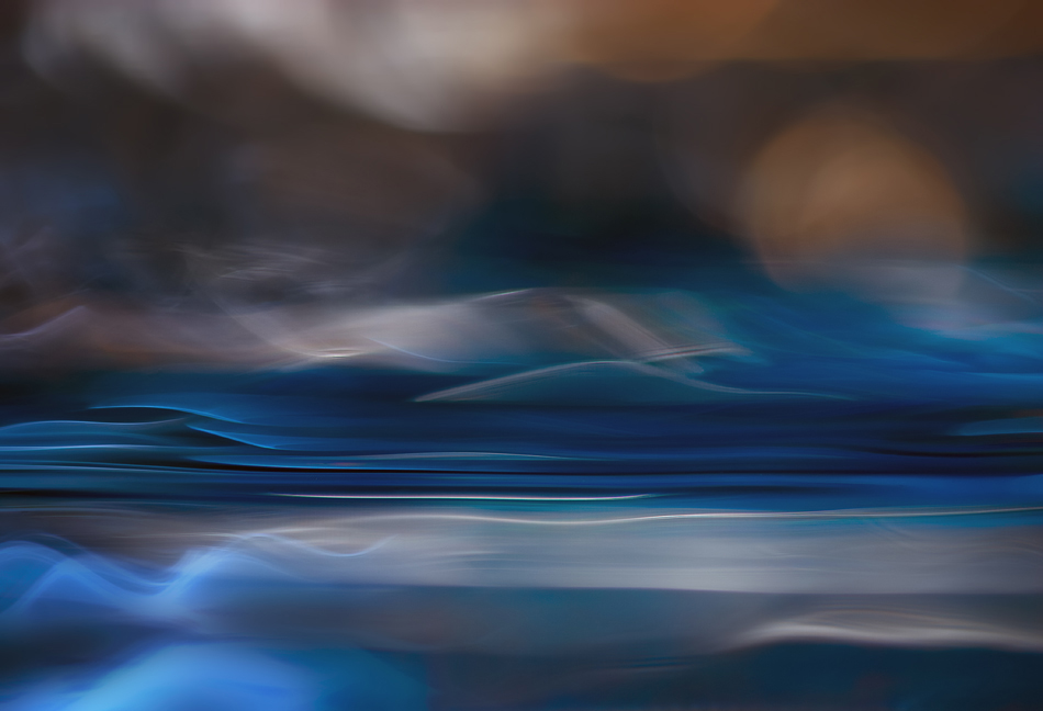
Ursula has very unique photographic style, and a lot of talent. I first saw her work on 1x.com and then followed to her own web site. I find it very fascinating how through abstract forms and colors Ursula manages to convey various moods, feelings, and emotions. I was very happy when Ursula agreed to this interview because I had so many questions to ask her!
Everybody please meet Ursula
Tell a little about yourself. Are you a full time photographer?
I was born in the north-eastern part of Argentina, not too far from Iguazu Falls. I grew up in both Argentina and Chile. I moved to the USA to attend university, and eventually moved permanently to Canada. I now am Canadian, living in the interior of beautiful British Columbia. British Columbia is a beautiful province. It’s a mountainous area, with lots of trees, lakes and rivers, waterfalls, rocks, and wildlife. For me, it’s a great place to live.
I am married. My husband and I have five children. I have a degree in Education with a major in Art and History. Currently I dedicate most of my time to photography.
Do you have other hobbies?
I don’t have any hobbies at this time, although I love beadwork, hiking, and reading mysteries.
Can you describe the “mental” process of creating a photograph? What I mean is how do you decide to take a photo? Do you see something that catches your attention and photograph it, or first the idea of a certain photo comes to you and then you execute it?
It’s a variety of things.
At times I set out very deliberately to make a certain kind of image. For example, “bounce” is such an image. I participate at DPChallenge occasionally. One of the challenges last year was “Point of Color”, where the assignment was to capture an image where a point of color is the main subject.
Photo by Ursula Abresch. Click on the photo to enlarge.
I decided to photograph a group of paper strips taped together at one end for this challenge. I entered a different photo into the challenge, but “bounce” was the result of this assignment. The composition, the setup, everything was quite deliberate. “Coastal dawn” is a similar story. I had been experimenting with waterscapes, closeups of reflections on water in a pan, and I deliberately set out to create a sunset/sunrise impression. Most of my studio work is quite deliberate.
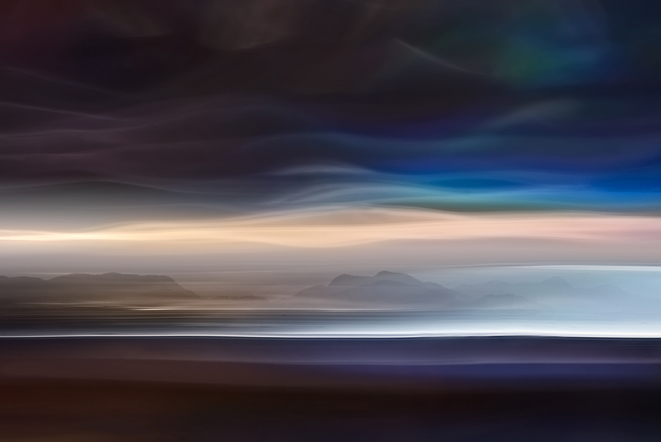
I prefer to work outdoors though, in natural light. When working outdoors I usually have a theme for the day. For example, “an autumn song” and “late fall” are both made on days when I set out to capture the mood and the spirit of Autumn. One was made in October, the other in November of last year.
Photos by Ursula Abresch. Click on the photo to enlarge.
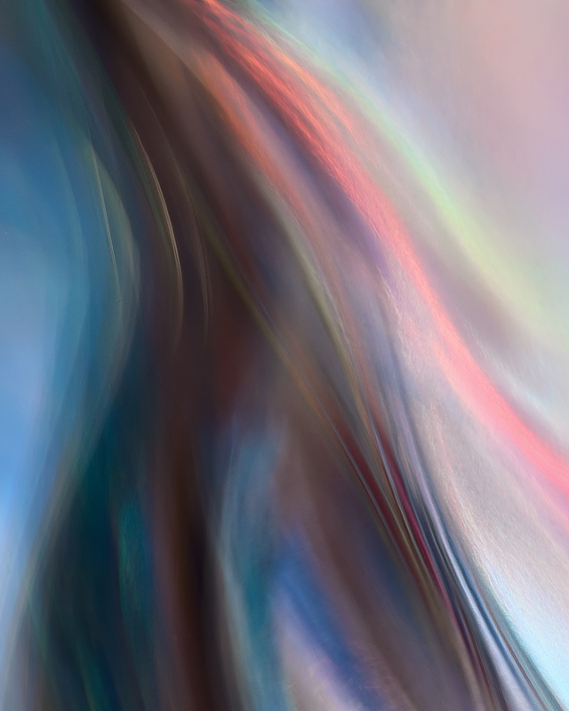
Sometimes I set out to work on a particular technique. In those cases I am not so interested in the subject, but more in the potential of the subject for a particular technique. Two examples are “bittersweet” and “burn”. The objective was to make photos that would be good for HDR processing techniques. I think they worked well for that exercise.
Photos by Ursula Abresch. Click on the photo to enlarge.
Same with “needles”: the idea here was to practice using the Lensbaby. The subject/final photo wasn’t planned, what was planned was the method. I am happy with the result nevertheless.
Photo by Ursula Abresch. Click on the photo to enlarge.
Sometimes a photo just happens. “Hunter” is such a photo. I was driving home to Canyon Village in Yellowstone National Park on a rainy evening, and this scene happened. I am glad it did.
Photo by Ursula Abresch. Click on the photo to enlarge.
Finally there are the photos that are conceived over time and carried out mainly in Photoshop. “Revelation” and “my BC” are like that. “My BC” uses 2 pictures, one made in April of last year, the other in August. They are combined in Photoshop for the final image. The base photo for “revelation” was made in the Fall of 2009, the idea for the final image didn’t come to me until a year later, when I was experimenting with adding texture files to images to create more visual interest and intensify the story. I think the process worked well in both instances.
Photos by Ursula Abresch. Click on the photo to enlarge.
What are your sources of inspiration?
The place where I live, British Columbia, has become an important source of inspiration in my photography. It is a subject for some of my more representational images, and also for many of my more abstract images, where I try to reflect the essence of a subject, or where I use a subject to express emotion. For example, many of my closeup images of the Columbia river are an attempt to reflect my own thoughts and feelings in pictures.
Painters from Canada, in particular Western Canada also influence my work. We live in the same world, so I like to see if I can see what they saw the way they saw it. The works of Emily Carr, especially her fantastic studies and paintings of trees, are a constant source of inspiration for my photos. For a while, and even now, I was quite inspired by the works of Takao Tanabe, a more recent painter than Emily Carr, especially his waterscapes. Lately I’ve been looking at works by the Group of Seven, in particular Lawren Harris and A.Y. Jackson – I find their work very inspiring!
Last, I’ve been trying to familiarize myself with at least some of the printmaking by First Nations people in British Columbia, trying to find ways to apply some of their concepts to my photography.
Do you try to learn from other photographers?
Yes. I look at the work of other photographers all the time, and try to learn from them. Some names that come to mind are Freeman Patterson, Dorothea Lange, Alfred Stieglitz, John Shaw, Galen Rowell, Tim Fitzharris, Irving Penn (especially his still-life work).
But as mentioned in the last question, more so than from photographers I learn from painters.
What makes great photograph to stand out from other good photographs?
Good technical skills are essential. But photograph that stands out is a creative visual composition with one or more of the following: excellent light, captivating mood, compelling story, irresistible graphic appeal. Not all are present in all great photographs, but some always are. Some pictures draw you in because they tell such a good story. Others because you can strongly feel the mood when you look at it. Yet others simply overwhelm you with the beauty of their design. In my view, the more characteristics combined into one photo, the stronger the overall appeal.
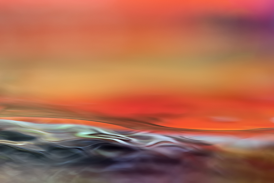
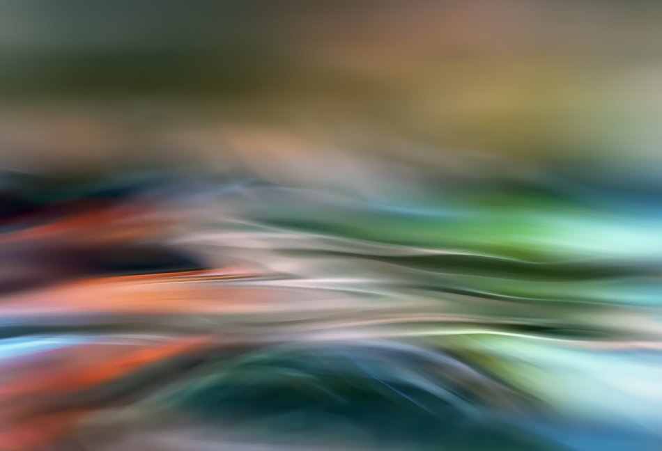
You have beautiful abstract photos, such as “Femininity”, “Firewater”, “Coastal Dawn”, “Drifting”. How do you create them? Is this made in camera or there is Photoshop involved?
There is Photoshop involved in all of my photos. For me, and for any digital photographer, it wouldn’t be possible to make a final print without using Photoshop or some other photo-editing software at some stage. Making the final print is the goal, and in the digital world you can’t do that without software.
Photos by Ursula Abresch. Click on the photo to enlarge.
The four photos you mentioned are all done in studio. Three (“firewater”, “coastal dawn” and “drifting”) are closeups of reflections in a pan of water. “Femininity” is also a closeup of a reflection in a pan of water but with a glass vase partially submerged into the water as the point of focus. Imagine being by a calm lake in Autumn, sun behind you shining on the beautiful trees at the other side of the lake. What do you see on the surface of the lake? A beautiful reflection of the Autumn colors. That is essentially what I am doing here, using a pan of water and reflective materials on the far side to make closeups of these reflections on the surface of the water. For added interest, the water in the pan is not still but moved around. The setup is quite simple, and the results are somewhat predictable but not entirely, at least not yet, for me. The variable is the water movement.
Photos by Ursula Abresch. Click on the photo to enlarge.
In “coastal dawn” I deliberately put a red dot on the blue reflective material with the intention of simulating a sunset or sunrise. I think it worked. In “femininity” I put the vase in the water and moved water over it while photographing because I wanted an interaction between the very hard edge of the glass and the soft movement of the water. The other two, “firewater” and “drifting” are simply closeups of the colorful reflections on the surface of the moving water.
I have to add- this method is not my invention. I learned to make this kind of pictures from Willy Marthinussen at 1x.com.
How did you learn to use Photoshop?
I started out editing my images in Paint Shop Pro. I switched to Photoshop in 2007. I learned mainly by trial and error, but also by asking questions of other photographers on the net at sites such as DPChallenge. I have worked my way through a few online tutorials, and that also was helpful.
I can’t help it, but I have to know technical details. What equipment do you use?
I started out with Nikon digital because I liked the name “Nikon” better than “Canon”. I also liked the intuitive menus, the way the Nikon fit in my hands, and the slightly less creamy look of the photos.
Camera bodies:
Nikon D200 and Nikon D7000
Lenses:
Nikon AF Nikkor 50mm f/1.8
Nikon MF Nikkor 200mm f/4 AIS
Nikon MF Zoom-Nikkor 75-150mm f/3.5 E
Lensbaby 2.0
Sigma 150mm f/2.8 EX APO Macro EX DG HSM
Sigma 70-300mm f/4-5.6 APO DG Macro
Tokina AF 12-24mm f/4.0 AT-X Pro DX
Other:
Manfrotto 055PROB tripod with Manfrotto 486RC2 ball head
Processing:
PSCS4 and Photomatix on a MacBook Pro connected to a Cinema Screen
HP B9180 Photosmart Pro printer
Do you use flashes and light modifiers ?
I use available light most of the time. I do have a Nikon SB600 flash that I use occasionally, for example in the creation of waterscapes such as the four images you mentioned in your question about my abstracts.
And finally, my traditional question: If you had only one advice to give to beginner photographer, what would it be?
Always remember that technical skills are essential, but it is artistic perception that finally makes the photo.
Thank you Ursula for taking time to answer my questions and for your beautiful and inspiring work!
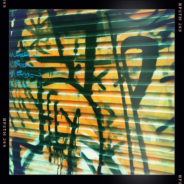
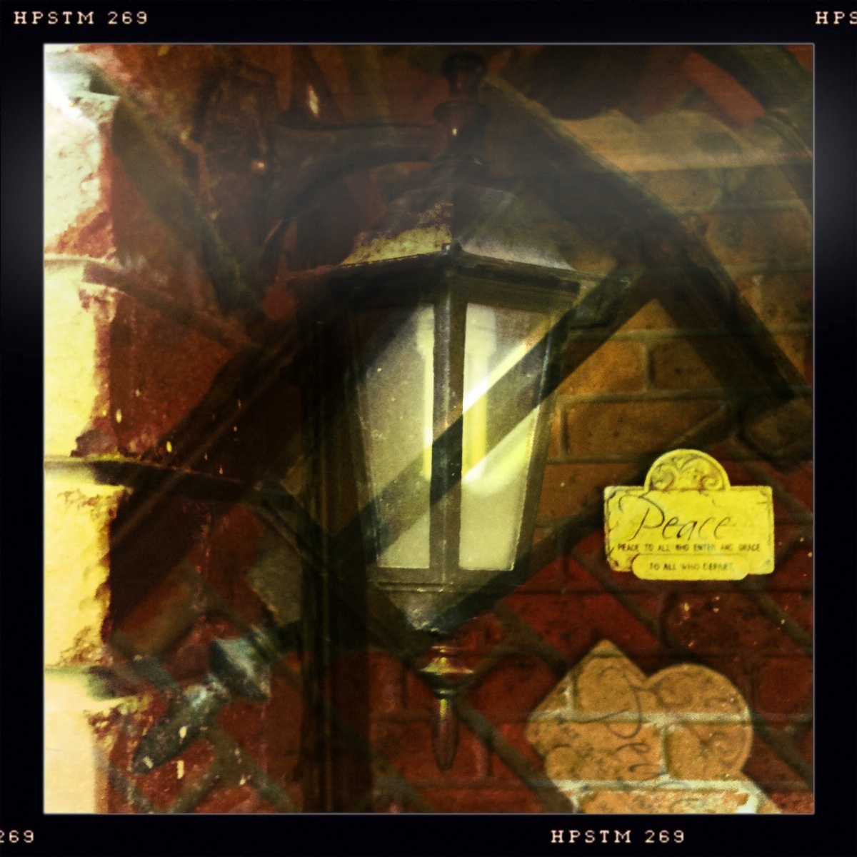
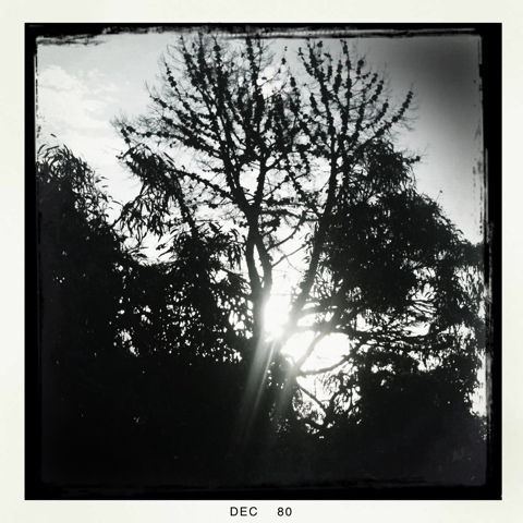
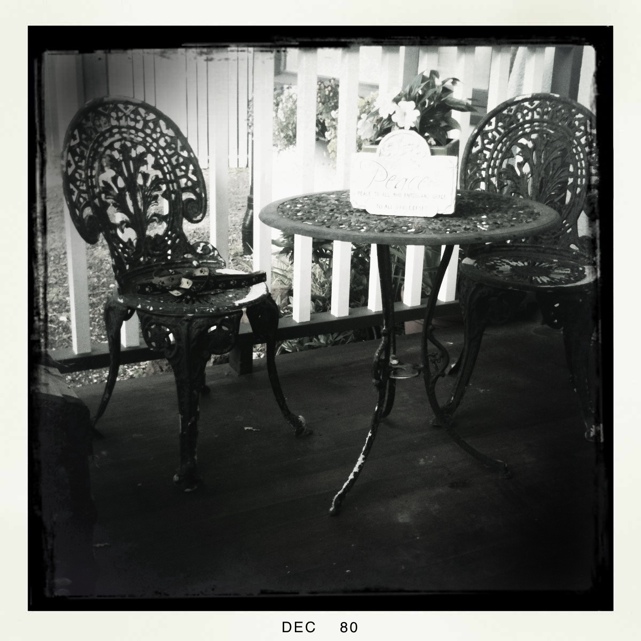
I should have written this post a long time ago, as I’ve been using Hipstamatic ever since I got my iPhone. First of all I must say that I am not affiliated with the creators of this app in any way, I simply love this app!
So what is it? Simply put “Hipstamatic” is an alternative app to iPhone’s native camera application. It is very different though. This app attempts to emulate the ancient plastic film cameras in a very realistic way. Its creators put a lot of thought in the design and functionality of this app, and they keep improving it. Since this app emulates film camera, it has a virtual film loaded into it, and the great thing about it is that you can change this film. For example they have different types of B&W films. But it is not all – you can also swap virtual lenses on the Hipstamatic camera, each lens creating a different effect in the resulting photograph, and you also can swap flashes!
Even though all these features are virtual, their effect on the final photograph is very real, and I find it very interesting. There are many combinations of flash/lens/film that you can use to achieve the look that you want.
Currently you can purchase this app from the Apple Store for $1.99 ($2.49 in Australia), and it comes with basic set of lenses and films. Then you can purchase additional “Hipstapacks” (packages of lens+film) from inside the application.
Though I found a few combinations of lenses and films that I particularly like, and have been using them a lot for my daily photo section, I still have tons of fun playing with different combinations creating different new looks for my photos.
If photography is your hobby, passion, or you just like playing with your iPhone, I highly recommend this app. In my opinion it worth every penny.
You might think I’m going a little bit crazy here, but hey, don’t make any rushed judgments!
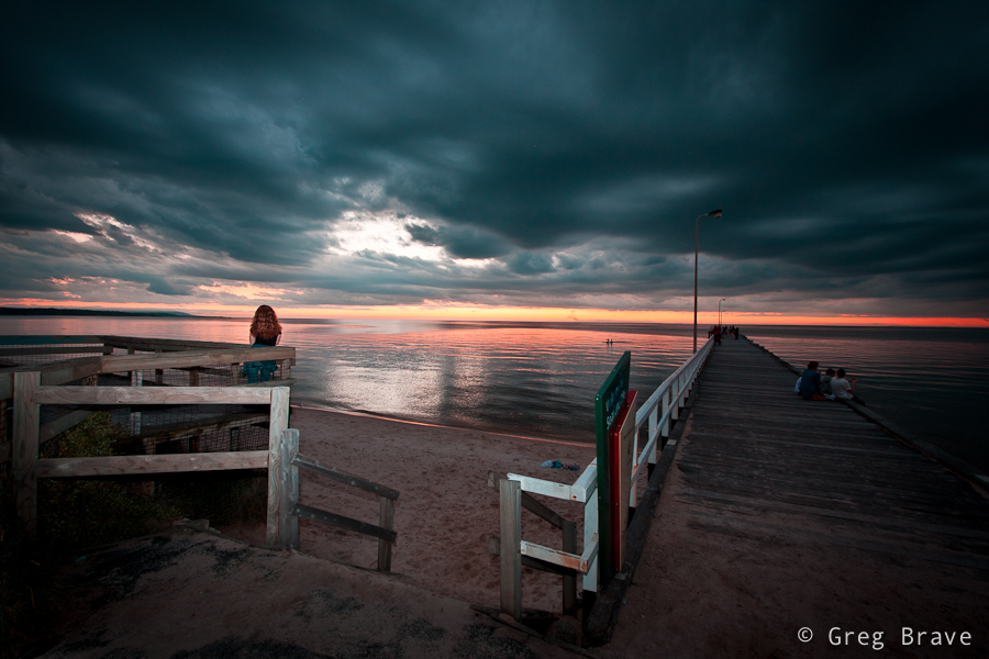
Yes, flash won’t help you to light the landscape but it can help you make your sunset photos a little bit different. Usually when you see sunset photos, the foreground elements of composition are silhouettes due to the high contrast between the backlight from the setting sun and the darkness of the foreground. Sometimes these silhouettes of objects or people look good in the photo, but sometimes adding a little foreground light can improve the final image.
In the following example you can see pretty much the same composition taken with (on the right) and without (on the left) the flash.
Click on the photo to enlarge.
While the silhouette in the left photo looks nice, using a little bit of light to show the cool red hair of the standing person adds a nice touch to the photograph. It also reveals a bit more detail in the foreground, though I’m not sure if it is a good thing in this case.
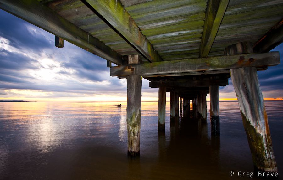
In the photo below I also used flash to light the foreground, and show the beautiful color and texture of the wood. Without flash this photo would have been too dark and much less interesting. Another way of achieving this result would be shooting several frames with different exposures and later combining them into an HDR image, but it would take much more time and possibly look less realistic.
Click on the photo to enlarge.
These are only a few examples of endless possibilities which open up when you start using flash in many situations where it is not normally used, not only during sunset. For example you can use flash when shooting in harsh daylight in order to soften the hard shadows that daylight produces.
Hopefully this post inspired you and gave you a starting point for your own creative ideas when and where to use that flash that has been lying in your photo bag for too long 🙂
If you have any original ideas or examples of unusual use of flash, please share them in the comments.
Recently I came across very talented photographer Jordan Matter. He mostly photographs models, actors, and dancers for their portfolios, but he also does wedding, fashion, and corporate photography. He has a gift of showing the essence of the person he photographs in a very pleasing way.
But what got me really interested is his work is one of his recent personal projects called “Dancers Among Us”. In this project he works with some of the top New York City dancers – he photographs them in all kinds of public places in New York City, in various dance poses. But of course there is much more to it than that. Jordan creates beautiful still images capturing motion, emotion, feelings and more. He himself describes the motivation for this project in very inspiring words.
I couldn’t stop watching his photos, they posses a kind of joy and happiness that is difficult to describe, but once you take a look at the photos, you’ll understand what I mean.
If I got you interested, you can see the photos from the project “Dancers Among Us” on Jordan’s website.
I look forward to your comments regarding this magnificent project. Which photos did you like the most?
If you think about it, in many landscape photographs there are these often small compositional elements that create the overall mood of the photograph. The whole photograph can show a magnificent landscape, but still what makes all the mood (or sometimes adds the final but vital touch) are these elements. And once you thought about this, you can try and consciously add them to your photographs. Just like I did.
This photo would be nice even without the bird, but it would be empty and lifeless. Having the bird in the photograph adds life, motion, and mood to it. Yes, the bird is not sharp ( due to the rather long exposure), and there are not many details of the bird visible, but it is not important. The most important thing is that it is there.
Click on the photo to enlarge.
Can you guess what is the “mood” element in the photo below? It is the moon. Without it the photo would still be nice, with the beautiful rays of sun reaching the sky from below the horizon, but moon adds a final touch to the composition. In my opinion photo wouldn’t be complete without it. And also, I think it is important that it is a young moon and not a full moon. It has to do with our stigmas and perceptions – full moon associates with dark night, bright moon light, and in my opinion would be inappropriate in this image, while the young moon associates with evening or morning sky and fairy-tales.
Click on the photo to enlarge.
As you can see in my two examples important mood elements are small in dimensions, compared to other parts of the image, but are very important and vital when composing the shot.
I hope that having this in mind will help you create more striking and meaningful images.
Here’s to your next photo! Go out there, and don’t forget to have fun!
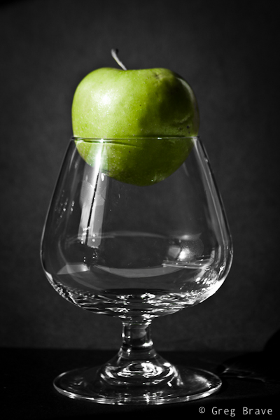
In this post I would like to show that you don’t need sophisticated lighting setups and other “special” props to create interesting still life images. All I used in the photos that you will see below was a glass, an apple, two small sheets of black paper, and two cardboard frames.
The main player here was the light. For quite some time now I’ve been noticing that I have a beautiful light coming from my kitchen window during the late afternoon hours, and finally I decided to take advantage of it. Writing these lines it is a late afternoon of another day, this same light again coming from my kitchen window and I struggle with a strong urge to leave everything and shoot some more still life.
I liked how the glass shadow looks on the black sheet of paper. To enhance it I poured water inside the glass to make it wet, so the shadow would look more interesting, and here is the result.
In post processing I converted the photo to B&W (when you shoot RAW you always get a colored image), and increased contrast and clarity. That’s it.
Click on the photo to enlarge.
In the next photo I deliberately used a green apple, because I intended for the shots to be in b&w except for the apple, and being evenly colored green it was very easy to leave only the green color. In lightroom rather then directly converting the photo to B&W, I separately decreased the saturation of all colors except the green. Then I had to increase the green saturation to bring back the original color of the apple. In this photos I simply put one black sheet of paper on the kitchen table, and another one was acting as a background. The rest is obvious. The direction of the light can be easily determined from the highlight on the apple. Because I couldn’t move the light source 🙂 I created my composition so that the light would be falling in the desired direction. In post processing, in addition to what I already described, I also increased clarity and contrast, and added just a touch of vignetting.
Click on the photo to enlarge.
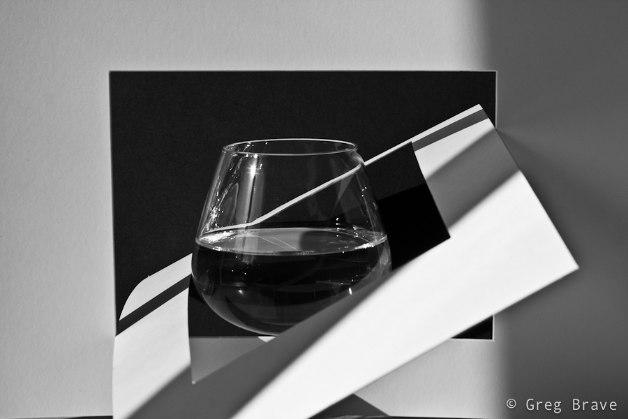
In the next three photos I was playing with geometric forms, light and shadow. I poured some water into the glass to get additional horizontal line for my geometric formation. Actually I did that intuitively, and only now, realized why. Here again, two most important factors were light and creativity. You should understand that I didn’t come up with these compositions right away. It took me quite some time of thinking, imagining, trial, and error to come up with something that I thought was working for me.
Click on the photo to enlarge.
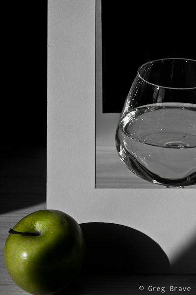
Here I tried to shoot just a fragment of the whole, and ended up liking it. In my opinion it gives a hint of the whole leaving enough room for imagination.
Click on the photo to enlarge.
In this final photo I tried a more complex approach to my composition by adding more detail. I think it is a risky thing to do because I could easily over complicate the photo thus loosing the viewer’s attention. I hope I didn’t, and I’d be glad to hear about it in the comments to this post.
Click on the photo to enlarge.
So here you go. Still life photography that doesn’t require expensive equipment or artificial light. I hope you liked it, and I hope that you got inspired by it to create your own still life images.
As always your comments are appreciated, and
Remember, you only need to enter your name to leave a comment!
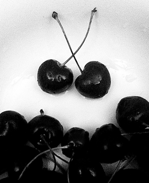
Wishing everybody a Fruitful and Creative New Year!
In this post I’d like to talk about photographer’s artistic interpretation of the observed scene.
When I decide to take a photograph of a location, it is usually because I feel some sort of impulse. This impulse comes as a result of the surroundings communicating a certain mood, or association to me. You can say that I am photographing more of a mental image of the scene that I have in my mind at that moment than the actual scene. And consequentially, later when I see the photograph on my computer, it is quite different from my mind’s picture.
I call bringing the two images together “Artistic Interpretation”, and use post processing to achieve that. I constantly feel the need to improve my post processing skills to be able better present my photographic intentions.
In the following two examples, you can see the photographs before and after my artistic interpretation (left photo is before and right photo is after).
It was evening time, about 40 minutes after the sunset. The darkness came quickly and the sky was cloudy, it was going to rain any minute. I felt the “pressure” of the coming rain in the air taking this photograph. When I saw the resulting photograph, I felt that this feeling of a close rain and late evening was gone and I had to bring it back. I increased contrast and reduced saturation. I feel that I succeeded in bringing that mood back, but I’ll leave it for you to decide.
Click on the photo to enlarge.
On another occasion I was again walking along the beach. It was a shortly after the sunset, and because it was cloudy, I could barely see the faint remnants of sunlight. The clouds were really beautiful and I couldn’t resist taking a photo. In post processing I increased contrast and added a bit of saturation to the yellow. I also added slight vignetting to concentrate the viewer’s attention on the horizon.
Click on the photo to enlarge.
What do you feel looking at these images? Can you bring your own examples of your artistic interpretation?
As always any comments, suggestions, ideas and anything else you’d like to say are welcome.
One of the compositional tools that photographers use to draw the eye of the viewer into the photograph is lines, which lead the viewer through the photograph. And by lines I don’t mean pencil drawn lines or anything like that. These “lines” can be represented by various contours of elements in the image.
Here is an example of leading lines in the image:
Click on the photo to enlarge.
As you can see there are several such lines in this photo. One of them is the line of the wooden fence. The “line” can be broken and not straight, as is the case here, but nevertheless it still does the job. Another line is formed by tops of the bush, and finally the third imaginary line appears when your eye connects between the three tree tops.
All three lines converge at the lower left part of the photograph leading the eye from right to left. However there is one more line, which “breaks” this pattern. It is the stripe of bright sky protruding through the clouds. While other lines are relatively easy to control because they are stationary , this line could be caught only during a short period.
Lines can be a very strong compositional element when used wisely and in place, for example you can use such lines leading the viewer’s eye to the main subject of your photograph.
What are your examples of leading lines? You can share your photos in the comment section to this post.
About a week ago I found a wonderful photo website of a great photographer Tony Kuyper. In addition to sharing beautiful photographs on his website, Tony also writes Photoshop tutorials on photography post processing. And what a great tutorials they are! You need to know your way around Photoshop in order to fully benefit from them though.
For me these tutorials revealed a whole new world, and I have been playing with my photos, implementing stuff I learned from Tony’s tutorials this whole week.
Well known photographer David duChemin is currently traveling in New Zealand. Inspired by the photos he is sharing on his blog I felt the urge to go over my own photos that I took while traveling in New Zealand a few years ago.
Using the knowledge from Tony Kuyper’s tutorials I was able to significantly improve some of my New Zealand’s photos. Here, judge for yourselves.
Click on the photo to enlarge.
In the photo above, the sand on the foreground and the greenery at the background were too dark. I was able to seamlessly lighten them and also to slightly increase the green’s saturation without affecting other parts of the image.
Click on the photo to enlarge.
In this image I was able to selectively increase the color saturation only where I needed to, without affecting the saturation of other parts of the image, and, what is the most important here – I could do that seamlessly. And by seamlessly I mean that you can’t see any “borders” between the parts with different saturation levels.
I hope I intrigued some of you with Tony’s tutorials. I loved them and therefore recommend them to you unless you are ideologically against post processing.
You are welcome to share your thoughts and processed photos, and
Remember, you only have to enter your name to leave a comment!
Sounds easy right? You just go out there at sunset time and shoot away. Well it is easy if you only want snapshots, but if you want beautiful photos you really should plan ahead. Don’t get me wrong – accidents do happen, and occasionally you might snap a nice sunset photo just from accidentally being in the right place at the right time, but most of the time it just doesn’t work that way.
Planning is essential when shooting at sunset, and it doesn’t matter whether you shoot landscapes or models at sunset or anything else – you have to plan. Main reason for that is the fact that sunset is not eternal, and the quality of light changes every minute during the sunset.
Click on the photo to enlarge.
Ideally you should visit the location during the daytime, or another sunset time when you are not planning to shoot, and look around, think of ideas of what you are going to shoot there. Imagine the sun being at various heights in the sky, the colors changing, find angles and places from which you’d like to create photos. Think of the compositions that you’d like to create.
Click on the photo to enlarge.
At the day of the shoot arrive at the location at least 2 hours before the sunset time and prepare your gear. If you are going to shoot people and you need lighting equipment to be in place – do it BEFORE the actual shooting time. Be ready. Because when the sunset will start happening you won’t have much time to think, you’ll have to shoot quickly so you won’t lose precious light.
Click on the photo to enlarge.
Remember that if the exact sunset time is, let’s say, 20:00, it is the time that the sun disappears below the horizon, so if you arrive at location at 20:00, you won’t see the sun. Actual sunset time good for shooting starts approximately 40 minutes before the sunset. This time period depends on many factors such as your geographic location, time of the year, and the weather. You can also shoot after the sun disappears, and quite often the lighting many minutes (usually about 20 to 40 minutes) after the sunset is very beautiful.
Click on the photo to enlarge.
Remember to take weather into account when planning your shoot. Too many clouds for example can totally block the sunset light, making the sunset uninteresting, but then a complete absence of clouds is also not always welcome. Remember that weather is something that you can’t control, be patient with it, and don’t despair. With enough patience and determination you’ll get your shot. I promise!
What are your tips for shooting at sunset? Any examples of sunset photography?
Remember, you only have to enter your name to leave a comment!
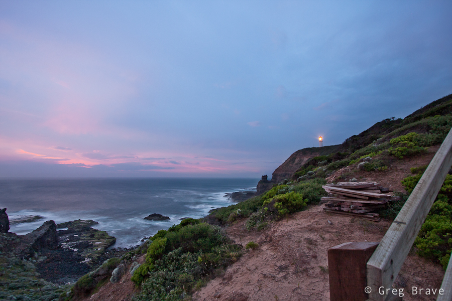
Cape Schanck is the southernmost tip of the Mornington Peninsula and separates the wild ocean waters of Bass Strait from the slightly calmer waters of Western Port. Its most recognizable symbol is the Cape Schanck Lighthouse, which was built in 1859 and was the second lighthouse built in Victoria. A prominent rock outcrop is Pulpit Rock. It stands out at the very tip of the cape.
The first time I went there was on weekend mid-day, and my biggest problem photography-wise was the strong straight sunlight, which made the shadows very dark and deep. On the photo below you can see the shadows I’m talking about. The good part was the colors being very vibrant. The rock on the upper right is the Pulpit Rock.
Click on the photo to enlarge.
At my first visit there I decided that I have to visit the place on sunset and see what can I make out of it, so a few days later I drove there after work (it is a 40 minutes drive from where I live), but the sunset wasn’t that good. It was very cloudy, sunlight could barely be seen, and I started thinking that I won’t be able to create even a single good photo, but I was patient and decided to stay there and walk around even after the sun fell completely below the horizon, and suddenly the sky started to clear and I was able to catch the photo below.
Click on the photo to enlarge.
On the right you can see the Cape Shanck lighthouse. So this was a good experience for me, as I saw that when shooting at sunset, patience is a good practice because even quite some time after the sunset it is still possible to capture the beautiful remaining light.
As always your comments are welcome, and
Remember, you only have to enter your name to leave a comment!
Yesterday at dinner me and my sister had conversation about how digital photos are made, and what do all these strange definitions mean. Then I remembered the time when I was struggling to understand all these concepts. It took me some time to wrap my head around them.
I think many beginner photographers are still struggling with them. So I’d like to share what I have learned and understood in the way that is clear to me, and hopefully will be clear to you.
Let’s start with the initial image that comes out of the camera – what does it mean that camera produces, let’s say, 10 Mega pixel image?
Ok, before answering this question let’s explain what a “pixel” is. Pixel is a virtual dot. Yes, a virtual one – it doesn’t have dimensions of its own. Let’s just leave it at that for now and I’ll explain down the road when pixel gets it’s physical dimensions. Now imagine a rectangle shape filled with dots. On its long side it has 3648 dots and on its short side it has 2736 dots. So the total number of dots would be 3648*2736=9,980,928 – it is almost 10 million dots or in other words 10 Mega pixels.
All digital images are “composed” from pixels (dots). Each pixel has its own set of values such as color, brightness, saturation etc.
So when we say that camera produces 10 Mega pixel images, it means that for each image camera provides this set of values for ten million pixels, all these numbers being put into a single JPEG or RAW (or any other format) file.
When you load this image on your computer’s display all these values are translated into actual color, intensity, etc. and together form the captured photo. Remember I said that pixel has no dimensions? As long as it “sits” in the JPEG or RAW file it doesn’t, but as soon as the file is displayed on the display, pixel receives its physical dimensions depending on DPI, on which I’ll explain next.
Let’s stay with the 10 Megapixel photo for now, and try to understand the DPI. DPI stands for Dots Per Inch. So basically if we have, for example, 10 DPI resolution then it means that for each square inch of image we have 100 pixels (10 by 10) with information regarding their color, intensity, etc. And these 100 pixels are taking the whole square inch, so they each pixel has certain size. And if we have 20 DPI resolution then we have 20×20 pixels per square inch (400 in total), therefore each pixel is smaller, and the result is better sharpness of the image.
You might get confused a little bit at this point – DPI stands for DOTS per inch but I’m talking about pixels. Here’s the thing – when a dot displayed on the computer screen, it is called a pixel, and when this same dot is printed on the paper, it is called a dot. Sometimes the abbreviation PPI (Pixels Per Inch) is used for computers but I’ll mostly stick to DPI.
Now let’s talk some real numbers
If you are displaying your images on computer display, then you don’t need resolution higher than 72 DPI because of physical limitations of the display (the smallest dot that display can show is of certain size, so physically there can be no more than 72 pixels per inch displayed on computer screen). If you’ll save your images in a higher resolution than 72 DPI and only look at them on your computer, you will just waste your storage space because the bigger your DPI, the more space the photo will take on your hard drive provided its physical dimensions stay the same.
If you want to print your photos, then resolutions of 240 DPI or even better 300 DPI are appropriate. This is due to the fact that printer can print much smaller dots than computer screen can show. If you’ll use a much lower resolution for printing, then instead of nice photo with sharp detail and smooth color transitions you’ll see image comprised of colored squares because your digital file will contain inefficient amount of data.
Let’s go back to the digital image produced by a 10 Megapixel camera. As we already said, this image contains information about 10 million dots/pixels. That’s it, not less and not more. Now when you want to print this digital image, these 10 million dots are your limit, and it is for you to decide how to use them.
For example if you want to print at resolution of 300 DPI (to remind you DPI stands for Dots Per Inch) then you are limited to picture size of 12.16×9.12 inches (30.89×23.16 centimetres). How did I get these numbers? Easy: remember that we said that a 10 Megapixel image has the following dimensions 3648×2736? Now if you divide 3648 by 300 (your desired resolution), you’ll get 12.16 inches for the long side of the printed photograph, and similarly divide 2736 by 300 to get 9.12 inches for the short side. Don’t forget that it is the maximum size for resolution of 300 DPI. You can always print smaller sizes. In that case not all the information contained in the file will be used for printing.
After understanding how the Megapixel count and the resolution (DPI) are affecting the size of the printed image, it is clear that for any given digital image (in our example it is an image from a 10 Megapixel camera) the lower your desired resolution, the larger the printed photo can be.
For most of the printers you don’t need to go above 300 DPI because of the physical limitations of the printer – it simply can’t print more than 300 dots per inch, but when would you like to decrease the printed resolution? I can give one most common example here – printing large posters or ads that will be viewed from long distance. If you look closely at big advertisement signboards with photos, you’ll see that their resolution is very low and you can distinguish between printed dots when looking from close distance, but when looking from farther distances it looks like a good photograph.
The last thing that I’d like to discuss is the dialog box in Photoshop named “Image Size” because it illustrates perfectly all the concepts I wrote about. In order to get to this dialog box, in Photoshop go to the “Image” menu and from there choose “Image Size”. Then the following window will open:
Of course, the numbers shown are depended on the currently opened image. The numbers that you see in the screenshot above are from 10.1 Megapixel image, but you can play with any photo that you’ve got. As you can see there are three sections in this window:
1. Pixel Dimensions
2. Document Size
3. Check boxes
(For the sake of this exercise, make sure that the “constrain proportions” check box is checked – we want the image to keep its original proportions)
The first two sections are interconnected, which means that if you change numbers in one section, numbers in the other section are also changing.
Lets start with the “Document Size” section, and change the Resolution to a higher number. You’ll see that “Pixel Dimensions” are also changing to higher numbers, and it makes perfect sense – if you want to have more pixels per inch, the total pixel width and height of your image will increase provided that physical dimensions of the photo stay the same. Now change the Width in the “Document Size” section to a lower number. The Height in the “Document Size” section will also change to a lower number because we are constraining our proportions, and more importantly, the Height and Width in the “Pixel Dimensions” section will also change to a lower numbers. Let’s explain that: we kept the resolution intact, but we want the physical width and length of the image to be smaller, which means we want less inches (or centimeters) but with the same 240 Pixels Per Inch, therefore we have less total pixels in our image. Now if we go over to the “Pixel Dimensions” section and change Width (and Height will change correspondingly due to constraining proportions) there to a larger number, then Width and Height in the “Document Size” section will also change to larger numbers. I hope that by now you gained sufficient understanding to explain this change by yourself.
There is one important thing to remember when changing dimensions of your photo in Photoshop – if you try to save the image larger than its original size, Photoshop will use mathematical algorithms to artificially add the additional pixels to enlarge your photo, which won’t always look smooth and natural.
That’s it. It is pretty easy when you take some time to understand the concepts. I hope that if you didn’t fully understand the discussed concepts before, you understand them now, and if not, feel free to leave me your questions in the comments section.
To wrap things up I’ll present some key points to think of when dealing with digital photographs
When saving photo for only web usage save it at resolution of 72 PPI
When saving photo for printing save it at resolutions of 240 or 300 DPI
When saving photo for web or for printing know the size of the photo that you want and save it at that size. This way you won’t waste storage space on your computer.
As always any comments are highly appreciated, and
Remember, you only have to enter your name to leave a comment!
Sometimes photo doesn’t need a frame, it is complete as it is. But then there are photographs that just don’t feel right until you frame them. Frame often adds sense of completeness to the photograph. Photographers often look for compositional elements to naturally frame their subject within the photograph.
It is also important to choose appropriate frame for each particular photo, otherwise it might distract the viewer, or even worse – ruin the whole impression from the photograph.
In our digital age it has become common practice to add frame directly to the photo during the post processing. This way of adding a frame has one significant advantage – flexibility. There are many different
applications that have collections of various frames, which you can add to your photos, or if you are familiar with programs like Photoshop you can draw your own frame around the photograph.
Since most of the photos that we come across are seen on display (either from our digital cameras or the Internet) adding frame directly to the digital photo adds to the viewing experience, and later photo can be printed and hung on the wall without the additional expense on the “real” frame (actually this point can be argued by many who prefer real frames).
I’d like to present here two examples of photos with digitally added frames.
Click on the photo to enlarge.
In this photo I added white frame, which in my opinion turns it to a nice postcard, smoothly fading edges of the image and creating dreamy look.
The photo below would be incomplete without a frame, it’s black edges would leave a sense of incompleteness. So I decided to add a frame. The frame’s color is intentionally greenish to match the tone of the photograph.
Click on the photo to enlarge.
What do you think about framing your photographs?
Remember, you only have to enter your name to leave a comment.
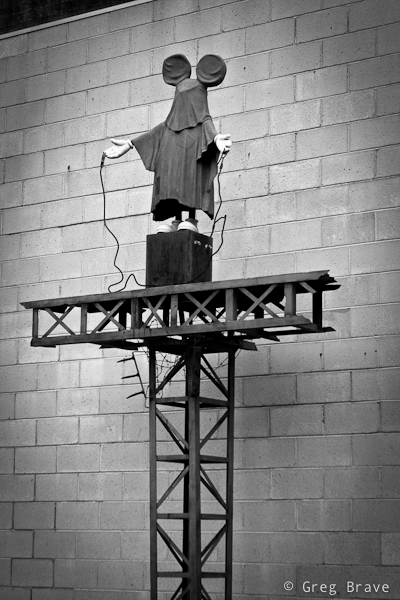
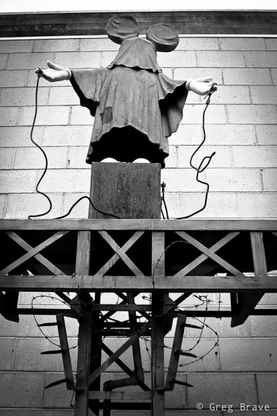
I found a nice place in Frankston named McClelland Sculpture park. It is a pretty large outdoor area with grass and trees and even a little lake. All through this area many sculptures from different artists are placed. Some of them I liked more, some of them less, but there was one sculpture that puzzled me the most:
Click on the photo to enlarge.
I don’t know what exactly artist who made it wanted to express, but in me it evoked a feeling of horror because there were two things that don’t go together – children and torture. Mickey Mouse represents happiness, happy childhood, great toys and movies, and seeing him on this “electric” torture pedestal creates disharmony in your perceptions.
I think artist wanted to warn everybody that the happy childhood of our future generations is in danger. I am not arts expert, so it is only my opinion here, but while this sculpture may represent a “wake up call” for the adults, I certainly would not show it to children, because seeing their beloved character like that may cause them nightmares or other negative reactions.
And now I’ll switch to a completely different topic – photographing this work of art. You can, of course, take a documentary photo of it, which is just presenting it as it is without any additional concerns, but when I photographed it, I tried to convey the impression that I’ve got from it through my photographs. My tools were composition, which is the angle of the shot and decision what details have to be included in the shot (or left out), and post processing.
Click on the photo to enlarge.
I am presenting here two photos with different composition. I can’t decide which conveys my impression the best, because each of these two photos contributes to it.
In the post processing I converted the photos to black and white, enhancing the ominous feel, which reminds me of the horrible photos from concentration camps of WWII, and added vignetting to further “darken” the look and concentrate the viewer on the subject.
I’d really like to hear what do you have to say about this work of art, and how I captured it, and which photo do you like more. Your opinion is highly appreciated, and
Remember, you only have to enter your name to leave me a comment!
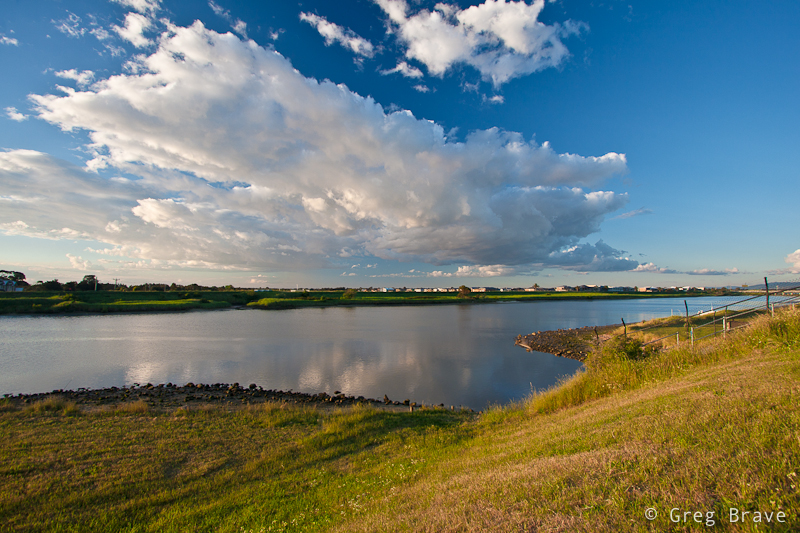
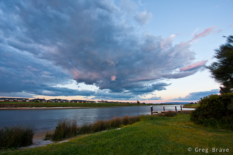
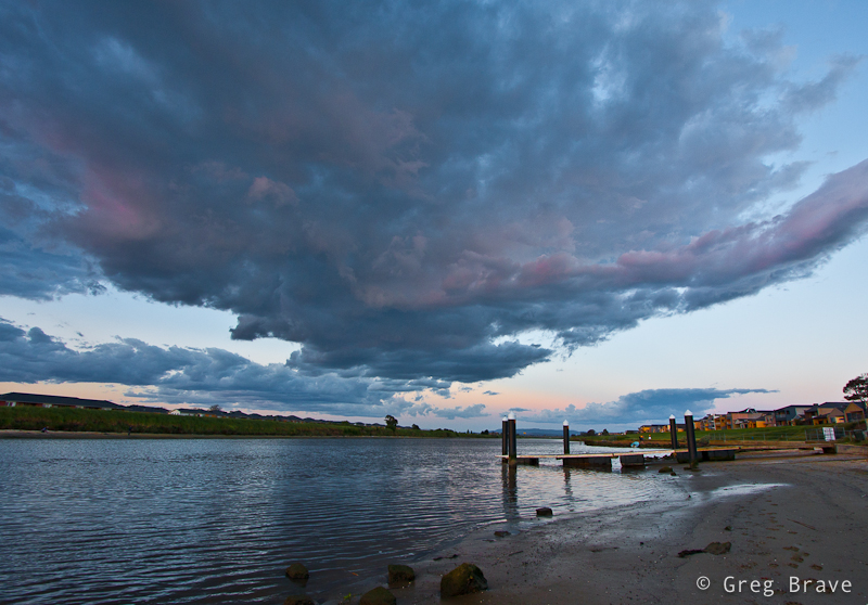
There is a Melbourne’s suburb named Patterson Lakes. It is considered to be one of the more prestigious places to live around Melbourne. The houses there are standing right on the lakes’ shores, and people can
sail their boats from the houses, through the lakes to the Patterson river and to the open sea.
I had a chance to walk around Patterson river area and took a few photos there. It was sunset time so the light was changing quickly, as you can see in my photos below.
Click on the photo to enlarge.
This second photo was taken approximately 20 minutes (maybe 15, or 30) after the first one, and you can see that light became more colorful.
Click on the photo to enlarge.
Here I just tried a different angle, and also went closer to the boat ramp, I liked both of these photos and couldn’t decide which one to present here, so I presented both of them leaving the decision up to you.
Click on the photo to enlarge.
I all three shots I used a Canon 10-22mm lens, the only difference being that in the first photo I used circular polarizer, and in the next two didn’t. As a result of using polarizer (and not the most expensive one) on wide angle lens combined with certain light conditions you can see darkened area at the top middle part of the photo (in the sky), which I didn’t like and removed the polarizer. This is not always the case though as it all depends on the light (including angle of the light relative to the lens). I often use my cheap 🙂 polarizer with the Canon 10-22mm lens and get away with it.
As always any comments, thoughts, and suggestions are highly appreciated, and
Remember, you only have to enter your name to leave a comment!
For those of you who are not familiar with 1x.com, it is one of the best photography sites out there. The photos displayed on that site are carefully selected by jury of several people. I personally visit it for inspiration and simple joy of looking at magnificent photography.
People that run 1x.com have created compilation of their best photographs, and joined them to form a very unique photo book – “In Pursuit Of The Sublime”.
They started shipping it from the beginning of November. This book is priced at $79 and worldwide shipping adds $20 to the cost. They also give 3 months bronze membership at 1x.com to all buyers of the book.
One more interesting detail is that you can view all the images that are included in the book online! This way you’ll know exactly what are you buying.
After having a look at all the images included in this magnificent book I am struggling with a strong urge to buy it. The cost is too expensive for me though, but who knows, I might just not be able to constrain myself 🙂
In any case you should definitely give it a look and if you like the images, you can buy the book here.