Fantasy Edits – Starting with photography to end up with artwork [Updated]

Sometimes I get a little tired with just a ‘simple’ photography. I think this is true for most of people – we can’t just do the same thing over and over again and not get bored with it. We need to mix things up. Thinking about it, I guess it doesn’t apply to the Japanese culture, in which people can dedicate their whole life to perfecting a single skill. Have you seen the documentary “Jiro Dreams of Sushi” ?

Anyway, I got a little sidetracked here. As I was saying sometimes I get really sick with photography to the point I can’t look at my camera without wanting to puke. Well, maybe I exaggerated a little, but you get the point. When it happens though, my creative urge doesn’t go away, so I try to come up with ways other than photography to let it out.

Being a photographer I have a lot of images in my Lightroom library, and when I don’t feel like shooting new ones, I try to reuse my old images to create something new out of them. Sometimes I get lucky and something nice comes out of my efforts, and when it does I want to share it with the world!

I call these series – “Space Fantasies”.

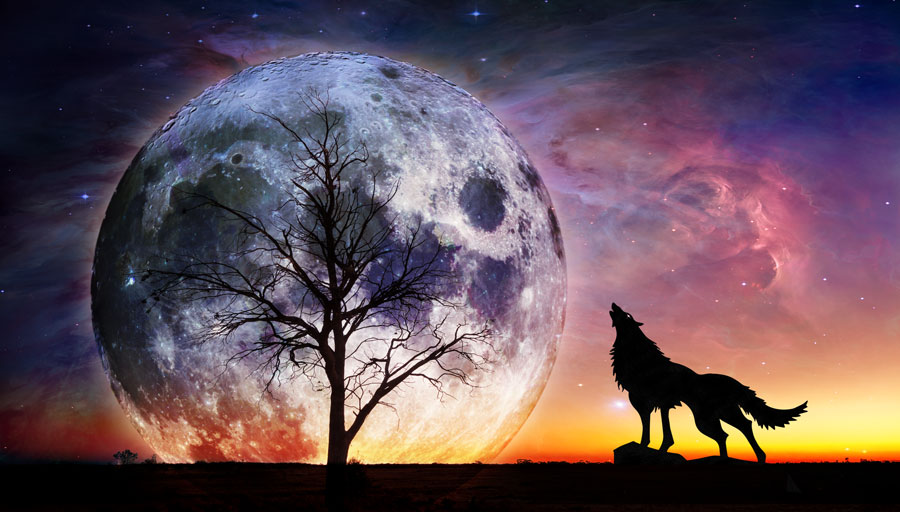
Since one of the purposes of this blog is to educate (ambitious, don’t you think?) I will share a bit about how the  image above was created. The rest of the images you’ll see in this post were created similarly.

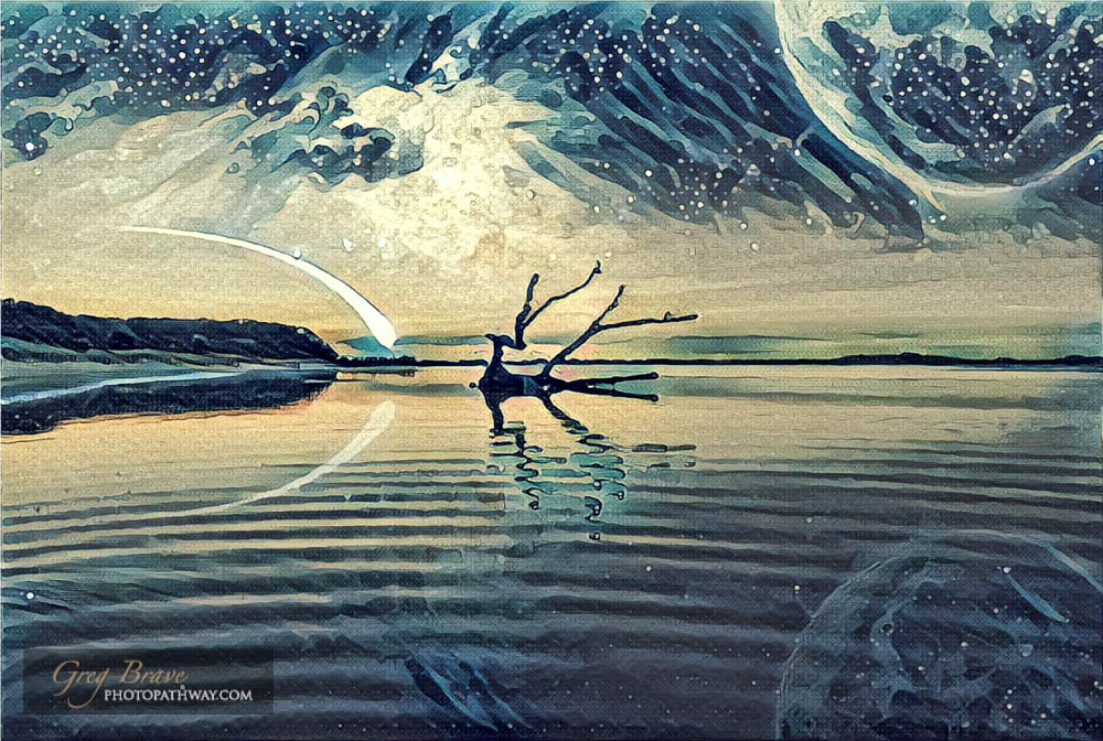
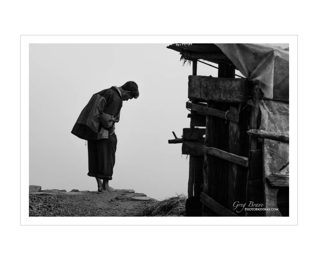
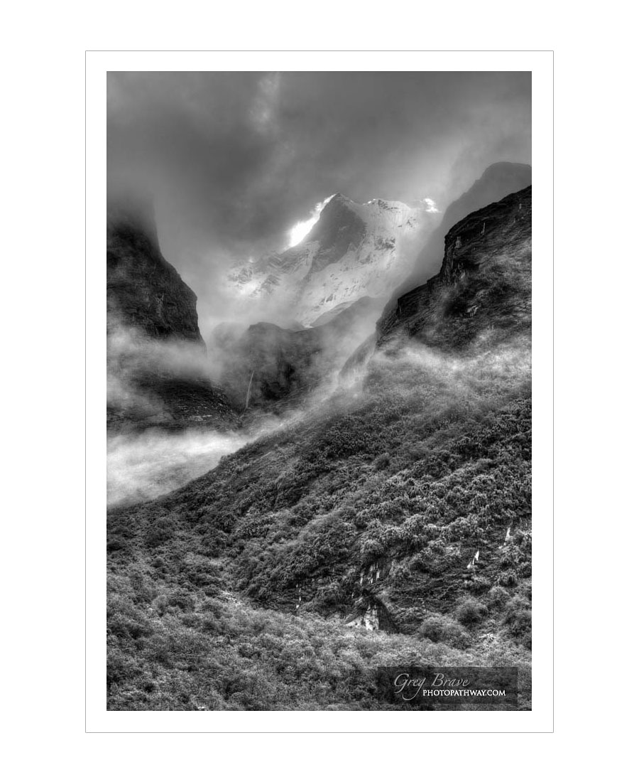
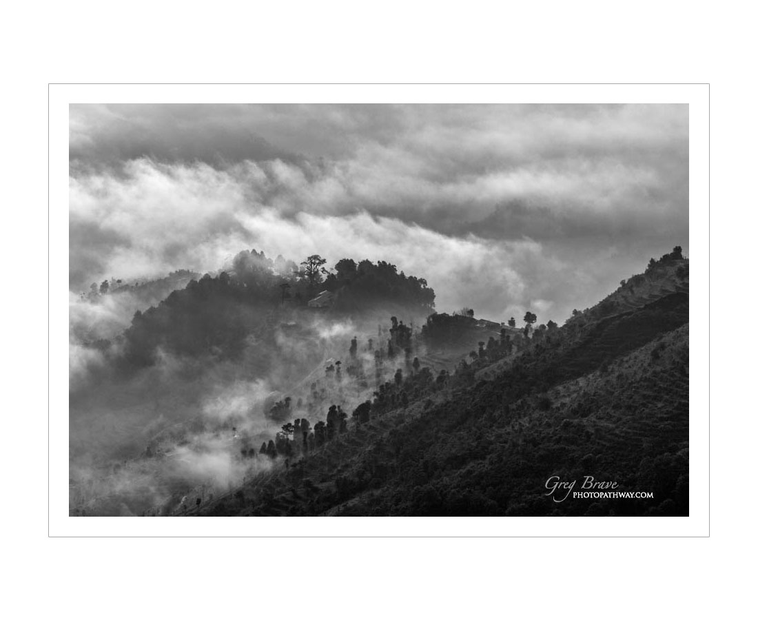
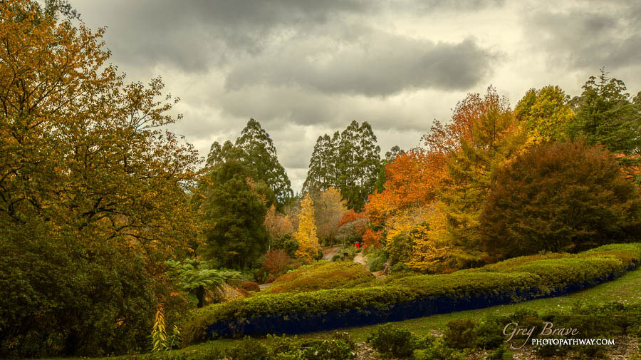
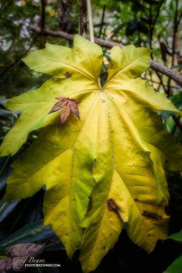
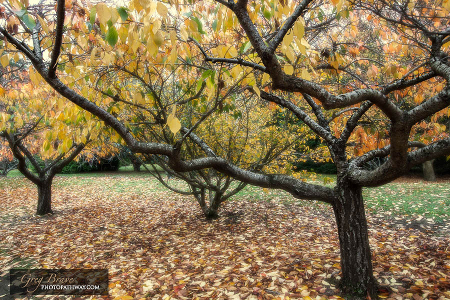
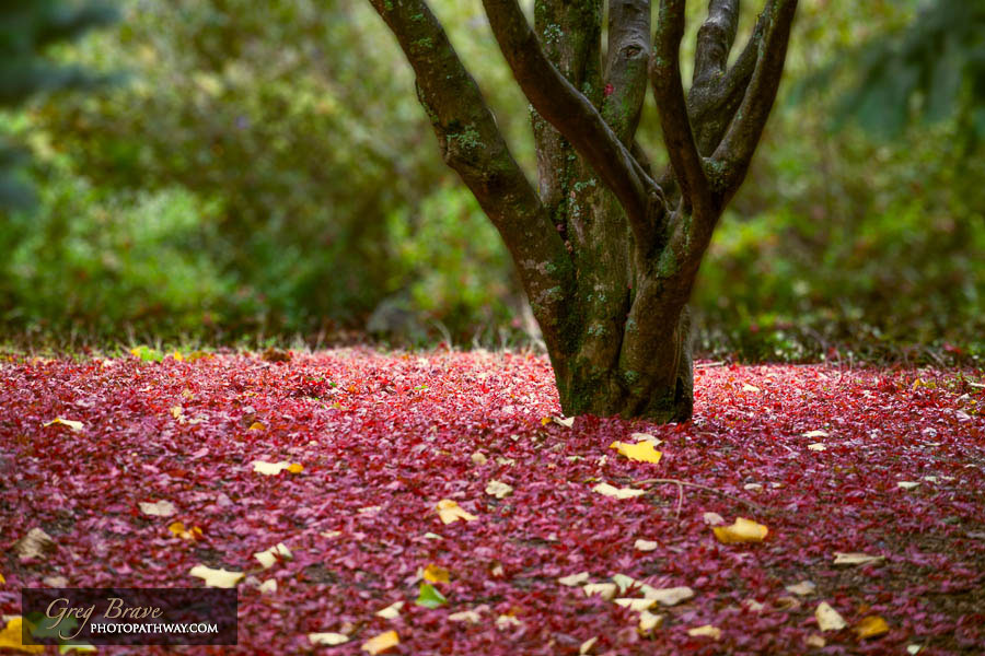
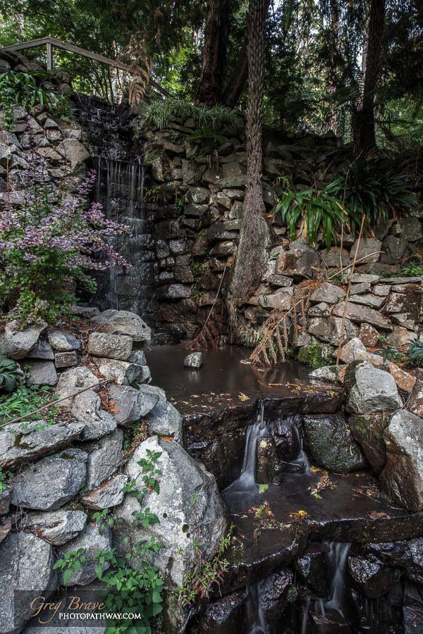
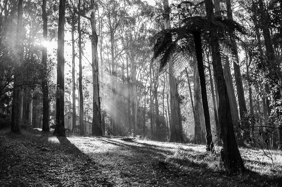
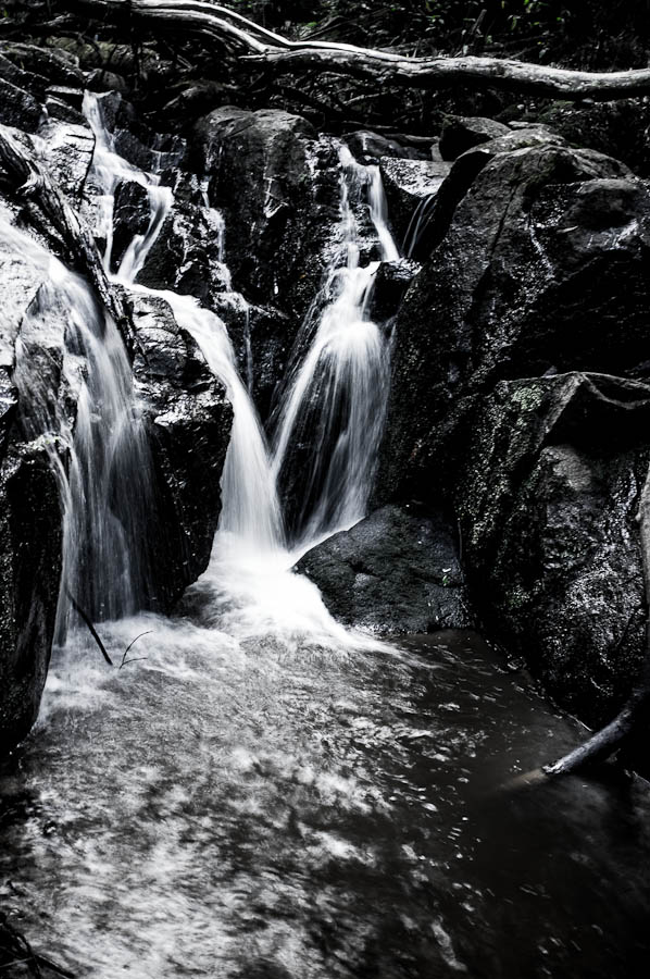
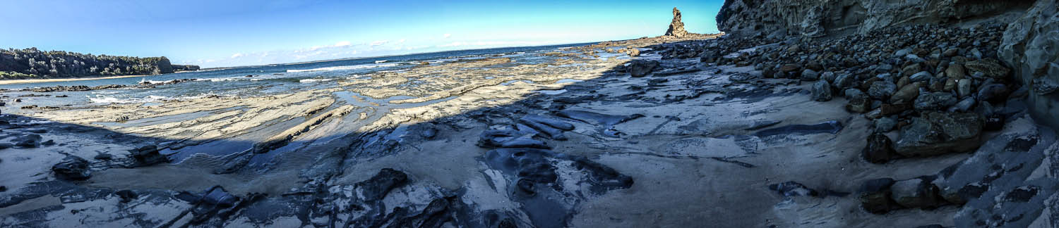
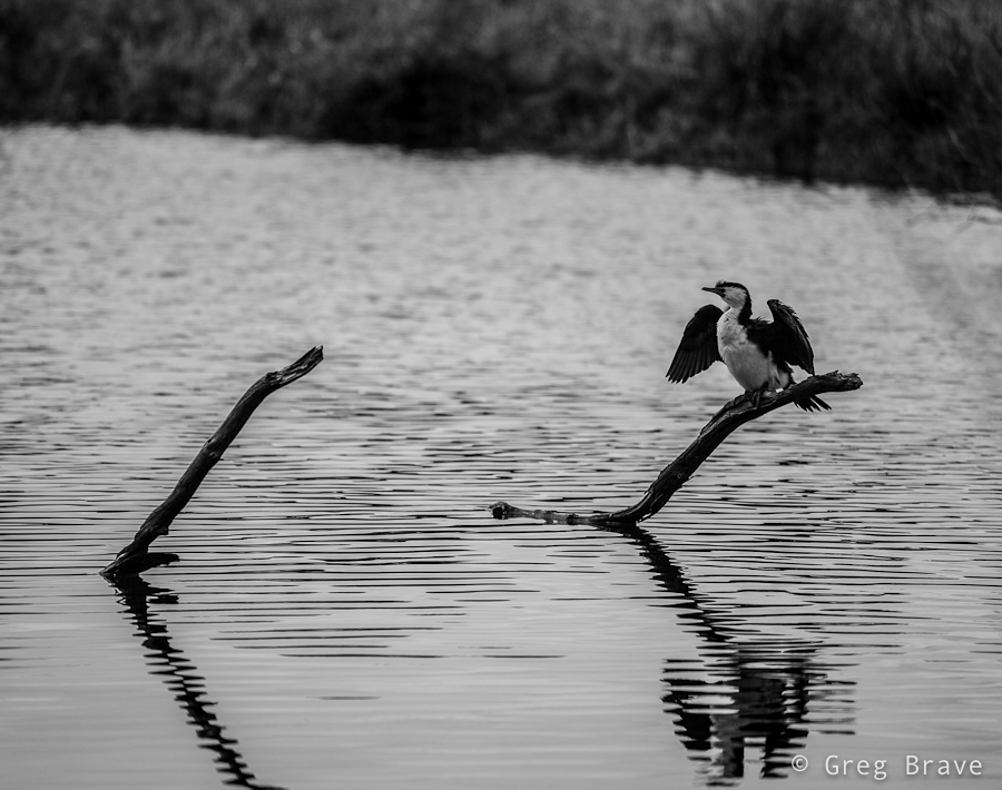
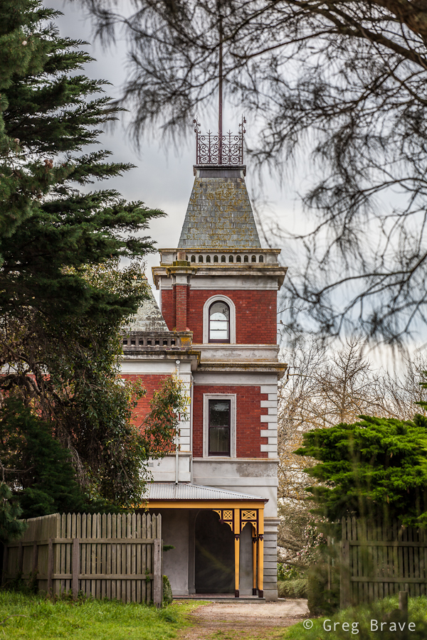
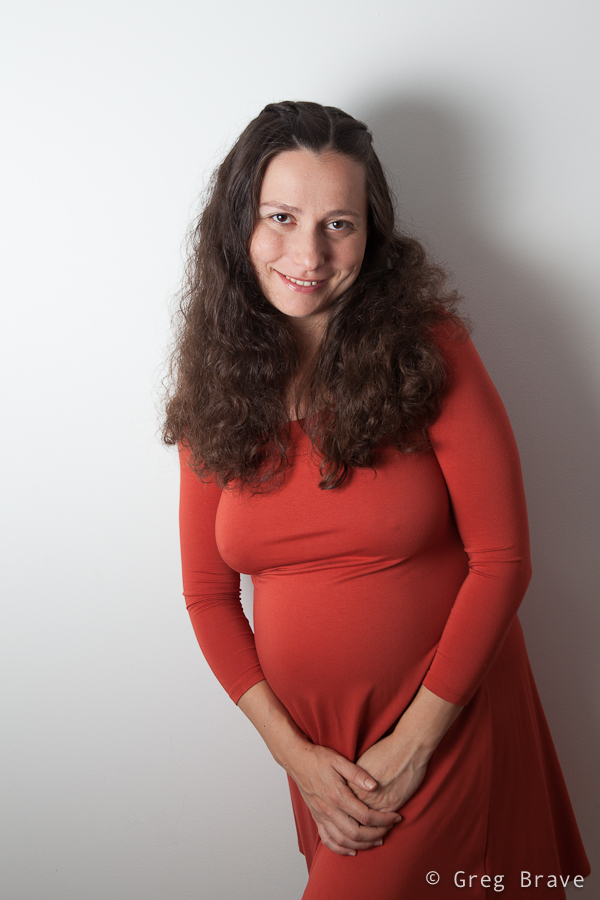
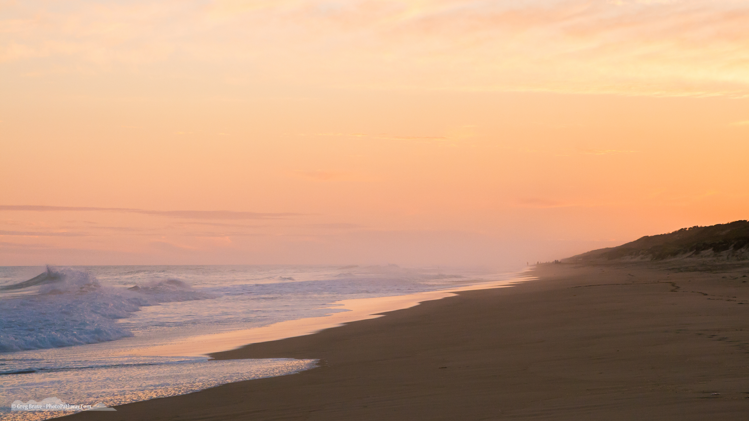
As you might’ve guessed it all started with a photograph. This one:

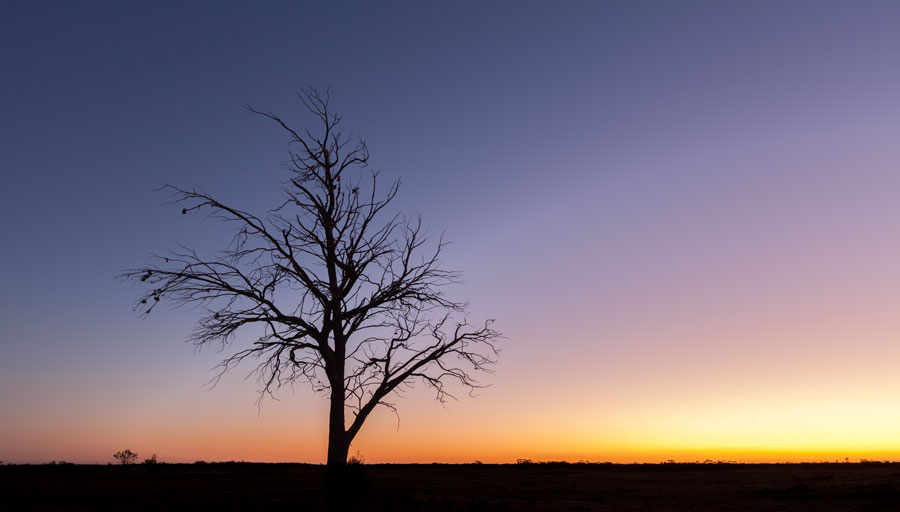
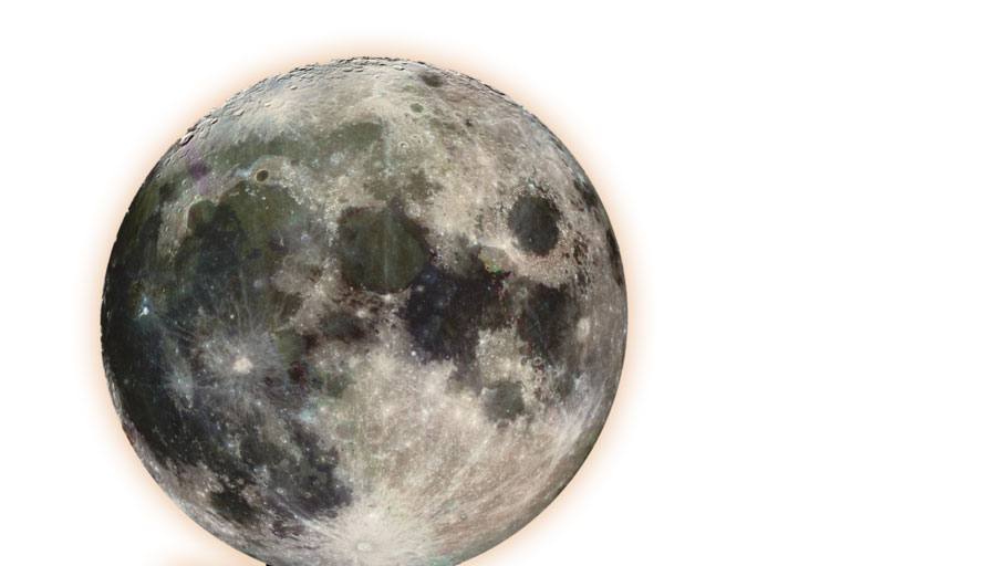
At first I was inspired by images of things with huge moon in the background so I just tried to add a moon to this image. Did you know that NASA has a great library of space imagery that is free to to use for anyone? That’s where I found my moon, since I don’t have a 600mm lens to shoot it myself. This moon:

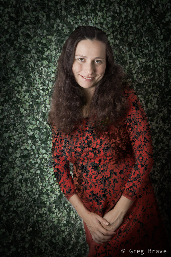
In order for the moon to seem behind the tree, I changed the blending mode of the layer to “Overlay” (did I mention that all this is done in Photoshop? Duh! Obviously :). When I did that, the image wasn’t interesting enough for me. I felt that something is missing. So I looked and looked at it and suddenly a thought popped into my head (or maybe not suddenly. Maybe something totally different happened, I don’t remember) – what if this is not our moon, what if all this is not happening on earth? So I added another image from NASA to reinforce my idea. This one:

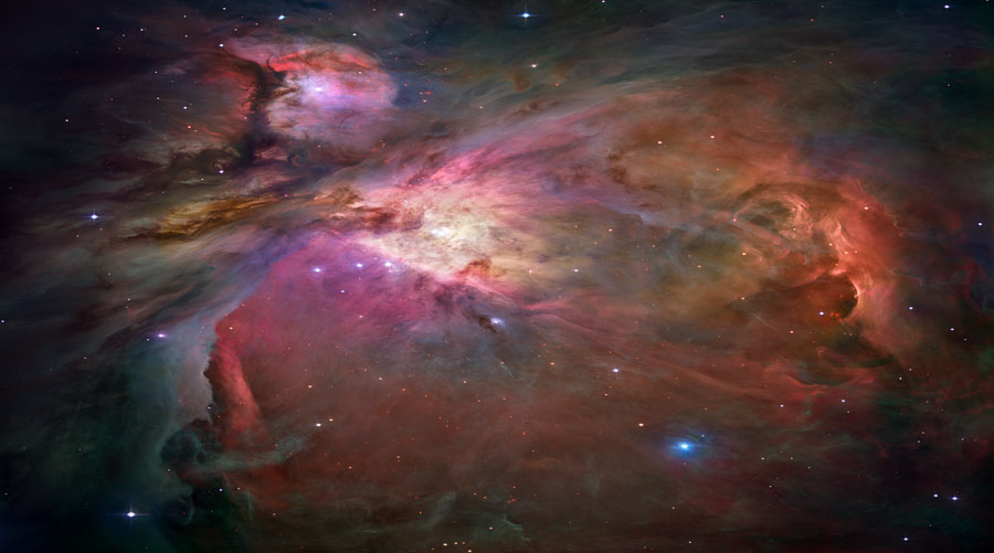
And again, to blend it with the rest, changed blending mode to “overlay”.

Now we are getting somewhere! I thought to myself, but still something was missing…

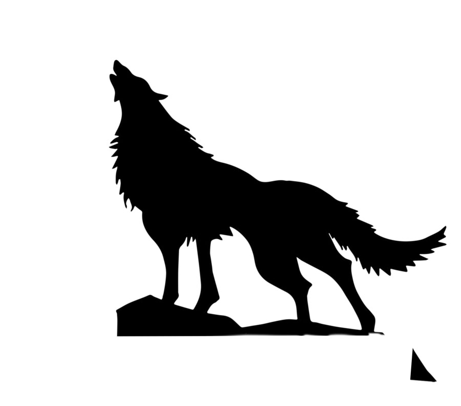
A few days later I looked at it again and crazy thought crept into my perfectly sane mind – What if it was our moon after all!? If this is a moon, and it looks like night – something that was missing was a howling wolf! But I am not a wildlife photographer, and I don’t have photos of wolves laying around. Even if I did, I doubt I would have one in exactly the right pose that I imagined it should be. To find a solution, or to be more exact, to find a wolf, I started browsing through Google images searching for “howling wolf”, and I found quite a few images. But it didn’t feel right to use them in my artwork – I wanted to make it myself, you know?

The solution came to me when I saw black and white logos of wolves – I realized that all I need is a silhouette! It doesn’t have to be a photograph. And still I wanted to make it myself. So I drew a wolf on a piece of paper using several different photos as references to get the exact pose I wanted. Then I took a photo of my drawing and brought it into Photoshop. Using the Image->Adjustments->Threshold filter I converted the photo to black and white:

After tinkering with the image a little bit more, it seemed that all the pieces fell into place! I was quite satisfied with the result:

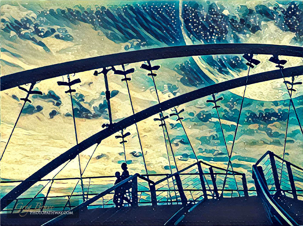
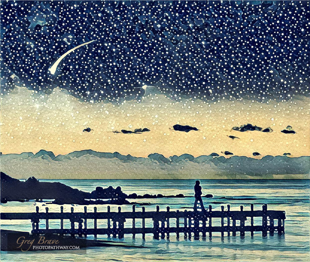
But my perfectly sane mind kept poking me, saying things like “psst! this could be better! try something else“. A few days later (you see, this was a long process!) I was playing with the Prisma app on my phone and got an idea to try putting my work through it. After trying a bunch of their filters, the one I liked the most was “Wave” (A tribute to the famous painting by Hokusai).

And that’s pretty much gave me the final image.

There is one more thing left to mention – Prisma outputs low res images, but I wanted it to have much larger resolution, so here is my somewhat complicated solution to the problem:

  1. Open the Prisma-processed image in Photoshop
  2. Enlarge the image to about 11 megapixels (Image->Image Size)
  3. Use Nik Sharpener Pro (for output) changing the following settings from defaults
    1. Structure = 50%
    2. Local contrast = 7%
    3. Focus = 10%
  4. Open the resulting image in Adobe Illustrator
  5. Trace the image in order to turn it into vector using “full color” leaving the rest of the settings as defaults
  6. Export back to JPEG from Illustrator at your desired resolution


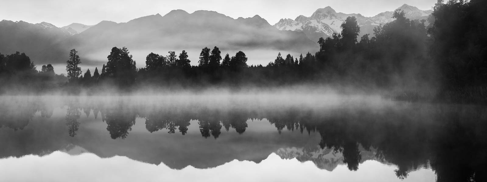
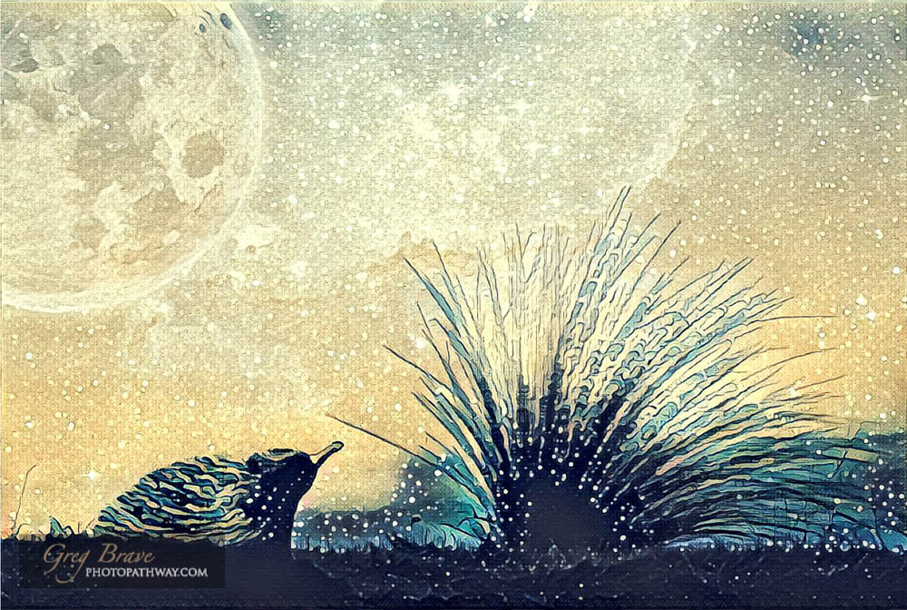
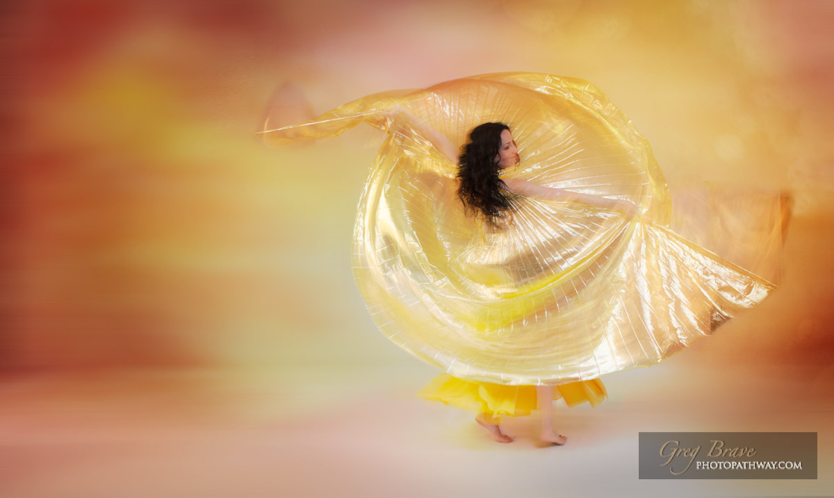
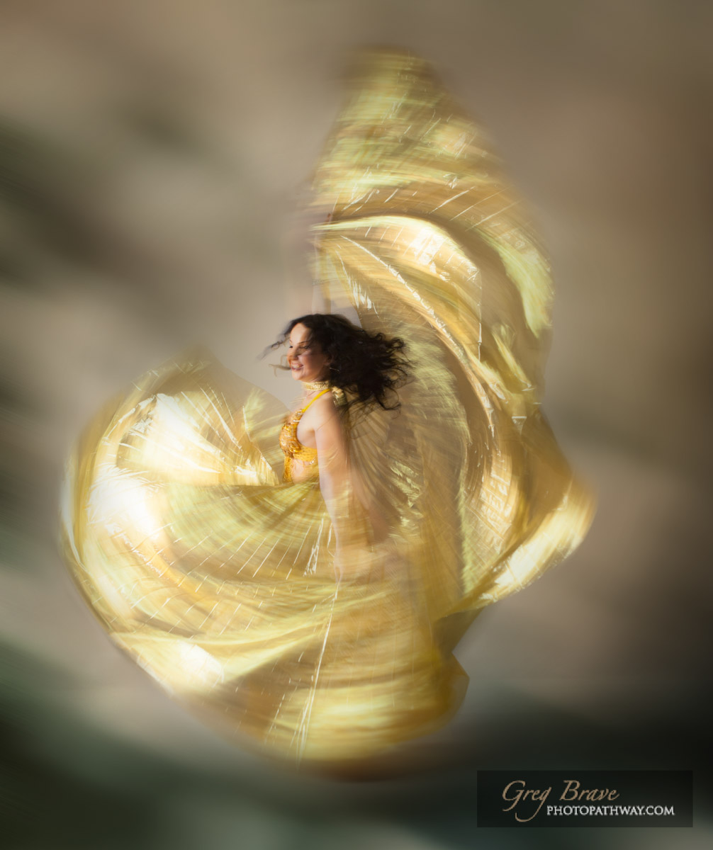
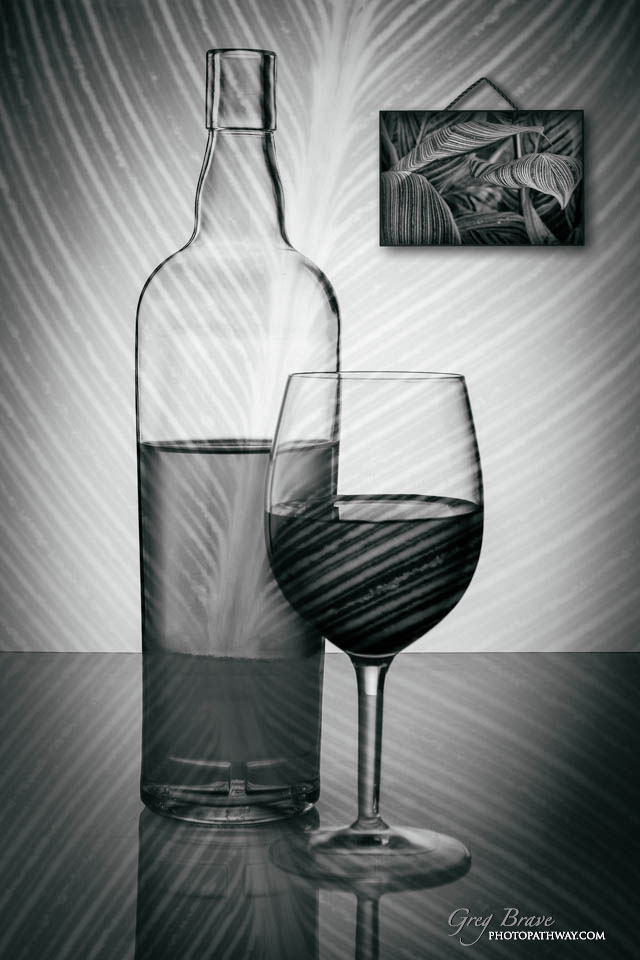
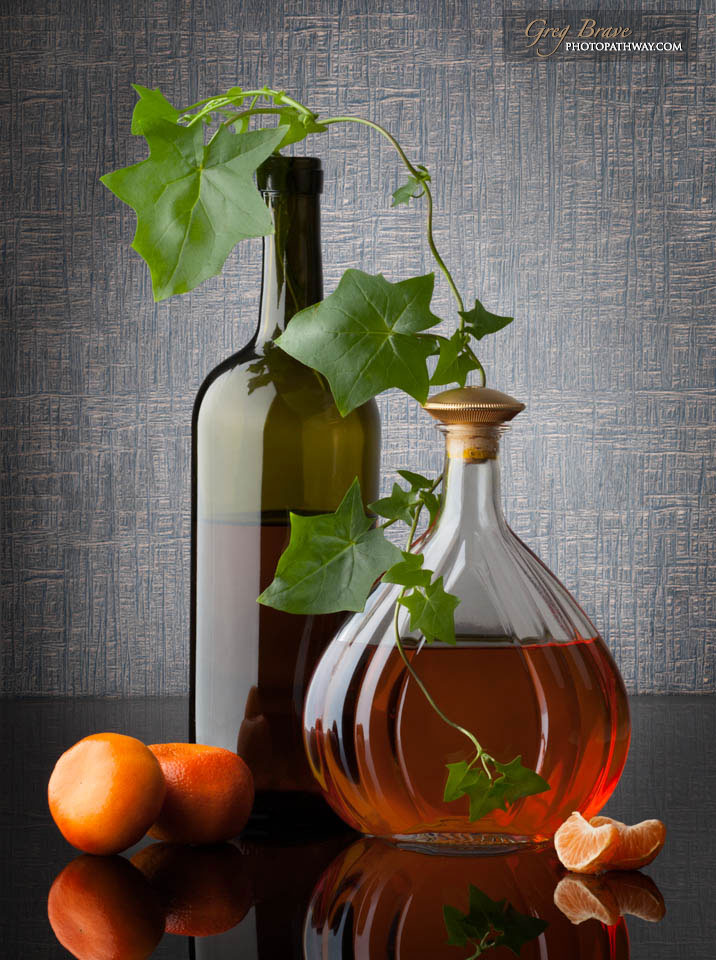
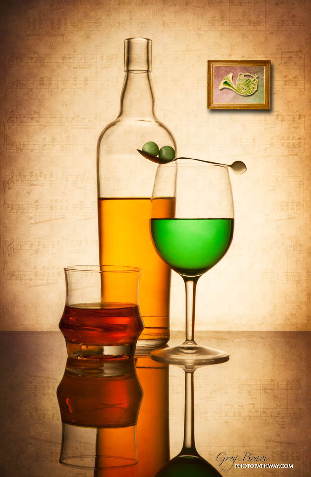
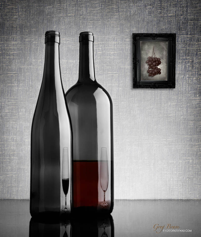
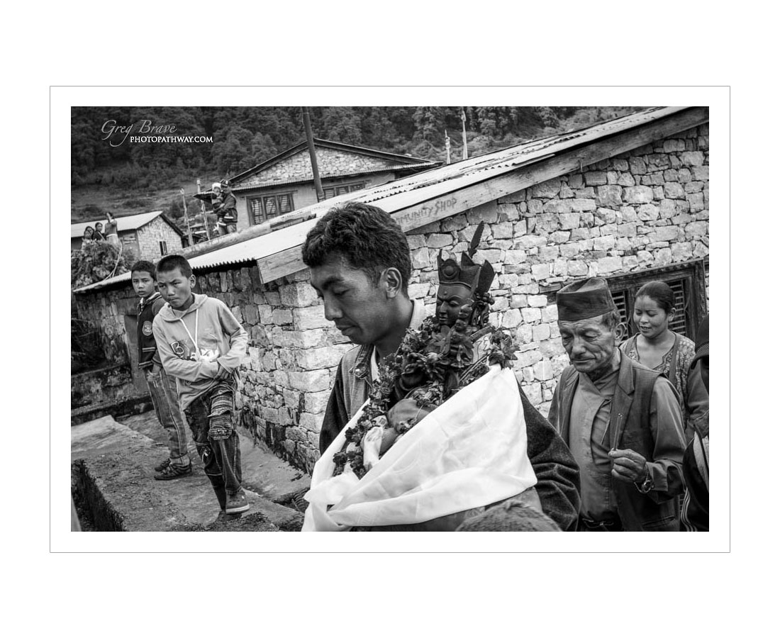
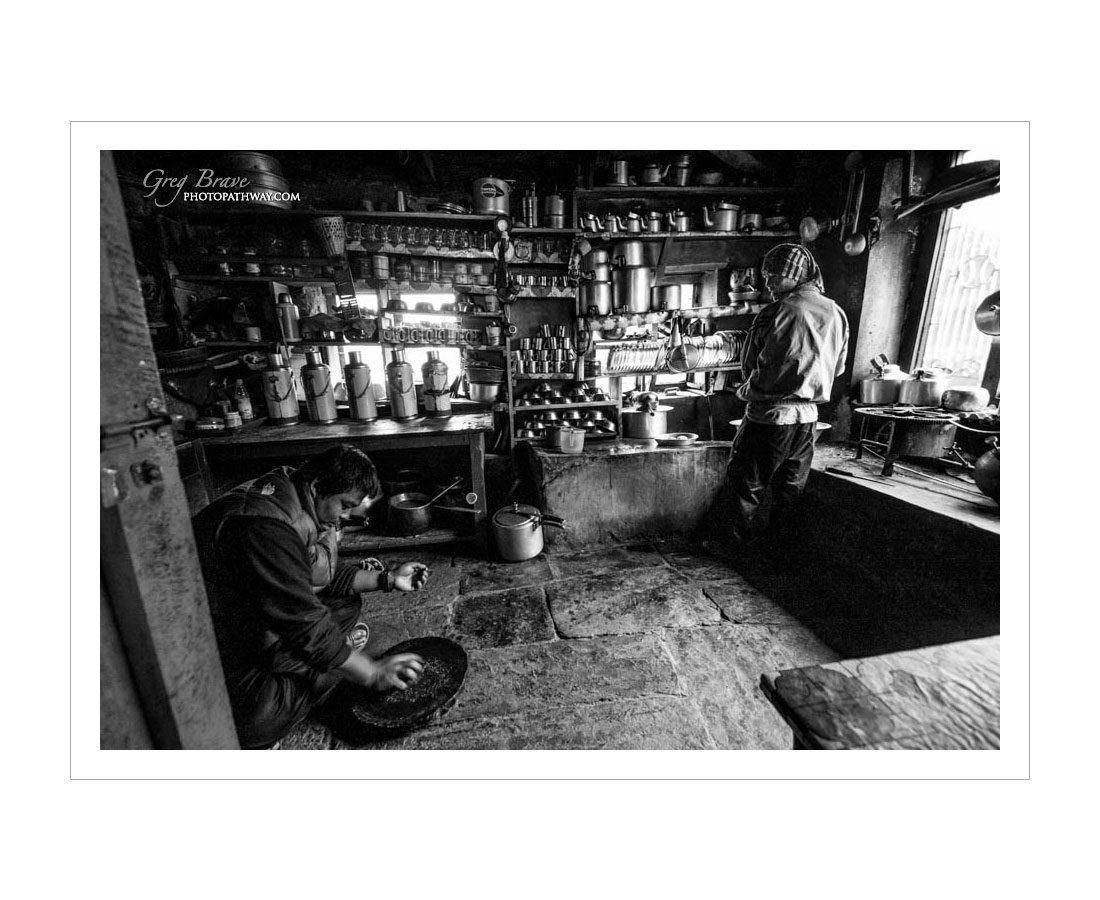
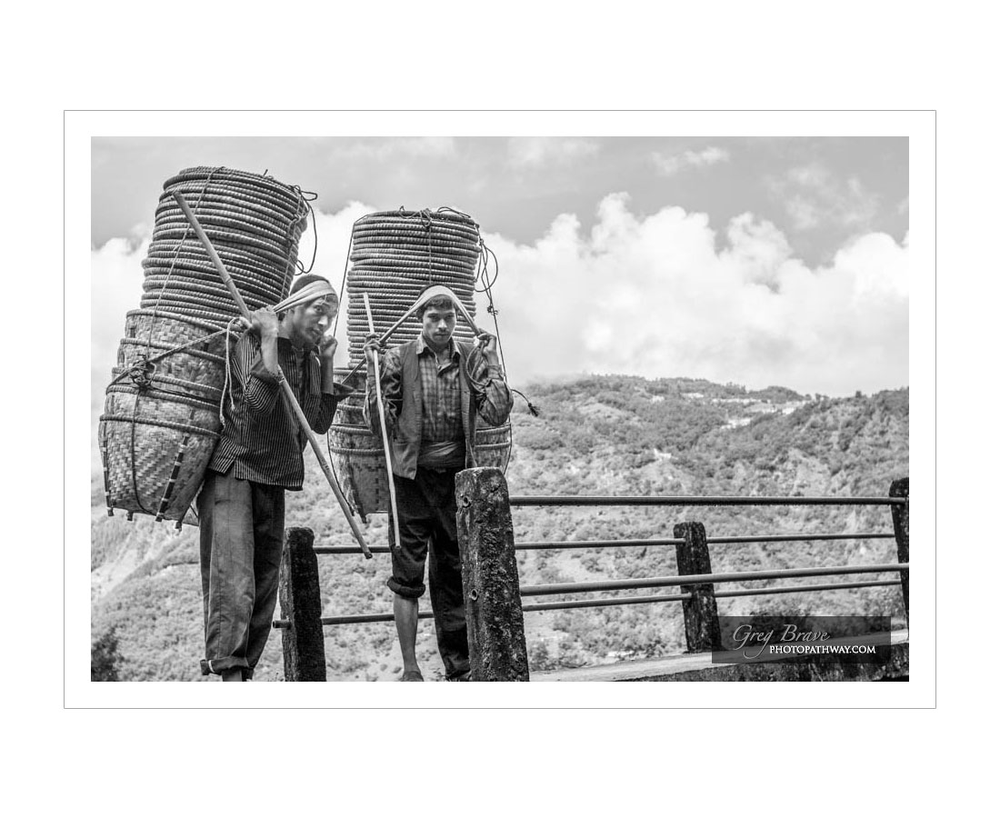
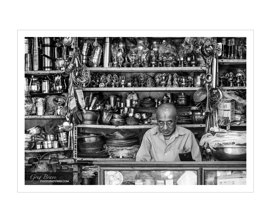
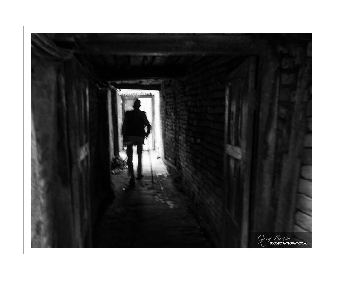
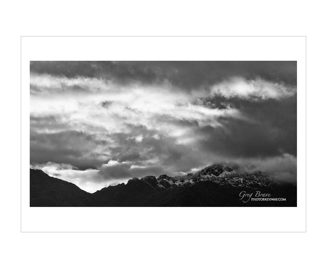
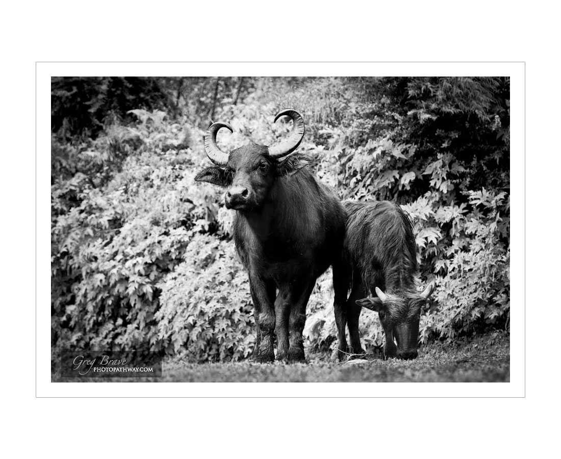
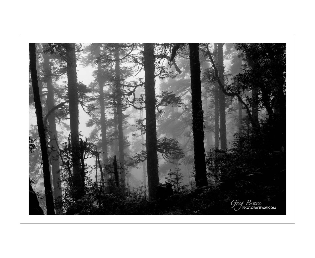
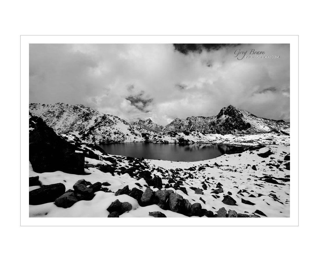
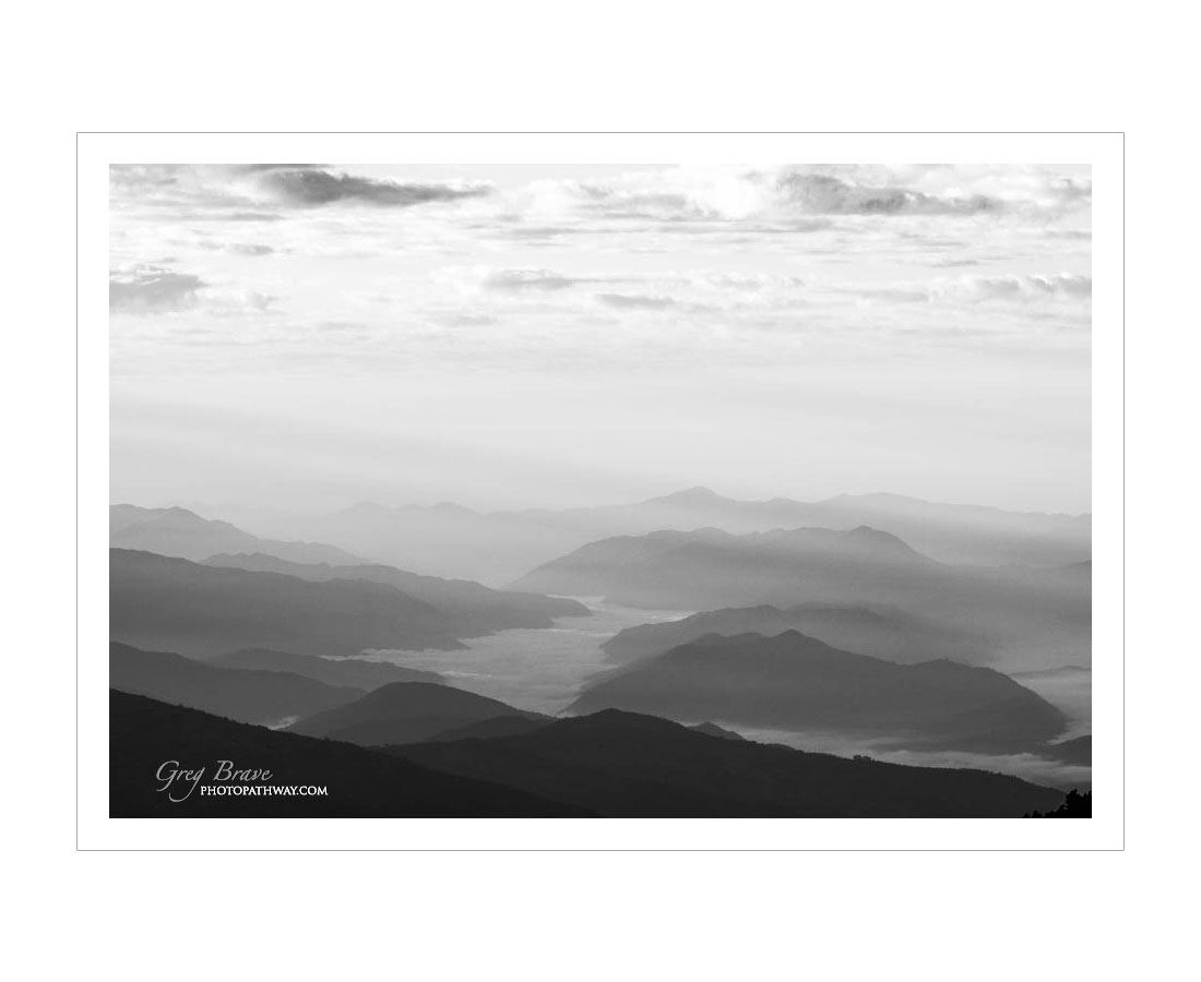
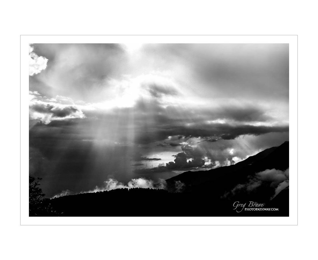
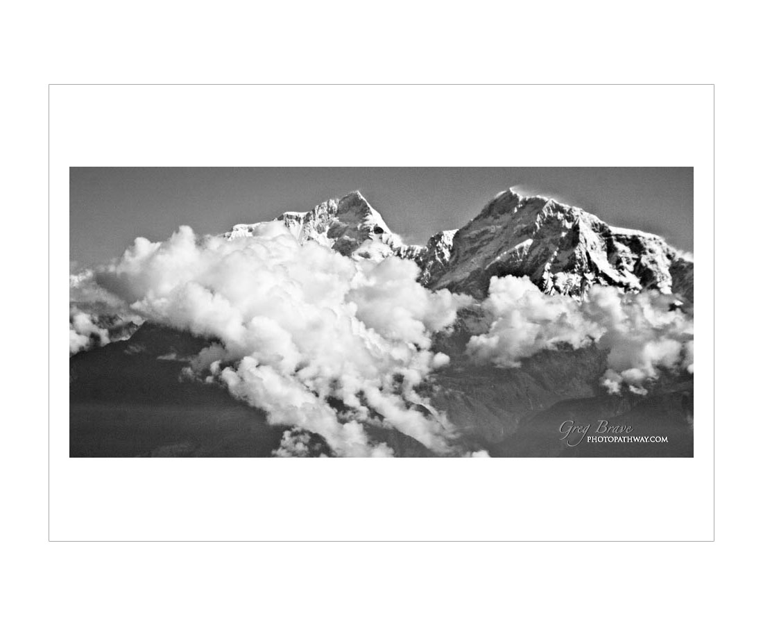
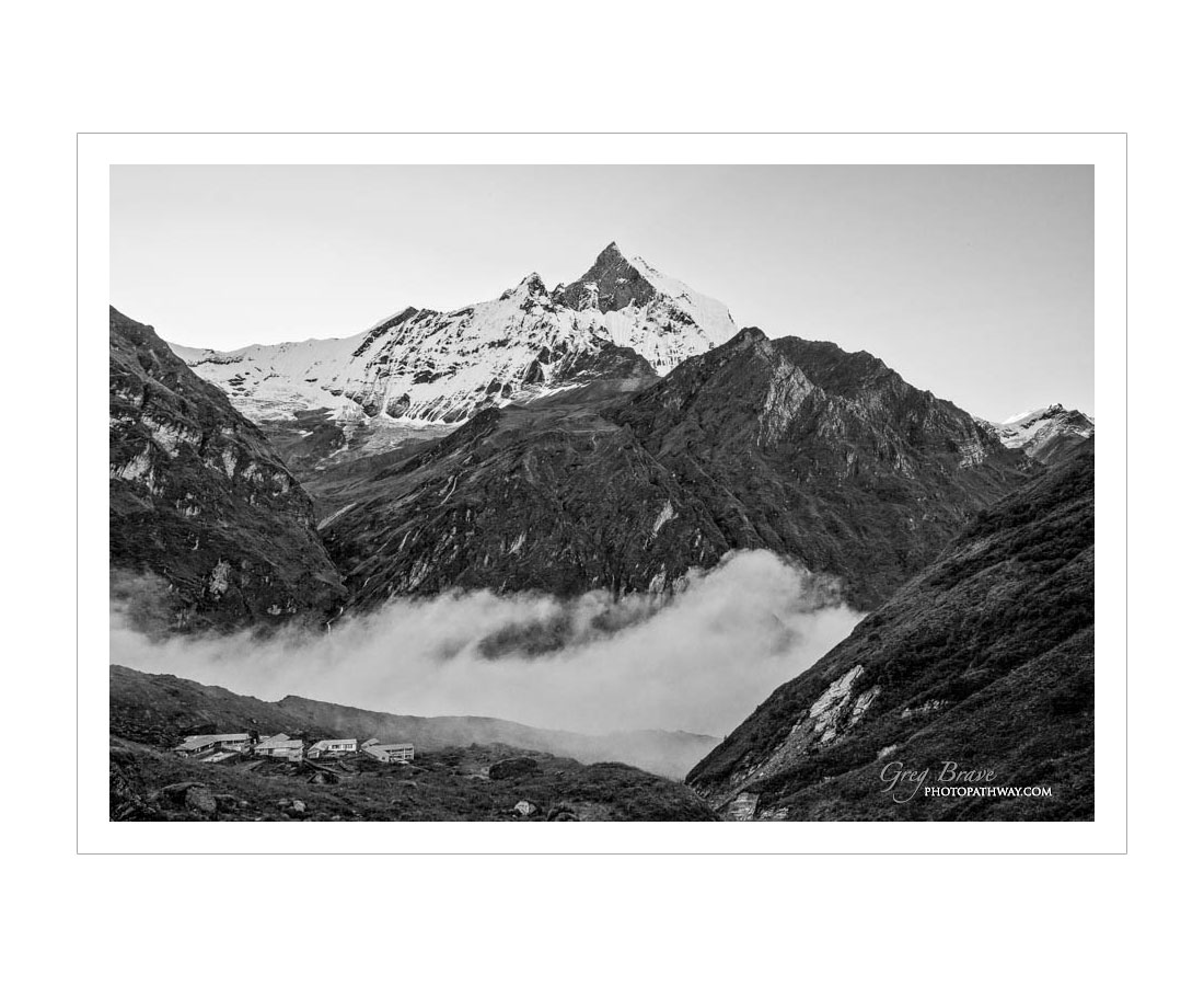
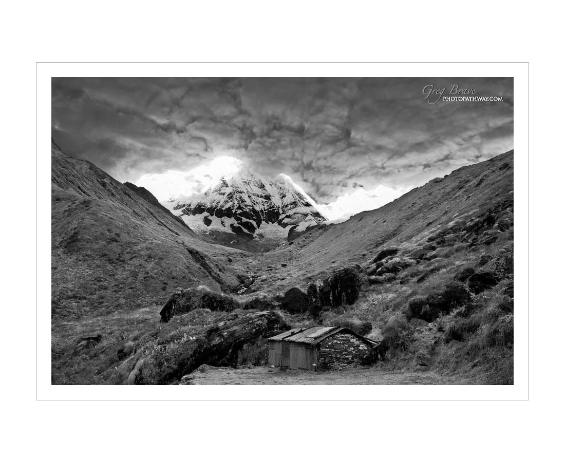
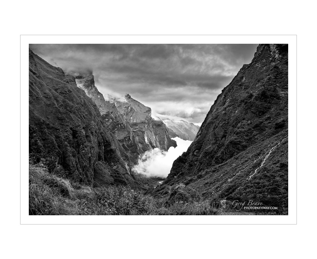
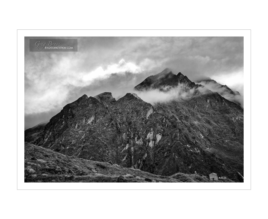
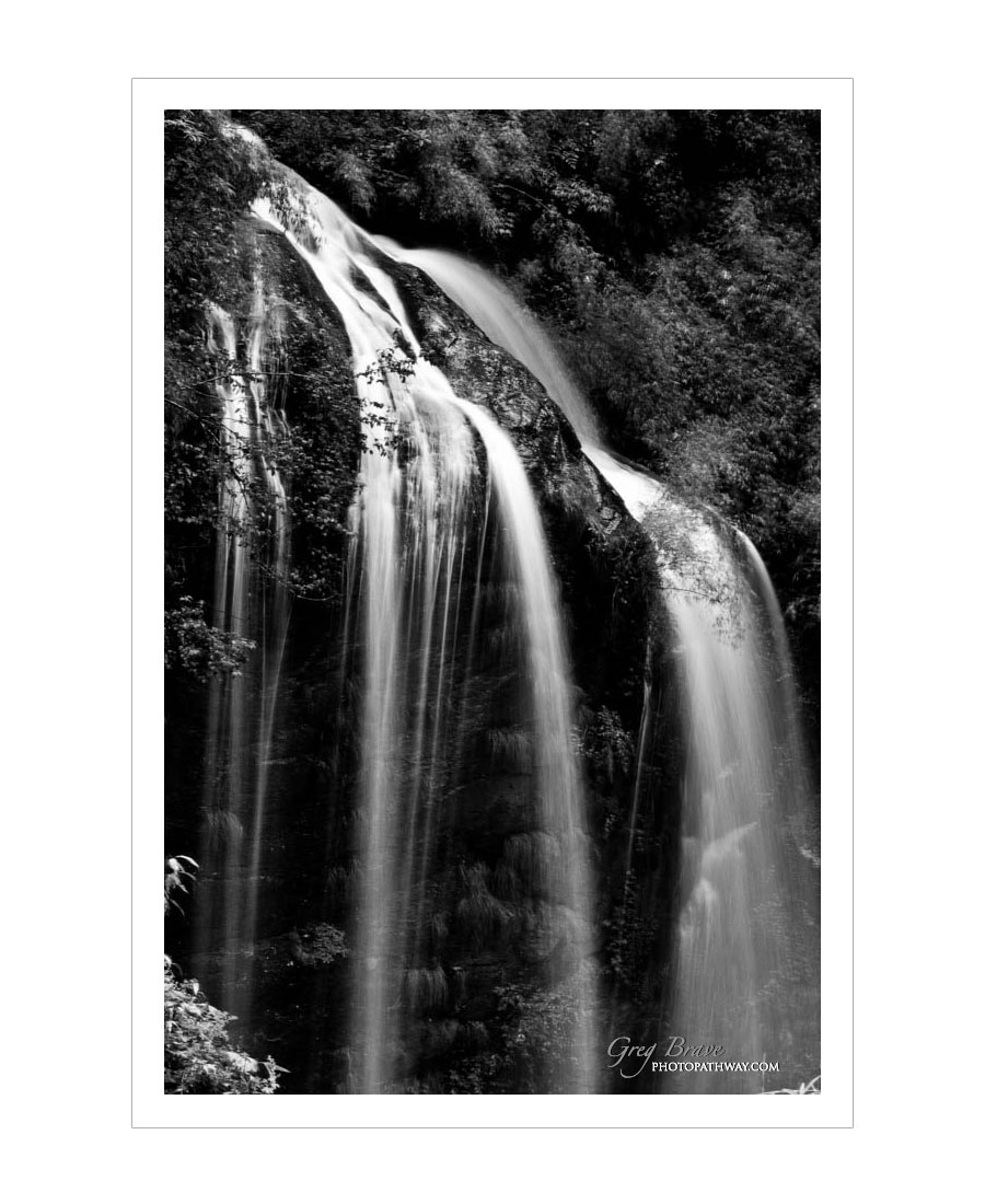
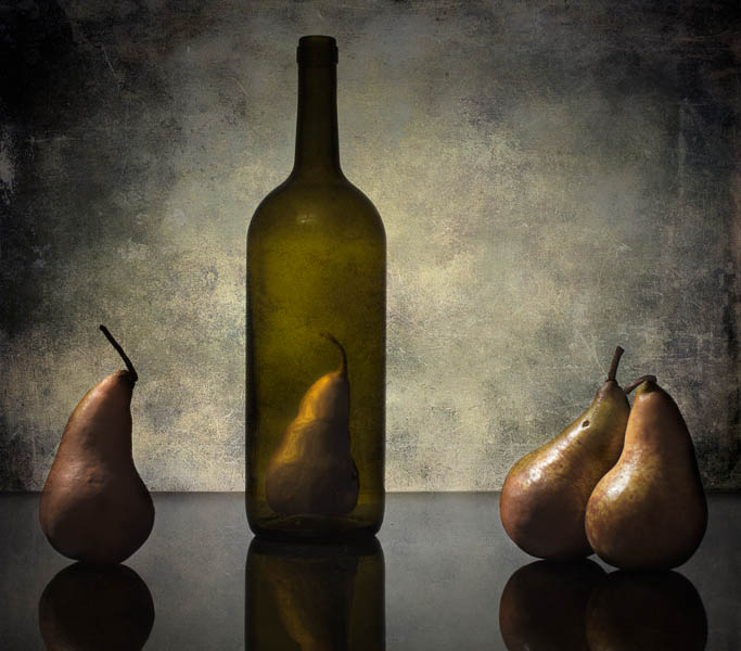
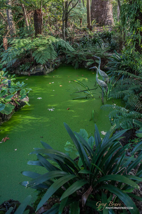
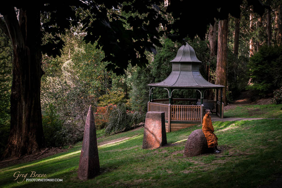
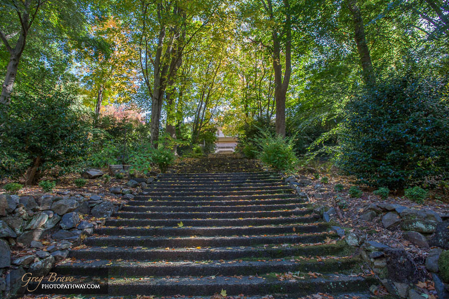
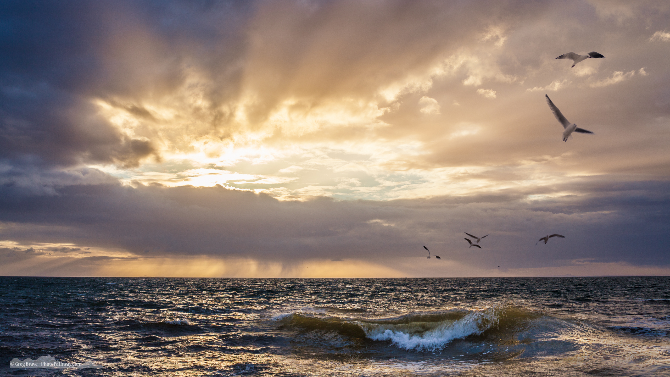
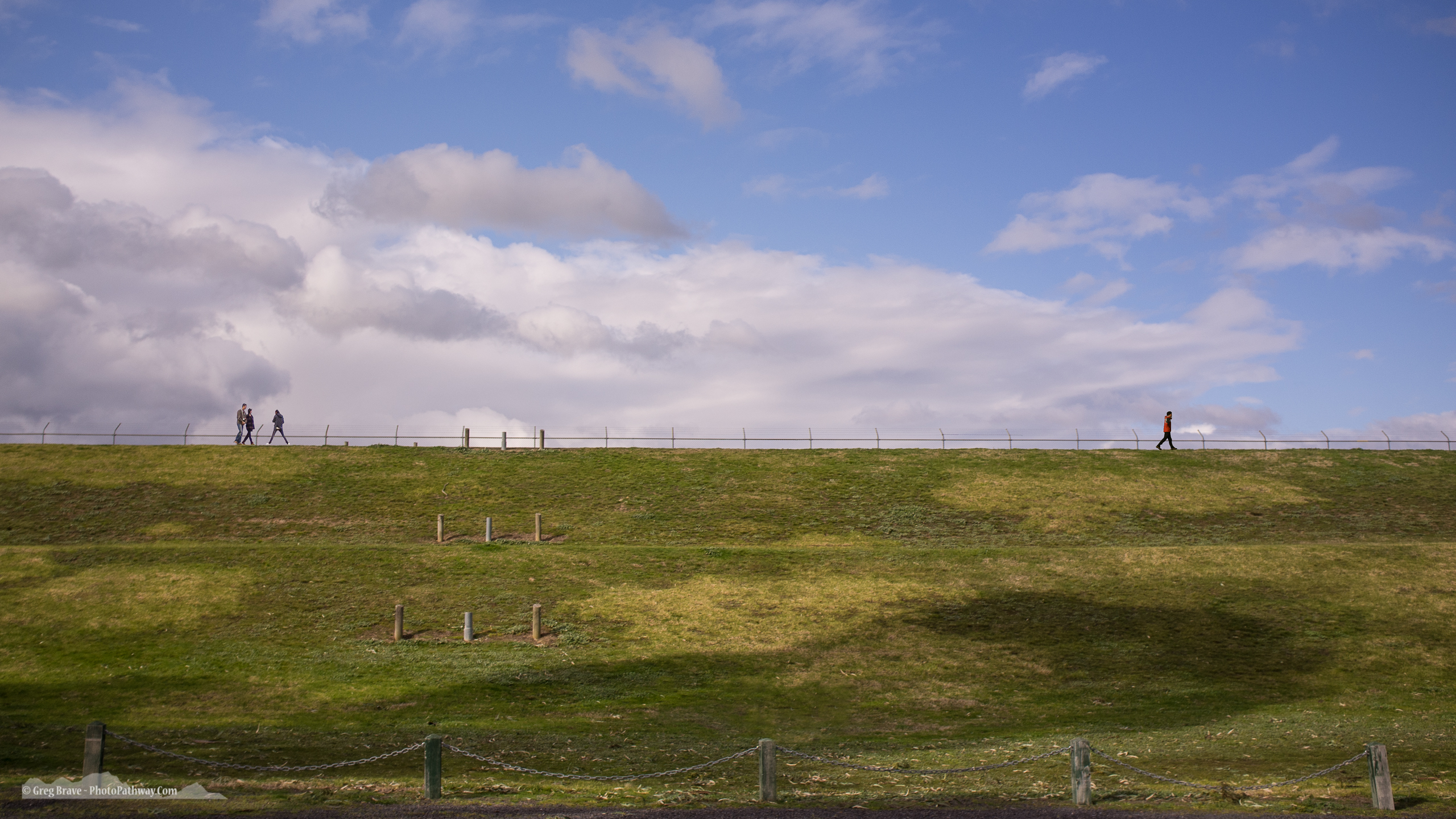
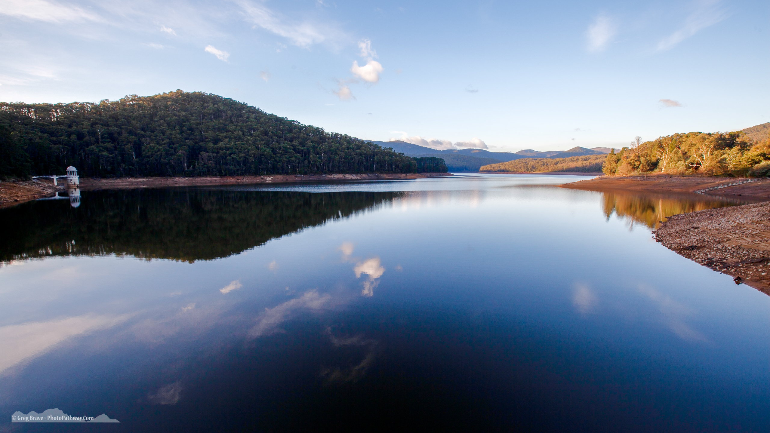
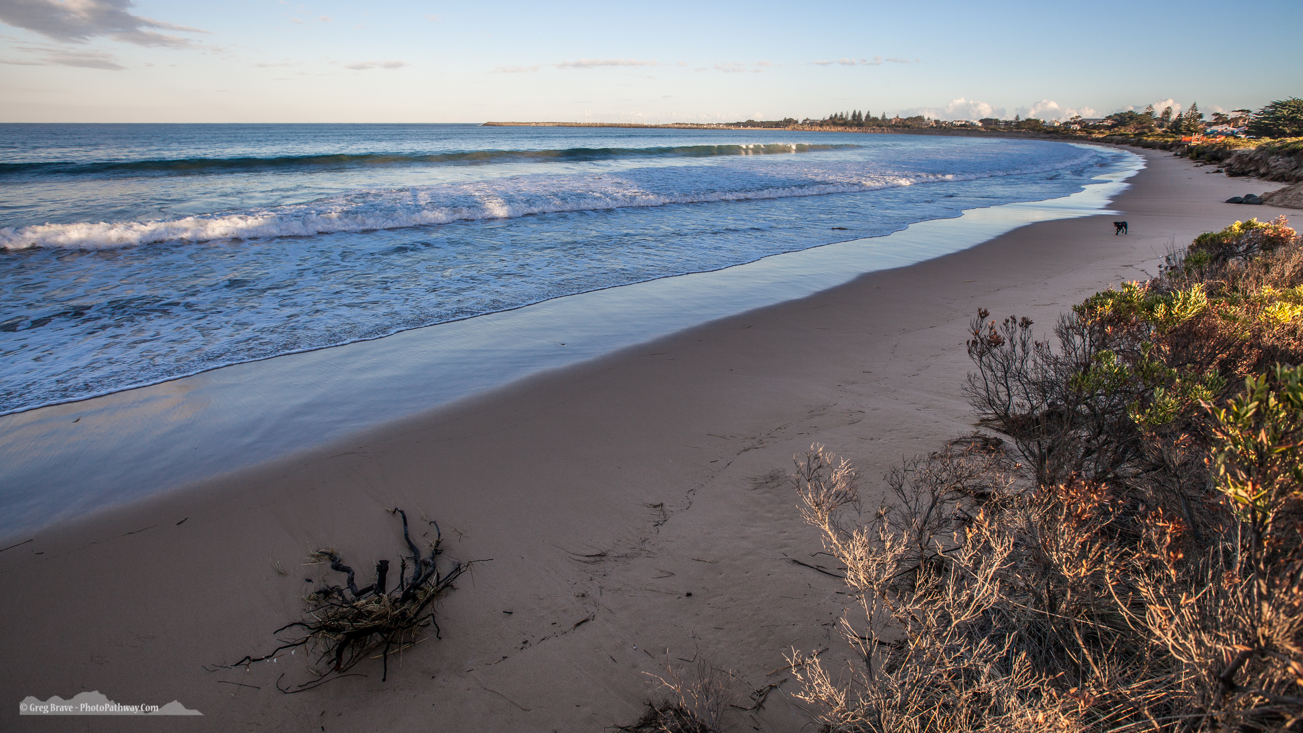
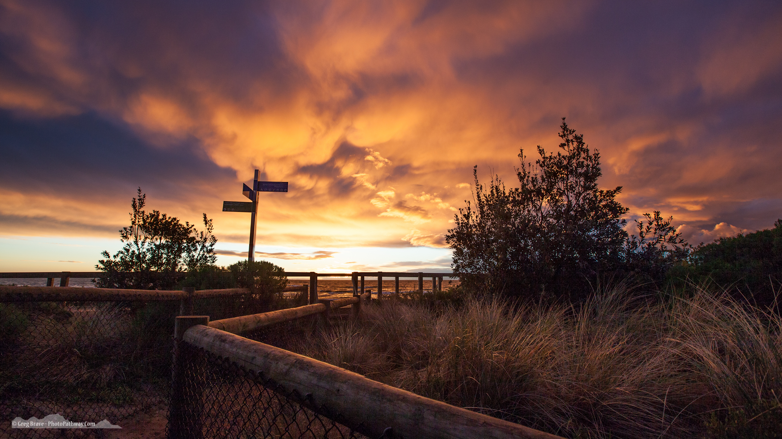
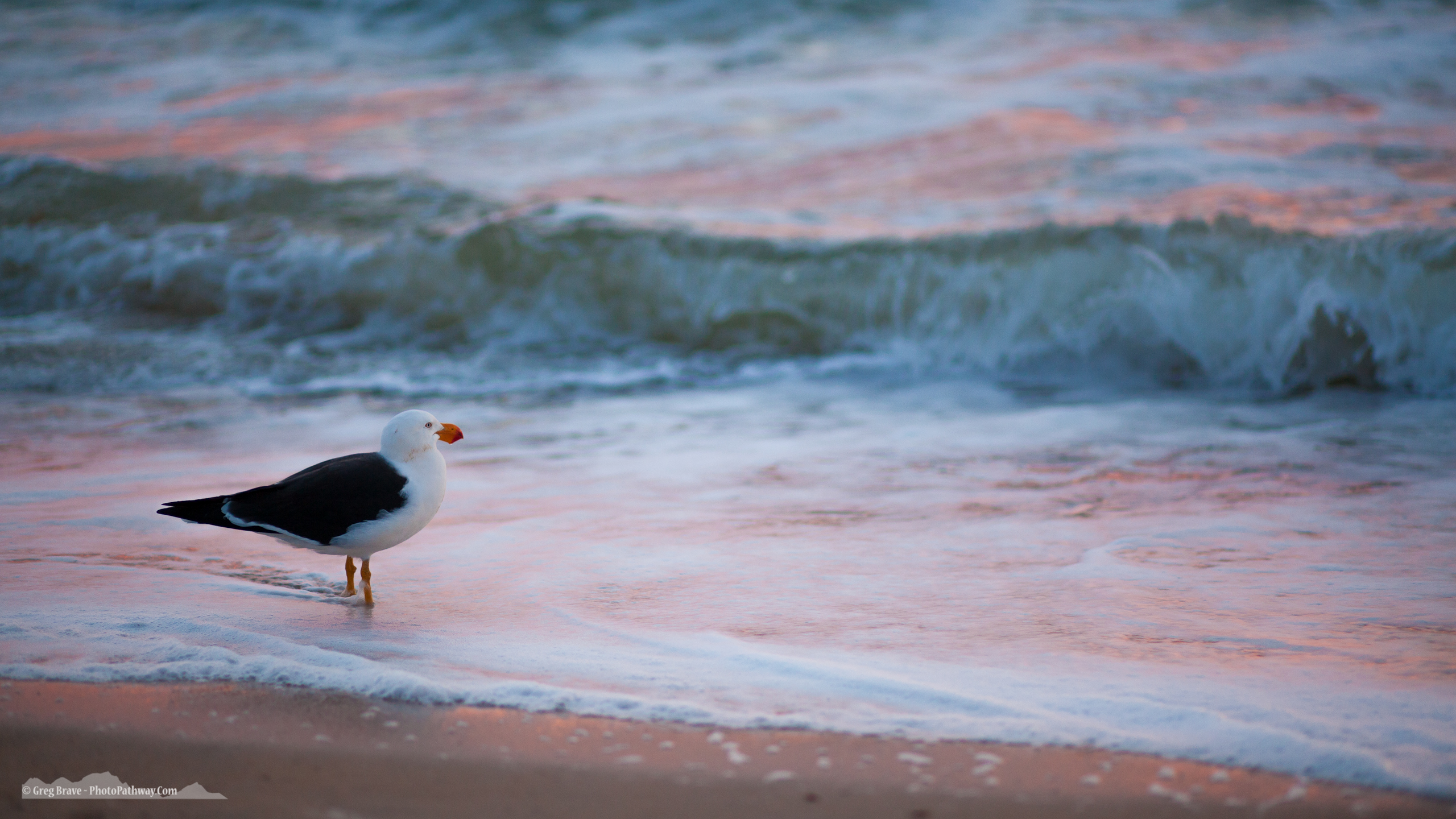
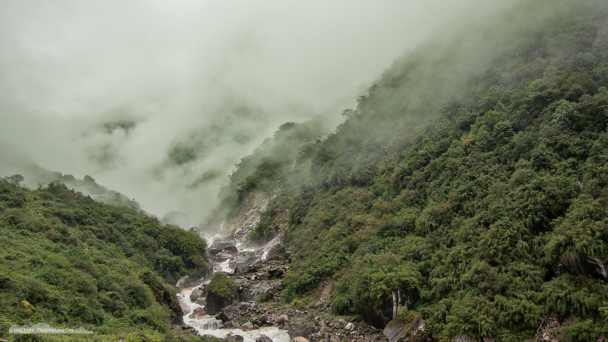
After getting my first fantasy-photo-collage-painting I couldn’t stop, and ended up with a whole series of works. Here they are. I hope this was of interest to some of you and provided useful info.

Enjoy!

– Greg

[UPDATE] Lately Prisma started offering an in-app purchase to be able to output high-res photos of up to 12MP.


[box type=”bio”] P.S. If you want one of these beauties printed on canvas and hanging on your wall – shoot me an email at greg@photopathway.com[/box]

12 Apostles Aerial Video demo show reel

Due to rapid advances in digital technology many photographers are gradually starting to add video to their arsenal. I was reluctant at first, but because I easily could record videos with pretty much any of my digital cameras, video slowly crept into my work.

Then drones started to get better, cheaper and easier to fly, so I decided to take a plunge and get me one of these fine examples of human ingenuity.

About 9 months ago I bought my first drone – DJI Phantom 3 Professional and started learning how to use it. It was pretty easy to get it up in the air and have basic control over it, however shooting smooth aerial videos was a whole another story. Drones are very responsive to movement of the cotrol sticks, which results in a jerky motion and jerky video. I had to learn how to operate the drone smoothly, and there are basically two main options achieving that:

1. Use the DJI Go app to adjust some settings making the drone react more smoothly to your actions (e.g. moving the sticks). And then spend lots of time perfecting your drone flying skills focusing solely on getting smooth cinematic shots.

2. Use the Litchi app. It allows you to program your drone’s flight, and it is great at it. For example you can set a point of interest on a map and have your drone circle around it in a perfect circle constantly focusing on that point creating beautiful sweeping aerial footage. This is how I made this video:

I spent time learning both – manually controlling the drone, and the Litchi app. Both of these skills are very useful in achieving good aerial video. Of course, I am still learning and perfecting my skills, but I was able to get some very nice footage alread.
Take a look at a short demo reel of my Twelve Apostles aerial videos:

I hope you like it, and will be happy to hear any comments or suggestions regarding any aspect of shooting aerial video in the comments below.

Cheers!

Why I never shoot in Manual mode

At one point in my photographic career I’ve noticed that many photographers proud themselves in shooting only in manual mode. I get it, they want to emphasize the fact that they mastered exposure technique and  know exactly what f-stop and shutter speed to set for each lighting scenario.

“I shoot manual only” people generally look down on all the regular folk who are not in their club.
Well, guess what, in my opinion it is not wise and plain unnecessary to shoot on manual in this day and age.

Let me defend the case of Aperture Priority mode as the only one you’ll ever need to use whether you are an amateur or even pro photographer. There’s only one caveat here – if you shoot high speed events such as sports or racing you might want to consider Shutter Priority mode, but I’ll get to this down the road.

Why Aperture Priority you ask? It’s simple – because it gives you full control of your camera without forcing you to always be cautious of accidentally under/over exposing your shot. I wrote ‘accidentally’ on purpose, since you still have full artistic freedom of intentionally blowing out your highlights or deepening the shadows.

Ethereal beautiful woman swirling in a dance move


But first thing first – what is Aperture Priority mode?
In Aperture Priority mode you set your desired aperture and camera sets the shutter speed according to its built-in light meter. From my description it seems that you get only to control the depth of field (since that’s what changing f/stop does to the image). However, in addition to setting the aperture in this mode, you can also set exposure compensation, which leads us to the next question.

What is exposure compensation? By setting exposure compensation you basically tell your camera to use its built-in light meter to set the exposure, but then intentionally over or under expose the scene by the amount that you specify. For example you are shooting a sunset pointing your camera directly at the setting sun. Built it light meter will set exposure according to the bright sun, leaving the rest of the scene under-exposed. So if you want to achieve correct exposure, you need to set exposure compensation at about +1 or +1.5 stops. This way the camera will ‘add’ more exposure time to its measurement.

Now that we are familiar with exposure compensation, add it to your arsenal when using Aperture Priority mode, and you are almost set for any shooting scenario. The remaining bit of knowledge to mastering Aperture Priority is the ISO control.

Celebration of color and movement

By setting ISO you control your sensor’s sensitivity to light. The lower the ISO number, the less sensitive your camera will be to light. But why do we need different values of ISO? Example to the rescue again! Let’s say you are shooting people indoors where the light is dim, and people are moving. At ISO 100 and f/8, your shutter speed will have to be 1/15th of a second in order to correctly expose your scene. But at 1/15s anything that is even slightly moving will be blurred in the resulting image. One solution would be to open your aperture to f2.8 (for example), but what if that’s not something you want to do? Or in some places the light is so dim that even at f2.8 your exposure times are too long. The only option you have is to set ISO higher. In the example above you’ll need to go up to ISO 400 or even 800 to get acceptable shutter speeds.

The lowest ISO is usually 50, which you would normally only use when shooting in bright daylight. The highest ISO differ between cameras, the highest that I heard of was 409,600! It means that this camera can basically shoot in very dark conditions and still produce visible details.  Remember though, you always want to shoot at lowest ISO possible because the higher your ISO, the more noise you’ll have in the image.

That’s it! By setting your desired f/stop, exposure compensation, and ISO, you have full control of your camera as if you were shooting in manual but still let your camera do the tedious job of metering the light so you don’t have to worry about it.

Let’s reinforce this claim with a few examples.

1. Shooting sunset with sun visible in the frame.

a. Set the desired f-stop. I’ll go with f/11 to achieve optimal overall sharpness and depth of field for my taste.
b. Since the sun is in the frame, the camera’s built in light meter will under-expose the scene, so I’ll set exposure compensation to +1 stop.
c. If I use tripod, I don’t care that the exposure time might be too long, so I don’t mess with ISO and leave it at the lowest setting possible for my camera. If I don’t use tripod, I half press the shutter button and see what shutter speed my camera chooses. If it is too long, I’ll bump the ISO to the next level (ISO levels are 50-\>100-\>200-\>400-\>800-\>etc.) and check the exposure time again.

2. Shooting portraits indoors.

a. Set the desired f-stop. I’ll go with f/4 in this case to achieve low depth of field that will give me enough sharpness for all facial features but also a pleasantly blurred background.
b. Check that there’s no exposure compensation set, because I want my portraits to be correctly exposed using the available light.
c. Half press the shutter button and see what shutter speed my camera chose at the lowest ISO setting. Then bump up the ISO until the shutter speed is acceptable. Shooting handheld I normally don’t go slower than 1/30th of a second, or even 1/60th if my hands are a bit shaky.

3. Shooting rays of light protruding through trees in the forest.

This is not an obvious thing to achieve. I am talking about those beautiful rays of light seeping through the dense foliage, and hitting the low vegetation.
a. Set your f-stop at whatever value that you want. No suggestions here on my part.
b. Here’s the important part – set the exposure compensation to about -1.5 stops. Reason being – you want the rays of light to stand out, so you need to under expose your scene. Don’t worry about the rays – they are so bright that they will still be perfectly visible, but your background now will be dark enough for the rays to stand out!
c. As usual, if you are not using tripod, half-press the shutter button and check the exposure time. Adjust the ISO accordingly.

Ethereal beautiful woman swirling in a dance move

[box type=”bio”]
In conclusion – Aperture Priority mode can be used to deal with any photographic situation without the hassle of manually metering the light as you would need in manual mode. Therefore it is to me an absolute winner between those two modes. If you have another opinion, please, feel free to share it in the comments as I am always willing to learn.
[/box]


Oh, I forgot to mention the Shutter Priority mode for sports and stuff. When you shoot fast moving objects such as race cars or football players, and you want to freeze their motion in your frame (in other words produce sharp images), you need to make sure that your shutter speed is short enough. Let’s say 1/500th of a second and shorter. Achieving that is easy with Shutter Priority mode, in which you set the desired shutter speed, and camera sets the f/stop. In Shutter priority mode you can still control all the rest of the settings by using exposure compensation and ISO controls exactly as you would in Aperture Priority mode.

The curse of Instagram

If you want to achieve any sort of publicity, it’s all about social media nowadays. Businesses are getting their names out there, individuals become famous, and  various groups grow in popularity. So anybody who wants any sort of attention takes it to social media.

I am a photographer, and obviously, I want to share my work with as large audience as possible. And if you are a photographer (or any other kind of artist) chances are that you too are seeking attention.
For photographers the obvious choice would be Instagram – the largest photo sharing social platform on the planet. Even though I’ve been using Instagram almost since it was created, I really started actively trying to gain a following little over two years ago.

A photo posted by Greg Brave (@gregbrave) on

I have to admit – I wasn’t successful in this endeavor, but I am not giving up just yet. In this article I’d like to share my experience and insights from the last two years of trying to get a following on Instagram. Please remember that this article consists of my opinions based on my own experiences with the platform.

I’ve studied various guides on ‘how to get a following on Instagram’, which basically all give the same advice. In short, here it is:

1. Post unique, beautiful, interesting etc. content.
2. Post regularly – posting images every day is considered to be the best practice
3. Add an engaging story/description to your images
4. Engage with your audience – when somebody posts a comment under your image, reply to them.
5. Be active on Instagram in general – leave meaningful comments under images that you like etc.
6. Participate in contests, giveaways, and collaborations on Instagram.
7. Use hashtags wisely – they have to be relevant to your content but also not too popular. If you use a hashtag like #instadaily, your image will get buried straight away in thousands of other images.

That’s about it.

A photo posted by Greg Brave (@gregbrave) on

I tried to incorporate most of the above into my Instagram routine and here is what found out:

1. When everybody tries to be unique, there is kind of sameness to it. We are all the same in our uniqueness (C) 🙂 . I am mostly a nature photographer, so nature and landscapes are what I am creating and sharing. There are so many beautiful and unique nature photographs out there that sometimes I no longer see a point in sharing more of those. Even if each photograph was amazing and unique, when you have millions of them – they start to look all the same.
2. People mostly comment for two reasons: Either you have a big following on Instagram and therefore you are popular so they want to be seen ‘in your company’ and maybe get a follower or two from people who see their comment. Or you don’t have a big following and will be so happy to receive a comment that you’ll go follow their profile straight away as a way to say thank you. Of course there are exceptions to this, but in my opinion this is a pretty accurate generalization.
3. Most of the comments I receive for my work consist of one or two words, or even less – an emoji, which in most cases I even don’t understand the meaning of. Like an emoji of clenched fist under an image of sunset over ocean. And the words are typically: ‘Amazing!’, ‘Gorgeous!’, ‘Love it!’, ‘Really Good’, ‘Very Cool’, ‘Great shot’ – you get the idea. I don’t want to be too harsh on these people, they left me a nice comment after all, but I feel that the intention behind most of these comments is only to grab my attention and maybe to get me to follow the commenter.
4. I get many people who start following my account, but after two days unfollow it. At first I didn’t understand why after posting an image I get 2 to 5 new followers but by the next day, when I post another image pretty much the same number of people unfollow my account. I thought to myself: can it be that this photo is that much worse than my previous one that those people got disappointed in me so much that they decided to unfollow? This question bothered me very much until I found a great little iPhone app called “Followers”. It shows you exactly who unfollowed you (instagram app only tells you the good news – when somebody starts following you, but when they unfollow you don’t get notified). Using that app I found out that a lot of my new followers unfollow me after a few days (or just one day). So I decided to do an experiment – I started following back every account that started to follow me. The results were very interesting – number of ‘unfollowers’ was greatly reduced. My conclusion from this experiment is simple – people start to follow me in hopes to get a follower and not because they like my work. The worst among these people (and there are quite a few) are the ones who unfollow you anyway – it is just their strategy to get followers without clogging up their own feed.

A photo posted by Greg Brave (@gregbrave) on

To sum it up, nobody has the time to really look at photographs and think about what they are looking at. At least not on Instagram. Hard to blame people for that – we are constantly bombarded with content that competes for our attention. Instagram became a stage for worldwide competition for attention.

I know that it is  popular to be all happy and positive these days, but in this post I tried to look at the reality of things, at least the way I see it. If you have anything to add or dispute – you are welcome to leave me a comment here or on Instagram 🙂

Fractal Wings – Free Wallpaper Download

I decided to renew my long going wallpaper download tradition. Lately I’ve been working on fractal art, so this one is not exactly a photo, but I hope you’ll still enjoy it.

August 2014 wallpaper is here for you to download!

Stylized wings fractal art

For resolution 2560×1707 (wide screens) right-click here and choose “Save As” option.

For resolution 2560×1440 right-click here and choose “Save As” option.


Cheers!

Greg.

Save

Save

Photographing Still Life Part II

About three months ago I wrote an article about my work with still life objects. I’ve been continuing photographing still life since then and experimenting with different ways of post processing the images. In this post I will show some of my more recent works. Click on the images to view larger version.

[one_half]In this image I went with simplicity in shapes but added more interest using texture. [/one_half] [one_half_last]Still Life with bottle and wine glass[/one_half_last]

[one_half] Here, on the contrary, I wanted to create a more complex image with additional elements. My main problem was to choose these elements so that they would fit harmoniously into my composition. I’ll leave it up to you to decide whether I succeeded or not.  [/one_half][one_half_last]Still Life with bottles, mandarins, and leafs[/one_half_last]

[one_half]I especially like this image, mostly because it wasn’t easy to come up with the idea for it. I started it by trying various compositions of glasses and the bottle, and various liquid levels. After I achieved something that looked good to me, I still felt that something was missing from the image. So I looked around for an item to add, and decided to add the two marbles. But I needed an aesthetic way to place them, and after a while I solved this puzzle with a spoon. I made a couple of shots and still wasn’t completely satisfied with the results. Suddenly it hit me that these marbles on the spoon look like musical notes! To make this idea more visible I added musical sheet to the background and the photo frame, and finally I felt the image was complete. [/one_half]

[one_half_last] Still Life with bottle and glasses
[/one_half_last]


[one_half]This is my best still life image to date. It has an interesting idea and a nice execution. In addition this image was accepted to 1x.com !!! It was my dream to have my image featured there, and I finally achieved it. You can see it on 1x.com here. [/one_half]

[one_half_last]Still Life with bottles [/one_half_last]


Save

Save

Save

Our Incredible Obsession With Gear

What do I mean by “gear obsession” ? It is the thought that using better photography gear will get you to take better pictures. I was so guilty of it in the past, and still sometimes get the irresistible urge to buy that new something that just came out.

Let’s do a little test. Does the following thought process sound familiar to you?

– The camera that I have is pretty old, and just yesterday they put out this new model with far better focusing, noise reduction, continuous shooting, _____________ (fill the blank).
– Once I get it, my photos will be crisper, sharper, clearer, and definitely MUCH better.
– Ok, I got this camera, but my huge collection of lenses (more than three I consider to be huge) doesn’t have the new 50mm f1.4 lens, which is MUCH better than its predecessor, and is not that expensive!
– Once I get this lens, I’ll really start using a 50mm lens and get wonderful photos with it! (Doesn’t matter that I already have a ‘worse’ 50mm lens and at least two of my zooms cover 50mm mark).
– Ok, I have a 50mm f1.4 lens now… But hey what about this new tripod from Manfrotto!? Yeah, I do have a pretty good tripod, but this one must be that much lighter and more stable! Having it will FOR SURE make me get up at 5 o’clock in the morning to shoot sunrises.

This constant feeling that something is missing from your photo bag, and getting it will finally allow you to take better images can go on forever.

If it does sound familiar, then you have the same problem that I had for quite a while. The real problem here is that getting all this stuff Absolutely Will Not help you take better photographs. And since the flow of new and better cameras and all other photography related stuff never ends, you are facing the danger of constantly chasing that next new thing coming out next week, month, year.

You might say that I am not totally right, and better equipment does produce better images. Well, yes and no. If by ‘better’ you mean better technical quality then, maybe yes. This is even not a certain yes. In many cases, the quality of light is one of the most important contributors to the technical quality of your work. Let’s say you want to shoot portraits in natural light, but it is high noon, and your subjects are standing in an open area without a hint of a shadow. It doesn’t matter that you have the best camera out there – you will still get unpleasant lighting on your subject and very harsh shadows. But if you wait for the sunset (for example), and move your subject into a slightly shadowed area where you’ll get beautifully diffused light, even a point and shoot camera will get you great results.

However, technical quality constitutes only about 1% of how good your image will be, and this is something that I’ve come to learn the hard way. Photographic forums are filled with thousands of bleak, uninteresting, and simply ugly images taken with the best cameras out there (Canon EOS 1Dx, Nikon D800, you name it). On the other hand I also found many beautiful photographs taken with point-and-shoots.

So what makes a photograph to be good, or even great? Well, it is a pretty tough question and here is my take on it. Good photograph is one that makes the viewer feel something, that evokes emotions within the viewer. Good photograph creates a mood or tells a story. And the more intense the emotions it evokes in the viewer, the stronger the mood – the better image it is.

How can all this be achieved within a single image? Well, most certainly not by technical quality of photographer’s equipment. It can be achieved through lots and lots of practice, through looking at work of masters and trying to understand what is it in the image that makes you feel the way that you feel. It is way past the basics such as rule of thirds, contrasts, lines, patterns, etc. Of course, you have to be familiar with all of the above, but to use it effectively, and break the rules where necessary is a whole another level of photography. In short, only developing your vision will allow you to create good photographs, and you can do it with almost any camera out there.

I find it liberating taking pictures with my mobile phone because I don’t have to worry about changing lenses, and being afraid of missing the shot because I don’t have the correct lens on my camera. With the phone I simply don’t have that choice, and instead I start to look around more, think about what I am looking at and create various compositions in my mind, The camera is there only to capture what I saw in my mind. It is really just a tool that helps the photographer express himself.

[box type=”bio”]What do you think makes a good photograph? Leave your thoughts in the comment section below.[/box]

Photographing Still Life

For the last several months I’ve been focusing on photographing still life images. I don’t know exactly why but I am drawn to still life photography. I like to create various compositions putting emphasis on shapes, light, and color. In this article I’ll share some of my creations and talk you through my thought process. The images that you will see here where created by me during the course of the last five months.

I started experimenting with simple shapes and gradually added more components using bottles and other items I had at home. My first images consisted of two objects and were shot in black and white. This way I was able to concentrate purely on shape and light. Here is one such example, which I liked. There is a contrast between one dark, “solid” object on the foreground and one light, almost transparent object in the background. I tried intuitively to place them in a way that would look interesting and pleasing to me.

Still life with bottle and vase in black and white by greg brave
click on the photo to enlarge

Next I added one more object, some color, and changed the lighting. The reason I changed the lighting is for the color to bee seen, but I still wanted to have shadow in the image. This way I aimed to bring a certain mood into the image. Looking at it on my computer screen I felt that something was missing, tried to add texture, and liked the result. This image is still very simplistic, a building block in my studies of still life photography.

Still life with bottle and vase in color by greg brave
click on the photo to enlarge

I kept on trying various compositions, and here’s my attempt to add some humor. There’s not much sense to it, but I like this drunk zebra 🙂

Still life with bottles and toy horse in black and white by greg brave
click on the photo to enlarge

The image below was inspired by images of Victoria Ivanova . She has some very cool conceptual still life images with pears (and other items). I call this image “Examination”. Will let you figure this one out for yourself 🙂

Still life with bottles and pears in color by greg brave
click on the photo to enlarge

Concept imagery is pretty difficult to come up with, and I didn’t have much luck with it just yet. In the meantime I continued to focus on form, light and color. In my next composition I wanted to emphasize a single color, so it would become the whole theme of the image. It doesn’t mean that there is only one color but that it is the vividly dominant one, so there’s no mistake as to which one is it.

Still life with bottle vase apple and glass in color by greg brave
click on the photo to enlarge

I also tried to change backgrounds and match them to my subjects. One of the things I learned from the photo below is that I don’t like empty things. I didn’t notice this at first, but when I looked at the final image I kept thinking that something was missing, and finally I realized that all the items were empty!

Still life with bottles and glasses in color by greg brave
click on the photo to enlarge

I didn’t repeat that mistake in my next image. In this image I made an emphasis on color. Seeing the final image I saw that vivid colors add a lot of interest to it. Ideally, of course, it should also be the shape, the light, and the meaning of the image together to form a good one.

Still life with bottles glass and fruits in color by greg brave
click on the photo to enlarge

The image below is the most recent one I created. When working on its’ composition I felt that only glass objects with (or without) liquid created a lacking picture. I tried to add various objects but nothing worked. Then I went out to the garden and looked around, saw this sprout and tried to add it to my composition. Finally I got what I needed, and the image was complete. There is an interesting “cross-balance” (term I thought of just now 🙂 ) in this photograph: A diagonal line of three filled objects from top left to bottom right, and another diagonal line of two empty objects from top right to bottom left.

Still life with bottles glass and flora in color by greg brave
click on the photo to enlarge

A few technical notes regarding my lighting setup: I generally had two lights. One is located below the table on which I created my compositions. That light was lighting the background and adding the glow to the bottles from behind. Another one is located to the left of the camera and just a bit above the bottles. On it I placed polarizing gel and also used a polarizing filter on the lens. I turned the polarizer on the lens so that the reflections of the light source in the bottles would not be visible. In some cases I created two exposures of the same composition – one with reflections and another without. Later in Photoshop I loaded the two exposures as layers, completely masked out the exposure with reflections, and only revealed the reflections that I wanted to be seen.

[box] Your comments, questions, and thoughts are highly appreciated![/box]

SetMyCam iPhone App Review

Recently I was asked to review an iPhone app SetMyCamera aimed to assist photographers in several aspects of photography.

Disclaimer: The only endorsement I received was a promo code to download the application for free, so I can play with it, and I don’t get any other benefits. Therefore, this review is my honest opinion of this application.

The app comes in three versions – SetMyCam Pro, MX, and DF. The Pro version contains all the features, while other versions contain less. I will go over all the features of the Pro app and at the end of the review will tell you briefly about the other two versions.

DoF – Depth of Field calculation

First of all, what is DOF? If you are not familiar with this concept, and you are into photography, you really should get to know it. I will briefly explain it with an example. Let’s say you are photographing your local basketball team and they all are standing in front of you in three rows (one row behind another). You aim your lens at them and focus on the faces in the middle row, so this row will be in focus for sure. But what about the row of players that in front and the one at the back? Will their faces be in focus as well? If you have sufficient Depth of Field then they will be in focus, otherwise they won’t. So which factors can change your DoF? There are quite a few:

1. The f/Stop that you chose. The bigger the f/Stop number, the bigger DoF you’ll get.

2. The focal distance of your lens. Wide angle lenses have generally bigger DoF than telephoto lenses. It means that at the same f/Stop wide angle lens will get you more planes in focus than a telephoto lens.

3. Distance from your lens to the plane on which you primarily focus.

4. Sensor size of your camera.

Most photographers develop an intuitive feeling for DoF from experience, but if you want to know exactly your DoF, or just better understand how it works, this tool in SetMyCam will be a good aid. Here is how it looks:

setmycam-dof

Before using any of the features in SetMyCam you’ll have to set your camera model so the app will know the size of your camera’s sensor. Then, in the DoF screen you can choose the lens that you are using, the f/stop, and the distance to your main focused object. Then the app will show you your DoF. Great educational practice would be changing various parameters and seeing how they affect the actual depth of field.

FoV – Field of View simulation

Again, first let me briefly explain what field of view is. In short, field of view, is what your camera sees. So when you use a wide angle lens your camera sees “more space”, and when you use a telephoto lens, your camera sees “less space”. However it is not as simple as that. Wide angle lens has a different perspective from a telephoto lens. If you shoot a landscape with a wide angle lens, for example, you will get more depth in your images, which means you can really tell that (for example) this tree is closer to me, than that cow in the distance. There is a better feeling of space. If you shoot the same landscape with a telephoto lens (first, you’ll have to get much farther from the point you shot it with wide angle lens, just to fit the same amount of space into your frame), you will get a “compressed” shot. It means that that cow in the distance will appear to be at the same distance as the tree, and just their sizes will be awkward. If you saw photos with a huge moon setting over a house or a hill – it was done by exploiting this fact. Photographer took a telephoto lens (lets say 1600mm) and shot this composition.

SetMyCam allows you to see on your iPhone screen what your camera will see using different lenses ranging from 30mm to 800mm (it can’t go wider than 30mm because this is the focal length of the iPhone’s camera), and it does it by utilizing digital zoom. You can also choose to display histogram.

 setmycam-lens


Motion

If you are not familiar with the “camera shake” concept, let me briefly explain. You can never hold your hands perfectly still, there is always at least a slightest movement. When you shoot handheld at slow shutter speeds (1/15th of a second for example) this movement of your hands affects the image by making it blurry. So what is the slowest shutter speed that you can shoot at but still get a sharp image? The answer is – it depends. It depends on the lens that you use (focal length), on the distance to your subject, and also on the stability of your hands.

SetMyCam can calculate for you that slowest shutter speed. To do that you set your focal length and the distance to your subject (approximate distance will be just fine), and then you hold the iPhone as steady as you can. After a brief moment the app will display the minimum shutter speed that you can use and still get a sharp image.

setmycam-shake

However, you should also take into account that your camera is much heavier and ergonomically different from the iPhone, and possible use a shutter speed just a tad faster. Remember that if you use tripod, you don’t need to be worried about camera shake.

IR Trigger

This feature of SetMyCam can be used only if you have an additional IR transmitter that plugs into your iPhone. I don’t have it, so I couldn’t play with this feature, however if you do have one and your camera supports IR triggering, this feature can be quite handy. In addition to simply remotely triggering your camera, you can do much more: you can shoot time-lapses, bracketed shots, and trigger the bulb mode.

setmycam-ir

This feature is pretty nice (provided you have the IR device for the iPhone), especially if you want to shoot timelapses, because you don’t have to buy an additional device for that and use your iPhone instead.


SetMyCam Pro has all these features and you can get it for $5.99 in Australian Apple store.

SetMyCam Mx has DoF, FoV, and Motion features (no IR trigger) and goes for $4.99

SetMyCam DF has DoF and FoV features and costs $2.99


Conclusion

This app might not be of much use in “real time” when it is time to shoot in my opinion. Because when you are shooting, for the most part you won’t have the time to get your iPhone, open the app, calculate everything that you need to calculate, then take out your camera and take a shot. However it is a great tool for self education – for example in DoF module you can play with different focal lengths and other parameters and see how exactly they influence the depth of field. Or when you know in advance the requirements of the shot and you must get everything in focus, it is a good idea to calculate the exact DoF.

Same with the Motion module – you can get a pretty good idea when your images will start getting blurry due to camera shake by changing focal lengths and seeing how stable you can hold your iPhone, so when the time comes you’ll have the knowledge to set your camera correctly.

FoV module: Personally I don’t find this feature to be very useful, however if, for example you go scouting locations for your next shoot, and you don’t bring your whole camera bag with all the lenses, using this feature can give you a feel of kind of photos you will get with your DSLR. Having said that, most of the photographers I know, do know their gear and don’t have to look through the viewfinder to know how the shot will look like using various focal lengths.

Autumn in National Rhododendron Gardens

Autumn is a very special time of the year. I feel that it is time for relaxation and contemplation. Walking under the reddish-orange trees in the parks, it invites me to think about things. Different things.  Autumn is also a very beautiful time of the year. But to be honest I have to say that any time of the year is beautiful, you just have to look for the beauty in it.

Autumn in National Rhododendron Gardens, Australia 1
While we were walking the gardens, a girl passed by. She fitted so perfectly the scenery with her raincoat and umbrella. For a while we walked behind her and I took some photos.
Autumn in National Rhododendron Gardens, Australia 2
Botanical gardens offer a wide variety of flora, sometimes creating very interesting contrasts of sizes, shapes, and colors.
Autumn in National Rhododendron Gardens, Australia 3
After a while we saw this girl again, sitting quietly and watching the lake. I wonder what she was thinking about…
Autumn in National Rhododendron Gardens, Australia 4
And here is the lake that she was watching. What can be more beautiful than colorful reflections in the still waters?
Autumn in National Rhododendron Gardens, Australia 5
The gardens were so beautifully that I couldn’t stop taking photos. The colors hypnotized me.
Autumn in National Rhododendron Gardens, Australia 6 Autumn in National Rhododendron Gardens, Australia 7 Autumn in National Rhododendron Gardens, Australia 8
If you enjoy autumn and photography you can understand 🙂
Autumn in National Rhododendron Gardens, Australia 9 Autumn in National Rhododendron Gardens, Australia 10 Autumn in National Rhododendron Gardens, Australia 11
Hope you enjoyed this little excursion to the National Rhododendron Gardens. Please let me know in the comments below!

How to determine suitable photographic paper

Photographers spend many hours perfecting their image capturing skills and a lot of money obtaining the most advance photography equipment. When images remain in the digital realm all is well, but when images are printed on an inferior photo paper all that hard work and money often goes down the drain. This can be avoided and rectified by using a suitable photographic paper and here is what to look for.

Brands

Manufactures of photo paper often brandish a budget line and a premium line so ‘brand name’ alone is less important than you think. In fact, users often limit their choice of paper to one made by their printer manufacture due to incorrect information. Printer manufacturers do not produce photo paper, which are made by external suppliers on their behalf.  Therefore, having a certain brand of printer does not limit you to its range of photo paper alone.  External suppliers often produce photo paper with universal compatibility that is made to a higher quality than your printer’s own range of photo paper.  As long as you ensure to adjust the printer settings to the correct finish, grade and size of photo paper results will match and often exceed your printer manufacture photo paper results.

Inkjet Vs. Laser Printers

Printer technology is divided into Inkjet and Laser technology. The choice of most photographers is Inkjet due to higher DPI (Dots Per Inch) of 2880 vs. 720DPI achieved by Laser printers. Higher DPI ensures accurate image details, true colour representation and high quality photo paper support over bigger areas (A3 and A3+ sizes for example). Inkjet uses dye or pigment based inks propelled on the media by means of an accurate jet (hence, Ink-Jet). It results in slower printing time compared to laser, but higher accuracy. On the other hand, laser uses powder based ink which melts on the media after going though heat fusion. It results in shorter printing time that is fantastic in a commercial office environment for example when large amounts of ready prints are needed quickly.  However printing quality of laser printers will not be accurate to the digital image as much as Inkjet will.

Photo Paper Structure

The difference between budget and premium photo papers by the same manufacturer or even between completely different makes is in the structure of the paper. Understand the various options and you would be able to choose the most suitable media for your printing job.

Base – Photographic papers are made from either normal uncoated base or one that has a pre-coating of polyethylene – PE, on which an inkjet receiving layer is then added.   PE photo paper base which are present in premium examples has superior of significant amounts of inks. The PE coating helps ensure that ink is not allowed to penetrate the paper.

Receiving Layer – Unlike the base which is visible to the eye, the receiving layer is invisible, however it makes ALL the difference between the average and the high end photo papers. The receiving layer is a chemical coating, which is applied onto the paper. It is tasked with welcoming the ink and ensures it is held in place. Smudging after printing, ink that has run to the other side of the paper, poor colour representation and other quality indicators are often linked to the type of receiving layer used.

Budget lines use a ‘cast coated’ receiving layer, which is suitable in most cases. It is a far cheaper coating to produce, which explains why you would often come across cast coated in budget lines. The chemical is placed on the paper so prints would often be prone to smearing if touched immediately after printing. Cast coated is made from uncoated base paper without the PE pre coating.

Superior models often use pore based receiving layer either nano or micro pore in which ink ‘sits’ within tiny pores in the chemical. Therefore, the print can be held immediately after printing and longevity of the print is far longer. Prints printed on the pore based receiving layer are instant dry, will cope better with UV light and water as well as having a better archival properties such as anti-fading and anti-yellowing.

Finish Options

Photo papers come in three common finishes which are designed to enhance the image. The three are measured to a glossy scale from the most to the least and naturally the options in between. It is often a question of personal taste, though it can also take a practical angle. The three are glossy, satin and matt, though variations such as semi-gloss, pearl and luster are also available.

Glossy – The finish with the highest level of glare is the glossy finish, though some brands use higher level of glare than others. Glossy will suit most circumstances as it has the potential to sharpen the image. On the other hand, behind glass and from certain angles the glare can make the image hard to see.

Satin – Satin includes certain gloss but to a lesser degree. Versions of satin that you are likely to come across include Pearl, Semi-Gloss and Luster. They are all extremely similar to satin, perhaps with a slight difference in texture.

Matt – Matt include zero levels of gloss. It is rarely used in the reproduction of high quality imagery, more for printing in bulk and on a tight budget.

Photo Paper Weight GSM

Weight is measured in GSM (grams per square meter – g/m²) and indicates perceived appearance than anything else. Unlike common belief, it isn’t an indication of ‘quality’ but does play an important role in the perceived value of the print. Higher GSM photo paper often feel heavier to feel, which when giving the print away makes for a good first impression. Heavyweight photo paper which carries the budget structure characters of normal base and coast coating will often prove inferior to a lighter weight photo paper which carries the premium structure qualities.

Enjoy your printing now that you are aware of the difference in photo paper qualities and options.  Please leave your comments below.

[box type=”download”] Written by Joseph Eitan of PhotoPaperDirect.com. Joseph is the MD of the brand and works with professional as well as amateur photographers in order to help them make the most of their printed media.[/box]

Guy Gowan’s Free Fuse Tv

If you are into photography and Photoshop in particular, and you never heard of Guy Gowan, you really should. Guy has a 30+ years of experience in the imaging industry, and his Photoshop workflow is pretty unique. He has a subscription based website, where you can buy an annual subscription and get access to his 100+ tutorials “teaching the art of image processing” as he writes on his website.

I was subscribed for a full year to his website and learned a lot! However, this post is not about the tutorials. Recently Guy added another cool and free (!) feature to his website – Fuse. He describes it as “A new free to view programme featuring new technology, techniques, ideas and personalities from the imaging world”. Basically what Guy does is he puts out every week or so a new Fuse episode, in which he talks about gadgets and various creative things he found on the web. Since Guy is a very smart and creative person himself, naturally he chooses very interesting stuff to talk about, and I find these episodes very interesting. In these days of information overload, I use Guy’s Fuse as a very delicate filter for what to watch and what information to take in.

If I’ve got you interested, you can see the latest Fuse episode here . If you decide to subscribe to Guy’s tutorials and webcasts, please enter my email into the “referrer email” field (greg at photopathway dot com) to show your appreciation 🙂


London Bridge Panorama, Great Ocean Road, Victoria, Australia

About a week ago I took my family for a short 5 day vacation. We decided to go for a drive along the famous Great Ocean Road here in Victoria. Of course I had my DSLR with me, however I didn’t use it during the noon hours of sunny days. I used my iPhone instead. Here is a panorama I took from the London Bridge viewing platform.

London Bridge, Great Ocean Road, Victoria, Australia

London Bridge, Great Ocean Road, Victoria, Australia

P.S. The photo from the previous post (Apollo Bay) was also taken on this trip.

Photographing still life in studio – how to shoot reflective surfaces

Have you ever tried to shoot still life with bottles or any other glass object? If you did then you know that it is difficult. It is difficult because glass reflects bloody everything. Theoretically I knew that, but I totally forgot about it when I suddenly got the urge to shoot me some bottles 🙂

I realized that only after first few clicks of the shutter, when looking at the back of my camera I saw reflection of me, my camera, ceiling and most of other irrelevant stuff in my studio. Then I started thinking what can I do to eliminate all the reflections.

First thing I did was to turn off all ceiling lights, leaving only modeling lights from the strobes to light the studio. It helped, but I didn’t want the strobes to be reflected in the bottles either. My solution was to place main light under the table pointed at the background, so the main light itself wasn’t visible at all and the bottles were lit from behind. I still had to add some light from the front, and so I did.

In the photo below you can see the reflection of the front soft box ( I cleaned it a bit in post, but it is still visible). This photo is a composite, in which bottles were shot fist and then I shot two additional photos while holding the grapes with two fingers at each side of the bottles. Having camera on tripod all the images were aligned to begin with. Later I loaded them as layers in Photoshop, and masked out my hands from the grapes.

Still life with bottles and grapes

For the next image I didn’t want to have any reflections on the bottle and glass at all, but I still needed to light the vase from the front. Since the vase wasn’t transparent, when I only lit the scene from behind, it was almost totally black. Therefore, to create the image below I shot two photos – first only with back lighting, and the second with additional light from the high left. In Photoshop, again, I loaded the two images as layers into a single file, and used the bottles from the first image and vase from the second.

Still life with bottles

It took me a while to create the image below, and not due to technicalities. On the vast plains of the Internet I saw a few creative still life photos with pears, and felt like trying something creative with them myself. It turned out to be not simple at all (not that I thought it would)! At first I just tried to arrange pears and other items without any intention – just to make something nice. After about an hour I realized that it doesn’t work. Then I put everything aside, and just sat on the couch and thought about what I really wanted to create. I thought about what happened lately in my life and in the world, and little by little ideas started popping into my head and I ended up with the image below, which I call “Examination”

Examination

 The background texture was added later in Photoshop, if you were wondering 🙂

P. S. There is one really cool way to get rid of the reflections of your light sources in the bottles (or any reflective surface), but it requires additional equipment, part of which I didn’t have. You can buy sheets of polarizing gels and put them on your light sources. Also you’ll have to put a polarizing filter on your lens. Then by adjusting the polarizing filter on the lens you will be able to completely eliminate the reflections.

Your comments  and thoughts on this post and my works are very much appreciated, so don’t hesitate to write them in the comment section below !

Early Fall at Alfred Nicholas Gardens

Alfred Nicholas Gardens are usually visited by photographers when Fall comes, and that’s what I wanted to do. However this year I arrived a little early and everything was still green. But it didn’t stop me from taking a few photos. Enjoy!

Upper Ponds at Alfred Nicholas Memorial Gardens

Arboretum at Alfred Nicholas Memorial Gardens

Stairs at Alfred Nicholas Memorial Gardens

Waterfall at Alfred Nicholas Memorial Gardens

Razor blades

Photographic paint

Melbourne Botanical Gardens – Vertical Panorama

Recently I tried to shoot something new for me – a vertical panorama. It turned out to be a fairly easy thing to achieve with the iPhone’s native app.

So I started to experiment in different locations, and here is one that I think is interesting. The downside to it is that iPhone can’t create HDR panoramas, so in this case the sky is blown out.

Later I found out that before you start taking the panoramic shot, you can lock exposure (by a long tap on the desired area) and then record the panorama. I afraid though that if I locked the exposure on the sky in this photo, then everything else would be very dark.

Melbourne Botanical Gardens - Vertical Panorama

Melbourne Botanical Gardens – Vertical Panorama

Olinda Falls, Victoria, Australia

This weekend I took my family to a nice place in Dandenong Ranges here in Victoria – Olinda Falls. Thinking of it I love everything about the Dandenong Ranges forest, it is just beautiful. Having a creek with a few nice little falls is just a bonus. In short, it is a short trek leading from the car park through the forest to the Olinda creek and its falls.

We arrived there at rather late afternoon,  sun was getting lower in the sky, there was humidity in the air as the creek was nearby. This perfect combination led to the photo below.

Near Olinda Falls, Victoria, Australia

Near Olinda Falls, Victoria, Australia


When you arrive at the creek, you have two options – the obvious one would be to use the stairs to reach either the upper viewing platform or the lower one. The less obvious option is to dump the stairs and come closer to the creek. There is a narrow and steep footpath that you can use to scramble up or down along the creek.

Olinda Falls 1, Victoria, Australia

Olinda Falls 1, Victoria, Australia

The advantage of the second option can be recognized mainly by photographers – scrambling along the creek you can see the various cascades of water up close and get many more interesting viewpoints than if you would just use the stairs and shoot only from the viewing platforms.

Olinda Falls 2, Victoria, Australia

Olinda Falls 2, Victoria, Australia

Guess which option I took :). Actually my wife Ira is more adventurous than I am so she led the way carrying our baby daughter Eva in her backpack-chair!

Olinda Falls 3, Victoria, Australia

Olinda Falls 3, Victoria, Australia

Since having our first baby I rarely take my Canon DSLR on our weekend trips with me because it is big and bulky and gets in the way when I need to help with Eva. I usually take the X100 and put it on a small tripod when necessary, so all the photos you see here were taken with it (and processed in Lightroom).

Olinda Falls 4, Victoria, Australia

Olinda Falls 4, Victoria, Australia

It was too bright for long exposures even with the smallest aperture available f16, but then I remembered one great function that x100 has – you can put a virtual ND filter on it! It is simple – in the menu you choose ND filter on. This allowed me to use slower exposure and significantly smooth out the water.

Olinda Falls 5, Victoria, Australia

Olinda Falls 5, Victoria, Australia

Panoramic shot of a place in Frankston

Here in Frankston, where I live, I take a daily stroll with my baby daughter. We have a few different routes, and on one of them there is this roundabout. Nothing special about it, but when I took a panoramic shot I happened to like it a lot. There is a certain dynamic to the lines that create the walking path, the road, and the nature strip. I like that. Here, see for yourself 🙂 (the image is clickable)

Somewhere in Frankston, Victoria, Australia

Somewhere in Frankston, Victoria, Australia

Looking at this photo, I just thought that I wish there was a person walking on the path… #afterthoughts

Streets of Melbourne

I am not a street photographer by any means, but sometimes I just feel like grabbing a camera and going for a walk. Without any pressure to get good photographs, no expectations either. Just walk the streets of Melbourne, pay attention to what is going on around me and snap a photo or two if I feel like it. This time I only had an iPhone with me. Well, “only” wouldn’t be a fair description, because my iPhone 5 has a very good camera 🙂

Here are some photos from that walk I took.

Restaurant in Carlton, Victoria, Australia

Restaurant in Carlton, Victoria, Australia


When walking around, I can’t resist turning into small, almost invisible, passages. They often lead me to nice secluded places within the busy city. This is how I found this flight of stairs. It took me a while to find an interesting viewpoint that showcases the intricacies of its shape.

Stairway, Carlton, Victoria, Australia

Stairway, Carlton, Victoria, Australia


The photo below was taken in front of a bar (who would’ve thought!). I simply liked this illustration. But as I was standing there, admiring it, an old lady passed by…

Guinnes Bar Window, Melbourne

Guinnes Bar Window, Melbourne


I instinctively snapped a photo and ended up liking it much more than just the window. Can you see why?

Guinnes Bar Window 2, Melbourne

Guinnes Bar Window 2, Melbourne


No street life photo session is complete without a homeless dude.

Day by day

Day by day


Someone threw out this spooky painting and I was tempted to take it with me, but I just took a photo of it instead.

4
This is my favorite photograph of this session. A couple of minutes before it was taken I passed by this nicely dressed lady but couldn’t photograph her. Continuing walking down the street I saw the billboard and it suddenly came together in my head. I then just stood there and waited for the woman to pass by and took this photo.

This Way

This Way


Hope you enjoyed this little virtual tour through few of Melbourne’s streets 🙂

Eagle’s Nest – Panorama shot with iPhone

Shooting panoramas is not something new at all. Shooting panoramas with iPhone isn’t either. However, in order to shoot a panorama on my iPhone 3Gs I had to use third party apps and it made the process somewhat cumbersome. Eventually I ended up almost not shooting panoramas at all.

But everything changed when I got an iPhone 5 (again as a present!), and now it has an option to shoot panoramas straight from the native camera app. It is pretty easy, although requires some basic skills, and its right there! So I’ve decided to take on a project to shoot at least one panorama a week, and share it here on my blog.

I also created a category especially for that. You can find it in the top menu bar, under the “Blog” menu.

Here is the first panorama that I’m sharing in this project. It was taken at Eagle’s Nest beach in Victoria.

Enjoy!

Eagle's Nest beach, Victoria, Australia

Eagle’s Nest beach, Victoria, Australia

Revue Fotografie – 1965 Part I – Portraits

I already wrote about wonderful Czech magazine that was being published during the 50’s – 90’s of the 20th century. In short, it was very good photography magazine, with great written material and superbly chosen photographs. In this post I am going to share my favorite photographs from the third issue of the year 1965.

Since lately I’ve been getting more seriously into portraiture, I will start with portraits.

The following portrait reminds me of the girl Mathilda from the movie “Leon” (it is also known as “The Professional”). I think it is a great portrait depicting a strong character of this girl.

Portrait of a Girl by Antonio Damiani

Portrait of a Girl by Antonio Damiani

While the photo above shows us beautiful and strong-minded girl, the next photograph is of a woman, with a wise and calm glance. This portrait gives me a sense of confidence and maturity.

Illusion by Andrew Pukachevsky

Illusion by Andrew Pukachevsky

Next photograph beautifully shows the human body as part of nature, as something that is inseparable from its surroundings.

Summer in the forest by Zdenek Virt

Summer in the forest by Zdenek Virt

I find portrait of a widow by Milosh Kudera to be very strong. To me it possesses the quiet strength and determination of a person with profound life experience.

Widow by Milosh Kudera

Widow by Milosh Kudera

What I like the most about the next image is how the slight turn the body conveys beyond any shadow of a doubt that there is conversation going on.

Homecoming by Petr Velkoborsky

Homecoming by Petr Velkoborsky

  The photo below to me is a glance to another epoch in time…

Confirmation by Vaclav Zykmund

Confirmation by Vaclav Zykmund

Next is a portrait of Albert Schweitzer , was a German and then French theologian, organist, philosopher, physician, and medical missionary.

Albert Schweitzer - portrait by Yousuf Karsh

Albert Schweitzer – portrait by Yousuf Karsh

Last but not least is a portrait of an old sailor by Paul Strand. In this image I see a modest man, who is used to look down at his feet, but who can undoubtedly stand his ground when he has to.

Old Sailor - Portrait by Paul Strand

-Old Sailor – Portrait by Paul Strand

I hope you enjoyed this short voyage to the past. I might have misspelled some photographers names, so if you know better, please leave me a comment and I will fix it.

Also, if you liked these photographs, you can download the free PDF album that I created using photographs from another issue of this magazine.

Photography podcast that is worth listening to

I am doing a lot of driving for my work and at some point I got sick and tired of all the Melbourne radio stations and started to think what else I can listen to while driving. The first thing that came to mind was the audio books and I used to listen to them for a while, but then it hit me – podcasts! I started looking around in the podcasts section of iTunes and choosing what to listen to. Naturally I looked for photography related podcasts and found plenty of those. So I got all enthusiastic, subscribed to many different ones, and started to listen to them while on the road.

Then my enthusiasm started to slowly fade away because most of the podcasts were NOT INTERESTING AT ALL. You may say that it is a matter of taste, and I may agree with you, but here is what I felt – people hosting most of the podcasts gave all the standard advice “how to shoot like a pro” stuff that if you are into photography for more than a year sound so obvious and so beaten up. I heard nothing interesting and enriching that was worth listening to. Majority of those podcasts were talking mostly about boring technical stuff and the new gear that was out.

I got to a point where I simply couldn’t listen to this silly jibber-jabber that sounded like an old tape playing again and again, and had to switch to other podcasts (not photography related, such as The Joe Rogan Experience podcast, which is totally awesome by the way!). But recently I decided to look around and see if I can find an interesting photography related podcast, and I got really lucky.

I found The Candid Frame podcast, which is hosted and produced by Ibarionex Perello and edited by Martin Taylor. I think that this is the best photography podcast out there. I have to say that I am not being paid to write this and am not connected in any way to this podcast. I am writing this only because I love this podcast and want to share it with all my readers.

Here is what I like about this podcast – it consists of interviews that Ibarionex conducts with various photographers and people of other creative professions. “Interviews – you’d say – that’s not new! Lot’s of folks do interviews with photographers!” That’s right, but not the way that Ibarionex does them. He prepares thoroughly for each interview, so he knows a lot about the person he interviews, and he asks VERY GOOD QUESTIONS which is so very important to make an interesting and informative interview. Many times the interviewed photographers themselves say “oh my god that’s an excellent question!”. As a result listeners get to really know these people, how they work, think, and feel, and this is for me what makes the podcast captivating. I just want to keep on driving and listen to it.

If you just got interested you can find out more about The Candid Frame Podcast on their website or search for it in the iTunes podcast directory.


Headache and Photography Copyrights

Many photographers nowadays are concerned with how to protect their photos on the web from others using them and I think this is bullshit for the most part of it. Over the last couple of years I came across lots of forum discussions, blog posts, podcasts, and articles around this issue and I think the main driving force of most people’s complaints about rights violation is greediness.

Here’s the argument I saw the most:

“Well if they found my photo on the Internet, and used it in their project then they should pay me!”

It was the same thing when recently Instagram tried to change their TOS – most of the angry people said “If they use our photos then we should get paid”.  It’s like – if no one uses your photos then anybody can look at them and it is fine by you, but the second you notice that someone makes money off them, then you immediately want a share of that. Don’t get me wrong, I am not saying that it is allright to steal others work, but something about people’s reaction doesn’t sound right to me.

My take on it – if you want to make money off your photography then take action, do something about it. Create your own website and sell your photos there, upload them to stock photo websites, sell prints. There are many ways you can make money from photographs. Hell people are making money from iPhone photographs. I’m not saying that it is easy, but it is possible. If your photos are any good of course.

If you don’t want anybody to illegally use your photos, don’t share them on the web period. The reality of the current situation is that if I can see your photo on my screen, I can have it. Not in great resolution, but just fine for web applications. If you put your nasty watermarks all over the image then people won’t be able to see your work so that kind of defeats the purpose of putting it online. I am adding my name to my photographs for one reason only – for people who see my photo and like it, to be able to find out more about me. And I am a strong believer in sharing, and not only in photography but also in life – the more you share and give the more benefits you get back from it. Karma thing.

To conclude this rant – my advice to all the people who are loosing sleep being afraid that their amazing photographs are being stolen on the web – stop worrying about it, strive to put as much amazing work out there as you can and promote the shit out of it.

Adding filters/effects to your photos – good or bad?

It has been a long going trend, most notably with Instagram and Hipstamatic to slap a filter on any photo that you take. As a result we have lots of photos converted to all kinds of retro styles with artificially added “film” grain, faded colors, funny colors, distortions of all kinds and many other “cool” effects. Normal colors in a photo just aren’t cool anymore.

My question is – what does this trend mean to photography as a form of art, and to our perception of what good photography is?

I think nowadays people forget that in the analog age photographers tried hard to achieve the true colors of what they photographed, and to reduce the amount of film grain as much as possible. But now this “retro” look is highly sought after and is created artificially by adding digital effects to initially very good photographs (true colors and no film grain).

Personally I like using these great iPhone apps and playing with various effects to see what they can do to my photographs. But I also think that any effect that you apply to your photo has to serve a purpose, and not be applied just for the sake of it. For example if you photograph your friends at costumes party and they are dressed in the 60s theme, then applying some retro effects to your photos would make sense. However adding these effects when photographing a corporate event is inappropriate.

Another thing that worries me is that many people, especially on Instagram, feel that adding an effect to any photo instantly makes the photo great. So they just snap away their photos thinking that they’ll slap a ‘Sutro’ or ‘Nashville’ on it and they will look like a million dollars no matter what is actually on them. In my opinion you can’t save bad composition by changing the colors.

In conclusion, I think that photography is first and foremost about expressing yourself and sharing your way of seeing the world. If you need to add filter to your image to help do that, then its fine. But slapping filters on all your photos just for the sake of it is simply wrong.

What do you think?

My Recent Images

Recently I’ve noticed that I mostly share my latest photographic works on my Facebook page and decided that it is not fair to my blog readers. Therefore here is some of my latest photographs with short commentary. All images are clickable.

Every landscape photographer knows that it is highly not recommended to shoot landscapes in the high noon or around that time, especially when the sky is clear and there are no clouds to diffuse the sunlight. When the sun is high in the sky, the colors are washed up, the shadows are very harsh, and the contrast between light and shadow is too high for the camera to capture – you’ll have either detail in shadows but burned highlights or normal highlights but completely dark shadow areas. But what if a landscape at noon is exactly what you want to capture?

I tried and this is what I came up with. Shooting RAW enabled me to pull up a bit more details from the shadows in post processing. Overall I think I managed to convey the warmth of the sun and the coolness of the ocean, but its up to you to decide.

It was a cool spring evening, and I knew that sunset was going to be beautiful, but unfortunately I got to the seashore too late. Seeing that I have definitely missed the sunset, I didn’t go to the beach as planned but took this photo instead. The house on the right is pretty mysterious to me. It is very old and decayed, I have never seen anyone in the house, but mysteriously

What can I say, I am a sucker for flowers and beautiful vivid colors, and I can’t ever resist taking photo of a beautiful flower, so here is one more from my collection.

Even though I just said that I like vivid colors, but I can also feel the magic of black and white photographs, and frequently feel that certain images convey they mood better in black and white.

The scene captured in the image below was almost black and white in reality. Stormy weather turned the water black, and clouds to dark shades of gray. I only enhanced this feeling in post processing.

Continuing the b&w theme following are two images that mostly exist in my imagination. I call them “Evening fantasy”… who knows maybe these two will meet each other some day 🙂

[box type=”bio”] Hope you enjoyed watching these images, and as always your comments are much appreciated![/box]

Tribute to Australian Spring

As you well know, it is Springtime in Australia. Everything blossoms and what a beautiful sight it is! Today we went for a short 2h walk along the Somers beach here in Victoria. During this short walk I saw such a huge variety of blossoming flowers that I couldn’t resist and took some photos. Here are just a few of those flowers.

Photopathway has a fresh new look!

For quite a while I’ve felt that PhotoPathway needed a new look, but didn’t have the time to do something about it. A couple of months ago I desided to start working on it, but as a result I didn’t post anything new. I promise that will change from now on!

In the meantime you are welcome to check out the new design and the new portfolio section. I decided to make the photos in my portfolio available for sale, for more info on that please visit Purchase page.

I would really like to know what you think about the new look and your thoughts and suggestions, so feel free to leave comments!

Weekend stroll at Coolart Historic Area

Coolart historic area is located near Somers, a small town approximately 72 km south-east of Melbourne, Victoria, located in the south-eastern corner of the Mornington peninsula. The area includes Coolart historic homestead, nice gardens, and lengthy walks around swamps, inhabited  by various birds species.

Last weekend all three of us took a walk there, and it was a great way to spend time! I won’t go into historic details, I just want to show it to you through my lens.

Walking through the wetlands, depending on time of the day and the year you can see many different bird species. Here is what we saw.

Click on the photos to enlarge.

We also had nice views of the wetlands and surrounding areas.

Click on the photo to enlarge.

The Coolart Mansion looks very interesting. Parks Victoria have done a good job preserving it.

Click on the photos to enlarge.

Both from outside and inside.

Click on the photos to enlarge.

Here are some more interior details. I had a feeling that b&w suits them.

Click on the photo to enlarge.

And finally a view of the mansion from the gardens surrounding it.

Click on the photo to enlarge.

I hope you enjoyed this little virtual trip and will be happy to hear about it in the comments section below 🙂

Brick Walls Texture Pack – Free Download


Here is the another texture pack for you to download for free!

If you are new at incorporating textures into your photographic work, please read this introductory post first.

Download Green Shrubs Texture Pack
Right-click on the image above and choose “Save As”

This texture pack contains several high-resolution photos of various brick walls.


I hope you’ll find this texture pack useful. Feel free to ask me any questions in the comments section below.


Have an opinion people!

Going through my photographic journey I’ve slowly started to notice this very negative fact… at first it was a vague thought on the back of my mind, but then slowly I started to see it more and more clearly (I am talking about the world of photography enthusiasts and also professional photogrpahers) – too many people don’t have their own opinion.

Let me explain. I found famous photographers, who also have blogs, in which they showcase their work and write about photography related issues. And then there’s the comments section – and in those comments I almost never see anything other than compliments. “Oh what a great article!”, “Wow, what a nice photograph!”, “You are absolutely right”… but when I read that article or look at that photo I am thinking to myself – well this stuff is worse than average… nice photo but nothing special… but if I write in the comments that this photo is not that good and also why I think that, and I always do it politely, in response I receive replies from other readers that I don’t understand the work, and I don’t see the author’s vision… I am sorry but this is bullshit. Those people don’t have their own opinion and they go with everybody elses judgement, who in turn think that if this photographer is popular then his works MUST be good.People tend not to think by themselves. After a while I stopped writing such comments because I saw that instead of contributing to the discussion I am just stirring the air.

Just recently I was searching for an interesting photography podcast to listen to while driving, and I found a podcast with very promising name “Art of photography”, but after listening to four or five episodes I couldn’t bear it anymore – all the guy talked about was film cameras and related technical stuff – reviewed some old film cameras, explained something about how to project light on a fork and onto light-sensitive paper to get an image of a fork, and even how to make film negative out of digital image (!!!). So this guy probably thinks that “Art of photography” is shooting with film…

Another very popular guy rants about how gear is not important, and how the vision is… and then I look at his photographs that he presents on his blog, which are mostly landscapes and I don’t see the vision… the thing that scares me is that those guys have their following, and people look at their work and want to be like them, while there’s not much to look up to. Yes, I know, in the world of photography everybody knows those guys, and nobody knows me, so they must be right and I must be wrong, but in my defense I have to say that before judging work of others I am thinking, by myself, listening to my inner voice, trying not to be swept by the opinions of others.

There are photographers who I look up to. Surprisingly most of them are not too famous. I visit their websites and blogs and listen to what they have to say and learn from them, but most importantly I am always trying to THINK and FEEL everything by myself. And this is what I wish for everybody who wants to get somewhere in photography – think for yourself, don’t let others do the thinking for you.


P.S. One of the websites that constantly presents great photographs is 1x.com. Just one thing to have in mind – they offer hosting service, and if you pay an annual fee you can have your own gallery on their website, where you can put whatever photos you like. When visiting the website you might accidentally end up in one of such galleries – those photos are not going through their tough selection process and hence their photographic value (the term I thought of myself! 🙂 ) varies.

Birthday Photoshoot

A couple of weeks ago I’ve got another family photoshoot. It was a very nice couple and a cutest little boy Leon who just recently turned 2 so they wanted some photos to remember this age. Parents wanted photos to be taken in the boys’ natural environment – their home and backyard. Therefore for me it was an “on location” photo shoot and I had to bring my lighting equipment.

Click on the photo to enlarge.


When shooting kids in studio you have time to set up all the lighting equipment before the session, but when you come to a family home, chances are you won’t have that luxury. There also might not be enough space for your light stands and stuff, which was exactly the case in this shoot. Lucky for me there was a large window with white curtains that provided a great light source. I also mounted a Canon 430ex speedlight on my camera and used it as additional light source, bouncing the light from the walls and ceiling.

For example, in the photo below I pointed the flash at the ceiling to get Leons’ beautiful long hair to be lit from above.

Click on the photo to enlarge.

With little kids most of the times you have first to earn their trust by playing with them and smiling a lot :), and then you have to react to their movements and catch those brief moments in which they forget about your presence and act naturally. I was also looking to capture various emotions and moods of the child.

Click on the photo to enlarge.

Another good idea is to give a kid something to play with. When Leon saw my large shoot-through umbrella, his eyes lit up with interest and he started to play with it, but it turned out to be too big for him. However his parents found a solution – they gave him a smaller umbrella, which kept him (and me) occupied for a while.

Click on the photo to enlarge.

At some point during the shoot Leon got so comfortable with me and my camera that he started intentionally posing for me. When kids pose for camera it is nothing like when adults do it. Kids are natural, they can’t look “posing for camera” by definition, and I can prove it to you. In the next two photos Leon was intentionally posing for me.

Click on the photo to enlarge.

Could you tell that he was intentionally posing?

Click on the photo to enlarge.

I didn’t think so!

Click on the photo to enlarge.

I enjoyed this photoshoot very much and most importantly – the parents loved my work!

Green Shrubs Texture Pack – Free Download

Many photographers are incorporating various textures into their photographs. By “incorporating” I mean blending a photo of a certain texture with a photograph. The most basic way to achieve it, is to load your photograph and the texture as two layers into single file in Photoshop, place the texture layer on top of the photograph layer, and change the blending mode of the texture layer until you find something that you like (or something that helps you to achieve the look you are going for). After that you can mask out various areas of the texture layer as you see fit, and also play with the opacity of this layer. This is a very brief explanation, and most of the times to achieve acceptable results more actions are needed.

Recently I had an idea for an image, and for that I needed a certain texture, which I didn’t have.  I started looking for it online and I was surprised to find so many textures for free download. There was one catch though – most of those textures were available in a very low resolution, much lower than the photograph that I wanted to apply it to. I had two options – either to stretch that texture to match my photo, or to use it several times as tiles. Either of these options wasn’t good enough for me, so I decided to shoot my own texture and went out for a walk.

Wandering around my neighborhood and looking for a texture that would suit my needs I saw so many differently textured objects that I decided to create my own high-resolution texture library.


And since I like to share, here is the first texture pack for you to download for free! 

Download Green Shrubs Texture Pack
Right-click on the image above and choose “Save As”

This texture pack contains three high-resolution files of green shrubs in various scales. Here is an example how I used one of them:

Ira before applying texture Ira after applying texture

Click on the photos to enlarge.

I’ll be honest with you, achieving this result wasn’t as simple as the steps that I described above. In addition to those steps I also performed color correction (to match colors of the texture and the model), used two layers of the texture with different blending modes for background and the dress, added light and vignetting.

I hope you’ll find this texture pack useful and feel free to ask me any questions in the comments section below.