Fantasy Edits – Starting with photography to end up with artwork [Updated]

Sometimes I get a little tired with just a ‘simple’ photography. I think this is true for most of people – we can’t just do the same thing over and over again and not get bored with it. We need to mix things up. Thinking about it, I guess it doesn’t apply to the Japanese culture, in which people can dedicate their whole life to perfecting a single skill. Have you seen the documentary “Jiro Dreams of Sushi” ?

Anyway, I got a little sidetracked here. As I was saying sometimes I get really sick with photography to the point I can’t look at my camera without wanting to puke. Well, maybe I exaggerated a little, but you get the point. When it happens though, my creative urge doesn’t go away, so I try to come up with ways other than photography to let it out.

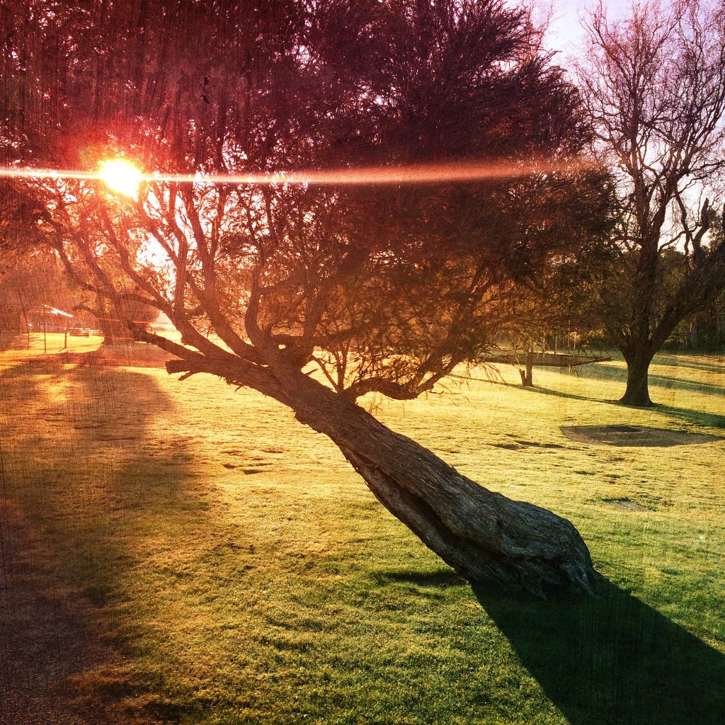
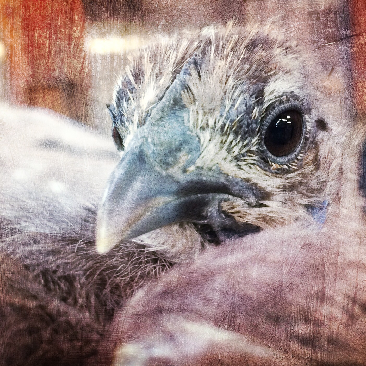
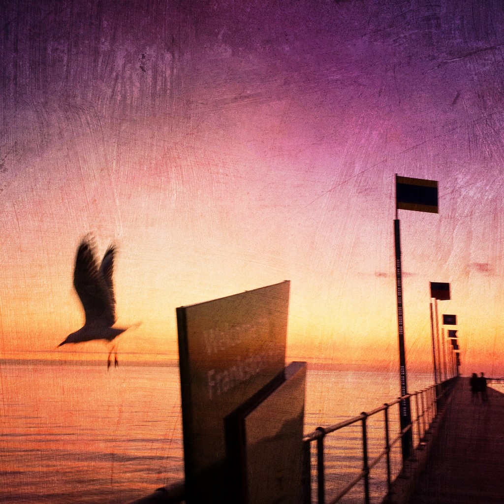
Being a photographer I have a lot of images in my Lightroom library, and when I don’t feel like shooting new ones, I try to reuse my old images to create something new out of them. Sometimes I get lucky and something nice comes out of my efforts, and when it does I want to share it with the world!

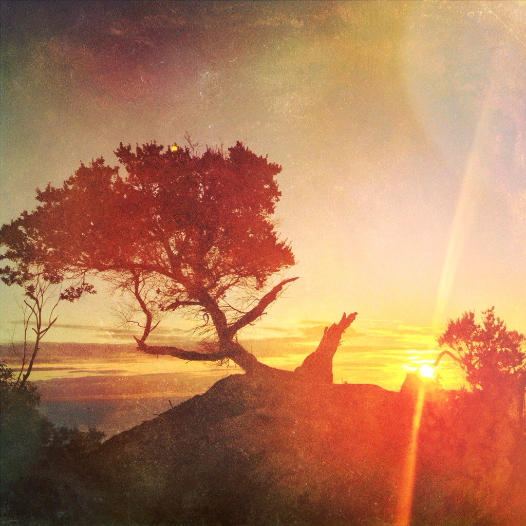
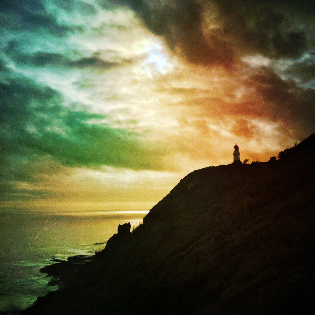
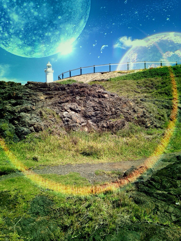
I call these series – “Space Fantasies”.

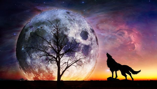
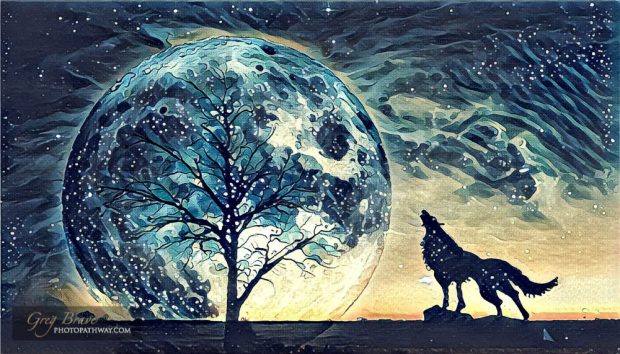
Since one of the purposes of this blog is to educate (ambitious, don’t you think?) I will share a bit about how theΒ  image above was created. The rest of the images you’ll see in this post were created similarly.

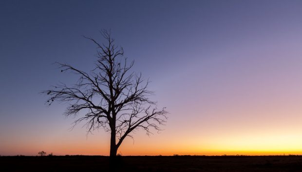
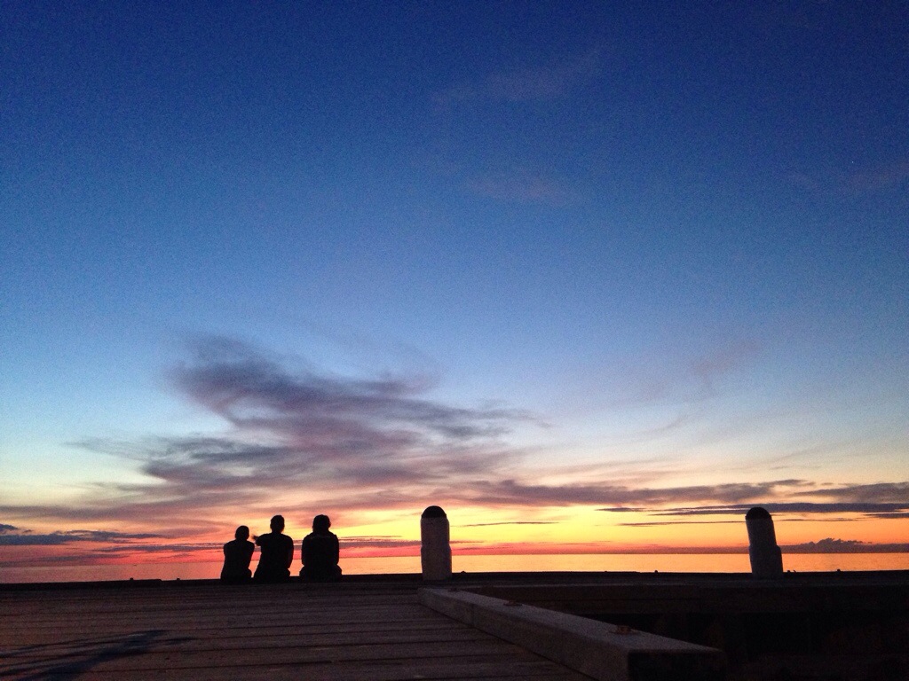
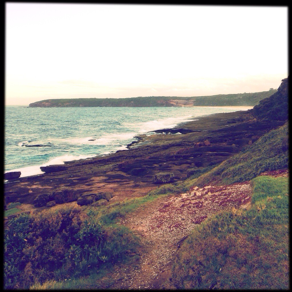
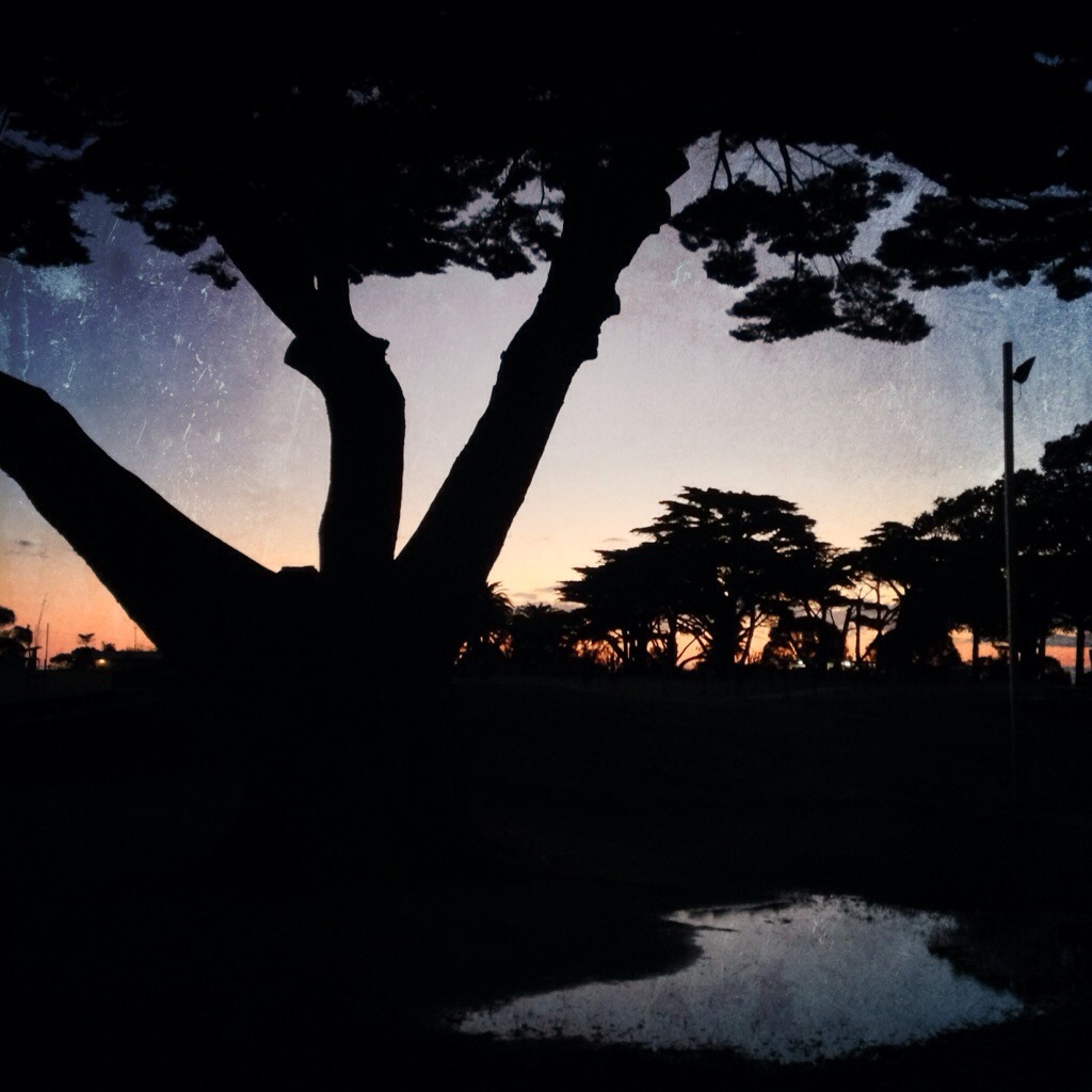
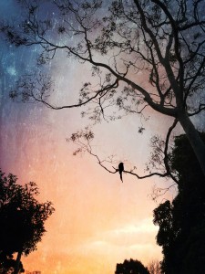
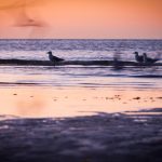
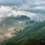
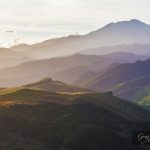
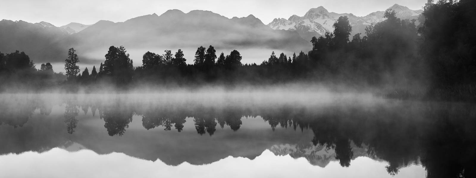
As you might’ve guessed it all started with a photograph. This one:

At first I was inspired by images of things with huge moon in the background so I just tried to add a moon to this image. Did you know that NASA has a great library of space imagery that is free to to use for anyone? That’s where I found my moon, since I don’t have a 600mm lens to shoot it myself. This moon:
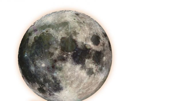
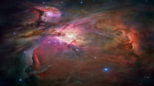
In order for the moon to seem behind the tree, I changed the blending mode of the layer to “Overlay” (did I mention that all this is done in Photoshop? Duh! Obviously :). When I did that, the image wasn’t interesting enough for me. I felt that something is missing. So I looked and looked at it and suddenly a thought popped into my head (or maybe not suddenly. Maybe something totally different happened, I don’t remember) – what if this is not our moon, what if all this is not happening on earth? So I added another image from NASA to reinforce my idea. This one:

And again, to blend it with the rest, changed blending mode to “overlay”.

Now we are getting somewhere! I thought to myself, but still something was missing…

A few days later I looked at it again and crazy thought crept into my perfectly sane mind – What if it was our moon after all!? If this is a moon, and it looks like night – something that was missing was a howling wolf! But I am not a wildlife photographer, and I don’t have photos of wolves laying around. Even if I did, I doubt I would have one in exactly the right pose that I imagined it should be. To find a solution, or to be more exact, to find a wolf, I started browsing through Google images searching for “howling wolf”, and I found quite a few images. But it didn’t feel right to use them in my artwork – I wanted to make it myself, you know?

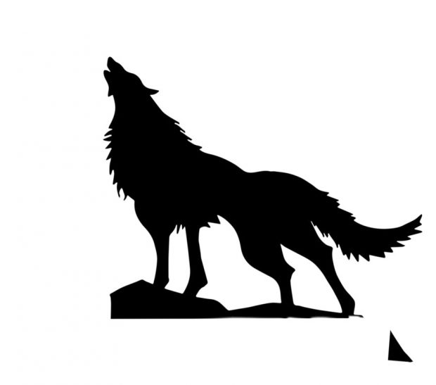
The solution came to me when I saw black and white logos of wolves – I realized that all I need is a silhouette! It doesn’t have to be a photograph. And still I wanted to make it myself. So I drew a wolf on a piece of paper using several different photos as references to get the exact pose I wanted. Then I took a photo of my drawing and brought it into Photoshop. Using the Image->Adjustments->Threshold filter I converted the photo to black and white:

After tinkering with the image a little bit more, it seemed that all the pieces fell into place! I was quite satisfied with the result:

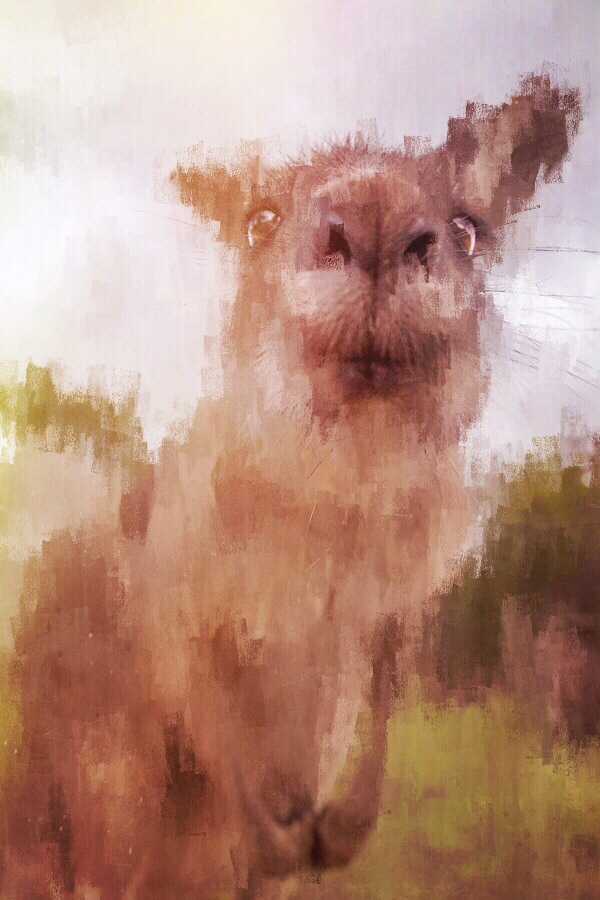
But my perfectly sane mind kept poking me, saying things like “psst! this could be better! try something else“. A few days later (you see, this was a long process!) I was playing with the Prisma app on my phone and got an idea to try putting my work through it. After trying a bunch of their filters, the one I liked the most was “Wave” (A tribute to the famous painting by Hokusai).

And that’s pretty much gave me the final image.

There is one more thing left to mention – Prisma outputs low res images, but I wanted it to have much larger resolution, so here is my somewhat complicated solution to the problem:

  1. Open the Prisma-processed image in Photoshop
  2. Enlarge the image to about 11 megapixels (Image->Image Size)
  3. Use Nik Sharpener Pro (for output) changing the following settings from defaults
    1. Structure = 50%
    2. Local contrast = 7%
    3. Focus = 10%
  4. Open the resulting image in Adobe Illustrator
  5. Trace the image in order to turn it into vector using “full color” leaving the rest of the settings as defaults
  6. Export back to JPEG from Illustrator at your desired resolution


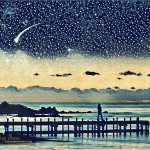
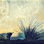
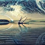
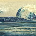
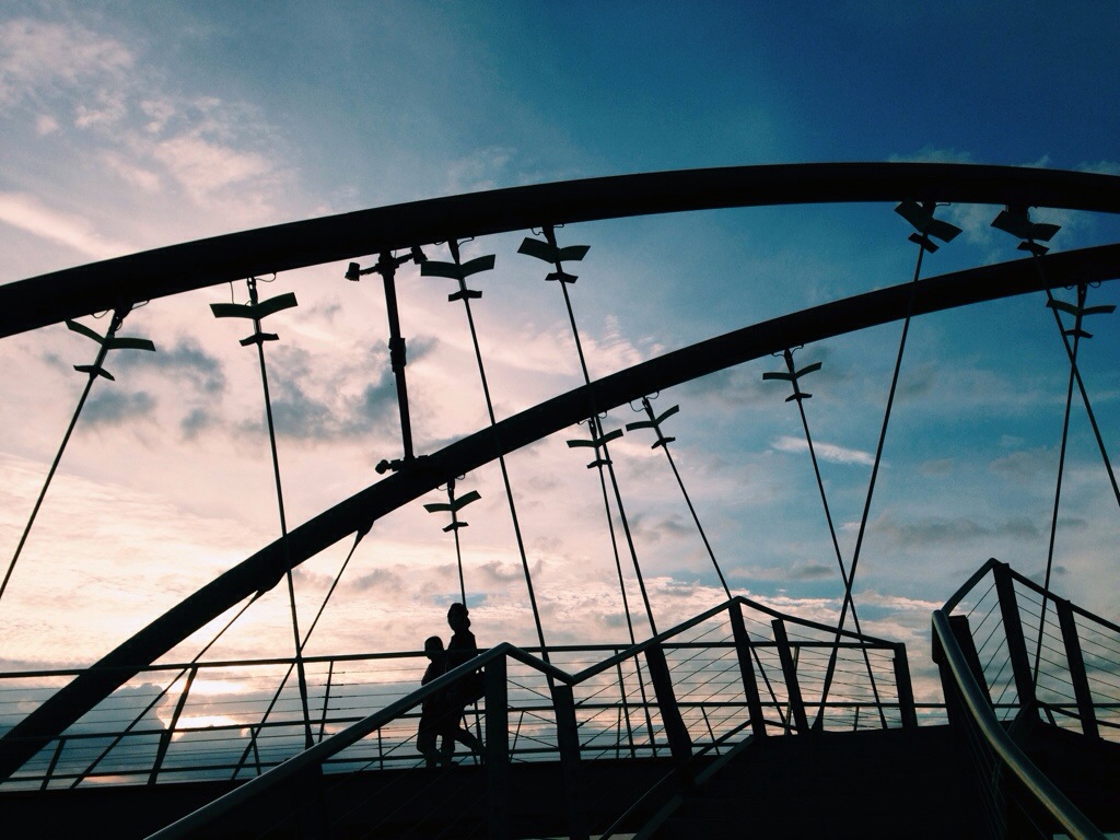
After getting my first fantasy-photo-collage-painting I couldn’t stop, and ended up with a whole series of works. Here they are. I hope this was of interest to some of you and provided useful info.

Enjoy!

– Greg

[UPDATE] Lately Prisma started offering an in-app purchase to be able to output high-res photos of up to 12MP.


[box type=”bio”] P.S. If you want one of these beauties printed on canvas and hanging on your wall – shoot me an email at greg@photopathway.com[/box]
12 Apostles Aerial Video demo show reel

Due to rapid advances in digital technology many photographers are gradually starting to add video to their arsenal. I was reluctant at first, but because I easily could record videos with pretty much any of my digital cameras, video slowly crept into my work.

Then drones started to get better, cheaper and easier to fly, so I decided to take a plunge and get me one of these fine examples of human ingenuity.

About 9 months ago I bought my first drone – DJI Phantom 3 Professional and started learning how to use it. It was pretty easy to get it up in the air and have basic control over it, however shooting smooth aerial videos was a whole another story. Drones are very responsive to movement of the cotrol sticks, which results in a jerky motion and jerky video. I had to learn how to operate the drone smoothly, and there are basically two main options achieving that:

1. Use the DJI Go app to adjust some settings making the drone react more smoothly to your actions (e.g. moving the sticks). And then spend lots of time perfecting your drone flying skills focusing solely on getting smooth cinematic shots.

2. Use the Litchi app. It allows you to program your drone’s flight, and it is great at it. For example you can set a point of interest on a map and have your drone circle around it in a perfect circle constantly focusing on that point creating beautiful sweeping aerial footage. This is how I made this video:

I spent time learning both – manually controlling the drone, and the Litchi app. Both of these skills are very useful in achieving good aerial video. Of course, I am still learning and perfecting my skills, but I was able to get some very nice footage alread.
Take a look at a short demo reel of my Twelve Apostles aerial videos:

I hope you like it, and will be happy to hear any comments or suggestions regarding any aspect of shooting aerial video in the comments below.

Cheers!

Why I never shoot in Manual mode

At one point in my photographic career I’ve noticed that many photographers proud themselves in shooting only in manual mode. I get it, they want to emphasize the fact that they mastered exposure technique andΒ  know exactly what f-stop and shutter speed to set for each lighting scenario.

β€œI shoot manual only” people generally look down on all the regular folk who are not in their club.
Well, guess what, in my opinion it is not wise and plain unnecessary to shoot on manual in this day and age.

Let me defend the case of Aperture Priority mode as the only one you’ll ever need to use whether you are an amateur or even pro photographer. There’s only one caveat here – if you shoot high speed events such as sports or racing you might want to consider Shutter Priority mode, but I’ll get to this down the road.

Why Aperture Priority you ask? It’s simple – because it gives you full control of your camera without forcing you to always be cautious of accidentally under/over exposing your shot. I wrote β€˜accidentally’ on purpose, since you still have full artistic freedom of intentionally blowing out your highlights or deepening the shadows.

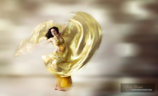
Ethereal beautiful woman swirling in a dance move


But first thing first – what is Aperture Priority mode?
In Aperture Priority mode you set your desired aperture and camera sets the shutter speed according to its built-in light meter. From my description it seems that you get only to control the depth of field (since that’s what changing f/stop does to the image). However, in addition to setting the aperture in this mode, you can also set exposure compensation, which leads us to the next question.

What is exposure compensation? By setting exposure compensation you basically tell your camera to use its built-in light meter to set the exposure, but then intentionally over or under expose the scene by the amount that you specify. For example you are shooting a sunset pointing your camera directly at the setting sun. Built it light meter will set exposure according to the bright sun, leaving the rest of the scene under-exposed. So if you want to achieve correct exposure, you need to set exposure compensation at about +1 or +1.5 stops. This way the camera will ‘add’ more exposure time to its measurement.

Now that we are familiar with exposure compensation, add it to your arsenal when using Aperture Priority mode, and you are almost set for any shooting scenario. The remaining bit of knowledge to mastering Aperture Priority is the ISO control.

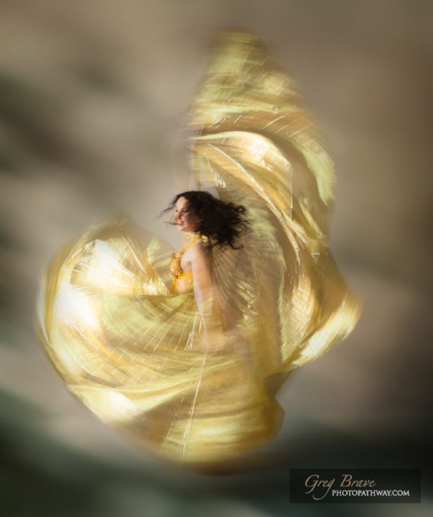
Celebration of color and movement

By setting ISO you control your sensor’s sensitivity to light. The lower the ISO number, the less sensitive your camera will be to light. But why do we need different values of ISO? Example to the rescue again! Let’s say you are shooting people indoors where the light is dim, and people are moving. At ISO 100 and f/8, your shutter speed will have to be 1/15th of a second in order to correctly expose your scene. But at 1/15s anything that is even slightly moving will be blurred in the resulting image. One solution would be to open your aperture to f2.8 (for example), but what if that’s not something you want to do? Or in some places the light is so dim that even at f2.8 your exposure times are too long. The only option you have is to set ISO higher. In the example above you’ll need to go up to ISO 400 or even 800 to get acceptable shutter speeds.

The lowest ISO is usually 50, which you would normally only use when shooting in bright daylight. The highest ISO differ between cameras, the highest that I heard of was 409,600! It means that this camera can basically shoot in very dark conditions and still produce visible details.Β  Remember though, you always want to shoot at lowest ISO possible because the higher your ISO, the more noise you’ll have in the image.

That’s it! By setting your desired f/stop, exposure compensation, and ISO, you have full control of your camera as if you were shooting in manual but still let your camera do the tedious job of metering the light so you don’t have to worry about it.

Let’s reinforce this claim with a few examples.

1. Shooting sunset with sun visible in the frame.

a. Set the desired f-stop. I’ll go with f/11 to achieve optimal overall sharpness and depth of field for my taste.
b. Since the sun is in the frame, the camera’s built in light meter will under-expose the scene, so I’ll set exposure compensation to +1 stop.
c. If I use tripod, I don’t care that the exposure time might be too long, so I don’t mess with ISO and leave it at the lowest setting possible for my camera. If I don’t use tripod, I half press the shutter button and see what shutter speed my camera chooses. If it is too long, I’ll bump the ISO to the next level (ISO levels are 50-\>100-\>200-\>400-\>800-\>etc.) and check the exposure time again.

2. Shooting portraits indoors.

a. Set the desired f-stop. I’ll go with f/4 in this case to achieve low depth of field that will give me enough sharpness for all facial features but also a pleasantly blurred background.
b. Check that there’s no exposure compensation set, because I want my portraits to be correctly exposed using the available light.
c. Half press the shutter button and see what shutter speed my camera chose at the lowest ISO setting. Then bump up the ISO until the shutter speed is acceptable. Shooting handheld I normally don’t go slower than 1/30th of a second, or even 1/60th if my hands are a bit shaky.

3. Shooting rays of light protruding through trees in the forest.

This is not an obvious thing to achieve. I am talking about those beautiful rays of light seeping through the dense foliage, and hitting the low vegetation.
a. Set your f-stop at whatever value that you want. No suggestions here on my part.
b. Here’s the important part – set the exposure compensation to about -1.5 stops. Reason being – you want the rays of light to stand out, so you need to under expose your scene. Don’t worry about the rays – they are so bright that they will still be perfectly visible, but your background now will be dark enough for the rays to stand out!
c. As usual, if you are not using tripod, half-press the shutter button and check the exposure time. Adjust the ISO accordingly.

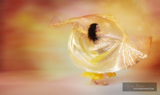
Ethereal beautiful woman swirling in a dance move

[box type=”bio”]
In conclusion – Aperture Priority mode can be used to deal with any photographic situation without the hassle of manually metering the light as you would need in manual mode. Therefore it is to me an absolute winner between those two modes. If you have another opinion, please, feel free to share it in the comments as I am always willing to learn.
[/box]
 

Oh, I forgot to mention the Shutter Priority mode for sports and stuff. When you shoot fast moving objects such as race cars or football players, and you want to freeze their motion in your frame (in other words produce sharp images), you need to make sure that your shutter speed is short enough. Let’s say 1/500th of a second and shorter. Achieving that is easy with Shutter Priority mode, in which you set the desired shutter speed, and camera sets the f/stop. In Shutter priority mode you can still control all the rest of the settings by using exposure compensation and ISO controls exactly as you would in Aperture Priority mode.

The curse of Instagram

If you want to achieve any sort of publicity, it’s all about social media nowadays. Businesses are getting their names out there, individuals become famous, andΒ  various groups grow in popularity. So anybody who wants any sort of attention takes it to social media.

I am a photographer, and obviously, I want to share my work with as large audience as possible. And if you are a photographer (or any other kind of artist) chances are that you too are seeking attention.
For photographers the obvious choice would be Instagram – the largest photo sharing social platform on the planet. Even though I’ve been using Instagram almost since it was created, I really started actively trying to gain a following little over two years ago.

A photo posted by Greg Brave (@gregbrave) on

I have to admit – I wasn’t successful in this endeavor, but I am not giving up just yet. In this article I’d like to share my experience and insights from the last two years of trying to get a following on Instagram. Please remember that this article consists of my opinions based on my own experiences with the platform.

I’ve studied various guides on ‘how to get a following on Instagram’, which basically all give the same advice. In short, here it is:

1. Post unique, beautiful, interesting etc. content.
2. Post regularly – posting images every day is considered to be the best practice
3. Add an engaging story/description to your images
4. Engage with your audience – when somebody posts a comment under your image, reply to them.
5. Be active on Instagram in general – leave meaningful comments under images that you like etc.
6. Participate in contests, giveaways, and collaborations on Instagram.
7. Use hashtags wisely – they have to be relevant to your content but also not too popular. If you use a hashtag like #instadaily, your image will get buried straight away in thousands of other images.

That’s about it.

A photo posted by Greg Brave (@gregbrave) on

I tried to incorporate most of the above into my Instagram routine and here is what found out:

1. When everybody tries to be unique, there is kind of sameness to it. We are all the same in our uniqueness (C) πŸ™‚ . I am mostly a nature photographer, so nature and landscapes are what I am creating and sharing. There are so many beautiful and unique nature photographs out there that sometimes I no longer see a point in sharing more of those. Even if each photograph was amazing and unique, when you have millions of them – they start to look all the same.
2. People mostly comment for two reasons: Either you have a big following on Instagram and therefore you are popular so they want to be seen ‘in your company’ and maybe get a follower or two from people who see their comment. Or you don’t have a big following and will be so happy to receive a comment that you’ll go follow their profile straight away as a way to say thank you. Of course there are exceptions to this, but in my opinion this is a pretty accurate generalization.
3. Most of the comments I receive for my work consist of one or two words, or even less – an emoji, which in most cases I even don’t understand the meaning of. Like an emoji of clenched fist under an image of sunset over ocean. And the words are typically: ‘Amazing!’, ‘Gorgeous!’, ‘Love it!’, ‘Really Good’, ‘Very Cool’, ‘Great shot’ – you get the idea. I don’t want to be too harsh on these people, they left me a nice comment after all, but I feel that the intention behind most of these comments is only to grab my attention and maybe to get me to follow the commenter.
4. I get many people who start following my account, but after two days unfollow it. At first I didn’t understand why after posting an image I get 2 to 5 new followers but by the next day, when I post another image pretty much the same number of people unfollow my account. I thought to myself: can it be that this photo is that much worse than my previous one that those people got disappointed in me so much that they decided to unfollow? This question bothered me very much until I found a great little iPhone app called “Followers”. It shows you exactly who unfollowed you (instagram app only tells you the good news – when somebody starts following you, but when they unfollow you don’t get notified). Using that app I found out that a lot of my new followers unfollow me after a few days (or just one day). So I decided to do an experiment – I started following back every account that started to follow me. The results were very interesting – number of ‘unfollowers’ was greatly reduced. My conclusion from this experiment is simple – people start to follow me in hopes to get a follower and not because they like my work. The worst among these people (and there are quite a few) are the ones who unfollow you anyway – it is just their strategy to get followers without clogging up their own feed.

A photo posted by Greg Brave (@gregbrave) on

To sum it up, nobody has the time to really look at photographs and think about what they are looking at. At least not on Instagram. Hard to blame people for that – we are constantly bombarded with content that competes for our attention. Instagram became a stage for worldwide competition for attention.

I know that it isΒ  popular to be all happy and positive these days, but in this post I tried to look at the reality of things, at least the way I see it. If you have anything to add or dispute – you are welcome to leave me a comment here or on Instagram πŸ™‚

Fractal Wings – Free Wallpaper Download

I decided to renew my long going wallpaper download tradition. Lately I’ve been working on fractal art, so this one is not exactly a photo, but I hope you’ll still enjoy it.

August 2014 wallpaper is here for you to download!

Stylized wings fractal art

For resolution 2560×1707 (wide screens) right-click here and choose “Save As” option.

For resolution 2560×1440 right-click here and choose “Save As” option.


Cheers!

Greg.

Save

Save

Photographing Still Life Part II

About three months ago I wrote an article about my work with still life objects. I’ve been continuing photographing still life since then and experimenting with different ways of post processing the images. In this post I will show some of my more recent works. Click on the images to view larger version.

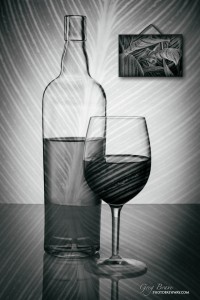
[one_half]In this image I went with simplicity in shapes but added more interest using texture. [/one_half] [one_half_last]Still Life with bottle and wine glass[/one_half_last]

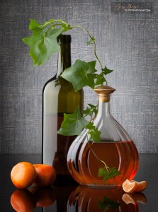
[one_half] Here, on the contrary, I wanted to create a more complex image with additional elements. My main problem was to choose these elements so that they would fit harmoniously into my composition. I’ll leave it up to you to decide whether I succeeded or not.Β  [/one_half][one_half_last]Still Life with bottles, mandarins, and leafs[/one_half_last]

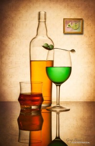
[one_half]I especially like this image, mostly because it wasn’t easy to come up with the idea for it. I started it by trying various compositions of glasses and the bottle, and various liquid levels. After I achieved something that looked good to me, I still felt that something was missing from the image. So I looked around for an item to add, and decided to add the two marbles. But I needed an aesthetic way to place them, and after a while I solved this puzzle with a spoon. I made a couple of shots and still wasn’t completely satisfied with the results. Suddenly it hit me that these marbles on the spoon look like musical notes! To make this idea more visible I added musical sheet to the background and the photo frame, and finally I felt the image was complete. [/one_half]

[one_half_last] Still Life with bottle and glasses
[/one_half_last]


[one_half]This is my best still life image to date. It has an interesting idea and a nice execution. In addition this image was accepted to 1x.com !!! It was my dream to have my image featured there, and I finally achieved it. You can see it on 1x.com here. [/one_half]

[one_half_last]Still Life with bottles [/one_half_last]


Save

Save

Save

Our Incredible Obsession With Gear

What do I mean by “gear obsession” ? It is the thought that using better photography gear will get you to take better pictures. I was so guilty of it in the past, and still sometimes get the irresistible urge to buy that new something that just came out.

Let’s do a little test. Does the following thought process sound familiar to you?

– The camera that I have is pretty old, and just yesterday they put out this new model with far better focusing, noise reduction, continuous shooting, _____________ (fill the blank).
– Once I get it, my photos will be crisper, sharper, clearer, and definitely MUCH better.
– Ok, I got this camera, but my huge collection of lenses (more than three I consider to be huge) doesn’t have the new 50mm f1.4 lens, which is MUCH better than its predecessor, and is not that expensive!
– Once I get this lens, I’ll really start using a 50mm lens and get wonderful photos with it! (Doesn’t matter that I already have a ‘worse’ 50mm lens and at least two of my zooms cover 50mm mark).
– Ok, I have a 50mm f1.4 lens now… But hey what about this new tripod from Manfrotto!? Yeah, I do have a pretty good tripod, but this one must be that much lighter and more stable! Having it will FOR SURE make me get up at 5 o’clock in the morning to shoot sunrises.

This constant feeling that something is missing from your photo bag, and getting it will finally allow you to take better images can go on forever.

If it does sound familiar, then you have the same problem that I had for quite a while. The real problem here is that getting all this stuff Absolutely Will Not help you take better photographs. And since the flow of new and better cameras and all other photography related stuff never ends, you are facing the danger of constantly chasing that next new thing coming out next week, month, year.

You might say that I am not totally right, and better equipment does produce better images. Well, yes and no. If by ‘better’ you mean better technical quality then, maybe yes. This is even not a certain yes. In many cases, the quality of light is one of the most important contributors to the technical quality of your work. Let’s say you want to shoot portraits in natural light, but it is high noon, and your subjects are standing in an open area without a hint of a shadow. It doesn’t matter that you have the best camera out there – you will still get unpleasant lighting on your subject and very harsh shadows. But if you wait for the sunset (for example), and move your subject into a slightly shadowed area where you’ll get beautifully diffused light, even a point and shoot camera will get you great results.

However, technical quality constitutes only about 1% of how good your image will be, and this is something that I’ve come to learn the hard way. Photographic forums are filled with thousands of bleak, uninteresting, and simply ugly images taken with the best cameras out there (Canon EOS 1Dx, Nikon D800, you name it). On the other hand I also found many beautiful photographs taken with point-and-shoots.

So what makes a photograph to be good, or even great? Well, it is a pretty tough question and here is my take on it. Good photograph is one that makes the viewer feel something, that evokes emotions within the viewer. Good photograph creates a mood or tells a story. And the more intense the emotions it evokes in the viewer, the stronger the mood – the better image it is.

How can all this be achieved within a single image? Well, most certainly not by technical quality of photographer’s equipment. It can be achieved through lots and lots of practice, through looking at work of masters and trying to understand what is it in the image that makes you feel the way that you feel. It is way past the basics such as rule of thirds, contrasts, lines, patterns, etc. Of course, you have to be familiar with all of the above, but to use it effectively, and break the rules where necessary is a whole another level of photography. In short, only developing your vision will allow you to create good photographs, and you can do it with almost any camera out there.

I find it liberating taking pictures with my mobile phone because I don’t have to worry about changing lenses, and being afraid of missing the shot because I don’t have the correct lens on my camera. With the phone I simply don’t have that choice, and instead I start to look around more, think about what I am looking at and create various compositions in my mind, The camera is there only to capture what I saw in my mind. It is really just a tool that helps the photographer express himself.

[box type=”bio”]What do you think makes a good photograph? Leave your thoughts in the comment section below.[/box]
Photographing Still Life

For the last several months I’ve been focusing on photographing still life images. I don’t know exactly why but I am drawn to still life photography. I like to create various compositions putting emphasis on shapes, light, and color. In this article I’ll share some of my creations and talk you through my thought process. The images that you will see here where created by me during the course of the last five months.

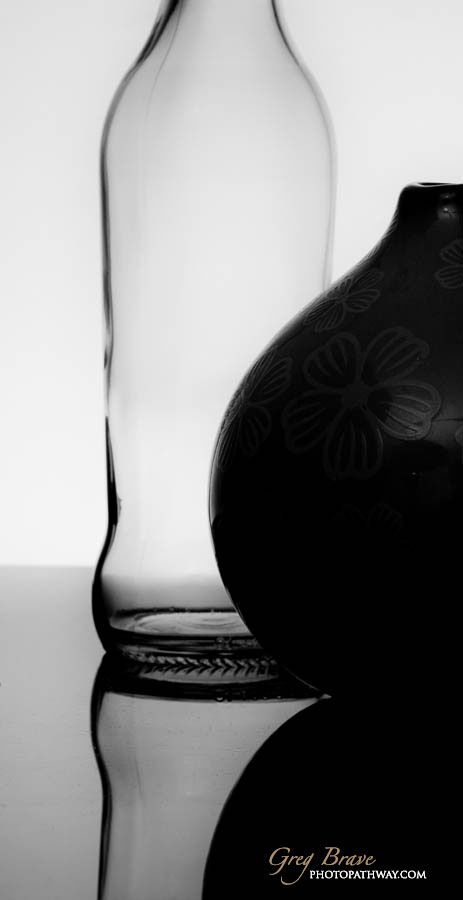
I started experimenting with simple shapes and gradually added more components using bottles and other items I had at home. My first images consisted of two objects and were shot in black and white. This way I was able to concentrate purely on shape and light. Here is one such example, which I liked. There is a contrast between one dark, “solid” object on the foreground and one light, almost transparent object in the background. I tried intuitively to place them in a way that would look interesting and pleasing to me.

Still life with bottle and vase in black and white by greg brave
click on the photo to enlarge

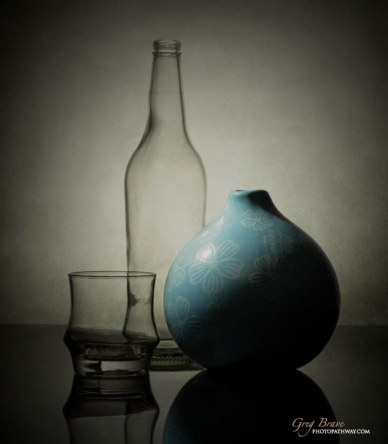
Next I added one more object, some color, and changed the lighting. The reason I changed the lighting is for the color to bee seen, but I still wanted to have shadow in the image. This way I aimed to bring a certain mood into the image. Looking at it on my computer screen I felt that something was missing, tried to add texture, and liked the result. This image is still very simplistic, a building block in my studies of still life photography.

Still life with bottle and vase in color by greg brave
click on the photo to enlarge

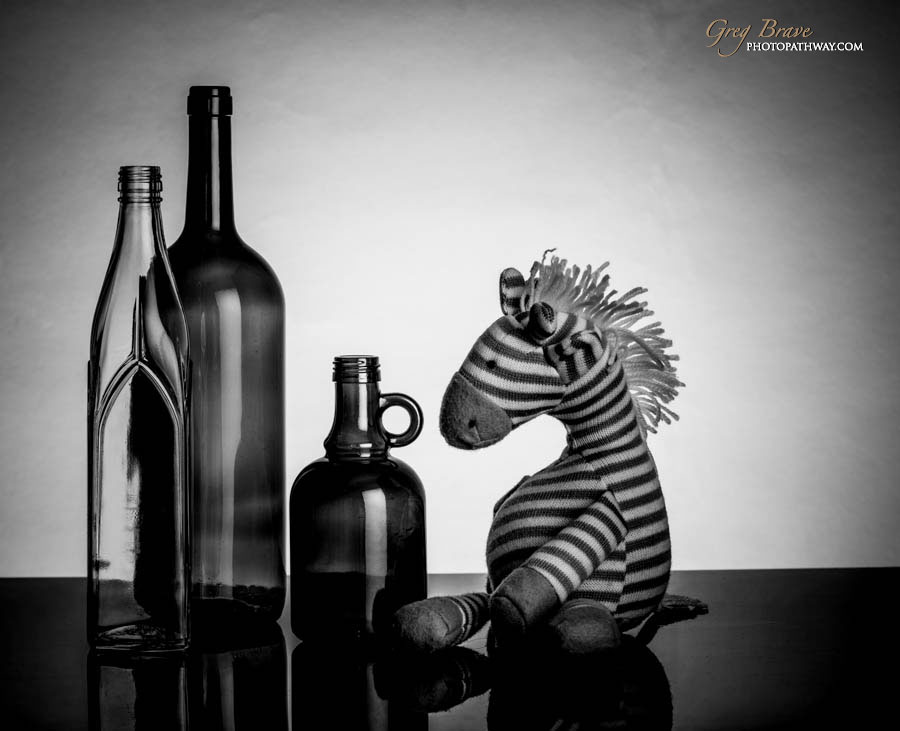
I kept on trying various compositions, and here’s my attempt to add some humor. There’s not much sense to it, but I like this drunk zebra πŸ™‚

Still life with bottles and toy horse in black and white by greg brave
click on the photo to enlarge

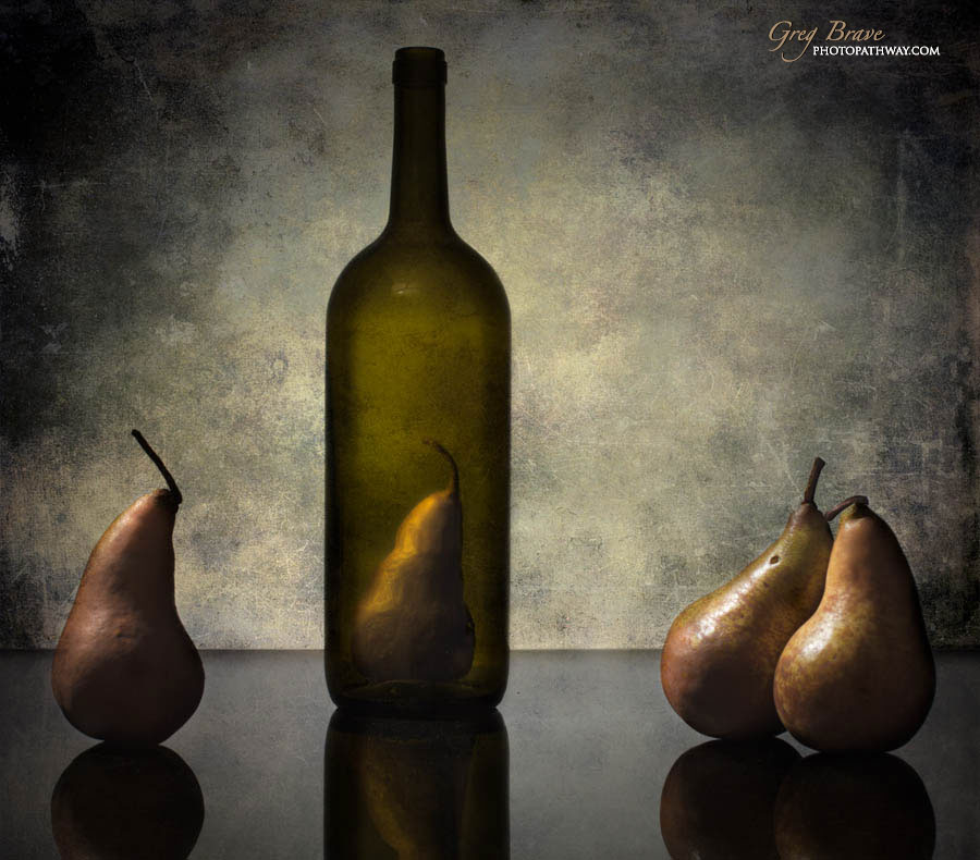
The image below was inspired by images of Victoria Ivanova . She has some very cool conceptual still life images with pears (and other items). I call this image “Examination”. Will let you figure this one out for yourself πŸ™‚

Still life with bottles and pears in color by greg brave
click on the photo to enlarge

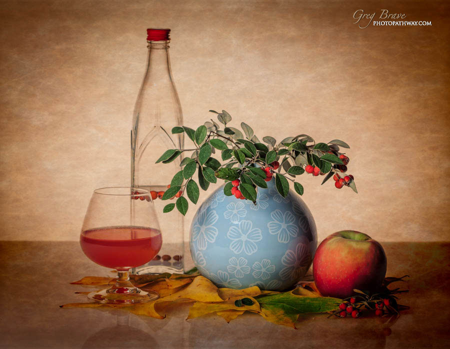
Concept imagery is pretty difficult to come up with, and I didn’t have much luck with it just yet. In the meantime I continued to focus on form, light and color. In my next composition I wanted to emphasize a single color, so it would become the whole theme of the image. It doesn’t mean that there is only one color but that it is the vividly dominant one, so there’s no mistake as to which one is it.

Still life with bottle vase apple and glass in color by greg brave
click on the photo to enlarge

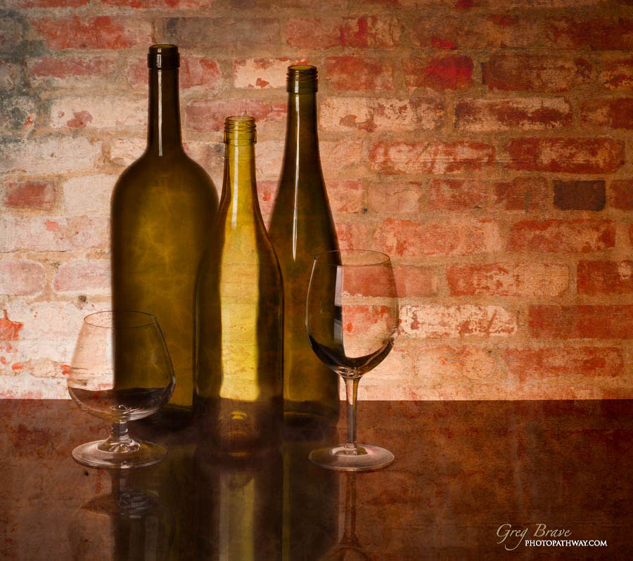
I also tried to change backgrounds and match them to my subjects. One of the things I learned from the photo below is that I don’t like empty things. I didn’t notice this at first, but when I looked at the final image I kept thinking that something was missing, and finally I realized that all the items were empty!

Still life with bottles and glasses in color by greg brave
click on the photo to enlarge

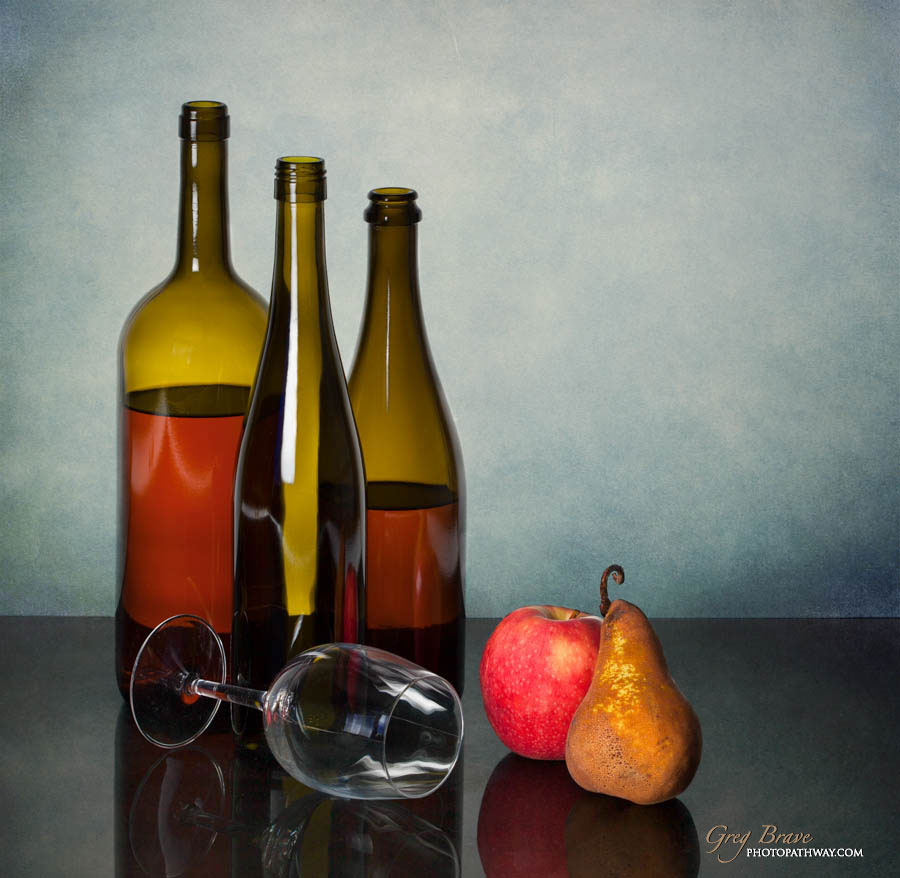
I didn’t repeat that mistake in my next image. In this image I made an emphasis on color. Seeing the final image I saw that vivid colors add a lot of interest to it. Ideally, of course, it should also be the shape, the light, and the meaning of the image together to form a good one.

Still life with bottles glass and fruits in color by greg brave
click on the photo to enlarge

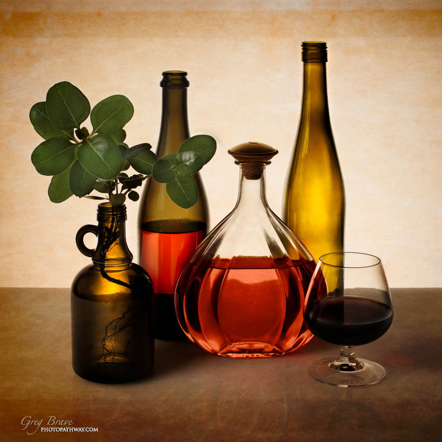
The image below is the most recent one I created. When working on its’ composition I felt that only glass objects with (or without) liquid created a lacking picture. I tried to add various objects but nothing worked. Then I went out to the garden and looked around, saw this sprout and tried to add it to my composition. Finally I got what I needed, and the image was complete. There is an interesting “cross-balance” (term I thought of just now πŸ™‚ ) in this photograph: A diagonal line of three filled objects from top left to bottom right, and another diagonal line of two empty objects from top right to bottom left.

Still life with bottles glass and flora in color by greg brave
click on the photo to enlarge

A few technical notes regarding my lighting setup: I generally had two lights. One is located below the table on which I created my compositions. That light was lighting the background and adding the glow to the bottles from behind. Another one is located to the left of the camera and just a bit above the bottles. On it I placed polarizing gel and also used a polarizing filter on the lens. I turned the polarizer on the lens so that the reflections of the light source in the bottles would not be visible. In some cases I created two exposures of the same composition – one with reflections and another without. Later in Photoshop I loaded the two exposures as layers, completely masked out the exposure with reflections, and only revealed the reflections that I wanted to be seen.

[box] Your comments, questions, and thoughts are highly appreciated![/box]