SetMyCam iPhone App Review

Recently I was asked to review an iPhone app SetMyCamera aimed to assist photographers in several aspects of photography.

Disclaimer: The only endorsement I received was a promo code to download the application for free, so I can play with it, and I don’t get any other benefits. Therefore, this review is my honest opinion of this application.

The app comes in three versions – SetMyCam Pro, MX, and DF. The Pro version contains all the features, while other versions contain less. I will go over all the features of the Pro app and at the end of the review will tell you briefly about the other two versions.

DoF – Depth of Field calculation

First of all, what is DOF? If you are not familiar with this concept, and you are into photography, you really should get to know it. I will briefly explain it with an example. Let’s say you are photographing your local basketball team and they all are standing in front of you in three rows (one row behind another). You aim your lens at them and focus on the faces in the middle row, so this row will be in focus for sure. But what about the row of players that in front and the one at the back? Will their faces be in focus as well? If you have sufficient Depth of Field then they will be in focus, otherwise they won’t. So which factors can change your DoF? There are quite a few:

1. The f/Stop that you chose. The bigger the f/Stop number, the bigger DoF you’ll get.

2. The focal distance of your lens. Wide angle lenses have generally bigger DoF than telephoto lenses. It means that at the same f/Stop wide angle lens will get you more planes in focus than a telephoto lens.

3. Distance from your lens to the plane on which you primarily focus.

4. Sensor size of your camera.

Most photographers develop an intuitive feeling for DoF from experience, but if you want to know exactly your DoF, or just better understand how it works, this tool in SetMyCam will be a good aid. Here is how it looks:

setmycam-dof

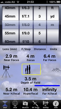
Before using any of the features in SetMyCam you’ll have to set your camera model so the app will know the size of your camera’s sensor. Then, in the DoF screen you can choose the lens that you are using, the f/stop, and the distance to your main focused object. Then the app will show you your DoF. Great educational practice would be changing various parameters and seeing how they affect the actual depth of field.

FoV – Field of View simulation

Again, first let me briefly explain what field of view is. In short, field of view, is what your camera sees. So when you use a wide angle lens your camera sees “more space”, and when you use a telephoto lens, your camera sees “less space”. However it is not as simple as that. Wide angle lens has a different perspective from a telephoto lens. If you shoot a landscape with a wide angle lens, for example, you will get more depth in your images, which means you can really tell that (for example) this tree is closer to me, than that cow in the distance. There is a better feeling of space. If you shoot the same landscape with a telephoto lens (first, you’ll have to get much farther from the point you shot it with wide angle lens, just to fit the same amount of space into your frame), you will get a “compressed” shot. It means that that cow in the distance will appear to be at the same distance as the tree, and just their sizes will be awkward. If you saw photos with a huge moon setting over a house or a hill – it was done by exploiting this fact. Photographer took a telephoto lens (lets say 1600mm) and shot this composition.

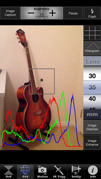
SetMyCam allows you to see on your iPhone screen what your camera will see using different lenses ranging from 30mm to 800mm (it can’t go wider than 30mm because this is the focal length of the iPhone’s camera), and it does it by utilizing digital zoom. You can also choose to display histogram.

 setmycam-lens


Motion

If you are not familiar with the “camera shake” concept, let me briefly explain. You can never hold your hands perfectly still, there is always at least a slightest movement. When you shoot handheld at slow shutter speeds (1/15th of a second for example) this movement of your hands affects the image by making it blurry. So what is the slowest shutter speed that you can shoot at but still get a sharp image? The answer is – it depends. It depends on the lens that you use (focal length), on the distance to your subject, and also on the stability of your hands.

SetMyCam can calculate for you that slowest shutter speed. To do that you set your focal length and the distance to your subject (approximate distance will be just fine), and then you hold the iPhone as steady as you can. After a brief moment the app will display the minimum shutter speed that you can use and still get a sharp image.

setmycam-shake

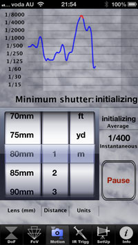
However, you should also take into account that your camera is much heavier and ergonomically different from the iPhone, and possible use a shutter speed just a tad faster. Remember that if you use tripod, you don’t need to be worried about camera shake.

IR Trigger

This feature of SetMyCam can be used only if you have an additional IR transmitter that plugs into your iPhone. I don’t have it, so I couldn’t play with this feature, however if you do have one and your camera supports IR triggering, this feature can be quite handy. In addition to simply remotely triggering your camera, you can do much more: you can shoot time-lapses, bracketed shots, and trigger the bulb mode.

setmycam-ir

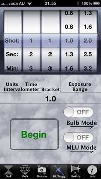
This feature is pretty nice (provided you have the IR device for the iPhone), especially if you want to shoot timelapses, because you don’t have to buy an additional device for that and use your iPhone instead.


SetMyCam Pro has all these features and you can get it for $5.99 in Australian Apple store.

SetMyCam Mx has DoF, FoV, and Motion features (no IR trigger) and goes for $4.99

SetMyCam DF has DoF and FoV features and costs $2.99


Conclusion

This app might not be of much use in “real time” when it is time to shoot in my opinion. Because when you are shooting, for the most part you won’t have the time to get your iPhone, open the app, calculate everything that you need to calculate, then take out your camera and take a shot. However it is a great tool for self education – for example in DoF module you can play with different focal lengths and other parameters and see how exactly they influence the depth of field. Or when you know in advance the requirements of the shot and you must get everything in focus, it is a good idea to calculate the exact DoF.

Same with the Motion module – you can get a pretty good idea when your images will start getting blurry due to camera shake by changing focal lengths and seeing how stable you can hold your iPhone, so when the time comes you’ll have the knowledge to set your camera correctly.

FoV module: Personally I don’t find this feature to be very useful, however if, for example you go scouting locations for your next shoot, and you don’t bring your whole camera bag with all the lenses, using this feature can give you a feel of kind of photos you will get with your DSLR. Having said that, most of the photographers I know, do know their gear and don’t have to look through the viewfinder to know how the shot will look like using various focal lengths.

Autumn in National Rhododendron Gardens

Autumn is a very special time of the year. I feel that it is time for relaxation and contemplation. Walking under the reddish-orange trees in the parks, it invites me to think about things. Different things.  Autumn is also a very beautiful time of the year. But to be honest I have to say that any time of the year is beautiful, you just have to look for the beauty in it.

Autumn in National Rhododendron Gardens, Australia 1
While we were walking the gardens, a girl passed by. She fitted so perfectly the scenery with her raincoat and umbrella. For a while we walked behind her and I took some photos.
Autumn in National Rhododendron Gardens, Australia 2
Botanical gardens offer a wide variety of flora, sometimes creating very interesting contrasts of sizes, shapes, and colors.
Autumn in National Rhododendron Gardens, Australia 3
After a while we saw this girl again, sitting quietly and watching the lake. I wonder what she was thinking about…
Autumn in National Rhododendron Gardens, Australia 4
And here is the lake that she was watching. What can be more beautiful than colorful reflections in the still waters?
Autumn in National Rhododendron Gardens, Australia 5
The gardens were so beautifully that I couldn’t stop taking photos. The colors hypnotized me.
Autumn in National Rhododendron Gardens, Australia 6 Autumn in National Rhododendron Gardens, Australia 7 Autumn in National Rhododendron Gardens, Australia 8
If you enjoy autumn and photography you can understand 🙂
Autumn in National Rhododendron Gardens, Australia 9 Autumn in National Rhododendron Gardens, Australia 10 Autumn in National Rhododendron Gardens, Australia 11
Hope you enjoyed this little excursion to the National Rhododendron Gardens. Please let me know in the comments below!

How to determine suitable photographic paper

Photographers spend many hours perfecting their image capturing skills and a lot of money obtaining the most advance photography equipment. When images remain in the digital realm all is well, but when images are printed on an inferior photo paper all that hard work and money often goes down the drain. This can be avoided and rectified by using a suitable photographic paper and here is what to look for.

Brands

Manufactures of photo paper often brandish a budget line and a premium line so ‘brand name’ alone is less important than you think. In fact, users often limit their choice of paper to one made by their printer manufacture due to incorrect information. Printer manufacturers do not produce photo paper, which are made by external suppliers on their behalf.  Therefore, having a certain brand of printer does not limit you to its range of photo paper alone.  External suppliers often produce photo paper with universal compatibility that is made to a higher quality than your printer’s own range of photo paper.  As long as you ensure to adjust the printer settings to the correct finish, grade and size of photo paper results will match and often exceed your printer manufacture photo paper results.

Inkjet Vs. Laser Printers

Printer technology is divided into Inkjet and Laser technology. The choice of most photographers is Inkjet due to higher DPI (Dots Per Inch) of 2880 vs. 720DPI achieved by Laser printers. Higher DPI ensures accurate image details, true colour representation and high quality photo paper support over bigger areas (A3 and A3+ sizes for example). Inkjet uses dye or pigment based inks propelled on the media by means of an accurate jet (hence, Ink-Jet). It results in slower printing time compared to laser, but higher accuracy. On the other hand, laser uses powder based ink which melts on the media after going though heat fusion. It results in shorter printing time that is fantastic in a commercial office environment for example when large amounts of ready prints are needed quickly.  However printing quality of laser printers will not be accurate to the digital image as much as Inkjet will.

Photo Paper Structure

The difference between budget and premium photo papers by the same manufacturer or even between completely different makes is in the structure of the paper. Understand the various options and you would be able to choose the most suitable media for your printing job.

Base – Photographic papers are made from either normal uncoated base or one that has a pre-coating of polyethylene – PE, on which an inkjet receiving layer is then added.   PE photo paper base which are present in premium examples has superior of significant amounts of inks. The PE coating helps ensure that ink is not allowed to penetrate the paper.

Receiving Layer – Unlike the base which is visible to the eye, the receiving layer is invisible, however it makes ALL the difference between the average and the high end photo papers. The receiving layer is a chemical coating, which is applied onto the paper. It is tasked with welcoming the ink and ensures it is held in place. Smudging after printing, ink that has run to the other side of the paper, poor colour representation and other quality indicators are often linked to the type of receiving layer used.

Budget lines use a ‘cast coated’ receiving layer, which is suitable in most cases. It is a far cheaper coating to produce, which explains why you would often come across cast coated in budget lines. The chemical is placed on the paper so prints would often be prone to smearing if touched immediately after printing. Cast coated is made from uncoated base paper without the PE pre coating.

Superior models often use pore based receiving layer either nano or micro pore in which ink ‘sits’ within tiny pores in the chemical. Therefore, the print can be held immediately after printing and longevity of the print is far longer. Prints printed on the pore based receiving layer are instant dry, will cope better with UV light and water as well as having a better archival properties such as anti-fading and anti-yellowing.

Finish Options

Photo papers come in three common finishes which are designed to enhance the image. The three are measured to a glossy scale from the most to the least and naturally the options in between. It is often a question of personal taste, though it can also take a practical angle. The three are glossy, satin and matt, though variations such as semi-gloss, pearl and luster are also available.

Glossy – The finish with the highest level of glare is the glossy finish, though some brands use higher level of glare than others. Glossy will suit most circumstances as it has the potential to sharpen the image. On the other hand, behind glass and from certain angles the glare can make the image hard to see.

Satin – Satin includes certain gloss but to a lesser degree. Versions of satin that you are likely to come across include Pearl, Semi-Gloss and Luster. They are all extremely similar to satin, perhaps with a slight difference in texture.

Matt – Matt include zero levels of gloss. It is rarely used in the reproduction of high quality imagery, more for printing in bulk and on a tight budget.

Photo Paper Weight GSM

Weight is measured in GSM (grams per square meter – g/m²) and indicates perceived appearance than anything else. Unlike common belief, it isn’t an indication of ‘quality’ but does play an important role in the perceived value of the print. Higher GSM photo paper often feel heavier to feel, which when giving the print away makes for a good first impression. Heavyweight photo paper which carries the budget structure characters of normal base and coast coating will often prove inferior to a lighter weight photo paper which carries the premium structure qualities.

Enjoy your printing now that you are aware of the difference in photo paper qualities and options.  Please leave your comments below.

[box type=”download”] Written by Joseph Eitan of PhotoPaperDirect.com. Joseph is the MD of the brand and works with professional as well as amateur photographers in order to help them make the most of their printed media.[/box]

Guy Gowan’s Free Fuse Tv

If you are into photography and Photoshop in particular, and you never heard of Guy Gowan, you really should. Guy has a 30+ years of experience in the imaging industry, and his Photoshop workflow is pretty unique. He has a subscription based website, where you can buy an annual subscription and get access to his 100+ tutorials “teaching the art of image processing” as he writes on his website.

I was subscribed for a full year to his website and learned a lot! However, this post is not about the tutorials. Recently Guy added another cool and free (!) feature to his website – Fuse. He describes it as “A new free to view programme featuring new technology, techniques, ideas and personalities from the imaging world”. Basically what Guy does is he puts out every week or so a new Fuse episode, in which he talks about gadgets and various creative things he found on the web. Since Guy is a very smart and creative person himself, naturally he chooses very interesting stuff to talk about, and I find these episodes very interesting. In these days of information overload, I use Guy’s Fuse as a very delicate filter for what to watch and what information to take in.

If I’ve got you interested, you can see the latest Fuse episode here . If you decide to subscribe to Guy’s tutorials and webcasts, please enter my email into the “referrer email” field (greg at photopathway dot com) to show your appreciation 🙂


London Bridge Panorama, Great Ocean Road, Victoria, Australia

About a week ago I took my family for a short 5 day vacation. We decided to go for a drive along the famous Great Ocean Road here in Victoria. Of course I had my DSLR with me, however I didn’t use it during the noon hours of sunny days. I used my iPhone instead. Here is a panorama I took from the London Bridge viewing platform.

London Bridge, Great Ocean Road, Victoria, Australia

London Bridge, Great Ocean Road, Victoria, Australia

P.S. The photo from the previous post (Apollo Bay) was also taken on this trip.

Photographing still life in studio – how to shoot reflective surfaces

Have you ever tried to shoot still life with bottles or any other glass object? If you did then you know that it is difficult. It is difficult because glass reflects bloody everything. Theoretically I knew that, but I totally forgot about it when I suddenly got the urge to shoot me some bottles 🙂

I realized that only after first few clicks of the shutter, when looking at the back of my camera I saw reflection of me, my camera, ceiling and most of other irrelevant stuff in my studio. Then I started thinking what can I do to eliminate all the reflections.

First thing I did was to turn off all ceiling lights, leaving only modeling lights from the strobes to light the studio. It helped, but I didn’t want the strobes to be reflected in the bottles either. My solution was to place main light under the table pointed at the background, so the main light itself wasn’t visible at all and the bottles were lit from behind. I still had to add some light from the front, and so I did.

In the photo below you can see the reflection of the front soft box ( I cleaned it a bit in post, but it is still visible). This photo is a composite, in which bottles were shot fist and then I shot two additional photos while holding the grapes with two fingers at each side of the bottles. Having camera on tripod all the images were aligned to begin with. Later I loaded them as layers in Photoshop, and masked out my hands from the grapes.

Still life with bottles and grapes

For the next image I didn’t want to have any reflections on the bottle and glass at all, but I still needed to light the vase from the front. Since the vase wasn’t transparent, when I only lit the scene from behind, it was almost totally black. Therefore, to create the image below I shot two photos – first only with back lighting, and the second with additional light from the high left. In Photoshop, again, I loaded the two images as layers into a single file, and used the bottles from the first image and vase from the second.

Still life with bottles

It took me a while to create the image below, and not due to technicalities. On the vast plains of the Internet I saw a few creative still life photos with pears, and felt like trying something creative with them myself. It turned out to be not simple at all (not that I thought it would)! At first I just tried to arrange pears and other items without any intention – just to make something nice. After about an hour I realized that it doesn’t work. Then I put everything aside, and just sat on the couch and thought about what I really wanted to create. I thought about what happened lately in my life and in the world, and little by little ideas started popping into my head and I ended up with the image below, which I call “Examination”

Examination

 The background texture was added later in Photoshop, if you were wondering 🙂

P. S. There is one really cool way to get rid of the reflections of your light sources in the bottles (or any reflective surface), but it requires additional equipment, part of which I didn’t have. You can buy sheets of polarizing gels and put them on your light sources. Also you’ll have to put a polarizing filter on your lens. Then by adjusting the polarizing filter on the lens you will be able to completely eliminate the reflections.

Your comments  and thoughts on this post and my works are very much appreciated, so don’t hesitate to write them in the comment section below !

Early Fall at Alfred Nicholas Gardens

Alfred Nicholas Gardens are usually visited by photographers when Fall comes, and that’s what I wanted to do. However this year I arrived a little early and everything was still green. But it didn’t stop me from taking a few photos. Enjoy!

Upper Ponds at Alfred Nicholas Memorial Gardens

Arboretum at Alfred Nicholas Memorial Gardens

Stairs at Alfred Nicholas Memorial Gardens

Waterfall at Alfred Nicholas Memorial Gardens

Razor blades

Photographic paint

Melbourne Botanical Gardens – Vertical Panorama

Recently I tried to shoot something new for me – a vertical panorama. It turned out to be a fairly easy thing to achieve with the iPhone’s native app.

So I started to experiment in different locations, and here is one that I think is interesting. The downside to it is that iPhone can’t create HDR panoramas, so in this case the sky is blown out.

Later I found out that before you start taking the panoramic shot, you can lock exposure (by a long tap on the desired area) and then record the panorama. I afraid though that if I locked the exposure on the sky in this photo, then everything else would be very dark.

Melbourne Botanical Gardens - Vertical Panorama

Melbourne Botanical Gardens – Vertical Panorama

Olinda Falls, Victoria, Australia

This weekend I took my family to a nice place in Dandenong Ranges here in Victoria – Olinda Falls. Thinking of it I love everything about the Dandenong Ranges forest, it is just beautiful. Having a creek with a few nice little falls is just a bonus. In short, it is a short trek leading from the car park through the forest to the Olinda creek and its falls.

We arrived there at rather late afternoon,  sun was getting lower in the sky, there was humidity in the air as the creek was nearby. This perfect combination led to the photo below.

Near Olinda Falls, Victoria, Australia

Near Olinda Falls, Victoria, Australia


When you arrive at the creek, you have two options – the obvious one would be to use the stairs to reach either the upper viewing platform or the lower one. The less obvious option is to dump the stairs and come closer to the creek. There is a narrow and steep footpath that you can use to scramble up or down along the creek.

Olinda Falls 1, Victoria, Australia

Olinda Falls 1, Victoria, Australia

The advantage of the second option can be recognized mainly by photographers – scrambling along the creek you can see the various cascades of water up close and get many more interesting viewpoints than if you would just use the stairs and shoot only from the viewing platforms.

Olinda Falls 2, Victoria, Australia

Olinda Falls 2, Victoria, Australia

Guess which option I took :). Actually my wife Ira is more adventurous than I am so she led the way carrying our baby daughter Eva in her backpack-chair!

Olinda Falls 3, Victoria, Australia

Olinda Falls 3, Victoria, Australia

Since having our first baby I rarely take my Canon DSLR on our weekend trips with me because it is big and bulky and gets in the way when I need to help with Eva. I usually take the X100 and put it on a small tripod when necessary, so all the photos you see here were taken with it (and processed in Lightroom).

Olinda Falls 4, Victoria, Australia

Olinda Falls 4, Victoria, Australia

It was too bright for long exposures even with the smallest aperture available f16, but then I remembered one great function that x100 has – you can put a virtual ND filter on it! It is simple – in the menu you choose ND filter on. This allowed me to use slower exposure and significantly smooth out the water.

Olinda Falls 5, Victoria, Australia

Olinda Falls 5, Victoria, Australia

Panoramic shot of a place in Frankston

Here in Frankston, where I live, I take a daily stroll with my baby daughter. We have a few different routes, and on one of them there is this roundabout. Nothing special about it, but when I took a panoramic shot I happened to like it a lot. There is a certain dynamic to the lines that create the walking path, the road, and the nature strip. I like that. Here, see for yourself 🙂 (the image is clickable)

Somewhere in Frankston, Victoria, Australia

Somewhere in Frankston, Victoria, Australia

Looking at this photo, I just thought that I wish there was a person walking on the path… #afterthoughts

Streets of Melbourne

I am not a street photographer by any means, but sometimes I just feel like grabbing a camera and going for a walk. Without any pressure to get good photographs, no expectations either. Just walk the streets of Melbourne, pay attention to what is going on around me and snap a photo or two if I feel like it. This time I only had an iPhone with me. Well, “only” wouldn’t be a fair description, because my iPhone 5 has a very good camera 🙂

Here are some photos from that walk I took.

Restaurant in Carlton, Victoria, Australia

Restaurant in Carlton, Victoria, Australia


When walking around, I can’t resist turning into small, almost invisible, passages. They often lead me to nice secluded places within the busy city. This is how I found this flight of stairs. It took me a while to find an interesting viewpoint that showcases the intricacies of its shape.

Stairway, Carlton, Victoria, Australia

Stairway, Carlton, Victoria, Australia


The photo below was taken in front of a bar (who would’ve thought!). I simply liked this illustration. But as I was standing there, admiring it, an old lady passed by…

Guinnes Bar Window, Melbourne

Guinnes Bar Window, Melbourne


I instinctively snapped a photo and ended up liking it much more than just the window. Can you see why?

Guinnes Bar Window 2, Melbourne

Guinnes Bar Window 2, Melbourne


No street life photo session is complete without a homeless dude.

Day by day

Day by day


Someone threw out this spooky painting and I was tempted to take it with me, but I just took a photo of it instead.

4
This is my favorite photograph of this session. A couple of minutes before it was taken I passed by this nicely dressed lady but couldn’t photograph her. Continuing walking down the street I saw the billboard and it suddenly came together in my head. I then just stood there and waited for the woman to pass by and took this photo.

This Way

This Way


Hope you enjoyed this little virtual tour through few of Melbourne’s streets 🙂

Eagle’s Nest – Panorama shot with iPhone

Shooting panoramas is not something new at all. Shooting panoramas with iPhone isn’t either. However, in order to shoot a panorama on my iPhone 3Gs I had to use third party apps and it made the process somewhat cumbersome. Eventually I ended up almost not shooting panoramas at all.

But everything changed when I got an iPhone 5 (again as a present!), and now it has an option to shoot panoramas straight from the native camera app. It is pretty easy, although requires some basic skills, and its right there! So I’ve decided to take on a project to shoot at least one panorama a week, and share it here on my blog.

I also created a category especially for that. You can find it in the top menu bar, under the “Blog” menu.

Here is the first panorama that I’m sharing in this project. It was taken at Eagle’s Nest beach in Victoria.

Enjoy!

Eagle's Nest beach, Victoria, Australia

Eagle’s Nest beach, Victoria, Australia

Revue Fotografie – 1965 Part I – Portraits

I already wrote about wonderful Czech magazine that was being published during the 50’s – 90’s of the 20th century. In short, it was very good photography magazine, with great written material and superbly chosen photographs. In this post I am going to share my favorite photographs from the third issue of the year 1965.

Since lately I’ve been getting more seriously into portraiture, I will start with portraits.

The following portrait reminds me of the girl Mathilda from the movie “Leon” (it is also known as “The Professional”). I think it is a great portrait depicting a strong character of this girl.

Portrait of a Girl by Antonio Damiani

Portrait of a Girl by Antonio Damiani

While the photo above shows us beautiful and strong-minded girl, the next photograph is of a woman, with a wise and calm glance. This portrait gives me a sense of confidence and maturity.

Illusion by Andrew Pukachevsky

Illusion by Andrew Pukachevsky

Next photograph beautifully shows the human body as part of nature, as something that is inseparable from its surroundings.

Summer in the forest by Zdenek Virt

Summer in the forest by Zdenek Virt

I find portrait of a widow by Milosh Kudera to be very strong. To me it possesses the quiet strength and determination of a person with profound life experience.

Widow by Milosh Kudera

Widow by Milosh Kudera

What I like the most about the next image is how the slight turn the body conveys beyond any shadow of a doubt that there is conversation going on.

Homecoming by Petr Velkoborsky

Homecoming by Petr Velkoborsky

  The photo below to me is a glance to another epoch in time…

Confirmation by Vaclav Zykmund

Confirmation by Vaclav Zykmund

Next is a portrait of Albert Schweitzer , was a German and then French theologian, organist, philosopher, physician, and medical missionary.

Albert Schweitzer - portrait by Yousuf Karsh

Albert Schweitzer – portrait by Yousuf Karsh

Last but not least is a portrait of an old sailor by Paul Strand. In this image I see a modest man, who is used to look down at his feet, but who can undoubtedly stand his ground when he has to.

Old Sailor - Portrait by Paul Strand

-Old Sailor – Portrait by Paul Strand

I hope you enjoyed this short voyage to the past. I might have misspelled some photographers names, so if you know better, please leave me a comment and I will fix it.

Also, if you liked these photographs, you can download the free PDF album that I created using photographs from another issue of this magazine.

Photography podcast that is worth listening to

I am doing a lot of driving for my work and at some point I got sick and tired of all the Melbourne radio stations and started to think what else I can listen to while driving. The first thing that came to mind was the audio books and I used to listen to them for a while, but then it hit me – podcasts! I started looking around in the podcasts section of iTunes and choosing what to listen to. Naturally I looked for photography related podcasts and found plenty of those. So I got all enthusiastic, subscribed to many different ones, and started to listen to them while on the road.

Then my enthusiasm started to slowly fade away because most of the podcasts were NOT INTERESTING AT ALL. You may say that it is a matter of taste, and I may agree with you, but here is what I felt – people hosting most of the podcasts gave all the standard advice “how to shoot like a pro” stuff that if you are into photography for more than a year sound so obvious and so beaten up. I heard nothing interesting and enriching that was worth listening to. Majority of those podcasts were talking mostly about boring technical stuff and the new gear that was out.

I got to a point where I simply couldn’t listen to this silly jibber-jabber that sounded like an old tape playing again and again, and had to switch to other podcasts (not photography related, such as The Joe Rogan Experience podcast, which is totally awesome by the way!). But recently I decided to look around and see if I can find an interesting photography related podcast, and I got really lucky.

I found The Candid Frame podcast, which is hosted and produced by Ibarionex Perello and edited by Martin Taylor. I think that this is the best photography podcast out there. I have to say that I am not being paid to write this and am not connected in any way to this podcast. I am writing this only because I love this podcast and want to share it with all my readers.

Here is what I like about this podcast – it consists of interviews that Ibarionex conducts with various photographers and people of other creative professions. “Interviews – you’d say – that’s not new! Lot’s of folks do interviews with photographers!” That’s right, but not the way that Ibarionex does them. He prepares thoroughly for each interview, so he knows a lot about the person he interviews, and he asks VERY GOOD QUESTIONS which is so very important to make an interesting and informative interview. Many times the interviewed photographers themselves say “oh my god that’s an excellent question!”. As a result listeners get to really know these people, how they work, think, and feel, and this is for me what makes the podcast captivating. I just want to keep on driving and listen to it.

If you just got interested you can find out more about The Candid Frame Podcast on their website or search for it in the iTunes podcast directory.


Headache and Photography Copyrights

Many photographers nowadays are concerned with how to protect their photos on the web from others using them and I think this is bullshit for the most part of it. Over the last couple of years I came across lots of forum discussions, blog posts, podcasts, and articles around this issue and I think the main driving force of most people’s complaints about rights violation is greediness.

Here’s the argument I saw the most:

“Well if they found my photo on the Internet, and used it in their project then they should pay me!”

It was the same thing when recently Instagram tried to change their TOS – most of the angry people said “If they use our photos then we should get paid”.  It’s like – if no one uses your photos then anybody can look at them and it is fine by you, but the second you notice that someone makes money off them, then you immediately want a share of that. Don’t get me wrong, I am not saying that it is allright to steal others work, but something about people’s reaction doesn’t sound right to me.

My take on it – if you want to make money off your photography then take action, do something about it. Create your own website and sell your photos there, upload them to stock photo websites, sell prints. There are many ways you can make money from photographs. Hell people are making money from iPhone photographs. I’m not saying that it is easy, but it is possible. If your photos are any good of course.

If you don’t want anybody to illegally use your photos, don’t share them on the web period. The reality of the current situation is that if I can see your photo on my screen, I can have it. Not in great resolution, but just fine for web applications. If you put your nasty watermarks all over the image then people won’t be able to see your work so that kind of defeats the purpose of putting it online. I am adding my name to my photographs for one reason only – for people who see my photo and like it, to be able to find out more about me. And I am a strong believer in sharing, and not only in photography but also in life – the more you share and give the more benefits you get back from it. Karma thing.

To conclude this rant – my advice to all the people who are loosing sleep being afraid that their amazing photographs are being stolen on the web – stop worrying about it, strive to put as much amazing work out there as you can and promote the shit out of it.

Adding filters/effects to your photos – good or bad?

It has been a long going trend, most notably with Instagram and Hipstamatic to slap a filter on any photo that you take. As a result we have lots of photos converted to all kinds of retro styles with artificially added “film” grain, faded colors, funny colors, distortions of all kinds and many other “cool” effects. Normal colors in a photo just aren’t cool anymore.

My question is – what does this trend mean to photography as a form of art, and to our perception of what good photography is?

I think nowadays people forget that in the analog age photographers tried hard to achieve the true colors of what they photographed, and to reduce the amount of film grain as much as possible. But now this “retro” look is highly sought after and is created artificially by adding digital effects to initially very good photographs (true colors and no film grain).

Personally I like using these great iPhone apps and playing with various effects to see what they can do to my photographs. But I also think that any effect that you apply to your photo has to serve a purpose, and not be applied just for the sake of it. For example if you photograph your friends at costumes party and they are dressed in the 60s theme, then applying some retro effects to your photos would make sense. However adding these effects when photographing a corporate event is inappropriate.

Another thing that worries me is that many people, especially on Instagram, feel that adding an effect to any photo instantly makes the photo great. So they just snap away their photos thinking that they’ll slap a ‘Sutro’ or ‘Nashville’ on it and they will look like a million dollars no matter what is actually on them. In my opinion you can’t save bad composition by changing the colors.

In conclusion, I think that photography is first and foremost about expressing yourself and sharing your way of seeing the world. If you need to add filter to your image to help do that, then its fine. But slapping filters on all your photos just for the sake of it is simply wrong.

What do you think?