Sometimes, after shooting portraits, when I look at the photos, I see that in some of them the persons’ iris is too dark. In that case I want to brighten it (obviously 🙂 ). To do that, in Lightroom 3 I used to choose the adjustment brush, bump up the brightness slider a little bit, and brush the eyes. This presented a problem because it would brighten up everything I “brushed”, so I had to be very accurate with the brush and the process took quite some time considering I would do it to many photos.
Luckily Lightroom 4 improved the overall processing workflow and now I can do it much faster and more efficiently. So If you have Lightroom 4 and want to brighten up a bit eyes of your models here’s a quick and easy way to do it.
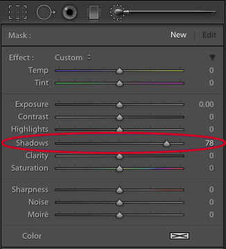
1. Go to develop module in Lightroom and select the adjustment brush:
2. Increase the Shadows slider quite a bit, but make sure that all other sliders are zeroed out.
3. Brush over your model’s eyes quickly, not trying to make the exact selection.
4. Adjust the Shadows slider to taste 🙂
What happens is that the Shadows slider brightens (or darkens if you slide it to the left) only the darks, and usually around the area of the eye, the iris is the darkest part. The eyelashes and the pupils are completely black and Shadows slider doesn’t affect them. So if you accidentally select a small portion of the white of the eye, or the skin, they won’t be affected by this adjustment.
Here’s an example of before and after using this technique
Before (click to enlarge)
After (click to enlarge)
I hope you will find it useful, and be sure to let me know how you go in the comments section below!
Lately Ira and I adopted a new habit – we get up early in the morning and go out for a walk in the neighborhood before work. It is winter in Australia so we have late sunrises and early sunsets, therefore we often start our walk before the sunrise, and have the joy of witnessing it to the fullest.
From photographer’s point of view not just any sunrise, as well as sunset, is perfect for landscape photography. Of course it all depends – whether there are too many or too few clouds in the sky, if it was raining at night (if it was, there is a good chance of having crystal clear atmosphere with bright colors), if there is morning mist. It is also depends on your subject obviously, and on how you intend to photograph it – for example what quality of light do you need.
Anyway, I am talking about simple walk here, with no specific intentions. In this case good sunrise colors and interesting cloud formations can help a lot in creating interesting photographs.
Here, see for yourself:
Click on the photo to enlarge.
I liked the sunrise-lit sky very much, and decided to make it the main subject of the photo above. I only had to find a decent framing for it.
I decided to call the photo below “Absense”… can you think why? If you have an idea please write it in the comments section below.
Click on the photo to enlarge.
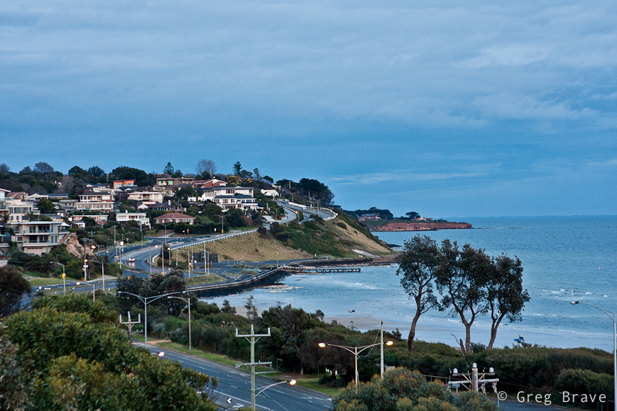
Next photo shows a location that I’ve photographed many times, but under this light, I think it looks the best. I am bothered a little bit with the foreground, but I still like this photo very much. Many things come together here – as I already mentioned the light is beautiful, the depth is depicted nicely by the three planes – the foreground, the “middleground” with the white houses and the background plane is emphasized by the piece of land sticking out. The winding road takes the viewer’s eye smoothly through the planes, and the lonely car in the middle-left adds to the overall mood of the photograph.
Click on the photo to enlarge.
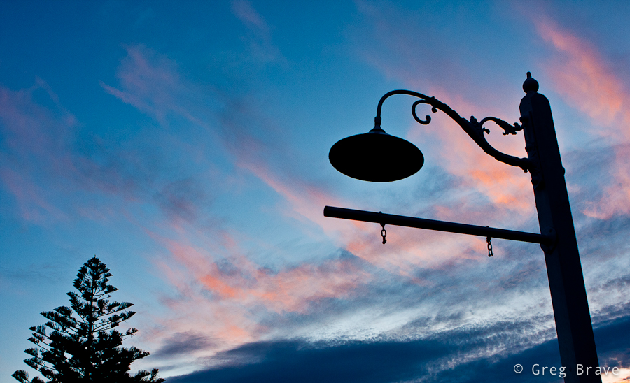
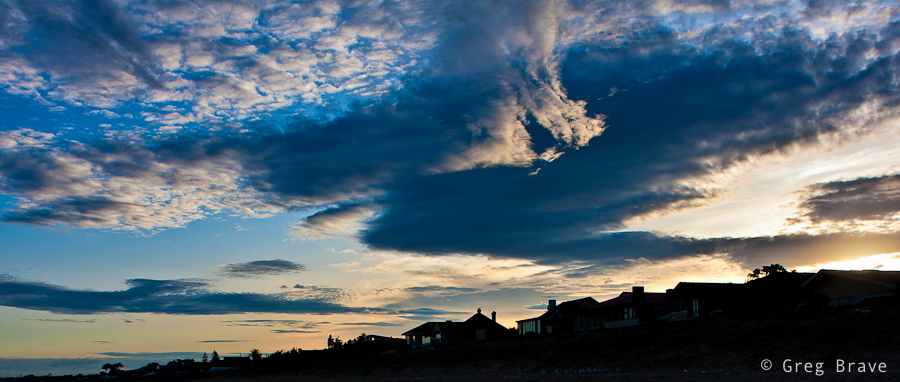
I took the photo below because of two main reasons – one, to show the beautiful cloud shapes and sky colors colors, and two, to emphasize the pure graphic nature of the tree branches, which are very eloquent when depicted as silhouettes. I think that the plain poles in the middle add nice perceptual contrast to the intricate shapes of the trees.
Click on the photo to enlarge.
Next photo is simply here for you to enjoy.
Click on the photo to enlarge.
I call the next photo “The victory of Light over Darkness”. Again the main interest in it is the sky, but without having interesting shapes of houses on the foreground I wouldn’t take it.
Click on the photo to enlarge.
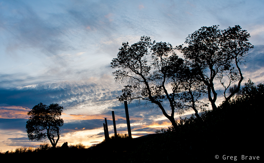
Here’s couple more photos from the same walk taken after the sunrise, when the sky wasn’t so interesting anymore and I had to concentrate on other things 🙂
Click on the photo to enlarge.
Feel free to leave your thoughts, suggestions, and other comments in the section below.
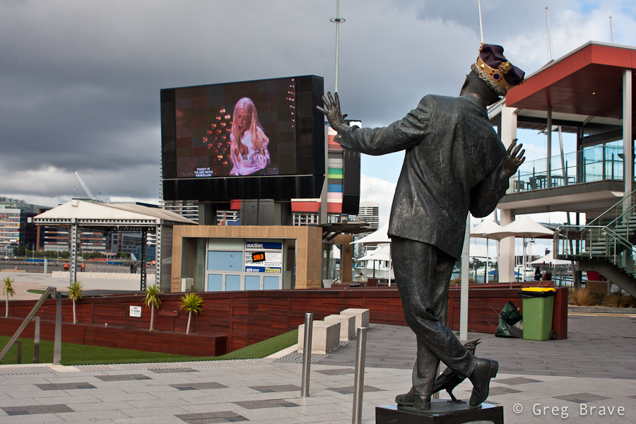
Yesterday I visited Melbourne’s CBD, and had a chance to take a few photos in Docklands area. Afterwards, when I was going through them on my computer (most of them weren’t anything special 🙂 ) , one photo grabbed my attention.
Here it is:
Click on the photo to enlarge.
When I was making it, I simply thought it would be a good idea to capture the singer on the big screen in an interesting pose so that I would have both, statue and singer ‘posing for the camera’.
But when I was looking at the photo later, on my computer screen, I’ve noticed that it has very ‘dynamic’ feel. I could feel the movement of the statue, as if it was a live person. So I started thinking – why is that happening? Why is the statue, which didn’t look that much ‘alive’ in reality, came to life in my photograph?
And here is my conclusion: it is because I created Interaction between the statue and the singer. It looks like the statue ‘responds’ to the movement of the singer, and since we all have no doubts that the singer is a live person, that feeling also ‘spills’ onto the statue.
It is very interesting effect, which can be used when photographing other situations. Even with this same statue – if instead of singer a real person would be somehow interacting with the statue, it would also make the statue come to life. For example imagine a bunch of kids dancing around it.
As always your thoughts and comments are highly appreciated!
I think that this is how many photographers start their venture into the realm of professional photography (by “professional” I mean paid jobs): I photographed my friend’s kid, then his friend saw the photos, got excited and offered me the job.
He asked me to make portraits of his one year old son and of the whole family. Needless to say that I agreed. Even though nowadays everyone has a digital camera, and any parent snaps tons of family photos, there are many people who still appreciate good photography, and can tell a great portrait from snapshot. Still, the job of photographer is harder now than ever before – his photos has to stand out of thousands of such snapshots.
So let me share my experience from this family photo shoot.
First of all I talked to the guy and asked him what did he expect from the shoot. This is very important – you have to be absolutely clear in regards to what your client expects from you. Here are some example questions to ask your client:
– How many digital photos (in files, not printed) does he expect to receive?
– Does he want prints, or just the digital files?
– Agree on the time frame for you to deliver the photos
– Does he want any artistic post processing?
– Which portraits exactly does he want – of the whole family only, individual portraits only, both, or maybe he has some kind of special request.
– Ask your client if he can show you (from internet or his friends) examples of photos that he particularly liked.
-If the shoot is to be held at client’s house ask the client about the dimensions of the house, and whether he wants the shots to be studio-like, because in that case you’ll have to bring your own background.
Click on the photo to enlarge.
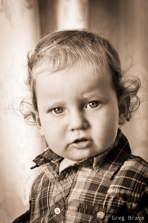
In my case client already saw my work and he said that he wants something of that kind. What he saw was portrait of a child tightly cropped and processed in sepia tones. In addition he said that he would like similar kind of photo but of the whole family. He also said that he doesn’t need a lot of photos, just a portrait or two that will remain for the years to come.
Click on the photo to enlarge.
The photo above is my favorite from that shoot. I love the kid’s look, and his inviting hand that “takes” the viewer’s hand and leads him into the child’s world…
Sorry, I got distracted… where were we? Ah, the expectations! So after talking to the client I understood his demands, and tried to fulfill them during the shoot.
Preparing for the shoot
I did this shoot at the client’s house, so I’ll describe my preparations for that specific case.
– Most important thing: Lighting. Even if the shoot takes place during daylight, if it is indoors there might not be enough sunlight, so you’ll have to bring your lighting equipment. I had a light stand, two strobes, a white shoot-through umbrella and a soft box.
– Lenses. If your client doesn’t have a lot of space in the house, you might not be able to use your favorite telephoto lens for portraits, which is too bad as it creates lovely bokeh :).
For portraits I used two lenses – Canon 24-70mm f2.8L and Canon 100mm f2.8 macro.
– Memory cards, backup batteries, cleaning cloth etc. Though this might seem trivial, but forgetting any of these (well cleaning cloth excepted) can cost you the photo shoot. If you bring strobes, then don’t forget backup batteries for them.
Click on the photo to enlarge.
The Shoot
Don’t be late. This is very important – it shows how seriously you take your job.
As a photographer you will benefit from being an open and communicative person. Talking freely and openly with people you are about to photograph makes them feel more comfortable with you and in front of your camera, and enables you to capture their natural expressions.
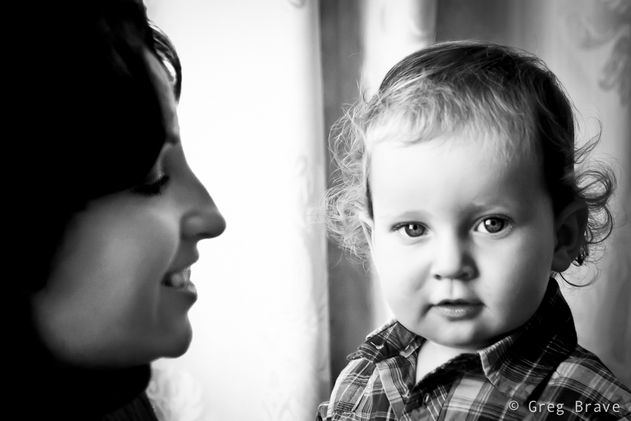
Shooting little kids is difficult because you can’t just ask them to be still, sit at one place, smile, or play with their toys. So you have to improvise. It is a good thing to ask parents for help. In my case the kid’s mother played with him and I was able to catch some nice facial expressions and poses.
Click on the photo to enlarge.
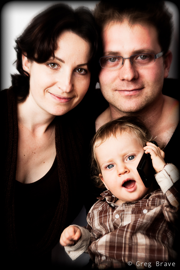
When we got to shoot the family portrait, at first parents had difficult time keeping the child still in front of the camera, but then they gave him father’s cellphone, and it was a bingo!
After the Shoot
We agreed that I will deliver the finished photos within a week from the shoot, but I delivered them in tree days, reasons being first of all because I love processing photos and couldn’t wait to see what I can do with the “raw material”, but also because I think it is a good little marketing trick. When people expect to receive a product in certain amount of time, but they receive it earlier than that, provided that the product is good, they feel even better about your services.
The most important thing that I’d like to leave you with is: Don’t be afraid to try! Don’t think that you can’t do it, and the client won’t like your photos. If you love photography, and someone offers you the job – Take It! You can read a thousand articles on the subject (including this one), but they won’t give you the same experience you’ll get from the actual shoot.
Sassafras is a small village located in Dandenong Ranges. The area was named Sassafras Gully, after the trees which grew in the area. Sassafras is a tourist destination with some antique shops, boutiques, and nurseries.
While most of the tourists visit Sassafras on their way driving the Dandenong Tourist Road through to other destinations, Ira and I came here specifically. We wanted to visit the “Tea Leaves” store, which has over 300 teas and herbs. But then again, we are not tourists – we live within 40 minutes drive from here.
As you probably guessed I wouldn’t write this post if I didn’t have some photographs to share along with it. The tea store was really nice, but it was too small and crowded to photograph. After we finished our tea-shopping, we decided to explore the surroundings.
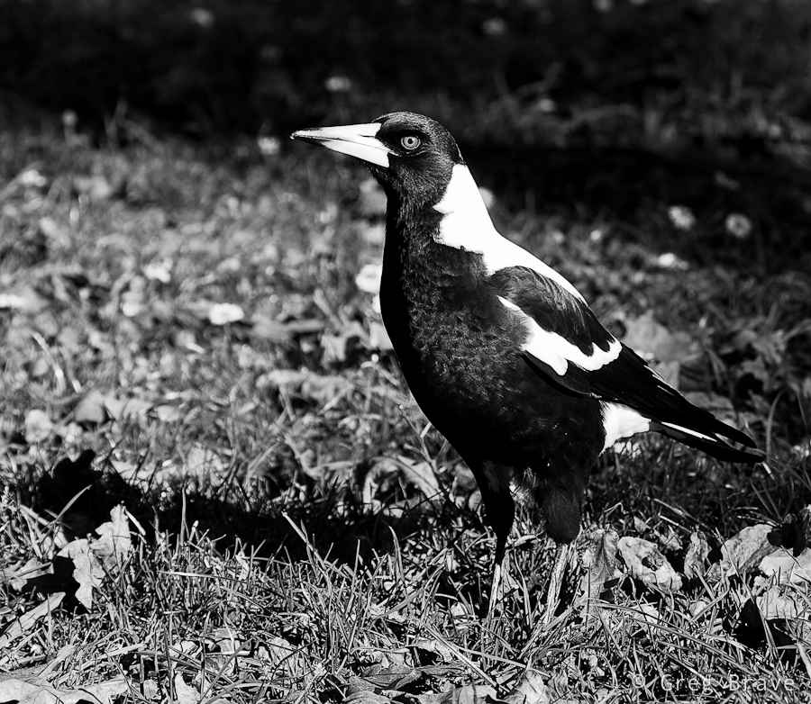
I always liked the Australian Magpies. I think that they are very interesting birds, and I also like their singing – Australian Magpies are considered to be among Australia’s most accomplished songbirds. There were plenty of these birds in Sassafras, so I could take a few photos, and here is one.
Click on the photo to enlarge.
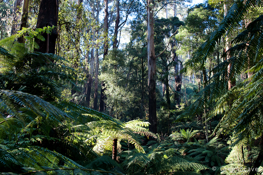
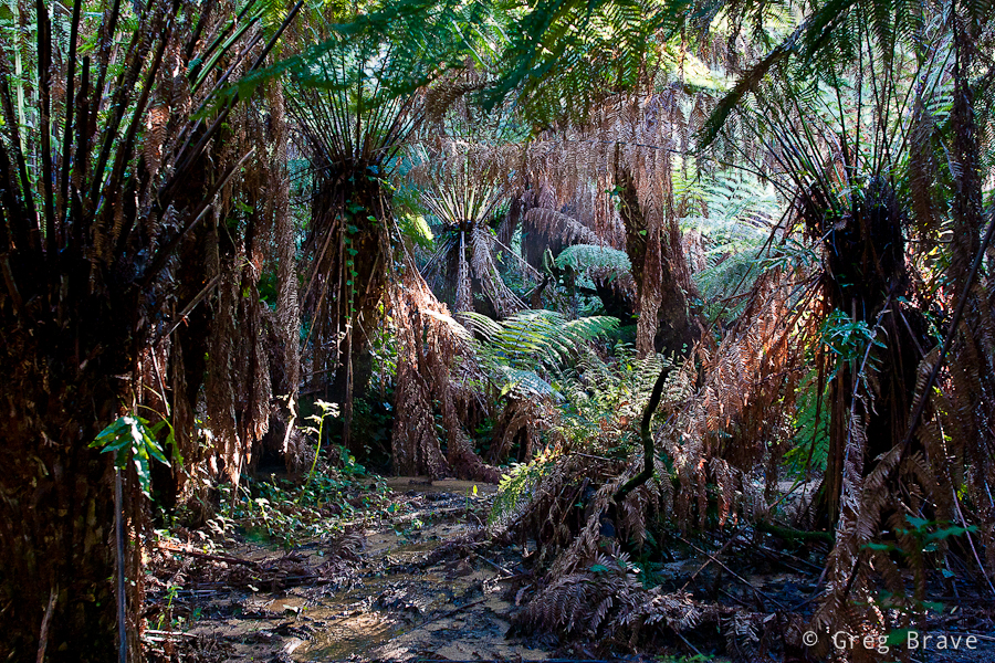
Dandenong Ranges is a beautiful place, and Sassafras is surrounded with eucalyptus and fern-tree forests with kilometres of walking trails. Ira and I came across one of the trails and went into the woods. It was such a beautiful walk! I can still feel the cold fresh air filled with smells of nature…
Click on the photo to enlarge.
The forest was magical. It was around three o’clock in the afternoon, and the sun was already setting (the sunset time is currently around five o’clock) so the light was beautiful. I was fascinated with the rays of light breaking through the foliage.
The biggest problem when photographing forests is to find distinction. What I mean is when you walk in the forest and you simply like what you see and take a picture, most of the chances that the resulting photo won’t be interesting. It will be very cluttered with leaves, tree trunks, and branches. One of the keys here is to find some kind of order in the forest and reflect it in your photograph.
The photo above is a bit too cluttered to my taste, but I still like it – I found an opening in the forest, saw this fern lit by the sun, and decided to make it a main point of interest in the photograph. Rays of light in the background add another dimension to the photo making it… airy?
Click on the photo to enlarge.
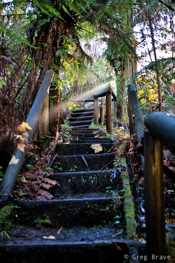
Walking down the trail we came across wooden stairs, and saw this “unreal” ray of light shining through. I just couldn’t pass the opportunity ☺. Though I am bothered a little by the wooden rail on the foreground right, overall I like this photo. The stairs lead the eye into the photo, and them being not straight enhances the feel of space, while ray of light helps creating magical forest atmosphere.
Click on the photo to enlarge.
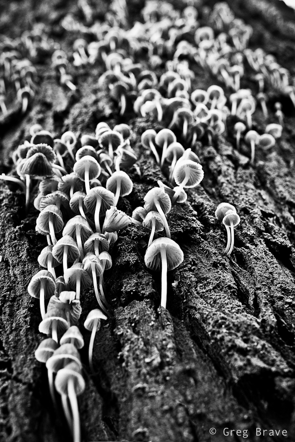
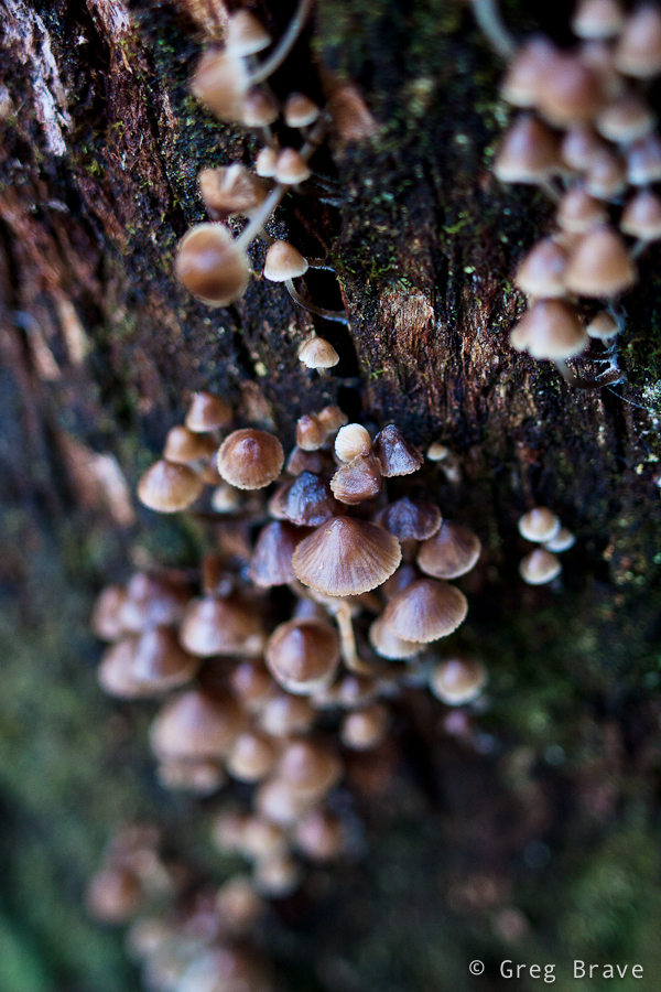
At one point I saw a huge eucalyptus and just stood there admiring this nature creation, then Ira said – “look! There are lots of tiny mushrooms growing from the trunk of this tree!” And only then I saw them. The tree trunk was so big, and the mushrooms were so tiny that I didn’t notice them even though there were so many. I really liked this “crowd” and spent a good 15 minutes trying to find an interesting angle.
Click on the photo to enlarge.
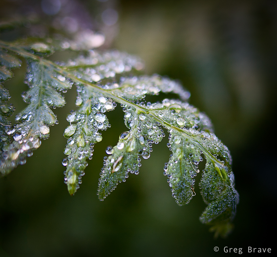
As in most of my walks in the nature, I couldn’t resist taking a few macro shots. I didn’t have a tripod with me (what a rookie mistake! ), so this photo might not be tack sharp, but it is sharp enough to show all the diversity of the water drops. I really like the tenderness and fragility in this photograph… one careless move and this beauty will disappear.
And finally I’d like to present my best photo from that walk in Dandenong Ranges.
Click on the photo to enlarge.
I feel that in this photo I succeeded to create order from the forest’s chaos. I found a pattern made by the standing ferns, and a space in between, and the light was just right. I tend to think that in nature photography great photo is created when two factors come together – pure luck (the light, weather conditions) and the photographer’s vision. Sure, if there is no vision, there won’t be any great photos, but when you have the vision you still need the nature to play along with it.
I hope that you enjoyed this journey into the Dandenong ranges, a beautiful place in Australia, and I’ll see you next time right here, on my photo pathway.
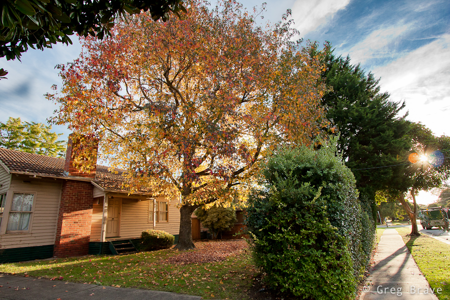
While Spring rules in most parts of the world now, Australia is heading for winter. Driving through my neighborhood towards home from work I felt a kind of Autumn mood in the air. So when I came home I quickly grabbed my camera and went out for a walk. I wanted to capture this mood before it vanished.
This maple tree fascinated me. The autumn colors are revealed here in all their beauty. Warm light of the setting sun gets even warmer filtered through the orange-yellow leaves creating a very cosy atmosphere. The only thing I’m missing in this photo is a lonely person sitting on the stairs…
Click on the photo to enlarge.
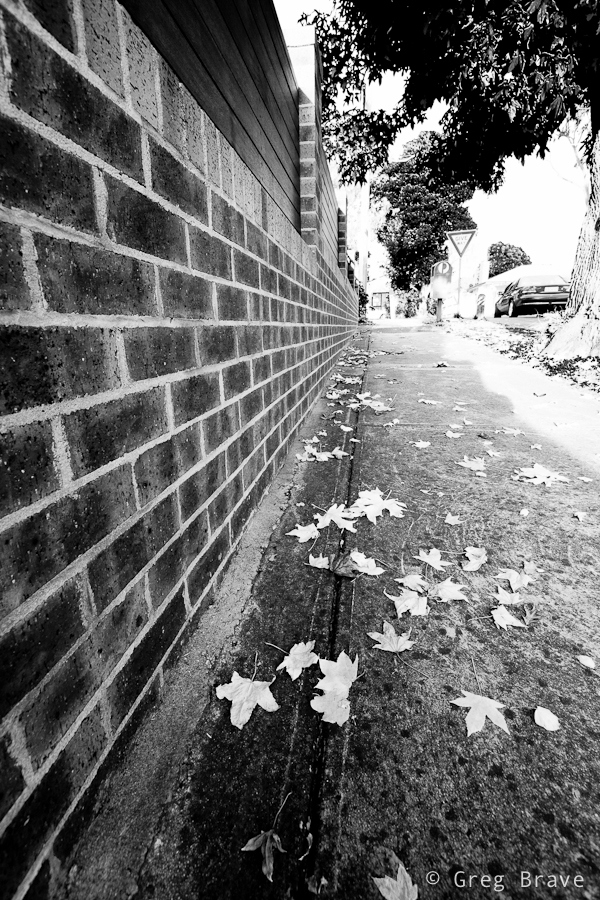
In the next photo I focused my attention on the fallen Autumn leaves adding the fence on the left to emphasize the perspective and add a sense of movement to the photograph.
Click on the photo to enlarge.
At first I didn’t realize why I wanted to capture what you see in the next photo, but then I realized that it was the combination of cleanliness of forms, simplicity of the composition, and the background texture. Combined together these three factors formed a complete picture in my mind and I pressed the shutter-release button.
Click on the photo to enlarge.
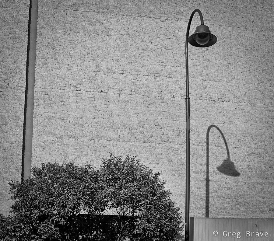
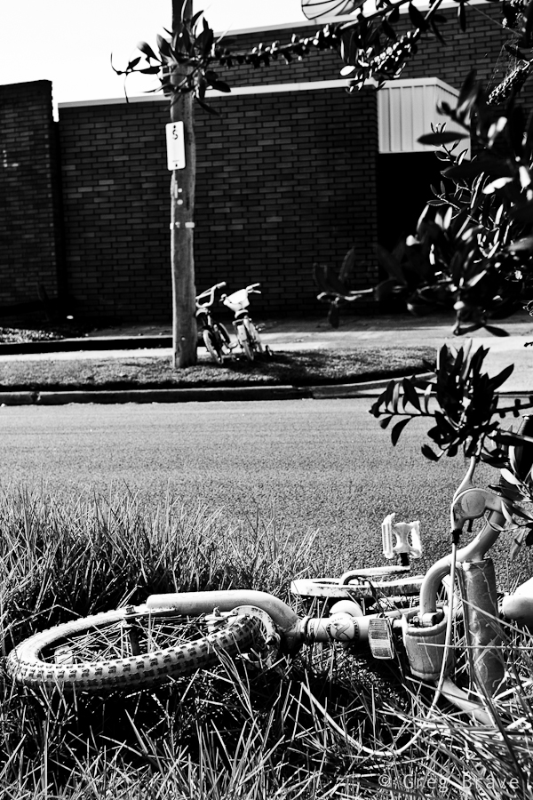
Walking around I saw these bicycles and immediately the words such as “separation”, “loneliness”, “different” started popping into my mind. You know kids can be cruel sometimes, and in my mind this was a good visualization of this fact. Even thought there is not much of an Autumn mood in this picture, since I took it on the same walk I decided to present it here.
Click on the photo to enlarge.
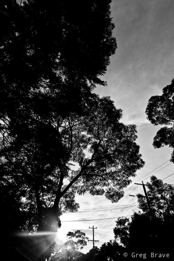
And finally going back home, when Sun was getting close to the horizon, I took this photo. I can’t say much about it except the fact that I like it.
Click on the photo to enlarge.
Hope you enjoyed the photos. Feel free to comment on them in the comments section below, I’d be happy to know what you think!
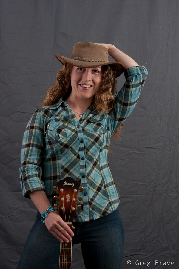
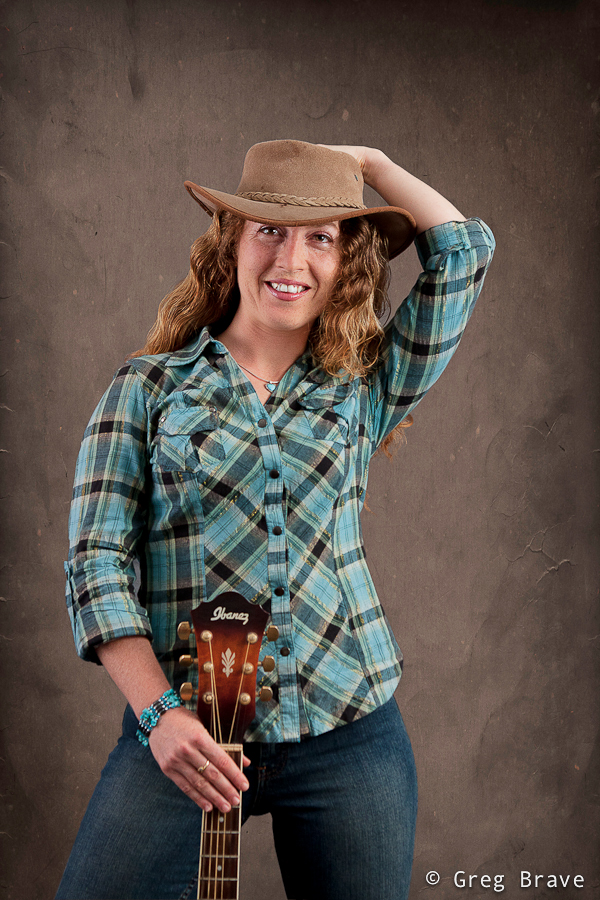
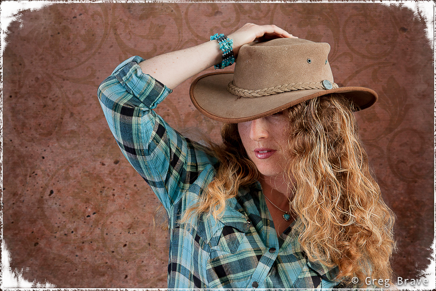
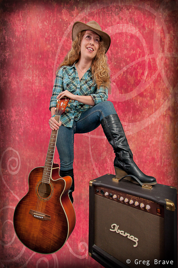
For quite some time now I wanted to shoot portraits, and finally I found a model to shoot!
Since photography is my hobby I don’t have a studio, so I had to improvise. I converted my living room into a studio for a day, and shot my model on gray muslin background. I bet everybody heard about these famous muslin backgrounds. But what the guys who sell them to you don’t mention is that you receive the muslin in a really crumpled state, and if it is 3 by 6 meters long, there is no way you can iron it by yourself. But I had no other choice than to use what I had.
My solution to this problem was in post processing – I had to “cut” the model from the original background and paste it onto another background in Photoshop. You can see before and after images in the example below.
Click on the photos to enlarge.
In order create precise selection of the model in Photoshop I used the pen tool. Many people don’t use this tool because they find it confusing just like I did before I saw this tutorial:
After getting used to the Pen tool, I promise you that you won’t ever go back to lasso or any other selection tool when you need to do a complex selection. After I selected the model using pen tool, I used the option “Refine Edge” to refine the edge of the selection in the areas with model’s hair. It is really important to make the hair look natural on the new background. My last step in the selection process was feathering the whole selection by 2 pixels to add a more seamless transition from the model to background.
Click on the photo to enlarge.
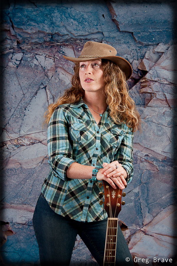
If you don’t want to cut and paste your model, and still use your crumpled muslin background, here is how you can do that:
If you have enough space, put your model far from the background, and use wide aperture – this will make the background go out of focus and its wrinkles won’t be visible. In addition to that, you can setup your lighting so that no significant light will fall on the background making it dark (you can use gobos for that).
Click on the photo to enlarge.
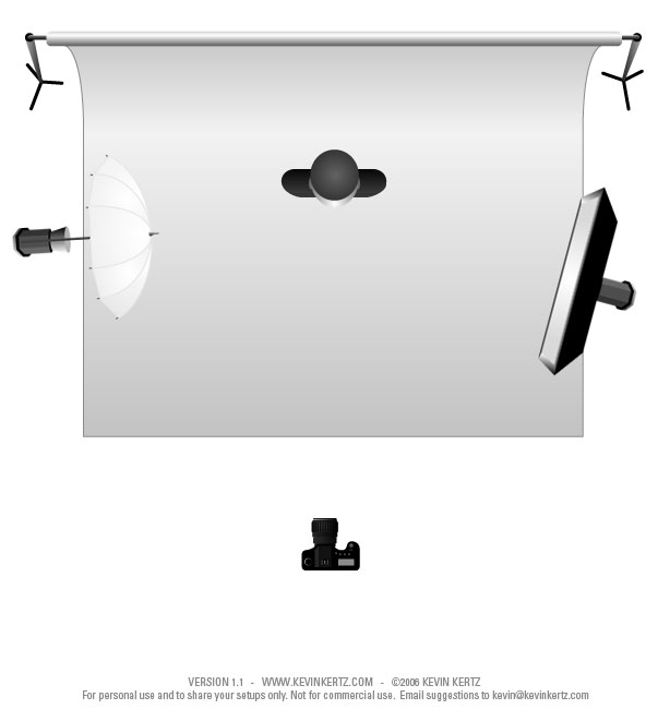
In all the photos you see here I used pretty much the same lighting setup, only slightly varying the position of my strobes and their strength. Here is my basic lighting setup diagram:
Click on the photo to enlarge.
You probably wonder where I got backgrounds that I use on these photos, and it is no secret. You must have heard about OnOne software. I used one of their products named PhotoFrame. This product can work as a standalone application or as a plug-in for Photoshop and Lightroom. The primary aim of this product is to supply the user with lots of photo-frame templates, so you can choose and add nice framing to your images, but it also has a great collection of backgrounds. I downloaded their trial version here. In the image below you can also see the frame that I created with this plug-in.
Click on the photo to enlarge.
But it is the only frame that I used from PhotoFrame. Other “frames” that you can see in the photos here, are simply a creative use of vignetting feature in Lightroom, which is pretty easy to achieve – you simply reduce the roundness of the vignette somewhere around -90 to -100, set it’s midpoint between 0 and 15, and the amount slider is up to you.
Click on the photo to enlarge.
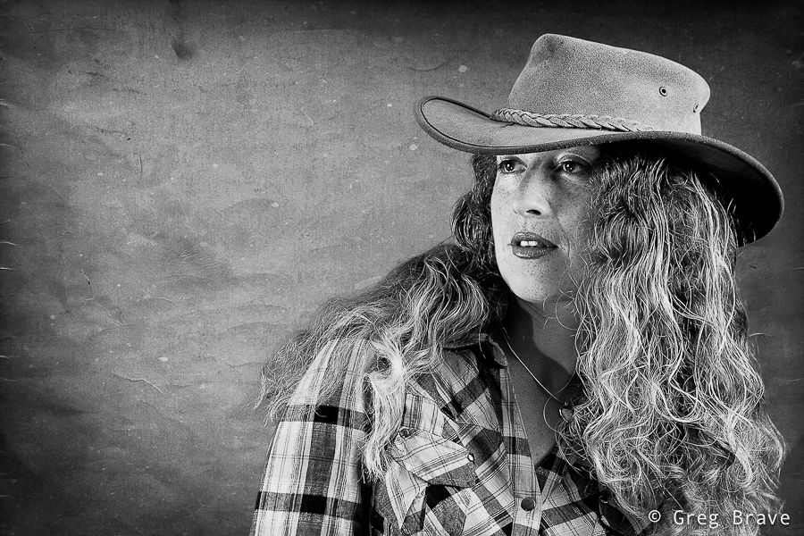
While most important aspects of portrait photography lie in the artistic sphere rather than technical, still in order to get acceptable results, all the technical details must be carried out correctly, and this is why I dedicated this article to them. Nevertheless after all the technical aspects are set and done, I forget about them and concentrate on the model and on my artistic perceptions of what I want to achieve from the shoot.
Click on the photo to enlarge.
If you have any questions regarding the issues brought up in this post, feel free to leave them in the comments below, and as always any other comments are highly appreciated.
This is another photo-sharing post. Recently I had the time to revive my small home studio, so while I was at it, I took some photos… actually I took a lot of photos, most of which aren’t worthy of sharing.
Here’s the only two I liked:
This photo was taken inside light tent with two flashes (one from each side). I call it “Almost Symmetrical”. Nothing much to it, just having fun 🙂
Click on the photo to enlarge.
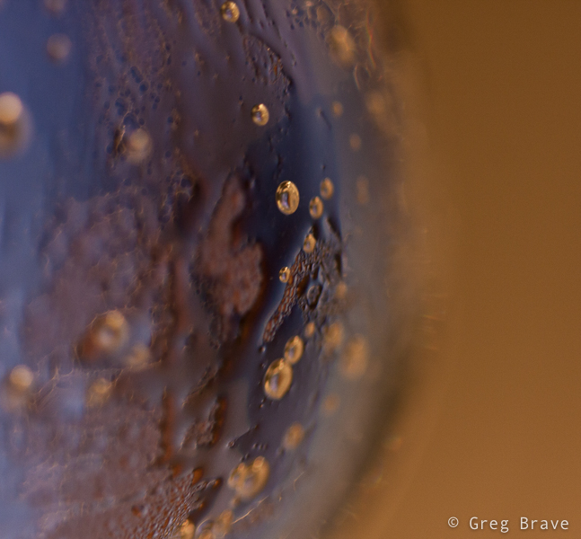
And I also liked this abstract photo, which is really a closeup of glass filled with cold bubbling mineral water, with yellow light in background.
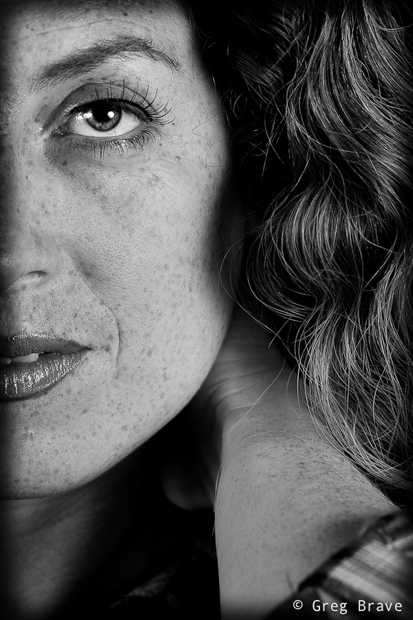
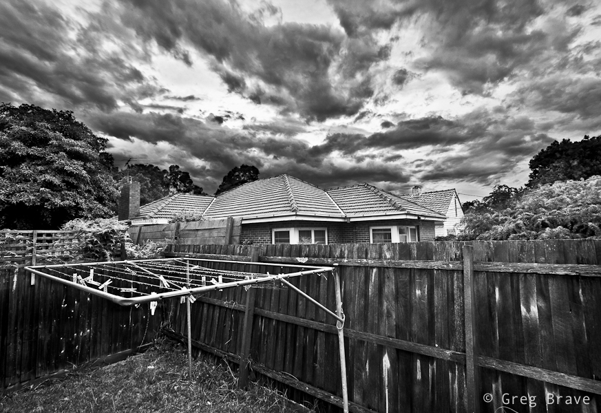
In one of my previous articles I wrote about shooting with intention for B&W (tip number 6), and not merely looking at your photos and trying to convert them to B&W to see if that looks good. Now I would like to add the concept “seeing in black and white”. It comes to you when you shoot a lot of b&w images – you then gain the ability to look at your composition and in your mind see how it would look in b&w. Sometimes, the weather is such that you don’t need this ability – the colors are simply black (dark gray) and white (light gray), but on other occasions the sky may be blue with white clouds and everything around you so colorful that imagining how it would look in b&w would be difficult. This is when the “seeing in black and white” skill comes handy.
Click on the photo to enlarge.
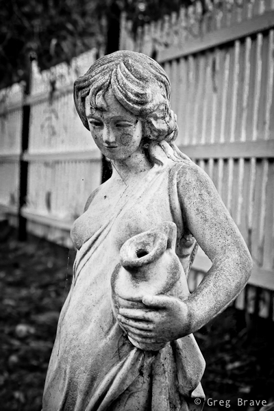
Sometimes the scene itself calls for b&w, as it was with this garden statue. This woman was standing in this garden for a long time and her skin turned from pearl white to muddy gray, the same happened to the color of the fence, and in any case the emphasis here is not on the color.
Click on the photo to enlarge.
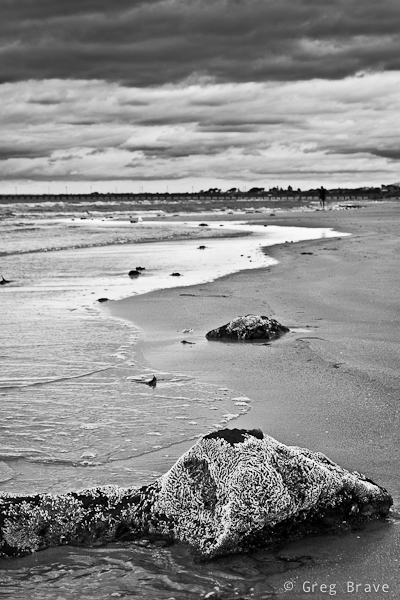
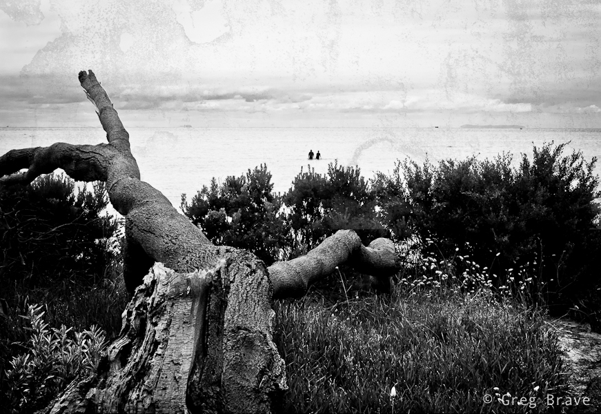
Black and white in photography often helps to convey mood, and emphasize shapes and textures.
Click on the photo to enlarge.
Here is another example of emphasizing shapes by shooting in black ans white.
Click on the photo to enlarge.
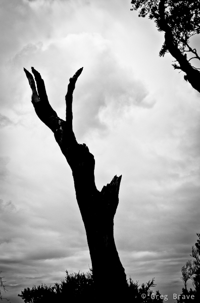
Did I mention mood already? I just love it when the sky looks like it is going to rain any minute, and light is dim. These minutes before the rain are great for capturing photos such as this one. I wish there would be a bird sitting on the hanger at the foreground though…
Click on the photo to enlarge.
I hope you liked the photographs, and I’ll see you next time!
As always your comments, thoughts, and experiences are highly appreciated.
Sometimes photo doesn’t need a frame, it is complete as it is. But then there are photographs that just don’t feel right until you frame them. Frame often adds sense of completeness to the photograph. Photographers often look for compositional elements to naturally frame their subject within the photograph.
It is also important to choose appropriate frame for each particular photo, otherwise it might distract the viewer, or even worse – ruin the whole impression from the photograph.
In our digital age it has become common practice to add frame directly to the photo during the post processing. This way of adding a frame has one significant advantage – flexibility. There are many different
applications that have collections of various frames, which you can add to your photos, or if you are familiar with programs like Photoshop you can draw your own frame around the photograph.
Since most of the photos that we come across are seen on display (either from our digital cameras or the Internet) adding frame directly to the digital photo adds to the viewing experience, and later photo can be printed and hung on the wall without the additional expense on the “real” frame (actually this point can be argued by many who prefer real frames).
I’d like to present here two examples of photos with digitally added frames.
Click on the photo to enlarge.
In this photo I added white frame, which in my opinion turns it to a nice postcard, smoothly fading edges of the image and creating dreamy look.
The photo below would be incomplete without a frame, it’s black edges would leave a sense of incompleteness. So I decided to add a frame. The frame’s color is intentionally greenish to match the tone of the photograph.
Click on the photo to enlarge.
What do you think about framing your photographs?
Remember, you only have to enter your name to leave a comment.
There is so much talk about post processing, and whether it is good or bad. There are people who never post process their photos, and there are also people who always process their photos, and also anything in between.
I do process my images in Lightroom or Photoshop, but not always. Sometimes the weather is perfect, and the air is so clear that nothing needs improvement. But in our busy world, we don’t always have the time to wait for the perfect conditions, and have to settle for whatever weather there is when we have the time for shooting. In such cases post processing can significantly improve the end result, and it is very important to shoot RAW in such cases because it gives you more flexibility in post processing.
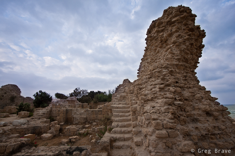
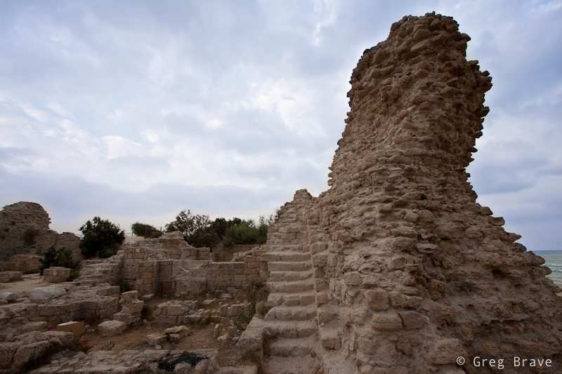
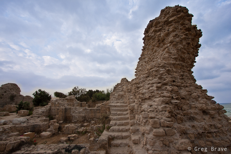
In this post I will walk you through my Lightroom post processing steps, using one of the recent photos I took. Below on the left you can see the initial photo of an old fortress that I took on early morning. Unfortunately the sky was covered with clouds so that there was no contrast in the photograph.
Below on the right you can see the final image, after I finished working on it in Lightroom 3.
Click on the photo to enlarge.
So how I achieved this end result? Let me walk you step by step. All the steps below were performed in the Develop module.
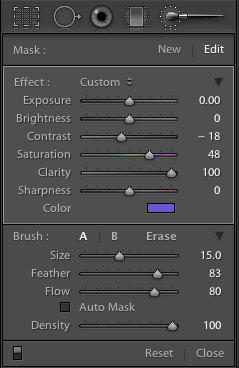
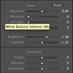
First of all the sky bothered me the most in my initial image. It lacked contrast and was completely colorless. So I opened the adjustment brush, set it up and covered the sky area. Below you can see the screen shot of the settings that I used for the adjustment brush. Let’s go through some of them:
Contrast – though in most cases increasing contrast is more useful, in this case with clouds decreasing the contrast revealed more detail in the clouds.
Saturation – I increased the saturation of the adjustment brush because I also changed the Color to a shade of blue (as I’ll show in the next screen shot), and for this addition of color to be seen better I had to increase the saturation.
Clarity – Clarity is always good for clouds :). Really, increasing clarity makes clouds pop.
Color – I decided to add a slight color tint to the clouds so that they won’t be boring gray, but still have a realistic color.
Feather and Flow of the brush are needed for creating smooth gradients between the adjusted and not adjusted areas. The values that you see here are not a must, and you’ll have to play with them to find what suits your taste.
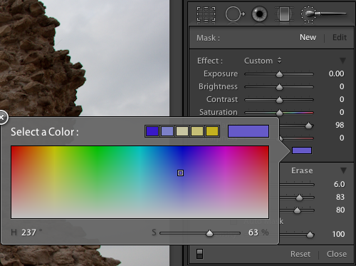
Below you can see the color selection box and the values that I chose.
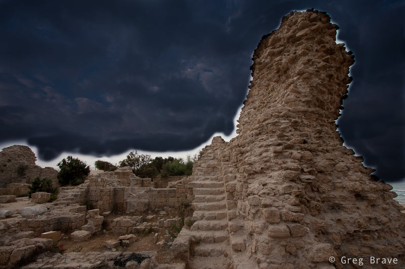
Now, I painted with the adjustment brush over the sky. There is a slight problem when you want to paint with adjustment brush over large areas, especially when the changes that brush does are subtle – you might miss a few spots in the middle and even more at the edges. I found a pretty easy solution for this: temporarily, in the adjustment brush settings decrease the exposure value to -4 so that in addition to all your essential adjustments, you’ll also significantly darken the image in the painted area. This will make the painted area perfectly visible. Then, after selecting everything that you want, slide the exposure slider back to it’s initial position.
In the image below you can see the clouds painted over with the adjustment brush with exposure set to -4.
Click on the photo to enlarge.
And here you can see the result of painting with the adjustment brush after I returned the exposure slider to zero:
Click on the photo to enlarge.
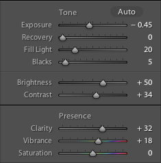
After adjusting the sky I examined the overall look and decided to make a few more adjustments to the whole image. In the screen shot below you can see the initial settings, with which I started.
Let me explain the adjustments that I did.
I decreased Exposure slider to -0.45 in order to reveal even more details in clouds, but this also darkened too much the lower part of the image. To compensate for that I increased the Fill Light slider to 20. After increasing the fill light, I felt lack of contrast in the fortress, so I increased the Contrast to +34. Next I increased the Clarity and Vibrance just a little for a finishing touch. In the screen shot below you can see the final settings.
And this is how the image looked like after performing those changes.
Click on the photo to enlarge.
We’re almost done, but not just yet.
I stared at the image for a few minutes, and it seemed to me that something was missing. Finally I understood what it was – subtle vignetting. Let me explain. The shape of the right column together with the clouds create a sense of movement from the outer frame towards the center of the image, and vignetting would emphasize this sense of movement.
And here is the final image (same one as in the beginning of this post).
Click on the photo to enlarge.
So this is how I do my post processing – by first analyzing the image, deciding what is missing or could be improved, and performing the adjustments. Of course this whole process is not “scientific” at all. It is very intuitive and imaginative, because in order to achieve an end result you have to visualize it first. Sometimes though it is more like “lets move this slider and see what it does to the image”.
Did you find this article helpful? How do you post process your images? Any examples of before and after will be much appreciated, and
Remember, you only have to enter your name to leave a comment!
This time I would like to talk about creating abstract photographs. There are many ways of doing it, and one of the simplest ones is to take a closeup shot of something with interesting texture making it unclear what it is from one side but creating an interesting combination of forms, colors etc. from the other side.
For example you can find an old wooden door with paint which partially came off and take a closeup of it, or take closeup shots of rusty metal. Another idea would be taking closeup shots of architectural creations including particular parts without revealing the form of the building. There are many more ways of course, and these are only a few examples.
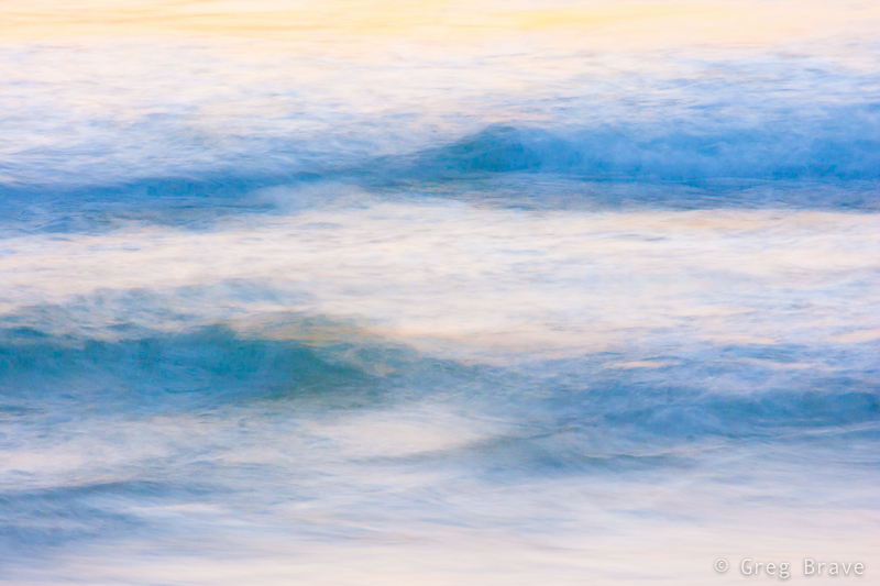
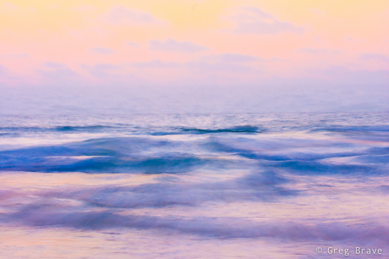
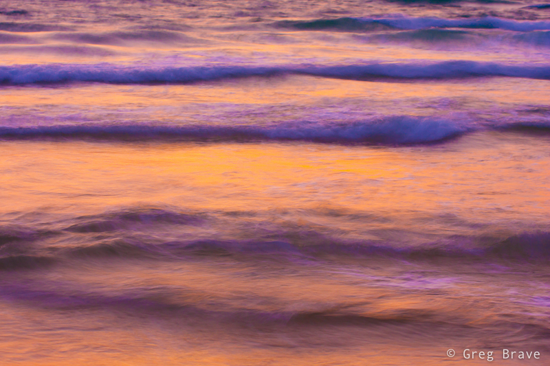
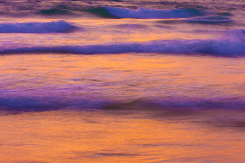
For these series of abstract photographs I decided to photograph waves. I came to the seashore about an hour before the sunset, put down my tripod, mounted my Canon 40D and started shooting.
Photographs by Greg Brave. Click on the photo to enlarge.
As you can see these all tight crops (well all except one) of waves taken with long exposure. Using long exposure in this case is critical because if I would use normal exposure (1/50 sec and faster) then the waves would be easily recognizable even in tight crops.
Photographs by Greg Brave. Click on the photo to enlarge.
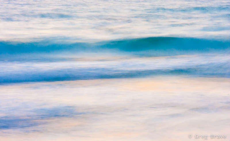
After the shoot I came home, opened the photos in Lightroom and started playing with them trying to get the best abstract results I can. And I found something really beautiful, which I would like to share with you.
Everybody plays with Vibrance and Saturation controls (in any photo processing application), but when you work on a “real world” images, not abstract, increasing saturation or vibrance too much makes the image look not real, over-saturated. But in this case my goal was to create a beautiful abstract image, and I saw that when I crank the saturation slider to the maximum, it gives me very nice result making the photos look more like paintings and also emphasizing the warm sunset colors. But it wasn’t perfect, and I am sure that many of you encountered this – when you increase the saturation to a certain level you start having color artifacts in your image, and you are forced to decrease it to the level where there are no artifacts.
Here is what I found in Lightroom – in order to eliminate these color artifacts you have to increase the Luminance Noise Reduction slider (in the Develop module) until no color artifacts present in the image! I was stunned – because now I could increase saturation as much as I wanted. There is one downside to it though – the image looses some of its sharpness, which wasn’t a problem in my case.
Photograph by Greg Brave. Click on the photo to enlarge.
I would be happy to hear what you think of these images. How would you create an abstract photograph?
Remember, you only have to enter your name to leave a comment!
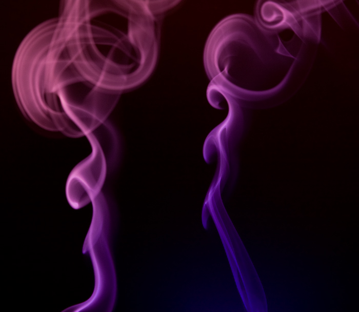
In every photographer’s evolution process comes a time when he tries to photograph smoke. As a result you can see many photos of smoke on the internet. Now my time has come!
As always I wanted to do something different with smoke, so that my photos will differ from most of what can be seen online. Common practice with photographing smoke is to photograph it with plain white flash and then add color to it in photoshop. But I decided to do it a little bit different – I used flashes with colored gels on them, so I received the colored smoke “in-camera”. That was not enough for me and I tried to use two flashes with different color gels pointing at different parts of smoke, and here you can see what came out of it:
Photo by Greg Brave. Click on the photo to enlarge.
The red flash had a gobo so that the light wouldn’t spill on the top blue part, and it was also stronger than blue flash so it would overpower the blue light spilling from above. Of course I didn’t get the result that you see in the photo above right away. It took me couple dozens of shots to achieve it.
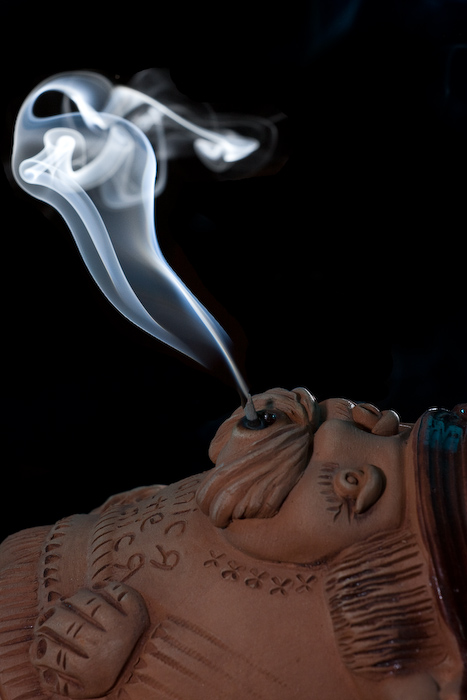
My next move was the following one – I thought that most of the beautiful smoke I saw online wasn’t “attached” to anything, so I tried to add a “source” to the smoke as you can see in the photo below.
Photo by Greg Brave. Click on the photo to enlarge.
In this photo I faced a technical issue – the flash power that I needed to properly light the smoke was too much for the “smoker” and resulted in overexposed lower part of the photo. I solved this issue by using again two flashes. The flash that was lighting the smoke was placed behind and to the right of the “smoker” and set to “high” power. Then I used a second flash to light the smoker, and placed it in front of the smoker and a little bit to the left. This flash was set to a much lower power and was directed in such a way that the light from it wouldn’t spill on the background (because I wanted a black background).
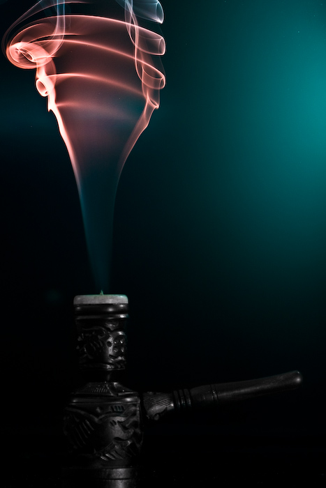
Here is another attempt of adding a source to the smoke.
Photo by Greg Brave. Click on the photo to enlarge.
For this shot I also used two flashes – one with dark-green and another with red gel on it. The red flash was placed from the left and pointed high up to light the upper part of the smoke, while the green flash was placed to the right of the composition and pointed to the lower part. In this photo I had a glossy background and you can see the greenish reflection of the flash in it. I tried to shoot this scene also with matte background but I liked this version more because it adds nice color touch to the overall dark image.
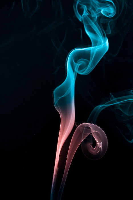
Continuing my experiments I placed two smoke sources and tried to blow on the smoke to create different shapes while I am taking shots of it. I got many interesting photos this way, and this is the one photo I chose to present here:
Photo by Greg Brave. Click on the photo to enlarge.
Strangely it reminds me of two opposite sex persons having a conversation. In this shot and two of the following shots I used two flashes with blue and red gels on them, placed from the sides of the frame pointed up at the smoke and away from the background.
This is pretty important – if you want your background to remain dark, you have to point your flashes towards the camera and away from the background. When I say “towards the camera” it doesn’t mean that flashes have to point straight into the lens, they just need to be pointed in the direction of the camera and, again, away from the background. This way, since the light travels in straight lines it won’t hit the background (unless it reflects off something, so make sure it doesn’t) leaving it black.
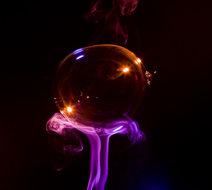
During the time that I was experimenting with smoke I was constantly thinking what more can I do to make my photos stand out. And one day, at work, my friend brought this childish toy to make soap bubbles. We had so much fun playing with it and remembering the days that we were kids… and then it hit me – I can combine smoke with bubbles to create beautiful images. At this point I started to visualize what can be done with smoke and bubbles, and the idea that I liked the most was to create image of a soap bubble resting on top of smoke pillar.
This was not an easy task to do, as I didn’t have anyone to help me shoot this. So here is what I did: I placed my camera on a tripod, and pointed it exactly at the area where I intended to “place” a bubble on top of the smoke pillar. I focused the lens on the plane of the smoke and changed to manual focus. Then I connected a remote shutter release cable so that I could stand away from the camera. Then I just made a soap bubble and tried to place it where I wanted, shooting in continuous mode during this whole process. Then bubble would pop, and after checking the LCD and seeing that I didn’t get any satisfactory results I would repeat the process.
Eventually, after way too many failures 🙂 here is what I’ve got:
Photo by Greg Brave. Click on the photo to enlarge.
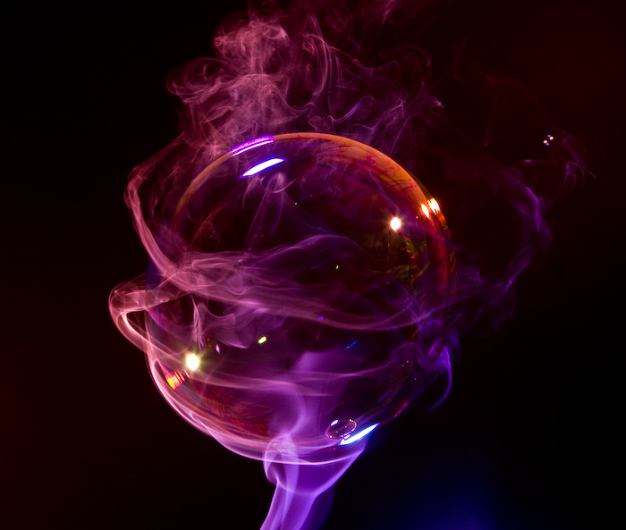
This is pretty much what I had in mind. But in the process I also got the following image, and I like it much more than the image above. It looks like a planet in deep space…
Photo by Greg Brave. Click on the photo to enlarge.
One more tip if you decide to try this yourself – bubbles reflect everything, and I mean EVERYTHING around them. So after seeing myself being reflected in the bubbles, I had to wear black sweater and a black hat to eliminate my reflection as much as possible. I also turned off any additional lights in the room.
In the next, and last photo I tried a little different approach – I used only one flash but I shot it through umbrella in order to make my light source bigger. In the result below you can see that umbrella can be recognized in the reflection, but I still like this photo. I call it “Aliens!” 🙂
Photo by Greg Brave. Click on the photo to enlarge.
I hope that you learned something new from my experience with smoke and bubbles and it inspired you to try this yourself.
Comments, suggestions and critiques are welcome as always, and if you have any questions, technical or other, you can leave a comment or drop me an email to greg at photopathway dot com
My friend had a trip to the US, and I used this opportunity to get me this great Canon lens, which I have been dreaming about for quite some time!
As you might have already guessed this is a Canon 70-200 f4 L-series lens. This is the cheapest one from this line of Canon lenses, f4, without image stabilizer. I bought it at B&H for about 630USD and had it shipped to the address my friend was staying at.
The telephoto lens I used before was Canon 75-300 f4-5.6 III USM, given to me as a present. I have enjoyed that lens for about two years, but eventually its lack of sharpness and overall image quality comparing to my other lenses started to bother me a great deal. After doing a little research, I came up with this Canon 70-200 f4 L lens. After reading tons of reviews and watching photos made with this lens I was convinced that it had very good sharpness and image quality, and though I was loosing a 200 to 300 mm range compared to my old lens, I decided to go for it.
There are also much more expensive variations of this lens – f4 with image stabilizer, which goes at B&H at about 1200USD (!!!) and there is also Canon 70-200 f2.8 IS L (1800USD). All these models are far beyond my financial capability, but I have to say that even if I could afford them, I am not sure at all that I would buy them.
This is something that has to be explained. When you look for a lens, first of all you ask yourself what are you going to shoot with it? In my case it is landscapes, portraits, and studio photography.
When I shoot landscapes I mostly use a tripod anyway, so I don’t need that additional f-stop for quicker shutter speeds. In addition when shooting landscapes smaller apertures are used anyway.
When I shoot portraits and studio, I either do it in daylight, which is bright enough for f4, or I use flashes, and their power and position can also be adjusted for working with f4 and smaller apertures.
The more expensive Canon 70-200 models have also one disadvantage – weight: the f2.8 IS model weights about one 1.5 kilos (!) and the f4 IS model weights 760 gr, while f4 without image stabilizer (the one that I bought) weights 700 gr. The weight is very important when you are hiking with your photo gear, and also when you are holding camera in your hand for a long time.
As you can see currently I have no real need for the more expensive models, but what is important that Canon 70-200 f4 L – is an L-series lens, which means that it has L-series optical components, and the image quality it produces is the same (if not better due to its simpler build) as its more expensive modifications.
You might ask “but who does need those expensive models?”. Well I can think of a few reasons – for example birds photographers really need that lens-speed, or indoor sports photographers – there are many occasions in which they can’t use flashes, but have to shoot quickly moving subjects.
Enough about my choices. What about the lens itself? I will not write a full review here, at least not just yet, but I will share my first impression with you.
I am very happy with it. The build quality is superb, the lens sits good in my hand and the focus ring is very comfortable. The image quality is top-notch. The sharpness is the best I had so far, and the colors are stunning. This lens looks heavier and bulkier than it actually is, and it comes with its own original lens hood. The focusing process is almost silent and pretty quick. One disadvantage of this lens is that its filter size is 67mm and not 77mm like most of the L-series lenses, so I will have to buy an additional polarizing filter for it.
Enough words for this post, here are a couple of photos I made using the Canon 70-200 f4 L lens, and as always comments and critiques are welcome!
Ahula Reserve . Photograph by Greg Brave. Click on the photo to enlarge.
Family Vacation. Photograph by Greg Brave. Click on the photo to enlarge.
Watch Your Step… Photograph by Greg Brave. Click on the photo to enlarge.
Recently I was learning a lot about lighting and together with that I am now slowly making my way into the still life photography. I made me my own little studio. Well not really a studio, but a table and some accessories so that I can try and photograph still life. For one of my sessions I decided to shoot a glass with liquid in it. It turned out to be not a simple task as glass reflects absolutely everything! So that particular session wasn’t successful at all, but I didn’t give up, and after working on it for a few weeks, I finally got my lighting straight and about a week ago I made the following image:
Photograph by Greg Brave. Click on the photo to enlarge.
It looked pretty darn good to me, so I posted it on PhotoSig to try and get some critiques. To tell you the truth I was hoping to receive more compliments than critiques. I actually received some compliments, but there were two critiques that simply opened my eyes to still life photography, and I would like to present here several tips from those critiques. But first take a good look at the photo above and try to see what is wrong with it.
… ok, now, when you have your own opinion on my photo lets see what improvements I could have made to that shot.
The highlight on the glass seems stronger than the highlight on the pepper, and therefore takes away more attention – reduce the highlight on the glass.
The pepper that was chosen is not flawless, but it is also not an old one so that little imperfections that it has don’t emphasize its age, and only disturb the eye of the viewer.
Pepper has a darker are due to my lighting imperfection. I should have put a reflector near the pepper to light better that area.
There is a reddish area at the foreground that should be fixed.
The definition of the foreground (the contrast) could also be better.
The glass is poorly separated from the background. In order to better separate it, two black cards can be placed at two sides of the image (outside the composition). They would throw a black reflections on the glass contours, making it better separated from the background.
The background darkens towards the top of the photo. A reflector or soft box could be placed on the top to fix that.
Now I also received additional and very useful tips that I sure will use in my still life photography (when appropriate of course!). Here are some of them:
Always dilute the liquid to make it less dark
When possible slightly crumple some foil small enough that it can’t be seen and place it behind the drink, so that it will add sparkle to the liquid.
If you want to add bubbles to the liquid, then add glycerin and use straw to make a bubble.
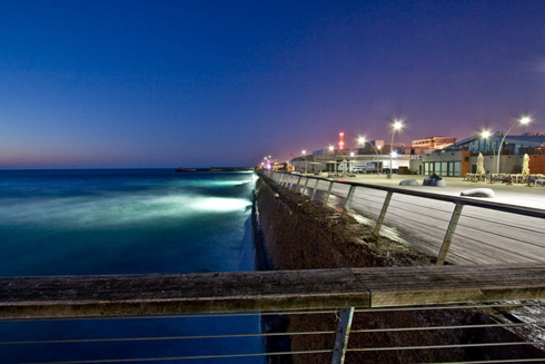
I hope this day was as good for you as it was good for me. My photo was printed in National Geographic magazine, Israeli August issue! I wanted to share my joy, and I’d also like to explain how I did it. I imagine that this is a dream for many photographers.
As you know (or might guess) there is a National Geographic web site – www.nationalgeographic.com. At their web site they also have a section named “Your Shot”. In this section people from all over the world submit their photos. Each day twelve photos are picked to be displayed on the site that same day – they call it “The Daily Dozen”. But in addition photos that editors like the most are picked and printed in the printed version of National Geographic magazine.
Since many countries translate National Geographic magazine to their language, they also add to each issue some articles regarding the local country. In that section they sometimes also print photos from local photographers with a few lines about the photographer and the photograph.
I created an account at National Geographic Your Shot section and uploaded my photo there. It turned out that they liked it in NG headquarters in Washington and also in Israel, contacted me and asked for a little info about me and the photograph. Then after a month or two – voila! my photo was printed, and I also received a free issue of that month.
Now I will show my photo (show off!!!) and describe how I shot it. First of all here is the photo:
I took this photograph about 40 minutes after the sunset, and in addition I was using polarizer to reduce the light even more. Actually polarizer created an additional effect – it made colors more saturated by eliminating the reflections (or anything that was left of them after the sunset). Of course I was using a tripod and a remote shutter cord to eliminate camera shake. The exposure time was 25 seconds and the aperture was f7.1. I used wide angle lens (Canon 10-22mm) at its almost widest angle (12mm).
The interesting thing about this photograph was that during the 25 seconds of exposure many people went by, but they are not seen in the photo! It was because people were too dark and stayed too short time inside the frame to get “noticed” by the camera. The only person that is visible is the one that was sitting during all that time on the bench.
I shot several photos at that location slightly changing the composition. I had a shot without the rail in front. That shot was “divided” in two sections – the sea, and the boardwalk. I felt that it was out of balance, and searched for something to balance the photo. The rail across the bottom of the photograph provided this balance creating the final shot I was satisfied with.
You can see more photographs from that day on my web site where I display my work: IsraNature in the album named “Sea World”. Well what the heck – click here to go directly to that album. I recommend watching all the photos on full screen (there is a button at lower right corner).
And last but not least here is the link to the National Geographic “Your Shot” section: Your Shot
Many advanced amateur photographers are familiar with notion of f-stops and shutter speeds, and also know that there are many different combinations of f-stop+shutter speed that allow for the same amount of light to hit the sensor of the camera (or the film). But there is a catch involved in it that I would like to focus your attention on in this article.
I will say it right away that for this article to be of any use to you, you have to know what is f-stop, shutter speed, and exposure. But even that said I’ll start with a little theory, which may serve just as reminder for most of the readers (myself included) but for beginner photographers it might be even something they didn’t know before.
There are many different combinations of f-stop and shutter speed that represent the same exposure, so for the same lighting conditions you can choose for example f/11 with 1/15s for correct exposure, but you can also choose f/2 with 1/500 for exactly the same exposure. Of course there are substantial differences between these two settings, which you also have to take under consideration, but both of them allow for the same exposure.
So what exactly are the combinations of f-stop and shutter speed that result in the same exposure?
The answer is pretty simple, but with a little twist. First – the answer. There are 9 full f-stops, and also 9 common shutter speeds (actually there are few more, but here I’ll concentrate on these). So if your correct exposure consists from a certain f-stop and a certain shutter speed from these nine, then to receive exactly the same exposure with different f-stop and shutter speed combination you’ll have, for example, to set one f-stop above your current one, and one shutter speed below your current one, thus you will close your aperture so that less light will hit the sensor, but at the same time you’ll prolong the time that the sensor is exposed, so eventually the same amount of light will hit the sensor. This way you can continue changing the f-stop/shutter speed combinations but still have the same exposure.
And now the twist:
In the modern cameras you can actually set more f-stops and shutter speed than these 9. Between the full f-stops there are now intermediate f-stops, and this fact confused me because now when I changed to the next f-stop I didn’t know whether it was a full one or an intermediate, same thing being with shutter speeds. So having modern digital camera denied me this knowledge of getting the same exposure due to having intermediate settings.
What are original full f-stops and shutter speeds are then? Well, here they are for your (and mine) convenience:
Just to make it more clear – if you set your camera to automatic mode, take a shot and see that it used f5.6 f-stop with 1/60s shutter speed, you then can switch to manual mode and set f/4 with 1/125s and also have properly exposed photograph. Of course that by changing from f/5.6 to f/4 you reduced your depth of focus, and also shutter speed of 1/125s will make it harder to create blurring effect, but about these implications of different f-stops and shutter speeds I will write in another article. And until then – take care!
I learned the following tips from two professional photographers I happen to know. These are not the most common tips that any amateur receives like “Try shooting the same frame with different exposures and see what works best” or “To freeze action use fast shutter speed”. These tips are more profound and “rare” as I call them, having more meaning than I can actually explain here, so you will have to rethink for yourself some of them. And one more thing – some of them can be achieved only with SLR (Single Lens Reflex) camera.
1. When looking through the viewfinder “scan” with your eye the whole frame.
Human eye is seeing the sharpest only the object that it looks at. All other objects are not in perfect focus. But camera sees all the things that are in the same plane in the same sharpness, and if your aperture fairly small then many more planes will get sharp. So when taking the shot you have to be aware of other “sharp” objects that will be visible in the final photo.
One way to do this “scan” is to first focus with AF (auto focus) on what you want, and then rotate the manual focus ring just a little bit. It will make the whole frame a little blurred. When everything is blurred your eye will automatically scan the whole frame for something sharp, thus going over the whole frame.
Another way is just to stare into the view finder for a few seconds, not trying to focus on anything specific. This is something that takes a little practice to master.
2. Use manual focus override to adjust focus to what you need.
Sometimes you need to control the DOF (Depth Of Field) to achieve the desired result. First you focus on your main subject using auto focus, and then while the shutter release button is half-pressed you turn the manual focus override ring to adjust the focus to what you need. Have in mind though that manual focus override is not featured in all lenses. There are cheaper lenses that can work only in automatic or manual mode but not both simultaneously.
3. Initially compose the photo for cropping or adjustments.
Many amateur photographers just shoot the photo and then when they open it in photo-processing software (such as Picasa, Lightroom, Photoshop, ACDSee etc.), and only then, they start thinking what they can do to improve it. Maybe crop it like this? Maybe emphasize a little more shadows? Try to think about these things (especially the crop) before pressing the shutter-release button. It will make it much easier to perform cropping and other adjustments later. You will also be forced to THINK before you shoot.
4. During the shoot of an event – shoot on manual.
When you are shooting events that happen fast, you can’t afford to mess with camera controls. You can miss the shot of the day that way. So what you can do is: set your camera to aperture priority mode, and choose the desired aperture. Then half press the shutter-release button and on the screen (or inside the viewfinder) you will see the suggested shutter speed. Take a few photos and see if you like what you get (in terms of exposure), if not adjust exposure compensation. After you are satisfied, switch to manual and set the same values of shutter and aperture. From now on shoot on manual during the whole event with the same settings, unless there are drastic changes of light in the scene. I realize that this is kind of “half-tip” and many professional photographers are working only in manual changing between f-stops and exposure automatically to get the best results. But here I am talking about amateurs, like myself, who are not just yet there.
5.Don’t look at the back LCD screen after each photo.
Actually this tip is pretty controversial, but I’ll stick with it. Not looking at the LCD display after taking each shot makes you THINK more before each shot, and also leaves a room for anticipation towards the final images. This is a good exercise, and while it might not be a good idea during an important shoot, I advise to do it wholeheartedly during your everyday shooting. Think of it, if you have this habit of looking at your back screen after each photo, and you are in a scene where everything happens fast, you just might miss an interesting shot while looking at the LCD display.
6. Don’t just convert to b&w – shoot with intention for b&w.
Instead of going over your photographs after a shoot and thinking “Well, this photo might look good in B&W, lets try to convert it!” Shoot the photographs with B&W in mind, think B&W. When shooting B&W, highlights and shadows have more importance, and also other artistic aspects of the photo (such as facial expressions, hand gestures, etc.) stand out more in B&W, because you don’t have the “distraction” of the color. When shooting with B&W in mind you pay more attention to tones (light/dark) than to colors.
7.When shooting people in low light take spot light metering from their skin.
In difficult light conditions, particularly in low light, when using center-weighted average metering most of the chances that you will over-expose your photo. So it would be better to switch to spot metering and take the measure from the skin of the person you are about to shoot. If for some reason it is impossible, then take the measurement from the palm of your hand while placing it in similar lighting.
8. When shooting with slow shutter speeds hand-held, don’t release the shutter button.
When you shoot with slow shutter speed, you have to do everything in your power to reduce the camera shake, so in addition to holding it steady, leaning against the wall etc., when you press the shutter button, don’t press and release it straight away, but press it smoothly leaving your finger on it for a while after you hear the shutter sound. This little trick can improve greatly the outcome. In many ways shooting photos with slow shutter speed is like sniper-shooting a rifle – most of the actions are the same: for example it helps to take a deep breath in, then breath out, and then press the shutter-release.
Well, I hope you’ll find these tips useful and would really like to hear your thoughts about them. I probably will write more on some of these tips in my future articles.


