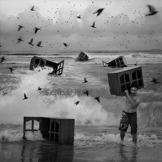
In this post I’d like to talk about composing photographs “after the fact”. Wait, don’t jump to any conclusions just yet, let me explain what I mean.
About a month ago I had to fly to Sydney for work but got stuck at the airport due to bad weather. I spent about two hours sitting in front of the large viewing glass looking at the runways. The weather was indeed stormy, it was dark from all the clouds, and there was nothing to photograph.
But when the weather started to get better, clouds began to clear, and airport started to come back to life, I finally took my camera out and started to stock my prey. I wanted to capture this feeling of the “airport awakening” when the planes begin to approach the runways, and workers move to and fro. Unfortunately no matter how hard I tried or how long I waited, I couldn’t capture the picture I had in mind… at least not in a single frame. Needless to say that I was very disappointed.
Later, when I returned home and went over those photos, my imagination switched gears – I saw details in different photographs, that put together would be able to create that image I had in my mind while shooting. Since I know my way around Photoshop, I decided to go ahead and try to do that.
I ended up with two images which both have two things in common – both of them I would call “airport awakening” because they portray the clearing of the storm, and resuming operations of the airport. The second thing is the way in which I created this sense of awakening – with directions. I’ll explain this in more detail by going over the images.
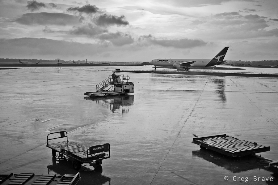
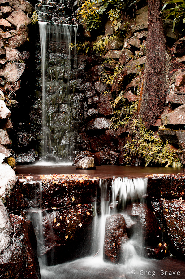
In this first image I have three different “directions”, which go in zig-zag shape leading the viewer’s eye from one element of composition to the next. First is the direction of the two trolleys, which goes from lower right to somewhere in the middle left side of the image, next is the direction of the moving utility vehicle which catches the eye on its way to the left and redirects it towards the upper right corner, and finally the eye reaches the plane and again changes direction to the left ending up on the airplanes in the distance. The floor is still wet from the rain, but the sun starts to shine through, giving the feeling that storm has ended…
Click on the photo to enlarge.
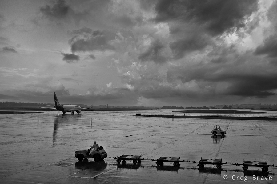
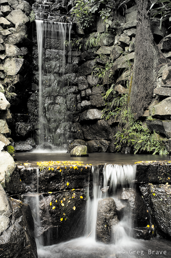
The second image is darker, as if there is still the danger of the storm, but the moving vehicles hint of a hope for good weather. And again, we have the directions theme – from right to left, then from left to right, and finally the plane takes us into the depths of the image.
Click on the photo to enlarge.
The main thing that made the compositing easy was that I shot all the photos from approximately the same location and also I was using the same focal length.
As always your thoughts, suggestions, and critiques are welcome in the comments section below.
I am not a believer in the “straight out of camera” philosophy. You know, the photographers who don’t do post processing at all and sometimes shoot in plain JPEGs. Anything in addition to that, would be “distorting the reality” they claim. My opinion on this subject is that there is no such thing as objective reality. Everyone sees what he sees through his own eyes and his own perspective. Your previous life experience also alters your perception of everything that you see around you. Even when you simply point your camera at a scene and shoot, the light goes through the lens, hits the sensor, gets transferred into electronic signals, then is processed by your digital camera’s own processor, and undergoes even more transformations until you see the photo on your computer screen. I don’t think I need to go further.
So, when I work on a photo, first I usually perform basic adjustments in Lightroom such as brightness and contrast and then, if I feel that it is not enough, first I try to understand why I feel that way. Is it the composition? If it is the composition then there’s nothing much can be done in post processing, and I will probably discard that photograph. But if the composition feels right then I continue my exploration. Are the shadows too shallow or too deep? Can the colors be improved?
Next, I open the photo in Photoshop and start playing with it, changing color palette, increasing/decreasing lights and darks, and other adjustments. Usually I come up with several versions of processed image, which look good to me, then I compare them and choose the one that I like the most.
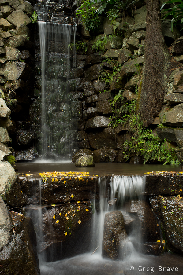
Below I have three versions of the same photo, but the thing is that I can’t choose the one that I like the most. Each version has its own mood, and I have trouble choosing.
The first image below is the original version with only minor brightness adjustments.
Click on the photo to enlarge.
The second version received quite a bit of processing, and has a warm autumnal feeling to it. I like the purplish glow and how it contrasts with the white of the water.
Click on the photo to enlarge.
In the third version I used the original photo as the base, substantially decreasing color saturation, of all the colors except the yellow of the leaves in the water. I also happen to like this version a lot.
Click on the photo to enlarge.
Which version did you like? Please help me choose, but I also need to know the reason for your choice, and this is what the comment section below is for! You can also leave your comments on my Facebook page – http://www.facebook.com/photopathway
Thinking of it, maybe I should’ve titled this post “story of an idea” because I will be talking about creation of one particular image. But I eventually I decided on the current title because the way this creation emerged from the depths of my imagination is one of the most common ways.
A few weeks ago I had a photo session with Ira, in which my primary goal was to try some new lighting techniques that I thought of. In that shoot I decided to focus on close up portraits (chest line and up). I experimented with different backgrounds and asked Ira to put on a few different shirts.
At first nothing was working for me. The lighting was bad, and I didn’t get any interesting results… but then again, I didn’t start this shoot with a specific idea in mind – it’s like that phrase from Alice in wonderland:
– In which direction should I go?
– It depends on where do you want to arrive
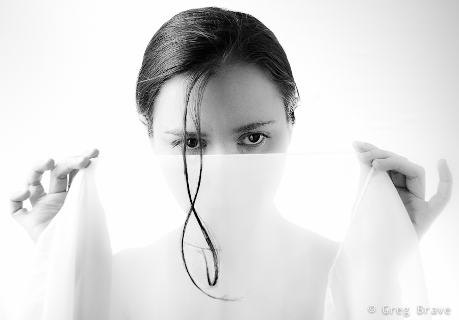
But I felt inspired that day and just kept on shooting and trying to get some nice shots. At one point Ira suggested adding an accessory – a piece of white semi transparent white fabric that she had, and I agreed to try it – it is a good idea to listen to your model, especially when you are out of ideas 🙂
Trying different variations we came up with this photograph:
Click on the photo to enlarge.
I liked it, but quite frankly it lacks an idea behind it. I looked at this photo and thought “nice photo! but what am I trying to tell with it?”. And I couldn’t find an answer. So I forgot about this photo for a while and focused on other tasks.
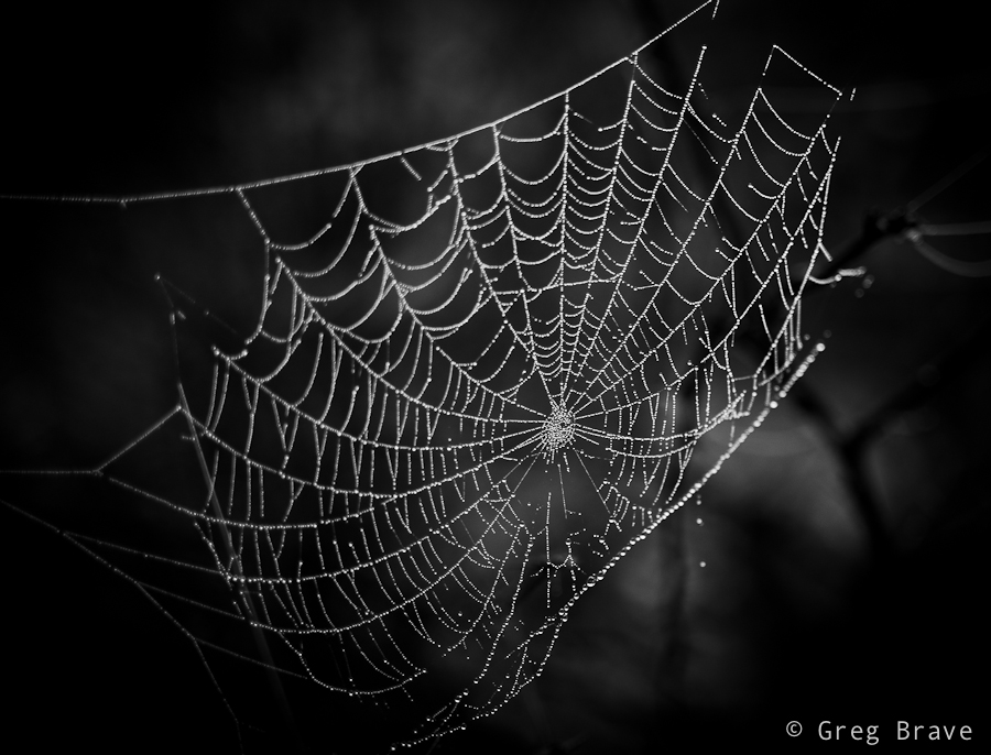
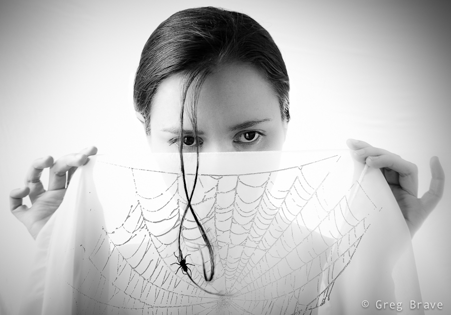
After a while (a few days have passed since the shoot), when I was watching a Phlearn Pro photoshop tutorial (which by the way was magnificent!), suddenly an idea emerged in my mind. I remembered this photo of a spider’s web that I took:
Click on the photo to enlarge.
And it suddenly got layered, in my mind, onto that photo of Ira holding white fabric, as if she was holding the web itself. I rushed into photoshop to try it, to see how it looks in reality. It was nice but still something was missing… what was it? The spider of course. So I searched the net for images of spiders and chose the one I liked the most. Then I brought it as a layer into my working file, and converted the spider to be pure black.
Now I needed to find a meaningful placement for the spider. I tried different variations before I came up with the final result, which you can see below. I call this image “The Way Up” :
Click on the photo to enlarge.
By describing my creative process on one particular image I wanted to show one of the many ways creative ideas come to life – they are not always pre-conceived, and sometimes, as it was in this case, they develop step by step over time, graduating slowly towards the end result.
What do you think about the final image? Your thoughts, comments, and suggestions are always appreciated!
Yesterday at dinner me and my sister had conversation about how digital photos are made, and what do all these strange definitions mean. Then I remembered the time when I was struggling to understand all these concepts. It took me some time to wrap my head around them.
I think many beginner photographers are still struggling with them. So I’d like to share what I have learned and understood in the way that is clear to me, and hopefully will be clear to you.
Let’s start with the initial image that comes out of the camera – what does it mean that camera produces, let’s say, 10 Mega pixel image?
Ok, before answering this question let’s explain what a “pixel” is. Pixel is a virtual dot. Yes, a virtual one – it doesn’t have dimensions of its own. Let’s just leave it at that for now and I’ll explain down the road when pixel gets it’s physical dimensions. Now imagine a rectangle shape filled with dots. On its long side it has 3648 dots and on its short side it has 2736 dots. So the total number of dots would be 3648*2736=9,980,928 – it is almost 10 million dots or in other words 10 Mega pixels.
All digital images are “composed” from pixels (dots). Each pixel has its own set of values such as color, brightness, saturation etc.
So when we say that camera produces 10 Mega pixel images, it means that for each image camera provides this set of values for ten million pixels, all these numbers being put into a single JPEG or RAW (or any other format) file.
When you load this image on your computer’s display all these values are translated into actual color, intensity, etc. and together form the captured photo. Remember I said that pixel has no dimensions? As long as it “sits” in the JPEG or RAW file it doesn’t, but as soon as the file is displayed on the display, pixel receives its physical dimensions depending on DPI, on which I’ll explain next.
Let’s stay with the 10 Megapixel photo for now, and try to understand the DPI. DPI stands for Dots Per Inch. So basically if we have, for example, 10 DPI resolution then it means that for each square inch of image we have 100 pixels (10 by 10) with information regarding their color, intensity, etc. And these 100 pixels are taking the whole square inch, so they each pixel has certain size. And if we have 20 DPI resolution then we have 20×20 pixels per square inch (400 in total), therefore each pixel is smaller, and the result is better sharpness of the image.
You might get confused a little bit at this point – DPI stands for DOTS per inch but I’m talking about pixels. Here’s the thing – when a dot displayed on the computer screen, it is called a pixel, and when this same dot is printed on the paper, it is called a dot. Sometimes the abbreviation PPI (Pixels Per Inch) is used for computers but I’ll mostly stick to DPI.
Now let’s talk some real numbers
If you are displaying your images on computer display, then you don’t need resolution higher than 72 DPI because of physical limitations of the display (the smallest dot that display can show is of certain size, so physically there can be no more than 72 pixels per inch displayed on computer screen). If you’ll save your images in a higher resolution than 72 DPI and only look at them on your computer, you will just waste your storage space because the bigger your DPI, the more space the photo will take on your hard drive provided its physical dimensions stay the same.
If you want to print your photos, then resolutions of 240 DPI or even better 300 DPI are appropriate. This is due to the fact that printer can print much smaller dots than computer screen can show. If you’ll use a much lower resolution for printing, then instead of nice photo with sharp detail and smooth color transitions you’ll see image comprised of colored squares because your digital file will contain inefficient amount of data.
Let’s go back to the digital image produced by a 10 Megapixel camera. As we already said, this image contains information about 10 million dots/pixels. That’s it, not less and not more. Now when you want to print this digital image, these 10 million dots are your limit, and it is for you to decide how to use them.
For example if you want to print at resolution of 300 DPI (to remind you DPI stands for Dots Per Inch) then you are limited to picture size of 12.16×9.12 inches (30.89×23.16 centimetres). How did I get these numbers? Easy: remember that we said that a 10 Megapixel image has the following dimensions 3648×2736? Now if you divide 3648 by 300 (your desired resolution), you’ll get 12.16 inches for the long side of the printed photograph, and similarly divide 2736 by 300 to get 9.12 inches for the short side. Don’t forget that it is the maximum size for resolution of 300 DPI. You can always print smaller sizes. In that case not all the information contained in the file will be used for printing.
After understanding how the Megapixel count and the resolution (DPI) are affecting the size of the printed image, it is clear that for any given digital image (in our example it is an image from a 10 Megapixel camera) the lower your desired resolution, the larger the printed photo can be.
For most of the printers you don’t need to go above 300 DPI because of the physical limitations of the printer – it simply can’t print more than 300 dots per inch, but when would you like to decrease the printed resolution? I can give one most common example here – printing large posters or ads that will be viewed from long distance. If you look closely at big advertisement signboards with photos, you’ll see that their resolution is very low and you can distinguish between printed dots when looking from close distance, but when looking from farther distances it looks like a good photograph.
The last thing that I’d like to discuss is the dialog box in Photoshop named “Image Size” because it illustrates perfectly all the concepts I wrote about. In order to get to this dialog box, in Photoshop go to the “Image” menu and from there choose “Image Size”. Then the following window will open:
Of course, the numbers shown are depended on the currently opened image. The numbers that you see in the screenshot above are from 10.1 Megapixel image, but you can play with any photo that you’ve got. As you can see there are three sections in this window:
1. Pixel Dimensions
2. Document Size
3. Check boxes
(For the sake of this exercise, make sure that the “constrain proportions” check box is checked – we want the image to keep its original proportions)
The first two sections are interconnected, which means that if you change numbers in one section, numbers in the other section are also changing.
Lets start with the “Document Size” section, and change the Resolution to a higher number. You’ll see that “Pixel Dimensions” are also changing to higher numbers, and it makes perfect sense – if you want to have more pixels per inch, the total pixel width and height of your image will increase provided that physical dimensions of the photo stay the same. Now change the Width in the “Document Size” section to a lower number. The Height in the “Document Size” section will also change to a lower number because we are constraining our proportions, and more importantly, the Height and Width in the “Pixel Dimensions” section will also change to a lower numbers. Let’s explain that: we kept the resolution intact, but we want the physical width and length of the image to be smaller, which means we want less inches (or centimeters) but with the same 240 Pixels Per Inch, therefore we have less total pixels in our image. Now if we go over to the “Pixel Dimensions” section and change Width (and Height will change correspondingly due to constraining proportions) there to a larger number, then Width and Height in the “Document Size” section will also change to larger numbers. I hope that by now you gained sufficient understanding to explain this change by yourself.
There is one important thing to remember when changing dimensions of your photo in Photoshop – if you try to save the image larger than its original size, Photoshop will use mathematical algorithms to artificially add the additional pixels to enlarge your photo, which won’t always look smooth and natural.
That’s it. It is pretty easy when you take some time to understand the concepts. I hope that if you didn’t fully understand the discussed concepts before, you understand them now, and if not, feel free to leave me your questions in the comments section.
To wrap things up I’ll present some key points to think of when dealing with digital photographs
When saving photo for only web usage save it at resolution of 72 PPI
When saving photo for printing save it at resolutions of 240 or 300 DPI
When saving photo for web or for printing know the size of the photo that you want and save it at that size. This way you won’t waste storage space on your computer.
As always any comments are highly appreciated, and
Remember, you only have to enter your name to leave a comment!
I think that one of the most important aspects of photography is about joy of creation, expressing yourself and enjoying every minute of it. I always try to be creative, and though I don’t always get the desired results from my experiments I just continue trying. For me there is no other way. I try to put my heart and soul into my work mixed with feeling and emotions.
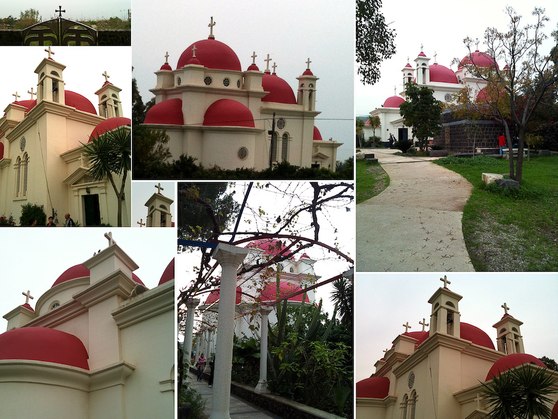
Today I’d like to share with you one of my attempts at creativity. It was a nice autumn weekend in Israel when me and Ira went to the Upper Galilee region to do a walking track near the Sea of Galilee. On our way back we stopped to visit the Greek Church of the 12 Apostles. This church always attracted me when I was driving by with its’ red roofs but I never had the chance to actually get inside.
This time we had about an hour, so we decided to finally give this church a closer look. I was so tired from our trip that I left my Canon DSLR in the car. I just didn’t have any mental mood for photography. But the closer we got to the church the stronger grew my desire to photograph it. Eventually I decided to photograph it with my iPhone.
This Greek church is very beautiful and is also located in a beautiful place. When we returned to our car I was surprised to find out that I took about fifty photographs of the church and its surroundings from variety of different sides and angles.
Another important aspect of photography (again, in my opinion) is to know how to choose your best photos, and to be brave enough to delete most of the rest. Otherwise you’ll end up with tons of photographs, which are very similar to each other (a tiny difference in a crop here, and in viewing angle there).
Thus on our way back (Ira drove the car) I went over all the photos of the Greek church that I took and deleted about 90% leaving only the ones I though were most successful. After that I started thinking – what would be the best way to present these photos in a way that would show the Greek Church of the 12 Apostles in all its beauty and also reveal some of the architectural details.
Eventually I decided to create a photo-collage of all the best photos. During the following months I was busy with other projects (including trip to Prague) and only recently got the time to put the idea of a photo-collage to test. It took me quite some time to do that as I had to change sizes, crops and other things in order to create what I had in mind.
Here is the collage of the Greek Church of the 12 Apostles. Remember that all the photos here were taken with my iPhone, and don’t judge the quality too harsh 🙂
And as always feel free to leave comments!
Cheers,
Greg.
Greek Church of the 12 Apostles. Photograph by Greg Brave. Click on the photo to enlarge.
This is the second part of my interview with Katerina Lomonosov. Click here to read the first part.
To read the whole interview in one piece click here.
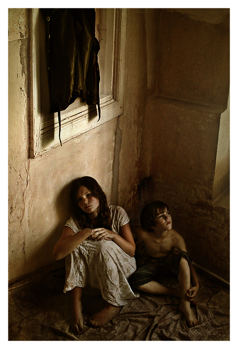
Let’s talk about the following photograph:
Photograph by Katerina Lomonosov. Click on the photo to enlarge.
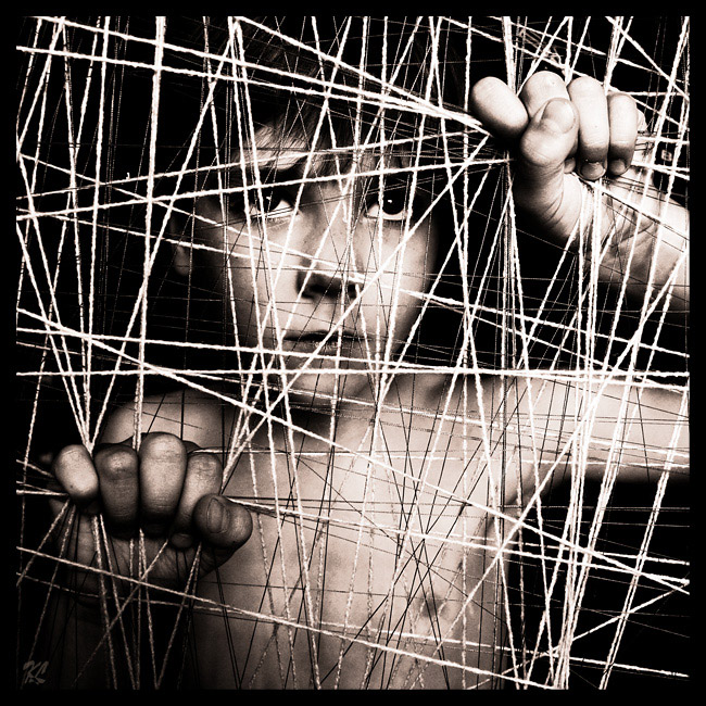
Looking at it I feel vague associations with some of my childhood fears. What did you want to communicate through this photograph?
This photograph is named “Philosophy of Unfreedom”. At first this photograph is simply gives an impression of prisoned child staring outside from the “cage”. But I put also a hidden meaning here. Pay attention to the child’s hands. Look how hard he clings to his “cage”. How often we, being unfree in the literal or figurative meaning of this word, are afraid to loose our “cage”, fear to make changes in our lives, and feel comfortable in our unfreedom, though not always admit it?
Such interpretation doesn’t lie on the surface, and if a viewer won’t take time to “decipher” it, it will remain hidden. But even without it the photograph turned out to be deep, memorable, and strong – mostly thanks to a good acting of my five years old son ☺.
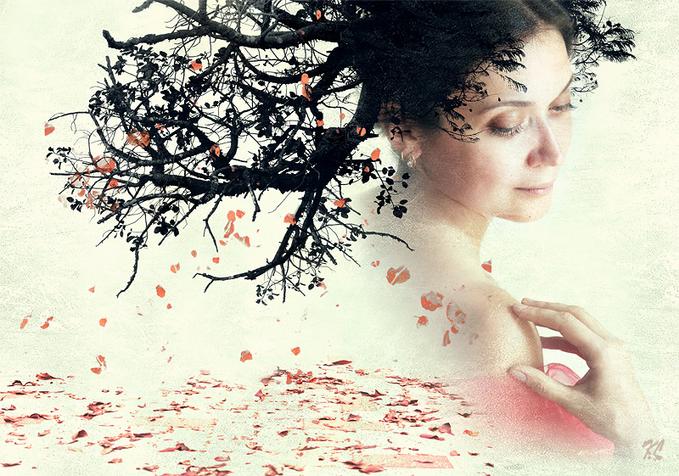
Photo “October…” I liked the most. It breathes with tenderness and freshness of the autumn… Tell us a bit about the creation of this photograph.
Photograph by Katerina Lomonosov. Click on the photo to enlarge.
This work is one of my favorites. The model is a young woman who came to me. She wanted me to create beautiful photographs of her. So she wanted to look good in the pictures, and my goal was not to disappoint her…
The idea of hair-tree came immediately to my mind, but post-processing took several hours. Then I was ready to send the work to my customer, but something stopped me…
I was returning to work on it each day of that week – tried to add various elements, but nothing worked. Until one day I had the idea to add falling leafs to the tree… Then everything fell into place, and the photograph got its final look.
Tell us about the accessories that you use in your work.
Each composition gets its own accessories. Sometimes it’s gloves or a fan, often different types of fabric, sometimes flowers. I also like to use fruits and vegetables – they seem “real” to me, just as the nature created them, I think this is important for my work. Once I even brought a stepladder from work – it complemented the background of the composition, and I made some very nice pictures with it.
Photograph by Katerina Lomonosov. Click on the photo to enlarge.
What equipment do you use? How important is quality equipment for photographer?
I started with a small point-and-shoot Fuji A210. Many of my early works, which are made with it, now participate in international exhibitions and competitions. Later, I bought Canon 350D and used it for three years. My best works are made using this camera.
Now I have Canon 5D Mk.II. I gladly switched to full frame, but still think that the photographer’s eyes and mind create the photograph and not the camera.
My opinion is that in most cases it is not essential which camera captured the picture – most important is when photograph reaches deep inside and touches your feelings.
Tell us a little about your work with light. What lighting techniques and equipment do you use?
Lighting? I use natural light that reaches my living room through the windows. Nothing more. I don’t use flashes, umbrellas, or reflectors. The important thing for me is to have free time during the daylight hours.
How much time you devote to Photoshop? What features of Photoshop you use the most?
Post-processing in Photoshop is crucial to me. I devote quite a lot of time to it. I work on each photograph for several hours. I use color-correction, add various textures, and work a lot with masks and layers.
Photograph by Katerina Lomonosov. Click on the photo to enlarge.
Is it possible to buy your work, and if so, where?
I sell my work in galleries on the internet, some of them are presented in the Moscow gallery “Fotoloft”
You can also purchase my work directly from me.
If you could give only one piece of advice to a beginner photographer, what would it be?
I would advise to photograph with your “soul”. To put a maximum of “yourself” in what you do, and the result will not be long in coming.
Photograph by Katerina Lomonosov. Click on the photo to enlarge.
Thank you Katerina for your time and knowledge! It has been a true pleasure talking with you.
If you liked Katerina’s works, you can visit her Gallery.
You can also contact Katerina regarding purchasing her work through her email: lomonosov.katerina at gmail.com
Katerina has a unique style in photography and she is a winner of many international photographic competitions. I was very lucky to have a chance to interview her, and she also turned out to be a very nice person.
It is my pleasure to present you Katerina Lomonosov!
Click on the photo to enlarge.
First of all please tell us a little about yourself. When did you start getting interested in photography? Which stages of your development as photographer were the most important?
I was born in 1975, in Ukraine. As a child I liked drawing and graphics. In 1997 I moved to permanent residence in Israel, where I live now. From the year 2000 I am working as graphic-designer in an advertisement company.
I got interested in photography back in 2005. It so happened that at that time, a certain kind of emptiness appeared in my life. I wanted to fill that emptiness with something interesting, beautiful, bright… That “something” turned out to be photography…
I grow and evolve with my every new work, I’m a painter, I live, think and feel with my creations… Creative photography has become a crucial part of my life… I take part in various projects in the field of documentary and art photography, and I plan to grow and develop further in this area.
Photograph by Katerina Lomonosov. Click on the photo to enlarge.
Where are you drawing inspiration and ideas for your works?
Inspiration and ideas for my works come in different ways… Sometimes idea just pops up from the subconsciousness, and some things come from pictures of other authors on the Internet. Some of my works are inspired by paintings of famous artists. There are also ideas on a particular subject, which are literally “nursed” in my head for a long time before they find their way out to be captured in a photograph.
Who are your models? Are they your relatives, acquaintances, or maybe professional photo models? How do you choose them?
My first models were my children – my son, who was then five years old, and a daughter, she was thirteen back then. Later, some of my friends and acquaintances were added to my arsenal, and also friends of my daughter. Nowadays many professional photo models would be honored to participate in my photographic work.
The most important thing for me when I choose a model is not the professionalism of the model but his/her natural body language and an expressive face, especially the eyes.
For me it is important to show in my photographs not only the beauty of lines, and location of light-spots, but also something from the depths of human nature, you may call it the “soul”. In my work I always strive to give depth of meaning to my photographs, so that they would make people think and try to understand what I wanted to express. I want my photographs to reach for the person’s deepest feelings and emotions.
Photograph by Katerina Lomonosov. Click on the photo to enlarge.
How do you find and choose locations?
Most of my photographs are a created at my house’s living room. I just move the furniture aside and make a small “studio”, but it is more like a simple corner. Occasionally I get out with my friends to take pictures outside. When shooting outside I prefer abandoned houses, but with walls and windows still intact , so even outside I seek places that look like my familiar environment at home.
How much time in your weekly routine is given to photography?
In good times, every Friday is all about photography. One day a week. Sometimes I also shoot on Saturdays. But I also have busy periods, when I have to sacrifice my hobby for other matters, and several weeks can pass without me creating a single photograph.
* * *
This is the end of Part I of my interview with Katerina Lomonosov. Click here for Part II.
If you liked Katerina’s works, you can visit her Gallery.
You can also contact Katerina regarding purchasing her work through her email: lomonosov.katerina at gmail.com
Recently I have seen many HDR images that were too exaggerated, making them completely unrealistic and in some cases even unpleasant to watch. Programs such as Photomatix make it very easy to create HDR images but they are also tend to lead people to create very exaggerated HDR images, maybe because it is very easy to accomplish in these programs.
I have nothing against using HDR techniques in creating artistic imagery, but I would like to remind you that the original intention of the HDR was just to increase the dynamic range of the photograph.
However with a little knowledge of Photoshop, you can do that – you can create an HDR image that will look very realistic but still show all the detail that you want it to show.
I created a pretty simple tutorial that shows how to manually create HDR image in Photoshop. In this tutorial I used two photos taken at the same location (using tripod), one exposed for the bright sky and the other one exposed for the darker lower part. Though I used only two photos, you can use as many photos as you like revealing detail in any part of the scene according to your preferences.
There is one point of this tutorial that I would like to stress out one more time – use large brush with soft edges and opacity around 50 to 60 percent. It is important so that your final image won’t have these “white glow” edges that can be seen in so many HDR images.
If this tutorial helped you to create your own HDR images I would sure like to see them! But if you don’t have Photoshop, but still want to create HDR images, you might want to try Photomatix.
I bet that some of you had to do this: you had to create a desired size image from a photo. But you needed this new image to be a certain part of the initial photo (with a specific dimensions) but without changing the aspect ratio of the image – so it will still look natural.
Recently I had to create a head-banner for a web site of my friend. He gave me initial image and asked me to make a banner of a size 800×250 pixels from this image. It turned out to be not as simple as I thought at first, but finally I managed to do it. I want to share what I learned and so I created a tutorial.
So here we go: