Shooting Baby Closeups

Recently my good friend asked me to photograph his baby son Eric. I gladly accepted because I don’t usually get to photograph babies and wanted to give it a try.  The only problem was that my friend’s house didn’t have any suitable place to make a little studio out of, every place I looked at was too cluttered with stuff, which could distract the viewer’s attention from Eric. Finally I found a few places but knew in advance that the resulting photographs won’t be the way I’d like them to be.

Still I wanted to make at least a few photographs that would stand out and satisfy my artistic demands 🙂 The only solution I could come up with was to shoot close-up shots of Eric so that background wouldn’t matter much. Three of those shots I chose to present here.

The key aspect of the following photographs is the light. It is different in all three of them, but in each photo it plays very important role.

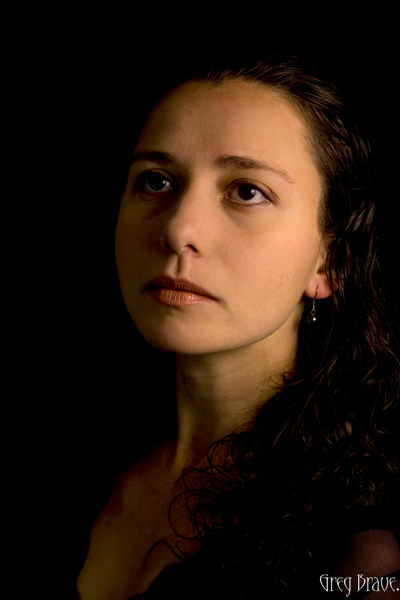
For the following photograph I used a 100mm Canon macro lens at f2.8. I had a flash with me and tried to use it, bouncing from the ceiling or walls and varying its power, but I didn’t like the results – the light was too harsh and too white for my taste. Yes I could use a 1/4 CTO gel to warm up the light a little bit, but I choose a different approach instead – I asked my friend to take Eric and come closer to the window.

It was about 5 o’clock in the afternoon and sun light was still pretty strong, but was already getting warmer as sun got lower and lower. After positioning the happy couple the way that there were no significant shadows on Eric’s face I started to shoot, and the photo below was the winner of that batch. I like it because of the intimacy it transmits to the viewer, the closeness between the child and his parent. Because the light coming from the window was much stronger than the light in the room I could set the exposure so that the background remained completely black.

Everyone, meet Eric!

Click on the photo to enlarge.

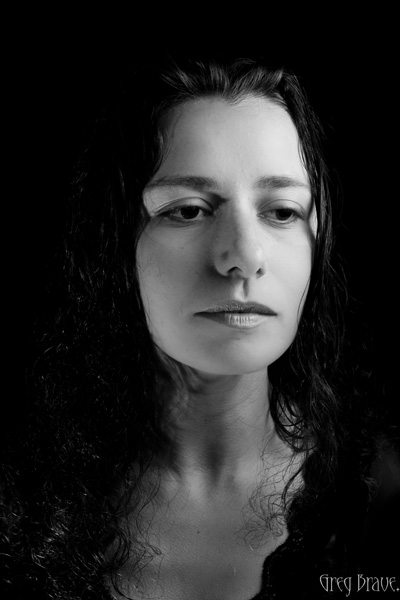
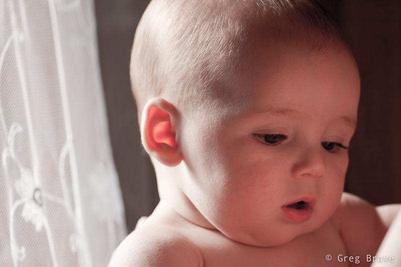
For the next two photos I used a 70-200mm f4 L Canon zoom lens at f4.

In the next photo I took Eric to another window in the house, with transparent white curtains to serve as background. I intentionally went for the high contrast in lighting in order to create a little drama. But nevertheless as you can see there are no harsh shadows on Eric’s face, that would be unaesthetic for my taste. I like the way his eyes are emphasized in this photograph as if they were eyes of an adult but on a cute baby face.

The eyes, the eyes!

Click on the photo to enlarge.

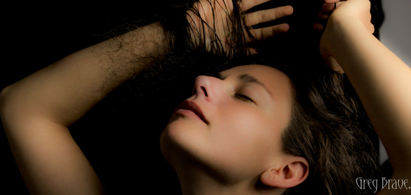
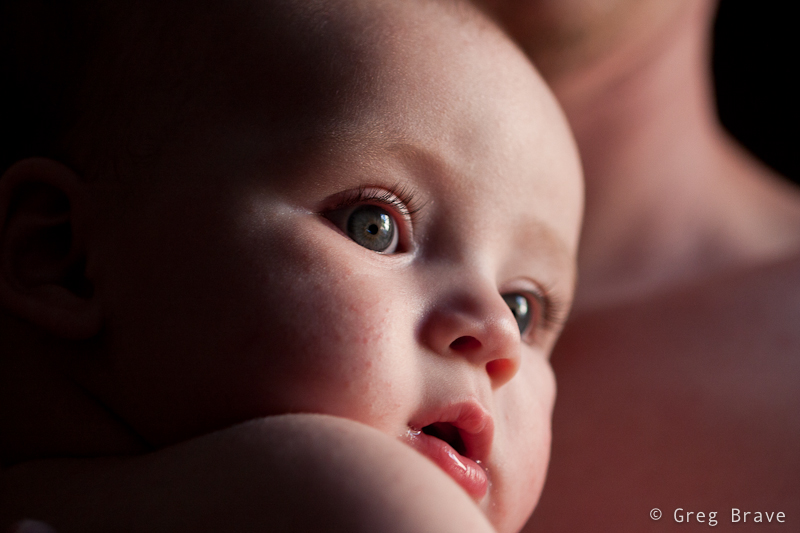
I also included the photo below in this article to demonstrate use of reflected light. In this photograph my friend hold’s Eric close to his body, and the light from the window reflects from his body and lights Eric’s face with soft warm light. So in order to create warm light you don’t always need gels and flashes… sometimes human skin can do the job just fine! 🙂

Eric in soft light

Click on the photo to enlarge.

What additional tips can you share regarding photographing babies? Did you like the photographs presented here?

As always comments are highly appreciated, and

Remember, you only have to enter your name to leave a comment!

Till the next time,
Take care!
Greg.

Expressing Emotions Through Photography

One of the greatest powers of photography is the ability of expressing one’s emotions through it. The most powerful photographs out there are the ones that successfully convey a certain mood or emotion.

But to convey an emotion through photograph is not an easy task. Often times you photograph a scene and think that it is pretty powerful, and then the resulting image disappoints. In order to successfully achieve the desired result many things have to come in place.

Let’s see what are the tools that if used correctly will allow your photographs to be emotional.

Light. It is very important in any photograph, and it has to be just right when expressing emotions. For example when you express anger, you might want to keep the scene in dark colors, while photographs expressing joy and happiness are mostly bright and shiny.

Color. Another important component. The first example that comes to my mind is the Red color, which can represent danger (in various signs) but in other contexts can also represent romance (red roses, red lips). Another example would be Green color, which has calming effect, if you want to create sense of tranquility in your photo you might want to fill it with green color (trees, plants, jungle, sea). When you consider various combinations of colors – the possibilities are endless, and don’t forget the power of black and white photographs!

Composition. It is absolutely essential to have an appropriate composition for expressing any emotion through your photograph. Sometimes just a slight change of camera angle can make all the difference and emotionally faded image comes to life.

Focus. When you want to emphasize a certain part of your image you put it in sharp focus while making other parts more blurred, but this rule isn’t written in stone. Sometimes the blurred parts of an image create all the mood, and hint the viewer about the story of the photograph. So it is not about the image being sharp or not, but about using the focus in such ways that will contribute to your final result.

There can be endless combinations of these components, and it is photographer’s job to find and create the ones that work, the ones that convey emotions to the viewer in a powerful way.

I decided to try and convey the emotions of love and affection. There are million of different ways to do that – photograph a young couple in different settings,  a mother with child, etc. I decided to do that with still life.

When Ira and I were on vacation a few months ago, we bought this tiny figure of two hippos as a symbol of our feelings, and this figure immediately came to my mind as being perfect for the task. But just a figure wasn’t enough, so I thought what else can I add to the composition? I knew for sure that I wanted the image to be in bright and happy colors, so I was looking for something colorful. I ended up with these beautiful tiny blue flowers (forgive me for not knowing their name), and below the hippos and flowers I placed dry tree leaves, which were bright yellow.

Hippos In Love 1 Hippos In Love 2

Click on the photo to enlarge.

Now, when I had all the components, all that was left was to combine them together in one composition. I tried many different variations and the two that you see above I liked the most. In order to concentrate the viewer’s attention on the hippos I used wide aperture and focused on their eyes. This way most of the flowers were blurred creating a happy, bright, and colorful background for the “hippos in love”.

Photographing hippos, I noticed how tender these flowers were, and photographed them alone to try and show their tenderness. Two photos below is what I came up with.

Flowers in Black and White Flowers in Color

Click on the photo to enlarge.

I can’t say to what extent I succeeded in conveying the emotions of love, affection, and tenderness through these images. It is for you to decide. Can you feel it through my images? How would you express your emotions through photography?

Remember, you only have to enter your name to leave a comment!

Till the next time,

Greg

Creating abstract photographs

This time I would like to talk about creating abstract photographs. There are many ways of doing it, and one of the simplest ones is to take a closeup shot of something with interesting texture making it unclear what it is from one side but creating an interesting combination of forms, colors etc. from the other side.

For example you can find an old wooden door with paint which partially came off and take a closeup of it, or take closeup shots of rusty metal. Another idea would be taking closeup shots of architectural creations including particular parts without revealing the form of the building. There are many more ways of course, and these are only a few examples.

For these series of abstract photographs I decided to photograph waves. I came to the seashore about an hour before the sunset, put down my tripod, mounted my Canon 40D and started shooting.

abstract image abstract image

Photographs by Greg Brave. Click on the photo to enlarge.

As you can see these all tight crops (well all except one) of waves taken with long exposure. Using long exposure in this case is critical because if I would use normal exposure (1/50 sec and faster) then the waves would be easily recognizable even in tight crops.

abstract image abstract image

Photographs by Greg Brave. Click on the photo to enlarge.

After the shoot I came home, opened the photos in Lightroom and started playing with them trying to get the best abstract results I can. And I found something really beautiful, which I would like to share with you.

Everybody plays with Vibrance and Saturation controls (in any photo processing application), but when you work on a “real world” images, not abstract, increasing saturation or vibrance too much makes the image look not real, over-saturated. But in this case my goal was to create a beautiful abstract image, and I saw that when I crank the saturation slider to the maximum, it gives me very nice result making the photos look more like paintings and also emphasizing the warm sunset colors.  But it wasn’t perfect, and I am sure that many of you encountered this – when you increase the saturation to a certain level you start having color artifacts in your image, and you are forced to decrease it to the level where there are no artifacts.

Here is what I found in Lightroom – in order to eliminate these color artifacts you have to increase the Luminance Noise Reduction slider (in the Develop module) until no color artifacts present in the image! I was stunned – because now I could increase saturation as much as I wanted. There is one downside to it though – the image looses some of its sharpness, which wasn’t a problem in my case.

abstract image

Photograph by Greg Brave. Click on the photo to enlarge.

I would be happy to hear what you think of these images. How would you create an abstract photograph?

Remember, you only have to enter your name to leave a comment!

Have a Great and Creative day!

Greg.

How Photographic Ideas Can Come to You

This is a very interesting question you know. I am sure that anyone who takes interest in photography at times thinks about it. In my head sometimes these thoughts sound like “I’d really like to make a great photograph… yeah… but what should I shoot?… what should I create?…

If you really want to create something, especially if you are not sure yet what it is, you have to allocate a certain amount of time to thinking about it. I mean that you have to tell yourself – “today between 10:00 and 11:00 I am thinking about creating an interesting (also can be beautiful, romantic, breathtaking, sad… anything you prefer) photograph”.

I want to demonstrate this from my own experience. A few days ago I felt this urge to photograph something at my tiny home studio. I didn’t have any idea what it would be, but I just had this desire to create. So I made myself sit down for about 45 minutes, come up with ideas, and briefly sketch them on piece of paper.

My first problem was that not ANY idea that came to my mind was possible to shoot because I was limited to the objects that I had in my apartment. Having realized that fact, instead of just thinking of any idea for photograph, I started looking around my home at different objects and thinking how can I use them creatively?

While looking I saw my table lamp. Actually it was always standing on my table, but until I made myself to think creatively, I never thought about this lamp as a subject for my photographs. And then, while looking at this lamp I remembered of some TV program I saw as a kid that had these two lamps jumping around like live beings, and I decided to try and create something in that direction.

I still had no idea what would come out of it, and I didn’t have any definite final result. So I just started sketching this lamp standing on the table in different poses and thinking what can be done with that. No, I can’t draw, and it doesn’t matter, because you need sketching only to help your thinking process.

One of the ideas that came to my mind was to photograph this small lamp with it’s light bulb lying beneath it, while the lamp “sadly looking” at the bulb. And so I did as you can see in the image below.

thinking lamps

Photograph by Greg Brave. Click on the photo to enlarge.

In this image of lonely lamp looking at its light bulb I used only one flash from the left side with 1/2 CTO gel on it (this gel makes the white flash light to be warmer). I wanted a warm lighting here. Looking at the result I felt that it is not enough for an interesting image… I felt that it doesn’t conveys the “stare” of the lamp at the light bulb.

And then suddenly it hit me – I need another lamp to make this more interesting! And luckily my life partner Ira had one on her table. I took that lamp and started playing with two lamps. Finally great idea came to me – to make the second lamp “look” inside the first lamp as if to see “what happened? why you lost your bulb?” and so you can see my compositional setup in the photo below.

thinking lamps

Photograph by Greg Brave. Click on the photo to enlarge.

Now, having the final idea of a shot in place I started thinking of little details. I wanted to emphasize the fact that the second lamp did have its bulb. How would I do that? Well, I decided that I would light the whole scene with white light, but I would also have yellow (warm) light coming out of the second lamp towards the first lamp. And you can see in the photo below that the down-looking lamp is warm-lit.

The final photograph below I accomplished using three strobes. Two strobes without any gels from left and right sides (I had to play with their powers to achieve the desired lighting), and the third strobe with 1/2 CTO gel on it I held in my hand and pointed inside the first lamp.

thinking lamps

Photograph by Greg Brave. Click on the photo to enlarge.

After getting the final image above, I felt that there is not enough emphasis on the light that comes out of the second lamp. I wanted those rays of light to actually be seen. And here is a point that I am sure not all of you thought about. Rays of light are invisible unless they reflect off of something and hit our eyes. So in order to make these rays of light to be actually visible I had to have them reflect off of something – for example dust, or smoke. So if I would fill up the whole area with smoke then the rays of light would be seen. But then the rays of my two other flashes would also be seen, and the whole image wouldn’t be clear and crisp.

So I decided to take this work to Photoshop, and artificially add the rays of light, using the original light warmth that 1/2 CTO gel gave me (just used eyedropper tool in photoshop to sample that color). To give you an idea how I did it – think of Radial Blur filter in Photoshop. If you have additional questions regarding how I did it feel free to ask me in the comments. And for all the people who are against “Photoshop manipulation” –  in the case of this photograph my goal was not to show reality, but to convey an idea of mine, therefore I am totally cool with using Photoshop here.

Here is the final result, which I am pretty happy to come up with.

thinking lamps

Photograph by Greg Brave. Click on the photo to enlarge.

In conclusion – the main idea of this article is to show that in order to come up with interesting photographs, you have to allocate time for thinking – what you want to do and how you are going to do it. Even if you don’t have any specific idea in mind, just make yourself sit down and think for half an hour or so, and I am sure that you’ll come up with something interesting!

As always your thoughts and comments are welcome.

Do you agree with this article? If you don’t then why? Can you suggest additional steps towards being more creative?

Remember, you only have to enter your name to leave a comment!

Till the next time,

Cheers!

Greg.

Photographing Sunflowers at Sunset

Hello everybody!

Today I’d like to talk about photographing sunflowers in the outdoors. I mean not one or two sunflowers at home but photographing them in the open field.

It all began when my friend asked me to make a picture for her. She wanted a very specific photograph of a large field of sunflowers, that would be completely yellow because in her imagination all the sunflowers would look up at the sky. This idea came to her while she was driving along a sunflower field, but she didn’t really pay attention to them.

I was glad to have an assignment like this because I just love any opportunity to be creative, and also if she would later hang my photo on her wall, it would be very flattering. So we decided on a day and drove to that sunflower field. I chose second half of the day towards sunset, but early enough to have time to scout the area and choose location.

When we arrived at the sunflower field I was surprised to see that all the sunflowers were NOT holding their heads up, as you can see in the photograph below. I am sure that there is a scientific explanation to this (maybe they were ripe and heavy for example), but in my mind I have always imagined sunflowers to hold their head up high. As a result it was impossible to make a photograph that my friend wanted. In the photo below you can see that there is too much green in between the yellow.

Sunflowers

Photograph by Greg Brave. Click on the photo to enlarge.

But since we have already came I decided not to leave empty-handed and began to think of various creative ideas to shoot the sunflowers in their current state. Let me remind you that it was around sunset time and the sun was getting lower and lower. The shot that you see below was made almost against the sun. The sun was almost facing directly inside the lens and then I lowered it a little. So the flare can be seen, and in my opinion it contributes greatly to this photograph by creating a certain end-of-the-day mood. I also like how it lights the white “hair” on the stalk emphasizing its shape.

Sunflowers

Photograph by Greg Brave. Click on the photo to enlarge.

When the sun descended more, the contrast between the sky and the sunflower field grew and it was impossible to capture both the blue sky and the yellow sunflower heads without flash. Either the sky was burned out and the sunflowers were correctly exposed, or the sky was correctly exposed and the sunflowers became very dark. So I took my Canon 430EXII flash out and started using it together with my Yongnuo remote trigger. I was shooting on manual, setting the exposure to correctly expose the sky and setting the flash power so that sunflower would also be correctly exposed. I asked my friend to hold the flash in a way that the sunflower would be lit from the side creating nice shadows.

But, of course, nothing comes out right from the first try, and I want to show that here. As you can see from the photograph below the lighting on the sunflower looks too bright and too artificial, and the shadows are too harsh. In addition there is a big shadowed area of the sunflower as a result of incorrect flash position. And even though the sky is correctly exposed it is not enough to make a good picture.

Sunflowers

Photograph by Greg Brave. Click on the photo to enlarge.

But I didn’t give up, and after numerous attempts and adjustments I found the right combinations and my photographs started to improve. I was thinking less and less about technical side of the photographing process and concentrated more on the creative side. In the photo below you can see more natural lighting and balanced composition.

Sunflowers

Photograph by Greg Brave. Click on the photo to enlarge.

I thought that the sunflower above came out too yellow so I decided to add a 1/4 CTO gel to the flash and see what happens. And I liked the result of that, which you can see in the photographs below. I liked the warmth of the light, which matched good (in my opinion) with the warm colors of the sunset.

Sunflowers Sunflowers

Photographs by Greg Brave. Click on the photo to enlarge.

As the sun was getting almost down to the horizon I got this interesting idea to shoot the sunflower with the setting sun in an interesting juxtaposition (never believed I would use this word 🙂 ), and because the sunflower heads weren’t looking up I could do that! I came low under the sunflower and positioned it to be in front of the sun, asking my friend to point the flash from my right at the sunflower. I needed the flash to point a little up so that the light wouldn’t spill on the green leaves.

Sunflowers

Photograph by Greg Brave. Click on the photo to enlarge.

After getting the shot above I was pretty much satisfied but decided to try more compositions and lighting directions just to see what comes out. And it turned out to be the right decision, because in my opinion then I made my best photo of that evening.

I call it “Don’t want to look at the sunset

Sunflowers

Photograph by Greg Brave. Click on the photo to enlarge.

One more thing – you could say that I didn’t have to use flash but to take several exposures and combine them together in HDR. Yes, I could but in order to do that I had to use tripod and also if it was windy (even a little), it would be difficult to create a good HDR photograph. Taking into account that I had limited time as the sun was setting pretty fast, if I was using tripod I wouldn’t have time and flexibility to try as much different compositions as I did just hand-holding my camera.

I hope you liked viewing these photographs, and learned something new in the process.

I want to read your comments and your suggestions are always appreciated. If you have pictures of sunflowers that you’d like me to review, you can send them to greg at photopathway dot com and I’d be glad to do that here on my blog.

Remember you only have to enter your name to leave a comment!

Trip to Switzerland with stop in Prague

Good day everybody! It has been a while since my last post. I had some pretty cardinal changes in my personal life, and was so caught up that couldn’t free my mind to write anything. But I continued to take photos and have some new stuff to share.

In addition to the changes, during this time me and Ira also went on an 8 day trip mainly to Switzerland but with short, 2 day stop in Prague. Actually one out of these two days we weren’t in Prague but in a small village named Černošice. It is located about 20 minutes by train from Prague, and it is so beautiful!

Černošice lies on the Berounka river, so we stepped off the train and went to the river right away. There is a nice walking trail along the river, and in the photos below you can see some of the views that we saw while walking there.

I saw these naked trees on the shore and their beautiful reflections in the water. I wanted to photograph them but thought that only the trees with their reflections were not enough to make interesting photograph, so I was looking for an additional element for my photograph. These red tulips were it.

Černošice

Photograph by Greg Brave. Click on the photo to enlarge.

The photograph above was not enough for me and I was looking for additional ways to photograph these trees and their reflections and as a result I got the photo below. The additional element was the tree branch from the left. As you can assume I have much more photos of these trees in my collection, but I chose these two to show here because I think they are most successful composition-wise.

Černošice

Photograph by Greg Brave. Click on the photo to enlarge.

While walking, I saw this horse’s hoof fungus. Well, it is not an unusual sight, at least not in Europe, but I just got this idea to photograph it, but as always I looked for somewhat different way of doing it. I decided to use a wide angle lens to emphasize its form and at the same time to hint about where it grows.

Černošice

Photograph by Greg Brave. Click on the photo to enlarge.

When I took the photo below I was almost certain that it won’t be something I’d share. The sun was harsh creating a very high contrast between the sky and the earth, but the clouds looked so interesting that I couldn’t resist giving it a try. And I am glad I did! I like this photo because it is pretty simple, but at the same time it conveys movement and a feel of space.
Actually this photo didn’t look exactly like this when I opened it in Lightroom. The lower half of it was almost completely dark. But here comes the magic of shooting raw – using the “fill light” slider I was able to recover many details. In general, I use the “fill light” adjustment slider when I am forced to shoot in harsh afternoon light, and there are some strong shadows. The fill light adjustment helps make these shadows much less disturbing.

Černošice

Photograph by Greg Brave. Click on the photo to enlarge.

Next photo is pretty ordinary, I mean there are many photos like it out there, but I still liked it for being so bright, happy, and colorful, and couldn’t resist sharing it.

Černošice

Photograph by Greg Brave. Click on the photo to enlarge.

I am not presenting here photos I made in Prague, since not long ago I had a more substantial trip to Prague and already posted photos from it. You can find my articles about Prague here and here.

After short stop in Prague we continued to our main destination – Switzerland. I always wanted to see whether this country is as beautiful as photographs show. Believe me – it is!

Our first destination was small town named Grindelwald. It is located in a very beautiful and mountainous area, which was exactly what we wanted. We camped in Grindelwald and went for a long hikes up the mountains from there. Since late April is still pretty cold, there weren’t much tourists (the ski season was over, and the summer hiking season didn’t begin yet), and we mostly hiked alone.

In the photographs below I will show some of the stunning views we saw on our hikes.

Grindelwald area Grindelwald area

Photographs by Greg Brave. Click on the photo to enlarge.

I was looking for interesting shapes, patterns and angles to create interesting photographs, that would stand out. Whether I succeeded or not is for you to decide.

On one of our hikes we went so high up the mountains that we reached areas where snow didn’t melt yet and the wooden houses, which are restaurants and resorts in the summer, were completely covered with snow! There is one catch in photographing snow under bright sunlight (just in case that you are not familiar with it) – because the snow is so white it reflects the light very good, and the light meter in the camera perceives the scene to be very bright thus underexposing the photograph. So you have to set your exposure compensation to about +1 stop. It is not an exact science so just try and see for yourself.

Grindelwald area

Grindelwald area

Photographs by Greg Brave. Click on the photo to enlarge.

After two days in Grindelwald area we went to another area near town named Hintergoldingen, also with mountains but they were lower so there was almost no snow there. The next photo is from that area. The wast green fields are breathtaking! At the end of this article I will put some more photos from here.

Hintergoldingen area

Photograph by Greg Brave. Click on the photo to enlarge.

And finally on our last day, on the way to the Zurich airport, we stopped in Rapperswill – a small town located near Zurich lake. This tree caught my attention as light was hitting its leaves making them shine beautifully.

Rapperswill

Photograph by Greg Brave. Click on the photo to enlarge.

I also tried to capture the slow pace of this place, where locals and tourists relax and don’t hurry anywhere.

Rapperswill Rapperswill

Photographs by Greg Brave. Click on the photo to enlarge.

Hintergoldingen area Hintergoldingen area Hintergoldingen area Hintergoldingen area Hintergoldingen area

Photographs by Greg Brave. Click on the photo to enlarge.

We had a great time on our trip and I hope I succeeded in showing it in my photographs. I bought a backpack for my photographic equipment especially for this trip, it was a “CompuRover” from Lowepro. I was very satisfied with it and I am planning to write a detailed review on it in the near future, so stay tuned if you are interested!

This is it for now, and until next time take care!

Greg.

Smoke and Bubbles

In every photographer’s evolution process comes a time when he tries to photograph smoke. As a result you can see many photos of smoke on the internet. Now my time has come!

As always I wanted to do something different with smoke, so that my photos will differ from most of what can be seen online. Common practice with photographing smoke is to photograph it with plain white flash and then add color to it in photoshop. But I decided to do it a little bit different – I used flashes with colored gels on them, so I received the colored smoke “in-camera”. That was not enough for me and I tried to use two flashes with different color gels pointing at different parts of smoke, and here you can see what came out of it:

Colored Smoke

Photo by Greg Brave. Click on the photo to enlarge.

The red flash had a gobo so that the light wouldn’t spill on the top blue part, and it was also stronger than blue flash so it would overpower the blue light spilling from above. Of course I didn’t get the result that you see in the photo above right away. It took me couple dozens of shots to achieve it.

My next move was the following one – I thought that most of the beautiful smoke I saw online wasn’t “attached” to anything, so I tried to add a “source” to the smoke as you can see in the photo below.

 Smoking ceramic man

Photo by Greg Brave. Click on the photo to enlarge.

In this photo I faced a technical issue – the flash power that I needed to properly light the smoke was too much for the “smoker” and resulted in overexposed lower part of the photo. I solved this issue by using again two flashes. The flash that was lighting the smoke was placed behind and to the right of the “smoker” and set to “high” power. Then I used a second flash to light the smoker, and placed it in front of the smoker and a little bit to the left. This flash was set to a much lower power and was directed in such a way that the light from it wouldn’t spill on the background (because I wanted a black background).

Here is another attempt of adding a source to the smoke.

Colored Smoke with pipe

Photo by Greg Brave. Click on the photo to enlarge.

For this shot I also used two flashes – one with dark-green and another with red gel on it. The red flash was placed from the left and pointed high up to light the upper part of the smoke, while the green flash was placed to the right of the composition and pointed to the lower part. In this photo I had a glossy background and you can see the greenish reflection of the flash in it. I tried to shoot this scene also with matte background but I liked this version more because it adds nice color touch to the overall dark image.

Continuing my experiments I placed two smoke sources and tried to blow on the smoke to create different shapes while I am taking shots of it. I got many interesting photos this way, and this is the one photo I chose to present here:

Colored Smoke

Photo by Greg Brave. Click on the photo to enlarge.

Strangely it reminds me of two opposite sex persons having a conversation. In this shot and two of the following shots I used two flashes with blue and red gels on them, placed from the sides of the frame pointed up at the smoke and away from the background.

This is pretty important – if you want your background to remain dark, you have to point your flashes towards the camera and away from the background. When I say “towards the camera” it doesn’t mean that flashes have to point straight into the lens, they just need to be pointed in the direction of the camera and, again, away from the background. This way, since the light travels in straight lines it won’t hit the background (unless it reflects off something, so make sure it doesn’t) leaving it black.

During the time that I was experimenting with smoke I was constantly thinking what more can I do to make my photos stand out. And one day, at work, my friend brought this childish toy to make soap bubbles. We had so much fun playing with it and remembering the days that we were kids… and then it hit me – I can combine smoke with bubbles to create beautiful images. At this point I started to visualize what can be done with smoke and bubbles, and the idea that I liked the most was to create image of a soap bubble resting on top of smoke pillar.

This was not an easy task to do, as I didn’t have anyone to help me shoot this. So here is what I did: I placed my camera on a tripod, and pointed it exactly at the area where I intended to “place” a bubble on top of the smoke pillar. I focused the lens on the plane of the smoke and changed to manual focus. Then I connected a remote shutter release cable so that I could stand away from the camera. Then I just made a soap bubble and tried to place it where I wanted, shooting in continuous mode during this whole process. Then bubble would pop, and after checking the LCD and seeing that I didn’t get any satisfactory results I would repeat the process.

Eventually, after way too many failures 🙂 here is what I’ve got:

Soap bubble on top of Colored Smoke

Photo by Greg Brave. Click on the photo to enlarge.

This is pretty much what I had in mind. But in the process I also got the following image, and I like it much more than the image above. It looks like a planet in deep space…

Soap bubble and Colored Smoke

Photo by Greg Brave. Click on the photo to enlarge.

One more tip if you decide to try this yourself – bubbles reflect everything, and I mean EVERYTHING around them. So after seeing myself being reflected in the bubbles, I had to wear black sweater and a black hat to eliminate my reflection as much as possible. I also turned off any additional lights in the room.

In the next, and last photo I tried a little different approach – I used only one flash but I shot it through umbrella in order to make my light source bigger. In the result below you can see that umbrella can be recognized in the reflection, but I still like this photo. I call it “Aliens!” 🙂

Aliens

Photo by Greg Brave. Click on the photo to enlarge.

I hope that you learned something new from my experience with smoke and bubbles and it inspired you to try this yourself.

Comments, suggestions and critiques are welcome as always, and if you have any questions, technical or other, you can leave a comment or drop me an email to greg at photopathway dot com

Shooting Panoramas with iPhone

At first this thought might sound crazy to you as it sure sounded to me, but then I thought that I could at least try to do that. Since my iPhone is always with me and my camera isn’t (due to circumstances beyond my control of course! ) it had already been more than a few occasions on which I really wanted to make a panoramic image but couldn’t.

So I decided to see if there are any apps for iPhone that can help me create panoramas. During my research I found several applications that  were created for this purpose. But after trying to use them I found out that most applications don’t do a good enough job – either the whole process was too time-consuming and difficult or the result wasn’t satisfying. And then I found application named AutoStitch.

First of all I want to say that I am not affiliated with makers of this application in anyway, and I don’t receive any benefits if you decide to buy this application after reading this article. I am writing this only because I loved this app and want more people to enjoy it.

AutoStitch really did the job so well that I was truly amazed at the results! And the process is also very simple. All you need to do is to take photos for panorama with your usual iPhone camera application. Just make sure that each photo overlaps with the next one at about 30 percent. Then you open the AutoStitch application, simply choose the photos that you want to create panorama from, and let the application to do all the work.

After AutoStitch finished, you will see the final image and also will be able to crop it as you wish. Then you can save it to your photos. There are several great things about AutoStitch that I liked very much:

1. The panorama creation process is pretty fast and simple.

2. The result is very impressive – photos are stitched perfectly together, and if you made each shot correctly, the final result is just great!

3. The final panorama can be saved at the maximal resolution of the iPhone, what I mean is take for example 5 photos with your iPhone, stitch them together in AutoStitch, and the final resolution that you’ll get will be 5 times bigger than single photo resolution.

4.You don’t have to use tripod or to be extreeemely careful! Just try to maintain the initial angle of shooting, and make sure that your photos overlap with each other. AutoStitch will do the rest.

I’d like to show you two of the panoramas that I created using AutoStitch. Please note that I reduced the resolution of these images in order to fit them here.

High Tech District in Tel Aviv

High Tech District in Tel Aviv. Photograph by Greg Brave. Click on the photo to enlarge.

Alonei Itzhak Nature Reserve

Alonei Itzhak Nature Reserve. Photograph by Greg Brave. Click on the photo to enlarge.

And now here is what welcome screen of AutoStitch looks like, when you open the app in the iPhone:

AutoStitch Welcome Screen

In conclusion – AutoStitch is a great application for creating panoramas in your iPhone. It is cheap, simple to use, and delivers great results.

If this article was helpful to you, or you have additional thoughts on creating panoramic photos in iPhone, you are welcome to leave comments to this article or drop me an email to greg at photopathway dot com.


Canon 70-200 f4 L short review and more experiences

My friend had a trip to the US, and I used this opportunity to get me this great Canon lens, which I have been dreaming about for quite some time!

As you might have already guessed this is a Canon 70-200 f4 L-series lens. This is the cheapest one from this line of Canon lenses, f4, without image stabilizer. I bought it at B&H for about 630USD and had it shipped to the address my friend was staying at.

The telephoto lens I used before was Canon 75-300 f4-5.6 III USM, given to me as a present. I have enjoyed that lens for about two years, but eventually its lack of sharpness and overall image quality comparing to my other lenses started to bother me a great deal. After doing a little research, I came up with this Canon 70-200 f4 L lens. After reading tons of reviews and watching photos made with this lens I was convinced that it had very good sharpness and image quality, and though I was loosing a 200 to 300 mm range compared to my old lens, I decided to go for it.

There are also much more expensive variations of this lens – f4 with image stabilizer, which goes at B&H at about 1200USD (!!!) and there is also Canon 70-200 f2.8 IS L (1800USD). All these models are far beyond my financial capability, but I have to say that even if I could afford them, I am not sure at all that I would buy them.

This is something that has to be explained.  When you look for a lens, first of all you ask yourself what are you going to shoot with it? In my case it is landscapes, portraits, and studio photography.

  • When I shoot landscapes I mostly use a tripod anyway, so I don’t need that additional f-stop for quicker shutter speeds. In addition when shooting landscapes smaller apertures are used anyway.
  • When I shoot portraits and studio, I either do it in daylight, which is bright enough for f4, or I use flashes, and their power and position can also be adjusted for working with f4 and smaller apertures.
  • The more expensive Canon 70-200 models have also one disadvantage – weight: the f2.8 IS model weights about one 1.5 kilos (!) and the f4 IS model weights 760 gr, while f4 without image stabilizer (the one that I bought) weights 700 gr. The weight is very important when you are hiking with your photo gear, and also when you are holding camera in your hand for a long time.

As you can see currently I have no real need for the more expensive models, but what is important that Canon 70-200 f4 L – is an L-series lens, which means that it has L-series optical components, and the image quality it produces is the same (if not better due to its simpler build) as its more expensive modifications.

You might ask “but who does need those expensive models?”. Well I can think of a few reasons – for example birds photographers really need that lens-speed, or indoor sports photographers – there are many occasions in which they can’t use flashes, but have to shoot quickly moving subjects.

Enough about my choices. What about the lens itself? I will not write a full review here, at least not just yet, but I will share my first impression with you.

I am very happy with it. The build quality is superb, the lens sits good in my hand and the focus ring is very comfortable. The image quality is top-notch. The sharpness is the best I had so far, and the colors are stunning. This lens looks heavier and bulkier than it actually is, and it comes with its own original lens hood. The focusing process is almost silent and pretty quick. One disadvantage of this lens is that its filter size is 67mm and not 77mm like most of the L-series lenses, so I will have to buy an additional polarizing filter for it.

Enough words for this post, here are a couple of photos I made using the Canon 70-200 f4 L lens, and as always comments and critiques are welcome!

Ahula Reserve

Ahula Reserve . Photograph by Greg Brave. Click on the photo to enlarge.

Family Vacation

Family Vacation. Photograph by Greg Brave. Click on the photo to enlarge.

Watch Your Step...

Watch Your Step… Photograph by Greg Brave. Click on the photo to enlarge.

Prague Photographic Trip Report – Continued

During our vacation in Prague me and Ira also visited a small town near Prague named Kutná Hora. At first I didn’t think of writing second chapter about my trip, but when I finally had time to browse through my photos from that town, I saw that I had a few very nice photos from there (if I won’t compliment myself on my photographs, then who will ? 🙂 ), so I decided to write a short post on our day in that sweet little town.

Kutna Hora is about an hour train ride from Prague, and if you, like me, don’t like organized trips, you can just buy a train ticket in Prague and visit it by yourself. The old town centre is about 20 minutes walk from the train station, and I think there is even a bus going from the station to town. Anyway we didn’t use any kind of transportation but our feet.

Alley Leading to St. Barbara Church

Alley leading to St. Barbara Church. Photograph by Greg Brave. Click on the photo to enlarge.

There are quite a few tourist attractions in Kutna Hora, such as St. Barbara Church, which is one of the most famous Gothic churches in central Europe. It is also a UNESCO world heritage site. By the way St. Barbara is the patron saint of miners, and this town was mostly based on silver mines in the past. Another attraction of the town is the Sedlec Ossuary. It is a small Roman Catholic chapel. Its’ main feature is that inside it is artistically “decorated” by many real human bones. It is estimated to contain the skeletons of between 40,000 to 70,000 people.

In addition it is pure pleasure just to walk the streets of the old town centre in Kutna Hora. This is what we did the most – just walking on the narrow streets between old buildings and taking photos, of course! When we got there it was rainy-misty weather. It was pretty dark for photographing, but I had my tripod with me, and all the photos that you see here were shot from tripod. Yes, even the dog in the last photograph!

St. Barbara Church in Misty Weather

St. Barbara Church Photograph by Greg Brave. Click on the photo to enlarge.

Actually I was surprised that I could use my tripod just about anywhere. Nobody told me that I couldn’t, which was strange because I am used from other places in Europe (Greece for example) that in most touristy places they don’t let you use the tripod. Shooting in mist I tried to convey this darkish and melancholic atmosphere. But it was not the case with these rose hips. Here I aimed at showing the “freshness” of the branch and the “coolness” of the air. I was captivated by the color of the hips!

Rose Hips in the Rain

Rose hips in the rain. Photograph by Greg Brave. Click on the photo to enlarge.

When photographing tourist attractions such as Sedlec Ossuary (which you can see below), I wanted my photos to be different from what most tourist were shooting (which is just straight-forward showing of what eye sees). So I tried to include elements that would add mood, which in my opinion was appropriate. In case of the Ossuary I went around it several times until I found this spot where the tree branches looked like they were reaching towards the building and blending nicely into the seamless gray sky.

Sedlec Ossuary in Kutna Hora

Sedlec Ossuary. Photograph by Greg Brave. Click on the photo to enlarge.

During our visit, there were not many people on the streets. Here and there we met tourists, but I was looking for local people to “put” in my frame, to make my photos more authentic. In the left photo below I succeeded, while in the right one I waited and waited for someone to pass by, but with no luck, and finally shot the scene without anyone. It is a shame, I would really like to have there a person or two.

Old Town Street in Kutna Hora Old Town Street in Kutna Hora

Kutna Hora old town streets. Photographs by Greg Brave. Click on the photo to enlarge.

On our way back to the train station, we were walking on a narrow sidewalk when I spotted this dog watching us from behind a window. Even though we had little time left till the train I couldn’t just pass by this photo opportunity. The thing is that it was getting dark already, and even high ISO wouldn’t help me out here. So even for this shot I had to take out my tripod. The doggy was watching intensely all my actions and at some point I thought, that’s it now it will start barking… but everything was just fine – I took a few shots and we took off to catch our train.

I hope you liked the photographs, and as always – comments and critiques are welcome!

Dog looking from behind window

The Doggy 🙂 . Photograph by Greg Brave. Click on the photo to enlarge.

Still Life first Attempts

Recently I was learning a lot about lighting and together with that I am now slowly making my way into the still life photography. I made me my own little studio. Well not really a studio, but a table and some accessories so that I can try and photograph still life. For one of my sessions I decided to shoot a glass with liquid in it. It turned out to be not a simple task as glass reflects absolutely everything! So that particular session wasn’t successful at all, but I didn’t give up, and after working on it for a few weeks, I finally got my lighting straight and about a week ago I made the following image:

Simply Red

Photograph by Greg Brave. Click on the photo to enlarge.

It looked pretty darn good to me, so I posted it on PhotoSig to try and get some critiques. To tell you the truth I was hoping to receive more compliments than critiques. I actually received some compliments, but there were two critiques that simply opened my eyes to still life photography, and I would like to present here several tips from those critiques. But first take a good look at the photo above and try to see what is wrong with it.
… ok, now, when you have your own opinion on my photo lets see what improvements I could have made to that shot.

  • The highlight on the glass seems stronger than the highlight on the pepper, and therefore takes away more attention – reduce the highlight on the glass.
  • The pepper that was chosen is not flawless, but it is also not an old one so that little imperfections that it has don’t emphasize its age, and only disturb the eye of the viewer.
  • Pepper has a darker are due to my lighting imperfection. I should have put a reflector near the pepper to light better that area.
  • There is a reddish area at the foreground that should be fixed.
  • The definition of the foreground (the contrast) could also be better.
  • The glass is poorly separated from the background. In order to better separate it, two black cards can be placed at two sides of the image (outside the composition). They would throw a black reflections on the glass contours, making it better separated from the background.
  • The background darkens towards the top of the photo. A reflector or soft box could be placed on the top to fix that.

Now I also received additional and very useful tips that I sure will use in my still life photography (when appropriate of course!). Here are some of them:

  • Always dilute the liquid to make it less dark
  • When possible slightly crumple some foil small enough that it can’t be seen and place it behind the drink, so that it will add sparkle to the liquid.
  • If you want to add bubbles to the liquid, then add glycerin and use straw to make a bubble.

Thank you Steve Chong and Randy for your helpful critiques!

I hope that these tips will help you too, and if you find them useful or have  something to add, please comment!

Wireless Flash Triggers

Starting to work with lighting the first thing you hear is that you have to work with off camera flashes. So you get a flash sync cord. But then you want to have two, three, or more flashes in your setup and encounter the problem triggering them all at once.

Then you find out about the wireless flash triggers and start looking into that. The first wireless trigger you find is the “Pocket Wizard” which is the most popular but costs a fortune, and you say to yourself – “I can’t afford this luxury of wireless triggering my flashes”.

And finally you find this post, where I write about my cheap wireless triggers 🙂

I found a cheap solution for wireless triggering my flashes. Same company (Yongnuo) that manufactures the flashes I wrote about, also makes wireless triggers for flash devices. They are cheap and have a 30 meters working range.

You will have to buy one transmitter, which goes on camera, and as many receivers as the number of flash units that you have. For example a bundle of one transmitter and two receivers on Ebay costs about $52.

Yongnuo Flash Trigger

Their single disadvantage for me was that the receiver has only the regular tripod mount (as you can see in the picture), but I needed it to have the hot shoe mount. In order to solve this problem I bought flash sync hot shoe adapters ($12) for each receiver (see the photo below). However there are similar wireless flash triggers (also Chinese and cheap) that come with hot shoe mount.

flash sync hot shoe adapter

I mount the flash on the flash sync hot shoe adapter and connect it to the receiver with PC cord.

Additional advantage of these wireless flash triggers is that they can trigger the flash in two ways:

1. From the transmitter that you put on your camera.
2. From any other flash that fires in their line of sight.

Disadvantages of these wireless flash triggers may be in the build quality. I am working with them only couple of months (and they worked good until now), and I have no idea for how long they will function properly. Compared to pocked wizards their working range is pretty short but personally I never encountered (or could think of) a situation where 30 meters weren’t enough for me.

In conclusion I think that these triggers are perfect for beginners, and who knows, maybe I won’t ever consider upgrading to anything else.

Beginnings in portraiture

As a result of my interest in working with light in photography I am starting to get interested in portraiture. From time to time I stumble across a good portrait on the net and find myself thinking about how photographer achieved the final result, and what things he had to consider before making the portrait. I also think about the lighting techniques used in different portraits. Finally I decided to give it a try myself. In the following photos you can see what came out of it.

My lighting equipment was pretty simple: Two flashes (Canon 430EX and Yongnuo) One flash was used as a main light placed on a light stand shooting through umbrella. Second flash was also on a stand but without umbrella used mostly as fill light or hair light. I had a piece of black fabric for the background, but in any case my ambient light was pretty low and most of the light came from flashes.

This portrait is pretty straight forward. I think that my lighting is a little harsh, and I don’t have a hair light from the left/top to separate the model from the background. I could say that I intended it to be that way… but I didn’t 🙂

portrait of beautiful woman 1

In the next two photographs I experimented with different facial expressions that in my opinion suited the model. I chose B&W because of two main reasons:
1. There were not many colors in the scene anyway, and I wanted to make the viewer concentrate on the expression of the model.
2. I confess – I couldn’t achieve the skin tone that I wanted.

portrait of beautiful woman 2

I noticed an undesirable shadow near model’s right eye only after the shoot so I couldn’t do much about it, but I sure will pay more attention to this kind of details in the future.

portrait of beautiful woman 3

While shooting I asked my model for different poses (even though it was a strictly portrait shoot, I think that pose affects the facial expression), and at first I took all the control. What I mean is that I told her what to do, where to look, where to turn her head, etc.
But at some point I told her to feel free to do what she wanted, to pose as she would like to be photographed herself. And it was the best decision I ever made in that shoot.
Just look at the following photos.

portrait of beautiful woman 4

portrait of beautiful woman 5

And as she got more relaxed I could get more interesting photographs. Here is an example of one, which I especially like:

portrait of beautiful woman 6

I felt great after this photo session because finally I got to try something that I thought a great deal of. I doubted that I could get any satisfactory results. And though I do understand that I have a long way to go from here, I still really like these photos and they keep me motivated to continue improving my skills.

I will be more than grateful for any comments or suggestions. Feel free to comment on my work – it will help me and other readers a lot!

And here is one last photo from that photo session:

portrait of beautiful woman 4

Until next time,
Take Care!
Greg.

My Lighting Equipment

After I wrote several posts about lighting (Light Study I, Light Study II, Patterns and Light Study), I received several responses from my readers saying – “You have up to three flash units in your setup! That is expensive. Not many amateurs who would like to experiment with lighting can afford that.”

Well, this is not exactly true. I agree that Canon flashes are expensive (even second hand), for example I bought my primary Canon 430 EX flash second hand for about 240 USD, and Nikon flashes are in the same price range. There are additional known brands that are a little cheaper but still expensive.

But I found really cheap flashes on e-bay from Chinese company named Yongnuo. Two of them cost me on e-bay only about 95 bucks (for both). Now you have to agree that this is cheap and much more affordable than branded flashes.

Of course there are pros and cons to such a purchase. Let me list here some of them:

Pros:

  • Price. Very affordable flash units.
  • Flash comes with diffuser dome, built-in bounce card, and wide angle cover (see on the photo below)
  • Flash head can be rotated in all the common directions almost the same as Canon/Nikon flashes.
  • The output power of the flash can be controlled (but look at the “Cons” section also)
  • GN number – 33, which means that this flash is pretty powerful.

Cons:

  • Recycling time of 5 seconds. My Canon 430EX recycles at about 2.5 seconds with Ni-Mh batteries.
  • No ETTL controls (so that flash power has to be set manually)
  • No flash zoom adjustments.
  • Power is controlled by turning wheel (see the photo below) and not digitally, so I can’t set, for example, exactly 1/2 power. I can do it only approximately.
  • No PC sync connector (but actually my Canon 430EX doesn’t have it either).
  • I am also not sure about the build quality. What I mean is that externally this flash looks good, but I don’t know how long it will work. Until now I have been using it for two months and didn’t have any problems.

Looking at the pros and cons, I can say that some of the cons are not that important to me – for example the fact that there is no ETTL controls doesn’t bother me because I always work manually with these flashes. I use them primarily as off camera flashes with remote trigger. If I have to use flash on-camera, I use my Canon 430EX. No flash zoom adjustments are also not that important – if you put your flash behind an umbrella or put a gobo on it – the zoom doesn’t really matter. Even without all this, you can just vary the placement distance of the flash.

I would like to warn you again – I can’t guarantee that the build quality of these flashes is the same as the branded ones. It probably is not. But in my opinion for beginners they can be a perfect start.

In conclusion – if you have the money buy the good and proved branded models, but if your budget is limited like mine and you still want to learn how to work with light, these Yongnuo flashes are good solution for starters.

Yongnuo Flashes
The white marks that you see near the power wheel are made by me.

In my next post on lighting I will talk about my remote flash triggers. So everyone interested – stay tuned!


If you got interested in these flashes you can visit the e-bay store where I found them. This is not an advertisement, I am not affiliated in any way with that store and don’t receive any benefits if you buy there.

Yongnuo Flashes

Light Study (II) – Flashes and Macro shooting

My personal study of light continues and this is the third post, which I am writing after another several hours of playing with light. My first post on this is “Patterns and Light Study” and second is “Light Study (I) Working with flashes”.

This time I was inspired by some abstract photographs I saw on the net, and wanted to try and do something abstract (or almost abstract 🙂 ) myself. For this shoot I used Canon 100mm F2.8 Macro lens, and two flashes with gels on them. The colors that you see on the final photographs were not edited in photoshop. I achieved them only by lighting, and of course this Canon macro lens is great!

As I said I wanted to achieve abstract photographs with certain aesthetic value main goal being my personal study of light techniques. First of all I needed a texture, so I walked around my apartment and searched for something suitable. Eventually I found a big blue plate with interesting ornament. Then I filled it with water (since the plate wasn’t deep, I had to be careful not to spill). Finally I had to decide on lighting. Because the plate was blue, I decided to choose a matching blue gel on my main flash to the right of the stage. I also wanted to have more than one color in the frame so I added another flash with pink-red gel to the left and a little behind the stage. I set the second flash to lower power than my main flash. Both flashes were with gobos (if you don’t know what gobo is, read my previous post).

[kml_flashembed movie=’http://www.photopathway.com/Gallery/Slideshows/light2/loader.swf’ height=’500′ width=’650′ base=’http://www.photopathway.com/Gallery/Slideshows/light2/’ wmode=’transparent’/]

The first photograph (from the left) is simple this plate with water (which is not seen). You can see that the strong foreground blue color slightly changes to purple towards the back due to the second flash coloring. And also because I was using a macro lens from close distance, the depth of focus is pretty low.

Then I thought of making some splashes in the plate and see what happens. Everybody saw at least some photos with water drops and ripples, so I thought that I can also try some of that, and my second photo shows one of the many interesting pictures I got.

When I had enough of playing with splashes, I added a sunflower petal to the picture and dropped a small water drop on it. Now I had to change my secondary lighting because the petal was yellow, and red light didn’t do it any justice. After experimenting I finally decided to put very light green gel on my secondary flash, and it resulted in emphasizing the yellow color of the petal with light and gentle shades of green. Third and fourth photos were taken with this setup (left flash on low power with light-green gel and right flash with blue gel).

And finally the fifth photo was taken using only the left flash with light-green gel on it. I worked on this photograph for quite some time to achieve the deep interesting shadows.

As always any comments and your own experiences are welcome!

Light Study (I) – Working with Flashes

Finally two additional flash units that I ordered on e-bay arrived and I could experiment with more than a single light source. Now I have one Canon flash (430 EX, bought second hand) and two Yongnuo flashes. Yongnuo (full name is Shenzhen Yong Nuo) is a Chinese company, which makes photographic equipment. They sell many products, which can be cheap replacements for the branded expensive Canon or Nikon stuff. For example these two new Yongnuo flash units cost me less than one Canon 430EX second hand! Anyway I’ll talk about the equipment in another post.

Basically what I was doing in this photo-session is placing light sources differently, shooting the picture, and looking at the result. My aim was to be able to predict how the image would look like so in the future I will be able to first visualize in my mind certain composition and then consciously achieve it using my light sources.

At first I couldn’t get any result that would satisfy me, my light was too scattered around and uncontrollable. Then I understood that I need more directional light, so I created gobos. This is something I learned from Strobist. You know that website right? If you don’t and interested in light, you definitely should visit it.

Anyway gobo is a simple cardboard rectangle box that you can do yourself. You then place it on your flash so it directs the light from it in one direction. And this helped a lot in achieving more predictable and neat results.

In addition I used colored gels on my flashes. Gels are transparent colored plastic stripes that you put on the flash to make its color different from daylight. By the way, there is one trick I learned myself in the process: if you use these gels, and work with auto white balance, your camera may try to adjust its white balance incorrectly since there is too much colored light in the scene. My solution was to put the white balance to “daylight” and that solved it.

[kml_flashembed movie=’http://www.photopathway.com/Gallery/Slideshows/light/loader.swf’ height=’500′ width=’650′ base=’http://www.photopathway.com/Gallery/Slideshows/light/’ wmode=’transparent’/]

And now to the results I received, and what I did to receive them:

In the first photo (from the left) I used two flashes. Both flashes were with gobos. The flash on the right side was without gel, and I pointed it more to the “base” of the light bulb. The flash on the left side was equipped with red gel and gobo, and was pointed a little above the lamp. This way I got less specular highlights on the light bulb. Both flashes were on manual control and placed approximately at the same distance from the subject, but the power of the left flash was weaker. This way I tried to achieve the feeling that the light bulb is glowing with red light.

In the second photo the setup was essentially identical to the previous one. I just added blue gel to the right flash. While this added interesting color to the photo I tend to like the first photo better because in my opinion it better achieves my goal – getting the light bulb to glow with red color.

Next two photos are of a champagne glass lighted with the same two flashes (still having gobos on them) left flash with red gel and right flash with blue gel. The difference now is that I put the left flash on minimum power so there would be much more blue and only a touch of red. Of course I achieved the result you see in the photos by trial and error.

One more thing to notice is that the background is almost completely black. This is not because I had a black backdrop. Actually my background was plain white wall, but all my light was directional (thanks to gobos) and none of it got spilled on the background. And since I worked with exposure settings that were too “low” for the ambient light in the room, as a result the background was heavily underexposed. If I wanted to have a background, I could use my third flash to light it.

That’s it for today’s photo-session. If you have any questions or comments, please feel free to leave comments here or drop me an email and I will be happy to get back to you. And, of course, your own experiences will be highly appreciated!
Just one more thing – don’t forget to visit the Strobist web site – I learned a lot there and sure that you would too!

Patterns and Light Study

Recently I have built a photographic table in order to improve my photographic skills, and now I am studying light and compositions. By studying I mean reading some books, looking at many photographs from a good photographers, and, of course trying to shoot myself.

In this photo session I was trying to create a repeatable pattern from some cups that I have. I saw that I could arrange them in some interesting ways but something was missing from the overall composition. After a long hard thinking and trying I finally came up with the idea of grapes. When I added grapes to the composition, I felt that they contributed a lot and I tried to arrange them in various shapes. By the way, I had to wash these grapes pretty hard in order to get rid of any dirt and fertilizer remnants.

In the first two photographs you can see two of the most successful patterns I could come up with.
However I had one more problem during my shoot – the Light. I had only one flash and it was without any diffuser, so I had to find a right place for it, so that the final lighting would be satisfactory.

I finally placed the flash on a stand on the right side of the composition, about a meter above, and not facing directly to the subjects but pointed “above” them, hitting a white wall behind.

You can see that the shadows inside the cups in the second photo are going rather steeply down as a result of flash placement. I also had to shoot my composition at such an angle that these shadows (inside the cup) wouldn’t be too harsh and too visible.

Another important thing composition-wise was to make the reflections remain in the frame, which gives additional dimension to the final photograph.

In the third photograph I tried to create another interesting form. Originally this photograph isn’t as tightly cropped, but putting it in this slideshow somehow cropped it. I am still new to making slideshows like that, and I will have to figure out why it happened.

Will be glad to hear any opinions and to answer any questions regarding these photos.

[kml_flashembed movie=’http://www.photopathway.com/Gallery/Slideshows/cups/loader.swf’ height=’500′ width=’650′ base=’http://www.photopathway.com/Gallery/Slideshows/cups/’ wmode=’transparent’/]

Sharing a personal achievement and a few tips

Good day everybody!

I hope this day was as good for you as it was good for me. My photo was printed in National Geographic magazine, Israeli August issue! I wanted to share my joy, and I’d also like to explain how I did it. I imagine that this is a dream for many photographers.

As you know (or might guess) there is a National Geographic web site – www.nationalgeographic.com. At their web site they also have a section named “Your Shot”. In this section people from all over the world submit their photos. Each day twelve photos are picked to be displayed on the site that same day – they call it “The Daily Dozen”. But in addition photos that editors like the most are picked and printed in the printed version of National Geographic magazine.

Since many countries translate National Geographic magazine to their language, they also add to each issue some articles regarding the local country. In that section they sometimes also print photos from local photographers with a few lines about the photographer and the photograph.

I created an account at National Geographic Your Shot section and uploaded my photo there. It turned out that they liked it in NG headquarters in Washington and also in Israel, contacted me and asked for a little info about me and the photograph. Then after a month or two – voila! my photo was printed, and I also received a free issue of that month.

Now I will show my photo (show off!!!) and describe how I shot it. First of all here is the photo:

Tel Aviv Sea boardwalk night scene photography. Tel Aviv old port

I took this photograph about 40 minutes after the sunset, and in addition I was using polarizer to reduce the light even more. Actually polarizer created an additional effect – it made colors more saturated by eliminating the reflections (or anything that was left of them after the sunset). Of course I was using a tripod and a remote shutter cord to eliminate camera shake. The exposure time was 25 seconds and the aperture was f7.1. I used wide angle lens (Canon 10-22mm) at its almost widest angle (12mm).

The interesting thing about this photograph was that during the 25 seconds of exposure many people went by, but they are not seen in the photo! It was because people were too dark and stayed too short time inside the frame to get “noticed” by the camera. The only person that is visible is the one that was sitting during all that time on the bench.

I shot several photos at that location slightly changing the composition. I had a shot without the rail in front. That shot was “divided” in two sections – the sea, and the boardwalk. I felt that it was out of balance, and searched for something to balance the photo. The rail across the bottom of the photograph provided this balance creating the final shot I was satisfied with.

You can see more photographs from that day on my web site where I display my work: IsraNature in the album named “Sea World”. Well what the heck – click here to go directly to that album. I recommend watching all the photos on full screen (there is a button at lower right corner).

And last but not least here is the link to the National Geographic “Your Shot” section: Your Shot

Kata Bag 3n1 20 Review

I decided to write this review since I have this bag for more than 7 months now and have been using it a lot. Before I bought it, like most of us do, I searched the net for reviews and thought I’ve got it completely figured out. I was sure back then that this bag is exactly what I need. And now, after months of experience with it I would like to share my conclusions and hope they would help some of you to make the right decision.

Buying Kata 3n1 (20) bag my requirements were:

1. I like to hike a lot, mostly one-day hikes, and I always want my camera with me. So I needed my photo bag to sit comfortable on my back.

2. Usually I take three lenses on a hike with me, all of them being Canon lenses: EF-S 10-22, EF24-70 2.8L, and EF70-300 f4-5.6. I needed my backpack to have room for these lenses, their hoods, 40D camera body, two polarizing filters and some additional stuff.

3. All the equipment should be properly stored but easily accessed when I need it.

4. Sometimes I take a tripod with me.

5. I also wanted a very durable bag that would provide a proper protection for everything I put in it since I am not so gentle with my equipment (except lenses of course!!!).

So did Kata 3n1 20 bag do the job?

Let’s go over each requirement and see:

1. This bag has very versatile shoulder straps. You can unclip each strap at its base and clip it to the other side making it possible to carry the backpack in three different positions: the usual backpack position, the sling position, and the x-position.

kata bag 3n1 20 review carrying positions

I tried all of them during my hikes and here are my conclusions:

The usual backpack position is the most comfortable one. I could hike for hours on rough terrain with backpack sitting comfortably on my back. The X-position is not very comfortable. I couldn’t walk long distances using it because x-shaped straps started pressing on my neck and shoulders and I had to pull them to the sides with my hands. Also the sling position, which is very convenient when you want to quickly get your camera, is not very comfortable. I couldn’t hike long distances using this position – the weight on a single shoulder (and neck) was too big. I think that if your gear doesn’t weight as much as mine, then you could use the sling position, but since I had to carry pretty big weight I didn’t find it useful.

2. I have enough room for all the equipment described above and I even have some free space left. So this requirement was fully satisfied.

3. But having this equipment organized conveniently is whole another story. The easiest thing is to get the camera with attached lens out of the side opening (the bag has openings from both sides so you can choose which side you want to use). But when you want to reach other lenses, it is not so easy. You have two options: a. To try and pull the lenses through the side opening and this is pure hell. And b. To take the backpack off your shoulders, put it on the ground (or table, or something), open the central compartment and take out what you need. Even the second option is not as easy as it seems since the central compartment can’t be fully opened – you can see it from the photo:

kata bag 3n1 20 review  main compartment

So when I put a lens in the far end of the bag then it won’t come out as easily as I would like it to. I have to say that the top compartment is very good. I like the way it opens and although it seems pretty small, I manage to put there quite a lot of stuff. I also like the handle on top. Two small side pockets on the outside are good for ipod, filters and cleaning cloths.

4. There is nothing on this bag that allows to attach a tripod, and this is too bad. If it had only a little something that I could use to securely attach a lightweight tripod, I would be a much happier man 🙂

5. This bag is very and I mean VERY durable. Its build quality is excellent. Much thought was put in all the weak elements, and in this bag they are very strong. All the gear is perfectly protected inside the bag, and it also has a rain cover. I took it on several hikes during rain and all the equipment stayed dry. I couldn’t say enough good things about the materials and the build of this bag and I am not going easy on it when I use it!

kata bag 3n1 20 review angle views

Conclusion

Pros:

  • Excellent build quality.
  • Comfortable when carrying it as a usual backpack.
  • Very convenient side openings.
  • Great top compartment.
  • Good equipment protection.

Cons:

  • The main compartment can’t be fully opened, which makes it difficult to access gear.
  • If your equipment is heavy, then you can only use this bag as a backpack and not as sling.
  • Impossible to attach tripod.

All that said, I am still using this bag and probably will use it for a while. If you found this review to be helpful, consider supporting my site by buying the Kata 3N1 20 backpack through my affiliate link.

After publishing this article as you can see from the comment below, I was contacted by Doug Feldner, the product manager for the Kata line in the US. He told me something very interesting! There is a tripod holder for the Kata 3n1 series! When I try it I sure will write a few lines about it here.

You can read my review on the tripod holder for the Kata 3n1 series here.

The Full f-stops and Original Shutter Speeds

Many advanced amateur photographers are familiar with notion of f-stops and shutter speeds, and also know that there are many different combinations of f-stop+shutter speed that allow for the same amount of light to hit the sensor of the camera (or the film). But there is a catch involved in it that I would like to focus your attention on in this article.

I will say it right away that for this article to be of any use to you, you have to know what is f-stop, shutter speed, and exposure. But even that said I’ll start with a little theory, which may serve just as reminder for most of the readers (myself included) but for beginner photographers it might be even something they didn’t know before.

There are many different combinations of f-stop and shutter speed that represent the same exposure, so for the same lighting conditions you can choose for example f/11 with 1/15s for correct exposure, but you can also choose f/2 with 1/500 for exactly the same exposure. Of course there are substantial differences between these two settings, which you also have to take under consideration, but both of them allow for the same exposure.

So what exactly are the combinations of f-stop and shutter speed that result in the same exposure?

The answer is pretty simple, but with a little twist. First – the answer. There are 9 full f-stops, and also 9 common shutter speeds (actually there are few more, but here I’ll concentrate on these). So if your correct exposure consists from a certain f-stop and a certain shutter speed from these nine, then to receive exactly the same exposure with different f-stop and shutter speed combination you’ll have, for example, to set one f-stop above your current one, and one shutter speed below your current one, thus you will close your aperture so that less light will hit the sensor, but at the same time you’ll prolong the time that the sensor is exposed, so eventually the same amount of light will hit the sensor. This way you can continue changing the f-stop/shutter speed combinations but still have the same exposure.

And now the twist:

In the modern cameras you can actually set more f-stops and shutter speed than these 9. Between the full f-stops there are now intermediate f-stops, and this fact confused me because now when I changed to the next f-stop I didn’t know whether it was a full one or an intermediate, same thing being with shutter speeds. So having modern digital camera denied me this knowledge of getting the same exposure due to having intermediate settings.

What are original full f-stops and shutter speeds are then? Well, here they are for your (and mine) convenience:

f-stops: f/1.4  f/2 f/2.8  f/4  f/5.6  f/8  f/11  f/16  f/22

shutter speeds: 1/1000s  1/500s  1/250s  1/125s  1/60s  1/30s  1/15s  1/8s  1/4s

And the f-stop@shutter speed combinations that will result in same exposure are:

f/22@1/4  f/16@1/8  f/11@1/15  f/8@1/30  f/5.6@1/60  f/4@1/125  f/2.8@1/250  f/2@1/500  f/1.4@1/1000

Just to make it more clear – if you set your camera to automatic mode, take a shot and see that it used f5.6 f-stop with 1/60s shutter speed, you then can switch to manual mode and set f/4 with 1/125s and also have properly exposed photograph. Of course that by changing from f/5.6 to f/4 you reduced your depth of focus, and also shutter speed of 1/125s will make it harder to create blurring effect, but about these implications of different f-stops and shutter speeds I will write in another article. And until then – take care!

How to Achieve “Smooth Waterfall” Effect

Recently I was browsing some photos of a photographer I liked and saw this beautiful photo of waterfall with smooth water flowing between the rocks. Then in the comments below I saw a question from someone asking how to make this “smooth water” effect. There was no answer in the comments.

Though I think that many even beginner photographers know answer to this question I decided to write here a short explanation on the subject and also provide additional useful info that I learned while trying to achieve this effect.

The “Smooth Water” effect

The effect of smooth water is achieved by using long exposure. The longer you set the exposure (starting with about 1/4s) the smoother the water will be. It happens because water doesn’t stay still like the surrounding rocks, but constantly flows, so during all that time that your shutter is open, the water slightly “changes” its appearance many times, which results in the smooth water effect. But it is not always simple to achieve this effect:

First of all you absolutely need a tripod. You need everything else besides water to remain sharp, but if you will hand-hold your camera and shoot with long exposure setting, everything will be blurred due to camera shake. If you don’t have a tripod you can try placing your camera on a rock (or anything that doesn’t move) and composing your shot from there, though it won’t give you the freedom of the tripod.

Additional problem that can be a serious one – if you are shooting on bright sunny day, there may be too much light for long exposure that will result in burned photos. So you are stuck with either not smooth water or a burned photograph. What can you do in such situation?

  • First – check your ISO settings and make sure that you are on the lowest ISO possible in your camera.
  • Second try closing the aperture as much as possible – lets say f22 (maybe less if you see that its enough).
  • Third (not always an option) wait for some clouds to block the sun.

If nothing helps then, in order to achieve the smooth water effect you will have to put filter on your lens to reduce the amount of light reaching the sensor. There are two types of filters that I use: Neutral Density (ND) filters and Polarizing filter.

Neutral Density filters have different densities and they can reduce the amount of light entering the camera by 1, 2, or 3 stops. By using them you’ll actually make a bright day darker. The combination of ND filter, small aperture, and low ISO should do the job.

Polarizing filter (or simply polarizer) is widely used in Landscape photography. There is more to polarizer but now what matters is that this filter reduces the amount of light entering the camera by about 1.5 stops, thus acting like ND filter in this aspect. If the only filter you have is polarizer then put it on if see if this would be enough light reduction to use long exposure.
You can find more useful info about polarizer at Great Landscape Photography

So as you can see though the explanation of “smooth water” effect is pretty simple, it is not always easy (or even possible) to achieve without proper tools.

8 Advanced Tips for amateur photographer

I learned the following tips from two professional photographers I happen to know. These are not the most common tips that any amateur receives like “Try shooting the same frame with different exposures and see what works best” or “To freeze action use fast shutter speed”. These tips are more profound and “rare” as I call them, having more meaning than I can actually explain here, so you will have to rethink for yourself some of them. And one more thing – some of them can be achieved only with SLR (Single Lens Reflex) camera.

1. When looking through the viewfinder “scan” with your eye the whole frame.

Human eye is seeing the sharpest only the object that it looks at. All other objects are not in perfect focus. But camera sees all the things that are in the same plane in the same sharpness, and if your aperture fairly small then many more planes will get sharp. So when taking the shot you have to be aware of other “sharp” objects that will be visible in the final photo.

  • One way to do this “scan” is to first focus with AF (auto focus) on what you want, and then rotate the manual focus ring just a little bit. It will make the whole frame a little blurred. When everything is blurred your eye will automatically scan the whole frame for something sharp, thus going over the whole frame.
  • Another way is just to stare into the view finder for a few seconds, not trying to focus on anything specific. This is something that takes a little practice to master.

2. Use manual focus override to adjust focus to what you need.

Sometimes you need to control the DOF (Depth Of Field) to achieve the desired result. First you focus on your main subject using auto focus, and then while the shutter release button is half-pressed you turn the manual focus override ring to adjust the focus to what you need. Have in mind though that manual focus override is not featured in all lenses. There are cheaper lenses that can work only in automatic or manual mode but not both simultaneously.

3. Initially compose the photo for cropping or adjustments.

Many amateur photographers just shoot the photo and then when they open it in photo-processing software (such as Picasa, Lightroom, Photoshop, ACDSee etc.), and only then, they start thinking what they can do to improve it. Maybe crop it like this? Maybe emphasize a little more shadows? Try to think about these things (especially the crop) before pressing the shutter-release button.  It will make it much easier to perform cropping and other adjustments later. You will also be forced to THINK before you shoot.

4. During the shoot of an event – shoot on manual.

When you are shooting events that happen fast, you can’t afford to mess with camera controls. You can miss the shot of the day that way. So what you can do is: set your camera to aperture priority mode, and choose the desired aperture. Then half press the shutter-release button and on the screen (or inside the viewfinder) you will see the suggested shutter speed. Take a few photos and see if you like what you get (in terms of exposure), if not adjust exposure compensation. After you are satisfied, switch to manual and set the same values of shutter and aperture. From now on shoot on manual during the whole event with the same settings, unless there are drastic changes of light in the scene. I realize that this is kind of “half-tip” and many professional photographers are working only in manual changing between f-stops and exposure automatically to get the best results. But here I am talking about amateurs, like myself, who are not just yet there.

5.Don’t look at the back LCD screen after each photo.

Actually this tip is pretty controversial, but I’ll stick with it. Not looking at the LCD display after taking each shot makes you THINK more before each shot, and also leaves a room for anticipation towards the final images. This is a good exercise, and while it might not be a good idea during an important shoot, I advise to do it wholeheartedly during your everyday shooting. Think of it, if you have this habit of looking at your back screen after each photo, and you are in a scene where everything happens fast, you just might miss an interesting shot while looking at the LCD display.

6. Don’t just convert to b&w – shoot with intention for b&w.

Instead of going over your photographs after a shoot and thinking “Well, this photo might look good in B&W, lets try to convert it!” Shoot the photographs with B&W in mind, think B&W. When shooting B&W, highlights and shadows have more importance, and also other artistic aspects of the photo (such as facial expressions, hand gestures, etc.) stand out more in B&W, because you don’t have the “distraction” of the color. When shooting with B&W in mind you pay more attention to tones (light/dark) than to colors.

7.When shooting people in low light take spot light metering from their skin.

In difficult light conditions, particularly in low light, when using center-weighted average metering most of the chances that you will over-expose your photo. So it would be better to switch to spot metering and take the measure from the skin of the person you are about to shoot. If for some reason it is impossible, then take the measurement from the palm of your hand while placing it in similar lighting.

8. When shooting with slow shutter speeds hand-held, don’t release the shutter button.

When you shoot with slow shutter speed, you have to do everything in your power to reduce the camera shake, so in addition to holding it steady, leaning against the wall etc., when you press the shutter button, don’t press and release it straight away, but press it smoothly leaving your finger on it for a while after you hear the shutter sound. This little trick can improve greatly the outcome. In many ways shooting photos with slow shutter speed is like sniper-shooting a rifle – most of the actions are the same: for example it helps to take a deep breath in, then breath out, and then press the shutter-release.

Well, I hope you’ll find these tips useful and would really like to hear your thoughts about them. I probably will write more on some of these tips in my future articles.