Category Archives: Photography
Everything photo-related from my point of view.
Adding filters/effects to your photos – good or bad?
It has been a long going trend, most notably with Instagram and Hipstamatic to slap a filter on any photo that you take. As a result we have lots of photos converted to all kinds of retro styles with artificially added “film” grain, faded colors, funny colors, distortions of all kinds and many other “cool” effects. Normal colors in a photo just aren’t cool anymore.
My question is – what does this trend mean to photography as a form of art, and to our perception of what good photography is?
I think nowadays people forget that in the analog age photographers tried hard to achieve the true colors of what they photographed, and to reduce the amount of film grain as much as possible. But now this “retro” look is highly sought after and is created artificially by adding digital effects to initially very good photographs (true colors and no film grain).
Personally I like using these great iPhone apps and playing with various effects to see what they can do to my photographs. But I also think that any effect that you apply to your photo has to serve a purpose, and not be applied just for the sake of it. For example if you photograph your friends at costumes party and they are dressed in the 60s theme, then applying some retro effects to your photos would make sense. However adding these effects when photographing a corporate event is inappropriate.
Another thing that worries me is that many people, especially on Instagram, feel that adding an effect to any photo instantly makes the photo great. So they just snap away their photos thinking that they’ll slap a ‘Sutro’ or ‘Nashville’ on it and they will look like a million dollars no matter what is actually on them. In my opinion you can’t save bad composition by changing the colors.
In conclusion, I think that photography is first and foremost about expressing yourself and sharing your way of seeing the world. If you need to add filter to your image to help do that, then its fine. But slapping filters on all your photos just for the sake of it is simply wrong.
What do you think?
Alien structure
Another day gone by
Matching Shoes
My Recent Images
Recently I’ve noticed that I mostly share my latest photographic works on my Facebook page and decided that it is not fair to my blog readers. Therefore here is some of my latest photographs with short commentary. All images are clickable.
Every landscape photographer knows that it is highly not recommended to shoot landscapes in the high noon or around that time, especially when the sky is clear and there are no clouds to diffuse the sunlight. When the sun is high in the sky, the colors are washed up, the shadows are very harsh, and the contrast between light and shadow is too high for the camera to capture – you’ll have either detail in shadows but burned highlights or normal highlights but completely dark shadow areas. But what if a landscape at noon is exactly what you want to capture?
I tried and this is what I came up with. Shooting RAW enabled me to pull up a bit more details from the shadows in post processing. Overall I think I managed to convey the warmth of the sun and the coolness of the ocean, but its up to you to decide.

It was a cool spring evening, and I knew that sunset was going to be beautiful, but unfortunately I got to the seashore too late. Seeing that I have definitely missed the sunset, I didn’t go to the beach as planned but took this photo instead. The house on the right is pretty mysterious to me. It is very old and decayed, I have never seen anyone in the house, but mysteriously

What can I say, I am a sucker for flowers and beautiful vivid colors, and I can’t ever resist taking photo of a beautiful flower, so here is one more from my collection.

Even though I just said that I like vivid colors, but I can also feel the magic of black and white photographs, and frequently feel that certain images convey they mood better in black and white.

The scene captured in the image below was almost black and white in reality. Stormy weather turned the water black, and clouds to dark shades of gray. I only enhanced this feeling in post processing.

Continuing the b&w theme following are two images that mostly exist in my imagination. I call them “Evening fantasy”… who knows maybe these two will meet each other some day 🙂


[box type=”bio”] Hope you enjoyed watching these images, and as always your comments are much appreciated![/box]
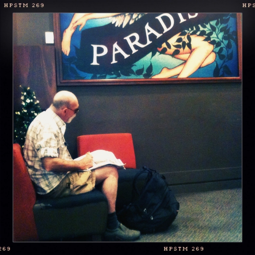
Boarding to paradise
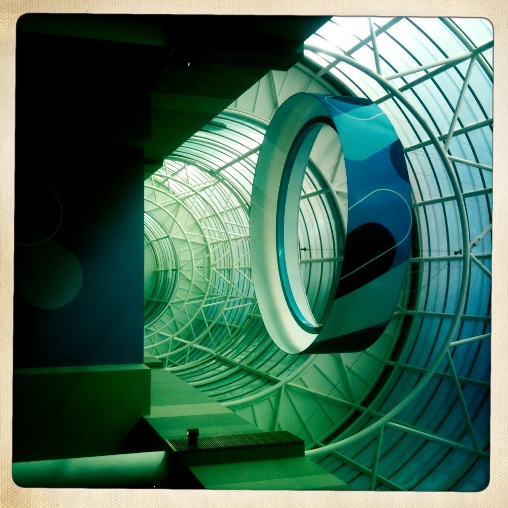
You haven’t seen the last of rings yet!

Rings keep on coming
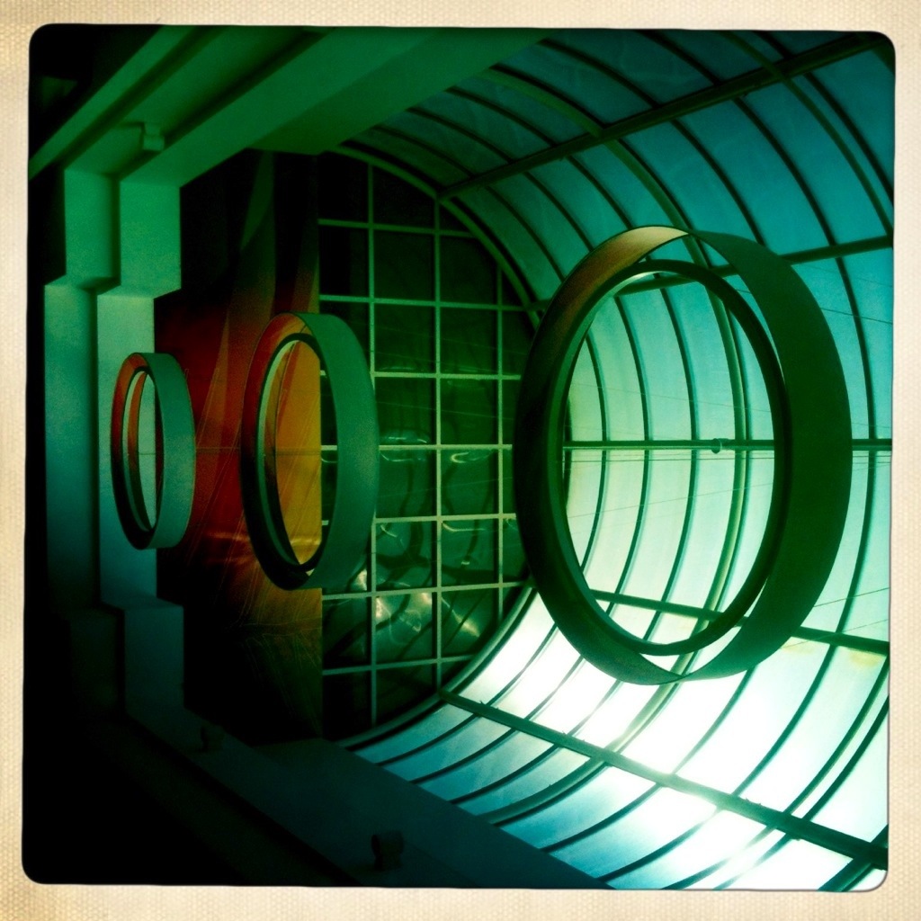
Space Rings
Feeding the Cockatoos at Dandenong Ranges
There is a nice cafe located in the Dandenong Ranges named “Grants on Sherbrooke”. It is a pretty ordinary place for one small exception – lots of Cockatoos and Rosellas live nearby and come to feed there. This cafe is a family business, so they took advantage of this situation, and created an organized place where people can buy bird food and feed the birds.
Walking by
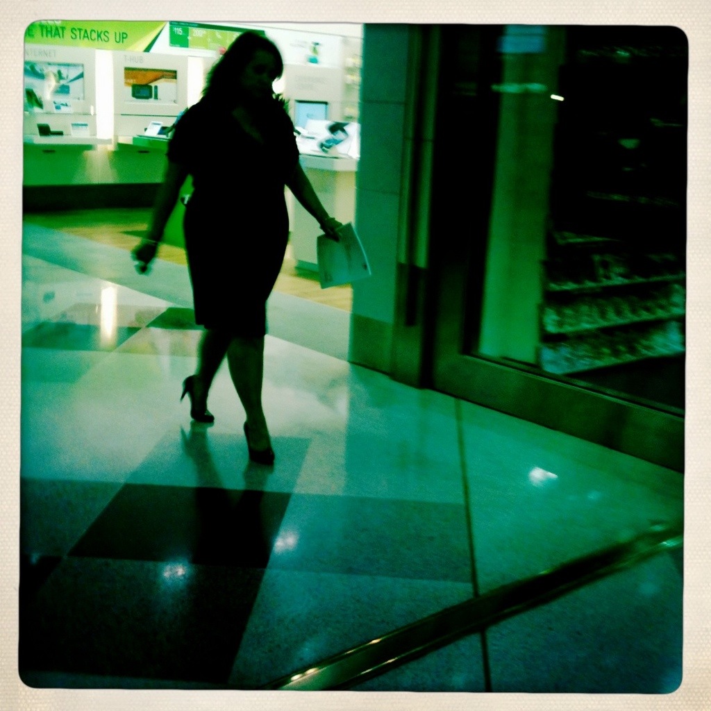
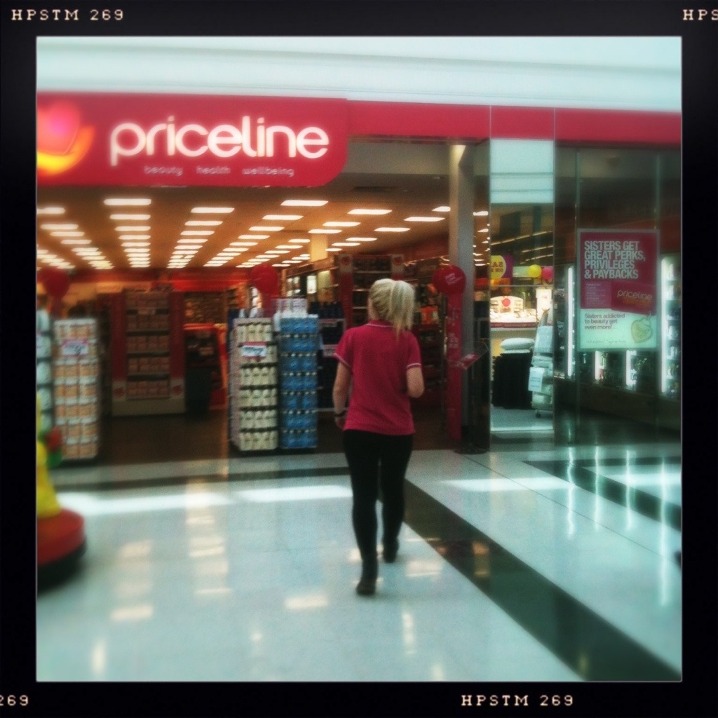
Guess where she is working
Tribute to Australian Spring
As you well know, it is Springtime in Australia. Everything blossoms and what a beautiful sight it is! Today we went for a short 2h walk along the Somers beach here in Victoria. During this short walk I saw such a huge variety of blossoming flowers that I couldn’t resist and took some photos. Here are just a few of those flowers.
Improvised Chair
My book was published in iBooks store
Recently I was not only working on redesigning PhotoPathway’s website but I was also creating a photo book titled “My Photo Pathway” to be published in iBooks store.
Photopathway has a fresh new look!
For quite a while I’ve felt that PhotoPathway needed a new look, but didn’t have the time to do something about it. A couple of months ago I desided to start working on it, but as a result I didn’t post anything new. I promise that will change from now on!
In the meantime you are welcome to check out the new design and the new portfolio section. I decided to make the photos in my portfolio available for sale, for more info on that please visit Purchase page.
I would really like to know what you think about the new look and your thoughts and suggestions, so feel free to leave comments!
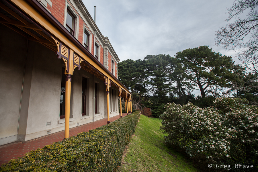
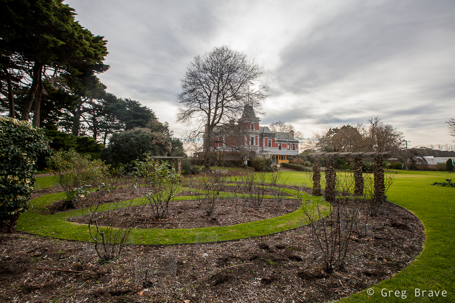
Weekend stroll at Coolart Historic Area
Coolart historic area is located near Somers, a small town approximately 72 km south-east of Melbourne, Victoria, located in the south-eastern corner of the Mornington peninsula. The area includes Coolart historic homestead, nice gardens, and lengthy walks around swamps, inhabited by various birds species.
Last weekend all three of us took a walk there, and it was a great way to spend time! I won’t go into historic details, I just want to show it to you through my lens.
Walking through the wetlands, depending on time of the day and the year you can see many different bird species. Here is what we saw.
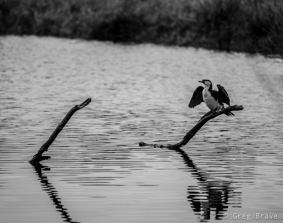
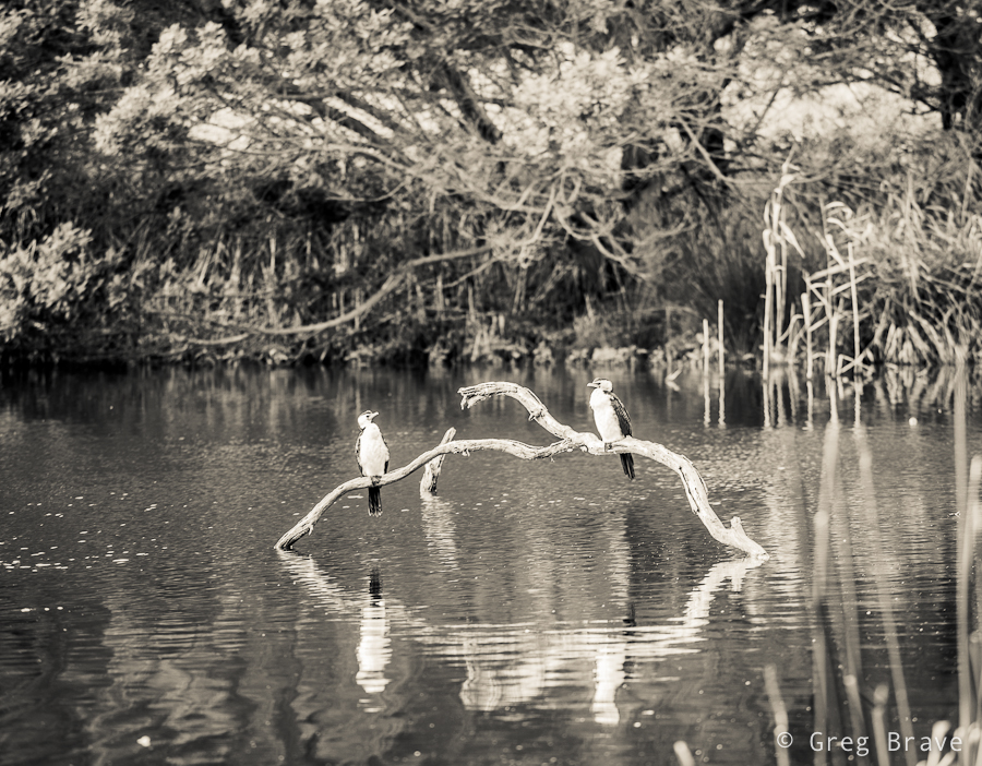
Click on the photos to enlarge.
We also had nice views of the wetlands and surrounding areas.
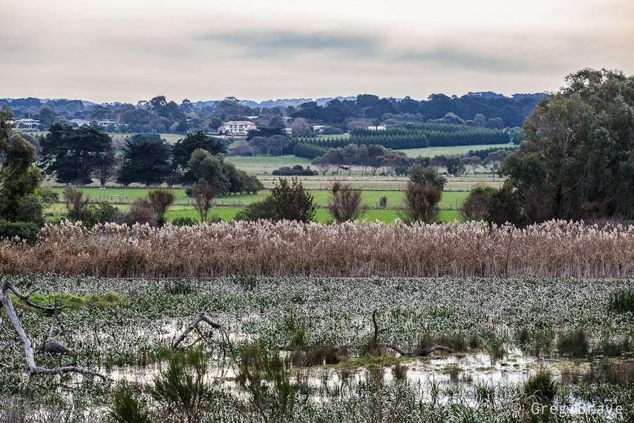
Click on the photo to enlarge.
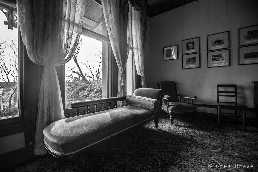
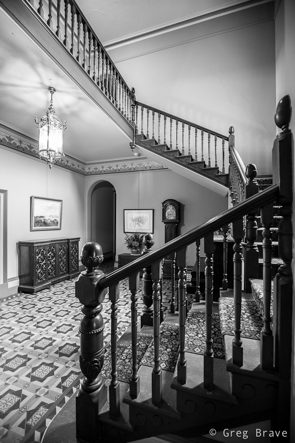
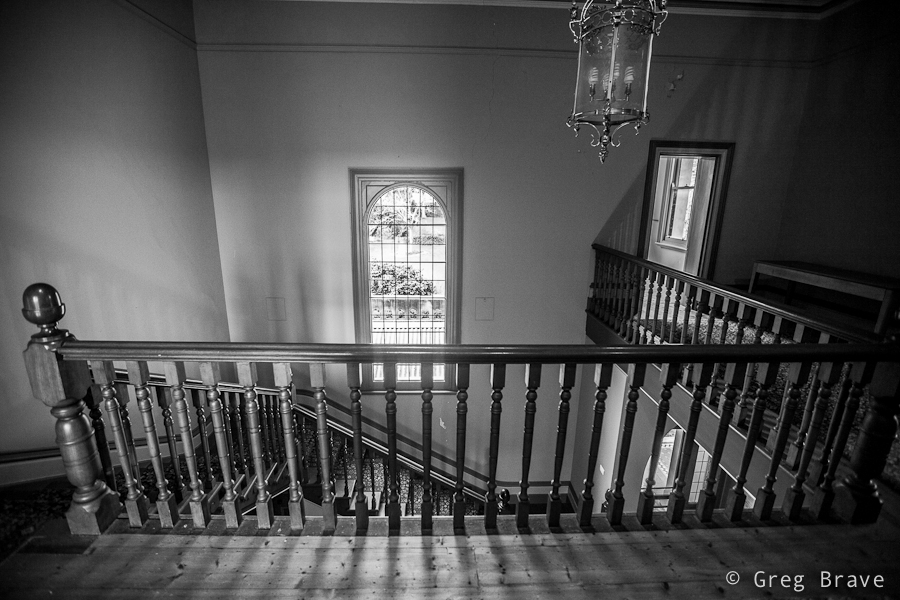
The Coolart Mansion looks very interesting. Parks Victoria have done a good job preserving it.
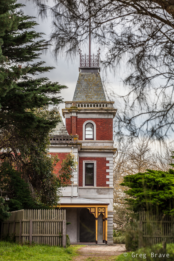
Click on the photos to enlarge.
Both from outside and inside.

Click on the photos to enlarge.
Here are some more interior details. I had a feeling that b&w suits them.
Click on the photo to enlarge.
And finally a view of the mansion from the gardens surrounding it.
Click on the photo to enlarge.
I hope you enjoyed this little virtual trip and will be happy to hear about it in the comments section below 🙂
Have an opinion people!
Going through my photographic journey I’ve slowly started to notice this very negative fact… at first it was a vague thought on the back of my mind, but then slowly I started to see it more and more clearly (I am talking about the world of photography enthusiasts and also professional photogrpahers) – too many people don’t have their own opinion.
Let me explain. I found famous photographers, who also have blogs, in which they showcase their work and write about photography related issues. And then there’s the comments section – and in those comments I almost never see anything other than compliments. “Oh what a great article!”, “Wow, what a nice photograph!”, “You are absolutely right”… but when I read that article or look at that photo I am thinking to myself – well this stuff is worse than average… nice photo but nothing special… but if I write in the comments that this photo is not that good and also why I think that, and I always do it politely, in response I receive replies from other readers that I don’t understand the work, and I don’t see the author’s vision… I am sorry but this is bullshit. Those people don’t have their own opinion and they go with everybody elses judgement, who in turn think that if this photographer is popular then his works MUST be good.People tend not to think by themselves. After a while I stopped writing such comments because I saw that instead of contributing to the discussion I am just stirring the air.
Just recently I was searching for an interesting photography podcast to listen to while driving, and I found a podcast with very promising name “Art of photography”, but after listening to four or five episodes I couldn’t bear it anymore – all the guy talked about was film cameras and related technical stuff – reviewed some old film cameras, explained something about how to project light on a fork and onto light-sensitive paper to get an image of a fork, and even how to make film negative out of digital image (!!!). So this guy probably thinks that “Art of photography” is shooting with film…
Another very popular guy rants about how gear is not important, and how the vision is… and then I look at his photographs that he presents on his blog, which are mostly landscapes and I don’t see the vision… the thing that scares me is that those guys have their following, and people look at their work and want to be like them, while there’s not much to look up to. Yes, I know, in the world of photography everybody knows those guys, and nobody knows me, so they must be right and I must be wrong, but in my defense I have to say that before judging work of others I am thinking, by myself, listening to my inner voice, trying not to be swept by the opinions of others.
There are photographers who I look up to. Surprisingly most of them are not too famous. I visit their websites and blogs and listen to what they have to say and learn from them, but most importantly I am always trying to THINK and FEEL everything by myself. And this is what I wish for everybody who wants to get somewhere in photography – think for yourself, don’t let others do the thinking for you.
P.S. One of the websites that constantly presents great photographs is 1x.com. Just one thing to have in mind – they offer hosting service, and if you pay an annual fee you can have your own gallery on their website, where you can put whatever photos you like. When visiting the website you might accidentally end up in one of such galleries – those photos are not going through their tough selection process and hence their photographic value (the term I thought of myself! 🙂 ) varies.
Birthday Photoshoot
A couple of weeks ago I’ve got another family photoshoot. It was a very nice couple and a cutest little boy Leon who just recently turned 2 so they wanted some photos to remember this age. Parents wanted photos to be taken in the boys’ natural environment – their home and backyard. Therefore for me it was an “on location” photo shoot and I had to bring my lighting equipment.

Click on the photo to enlarge.
When shooting kids in studio you have time to set up all the lighting equipment before the session, but when you come to a family home, chances are you won’t have that luxury. There also might not be enough space for your light stands and stuff, which was exactly the case in this shoot. Lucky for me there was a large window with white curtains that provided a great light source. I also mounted a Canon 430ex speedlight on my camera and used it as additional light source, bouncing the light from the walls and ceiling.
For example, in the photo below I pointed the flash at the ceiling to get Leons’ beautiful long hair to be lit from above.

Click on the photo to enlarge.
With little kids most of the times you have first to earn their trust by playing with them and smiling a lot :), and then you have to react to their movements and catch those brief moments in which they forget about your presence and act naturally. I was also looking to capture various emotions and moods of the child.

Click on the photo to enlarge.
Another good idea is to give a kid something to play with. When Leon saw my large shoot-through umbrella, his eyes lit up with interest and he started to play with it, but it turned out to be too big for him. However his parents found a solution – they gave him a smaller umbrella, which kept him (and me) occupied for a while.

Click on the photo to enlarge.
At some point during the shoot Leon got so comfortable with me and my camera that he started intentionally posing for me. When kids pose for camera it is nothing like when adults do it. Kids are natural, they can’t look “posing for camera” by definition, and I can prove it to you. In the next two photos Leon was intentionally posing for me.

Click on the photo to enlarge.
Could you tell that he was intentionally posing?

Click on the photo to enlarge.
I didn’t think so!

Click on the photo to enlarge.
I enjoyed this photoshoot very much and most importantly – the parents loved my work!
The only resident
Life is changing
I know I haven’t been around lately, but it was for a good reason! Last week Ira and I welcomed our baby daughter into this world. So this post will be all about her, our dear Eve.

Click on the photo to enlarge.
Being a photographer-dad, needless to say that already after one week, my hard drive doesn’t have enough space for all the photos I took of her. So I try to force myself to delete some of them. It is really hard, even when as a photographer, I see that the photo isn’t that good… but this is my daughter we are talking about!
Anyway 🙂 watching her for a while I saw that her face is constantly changing, different moods and expressions passing through like clouds in the sky. Sorting the photographs I chose a few of them to post here.


Hope you enjoyed the photos, and have a nice weekend!
The grass of the neighbor
Autumn is here
What, me? Heheh
Sailing
Fun Time
Building Composition
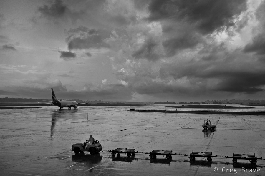
In this post I’d like to talk about composing photographs “after the fact”. Wait, don’t jump to any conclusions just yet, let me explain what I mean.
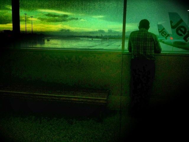
About a month ago I had to fly to Sydney for work but got stuck at the airport due to bad weather. I spent about two hours sitting in front of the large viewing glass looking at the runways. The weather was indeed stormy, it was dark from all the clouds, and there was nothing to photograph.
But when the weather started to get better, clouds began to clear, and airport started to come back to life, I finally took my camera out and started to stock my prey. I wanted to capture this feeling of the “airport awakening” when the planes begin to approach the runways, and workers move to and fro. Unfortunately no matter how hard I tried or how long I waited, I couldn’t capture the picture I had in mind… at least not in a single frame. Needless to say that I was very disappointed.
Later, when I returned home and went over those photos, my imagination switched gears – I saw details in different photographs, that put together would be able to create that image I had in my mind while shooting. Since I know my way around Photoshop, I decided to go ahead and try to do that.
I ended up with two images which both have two things in common – both of them I would call “airport awakening” because they portray the clearing of the storm, and resuming operations of the airport. The second thing is the way in which I created this sense of awakening – with directions. I’ll explain this in more detail by going over the images.
In this first image I have three different “directions”, which go in zig-zag shape leading the viewer’s eye from one element of composition to the next. First is the direction of the two trolleys, which goes from lower right to somewhere in the middle left side of the image, next is the direction of the moving utility vehicle which catches the eye on its way to the left and redirects it towards the upper right corner, and finally the eye reaches the plane and again changes direction to the left ending up on the airplanes in the distance. The floor is still wet from the rain, but the sun starts to shine through, giving the feeling that storm has ended…
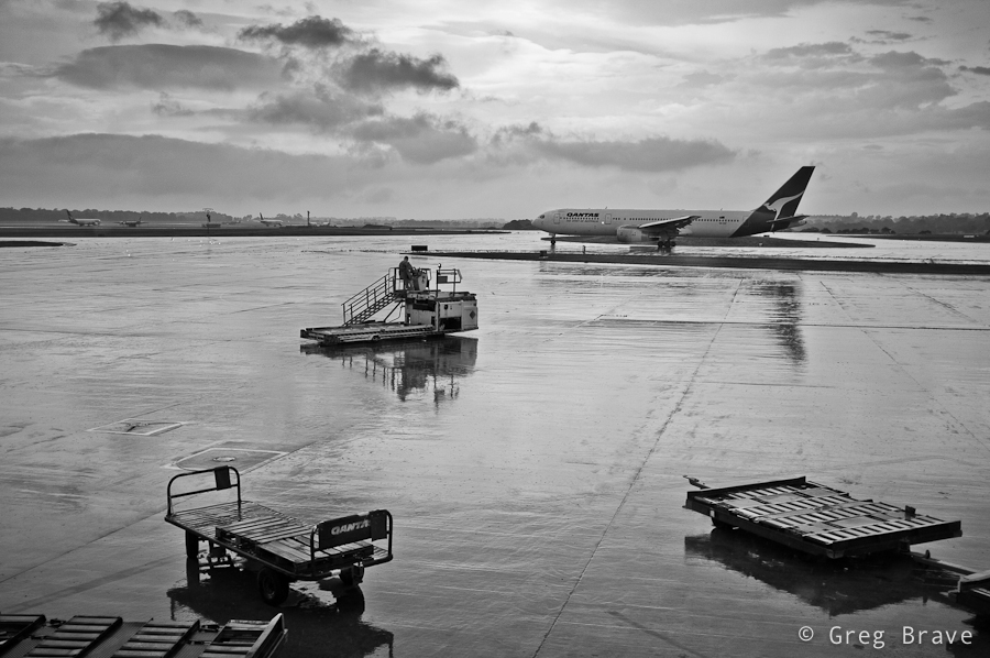
Click on the photo to enlarge.
The second image is darker, as if there is still the danger of the storm, but the moving vehicles hint of a hope for good weather. And again, we have the directions theme – from right to left, then from left to right, and finally the plane takes us into the depths of the image.
Click on the photo to enlarge.
The main thing that made the compositing easy was that I shot all the photos from approximately the same location and also I was using the same focal length.
As always your thoughts, suggestions, and critiques are welcome in the comments section below.
On His Toes
20th Century History Of Photography – Part II
The first great and glorious era of modern art left the stage to the accompaniment of shots of World War II. Photography, ever since the Man Ray, and Laszlo Moholy-Nagy, sought after its particular poetry, took over the role of the informant, an agitator and propagandist. Editorial images from the war and political life of the rear attracted attention and aroused the emotions much lighter and stronger than the most sophisticated pictorialistic shot, which relies on the beauty and harmony of the plot and form. Reportage photography, having unprecedented resources and technical equipment at its disposal during the wartime, realized its power. It rejected the simple descriptiveness, making the photographic document into a work of art.
After the war, the attitude of a busy and feverishly anxious world towards photography hasn’t changed. News and reportage photography began to play a leading role, while the amateur photography, which affected profoundly the photographic industry, followed its steps. This was not at all surprising: the increasing number of magazines consumed tons of photos. Intense competition demanded for original, unique shots. An unexpected opportunity unraveled before the amateur photographers – to bring their images into the world of professional photography.

Photo by Robert Capa. Click on the photo to enlarge.
“Earn with your camera!” – Called ads in newspapers and magazines during the 1940s and 1950s as strongly as ever: “Photograph, and your life will be richer!”.
The quality of newspaper photography was growing rapidly. A new type of photography emerged, it served for the artistic decoration of newspapers, which before the war, editors firmly rejected as unnecessary clutter of valuable newspaper-space. Competition with television forced photographic magazines to compensate for the lack of “currentness” by perfection of technical execution and aesthetic impact. Painstakingly prepared photo-essays began to appear. And at the head of this new direction was the “Magnum” agency with amazing images of exotic, incredibly bold frames.
“MAGNUM” again revived the fashion for “pictures of everyday life,” which found the most complete and artistically most significant expression in the collection of photographs of Cartier-Bresson, published in a book titled “The Europeans”, in Paris in 1955. Under the influence of work of Robert Capa, David Seymour, and Cartier-Bresson, western photography discovered the everyday life, and deeply penetrated into it capturing its dramas and diversity. Edward Steichen organized the exhibition “The Family of Man”, which contained pictures, selected from hundreds of thousands of photographs, and was the biggest event of the photographic life at the time. It was also the apex of reportage photography, the victory of photojournalism over the pictorial and poetic photography.
But then this rich source began dry up. Television won the battle in a dominating fashion, basically condemning the Hollywood and illustrated magazines to die. The publishers could no longer be satisfied with pictures of amateur singles that had very limited resources. They started more often to commission creative teams that actually, became photo agencies long before. These agencies could fulfil any commission, from military photos, and ending to the spicy photos of beauties that adorned the covers of fashion magazines.
Photo by Rene Burri. Click on the photo to enlarge.
“MAGNUM” secured its place in the history of photography. It firmly entrenched in its chosen field of photography and distributed materials mainly for the “Life” magazine. It did not resort to gangster methods of “scandalous” photographers stalking their victims in the back streets of “sweet life” on the Via Veneto. Agency managed to thrive without the assistance of gangs of apaches and did not resort to extortion, relying entirely on the simple but proven means of ensuring the success of the enterprise: darkrooms, helicopters, money, cooperation of diplomats or even prime ministers.
The optimistic ads prompting amateur photographers to earn money with their own cameras disappeared from the pages of magazines. Nobody believed them anyway. Nobody would pay several hundred dollars for a new camera just because it would allow for a few milliseconds shorter shutter speeds. Those decoys became a thing of the past (or did they? – Greg’s note).
Amateur photography all over the world returned to its true nature of simply love for photography, photographic trade and industry started to decline, but with renewed vigour sounded the photographic poetry, while the so-called “photography of everyday life” started losing his fans. All these phenomena were closely related to each other, although the “Photo-dealer” (a big photo equipment seller) said the source of all evil was Japanese produce and required high duties on imports of Japanese cameras.
Photo by Rene Burri. Click on the photo to enlarge.
However the “Magnum” agency moved its central office from Paris to New York, closer to the editors of the “Life” magazine, closer to sources of funding. This wasn’t particularly surprising: New York, Paris, Cape Town or Sydney – does it matter? This was just a station in endless traveling and the pursuit of pictures.
Photos of “Magnum” agency are still selected very carefully. No imperfect or weak images are allowed to slip to the press. 99 percent of production goes to trash, nevertheless what is left after the selection are images representing the very best of the Western storytelling photography.
But the agency founders are dead – and so is the noble motto of their creative team, calling for humanity and against the war. What remains is the perfectly organized company.
20th Century History Of Photography – Part I
In one of my articles I told you about the wonderful old Czech photo magazine Revue Fotografie. I also complied a pdf photo album with some of the photographs from one of its issues. Since then I have found quite a lot of Revue Fotografie issues, and red many of its great articles, but unfortunately they were all in Russian language, so I can’t display them here. However, just recently I red this article by Ludwig Soucek about the “Magnum” photo agency, which still exists today. This article was written in 1965 and it describes not only the history of the agency but the overall photographic history leading up to that time. I loved this article so much that I decided to translate and share it here. I had to “revise” it a bit because it speaks of some events in present tense while they already long gone – for example when this article was written Henry Cartier-Bresson was still alive and working at Magnum!
I’m sure this article will be of interest to anyone who is into photography.
Photo by Henry Cartier-Bresson. Click on the photo to enlarge.
The author of the fundamental piece “The Arts” Hendrik Willem van Loon wrote in 1939: “I am confident that after a hundred years, art researcher will dedicate the same amount of chapters in his book to photography, as well as to painting.” And when this prophecy comes true, then one of the largest chapters will probably be dedicated to the famous “Magnum” agency – a typical phenomenon of the global photography of our age that discovered and showed the world new forms of expression.
In the spring of 1947 three friends gathered together around a bottle of champagne: Robert Capa, Henri Cartier-Bresson and David Seymour, tramps who roamed all the seas and oceans, people with colourful biographies. Judging by their pseudonyms one can hardly guess that the first one is a Hungarian, the second – a Frenchman, and the third – a Pole. They founded a creative team that set a goal to introduce a fair share of sensationalism and emotion into journalistic and documentary photography (through which it would be able to sustain an unequal battle with television) – the humanistic tendencies and personality traits.
They had much to tell. During the Spanish Civil War they were on the same side of the front along with Ernest Hemingway, Ludwig Renn, General Walter (whose real name was Karol Sverzhevsky), and a physician Allen Gorgon. During the Second World War, Henry Cartier-Bresson was taken prisoner, tried to escape twice but without success, and only the third time was successful. Capa and Seymour fought as well – Capa armed with a rifle, Seymour with a camera.
Over a bottle of champagne this new group set its motto: “No to war!” Capa dreamed of photographing children and his beloved country, Greece; Bresson was going to visit the countries in which freedom was just being born – China and India.
Photo by Erich Lessing. Click on the photo to enlarge.
However, Robert Capa hit a mine, while as a war correspondent he was shooting a dirty war in Vietnam in 1954. And David Seymour was caught in machine gun fire, when he was in Israeli trenches shooting the report on the Suez conflict in 1956. Henri Cartier-Bresson was the lone survivor of the group. He became a press photographer of the magazine “Life” and has won great popularity. He also continued to work for “MAGNUM” flying all over the world, and constantly photographing. He would take hundreds, thousands, tens of thousands of images, but did not publish them, did not care about their application and did not create photo-essays from them. All that was dealt with by the Magnum’s headquarters staff group, which called itself “Cooperative for allocation and distribution of reportage photographs”
Agency’s funds, once very scarce – only sufficed for a bottle of champagne – had increased significantly. For the photo on the cover of the Life magazine in 1965, photographer could receive anywhere between 500 to 2000 dollars (according to his fame), and fees for the reportage would be twice or three times as much. The number of cooperative members grew. Englishman George Rodger, Austrian Ernst Haas, a Swiss Werner Bischof were the fourth, fifth and sixth members. Werner Bischof died tragically in 1954, falling into the abyss near Lima, where he was sent by the agency to shoot the holy city of the Incas – Machu Picchu.
“MAGNUM” didn’t suffer from lack of personnel though – it was a dream of every photojournalist to become a member of the agency. This popularity brought the agency vast new possibilities and glory. The agency welcomed several new photographers: Marc Riboud, Erich Lessing, Rene Burri, Brian Brake, Inge Morath, and others. All of them used Leicas, advertising the brand, as their shots were way better than any other type of advertising. Those photographers were setting the tone and dictated the fashion in the photography world.
After the Second World War photography captivated the world. Shares of the photographic industry, which was building more and more factories were the most reliable and profitable investment. During 1956 alone, more cameras were sold worldwide than during the hundred years that have passed since the invention of photography. After the WWII small-format cameras alone had sold about 125 million. Photographic companies that had billions in capital, united into powerful monopolies. In Japan, for example, the combined plants Aires, Canon, Fujica, Kalimar, Minolta, Nikon, Yashica, Mamiya, Ricoh, Bronica, Sankyo and others constituted one of the most powerful monopolies in the country. Before that happened, market conditions seemed secured for years to come. Hundreds of millions of amateur photographers, thanks to whom there was photographic market, were willing to buy new cameras having even the most minor improvements.
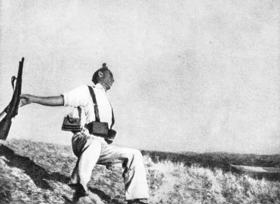
Photo by Robert Capa. Click on the photo to enlarge.
But in 1962, the first time since the Second World War, the number of units sold and materials ceased to grow. Prices have fallen – in some cases up to the one fourth of the original cost. Temporary instability of the market transformed into a crisis. The numbers of the first half of 1964 were very disappointing: out of the hundreds of factories, only three or four (Swedish “Hasselblad” American “Kodak”, German “Franke and Heidecke”) sustained the volume of production. Others clung to a straw – new and cheap models. They promised the maximal use of the film, and ensured completely successful photographs, but all their efforts were in vain: the photography craze that swept the world twelve years before, vanished.
This phenomenon was caused by a number of reasons. One of them was “Magnum.”
To be continued…
Friends

Sunny Rain
The Beer Story
Waiting
Three
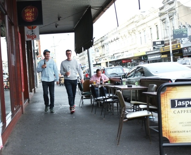
Street Candids
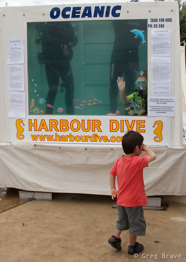
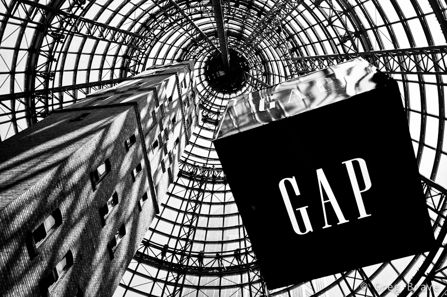
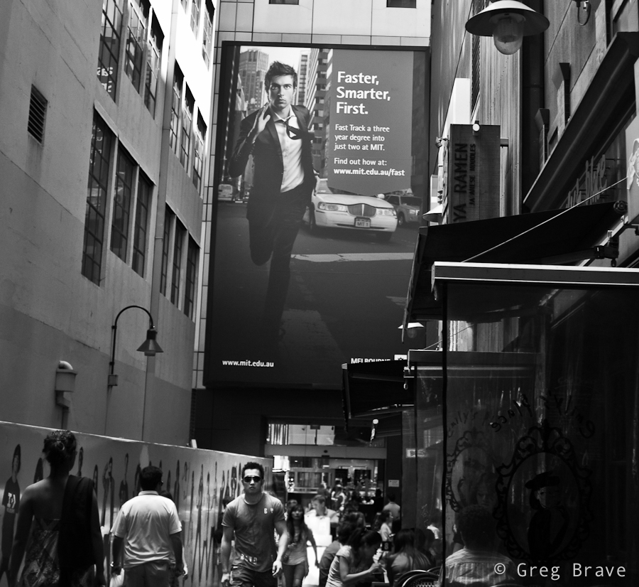
Lately I didn’t have much time for photography, so these photos are from couple of months ago. First three are from Frankston’s waterfront festival. And the last two were taken at Melbourne Central train station.
The following shot was planned. I saw this couple and was waiting for an expressive moment. I actually took several shots and this is my favorite.
I call this photo “Oh My God” :). I was trying to capture some of the kid’s expressions while riding this… thing, so I made a few shots, and only later saw this quite interesting result.
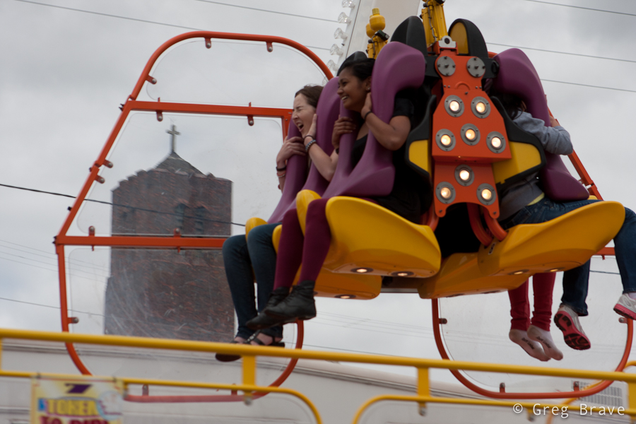
In the next photo I really like the hand gestures and little kid’s body language. It is a bit sad but very expressive
The photo below wasn’t Photoshopped – it is what you can see at the Melbourne Central station if you look straight up. In addition to the 3D effect, I like the shadow/light play on the building.
The next photo was also taken at Melbourne Central.
That’s it for now. I’m off to shoot one of my favorite subjects – the Sunset!
Waiting For Good Weather
Affection

Affection
Guess How Old I Just Turned
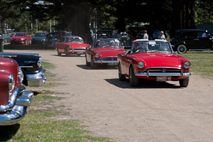
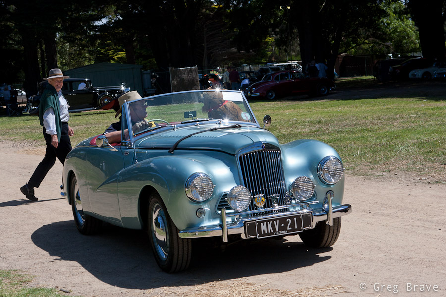
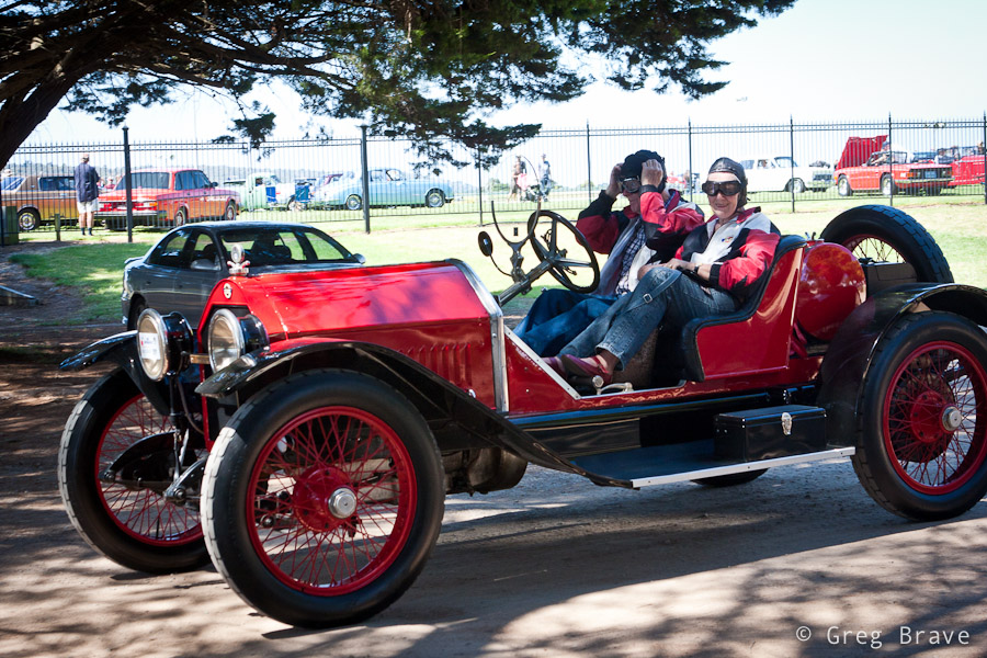
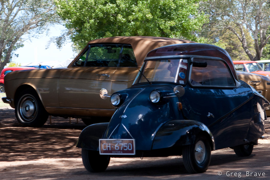
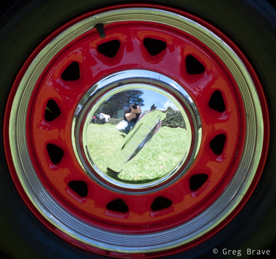
Old Cars Show in Mornington
|
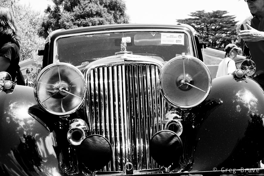
A couple of weeks ago Ira and I visited a collectible cars show at the Mornington’s racecourse. There were lots of beautiful old cars and we had lots of fun.There were also quite a few photographers taking shots of these beauties. But from my photographic perspective, I didn’t want to simply photograph the cars as I am sure there are already many photos of each model that was showcased there. |
| So instead I tried to look at the event not as “this is a car show, so I am going to photograph cars” but more as “this is a social event featuring nice cars, so there will be people interacting with them, and I want to capture this interaction”. And even when I photographed only the cars I tried to convey how I see them. For example when shooting the b&w Jaguar in the photo above I tried to show the “facial expression” of that car which was kind of “right in your face” 🙂 | 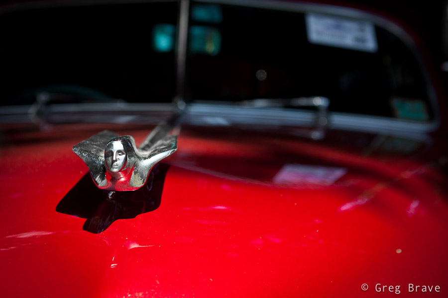 |
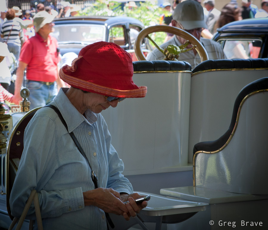
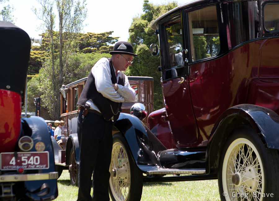
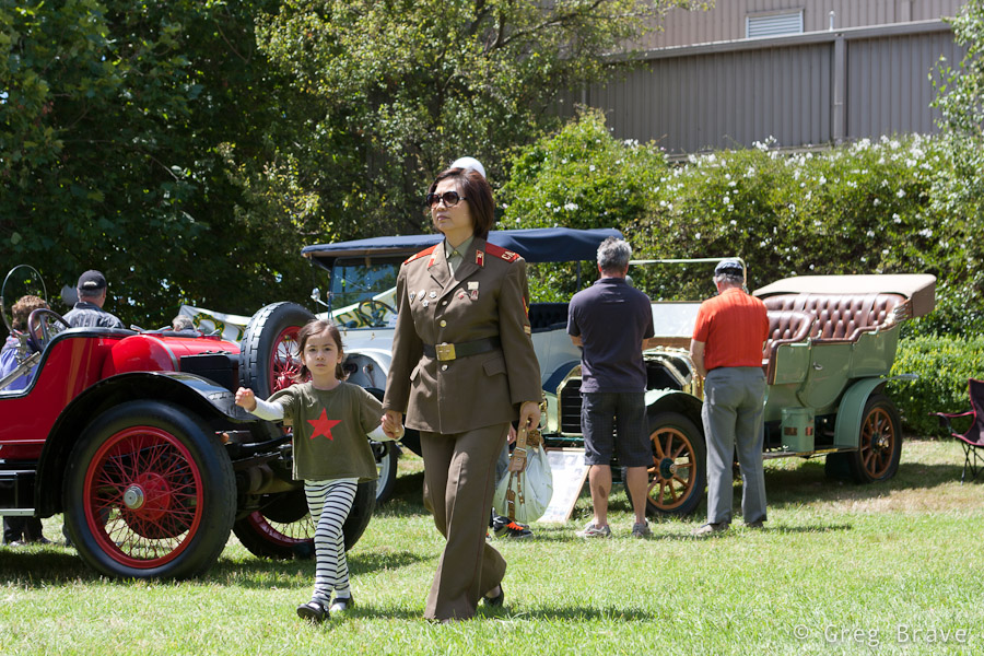
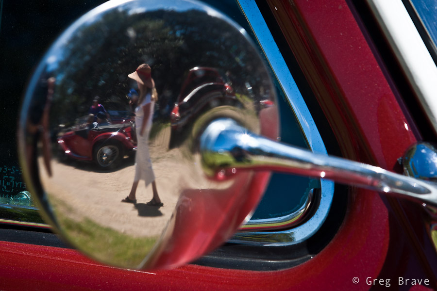
| We spent about one and a half hours at the show, and just when I thought that I’m done photographing, the car owners began starting up their cars and drive away – it was the end of that day. During the show the cars were standing unattended, while their owners were sitting somewhere in the shadow chatting and drinking coffee, so now it was a great opportunity for me to capture the cars together with their owners, and I tried to make the most of it. |
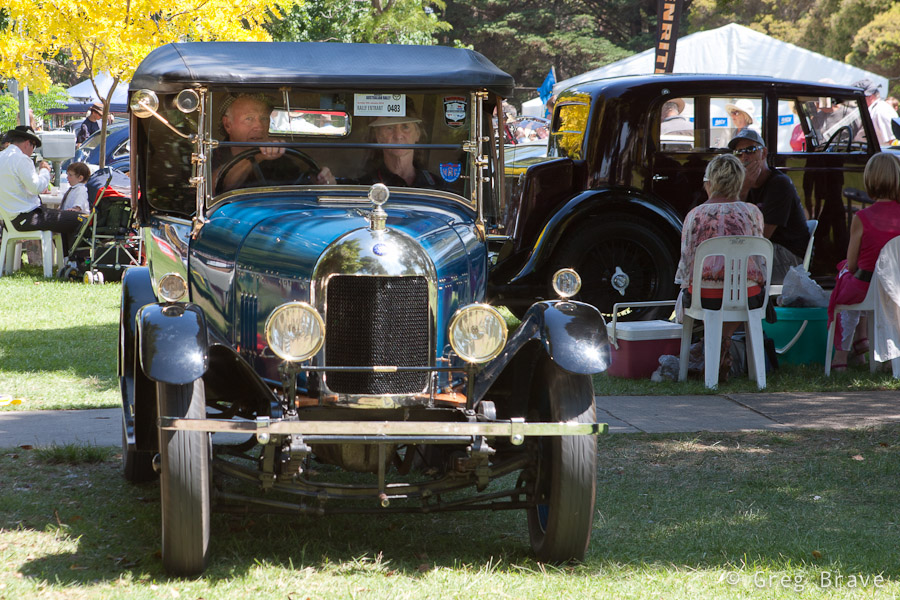
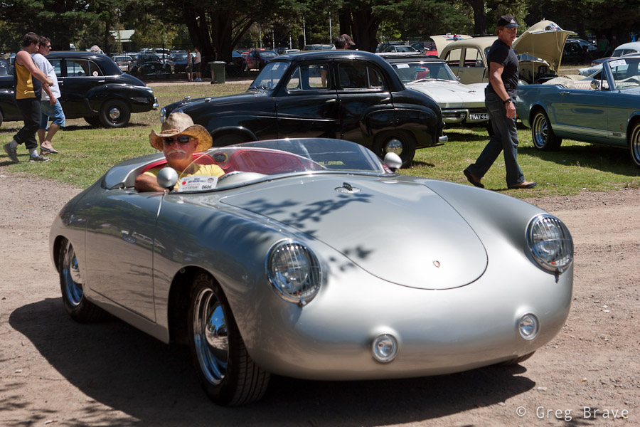

| From the technical side the biggest problem was the harsh sunlight, which created deep shadows and sharp transitions from light to shadow, so it was difficult to capture both the car and its surroundings and the driver sitting inside the car in the shadow. My solution to that problem was to shoot in RAW and slightly overexpose my photographs. This way in post processing I could lighten up the shadows and darken the highlights (the RAW format gives you a bit of freedom in correcting your exposure). |

| Hope you enjoyed the photos, and as always – you’re welcome to leave your “creative responses in the comment section below” (© Equals Three) 🙂 |
Buying Fruit
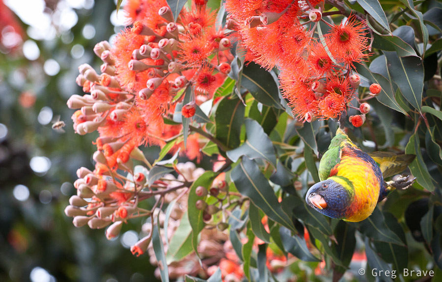
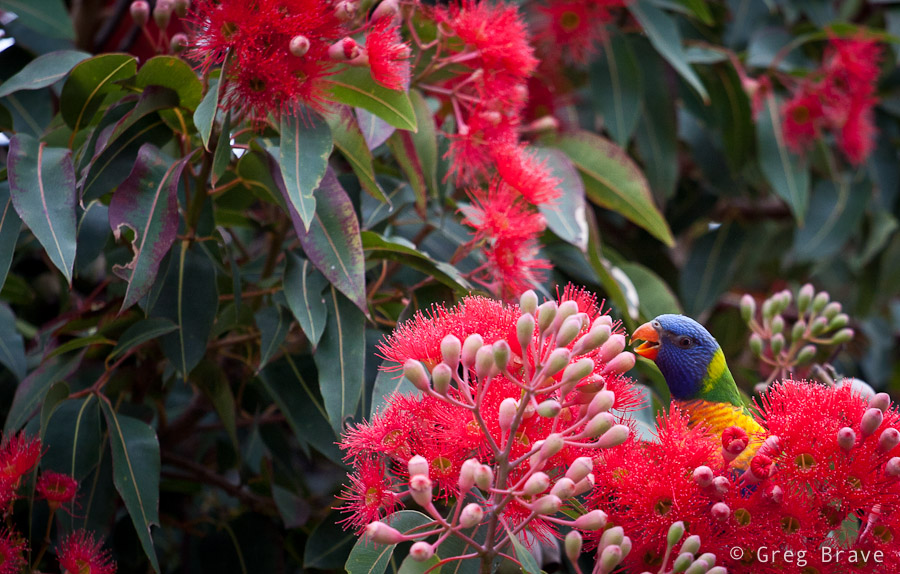
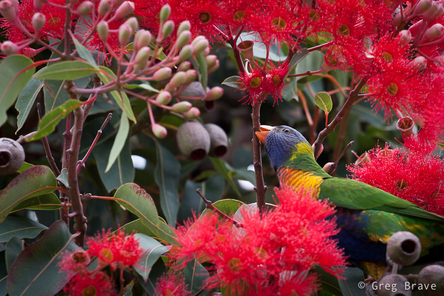
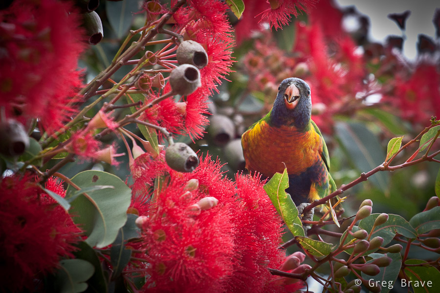
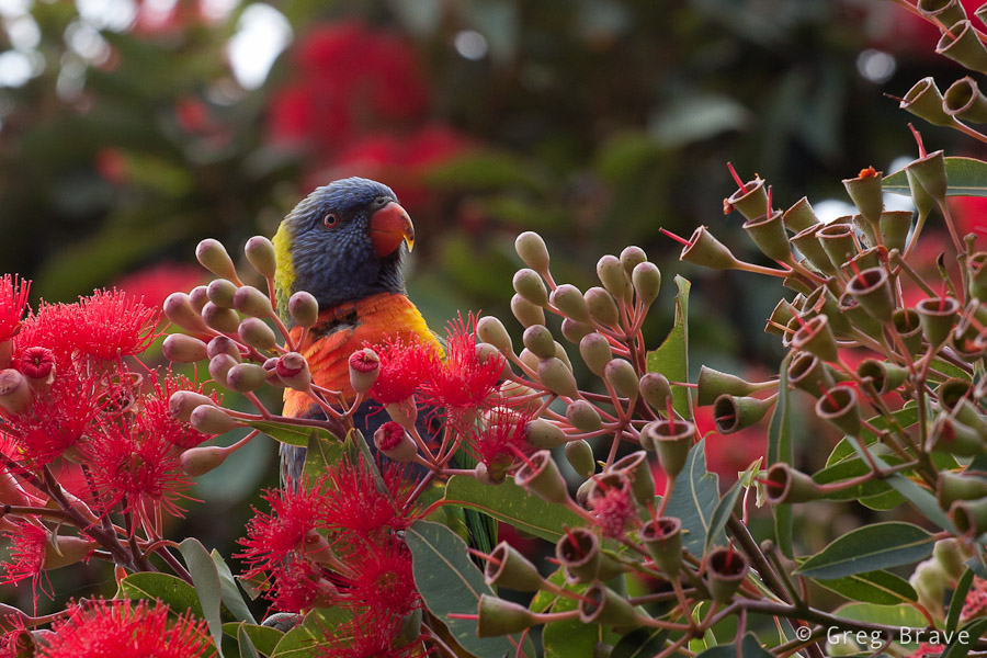
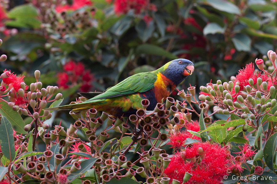
Blossoming Eucalyptuses
In the summer, here in Australia, Red-flowered gum trees start to blossom. This is a very beautiful sight! The whole tree is covered by marvelous, red-colored flowers. These trees have various hues of red, and when you have the whole street planted with them, the view is stunning!
Click on the photo to enlarge.
But merely this fact wasn’t enough for me to set aside some time on weekend and go photograph them. There was one more thing – early in the morning starting about at 7 o’clock and until about 9 the Rainbow Lorikeets (beautiful little parrots) come to feed on these trees. Most of the chances that you won’t see them later in the day there, but in the morning the blossoming trees are filled with these brightly colored little birds. It is quite simply a celebration of colors!
Click on the photo to enlarge.
I couldn’t miss this event, took my 70-200mm lens, and set out early in the morning to capture the nature at its best :). You can see what came out of that photo session in this post.
Click on the photos to enlarge.
I needed to have quite a lot of patience as the parrots were restless, kept moving all the time coming out and disappearing in the foliage, but I managed to get a few nice images. Hope you enjoy them!
Click on the photo to enlarge.
Accidents Happen
Healthy Obsession
Summer In Australia
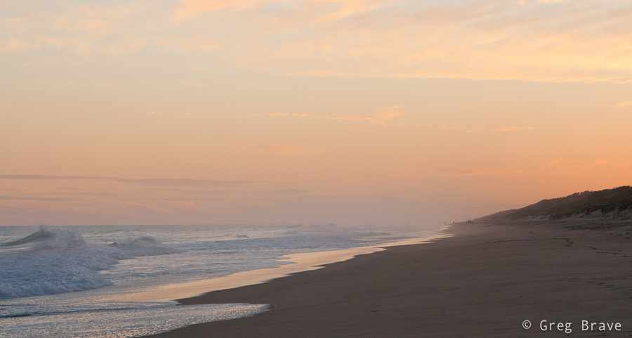
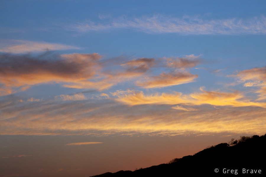
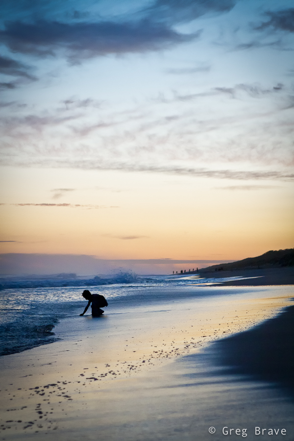
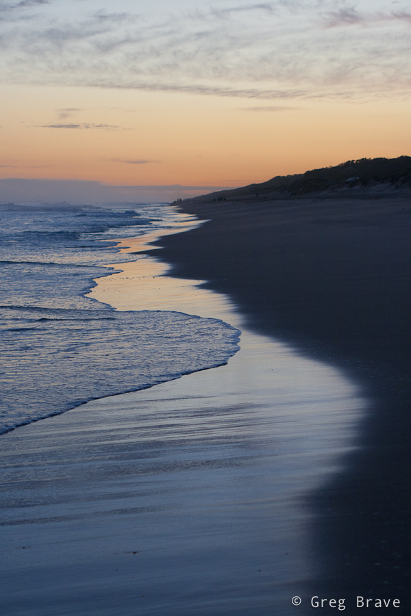
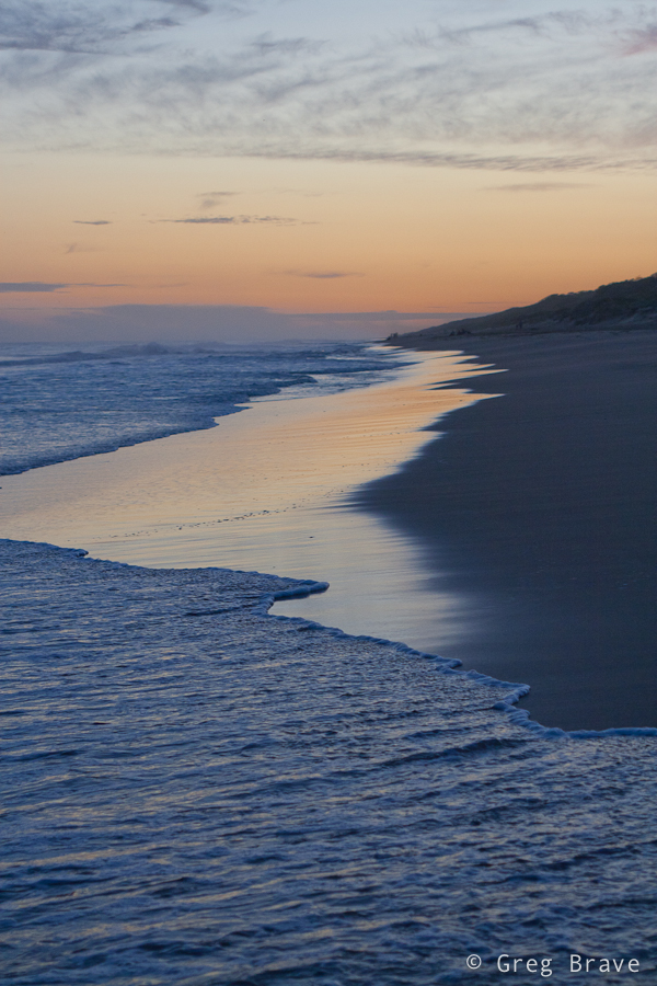
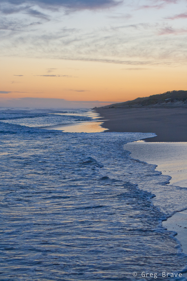
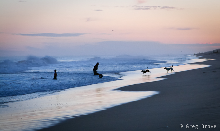
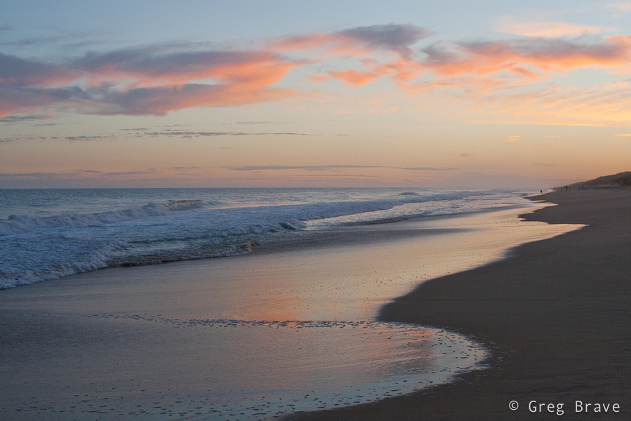
The Last Sunset of 2011
Ira and I have a tradition – we always try to spend the New Year’s eve somewhere far from the crowds and close to the nature. This time we spent it on the Ninety Mile Beach in Victoria. There are small pockets of free camping areas in the bush along the coastline, and though we weren’t alone there, when we went for our sunset walk on the beach, there was almost no one there.
Click on the photo to enlarge.
The last Sunset of the year 2011 was beautiful! The clouds slowly changed colors from golden to light pink, and the waves created intricate ever changing patterns on the sand erasing our footsteps as if we weren’t there at all.
Click on the photo to enlarge.
I became fascinated with the different shapes that the surf left on the beach and kept taking photographs, and later I had trouble to choose between them, so in this post you’ll see quite a lot of them.
Click on the photo to enlarge.
I’ve seen many photographers writing their resolutions for the new year. Well I don’t have one other than keep doing what I’ve already been doing, which is “Think and become a better photographer”. And when you think, you might change your opinion on various aspects of photography making your other resolutions obsolete. But you know, that’s only my opinion 🙂
Click on the photo to enlarge.
Click on the photo to enlarge.
Whatever your resolution for the 2012 might be, I’m wishing everybody a very Happy, Creative, Productive, Peaceful, and Healthy New Year!
They all stare at me!
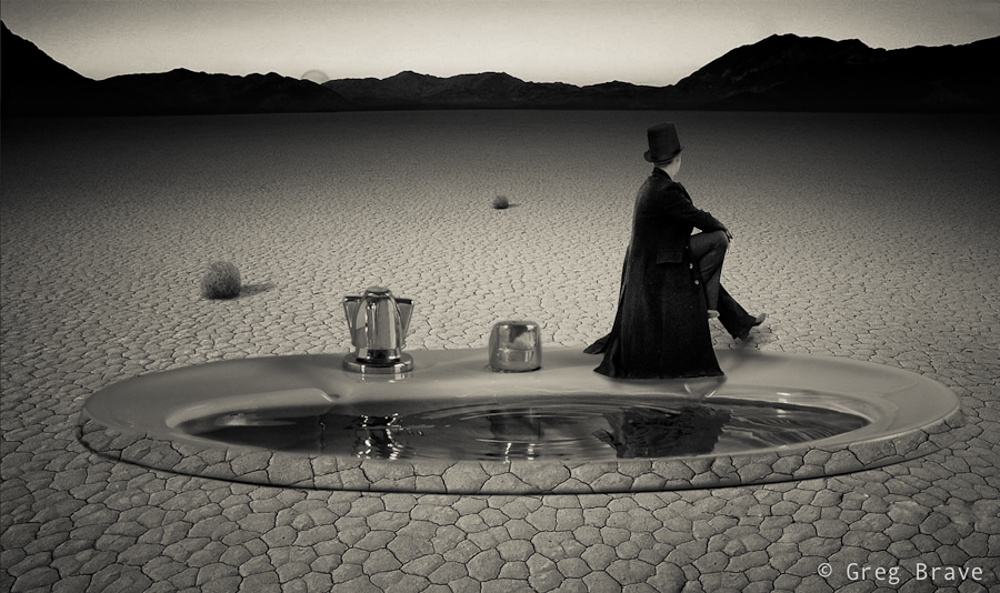
Using Your Imagination
Nobody knows what’s inside artist’s mind, so in order to express themselves and to share their visions with the world artists write music, paint, sculpt and use other means of expression. Mine is photography. Sometimes I have these crazy pictures in my mind, and I want to somehow realize them. Since I can’t draw very well, I am trying to do that by other means, currently it is compositing in Photoshop.
Recently an idea popped into my mind – a crazy magician who wanted to help all the thirsty people in the desert and he wanted to use his magic to create a lake in the desert, but something didn’t work right and he created a huge sink… so he sits on one of the knobs and feels blue 🙂
Here’s what came out of this idea:
Click on the photo to enlarge.
It is a composite of five photos – the background, which is the desert, the magician, the sink, the moon (yes! it is the moon 🙂 ), and the tumbleweeds. I did the composite in black and white because it is easier to blend all the parts together.
And what crazy ideas do you have ?
Ringside