There is so much talk about post processing, and whether it is good or bad. There are people who never post process their photos, and there are also people who always process their photos, and also anything in between.
I do process my images in Lightroom or Photoshop, but not always. Sometimes the weather is perfect, and the air is so clear that nothing needs improvement. But in our busy world, we don’t always have the time to wait for the perfect conditions, and have to settle for whatever weather there is when we have the time for shooting. In such cases post processing can significantly improve the end result, and it is very important to shoot RAW in such cases because it gives you more flexibility in post processing.
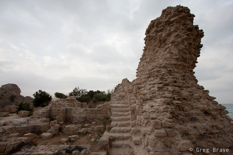
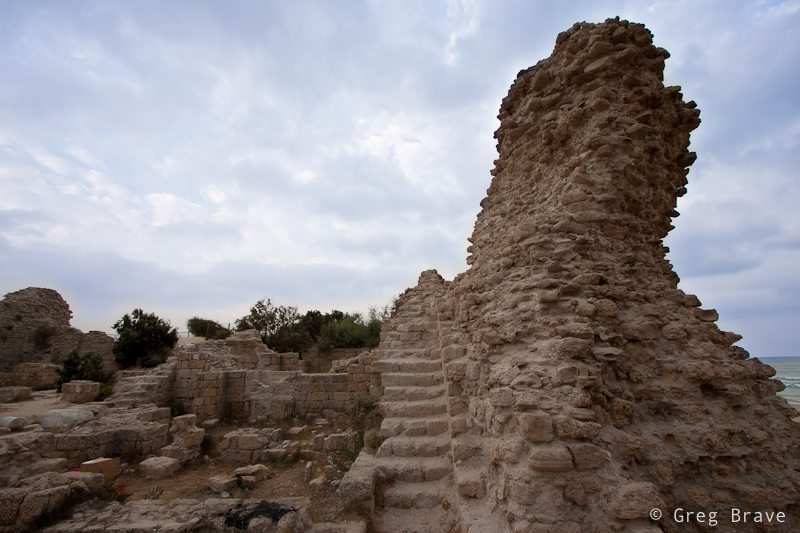
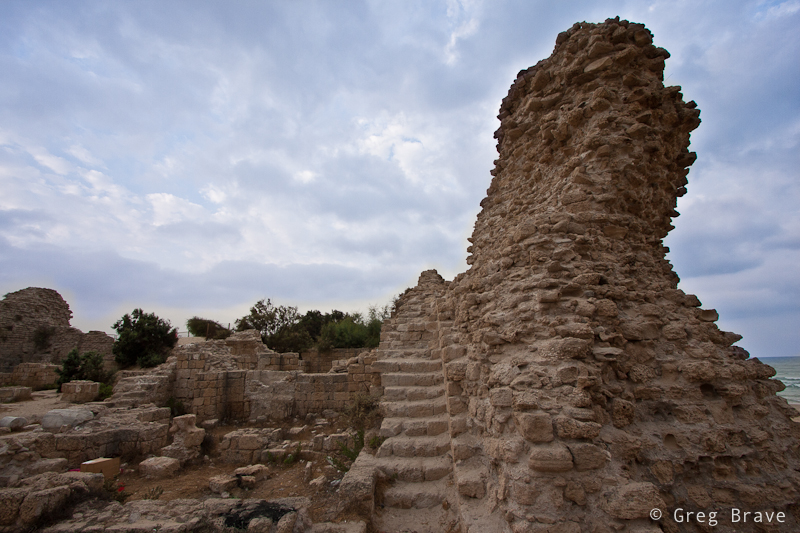
In this post I will walk you through my Lightroom post processing steps, using one of the recent photos I took. Below on the left you can see the initial photo of an old fortress that I took on early morning. Unfortunately the sky was covered with clouds so that there was no contrast in the photograph.
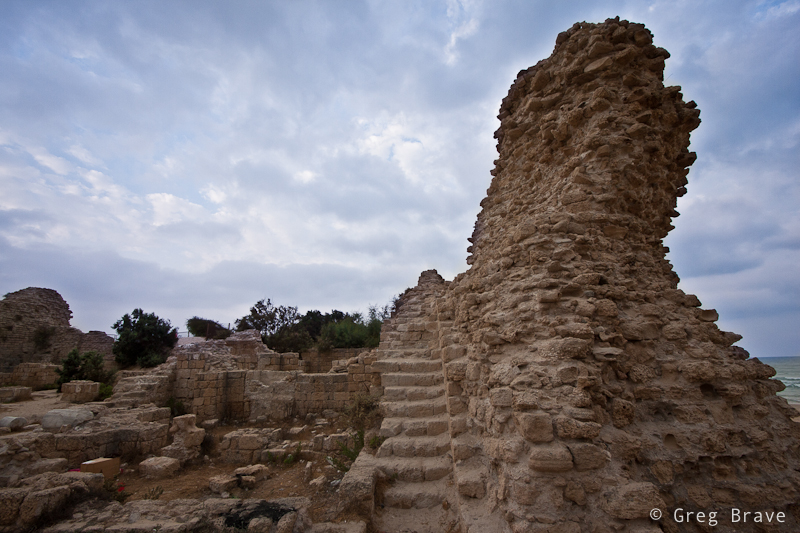
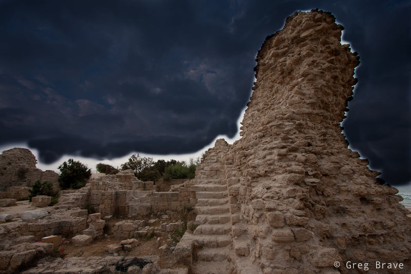
Below on the right you can see the final image, after I finished working on it in Lightroom 3.
Click on the photo to enlarge.
So how I achieved this end result? Let me walk you step by step. All the steps below were performed in the Develop module.

First of all the sky bothered me the most in my initial image. It lacked contrast and was completely colorless. So I opened the adjustment brush, set it up and covered the sky area. Below you can see the screen shot of the settings that I used for the adjustment brush. Let’s go through some of them:
Contrast – though in most cases increasing contrast is more useful, in this case with clouds decreasing the contrast revealed more detail in the clouds.
Saturation – I increased the saturation of the adjustment brush because I also changed the Color to a shade of blue (as I’ll show in the next screen shot), and for this addition of color to be seen better I had to increase the saturation.
Clarity – Clarity is always good for clouds :). Really, increasing clarity makes clouds pop.
Color – I decided to add a slight color tint to the clouds so that they won’t be boring gray, but still have a realistic color.
Feather and Flow of the brush are needed for creating smooth gradients between the adjusted and not adjusted areas. The values that you see here are not a must, and you’ll have to play with them to find what suits your taste.
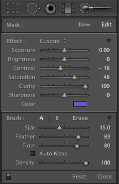
Below you can see the color selection box and the values that I chose. 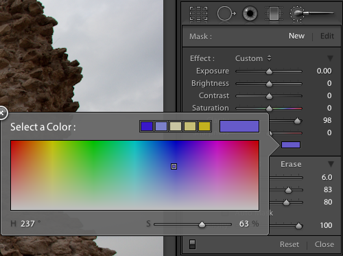
Now, I painted with the adjustment brush over the sky. There is a slight problem when you want to paint with adjustment brush over large areas, especially when the changes that brush does are subtle – you might miss a few spots in the middle and even more at the edges. I found a pretty easy solution for this: temporarily, in the adjustment brush settings decrease the exposure value to -4 so that in addition to all your essential adjustments, you’ll also significantly darken the image in the painted area. This will make the painted area perfectly visible. Then, after selecting everything that you want, slide the exposure slider back to it’s initial position.
In the image below you can see the clouds painted over with the adjustment brush with exposure set to -4.
Click on the photo to enlarge.
And here you can see the result of painting with the adjustment brush after I returned the exposure slider to zero:
Click on the photo to enlarge.
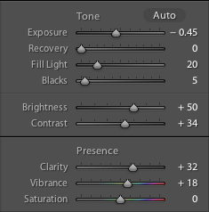
After adjusting the sky I examined the overall look and decided to make a few more adjustments to the whole image. In the screen shot below you can see the initial settings, with which I started.
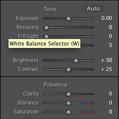
Let me explain the adjustments that I did.
I decreased Exposure slider to -0.45 in order to reveal even more details in clouds, but this also darkened too much the lower part of the image. To compensate for that I increased the Fill Light slider to 20. After increasing the fill light, I felt lack of contrast in the fortress, so I increased the Contrast to +34. Next I increased the Clarity and Vibrance just a little for a finishing touch. In the screen shot below you can see the final settings.
And this is how the image looked like after performing those changes.
Click on the photo to enlarge.
We’re almost done, but not just yet.
I stared at the image for a few minutes, and it seemed to me that something was missing. Finally I understood what it was – subtle vignetting. Let me explain. The shape of the right column together with the clouds create a sense of movement from the outer frame towards the center of the image, and vignetting would emphasize this sense of movement.
And here is the final image (same one as in the beginning of this post).
Click on the photo to enlarge.
So this is how I do my post processing – by first analyzing the image, deciding what is missing or could be improved, and performing the adjustments. Of course this whole process is not “scientific” at all. It is very intuitive and imaginative, because in order to achieve an end result you have to visualize it first. Sometimes though it is more like “lets move this slider and see what it does to the image”.
Did you find this article helpful? How do you post process your images? Any examples of before and after will be much appreciated, and
Remember, you only have to enter your name to leave a comment!
Greg.
Found your article from one of the forums. Very nice work and informative article!!!
Thank you x2, I am glad that you found it helpful.
Yes, very helphul!
nice result but the halo is still visible and makes it look a little bit fake (post-processed).
Stas,
Thank you for pointing my attention to the halo issue. It became mostly visible after the final adjustments, especially after adding a vignetting. So in order to eliminate this halo effect I should have been more careful in my final adjustments.
Hi, Sir,
I have been using Lightroom for 6 mos and it was always frustrating enhancing clouds using the graduated filter function, which gave me uneven, sometimes untidy results. I never realized I could use the paintbrush for the same purpose. Thanks so much for the tip. I bookmarked this page just to make sure I don’t forget your instructions.
Hello Trooper,
I am glad that you found this tutorial useful! Now you can think of additional ways of using the paintbrush that will help you in your post processing.
How would you remove the halo from the image?
Hi Alan,
Halo is a common problem in all kinds of post processings. In my case it is a result of not careful actions. If I would be more careful during each step, then I would see when the halo becomes visible, and eliminate it by “not doing” what I did.
For example if you paint on the clouds around the rock with adjustment brush but you don’t reach the rock close enough, sometimes you will have halo (depending on the type of the adjustment). One way to eliminate the halo would be to paint more closely to the rock, or even over the rock and see if that adjustment influences also the rock. If it does you can then carefully delete the adjustment area overlapping the rock.
It is not an exact science though.