I am not a believer in the “straight out of camera” philosophy. You know, the photographers who don’t do post processing at all and sometimes shoot in plain JPEGs. Anything in addition to that, would be “distorting the reality” they claim. My opinion on this subject is that there is no such thing as objective reality. Everyone sees what he sees through his own eyes and his own perspective. Your previous life experience also alters your perception of everything that you see around you. Even when you simply point your camera at a scene and shoot, the light goes through the lens, hits the sensor, gets transferred into electronic signals, then is processed by your digital camera’s own processor, and undergoes even more transformations until you see the photo on your computer screen. I don’t think I need to go further.
So, when I work on a photo, first I usually perform basic adjustments in Lightroom such as brightness and contrast and then, if I feel that it is not enough, first I try to understand why I feel that way. Is it the composition? If it is the composition then there’s nothing much can be done in post processing, and I will probably discard that photograph. But if the composition feels right then I continue my exploration. Are the shadows too shallow or too deep? Can the colors be improved?
Next, I open the photo in Photoshop and start playing with it, changing color palette, increasing/decreasing lights and darks, and other adjustments. Usually I come up with several versions of processed image, which look good to me, then I compare them and choose the one that I like the most.
Below I have three versions of the same photo, but the thing is that I can’t choose the one that I like the most. Each version has its own mood, and I have trouble choosing.
The first image below is the original version with only minor brightness adjustments.
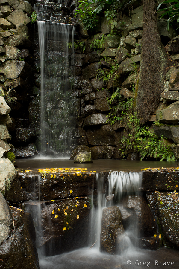
Click on the photo to enlarge.
The second version received quite a bit of processing, and has a warm autumnal feeling to it. I like the purplish glow and how it contrasts with the white of the water.
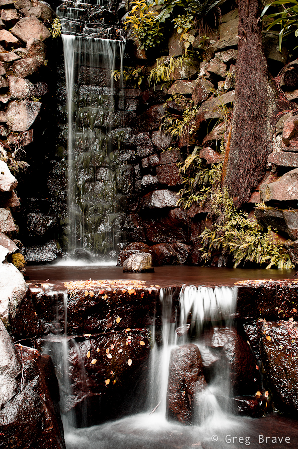
Click on the photo to enlarge.
In the third version I used the original photo as the base, substantially decreasing color saturation, of all the colors except the yellow of the leaves in the water. I also happen to like this version a lot.
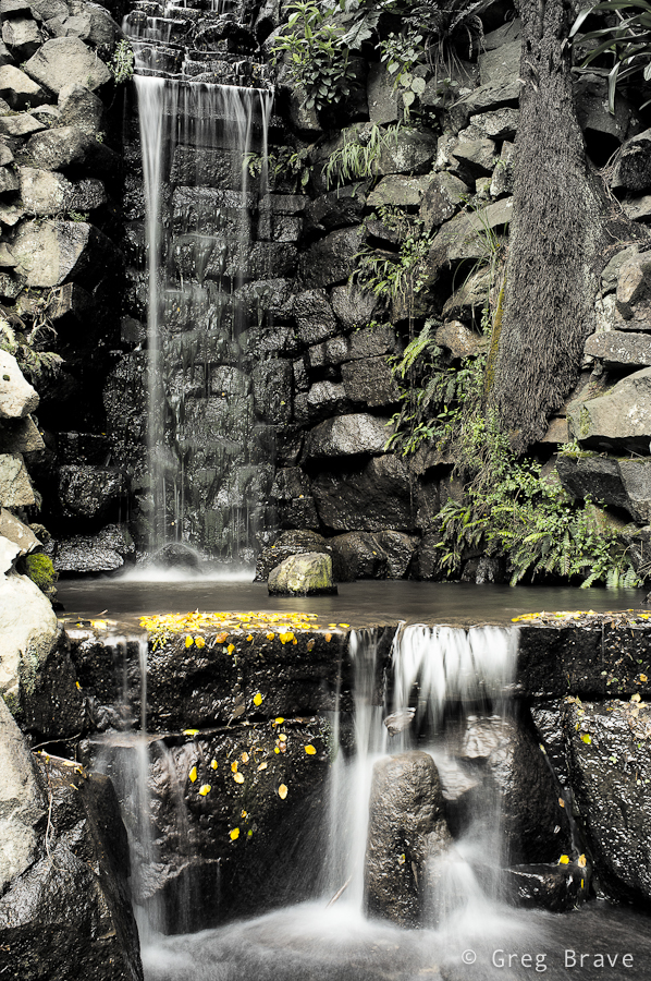
Click on the photo to enlarge.
Which version did you like? Please help me choose, but I also need to know the reason for your choice, and this is what the comment section below is for! You can also leave your comments on my Facebook page – http://www.facebook.com/photopathway
Hm, I can see why you cannot choose one! Each photo has a completely different mood.
The very first one is absolutely alive due to the vivid green colour.
The second one is a bit mistirious and kind of home-y. Warm colours are really inviting.
The third photo is more stylish due to grey-ish colours.
So I guess, my choice would be based on where I would want to have this photo in a frame.
Tha last one is superb!
Thank you Stas!