Alfred Nicholas Gardens are usually visited by photographers when Fall comes, and that’s what I wanted to do. However this year I arrived a little early and everything was still green. But it didn’t stop me from taking a few photos. Enjoy!
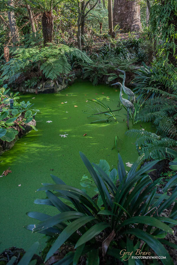
Alfred Nicholas Gardens are usually visited by photographers when Fall comes, and that’s what I wanted to do. However this year I arrived a little early and everything was still green. But it didn’t stop me from taking a few photos. Enjoy!
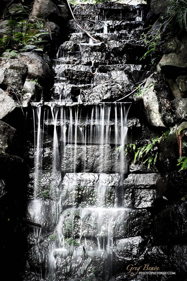
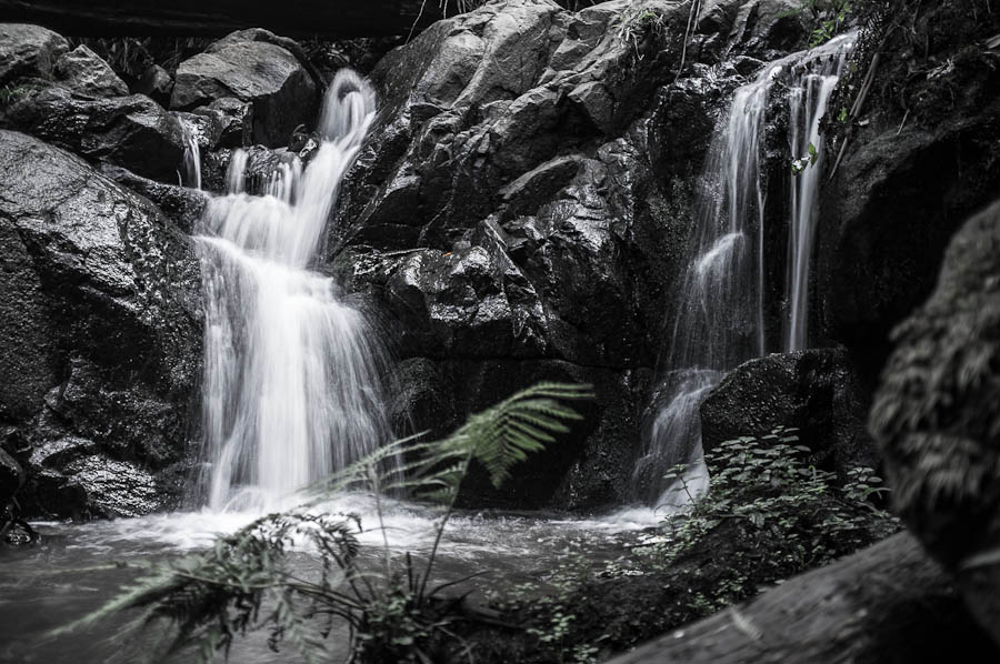
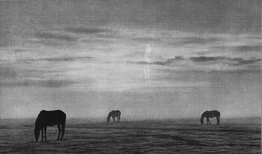
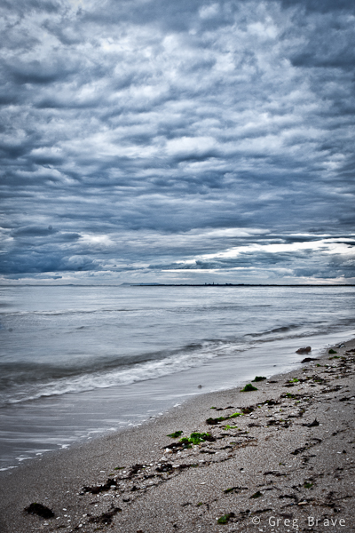
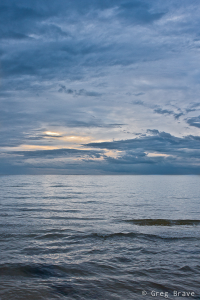
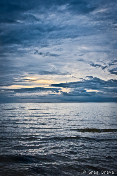
This weekend I took my family to a nice place in Dandenong Ranges here in Victoria – Olinda Falls. Thinking of it I love everything about the Dandenong Ranges forest, it is just beautiful. Having a creek with a few nice little falls is just a bonus. In short, it is a short trek leading from the car park through the forest to the Olinda creek and its falls.
We arrived there at rather late afternoon, sun was getting lower in the sky, there was humidity in the air as the creek was nearby. This perfect combination led to the photo below.
Near Olinda Falls, Victoria, Australia
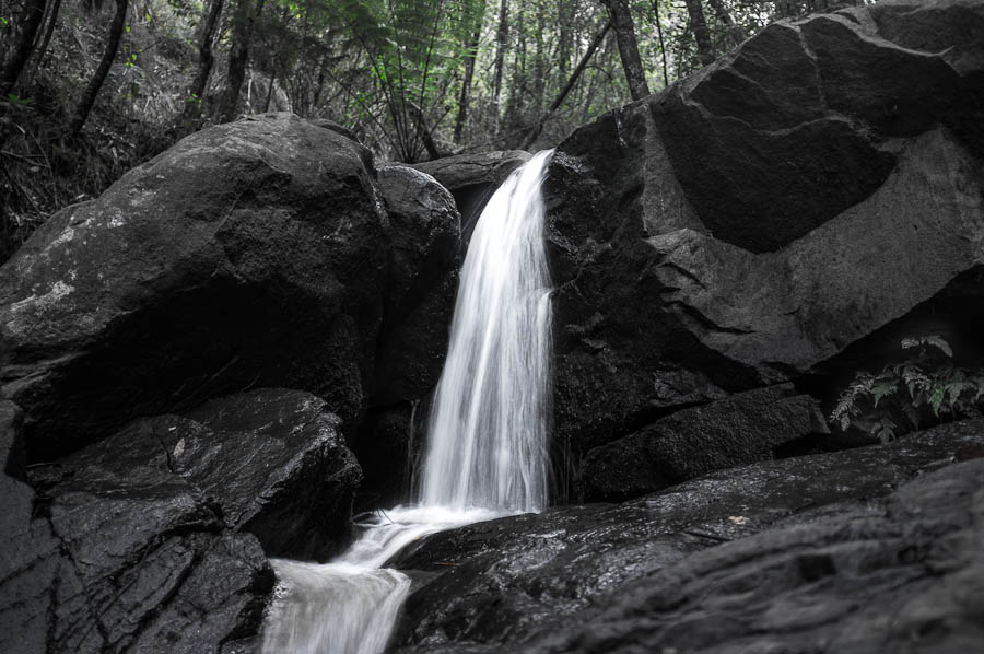
Olinda Falls 1, Victoria, Australia
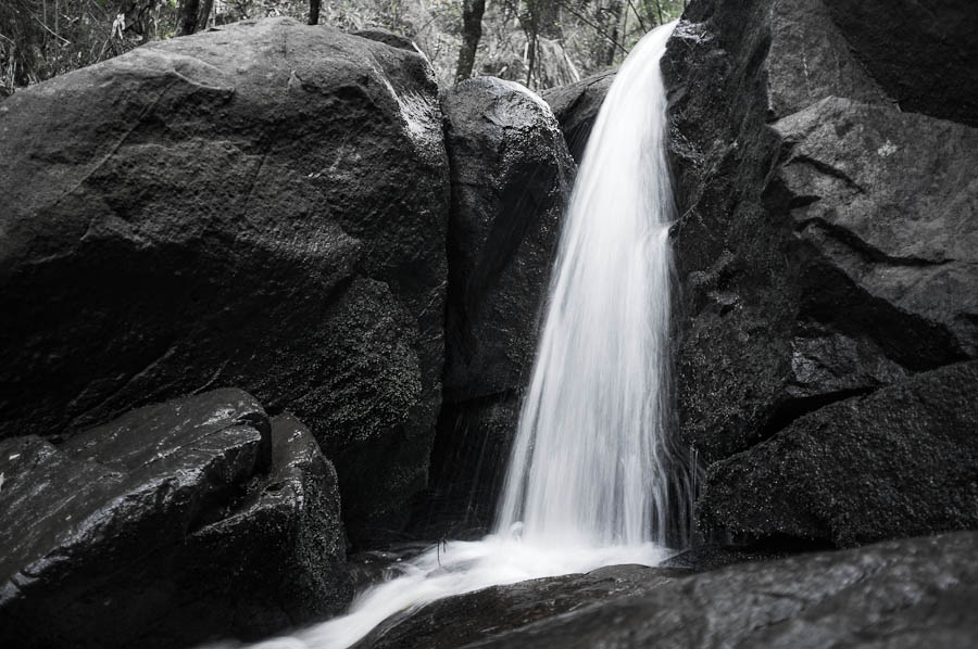
Olinda Falls 2, Victoria, Australia
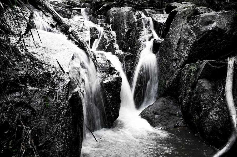
Olinda Falls 3, Victoria, Australia
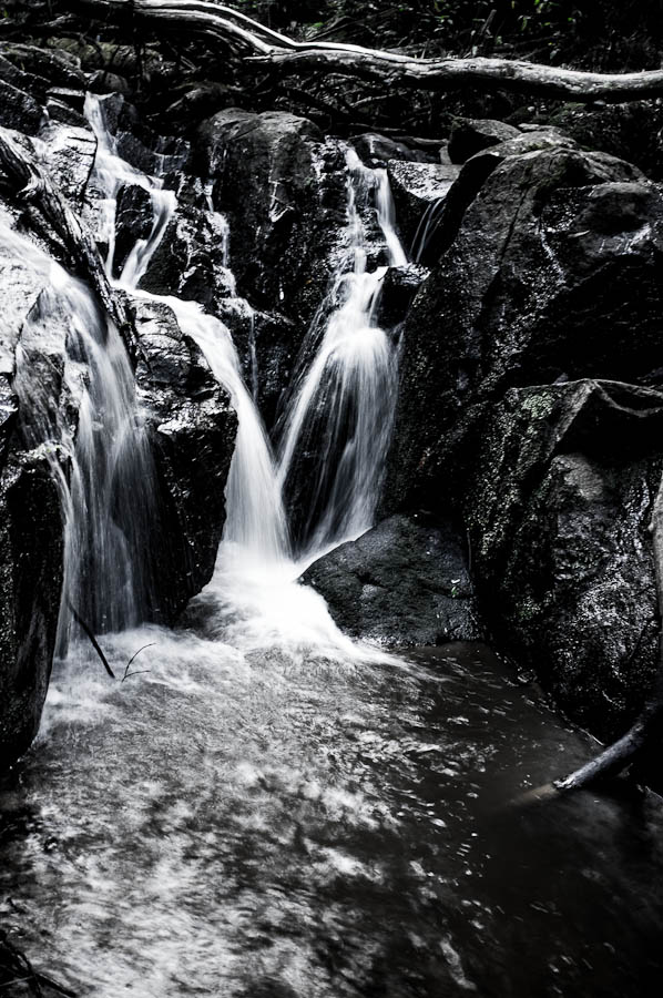
Olinda Falls 4, Victoria, Australia
Olinda Falls 5, Victoria, Australia
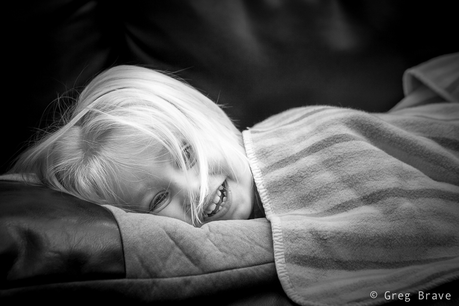
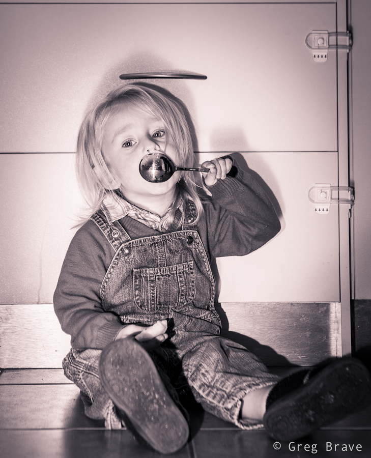
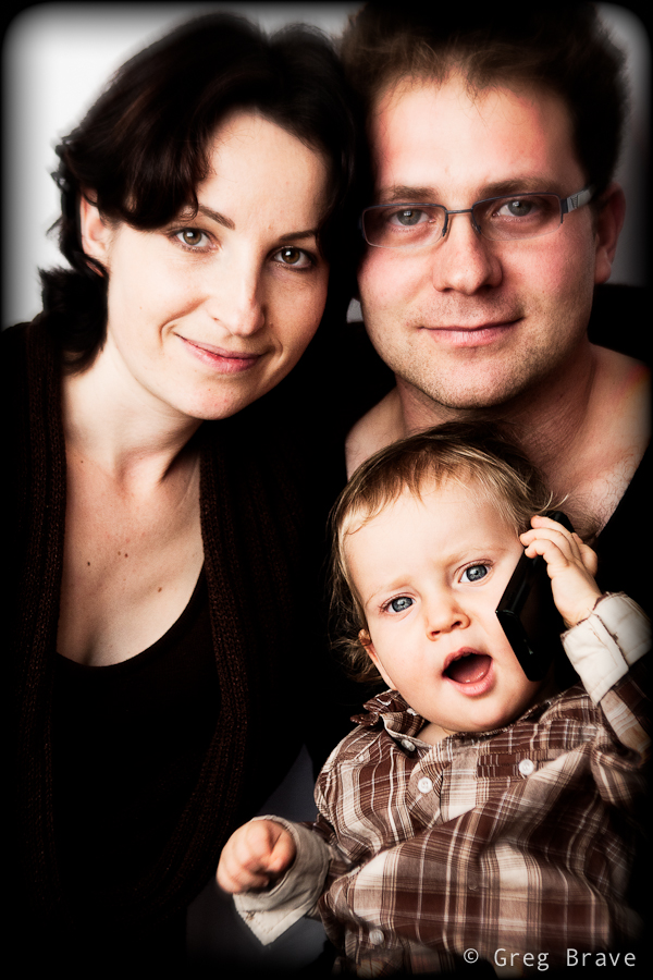
A couple of weeks ago I’ve got another family photoshoot. It was a very nice couple and a cutest little boy Leon who just recently turned 2 so they wanted some photos to remember this age. Parents wanted photos to be taken in the boys’ natural environment – their home and backyard. Therefore for me it was an “on location” photo shoot and I had to bring my lighting equipment.

Click on the photo to enlarge.
When shooting kids in studio you have time to set up all the lighting equipment before the session, but when you come to a family home, chances are you won’t have that luxury. There also might not be enough space for your light stands and stuff, which was exactly the case in this shoot. Lucky for me there was a large window with white curtains that provided a great light source. I also mounted a Canon 430ex speedlight on my camera and used it as additional light source, bouncing the light from the walls and ceiling.
For example, in the photo below I pointed the flash at the ceiling to get Leons’ beautiful long hair to be lit from above.
Click on the photo to enlarge.
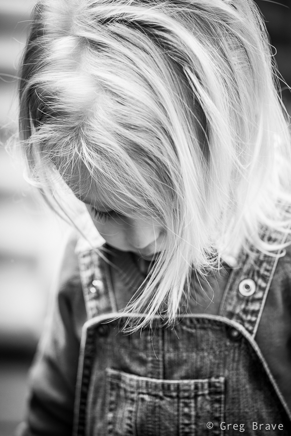
With little kids most of the times you have first to earn their trust by playing with them and smiling a lot :), and then you have to react to their movements and catch those brief moments in which they forget about your presence and act naturally. I was also looking to capture various emotions and moods of the child.
Click on the photo to enlarge.
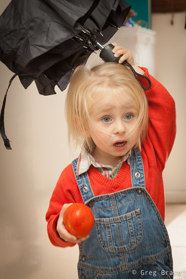
Another good idea is to give a kid something to play with. When Leon saw my large shoot-through umbrella, his eyes lit up with interest and he started to play with it, but it turned out to be too big for him. However his parents found a solution – they gave him a smaller umbrella, which kept him (and me) occupied for a while.
Click on the photo to enlarge.
At some point during the shoot Leon got so comfortable with me and my camera that he started intentionally posing for me. When kids pose for camera it is nothing like when adults do it. Kids are natural, they can’t look “posing for camera” by definition, and I can prove it to you. In the next two photos Leon was intentionally posing for me.

Click on the photo to enlarge.
Could you tell that he was intentionally posing?
Click on the photo to enlarge.
I didn’t think so!

Click on the photo to enlarge.
I enjoyed this photoshoot very much and most importantly – the parents loved my work!
|
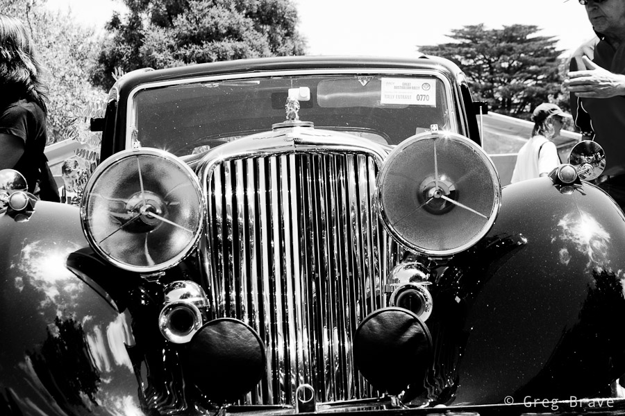
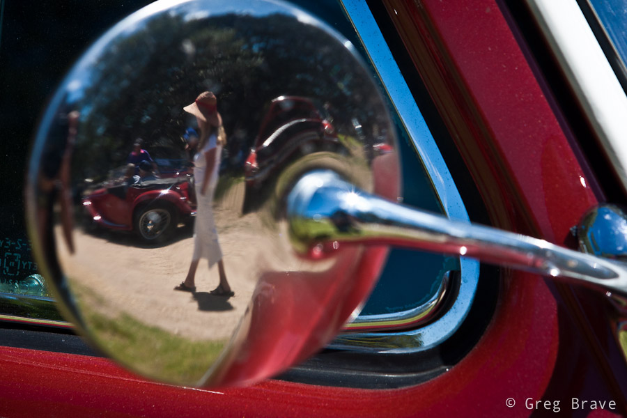
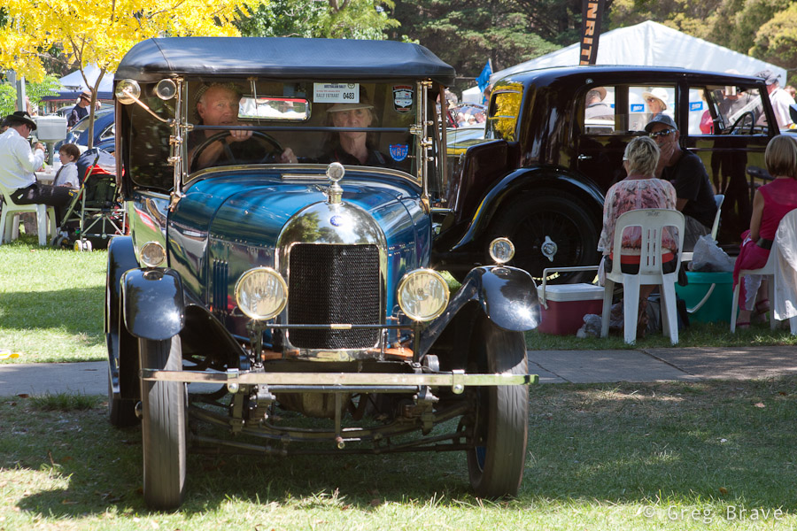
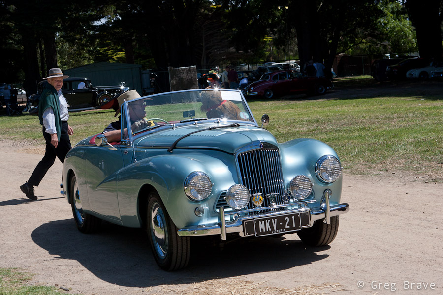
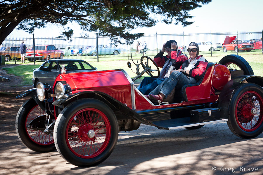
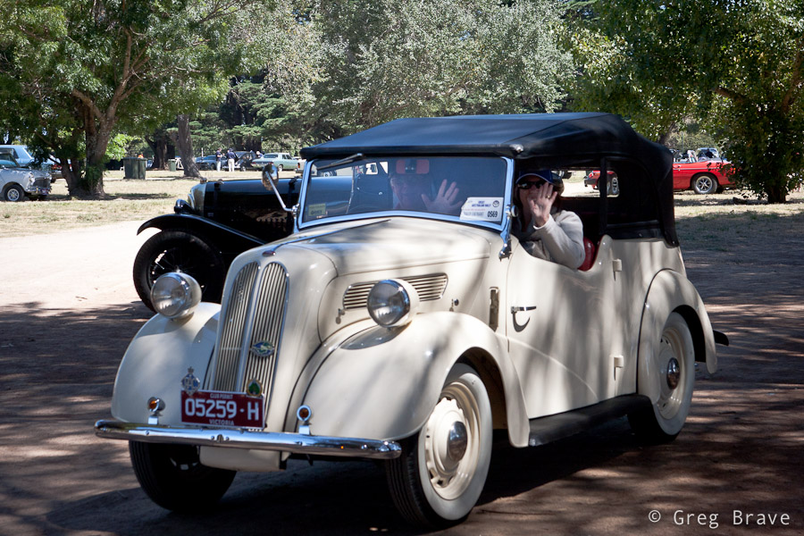
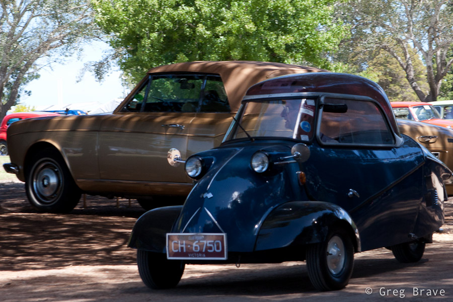
A couple of weeks ago Ira and I visited a collectible cars show at the Mornington’s racecourse. There were lots of beautiful old cars and we had lots of fun.There were also quite a few photographers taking shots of these beauties. But from my photographic perspective, I didn’t want to simply photograph the cars as I am sure there are already many photos of each model that was showcased there. |
| So instead I tried to look at the event not as “this is a car show, so I am going to photograph cars” but more as “this is a social event featuring nice cars, so there will be people interacting with them, and I want to capture this interaction”. And even when I photographed only the cars I tried to convey how I see them. For example when shooting the b&w Jaguar in the photo above I tried to show the “facial expression” of that car which was kind of “right in your face” 🙂 |  |
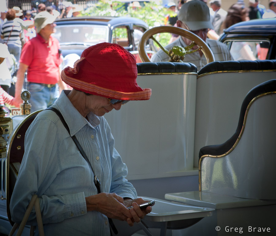
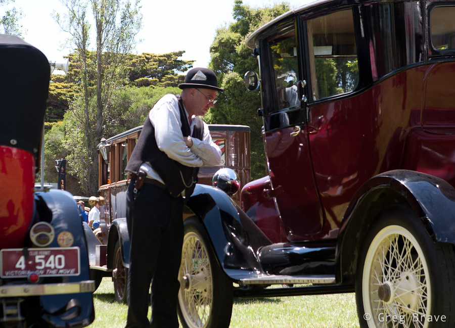
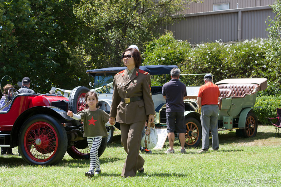
| We spent about one and a half hours at the show, and just when I thought that I’m done photographing, the car owners began starting up their cars and drive away – it was the end of that day. During the show the cars were standing unattended, while their owners were sitting somewhere in the shadow chatting and drinking coffee, so now it was a great opportunity for me to capture the cars together with their owners, and I tried to make the most of it. |
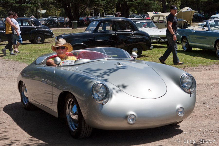
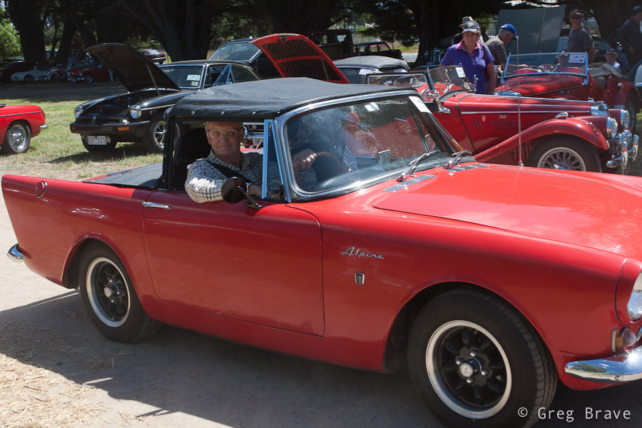
| From the technical side the biggest problem was the harsh sunlight, which created deep shadows and sharp transitions from light to shadow, so it was difficult to capture both the car and its surroundings and the driver sitting inside the car in the shadow. My solution to that problem was to shoot in RAW and slightly overexpose my photographs. This way in post processing I could lighten up the shadows and darken the highlights (the RAW format gives you a bit of freedom in correcting your exposure). |
| Hope you enjoyed the photos, and as always – you’re welcome to leave your “creative responses in the comment section below” (© Equals Three) 🙂 |
This is my second post, in which I write about my photographic experience in Nepal. You can read the first part here. While in the first part I showed you Nepali landscapes, now I’d like to show a few portraits of Nepali people.
Interestingly in some cases people would not let me to take their photographs at first. In that case I would nod in agreement (like, hey I won’t take your photo if you don’t want me to) , point my camera at other subjects, and take a few photos here and there. This would get them interested. Then I would approach them and show them the photos I just made on the back screen. Next thing you know they are posing in front of the camera and running back to me to see the picture. I wished I had a portable printer with me so I could print out and give them their photos.
The photo below was taken on Helambu trek. We were passing a settlement in the hills of Kathmandu valley and made a short break in a nice spot overlooking rice terraces. These women were passing by, and seeing us smoke asked for a cigarette. In return we asked to take their photos 🙂
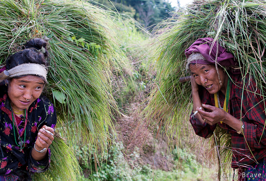
1/200sec at f3.5, 28mm | Click on the photo to enlarge.
One of the settlements on Helambu trek is Golphu Banyang. It has only one main “street” and not many tourists are staying there overnight, trying to reach the next village of Khutumsang. But it so happened that we did stay there, and I had the whole evening to photograph local kids. Once I showed them a photo on my camera they wouldn’t stop posing, only downside being late time of the day and, as a result, very dim light.
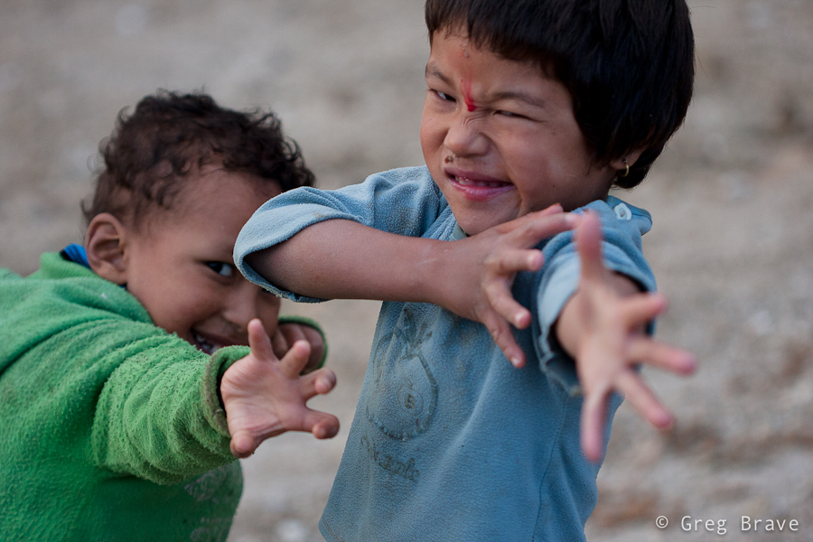
1/500sec at f2.8, 100mm | Click on the photo to enlarge.
The photo below was also made at Golphu Banyang on the following morning when we were leaving the village. The evening before I saw this old man in the same pose, doing the same thing, but it was too dark to make a good photo. In the morning though, there was this beautiful ray of light, lighting perfectly his face and hand. The result you can see below.
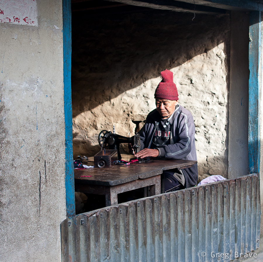
1/160sec at f3.2, 28mm | Click on the photo to enlarge.
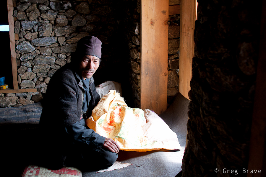
On our way to Gosainkund Pass we stopped at one of the two lodges in Phedi. The lodge was run by a Sherpa couple. While woman was preparing our dinner, we were chatting to the man. Well at least we tried. Even though he seemed to be speaking English fluently, I realized that we hardly understand each other. In any case the conversation turned out to be very interesting and we learned a lot about local animals… or at least we think we did 🙂
I took the following shot of this man in the lodge’s dining room in very poor light, hence the f1.8 and 1/30sec. This is one of several shots I made trying to get his eyes to be sharp, which was difficult with f1.8 and his constant movement.
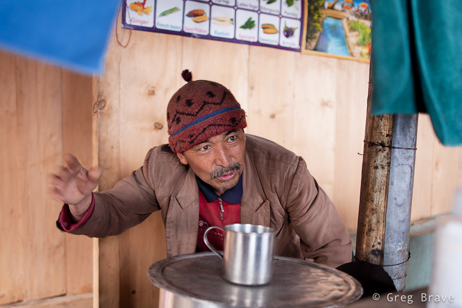
1/30sec at f1.8, 28mm | Click on the photo to enlarge.
Continuing from Phedi up to the Gosainkund Pass we reached a lonely lodge standing in a beautiful view of the surrounding mountains above and the valley below. Ram Sherpa, the owner of the lodge kindly agreed to be photographed. Ram was fixing holes made by some rodents in his rice bags when we reached his lodge. I liked the window lighting on him, which created definitive shadows on his face.
1/200 at f3.2, 28mm | Click on the photo to enlarge.
The man below is a Tibetan refugee living now in Nepal, in a village named Melamchi Gyang. He has a Dalai Lama badge on his hat, and he runs a small tourist lodge in the village. He asked me to take his picture and said I should bring him the photo when I come visit again… I wonder if there are any postal services to this village.
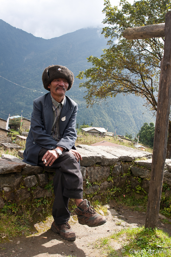
1/100sec at f8, 28mm | Click on the photo to enlarge.
In one of our final days in Nepal we went to an ancient city of Bhaktapur. It is about 30 minutes drive from the touristy Thamel, and it well worth a visit! One of my future posts on Nepal will probably consist solely of Bhaktapur’s photos. Bhaktapur is the third largest city in Kathmandu valley, and was once the capital of Nepal during the great Malla Kingdom until the second half of the 15th century. It is also listed as a world heritage site by UNESCO for its rich culture, temples, and wood, metal and stone artwork ((C) Wikipedia).
In addition to all the heritage sites, there are many shops for tourists. Walking around I saw a large Mandala shop and a woman drawing Mandalas for sale right there. If you saw mandalas you know that it is a very laborious task, which requires concentration and devotion. And look, she also holds the canvas by herself!
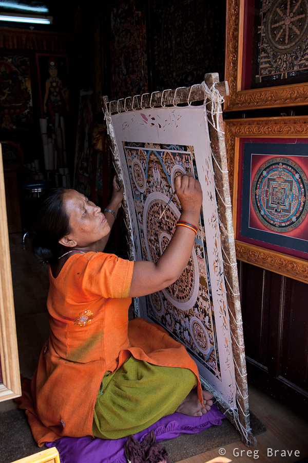
1/500 at f4.5, 20mm | Click on the photo to enlarge.
All in all I can say that people in Nepal are open and friendly to tourists, which doesn’t deny them to try and make as much money as they can from them.
As always your comments are highly appreciated!
When a person looks at a photo, he (or she) can almost immediately say whether he likes it or not. In rare cases it can take a while, but eventually you can either like the photo, not like it, or stay indifferent to it.
But have you ever tried to ask yourself exactly why do you like or don’t like the photograph? It is much more difficult to pinpoint the reasons for which you feel about the photo the way you do.
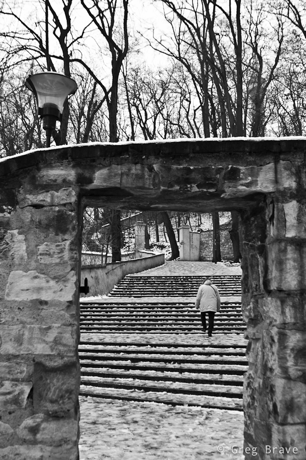
In this post I am going to present three photos that I made during one of my visits to Prague, and try to explain why I like them. It will be a good exercise for me, and also a good experience for you, my readers. You might agree with my observations, or might not, but in any case I hope to help you to be more conscious not only when looking at images, but also when creating them.
Click on the photo to enlarge.
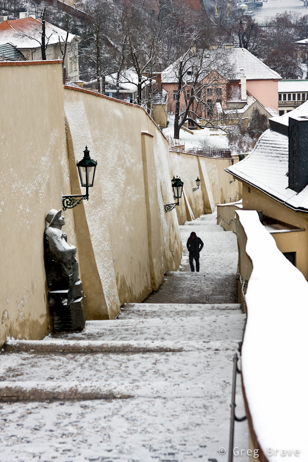
I like the photo above for several reasons. Main reason being that it creates a winter-cold feeling, and gets me in the wintery mood. How it does that? Well, first of all the B&W helps – it emphasizes the lack of colors on a typical overcast winter day. The lonely figure also adds to the mood. Imagine for a moment that instead of lonely figure there would be bunch of kids playing with snowballs – would that add to the mood that I’m talking about? Of course not. Considering everything else in the photograph would remain the same, they would create a contradiction by adding playful joy and “bright colors” into pale surroundings. This is why lonely figure is much more appropriate for this photo’s aim. What else? The bare trees and the snow on the ground of course. In addition there is also a three-dimensional feeling to this photo created by the narrow gate at the front leading the eye to the stairs and further on into the photo – different planes create a feeling of space, and the small human figure looks even lonelier in this space.
Click on the photo to enlarge.
Here is another photo of a snowy winter day, and also with a lonely human figure 🙂 What can I say, these photos were taken in the winter, it was cold and I was in THAT mood. I didn’t convert this photo to black and white because I didn’t feel that it was needed. On the contrary, I wanted the snow on the wall to be distinguishable, and the wall being colored helped that. There are several rhythms in this photo – the rhythm of the street lights, the rhythm of the columns on the wall, and the rhythm of the stairs, all creating a sense of harmony. The human figure has strong visual connection with the statue and the viewer’s eye travels between the two. This connection also prompts us to “humanize” the statue, to think of it as if it was a human figure standing there. These two figures are located in the frame in a way that creates compositional balance. The statue in front “tilts” the balance to the left, but the human figure “counterweights” it by being in the center. The statue is bigger, but because it has snow on it, it is brighter, and bright colored objects are perceived as light by the human eye, while human figure is smaller but it is much darker and thus perceived as “heavier”.
Click on the photo to enlarge.
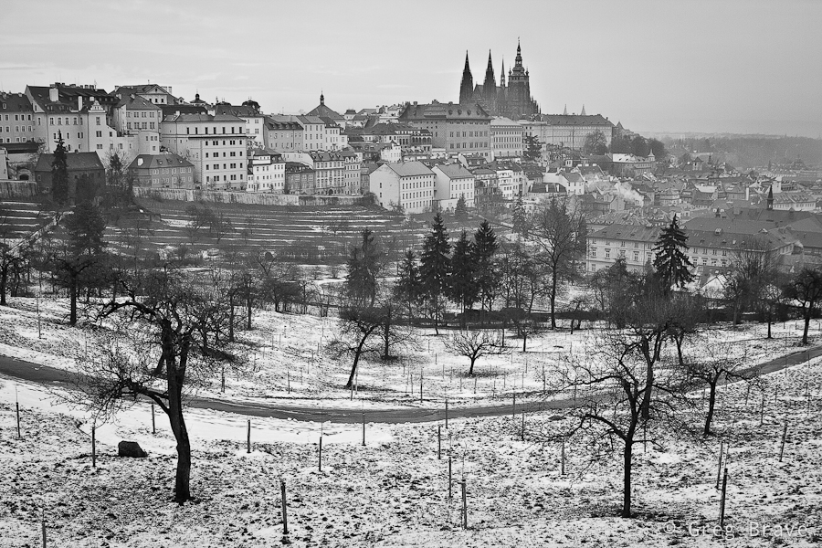
This last photo is my favorite. By the way, it almost didn’t need the conversion to B&W – the colors were missing from the world that day…
The arched walking path and the bare trees standing on its sideways create a sense of swirling motion around the city buildings with St. Vitus Cathedral rising in the middle and being steady as a rock. The horizontal lines in the middle background also add to the motion feel. It is almost a scene from fairytale with a mystical castle and enchanted trees.
Actually, besides what I wrote in the paragraph above, I find it hard to explain why this photo has such a strong impact on me, and maybe you can help me out here. How do you feel about the photos presented in this post, and this last photo in particular? And more importantly why do you feel that way?
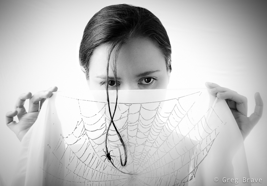
Thinking of it, maybe I should’ve titled this post “story of an idea” because I will be talking about creation of one particular image. But I eventually I decided on the current title because the way this creation emerged from the depths of my imagination is one of the most common ways.
A few weeks ago I had a photo session with Ira, in which my primary goal was to try some new lighting techniques that I thought of. In that shoot I decided to focus on close up portraits (chest line and up). I experimented with different backgrounds and asked Ira to put on a few different shirts.
At first nothing was working for me. The lighting was bad, and I didn’t get any interesting results… but then again, I didn’t start this shoot with a specific idea in mind – it’s like that phrase from Alice in wonderland:
– In which direction should I go?
– It depends on where do you want to arrive
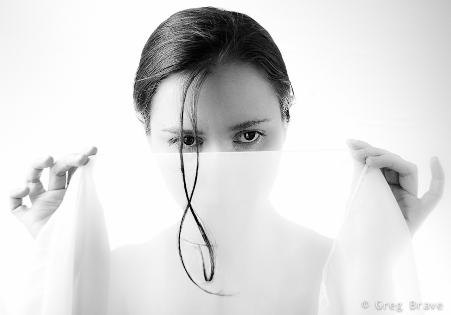
But I felt inspired that day and just kept on shooting and trying to get some nice shots. At one point Ira suggested adding an accessory – a piece of white semi transparent white fabric that she had, and I agreed to try it – it is a good idea to listen to your model, especially when you are out of ideas 🙂
Trying different variations we came up with this photograph:
Click on the photo to enlarge.
I liked it, but quite frankly it lacks an idea behind it. I looked at this photo and thought “nice photo! but what am I trying to tell with it?”. And I couldn’t find an answer. So I forgot about this photo for a while and focused on other tasks.
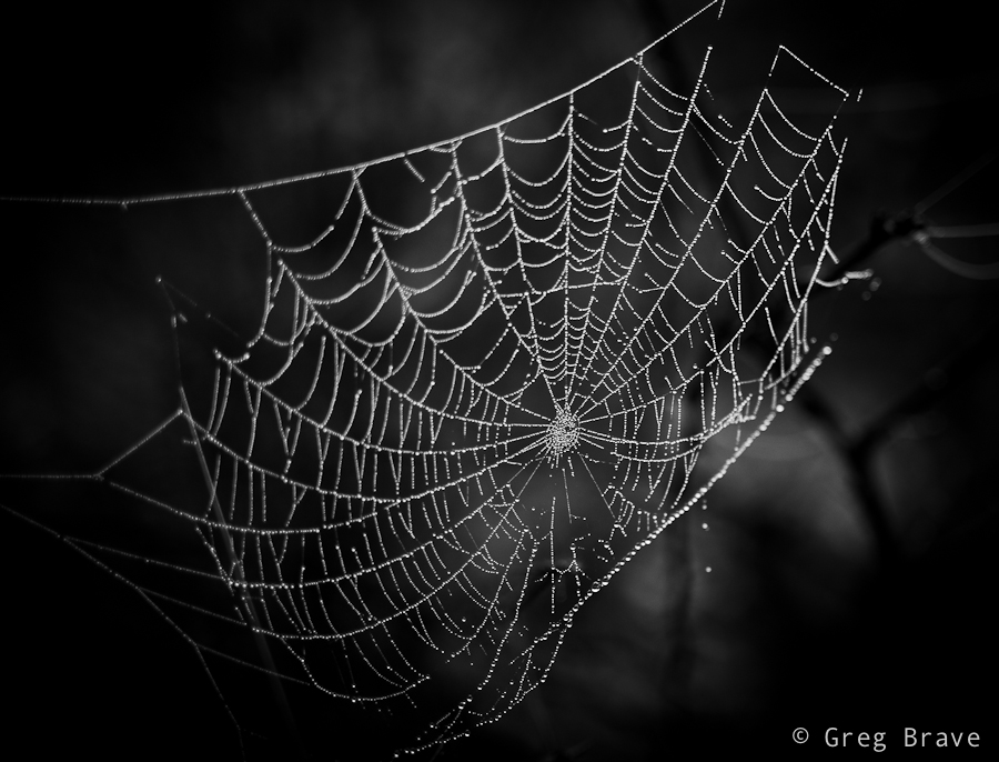
After a while (a few days have passed since the shoot), when I was watching a Phlearn Pro photoshop tutorial (which by the way was magnificent!), suddenly an idea emerged in my mind. I remembered this photo of a spider’s web that I took:
Click on the photo to enlarge.
And it suddenly got layered, in my mind, onto that photo of Ira holding white fabric, as if she was holding the web itself. I rushed into photoshop to try it, to see how it looks in reality. It was nice but still something was missing… what was it? The spider of course. So I searched the net for images of spiders and chose the one I liked the most. Then I brought it as a layer into my working file, and converted the spider to be pure black.
Now I needed to find a meaningful placement for the spider. I tried different variations before I came up with the final result, which you can see below. I call this image “The Way Up” :
Click on the photo to enlarge.
By describing my creative process on one particular image I wanted to show one of the many ways creative ideas come to life – they are not always pre-conceived, and sometimes, as it was in this case, they develop step by step over time, graduating slowly towards the end result.
What do you think about the final image? Your thoughts, comments, and suggestions are always appreciated!
Recently I had a chance to walk around Melbourne’s CBD, and I got fascinated with the wealth of photographic opportunities! You just have to keep your eyes open. I think such walk with a camera could also be a great exercise for any photographer. I have to admit, I just did it for fun… and I loved it!
Ok, let’s see what I’ve got for you this time:
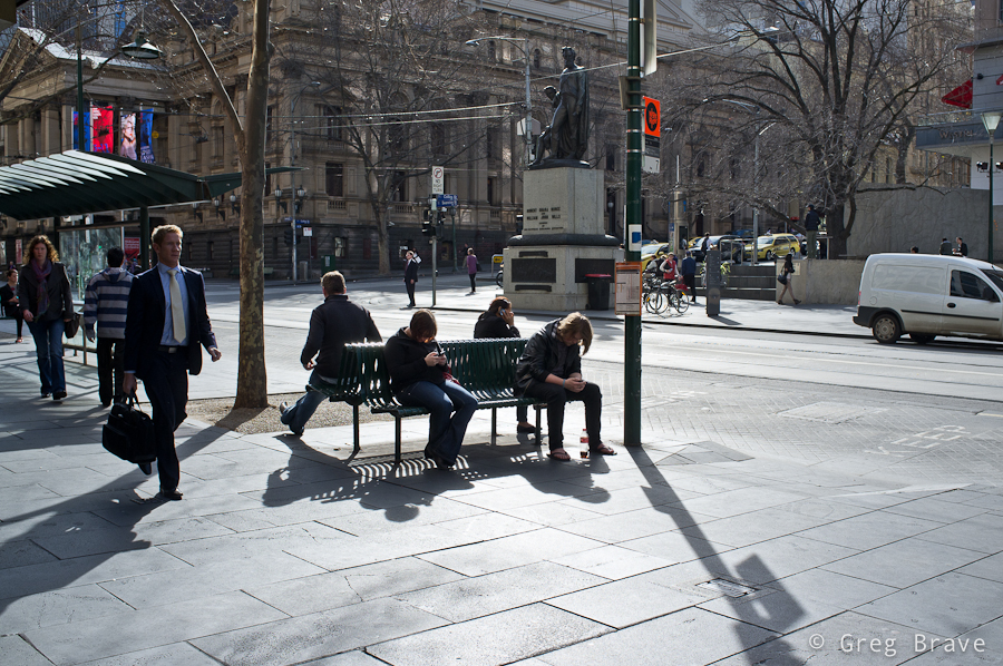
Click on the photo to enlarge.
The photo above is one of my favorites from that walk. There are several compositional connections in it, and while not all were intentional, nevertheless they all contribute to the composition. The most emphasized being the people sitting on the benches, three of them using their mobile devices and the fourth person might or might not use his device, and this fact creates additional interest. Another connection is between the walking man on the foreground left, and the walking woman on the background – these figures are connected with a virtual diagonal line. Third compositional connection is between two standing figures in the background. There is also an additional connection which I won’t mention here – think for yourself what is it and write your conclusion in the comments below.
Overall, I think, this photo creates a pretty good picture of “urban life”.
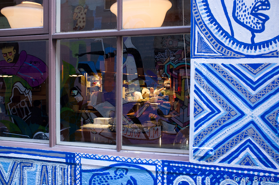
I took the next photo in one of the alleys. The restaurant wasn’t open just yet, but in the kitchen it was business as usual as they were preparing for opening. You must see this photo in a bigger size (just click on it). Walking through that alley first I was fascinated by the graffiti on the walls and then I saw the kitchen staff working inside, and immediately noticed the contrast of the inside/outside. I took a position in which the reflections of the graffiti on the opposite wall would be most visible in the windows to give a better idea to the viewer regarding the outside world, and waited for the one of the workers to make any articulate move. The result you can see below.
Click on the photo to enlarge.
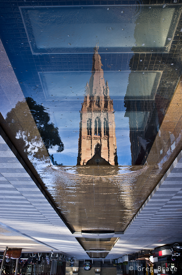
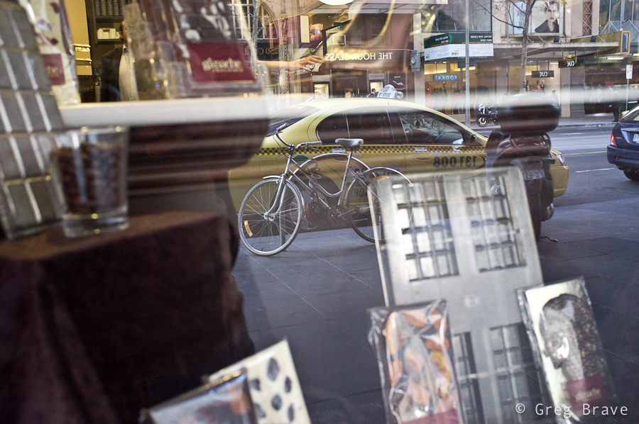
The photo below… yes, I know, photographing reflections and turning the photo upside down had become a corny trick, but in this case I just couldn’t help myself.
Click on the photo to enlarge.
The next photo shows a true moment of interaction between two people (my opinion of course), and this is why I like it so much. Catching such moments is not as easy as it might seem (people are interacting all the time after all!), and I got lucky with this one.
Click on the photo to enlarge.
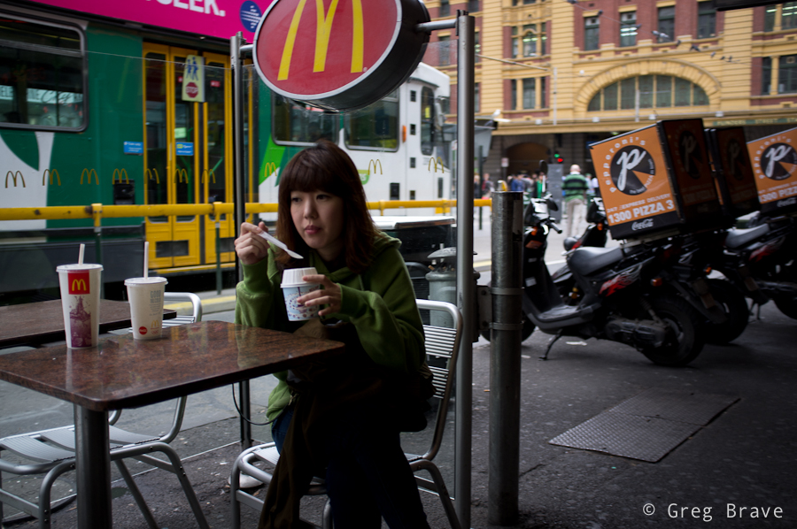
Here is another little urban story… I wonder if all the cups belong to this girl 🙂
Click on the photo to enlarge.
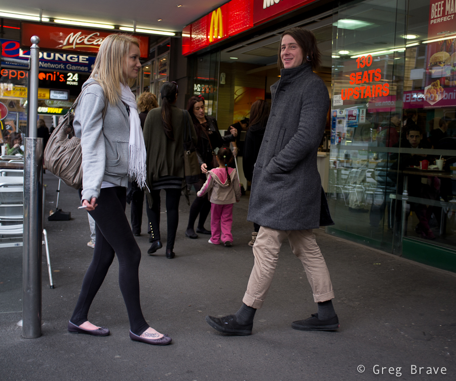
Next photo is an interesting one as there is a compositional conflict of directions… I just made this term up! Here’s what I mean – the group of teenagers are all looking left, also the “one way” arrow points to the left – all making the viewer wonder what’s there, and then you have the man standing in the center of the composition facing straight to the right, and even though I used the word “conflict” in my description of the photo, I still think that it is compositionally balanced because the compositional weight of the group of teenagers and the arrow is balanced by the weight of the man, though he is a single person opposed to the group, but he is in the center and his “sense of direction” is stronger.
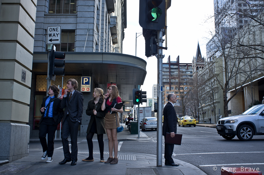
Click on the photo to enlarge.
I have mixed feelings about the last photo, but I still decided to present it here. What I like about it is that it is a collage without any photoshop, and also a slight surrealistic feel that it communicates. What do you think? I would appreciate any thoughts on this one.
Click on the photo to enlarge.
As always, your comments are appreciated!
Everyone following my blog must’ve noticed that lately I am getting into more serious study of photography as form of artistic expression. In Photopathway it all started with my post “Wisdom Of Photography” where I wrote about my exploration of an old book about art of photography. Next came the post “About the Attitude Toward One’s Own Artistic Endeavours” , in which I tell about wonderful Czech photography magazine “Revue Fotografie” from the 1960s. In that post I also presented my translation of one of the articles I liked the most in that magazine.
In this post I continue in the same direction but with a slightly different approach – I created a photo album (in PDF file) containing most of the photographs from the 3/1961 issue of “Revue Fotografie”, which I would like to share with as many aspiring photographers as possible by making this PDF file available for free download.

In the photo album I also wrote a foreword article outlining my reasons for creating it. Let me share parts of the foreword here, and make sure you download the album by clicking on the banners above or below.
“… I strongly believe that in order to advance in photographic vision and skills, one has to learn from the masters. Not to copy their work, but to understand what actually good photography is. Looking at good photographs one can begin to understand what do the words ‘photographic vision’ mean, and also to learn how to powerfully express thoughts, feelings, and emotions through a photograph.
Nowadays, one of the most serious problems lying on the path of any aspiring photographer, is the enormous amount of mediocre photographs presented everywhere, making it hard, especially for the beginner, to distinguish between real works of art and a ‘nice wrapping without the stuffing’.
So what am I presenting in this photographic album?
To explain that, first I have to tell you about a photographic magazine “revue Photographie” that was published four times a year in Czechoslovakia between 1950s and 1990s in several languages. Don’t even try to compare it to most of currently published photography magazines, which are filled with advertisement and “shoot like a pro” articles!
In its early years “revue Photographie” was considered one of the (if not THE) best photo magazines in the world. Founder and editor-in-chief of the magazine during 1950s and 1960s was Václav Jírů, a very talented photographer himself, whose photographs are now being displayed in museums and sold on auctions.
Václav Jírů selected and approved most of the photographs, making the magazine a true work of art. In today’s terms it would be comparable to 1x.com. Of course photographs weren’t the only asset of the revue. The articles too were very educational and informative, dealing not only with questions of photographic techniques but also with more important issues such as:
– Photography as form of art
– Moral obligations of the photographer
– Place of photography among other art forms
and many more.Even during the time it was published, “revue Photographie” was very sought after, and not easy to acquire, not to say about nowadays.
I got very lucky to lay my hands on one of the issues. It is the third issue of the year 1961, published in Russian. I happen to know Russian so I had an enormous pleasure reading it. One of the articles was simply too good to not share it, so I translated it to English and you will find it on the next page. The photographs, on the other hand, don’t require my translation, and are there for everybody to look at, learn, and appreciate.
In this photographic album I arranged most of the photos from the 3/1961 issue of the revue. I hope that many aspiring photographers will get to see this album, enjoy, and learn from the photographs presented in it.
I will continue my search for other issues of “revue Photographie”, translate its best articles, and put up its photos here, on the pages of my blog… “
Feel free to share this album with anyone who you think can benefit from it, and I would appreciate any feedback regarding this album in the comments section below this post or to my email – greg at photopathway dot com.
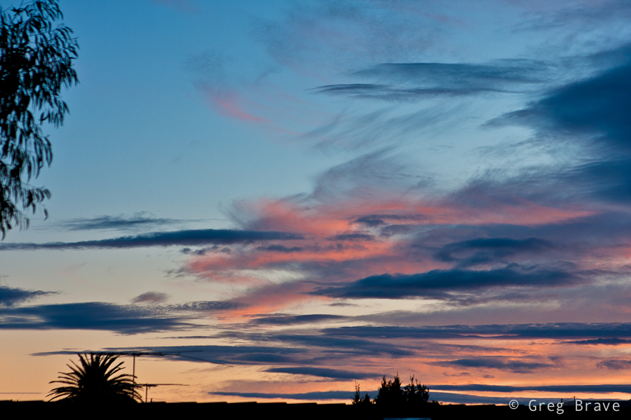
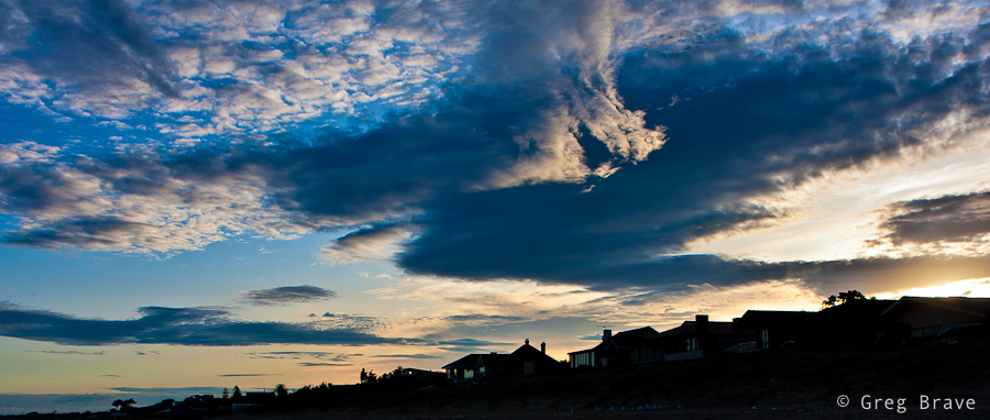
Lately Ira and I adopted a new habit – we get up early in the morning and go out for a walk in the neighborhood before work. It is winter in Australia so we have late sunrises and early sunsets, therefore we often start our walk before the sunrise, and have the joy of witnessing it to the fullest.
From photographer’s point of view not just any sunrise, as well as sunset, is perfect for landscape photography. Of course it all depends – whether there are too many or too few clouds in the sky, if it was raining at night (if it was, there is a good chance of having crystal clear atmosphere with bright colors), if there is morning mist. It is also depends on your subject obviously, and on how you intend to photograph it – for example what quality of light do you need.
Anyway, I am talking about simple walk here, with no specific intentions. In this case good sunrise colors and interesting cloud formations can help a lot in creating interesting photographs.
Here, see for yourself:
Click on the photo to enlarge.
I liked the sunrise-lit sky very much, and decided to make it the main subject of the photo above. I only had to find a decent framing for it.
I decided to call the photo below “Absense”… can you think why? If you have an idea please write it in the comments section below.
Click on the photo to enlarge.
Next photo shows a location that I’ve photographed many times, but under this light, I think it looks the best. I am bothered a little bit with the foreground, but I still like this photo very much. Many things come together here – as I already mentioned the light is beautiful, the depth is depicted nicely by the three planes – the foreground, the “middleground” with the white houses and the background plane is emphasized by the piece of land sticking out. The winding road takes the viewer’s eye smoothly through the planes, and the lonely car in the middle-left adds to the overall mood of the photograph.
Click on the photo to enlarge.
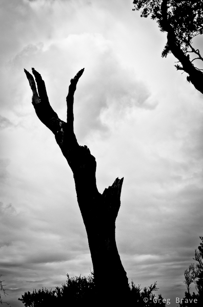
I took the photo below because of two main reasons – one, to show the beautiful cloud shapes and sky colors colors, and two, to emphasize the pure graphic nature of the tree branches, which are very eloquent when depicted as silhouettes. I think that the plain poles in the middle add nice perceptual contrast to the intricate shapes of the trees.
Click on the photo to enlarge.
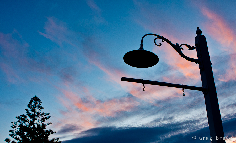
Next photo is simply here for you to enjoy.
Click on the photo to enlarge.
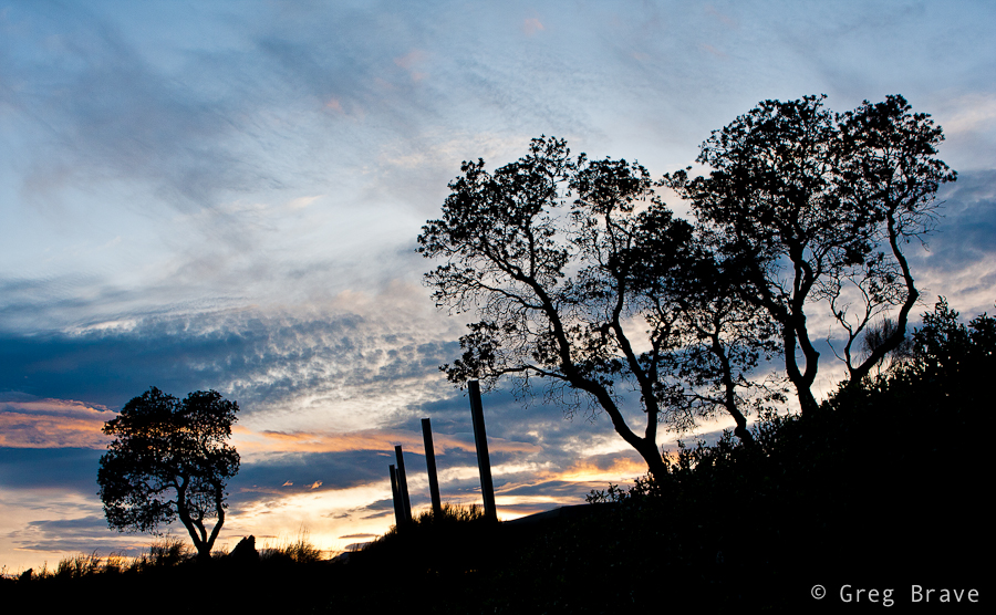
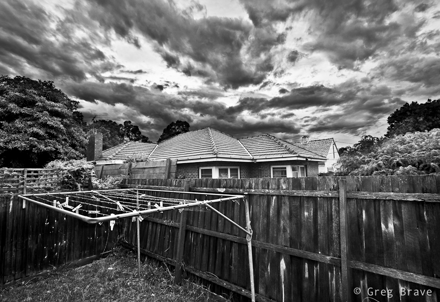
I call the next photo “The victory of Light over Darkness”. Again the main interest in it is the sky, but without having interesting shapes of houses on the foreground I wouldn’t take it.
Click on the photo to enlarge.
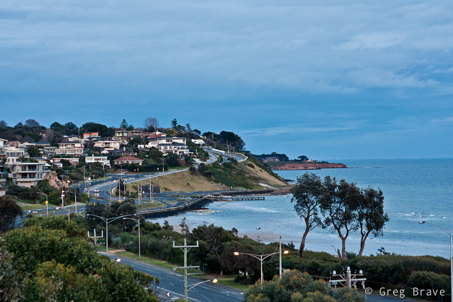
Here’s couple more photos from the same walk taken after the sunrise, when the sky wasn’t so interesting anymore and I had to concentrate on other things 🙂
Click on the photo to enlarge.
Feel free to leave your thoughts, suggestions, and other comments in the section below.
I’m off to take some photos, be back soon!
Yesterday I visited Melbourne’s CBD, and had a chance to take a few photos in Docklands area. Afterwards, when I was going through them on my computer (most of them weren’t anything special 🙂 ) , one photo grabbed my attention.
Here it is:
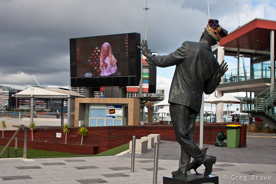
Click on the photo to enlarge.
When I was making it, I simply thought it would be a good idea to capture the singer on the big screen in an interesting pose so that I would have both, statue and singer ‘posing for the camera’.
But when I was looking at the photo later, on my computer screen, I’ve noticed that it has very ‘dynamic’ feel. I could feel the movement of the statue, as if it was a live person. So I started thinking – why is that happening? Why is the statue, which didn’t look that much ‘alive’ in reality, came to life in my photograph?
And here is my conclusion: it is because I created Interaction between the statue and the singer. It looks like the statue ‘responds’ to the movement of the singer, and since we all have no doubts that the singer is a live person, that feeling also ‘spills’ onto the statue.
It is very interesting effect, which can be used when photographing other situations. Even with this same statue – if instead of singer a real person would be somehow interacting with the statue, it would also make the statue come to life. For example imagine a bunch of kids dancing around it.
As always your thoughts and comments are highly appreciated!
In one of my recent articles titled “Wisdom Of Photography” I shared with you, my readers, some of the interesting thoughts about photography that I found in an old photography book. After finishing that book, I continued my search after interesting old photography related material, and I found a magnificent Czech magazine named “Revue Fotografie”, which was published four times a year in the middle of the 20th century (approximately from 1960s to 1990s). This magazine was widely considered to be one of the best photo magazines in the world at the time. It was also translated from Czech to some other languages including German, and Russian. The specific issue that I found was Russian edition of third magazine in 1961.
I can’t even begin to describe how much I was impressed with the articles and photographs presented in this magazine! But as always, I want to share some of the wisdom I learned from it. I am aware of the fact that my blog becomes more and more serious, but after all – it is my path in photography, and it is what it is.
From the magazine, I particularly liked one article. I translated it to English and sharing it here. While reading it, please have in mind that it was written in Czecho-Slovakia in its “Communism” period. I tried to omit as much as possible the parts which are not relevant to our times, but most of the article is as relevant to photography now as it was back then. Along with the translation I am also including a few of the photographs from the pages of the magazine.
I hope you enjoy it as much as I did!
Carel Gibner – ‘An Area’. Click on the photo to enlarge.
Written by Tamara Shevchenko, translated by Greg Brave
About the Attitude Toward One’s Own Artistic Endeavours
One of the most gratifying things in our work as editors of the “revue Fotografie” are the letters from our readers, and whole stacks of them! In these letters many photographers share with us their plans and views on photography. Often they write about their lives, and are being very demanding, as only sincere friends can be, towards the work of our magazine. The sincerity and friendliness of our addressees pleases our editorial staff, and countless praises awakens the desire to devote ourselves even more to our work.
Often, however, warm, friendly, and sincere letters are accompanied by poor, indistinctive, similar to hundreds other, photographs. One couldn’t help not to think about it. Why it is so? Why in such a wealth of different destinies, characters, and points of view, people who pick up cameras, try to reproduce overused themes or to emulate the masterpieces instead of revealing their own true selves?
Here we will not touch on the subject of talent and lack of it. In any case I don’t think the question of talent should be only regarded as a “gift of God”.
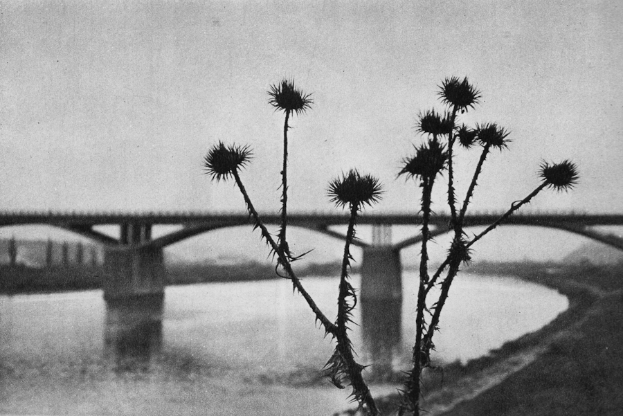
L.Fischer, Austria – “Secret”. Click on the photo to enlarge.
As we all know, Leonardo da Vinci was the first to develop laws of perspective for painting. And since then young artists don’t need to wait for “divine intervention” in order to rediscover these laws as they can all be learned from Leonardo. The cultural heritage of humanity is freely available to everybody. Therefore, looking through hundreds of photos, again and again I wonder if the inexpressiveness, impersonal nature, and similarity of them is in reality a hypocrisy and insincerity of the photographer towards himself?
Such an amateur photographer, having read on the front page of our magazine the words “review of artistic photography” immediately decides: “let’s send them photos of trees, water, sunset, or cloudy skies”… and our editorial office receives hundreds of photos of trees, water, sunsets etc. as if these subjects are the true discovery and revelation to the people.
L.Fischer, Austria ‘Curiosity’. Click on the photo to enlarge.
Art arose from the desire of the artist to tell about himself. After all, even when artist speaks about his surroundings, or events that he witnessed, he in fact tells us about himself, about things seen through his own eyes. And magnificent art, which survived its creators, was created by the artist’s ability to see things so originally and so deeply, as nobody saw ever before him.
If a person does not want to talk about himself, he is silent. But if a person is not silent, if he picks up a camera and tries to use photography as an art form because he feels that its means of expression fit him the most of all other forms of art, such person should not be afraid to create his own artistic statement. It is the right and the privilege of any human being of our modern times – to find and acknowledge the meaning of his own life, express it, and strive to live the life of significance, brightness, and excitement, to find one’s self.
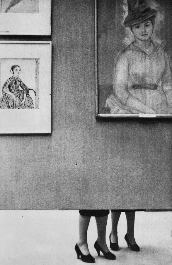
A.Zybin – ‘In Art Gallery’. Click on the photo to enlarge.
Of course, one should still photograph trees, waves, and sunsets, but the photographer must be an artist, a person who can see the landscape in his own original way. We are surrounded by a huge variety of things, creatures, and destinies, but we ignore them, hiding behind the undeniable beauty of the generally recognised subjects. In our photographs we avoid expressing the controversial, the unresolved issues within and around us.
We often comfort our self-esteem with the dream of our existence in true art by imitating famous photographs thinking that by doing that we can’t go wrong.
Equally wrong is the way of those who constantly increase the color saturation of their photographs (this can be understood not only directly, but also metaphorically – Greg’s note). This is an evidence to one’s inability to appreciate the beauty of life, to prefer real life’s beauty to the artificial one.
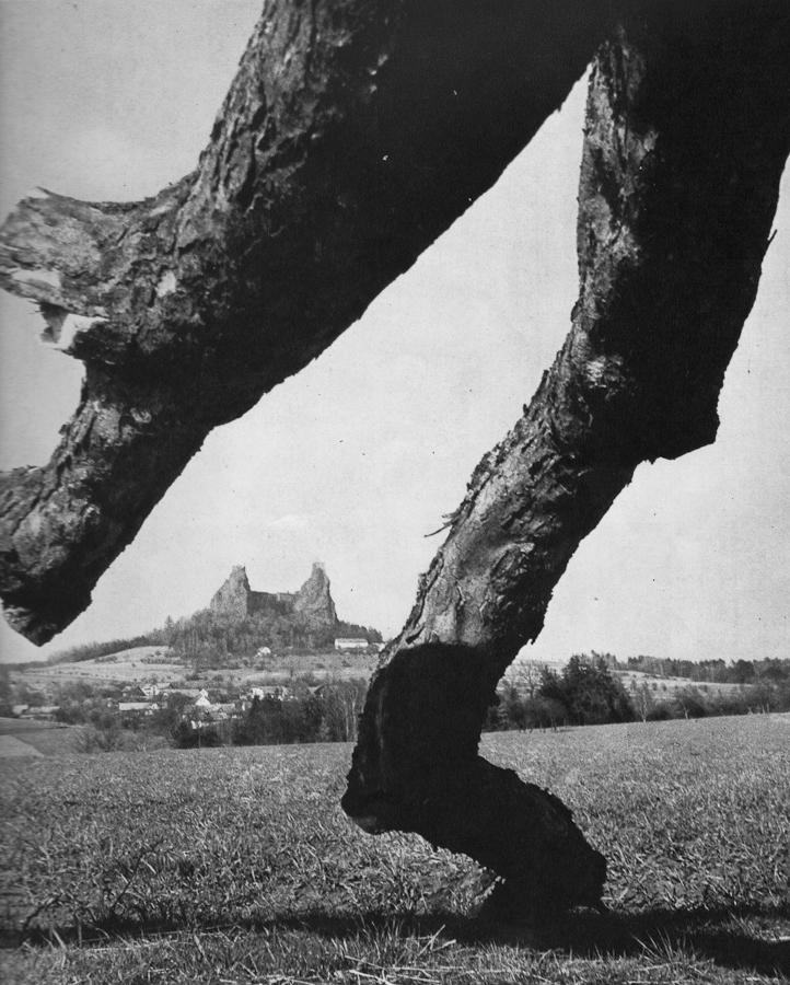
Leopold Fischer – ‘In А Storm’. Click on the photo to enlarge.
Our editorial office received one curious objection from one of our readers, condemning the photo of patterns created by foam on water, and other such photos in our magazine, which the reader personally didn’t like. From his letter I understood that many years of age separate this person from his childhood, and apparently also from the fresh, lively, and direct perception of the things around him. Childhood memories, though naive, are very profound. In childhood one sees things, so to say, up close (like in macro – Greg’s note). A small blade of grass is visible down to its root, a crack in the pavement is scary because it is deep and unexplored, thick walls of old buildings – what a fertile ground for imagination! These were just a few examples of course.
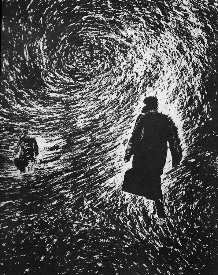
Yaroslav Parcovsky – ‘Time Walks The Earth’. Click on the photo to enlarge.
Over time a person learns to evade the puddles, not to climb up on every obstacle on his way, not to drag a stick along the fence. And learning manners is generally a good thing. But how many interesting things start to slip away from our attention as we grow up! In true artists many recognize soul of a child. Maybe this “childishness” actually is a profound understanding of things around us, the ability to see them “up close”.
Miroslav Yodas – ‘Construction’. Click on the photo to enlarge.
Therefore isn’t it better to be more curious of things surrounding us, which may even sometimes irritate one’s “untrained” perception, and not condemn them unconditionally just because they are perceived as something not usually shown in photographs?
Yuri Gantman – ‘In The Morning’s Silence’. Click on the photo to enlarge.
I think that this is how many photographers start their venture into the realm of professional photography (by “professional” I mean paid jobs): I photographed my friend’s kid, then his friend saw the photos, got excited and offered me the job.
He asked me to make portraits of his one year old son and of the whole family. Needless to say that I agreed. Even though nowadays everyone has a digital camera, and any parent snaps tons of family photos, there are many people who still appreciate good photography, and can tell a great portrait from snapshot. Still, the job of photographer is harder now than ever before – his photos has to stand out of thousands of such snapshots.
So let me share my experience from this family photo shoot.
First of all I talked to the guy and asked him what did he expect from the shoot. This is very important – you have to be absolutely clear in regards to what your client expects from you. Here are some example questions to ask your client:
– How many digital photos (in files, not printed) does he expect to receive?
– Does he want prints, or just the digital files?
– Agree on the time frame for you to deliver the photos
– Does he want any artistic post processing?
– Which portraits exactly does he want – of the whole family only, individual portraits only, both, or maybe he has some kind of special request.
– Ask your client if he can show you (from internet or his friends) examples of photos that he particularly liked.
-If the shoot is to be held at client’s house ask the client about the dimensions of the house, and whether he wants the shots to be studio-like, because in that case you’ll have to bring your own background.

Click on the photo to enlarge.
In my case client already saw my work and he said that he wants something of that kind. What he saw was portrait of a child tightly cropped and processed in sepia tones. In addition he said that he would like similar kind of photo but of the whole family. He also said that he doesn’t need a lot of photos, just a portrait or two that will remain for the years to come.

Click on the photo to enlarge.
The photo above is my favorite from that shoot. I love the kid’s look, and his inviting hand that “takes” the viewer’s hand and leads him into the child’s world…
Sorry, I got distracted… where were we? Ah, the expectations! So after talking to the client I understood his demands, and tried to fulfill them during the shoot.
Preparing for the shoot
I did this shoot at the client’s house, so I’ll describe my preparations for that specific case.
– Most important thing: Lighting. Even if the shoot takes place during daylight, if it is indoors there might not be enough sunlight, so you’ll have to bring your lighting equipment. I had a light stand, two strobes, a white shoot-through umbrella and a soft box.
– Lenses. If your client doesn’t have a lot of space in the house, you might not be able to use your favorite telephoto lens for portraits, which is too bad as it creates lovely bokeh :).
For portraits I used two lenses – Canon 24-70mm f2.8L and Canon 100mm f2.8 macro.
– Memory cards, backup batteries, cleaning cloth etc. Though this might seem trivial, but forgetting any of these (well cleaning cloth excepted) can cost you the photo shoot. If you bring strobes, then don’t forget backup batteries for them.

Click on the photo to enlarge.
The Shoot
Don’t be late. This is very important – it shows how seriously you take your job.
As a photographer you will benefit from being an open and communicative person. Talking freely and openly with people you are about to photograph makes them feel more comfortable with you and in front of your camera, and enables you to capture their natural expressions.
Shooting little kids is difficult because you can’t just ask them to be still, sit at one place, smile, or play with their toys. So you have to improvise. It is a good thing to ask parents for help. In my case the kid’s mother played with him and I was able to catch some nice facial expressions and poses.
Click on the photo to enlarge.
When we got to shoot the family portrait, at first parents had difficult time keeping the child still in front of the camera, but then they gave him father’s cellphone, and it was a bingo!
After the Shoot
We agreed that I will deliver the finished photos within a week from the shoot, but I delivered them in tree days, reasons being first of all because I love processing photos and couldn’t wait to see what I can do with the “raw material”, but also because I think it is a good little marketing trick. When people expect to receive a product in certain amount of time, but they receive it earlier than that, provided that the product is good, they feel even better about your services.
The most important thing that I’d like to leave you with is: Don’t be afraid to try! Don’t think that you can’t do it, and the client won’t like your photos. If you love photography, and someone offers you the job – Take It! You can read a thousand articles on the subject (including this one), but they won’t give you the same experience you’ll get from the actual shoot.

Click on the photo to enlarge.
Sassafras is a small village located in Dandenong Ranges. The area was named Sassafras Gully, after the trees which grew in the area. Sassafras is a tourist destination with some antique shops, boutiques, and nurseries.
While most of the tourists visit Sassafras on their way driving the Dandenong Tourist Road through to other destinations, Ira and I came here specifically. We wanted to visit the “Tea Leaves” store, which has over 300 teas and herbs. But then again, we are not tourists – we live within 40 minutes drive from here.
As you probably guessed I wouldn’t write this post if I didn’t have some photographs to share along with it. The tea store was really nice, but it was too small and crowded to photograph. After we finished our tea-shopping, we decided to explore the surroundings.
I always liked the Australian Magpies. I think that they are very interesting birds, and I also like their singing – Australian Magpies are considered to be among Australia’s most accomplished songbirds. There were plenty of these birds in Sassafras, so I could take a few photos, and here is one.
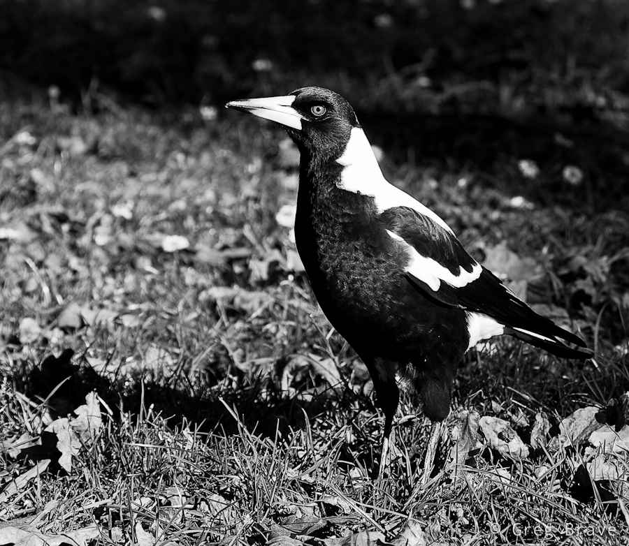
Click on the photo to enlarge.
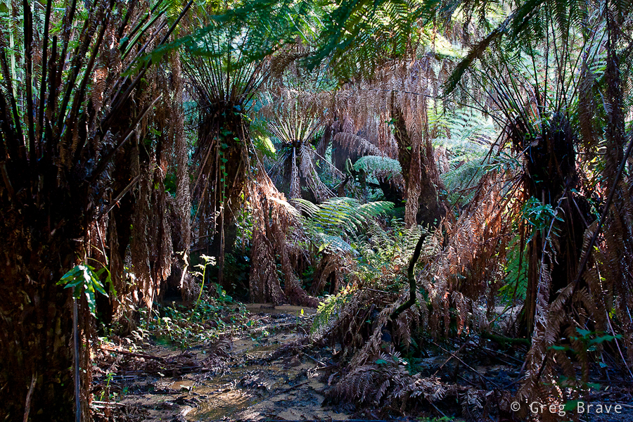
Dandenong Ranges is a beautiful place, and Sassafras is surrounded with eucalyptus and fern-tree forests with kilometres of walking trails. Ira and I came across one of the trails and went into the woods. It was such a beautiful walk! I can still feel the cold fresh air filled with smells of nature…
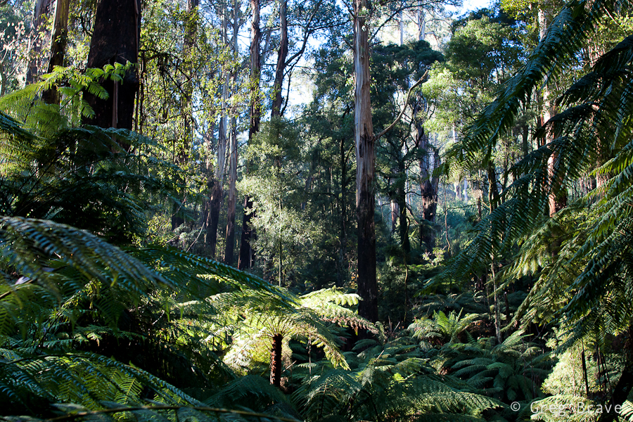
Click on the photo to enlarge.
The forest was magical. It was around three o’clock in the afternoon, and the sun was already setting (the sunset time is currently around five o’clock) so the light was beautiful. I was fascinated with the rays of light breaking through the foliage.
The biggest problem when photographing forests is to find distinction. What I mean is when you walk in the forest and you simply like what you see and take a picture, most of the chances that the resulting photo won’t be interesting. It will be very cluttered with leaves, tree trunks, and branches. One of the keys here is to find some kind of order in the forest and reflect it in your photograph.
The photo above is a bit too cluttered to my taste, but I still like it – I found an opening in the forest, saw this fern lit by the sun, and decided to make it a main point of interest in the photograph. Rays of light in the background add another dimension to the photo making it… airy?
Click on the photo to enlarge.
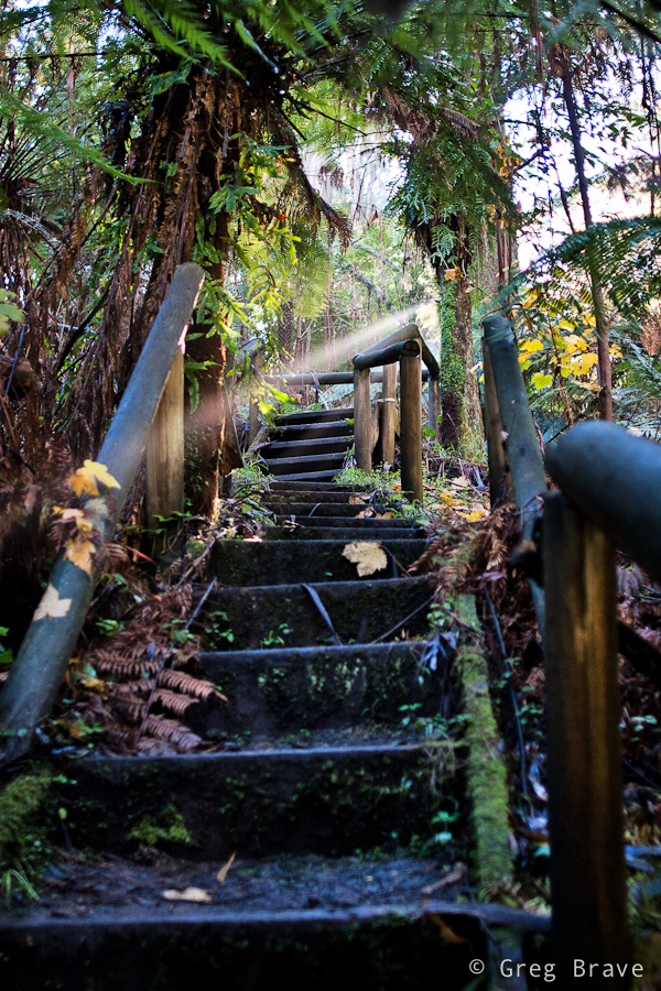
Walking down the trail we came across wooden stairs, and saw this “unreal” ray of light shining through. I just couldn’t pass the opportunity ☺. Though I am bothered a little by the wooden rail on the foreground right, overall I like this photo. The stairs lead the eye into the photo, and them being not straight enhances the feel of space, while ray of light helps creating magical forest atmosphere.
Click on the photo to enlarge.
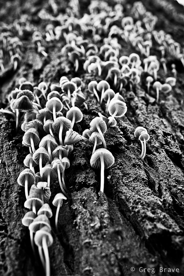
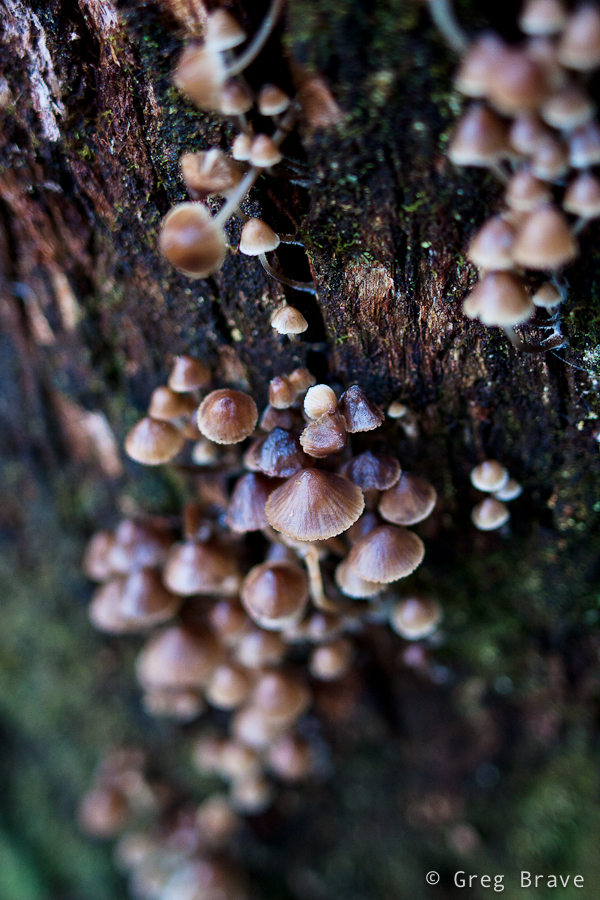
At one point I saw a huge eucalyptus and just stood there admiring this nature creation, then Ira said – “look! There are lots of tiny mushrooms growing from the trunk of this tree!” And only then I saw them. The tree trunk was so big, and the mushrooms were so tiny that I didn’t notice them even though there were so many. I really liked this “crowd” and spent a good 15 minutes trying to find an interesting angle.
Click on the photo to enlarge.
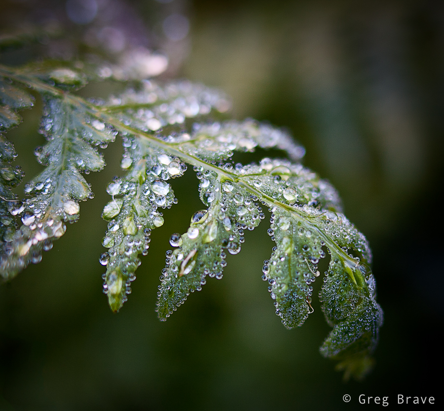
As in most of my walks in the nature, I couldn’t resist taking a few macro shots. I didn’t have a tripod with me (what a rookie mistake! ), so this photo might not be tack sharp, but it is sharp enough to show all the diversity of the water drops. I really like the tenderness and fragility in this photograph… one careless move and this beauty will disappear.
And finally I’d like to present my best photo from that walk in Dandenong Ranges.
Click on the photo to enlarge.
I feel that in this photo I succeeded to create order from the forest’s chaos. I found a pattern made by the standing ferns, and a space in between, and the light was just right. I tend to think that in nature photography great photo is created when two factors come together – pure luck (the light, weather conditions) and the photographer’s vision. Sure, if there is no vision, there won’t be any great photos, but when you have the vision you still need the nature to play along with it.
I hope that you enjoyed this journey into the Dandenong ranges, a beautiful place in Australia, and I’ll see you next time right here, on my photo pathway.
As always your comments are most welcome!
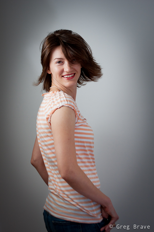
Recently one of my friend’s friends, Renata, saw these portraits I shot about a month ago, and liked them. So we decided to do a studio photo shoot with her. When I said “studio”, I meant a tiny studio that I put up in my living room. It consists of a black or white background, one light stand with Canon EX430 flash inside soft box, and one tripod converted to light stand with Yongnuo flash and white shoot-through umbrella.
Shooting in my home studio I am limited by the size of my living room, so I can’t use any focal length I want. The biggest zoom I can use is about 100mm. In that case I have to stand at the far end from the model, and still be able to shoot almost only head-shots.
The following photo was made using Canon 100mm f2.8 macro lens. Even though when shooting studio portraits I usually use my soft box as the main light, in this photo my main light was the Youngnuo flash through white umbrella from the left, and I used my soft box as hair light from the top right and it also acted as a fill in light to soften the shadows.
I placed the lights at such angles so that almost no light would spill on the background as I wanted the background to remain black. It is intentional that the Renata’s dress is also black and looks only slightly lighter than the background – I wanted to make an emphasis on her face.
Canon 100mm f2.8 macro; Shot at f8, 1/200 sec | Click on the photo to enlarge.
Continuing the discussion regarding the photo above – shooting that portrait I looked for Renata’s natural expression. At first she was a bit constrained trying to pose for the camera, but then we started a conversation about all kinds of topics and she got more relaxed. At one point I put the camera down and we continued speaking about a particularly interesting subject for her, and I noticed that she got completely relaxed. So I grabbed a camera and started shooting. This is when I got the shot above.
Next photo is posed, of course. It was my idea to shoot Renata with a candle, but after trying everything I had in mind, I couldn’t make a single nice photo. Then I asked my model to do anything she liked with the candle and just watched and shot. After a while I saw her making this pose and thought – “this is what I was looking for!”, so I asked her to remain in that pose and shot several variations. The photo below is the one me and Renata liked the most .
Sigma 28mm f1.8; Shot at f5, 1/200 sec | Click on the photo to enlarge.
In the next photo, I wanted to try a bit more dramatic lighting with stronger shadows. One of my primary concerns was to make her left eye (the one to your right when looking at the photo) free of shadows coming from the nose. I wanted it to be as vivid and visible as the right eye, and still to have strong shadows. This involved moving the main light around the model until I found the desired angle. All my flashes were set to manual mode, so in order to achieve stronger lighting I just increased the power of the flash.
Sigma 28mm f1.8; Shot at f5, 1/200 sec | Click on the photo to enlarge.
One more aspect to think about is the flash recycle time. I use small strobes (Canon EX 430 and Yongnuo), which are powered by 4 AAA batteries. Using such strobes at full power means waiting two to five seconds between shots, loosing priceless facial expressions and body poses. So I never use my strobes at full power unless I absolutely have no choice. I usually don’t go above 1/4th of the full power and set ISO and f-stop accordingly (taking the DOF into account of course).
After getting a few decent portraits, which were the main goal of the photo shoot, we started to improvise. I particularly liked the shot with the sunglasses. I liked Renata’s expression in that one – it is radiant and tender at the same time. Of course I didn’t get this shot on the first try, but the final result is what counts, right? 🙂

Canon 24-70mm f2.8 L; Shot at 24mm f2.8 1/200 sec | Click on the photo to enlarge.
The following photograph is my favorite. I love the dynamics of it. For this photo I had Renata stand facing the background and then turning swiftly around on my mark. I really wanted to catch that hair movement. It wasn’t as easy as it sounds because at each turn hair moves differently, and it doesn’t always look as nice as in the photo below. I probably did about 15 shots before making this one.
Canon 24-70mm f2.8 L; Shot at 42mm f4 1/200 sec | Click on the photo to enlarge.
I really enjoyed this photo shoot and I am pretty satisfied with the results. I find the background a bit boring, therefore thinking of my next photo shoot to be on-location somewhere.
I hope you found this article to be helpful and interesting, or at least one of these 🙂
Your comments / questions / suggestions are always appreciated!
Cheers,
Greg.
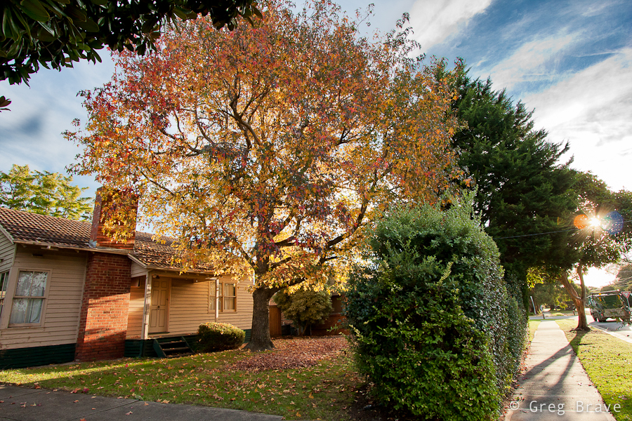
While Spring rules in most parts of the world now, Australia is heading for winter. Driving through my neighborhood towards home from work I felt a kind of Autumn mood in the air. So when I came home I quickly grabbed my camera and went out for a walk. I wanted to capture this mood before it vanished.
This maple tree fascinated me. The autumn colors are revealed here in all their beauty. Warm light of the setting sun gets even warmer filtered through the orange-yellow leaves creating a very cosy atmosphere. The only thing I’m missing in this photo is a lonely person sitting on the stairs…
Click on the photo to enlarge.
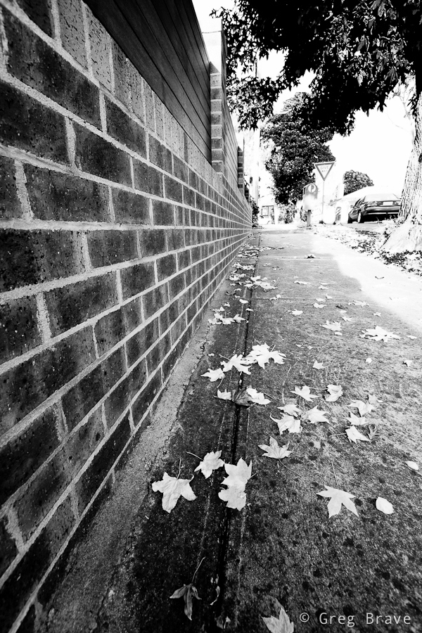
In the next photo I focused my attention on the fallen Autumn leaves adding the fence on the left to emphasize the perspective and add a sense of movement to the photograph.
Click on the photo to enlarge.
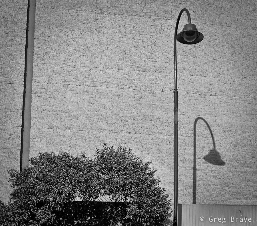
At first I didn’t realize why I wanted to capture what you see in the next photo, but then I realized that it was the combination of cleanliness of forms, simplicity of the composition, and the background texture. Combined together these three factors formed a complete picture in my mind and I pressed the shutter-release button.
Click on the photo to enlarge.
Walking around I saw these bicycles and immediately the words such as “separation”, “loneliness”, “different” started popping into my mind. You know kids can be cruel sometimes, and in my mind this was a good visualization of this fact. Even thought there is not much of an Autumn mood in this picture, since I took it on the same walk I decided to present it here.
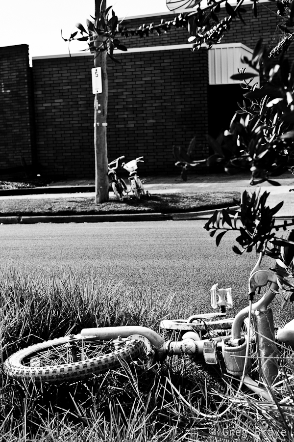
Click on the photo to enlarge.
And finally going back home, when Sun was getting close to the horizon, I took this photo. I can’t say much about it except the fact that I like it.
Click on the photo to enlarge.
Hope you enjoyed the photos. Feel free to comment on them in the comments section below, I’d be happy to know what you think!
Till the next time, take care!
Cheers,
Greg.
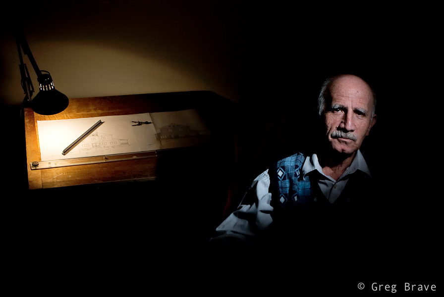
My father is a construction engineer. He is retired, but I’m still using present tense because its who he is. He loves his profession, and all the years that he was working, he did it with commitment and passion.
I can only wish everybody and myself that level of dedication to your job. It is said that best way of parenting is by personal example, and I fully agree with that. It is by his personal example my father taught me to be responsible and reliable person, to do any job the best way that I can.
How is this all photography related? – you may ask. Here is the answer: I decided to photograph my father, but I wanted my photo to tell a story about my father and his life. All his life he worked hard to provide for the family, and at the same time he loved his job, and even now, when he is retired he still draws plans for the house for us, his kids to build.
So I figured that the best way to portray my father would be with his drawing board, and though now all of the engineering work is done on computers, still most part of my father’s working career was during the time of drawing boards and we still have one for old times sake. Besides, drawing board is far more photogenic than a computer display 🙂
So here he is, my Father.
Click on the photo to enlarge.
There are two light sources in this photograph – one is the lamp that you can see in the photo, and the second source is a flash (Canon 430 EX) on a light stand to the right, with grid on it to direct the light directly to my father’s face and prevent it from scattering around. I wanted the “spotlight” effect.
As always your comments are appreciated.
Cheers,
Greg.
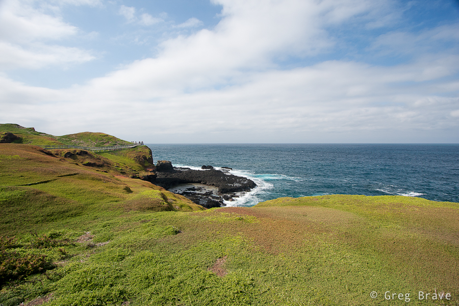
Phillip Island is located approximately 140km south-southeast from Melbourne. From my home it is about two hours drive. It was named after the first governor of New South Wales, Arthur Phillip. Phillip Island is pretty small: it has 9 kilometers at its widest, and is 26 km long, but it has about 97 kilometers of coastline, which allows for many photographic opportunities.
Recently I took a three day trip to Phillip island. As always I had my camera with me, and I’d like to share my experience with you my dedicated readers! 🙂
One of the first places I visited were “the Nobbies”. This area has spectacular coastal views, which you can experience from the boardwalks and lookout points set amongst natural sea bird gardens.
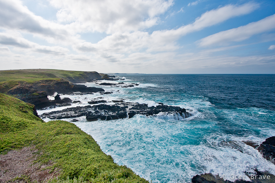
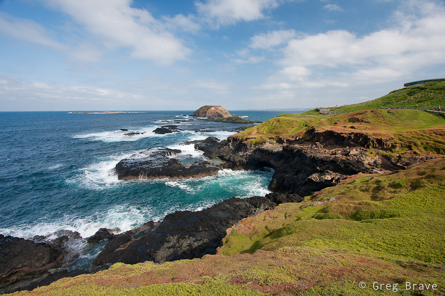
Click on the photo to enlarge.
The views were so magnificent that I couldn’t stop photographing. When I later saw my photos on the computer screen, the grass was so vividly green, as if I greatly increased the saturation. I even had to reduce saturation a little so the grass would look more natural! I really wanted to photograph this place on sunset, but the whole area closes before the sunset time due to wildlife activity in the twilight.
Click on the photo to enlarge.
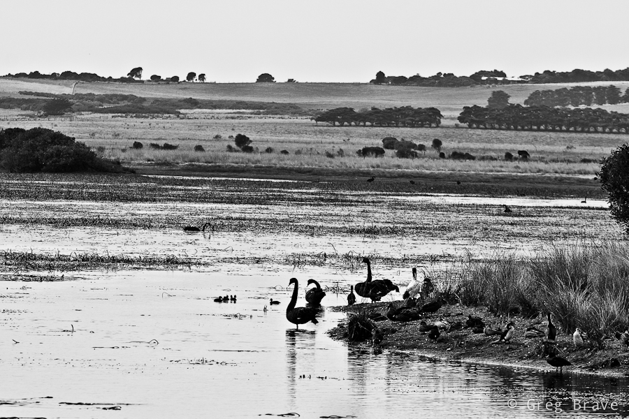
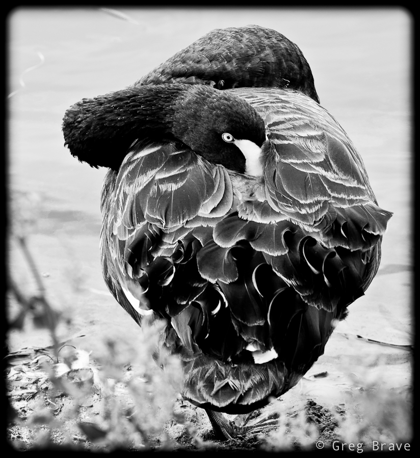
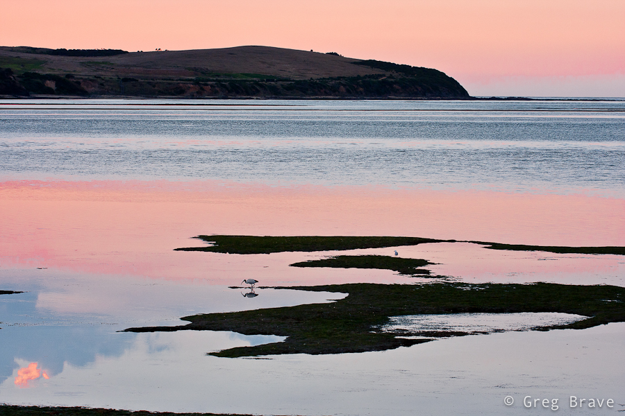
My next stop was the Swan Lake, the only permanent freshwater lake on the island. I didn’t see too many birds out there, but there still were a few, and I liked the “layered” view, which you can see in the photo below.
Click on the photo to enlarge.
There was a boardwalk leading around the lake with small hideouts along the route for watching birds without disturbing them. The shot below was made from one of the hideouts. I am not sure if swans sleep with their eyes open, or he noticed my presence despite the hideout.
Click on the photo to enlarge.
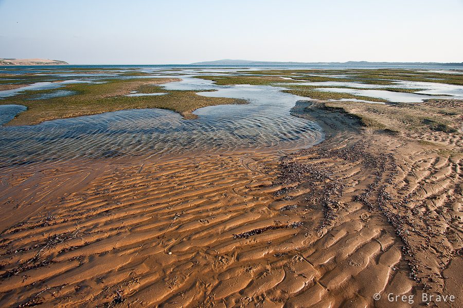
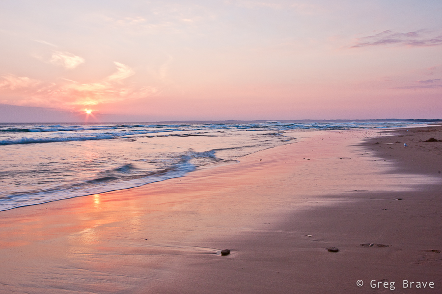
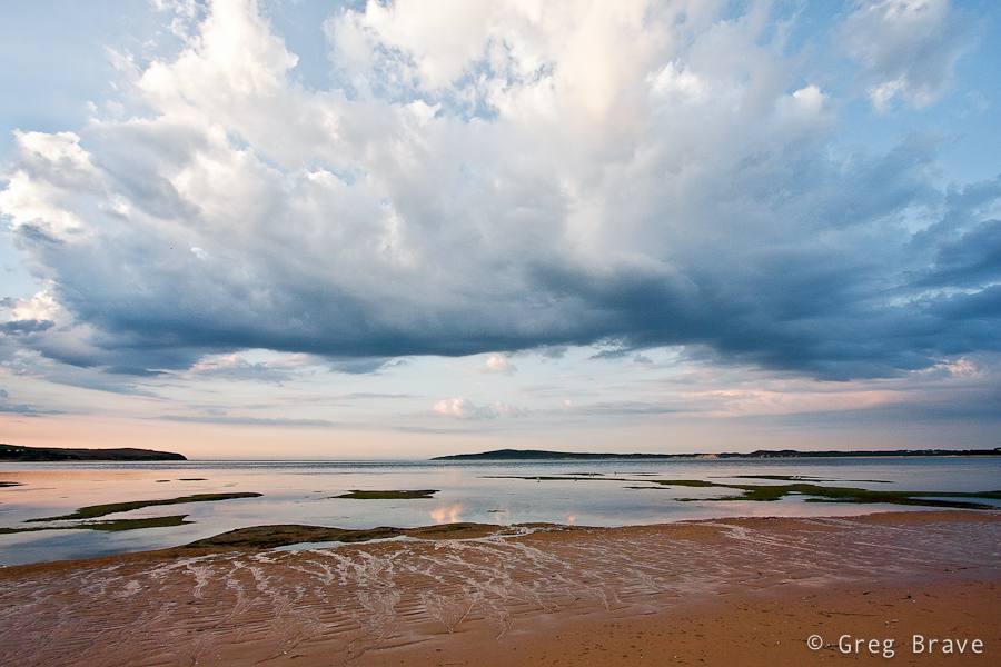
On my second day on Phillip Island, on late afternoo, I found this beach. It is very close to the bridge that connects the Island with mainland. The photo below was made on this beach, and somehow it reminds me of ancient Greek amphitheaters. I also decided to come back to this beach on the next day’s sunrise…
Click on the photo to enlarge.
and then I drove to another beach to photograph Sunset… why? you ask me. The answer is pretty simple – the sun was setting on the other side of the island! So the next photo was taken from Surf Beach, which is located on the way to Cape Woolamai.
Click on the photo to enlarge.
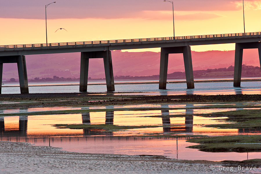
And we are back again, now at dawn to the same beach with the “amphitheater”. The land that you see in the distance is the mainland with small town of San Remo on it. Formed as a fishing village, San Remo’s economy nowadays mostly based around tourism.
Click on the photo to enlarge.
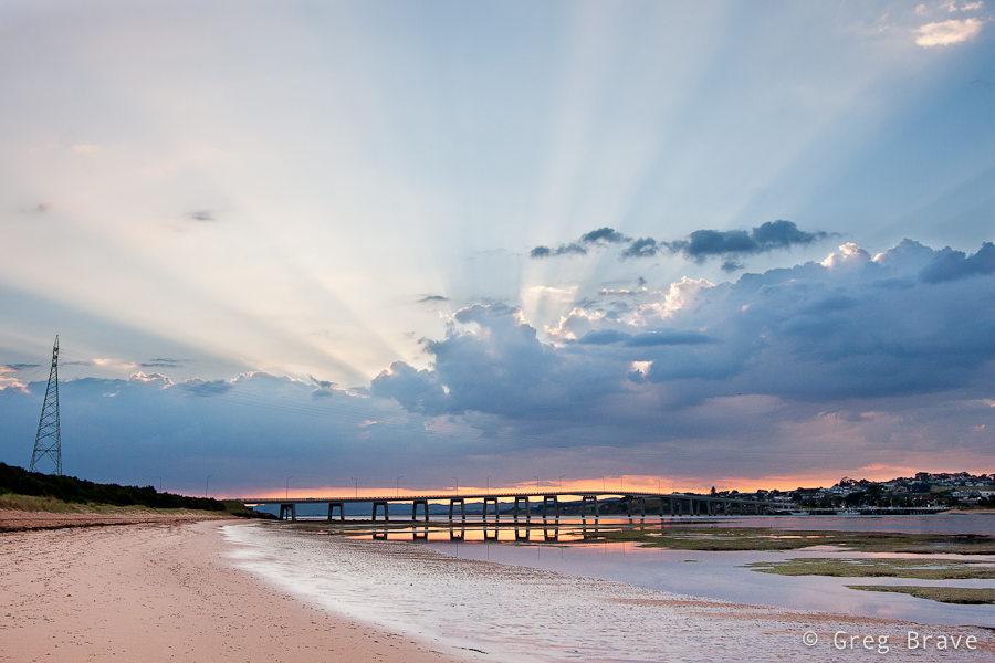
I think I already mentioned that Phillip Island is connected to the mainland by bridge. It is a 640 meter concrete bridge, which I found to be rather nice looking in sunrise colors.
Click on the photo to enlarge.
Unfortunately I have no idea what is the name of these birds but I find them very beautiful against the sunrise-pink colored water. For the shot below I used my Canon 70-200 f4 L lens and tripod.

Click on the photo to enlarge.
During the sunrise the clouds were moving pretty quickly so I was lucky enough to catch some pretty darn nice shots :), as you can see below
Click on the photo to enlarge.
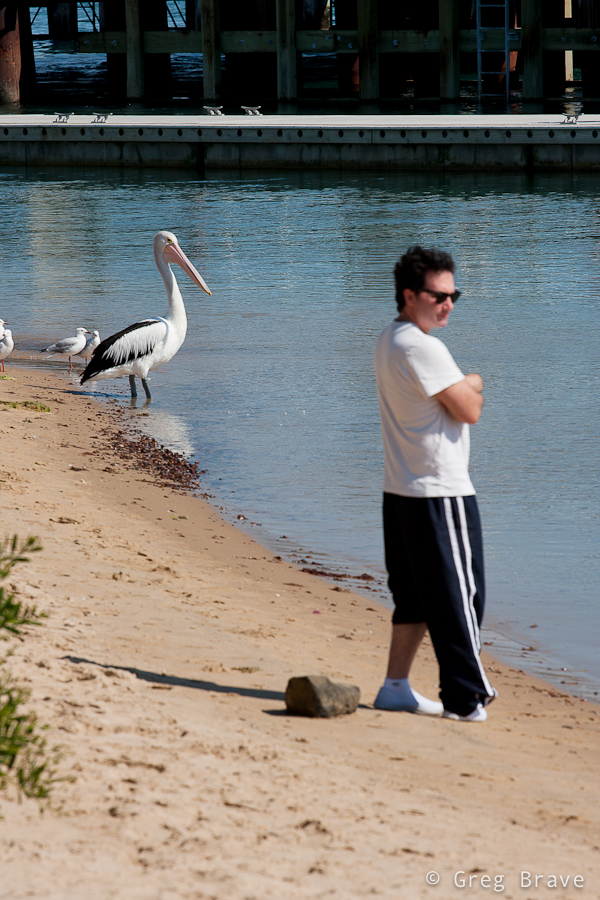
And finally I went to San Remo’s jetty to watch pelican feeding. Unfortunately that day feeding didn’t occur but, I snapped the photo below. Look, they are twins!
Click on the photo to enlarge.
That’s it for my photographic reportage from Phillip Island. I hope you liked my photographs, and
As always your thoughts and comments are welcome!
Till the next time, take care!
Cheers,
Greg.
Imagine that you need to photograph a large dark space, like a cave, or a church, but you only have a single flash. Is it even possible?
Quite some time ago I saw in a photography magazine photo of a big beautiful cave, perfectly lit, all the beautiful stalactites perfectly visible, and I thought to myself – there is no way photographer could bring powerful studio lighting equipment down there!
Fortunately there was a brief description to this photo – photographer put his camera on tripod and set it to long exposure, then during the exposure time he ran around the cave with small strobe flash and flashed all the areas of the cave. “Simple and Genious” I thought to myself back then.
Genious? Sure. Simple? Well, not really.
Recently I decided to photograph the front of my sister’s house decorated with shiny Christmas lights. Yes they still haven’t took them off, because my three year old nephew likes to turn them on every night before he goes to sleep :).
In order for Christmas lights to be visible, I had to do that after dark, and I only had one flash (not that it matters but it was Canon 430 EX). So I decided to try the technique described above, and it turned out not as simple as I first thought it would.
I’d like to share with you the tips that I learned from this experience, hoping they will make it easier for you should you decide to use this technique. I will do this in the form of step-by-step instructions how to perform this kind of shoot.
Here we go:
1. Set your camera on a tripod and compose your shot.
2. Choose the desired f-stop (here your guide should be only your artistic intentions, and not exposure considerations).
3. Focus your camera where you need to, then switch to manual focus. The reason for switching to manual focus is that in the dark it is hard for automatic focus to work, so each time you’ll press the shutter it may take a long time for camera to focus if at all.
4. Look at the scene and decide which areas need to be lit and which don’t.
5. Set your flash power to about 1/8th of its max power.
6. Press the shutter, and run around the scene with a flash in your hand flashing all the areas that need light. Flash ONCE each area.
7. Take a look at the result, and go over all the areas that needed to be lit. If they are too dark, next time you’ll flash them twice, or increase the flash power. Using low flash power and flashing several times the same area gives you more versatility in case you need different areas to be lit diferently.
8. Repeat the steps 6 and 7 until you are satisfied with the result.
In addition to this process you also need to have in mind the following:
Here are a few examples of the house that I photographed:
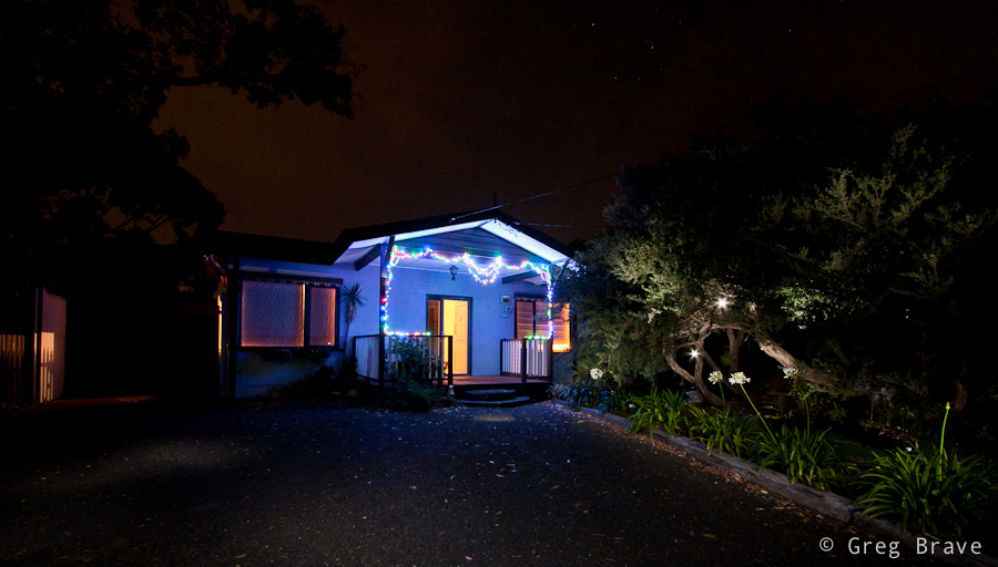
In the photo above, you can see that I deliberately flashed into the lens a couple of times to create lights in the tree. This is also a good example of what you’ll see in your image if you do it by chance.
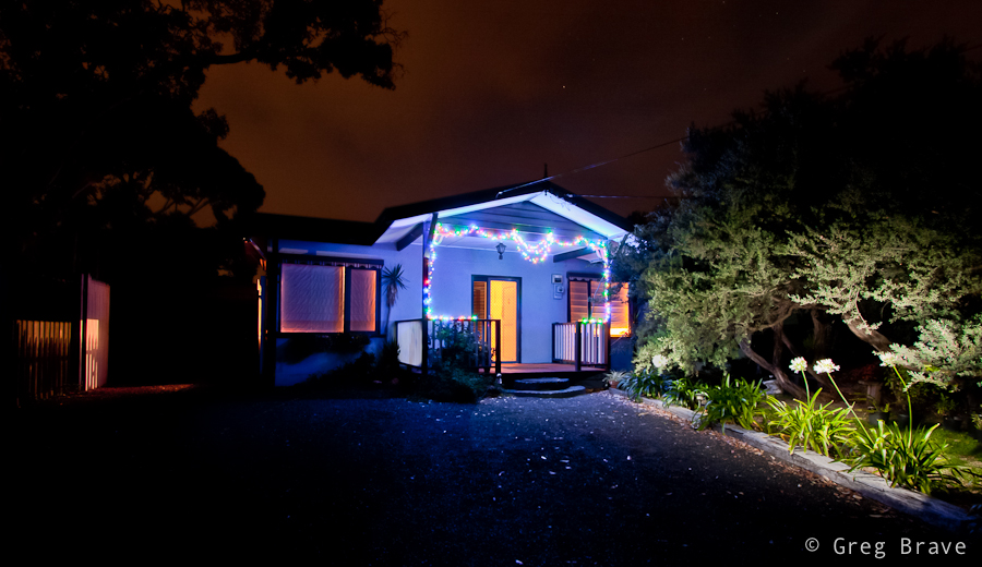
And here is another example, this time without the lights, and with better lit right side.
Till the next time, take care!
Greg.
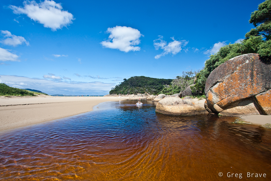
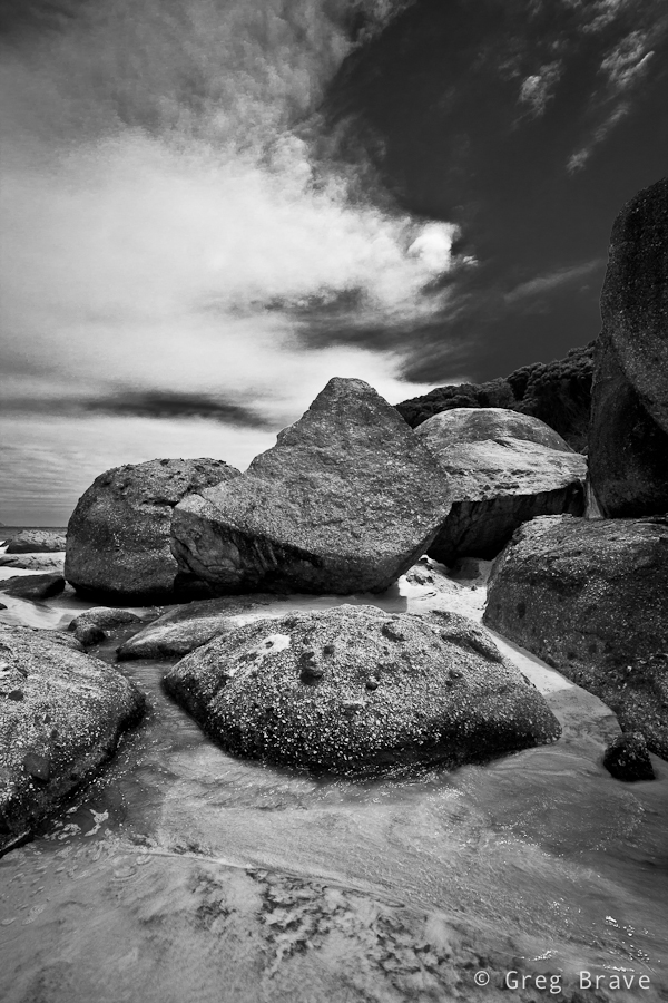
Wilson Prom is a peninsula, which is the southernmost point of the Australian mainland. Its coastline is about 130km in length and it is framed by granite headlands, mountains, forests and fern gullies.
During my visit there it was very windy. Winds reached speeds of 65 km/h, which made it pretty difficult to photograph the place, but the ever-changing clouds created a very moody atmosphere.
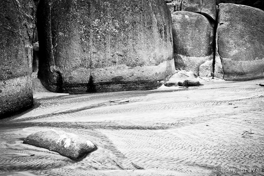
This photo was taken on the beach. I liked this small water canal and the ripples on it. If you look closely the rock on the left resembles head of a dolphin. Actually I didn’t notice that until my father saw this photo and pointed it out.
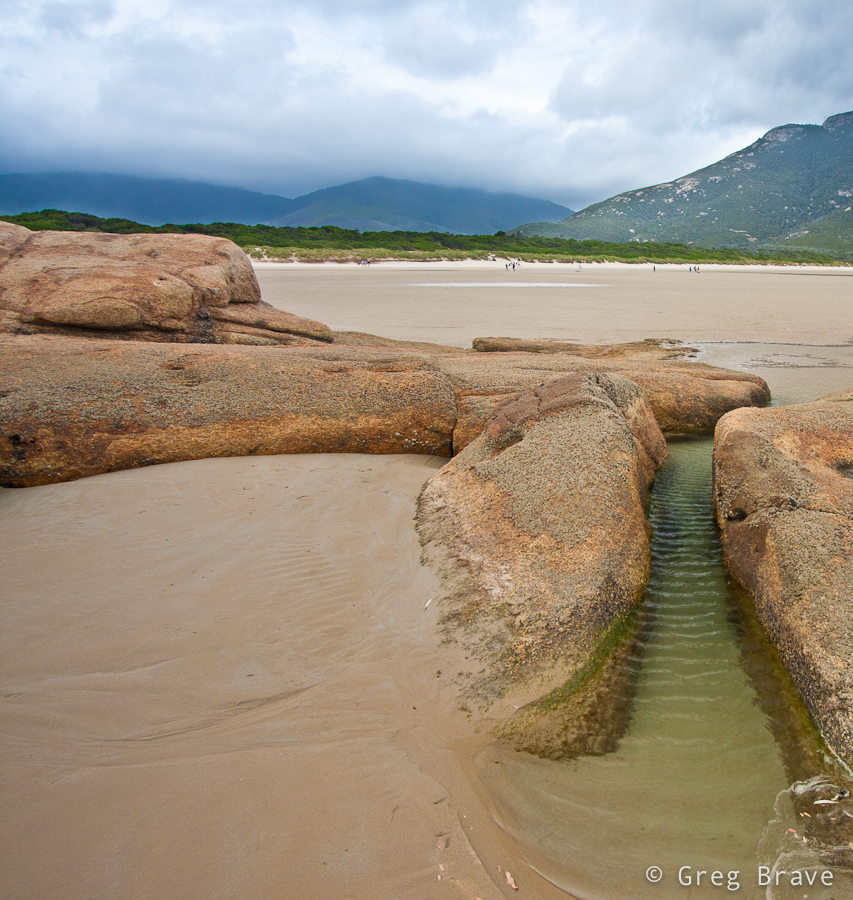
Click on the photo to enlarge.
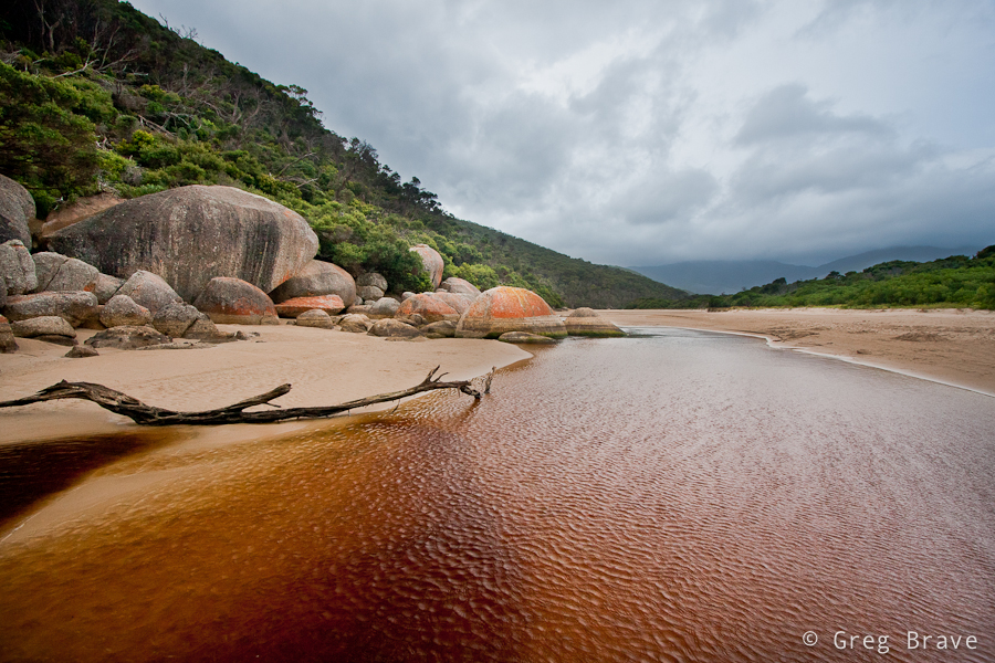
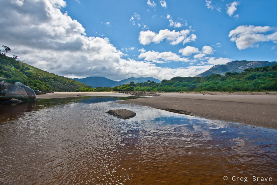
The river in the next photos named Tidal River. It is the main river in Wilson Promontory. It runs into Norman Bay and swells with the tide (hence the name). The river has a very interesting color, a purple-yellow. This is due to the large amount of tea trees in the area, which stain the water with tannin giving it a tea-like appearance.
Click on the photo to enlarge.
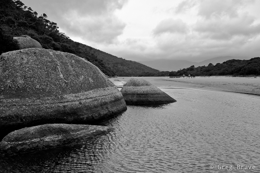
Here I wanted to emphasize the texture of the boulders, and I also wanted a minimalist look. Lack of color achieved it in my opinion.
Click on the photo to enlarge.
This is the famous whale rock. As you can see it resembles whale’s head.
Click on the photo to enlarge.
In about 100 meters from here forward Tidal River meets the ocean. The next photo and the rest of them was made on my second day at Wilson Prom. The winds weakened, and the weather improved a little. As a result you can see people swimming in the river.
Click on the photo to enlarge.
The photo below was pretty heavy processed. I shot it into into the sun, which made the lower part very under exposed, and I had to increase fill light to a horrible 87 percent in Lightroom! I must really start thinking of purchasing ND Grads… Nevertheless I really like the composition and feel of this photograph.
Click on the photo to enlarge.
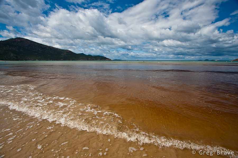
I always loved to photograph the ocean. As you can see Tidal River gives its color to the ocean making it look very unusual but also very beautiful to me. Clouds add the final touch, and below you can see the result.
Click on the photo to enlarge.
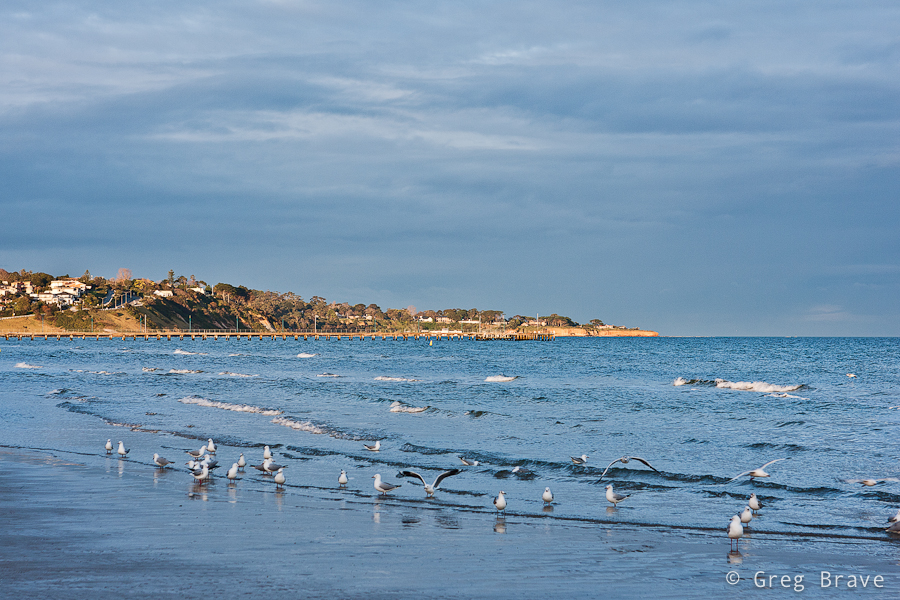
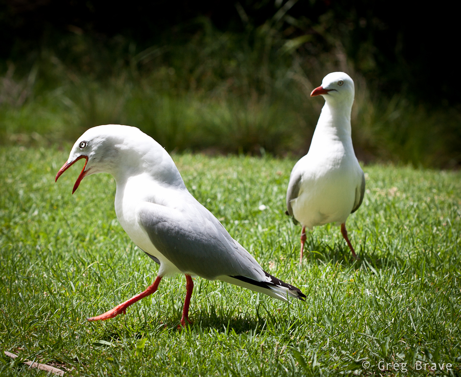
I’m convinced that photographers don’t give seagulls enough attention, and I’ve decided to fix that. In coastal Australia seagulls are everywhere, and they are not afraid of humans. On the contrary – they are always near, waiting for food. I found a nice location at one of the picnic areas, and took many shots of seagulls with the help of my 3 year old nephew who was throwing them food 🙂
Click on the photo to enlarge.
And last but not least two photos from the Squeaky Beach. The photo on the right is called “The Elephant Legs”. These rocks looked magnificent, and I want you, the viewers, to concentrate on their shapes and textures, hence the b&w.
Click on the photo to enlarge.
I used tripod for most of the photos you saw here. Just to give you an idea – I shot about 570 images in total, from them I deleted 520, and the photos you saw here were the chosen ten. If you liked these photos, you can see eight more on my Facebook page: www.facebook.com/photopathway
As always any comments are appreciated!
Till the next time, take care
Greg.
Hello Everybody!
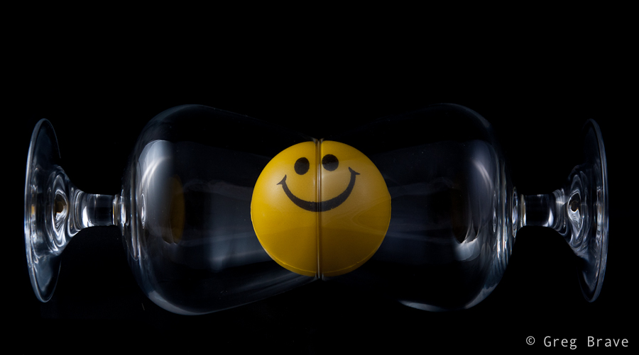
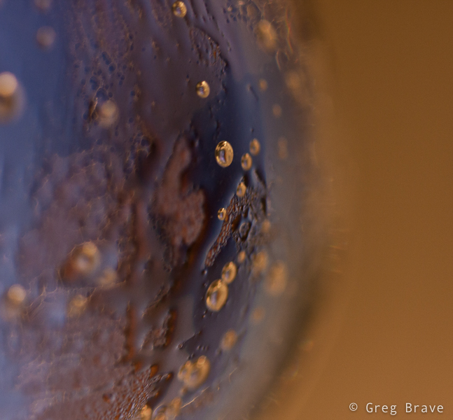
This is another photo-sharing post. Recently I had the time to revive my small home studio, so while I was at it, I took some photos… actually I took a lot of photos, most of which aren’t worthy of sharing.
Here’s the only two I liked:
This photo was taken inside light tent with two flashes (one from each side). I call it “Almost Symmetrical”. Nothing much to it, just having fun 🙂
Click on the photo to enlarge.
And I also liked this abstract photo, which is really a closeup of glass filled with cold bubbling mineral water, with yellow light in background.
Click on the photo to enlarge.
As always your comments are highly appreciated.
See you next time!
Greg
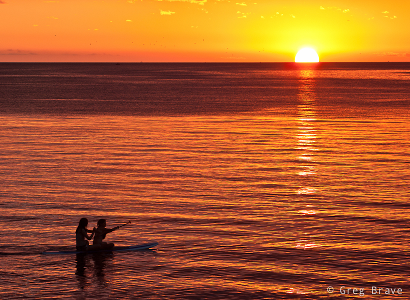
Those of you who frequently visit my blog probably know that I like shooting sunsets, so now I want to share some of my recent shots.
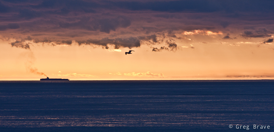
This one has strange colors, but I like it anyway. I was shooting sunset from the pier and suddenly in the far distance I saw this ship. I quickly changed to my telephoto lens, and made a few clicks. But something was missing… the photo was empty. Then a bird appeared in my viewfinder, and I got this shot.
Click on the photo to enlarge.
Here is one pretty simple photo. I like its simplicity, and I also like colors and reflections in this photo.
Click on the photo to enlarge.
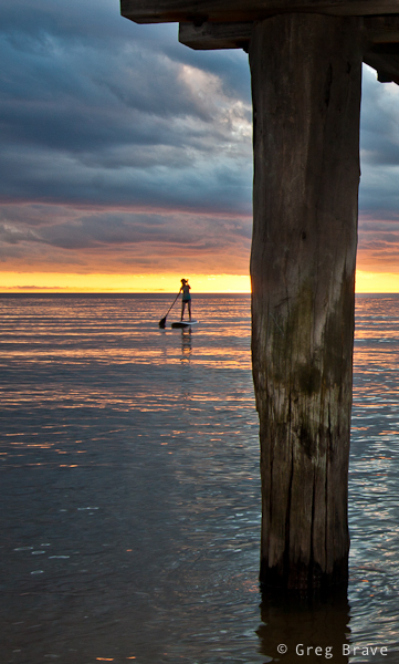
I wish the girl on the boat would come closer, but this is the best I could do under the circumstances 🙂
Click on the photo to enlarge.
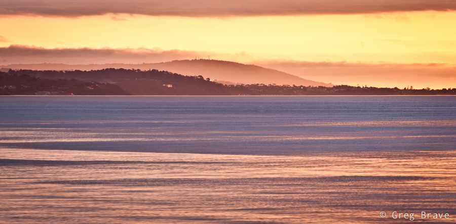
This shot was also taken with my telephoto lens because I wanted to isolate a small part of the shoreline.
Click on the photo to enlarge.
I call the photo below “classic sea sunset photograph” – setting sun, orange water, two silhouettes…
Click on the photo to enlarge.
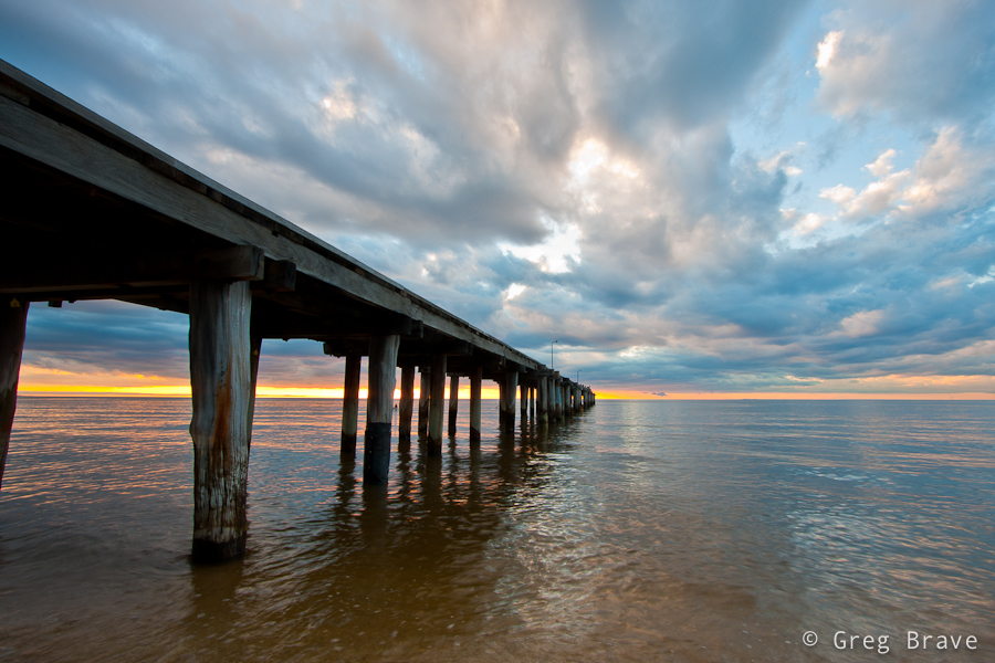
This collection wouldn’t be complete without a little humor. I was shooting standing under the pier (you can see photo from that location in this post), when two boys came and sat on it. I quickly turned and had time to take only one photograph. After a few moments one of the boys ran away, and it wasn’t that interesting anymore.

Click on the photo to enlarge.
I hope you liked the photos. Feel free to comment on them!
Till the next time, take care!
Greg.
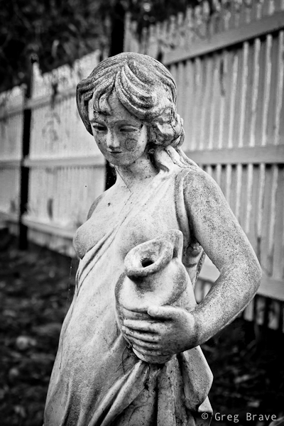
In one of my previous articles I wrote about shooting with intention for B&W (tip number 6), and not merely looking at your photos and trying to convert them to B&W to see if that looks good. Now I would like to add the concept “seeing in black and white”. It comes to you when you shoot a lot of b&w images – you then gain the ability to look at your composition and in your mind see how it would look in b&w. Sometimes, the weather is such that you don’t need this ability – the colors are simply black (dark gray) and white (light gray), but on other occasions the sky may be blue with white clouds and everything around you so colorful that imagining how it would look in b&w would be difficult. This is when the “seeing in black and white” skill comes handy.
Click on the photo to enlarge.
Sometimes the scene itself calls for b&w, as it was with this garden statue. This woman was standing in this garden for a long time and her skin turned from pearl white to muddy gray, the same happened to the color of the fence, and in any case the emphasis here is not on the color.
Click on the photo to enlarge.
Black and white in photography often helps to convey mood, and emphasize shapes and textures.
Click on the photo to enlarge.
Here is another example of emphasizing shapes by shooting in black ans white.
Click on the photo to enlarge.
Did I mention mood already? I just love it when the sky looks like it is going to rain any minute, and light is dim. These minutes before the rain are great for capturing photos such as this one. I wish there would be a bird sitting on the hanger at the foreground though…
Click on the photo to enlarge.
I hope you liked the photographs, and I’ll see you next time!
As always your comments, thoughts, and experiences are highly appreciated.
Cheers,
Greg.
I should have written this post a long time ago, as I’ve been using Hipstamatic ever since I got my iPhone. First of all I must say that I am not affiliated with the creators of this app in any way, I simply love this app!
So what is it? Simply put “Hipstamatic” is an alternative app to iPhone’s native camera application. It is very different though. This app attempts to emulate the ancient plastic film cameras in a very realistic way. Its creators put a lot of thought in the design and functionality of this app, and they keep improving it. Since this app emulates film camera, it has a virtual film loaded into it, and the great thing about it is that you can change this film. For example they have different types of B&W films. But it is not all – you can also swap virtual lenses on the Hipstamatic camera, each lens creating a different effect in the resulting photograph, and you also can swap flashes!
Even though all these features are virtual, their effect on the final photograph is very real, and I find it very interesting. There are many combinations of flash/lens/film that you can use to achieve the look that you want.
Currently you can purchase this app from the Apple Store for $1.99 ($2.49 in Australia), and it comes with basic set of lenses and films. Then you can purchase additional “Hipstapacks” (packages of lens+film) from inside the application.
Though I found a few combinations of lenses and films that I particularly like, and have been using them a lot for my daily photo section, I still have tons of fun playing with different combinations creating different new looks for my photos.
If photography is your hobby, passion, or you just like playing with your iPhone, I highly recommend this app. In my opinion it worth every penny.
Till the next time, take care!
Greg.
In this post I’d like to talk about photographer’s artistic interpretation of the observed scene.
When I decide to take a photograph of a location, it is usually because I feel some sort of impulse. This impulse comes as a result of the surroundings communicating a certain mood, or association to me. You can say that I am photographing more of a mental image of the scene that I have in my mind at that moment than the actual scene. And consequentially, later when I see the photograph on my computer, it is quite different from my mind’s picture.
I call bringing the two images together “Artistic Interpretation”, and use post processing to achieve that. I constantly feel the need to improve my post processing skills to be able better present my photographic intentions.
In the following two examples, you can see the photographs before and after my artistic interpretation (left photo is before and right photo is after).
It was evening time, about 40 minutes after the sunset. The darkness came quickly and the sky was cloudy, it was going to rain any minute. I felt the “pressure” of the coming rain in the air taking this photograph. When I saw the resulting photograph, I felt that this feeling of a close rain and late evening was gone and I had to bring it back. I increased contrast and reduced saturation. I feel that I succeeded in bringing that mood back, but I’ll leave it for you to decide.
Click on the photo to enlarge.
On another occasion I was again walking along the beach. It was a shortly after the sunset, and because it was cloudy, I could barely see the faint remnants of sunlight. The clouds were really beautiful and I couldn’t resist taking a photo. In post processing I increased contrast and added a bit of saturation to the yellow. I also added slight vignetting to concentrate the viewer’s attention on the horizon.
Click on the photo to enlarge.
What do you feel looking at these images? Can you bring your own examples of your artistic interpretation?
As always any comments, suggestions, ideas and anything else you’d like to say are welcome.
Till the next time, take care!
Greg.
One of the compositional tools that photographers use to draw the eye of the viewer into the photograph is lines, which lead the viewer through the photograph. And by lines I don’t mean pencil drawn lines or anything like that. These “lines” can be represented by various contours of elements in the image.
Here is an example of leading lines in the image:
Click on the photo to enlarge.
As you can see there are several such lines in this photo. One of them is the line of the wooden fence. The “line” can be broken and not straight, as is the case here, but nevertheless it still does the job. Another line is formed by tops of the bush, and finally the third imaginary line appears when your eye connects between the three tree tops.
All three lines converge at the lower left part of the photograph leading the eye from right to left. However there is one more line, which “breaks” this pattern. It is the stripe of bright sky protruding through the clouds. While other lines are relatively easy to control because they are stationary , this line could be caught only during a short period.
Lines can be a very strong compositional element when used wisely and in place, for example you can use such lines leading the viewer’s eye to the main subject of your photograph.
What are your examples of leading lines? You can share your photos in the comment section to this post.
Till the next time, take care!
Cheers,
Greg.
Sometimes photo doesn’t need a frame, it is complete as it is. But then there are photographs that just don’t feel right until you frame them. Frame often adds sense of completeness to the photograph. Photographers often look for compositional elements to naturally frame their subject within the photograph.
It is also important to choose appropriate frame for each particular photo, otherwise it might distract the viewer, or even worse – ruin the whole impression from the photograph.
In our digital age it has become common practice to add frame directly to the photo during the post processing. This way of adding a frame has one significant advantage – flexibility. There are many different
applications that have collections of various frames, which you can add to your photos, or if you are familiar with programs like Photoshop you can draw your own frame around the photograph.
Since most of the photos that we come across are seen on display (either from our digital cameras or the Internet) adding frame directly to the digital photo adds to the viewing experience, and later photo can be printed and hung on the wall without the additional expense on the “real” frame (actually this point can be argued by many who prefer real frames).
I’d like to present here two examples of photos with digitally added frames.
Click on the photo to enlarge.
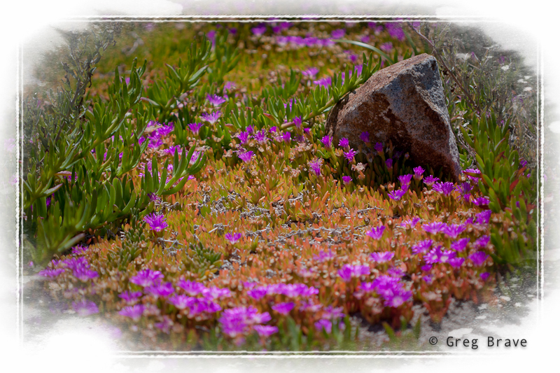
In this photo I added white frame, which in my opinion turns it to a nice postcard, smoothly fading edges of the image and creating dreamy look.
The photo below would be incomplete without a frame, it’s black edges would leave a sense of incompleteness. So I decided to add a frame. The frame’s color is intentionally greenish to match the tone of the photograph.
Click on the photo to enlarge.
What do you think about framing your photographs?
Remember, you only have to enter your name to leave a comment.
Cheers,
Greg.
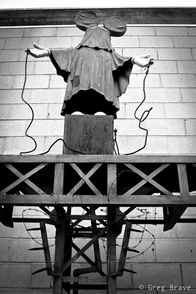
I found a nice place in Frankston named McClelland Sculpture park. It is a pretty large outdoor area with grass and trees and even a little lake. All through this area many sculptures from different artists are placed. Some of them I liked more, some of them less, but there was one sculpture that puzzled me the most:
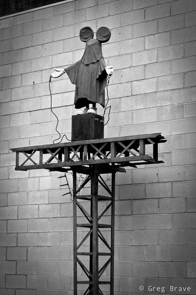
Click on the photo to enlarge.
I don’t know what exactly artist who made it wanted to express, but in me it evoked a feeling of horror because there were two things that don’t go together – children and torture. Mickey Mouse represents happiness, happy childhood, great toys and movies, and seeing him on this “electric” torture pedestal creates disharmony in your perceptions.
I think artist wanted to warn everybody that the happy childhood of our future generations is in danger. I am not arts expert, so it is only my opinion here, but while this sculpture may represent a “wake up call” for the adults, I certainly would not show it to children, because seeing their beloved character like that may cause them nightmares or other negative reactions.
And now I’ll switch to a completely different topic – photographing this work of art. You can, of course, take a documentary photo of it, which is just presenting it as it is without any additional concerns, but when I photographed it, I tried to convey the impression that I’ve got from it through my photographs. My tools were composition, which is the angle of the shot and decision what details have to be included in the shot (or left out), and post processing.
Click on the photo to enlarge.
I am presenting here two photos with different composition. I can’t decide which conveys my impression the best, because each of these two photos contributes to it.
In the post processing I converted the photos to black and white, enhancing the ominous feel, which reminds me of the horrible photos from concentration camps of WWII, and added vignetting to further “darken” the look and concentrate the viewer on the subject.
I’d really like to hear what do you have to say about this work of art, and how I captured it, and which photo do you like more. Your opinion is highly appreciated, and
Remember, you only have to enter your name to leave me a comment!
Till the next time,
Cheers!
Greg.
Lately I was thinking about minimalism in photography. For me it is conveying a message (mood, idea, emotion, etc.) to the viewer through minimum of visual details or subjects. When you see a successful example of minimalistic photography, it seems that it is very easy to accomplish, because there are not many details in the composition that you have to think about.
But that is not true. While trying to create photographs with minimum details, I found it to be pretty difficult to come up with a good one. It is due to scarcity of detail that each detail has to be absolutely necessary and located in the right place.
After numerous unsuccessful attempts I came up with this photo, which I like because it creates a certain mood.
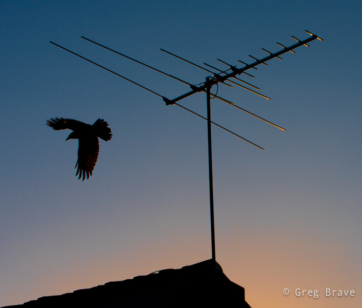
Click on the photo to enlarge.
Initially I wanted to make this photo with the bird sitting on the antenna, so I was waiting with the camera aimed at the scene for the bird to sit in “photogenic” pose (which would be such that its whole silhouette would be visible), but instead the bird flew away, and then I caught it changing my composition intentions on the fly. I was lucky to catch the bird with open wings as I made only one shot.
Now when I look at this photo, I think that I could have waited more for this or another bird to appear and sit on the roof, and it would make another interesting composition. Then I’d compare the photos to decide which I like best. But these are merely afterthoughts, and this image is the only one I have.
I would be happy to hear your opinions on this photo – what would you change in it and why? And any other thoughts that you’d like to share on the subject of minimalism in photography.
Remember, you only have to enter your name to leave a comment!
Till the next time,
Greg
As I promised, here are some more photos from where I live now, which is Australia if you haven’t followed me until now.
There are so many beautiful flowers and trees here, that I can’t resist photographing them and in the last month I gathered quite a collection of flowers and trees photos. Everything blooming now, it is Spring here. Take this tree for example. Imagine how it would be to look out of your living room window and see this beautiful tree!
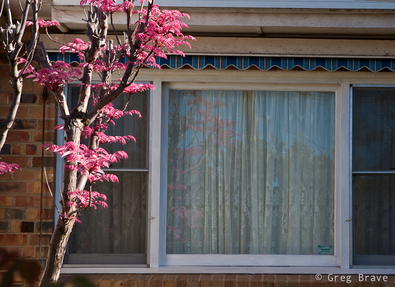
Click on the photo to enlarge.
In the next photo I couldn’t resist doing some Photoshop editing, and added a texture to the flower in addition to converting it to black and white (with dual toning). If you’d like to know how I did the conversion, you can read my post “Creative Conversion to B&W in Lightroom”. Thinking of it, I probably will also write a post about how to add textures to your photos.
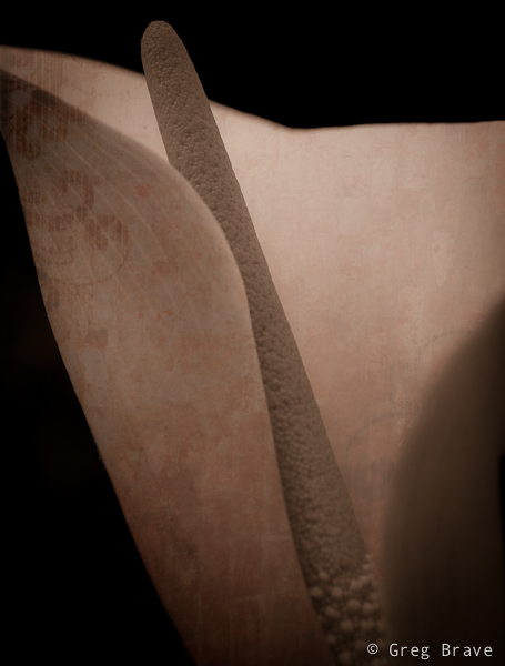
Click on the photo to enlarge.
The photo below was taken at Frankston’s Sculpture Park. This sculpture of a lady standing there created a mystic mood, and I tried to capture it. Whether I succeeded or not is for you to decide.
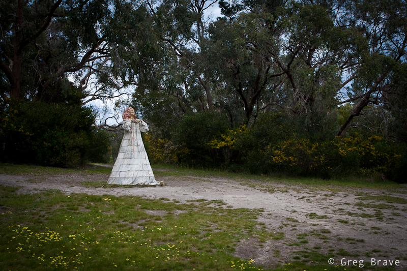
Click on the photo to enlarge.
These are Pelicans that live on the small beach in Hastings (small town). They are waiting for the lady from fish shop, which is located nearby, to come out and give them some fish leftovers.
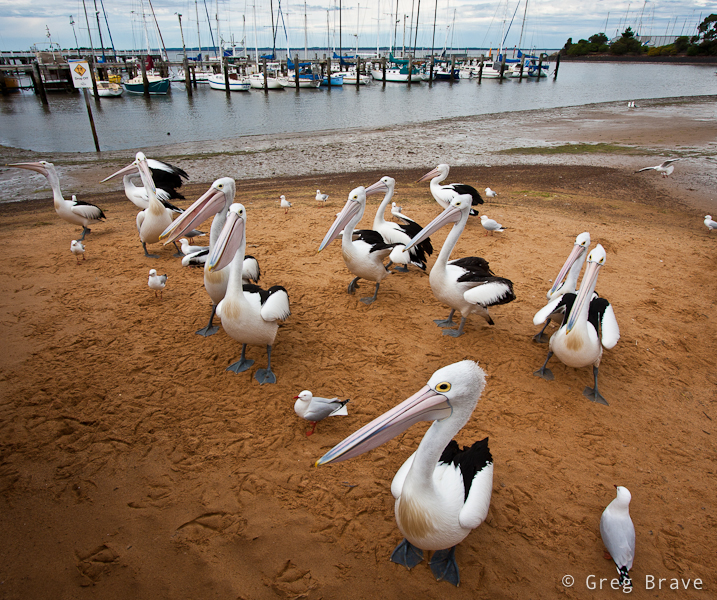
Click on the photo to enlarge.
This photo is from the same location.
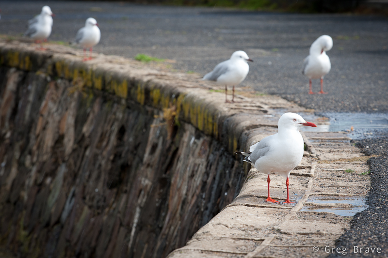
Click on the photo to enlarge.
I am fascinated by the shapes of the gum trees that are so common in Australia. Here is one example, but there are so many different and magnificent tree shapes that I might just create a collection of them.
Click on the photo to enlarge.
This photo was taken in Sydney in the outdoor art exhibition “Art and About”. I liked how these two guys were looking at the huge photo.
Click on the photo to enlarge.
It was a pretty short post, but I hope you liked the photos.
Any comments are always welcome and,
Remember, you only have to enter your name to leave a comment!
Greg.
It is a very common issue among photographers, therefore many articles were written on this, and now it is my turn. In this post I will describe how I try to keep myself inspired and what helps me to come up with ideas for photographs hoping that you find my experience useful.
Inspiration and ideas go somewhat together – when you feel inspired, most of the chances that you’ll have ideas for photographs, and when you have an idea for photograph, it’ll probably inspire you to bring it to life. Therefore the following text will be a mix of tips for getting inspired and coming up with ideas for images.
- I have a notepad in which I write quotes from different sources, which inspire me. You know, you read something or watch TV and at some point you hear a sentence that makes you go ” That’s right! What a great thought!”. If you don’t write it down most of the chances that you’ll forget it. So I write down these quotes and go over them from time to time or when I feel uninspired. That helps a lot, because not only you will be reading inspirational quotes, but you will also remember the circumstances at which you wrote it down, and that in itself can bring back the inspiration.
- During your “good” periods, when you feel inspired think of the things, events, places, people, which inspire you and write all that in the same notepad. It’ll help you a lot to get some of the inspiration back during the “low” periods.
- Another thing that inspires me is listening to the music that I like. Listening to music while looking around for ideas for photographs can be a huge help. Think about it for a second – in the movies they always use various kinds of music to create different moods. Take action movies for example. A certain music can add tension to otherwise usual situation. So when you listen to certain music and look around you, you will see things differently depending on the music that you listen to and it just might inspire you to raise your camera.
- I have a separate folder on my computer with my best photographs. When I create an image that I like very much, I add it to that folder. When inspiration leaves me and I feel that I won’t ever be able to create one good image, I go over my best images to remind myself what I am capable of.
- When I come across an image that captivates me, I try to find out who is the photographer and then visit his website. If I find his works exceptional I bookmark his website. Over the years I gathered list of photographers that inspire me, and I come back and go over their work when I need inspiration.
- I bet it happened to many of you, you keen photographers! You walk around doing your daily routine, and then suddenly a picture or a scene pops into your mind. It might be due to something that you see in front of you (on the street, in public transport, etc.), or because of your thoughts at that moment. It doesn’t matter why. But when it happens – write it down in a few words so that you won’t forget it. I do it in my iPhone because it is always with me. I have this nice diary application called Momento, and I write down there in a few words these pictures of my imagination. It doesn’t mean that I implement them all, but when I am out of ideas, I take a look at my notes and it helps.
- In the Momento app that I mentioned above I can also add photos to text. So if I see certain situation and an idea pops to my mind based on that situation, I simply take a photo of it and add it to the diary entry.
Well that’s about it. All these things combined help me stay inspired and keep shooting during my lowest periods and I hope that you’ll find useful at least some of them.
If you have your own ways to get ideas for photographs and stay inspired, I sure would like to hear about them in the comment section below, and
Remember, you only need to enter your name to leave a comment!
Greg.
This is a very interesting question you know. I am sure that anyone who takes interest in photography at times thinks about it. In my head sometimes these thoughts sound like “I’d really like to make a great photograph… yeah… but what should I shoot?… what should I create?… ”
If you really want to create something, especially if you are not sure yet what it is, you have to allocate a certain amount of time to thinking about it. I mean that you have to tell yourself – “today between 10:00 and 11:00 I am thinking about creating an interesting (also can be beautiful, romantic, breathtaking, sad… anything you prefer) photograph”.
I want to demonstrate this from my own experience. A few days ago I felt this urge to photograph something at my tiny home studio. I didn’t have any idea what it would be, but I just had this desire to create. So I made myself sit down for about 45 minutes, come up with ideas, and briefly sketch them on piece of paper.
My first problem was that not ANY idea that came to my mind was possible to shoot because I was limited to the objects that I had in my apartment. Having realized that fact, instead of just thinking of any idea for photograph, I started looking around my home at different objects and thinking how can I use them creatively?
While looking I saw my table lamp. Actually it was always standing on my table, but until I made myself to think creatively, I never thought about this lamp as a subject for my photographs. And then, while looking at this lamp I remembered of some TV program I saw as a kid that had these two lamps jumping around like live beings, and I decided to try and create something in that direction.
I still had no idea what would come out of it, and I didn’t have any definite final result. So I just started sketching this lamp standing on the table in different poses and thinking what can be done with that. No, I can’t draw, and it doesn’t matter, because you need sketching only to help your thinking process.
One of the ideas that came to my mind was to photograph this small lamp with it’s light bulb lying beneath it, while the lamp “sadly looking” at the bulb. And so I did as you can see in the image below.
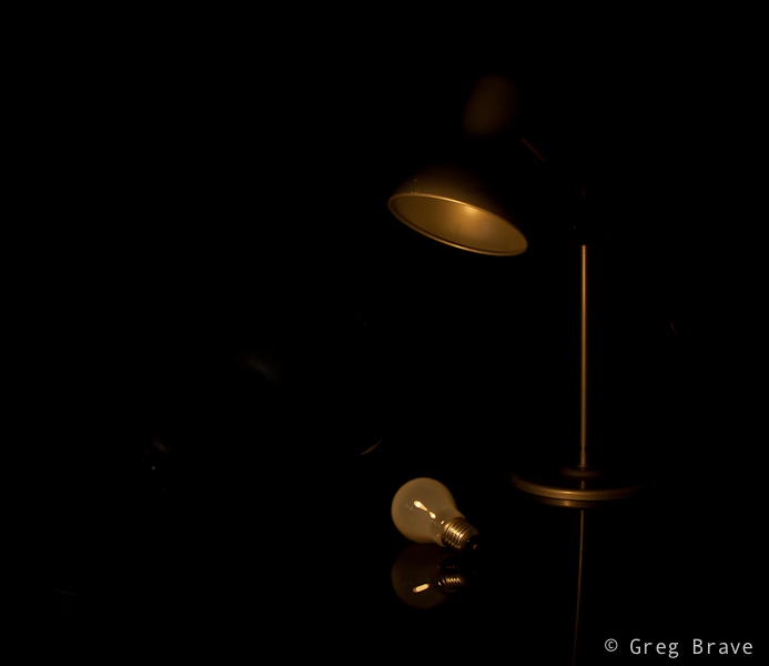
Photograph by Greg Brave. Click on the photo to enlarge.
In this image of lonely lamp looking at its light bulb I used only one flash from the left side with 1/2 CTO gel on it (this gel makes the white flash light to be warmer). I wanted a warm lighting here. Looking at the result I felt that it is not enough for an interesting image… I felt that it doesn’t conveys the “stare” of the lamp at the light bulb.
And then suddenly it hit me – I need another lamp to make this more interesting! And luckily my life partner Ira had one on her table. I took that lamp and started playing with two lamps. Finally great idea came to me – to make the second lamp “look” inside the first lamp as if to see “what happened? why you lost your bulb?” and so you can see my compositional setup in the photo below.
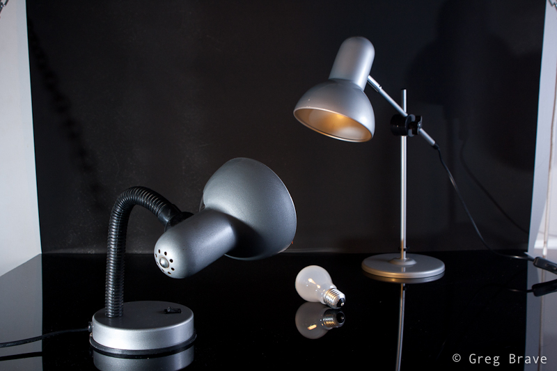
Photograph by Greg Brave. Click on the photo to enlarge.
Now, having the final idea of a shot in place I started thinking of little details. I wanted to emphasize the fact that the second lamp did have its bulb. How would I do that? Well, I decided that I would light the whole scene with white light, but I would also have yellow (warm) light coming out of the second lamp towards the first lamp. And you can see in the photo below that the down-looking lamp is warm-lit.
The final photograph below I accomplished using three strobes. Two strobes without any gels from left and right sides (I had to play with their powers to achieve the desired lighting), and the third strobe with 1/2 CTO gel on it I held in my hand and pointed inside the first lamp.
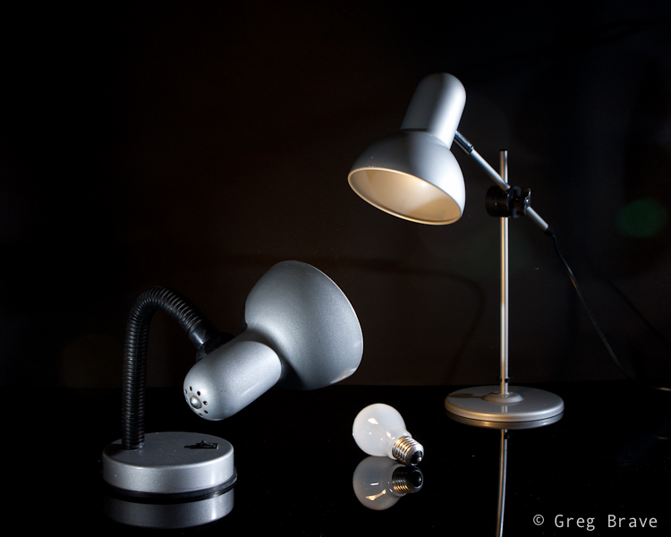
Photograph by Greg Brave. Click on the photo to enlarge.
After getting the final image above, I felt that there is not enough emphasis on the light that comes out of the second lamp. I wanted those rays of light to actually be seen. And here is a point that I am sure not all of you thought about. Rays of light are invisible unless they reflect off of something and hit our eyes. So in order to make these rays of light to be actually visible I had to have them reflect off of something – for example dust, or smoke. So if I would fill up the whole area with smoke then the rays of light would be seen. But then the rays of my two other flashes would also be seen, and the whole image wouldn’t be clear and crisp.
So I decided to take this work to Photoshop, and artificially add the rays of light, using the original light warmth that 1/2 CTO gel gave me (just used eyedropper tool in photoshop to sample that color). To give you an idea how I did it – think of Radial Blur filter in Photoshop. If you have additional questions regarding how I did it feel free to ask me in the comments. And for all the people who are against “Photoshop manipulation” – in the case of this photograph my goal was not to show reality, but to convey an idea of mine, therefore I am totally cool with using Photoshop here.
Here is the final result, which I am pretty happy to come up with.
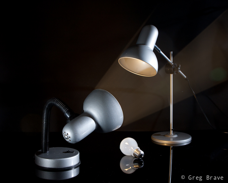
Photograph by Greg Brave. Click on the photo to enlarge.
In conclusion – the main idea of this article is to show that in order to come up with interesting photographs, you have to allocate time for thinking – what you want to do and how you are going to do it. Even if you don’t have any specific idea in mind, just make yourself sit down and think for half an hour or so, and I am sure that you’ll come up with something interesting!
As always your thoughts and comments are welcome.
Do you agree with this article? If you don’t then why? Can you suggest additional steps towards being more creative?
Remember, you only have to enter your name to leave a comment!
Till the next time,
Cheers!
Greg.
As I promised in the article about my trip to Switzerland, I am writing a detailed review on a photo backpack, which I took with me on that trip. It is a “Compurover” from Lowepro. When I was looking for a photo backpack on the net, I had trouble to find good reviews made by people who were actually using the product rather than just going over its features. I also had trouble finding detailed photographs of products. On the manufacturer’s sites there is usually only one or two photos of each product, which is absolutely wasn’t enough for me to get an idea about them.
So I had to actually go to various shops and check out different backpacks and spend quite a lot of time on it. Now, after finding the product that was the closest match to my demands, and using it for a while I decided to write a detailed review of this photo backpack including my own insights and conclusions based on real experience and heavy duty use.
I will start with what were my demands from a photo backpack.
We both – me and my life partner Ira like to hike. We love nature and try to spend as much time as we can outdoors. And obviously I love photography so taking my photo gear with me is never a question. The only question is what gear I am going to take with me and how I will be carrying it. Along these lines my demands from a photo backpack were the following:
1. It has to have enough padded space for all the photo gear I am taking with me outdoors.
2. It has to have an additional compartment for other hiking related gear (clothes, food, etc.).
3. It has to have a good carrying system, to sit comfortably on my back and waist, and wisely distribute the weight across my body.
4. It has to have a tripod holder.
5. It has to have a place for hydration system.
6. It has to have small, and preferably external pockets for all the little things (filters, cleaning cloth etc.).
7. It has to have a rain cover (very important).
Pretty big list huh? I worked hard to find a bag to fulfill all this, and I can’t say that I found a perfect backpack, but I came close.
The biggest problem that I encountered was that most of the professional photo backpacks don’t have enough room for other than photo gear. So I found many great backpacks, with good carrying system, but with no place for other stuff. It still puzzles me – if photographer goes out on a long day of shooting, with tons of gear, doesn’t he need to carry also some personal stuff? I need.
And now to the actual review.
In the two photos below you can see the “Compurover” front and back. It is pretty big backpack, made from top quality materials. It has a comfortable (at least for me) carrying system. During my trip I was walking for about 10 hours (!) a day with it on my back and feeling very comfortable. The waist belt is great – it is wide and well padded, so are shoulder straps. You can also remove the waist belt for drying/cleaning purposes.
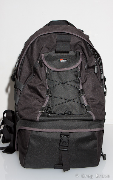
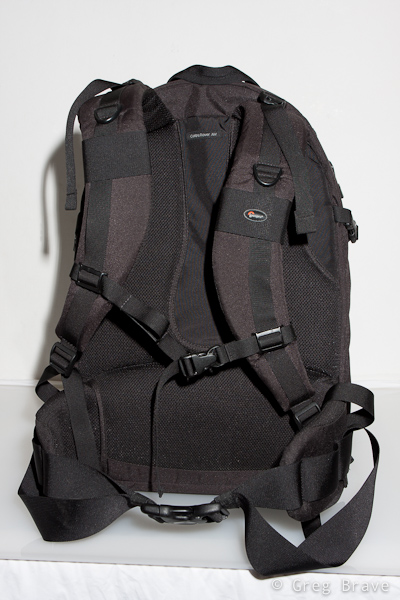
Photographs by Greg Brave. Click on the photo to enlarge.
The bottom compartment is for photo gear. It is padded like any other photo bag, and you can also change its configuration to match your photo equipment. It was big enough for me. In this compartment I could carry the following equipment:
Body: Canon 40D
Lenses: Canon 24-70mm f2.8L, Canon 70-200mm f4L, Canon 100mm macro f2.8L, Canon EF-S 10-22mm f3.5-4.6
Flash: Canon 430EX
And there was still room left for one additional small lens such as Canon 28-105 f3.5-4.5
This compartment closes with a zipper and a security lock. When you open it, it slides out in an angle giving you a comfortable access to the equipment. One thing to notice – zipper is somewhat hard to zip/unzip at the corners.
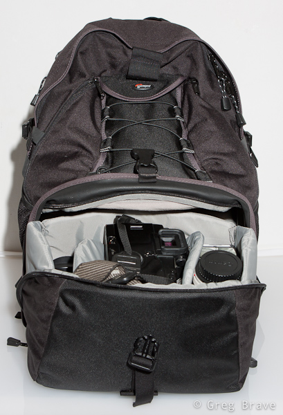


Photographs by Greg Brave. Click on the photo to enlarge.
The tripod holder. When not in use it is folded upward (you can see it on the front view of the backpack above). When needed you unfold it downwards, and put a tripod in it as shown below. Lowepro’s original idea was that you put your tripod under the bungee mesh and use two additional bungee cords (which come with the bag) to secure the tripod at the top and bottom. I found that to be too inconvenient, so what I did was to remove the two bungee cords from top and bottom ( you can’t see them on any of my photos) and only on the top I put a Velcro strap. I put the tripod in the tripod holder without putting it under the bungee mesh, and secure it on the top with a Velcro strap. For me it was enough to securely carry my large tripod.
By the way if you have a small tripod, you can carry it on the side of the backpack putting its legs in the side mesh pocket and securing it with the side strap.
There is also a pretty spacious pocket, which I use to carry my polarizers as you can see on the photo below.
The downside to this tripod holder is that in order to access your photo gear you have to remove the tripod first.
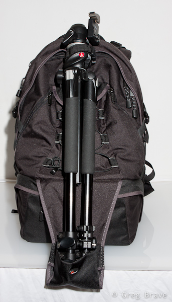
Photographs by Greg Brave. Click on the photo to enlarge.
Additional pockets. “Compurover” has two small zipped pockets on the front, which I use to carry cleaning stuff, micro leatherman, and filters. Pretty convenient. It also has mesh pockets on both sides.
Laptop compartment. The access to the laptop compartment is from the side, so that you won’t have to take out all your gear before getting to the laptop, which is especially convenient when you are passing airport security. But as you probably noticed, in my demands there was no need to carry a laptop. Actually the last thing I want with me on the outdoor hike is an additional 2-3 kilos of dead weight. Do you?
But here is my big breakthrough! I found this compartment to be very useful. Almost indispensable. I use it for my 3 liter hydration system! I put it inside, close the zipper almost all the way up and pull the hose from the top to the shoulder strap.
Photographs by Greg Brave. Click on the photo to enlarge.
Top compartment for other stuff. You can see it on the left photo below. Actually it is pretty spacious. Unfortunately I didn’t show it in this photo. I could put quite a lot of stuff in this compartment such as rain coat, sandwiches, utility knife, and more. As you can see, inside the top compartment there is a zipped pocket and another divider. There is also a memory card holder there. You can see it in more detail in the photo on the right.
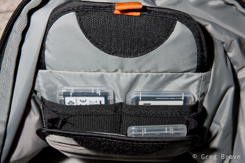
Photographs by Greg Brave. Click on the photo to enlarge.
In addition, with the bag comes this small pouch, which I found very convenient to carry spare batteries, cables and stuff.
Photograph by Greg Brave. Click on the photo to enlarge.
The one thing that I didn’t show in the photographs is the rain cover. It has its own pocket at the bottom of the bag.
Additional important little thing is that on the shoulder straps there are two plastic rings (one on each side). If I want to hike with my hands free (for trekking poles for example), but I also want my camera to be ready any minute, I hang it on these two plastic rings instead of hanging it on my neck. And when your camera is as heavy as mine it is very important.
Summary
| Pros
Lowepro’s “Compurover” is a good hiking photo backpack with good carrying system (wide and padded shoulder straps and waist belt). It has enough room for my photo equipment and it also has spacious compartment for other stuff. It has a tripod holder, and I can also carry about 2.5 liters of water in my hydration system in laptop compartment. This is especially good because I have all the top compartment for additional stuff. This backpack also has a sufficient amount of little pockets, and it has a rain cover. Cons The photo-gear compartment is a little difficult to open because zipper gets stuck a little bit on the corners. There is no quick access to the camera as I saw in other backpacks, so in order to get it out you will have to put down the backpack and open the photo-gear compartment. It is a big backpack, so if you want to go for a stroll in the park taking only your camera with one lens on it, this would be an overkill. If you carry a tripod then you would have to take it off the bag before being able to access your photo gear. |
Conclusion
I am happy with this backpack, and most of the cons are not an issue for me. The only thing for me that is left to see is whether this backpack will hold through the years.
Comments are welcome as always, and if you find this review useful I would also like to hear about it.
Till the next time,
Take care!
Greg.
Good day everybody! It has been a while since my last post. I had some pretty cardinal changes in my personal life, and was so caught up that couldn’t free my mind to write anything. But I continued to take photos and have some new stuff to share.
In addition to the changes, during this time me and Ira also went on an 8 day trip mainly to Switzerland but with short, 2 day stop in Prague. Actually one out of these two days we weren’t in Prague but in a small village named Černošice. It is located about 20 minutes by train from Prague, and it is so beautiful!
Černošice lies on the Berounka river, so we stepped off the train and went to the river right away. There is a nice walking trail along the river, and in the photos below you can see some of the views that we saw while walking there.
I saw these naked trees on the shore and their beautiful reflections in the water. I wanted to photograph them but thought that only the trees with their reflections were not enough to make interesting photograph, so I was looking for an additional element for my photograph. These red tulips were it.
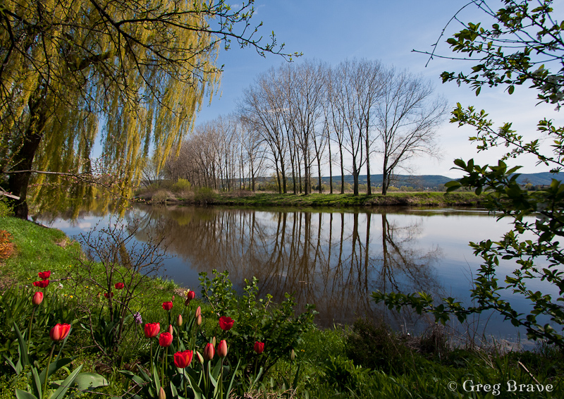
Photograph by Greg Brave. Click on the photo to enlarge.
The photograph above was not enough for me and I was looking for additional ways to photograph these trees and their reflections and as a result I got the photo below. The additional element was the tree branch from the left. As you can assume I have much more photos of these trees in my collection, but I chose these two to show here because I think they are most successful composition-wise.
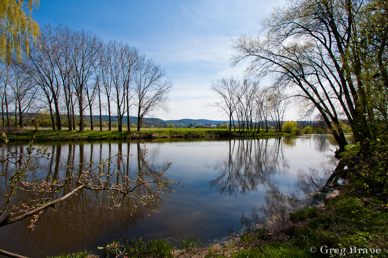
Photograph by Greg Brave. Click on the photo to enlarge.
While walking, I saw this horse’s hoof fungus. Well, it is not an unusual sight, at least not in Europe, but I just got this idea to photograph it, but as always I looked for somewhat different way of doing it. I decided to use a wide angle lens to emphasize its form and at the same time to hint about where it grows.
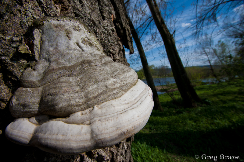
Photograph by Greg Brave. Click on the photo to enlarge.
When I took the photo below I was almost certain that it won’t be something I’d share. The sun was harsh creating a very high contrast between the sky and the earth, but the clouds looked so interesting that I couldn’t resist giving it a try. And I am glad I did! I like this photo because it is pretty simple, but at the same time it conveys movement and a feel of space.
Actually this photo didn’t look exactly like this when I opened it in Lightroom. The lower half of it was almost completely dark. But here comes the magic of shooting raw – using the “fill light” slider I was able to recover many details. In general, I use the “fill light” adjustment slider when I am forced to shoot in harsh afternoon light, and there are some strong shadows. The fill light adjustment helps make these shadows much less disturbing.

Photograph by Greg Brave. Click on the photo to enlarge.
Next photo is pretty ordinary, I mean there are many photos like it out there, but I still liked it for being so bright, happy, and colorful, and couldn’t resist sharing it.
Photograph by Greg Brave. Click on the photo to enlarge.
I am not presenting here photos I made in Prague, since not long ago I had a more substantial trip to Prague and already posted photos from it. You can find my articles about Prague here and here.
After short stop in Prague we continued to our main destination – Switzerland. I always wanted to see whether this country is as beautiful as photographs show. Believe me – it is!
Our first destination was small town named Grindelwald. It is located in a very beautiful and mountainous area, which was exactly what we wanted. We camped in Grindelwald and went for a long hikes up the mountains from there. Since late April is still pretty cold, there weren’t much tourists (the ski season was over, and the summer hiking season didn’t begin yet), and we mostly hiked alone.
In the photographs below I will show some of the stunning views we saw on our hikes.

Photographs by Greg Brave. Click on the photo to enlarge.
I was looking for interesting shapes, patterns and angles to create interesting photographs, that would stand out. Whether I succeeded or not is for you to decide.
On one of our hikes we went so high up the mountains that we reached areas where snow didn’t melt yet and the wooden houses, which are restaurants and resorts in the summer, were completely covered with snow! There is one catch in photographing snow under bright sunlight (just in case that you are not familiar with it) – because the snow is so white it reflects the light very good, and the light meter in the camera perceives the scene to be very bright thus underexposing the photograph. So you have to set your exposure compensation to about +1 stop. It is not an exact science so just try and see for yourself.
Photographs by Greg Brave. Click on the photo to enlarge.
After two days in Grindelwald area we went to another area near town named Hintergoldingen, also with mountains but they were lower so there was almost no snow there. The next photo is from that area. The wast green fields are breathtaking! At the end of this article I will put some more photos from here.
Photograph by Greg Brave. Click on the photo to enlarge.
And finally on our last day, on the way to the Zurich airport, we stopped in Rapperswill – a small town located near Zurich lake. This tree caught my attention as light was hitting its leaves making them shine beautifully.

Photograph by Greg Brave. Click on the photo to enlarge.
I also tried to capture the slow pace of this place, where locals and tourists relax and don’t hurry anywhere.
Photographs by Greg Brave. Click on the photo to enlarge.
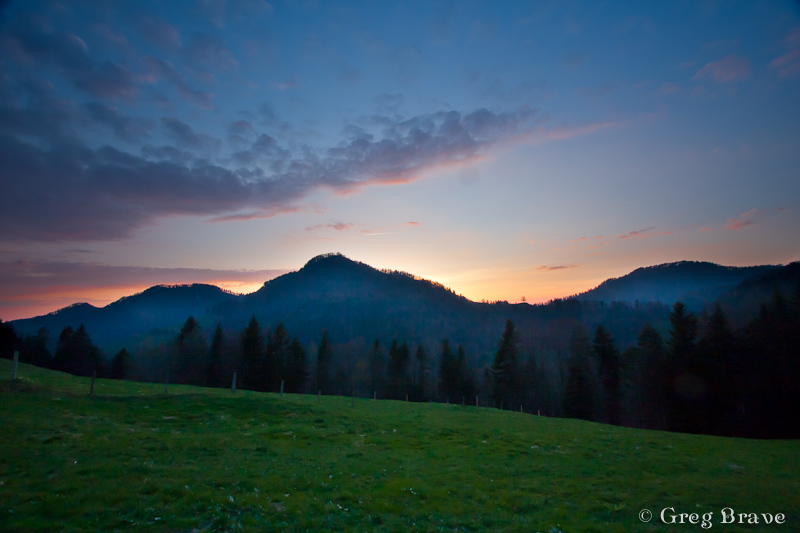
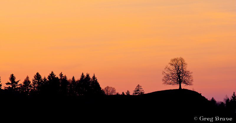
Photographs by Greg Brave. Click on the photo to enlarge.
We had a great time on our trip and I hope I succeeded in showing it in my photographs. I bought a backpack for my photographic equipment especially for this trip, it was a “CompuRover” from Lowepro. I was very satisfied with it and I am planning to write a detailed review on it in the near future, so stay tuned if you are interested!
This is it for now, and until next time take care!
Greg.
In addition to my passion for photography I also like to climb. Climb as in rock climbing. Up until now I didn’t mix these two things, and when I went out climbing I didn’t take my DSLR with me, because I was afraid that it would “get hurt”, and I also wanted to concentrate on climbing. Actually I was climbing long before I got into photography, so at first there was no issue here. But since I started photographing it always bugged me that I don’t have my camera with me.

Photograph by Greg Brave. Click on the photo to enlarge.
Recently it started bugging me so much that I couldn’t resist it anymore, and took my camera and three lenses with me when we went to climb. I decided first to climb a few routes, and then to take photos of my friends climbing. It worked out just great.
In my photos, I wanted to achieve several goals:
1. To show the surroundings in which we climbed.
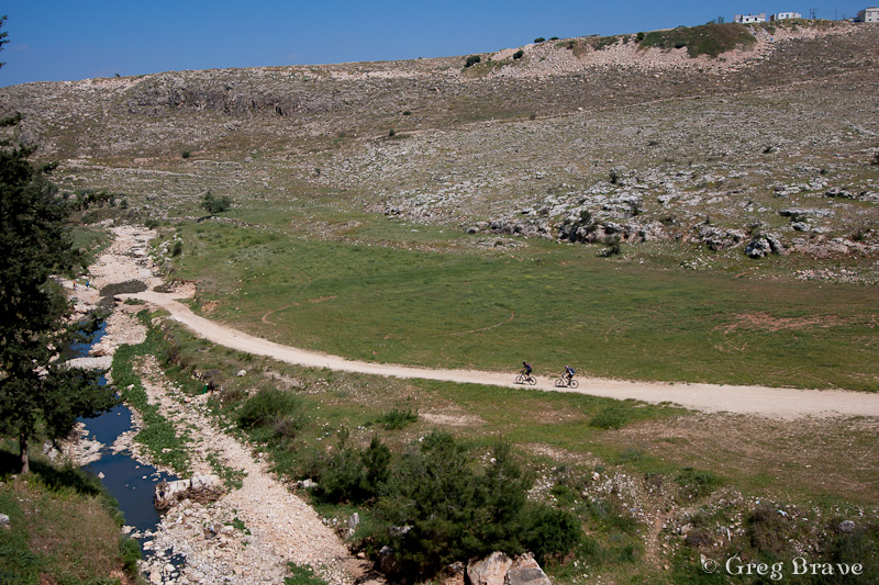
Photograph by Greg Brave. Click on the photo to enlarge.
2. To show the climber and the belayer in such a way that viewer would understand what is going on, and also to make the height of the climb “visible”, so the viewer would feel that the climber is high above the ground.
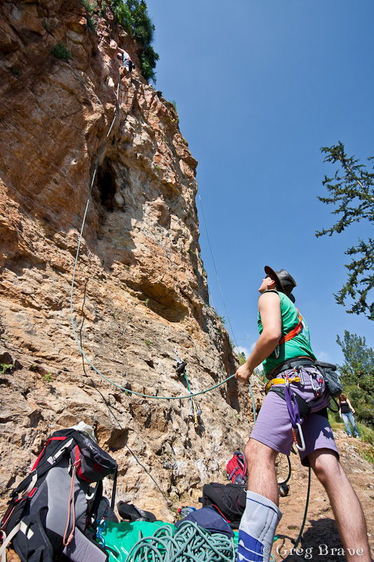
Photograph by Greg Brave. Click on the photo to enlarge.
3. To show the dynamics of climber when he climbs the route.
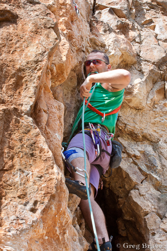
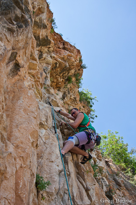
Photographs by Greg Brave. Click on the photo to enlarge.
4. To create rather artistic than documentary photos.
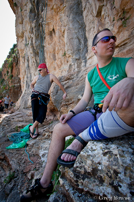
Photographs by Greg Brave. Click on the photo to enlarge.
You can judge for yourself to what extent I succeeded in achieving these goals.
One very important thing that I couldn’t control was the harsh sunlight, which made the contrast between the shadows and highlights very strong. When I go to photograph alone, I can time my visit to early morning or late afternoon, but in this case there were factors beyond my control. Partial solution to the harsh sunlight was shooting in RAW, and then in post processing playing with the “fill light” and “contrast” sliders to make the deep shadows brighter.
Any comments, suggestions, or opinions are always welcome.
Till the next time, take care!
Greg.
I think that one of the most important aspects of photography is about joy of creation, expressing yourself and enjoying every minute of it. I always try to be creative, and though I don’t always get the desired results from my experiments I just continue trying. For me there is no other way. I try to put my heart and soul into my work mixed with feeling and emotions.
Today I’d like to share with you one of my attempts at creativity. It was a nice autumn weekend in Israel when me and Ira went to the Upper Galilee region to do a walking track near the Sea of Galilee. On our way back we stopped to visit the Greek Church of the 12 Apostles. This church always attracted me when I was driving by with its’ red roofs but I never had the chance to actually get inside.
This time we had about an hour, so we decided to finally give this church a closer look. I was so tired from our trip that I left my Canon DSLR in the car. I just didn’t have any mental mood for photography. But the closer we got to the church the stronger grew my desire to photograph it. Eventually I decided to photograph it with my iPhone.
This Greek church is very beautiful and is also located in a beautiful place. When we returned to our car I was surprised to find out that I took about fifty photographs of the church and its surroundings from variety of different sides and angles.
Another important aspect of photography (again, in my opinion) is to know how to choose your best photos, and to be brave enough to delete most of the rest. Otherwise you’ll end up with tons of photographs, which are very similar to each other (a tiny difference in a crop here, and in viewing angle there).
Thus on our way back (Ira drove the car) I went over all the photos of the Greek church that I took and deleted about 90% leaving only the ones I though were most successful. After that I started thinking – what would be the best way to present these photos in a way that would show the Greek Church of the 12 Apostles in all its beauty and also reveal some of the architectural details.
Eventually I decided to create a photo-collage of all the best photos. During the following months I was busy with other projects (including trip to Prague) and only recently got the time to put the idea of a photo-collage to test. It took me quite some time to do that as I had to change sizes, crops and other things in order to create what I had in mind.
Here is the collage of the Greek Church of the 12 Apostles. Remember that all the photos here were taken with my iPhone, and don’t judge the quality too harsh 🙂
And as always feel free to leave comments!
Cheers,
Greg.
Greek Church of the 12 Apostles. Photograph by Greg Brave. Click on the photo to enlarge.
During our vacation in Prague me and Ira also visited a small town near Prague named Kutná Hora. At first I didn’t think of writing second chapter about my trip, but when I finally had time to browse through my photos from that town, I saw that I had a few very nice photos from there (if I won’t compliment myself on my photographs, then who will ? 🙂 ), so I decided to write a short post on our day in that sweet little town.
Kutna Hora is about an hour train ride from Prague, and if you, like me, don’t like organized trips, you can just buy a train ticket in Prague and visit it by yourself. The old town centre is about 20 minutes walk from the train station, and I think there is even a bus going from the station to town. Anyway we didn’t use any kind of transportation but our feet.
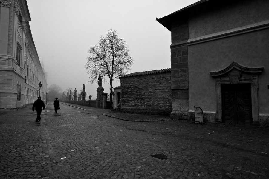
Alley leading to St. Barbara Church. Photograph by Greg Brave. Click on the photo to enlarge.
There are quite a few tourist attractions in Kutna Hora, such as St. Barbara Church, which is one of the most famous Gothic churches in central Europe. It is also a UNESCO world heritage site. By the way St. Barbara is the patron saint of miners, and this town was mostly based on silver mines in the past. Another attraction of the town is the Sedlec Ossuary. It is a small Roman Catholic chapel. Its’ main feature is that inside it is artistically “decorated” by many real human bones. It is estimated to contain the skeletons of between 40,000 to 70,000 people.
In addition it is pure pleasure just to walk the streets of the old town centre in Kutna Hora. This is what we did the most – just walking on the narrow streets between old buildings and taking photos, of course! When we got there it was rainy-misty weather. It was pretty dark for photographing, but I had my tripod with me, and all the photos that you see here were shot from tripod. Yes, even the dog in the last photograph!
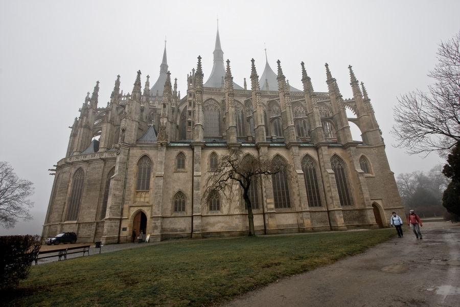
St. Barbara Church Photograph by Greg Brave. Click on the photo to enlarge.
Actually I was surprised that I could use my tripod just about anywhere. Nobody told me that I couldn’t, which was strange because I am used from other places in Europe (Greece for example) that in most touristy places they don’t let you use the tripod. Shooting in mist I tried to convey this darkish and melancholic atmosphere. But it was not the case with these rose hips. Here I aimed at showing the “freshness” of the branch and the “coolness” of the air. I was captivated by the color of the hips!
Rose hips in the rain. Photograph by Greg Brave. Click on the photo to enlarge.
When photographing tourist attractions such as Sedlec Ossuary (which you can see below), I wanted my photos to be different from what most tourist were shooting (which is just straight-forward showing of what eye sees). So I tried to include elements that would add mood, which in my opinion was appropriate. In case of the Ossuary I went around it several times until I found this spot where the tree branches looked like they were reaching towards the building and blending nicely into the seamless gray sky.
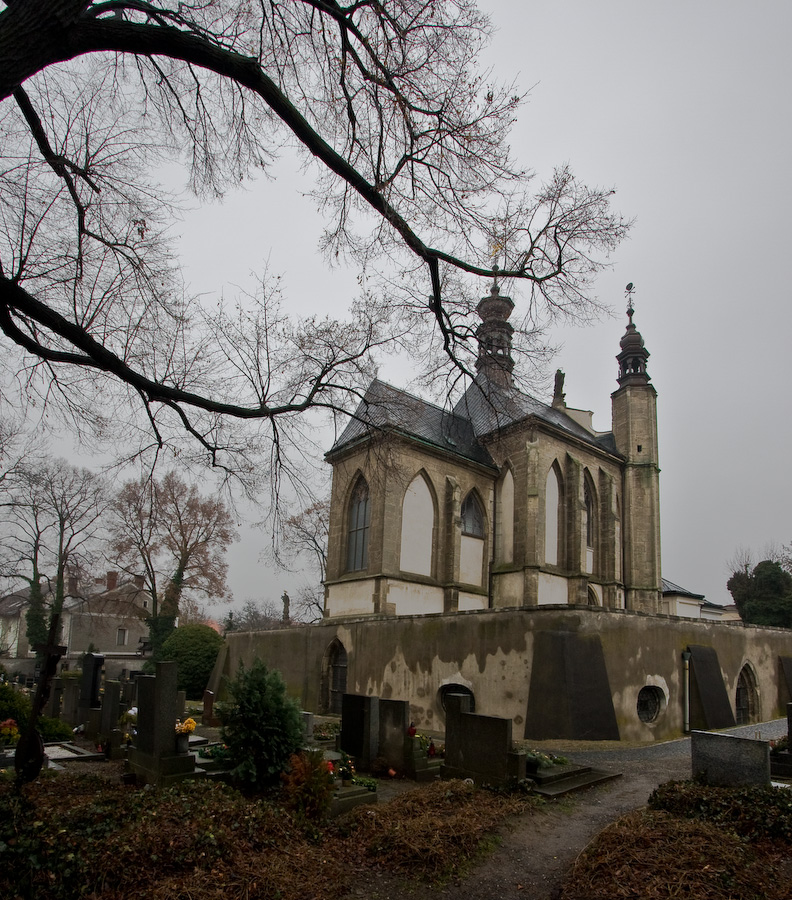
Sedlec Ossuary. Photograph by Greg Brave. Click on the photo to enlarge.
During our visit, there were not many people on the streets. Here and there we met tourists, but I was looking for local people to “put” in my frame, to make my photos more authentic. In the left photo below I succeeded, while in the right one I waited and waited for someone to pass by, but with no luck, and finally shot the scene without anyone. It is a shame, I would really like to have there a person or two.
Kutna Hora old town streets. Photographs by Greg Brave. Click on the photo to enlarge.
On our way back to the train station, we were walking on a narrow sidewalk when I spotted this dog watching us from behind a window. Even though we had little time left till the train I couldn’t just pass by this photo opportunity. The thing is that it was getting dark already, and even high ISO wouldn’t help me out here. So even for this shot I had to take out my tripod. The doggy was watching intensely all my actions and at some point I thought, that’s it now it will start barking… but everything was just fine – I took a few shots and we took off to catch our train.
I hope you liked the photographs, and as always – comments and critiques are welcome!
The Doggy 🙂 . Photograph by Greg Brave. Click on the photo to enlarge.
The Autumn is finally here. Even though it is warmer than I’d like it to bee, I definitely can feel the end of this year coming… You might say that December is a winter month, but not here, not in Israel! We barely have an Autumn and then it is Spring and Summer all over again. This is why this time of the year is very precious to me, I won’t be able to smell the wet earth and get this melancholic Autumn feeling for much longer… a couple of months, that’s all I’ve got.
Last Friday it was heavily raining all morning, but in the afternoon rain stopped and me and my life partner Ira went out for a walk in the park, and of course, I took my camera with me. It turned out to be a nice photo session. I would like to share some of the photos that I liked, and since I am learning photography, I will also discuss some “photographic” aspects of the photos. So here we go:
I like this photograph probably the most. The lines on the floor lead the eye towards the first subject – Ira, and then continue to lead towards the second subject – the tree. I like this tree so much, its branches curve so beautifully.
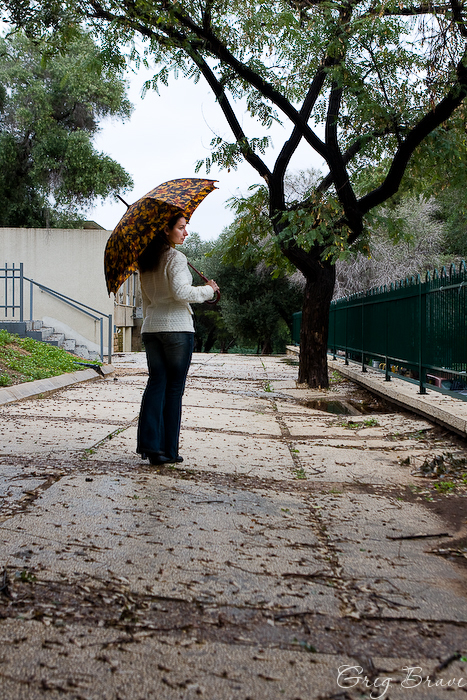
Photograph by Greg Brave. Click on the photo to enlarge.
This image could be pretty casual but, in my opinion, the red flower on the wooden fence adds a lot to it. There are also some disturbing elements in this photo that I’d like not to be there – the whole left part of the photo, in front of Ira. I wish it was simpler… much less cluttered. I also like the lower part of the fence, which is made of stone.
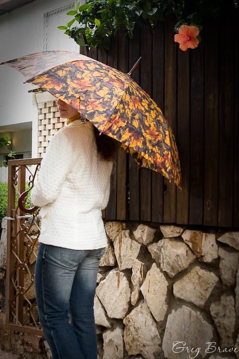
Photograph by Greg Brave. Click on the photo to enlarge.
Here I found a nice brick wall for the background, and we experimented with different poses for a while, but nothing worked. Then I just asked Irina to walk from me towards the wall and at some point called her name. She turned around and I made this shot! So I guess it was somewhat spontaneous.
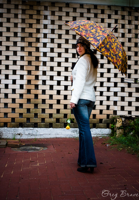
Photograph by Greg Brave. Click on the photo to enlarge.
This next photo is a bit disappointing for me. I found this great fence for the background, but after seeing the final image, I realized that I didn’t use its full potential. I could at least made this photo horizontal, to emphasize the horizontal lines of the fence. I can see this picture in my mind now – Ira standing on the right side of the horizontal photograph, and the horizontal lines of the fence lead the eye from her to the interesting statue that stood there a few meters to the left. I wonder now how I didn’t see this at the time of the shoot? Well, I guess this is how you learn stuff 🙂
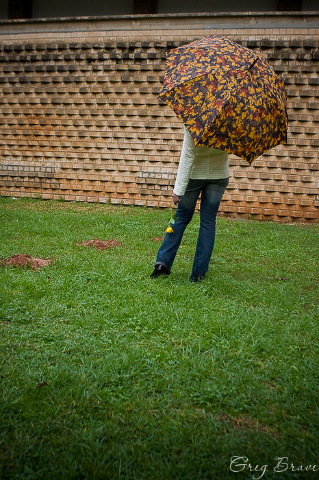
Photograph by Greg Brave. Click on the photo to enlarge.
I absolutely love this photograph! Almost as much as the first one. As we were walking in the park I saw some garden tables and decided to take a closer look at them. When we came near we saw that one of the tables was painted with graffiti, the main colors being vivid yellow and red. I looked at these colors, then I looked at the yellow rose that Ira was holding, then at the umbrella handle, and then I saw this picture in my mind. It took me about ten attempts to get it just the way I wanted though…
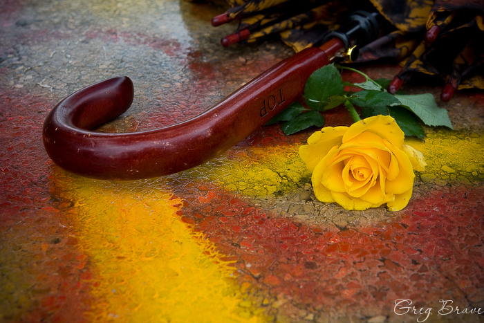
Photograph by Greg Brave. Click on the photo to enlarge.
Everybody makes reflection shots, and I am not an exception. But I always look to create something different, something with my personal touch. Usually you can see either the full scene together with its reflection, or only the reflection, but here I included just a little bit of the scene to complement the reflection. I find this shot a little bit unbalanced due to the placement of the rose, but still I like it a lot.
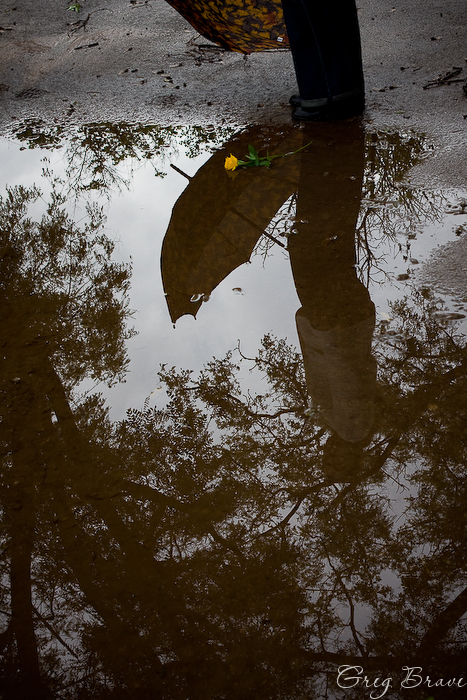
Photograph by Greg Brave. Click on the photo to enlarge.
The following images were a nice and unexpected bonus. While we were walking in the park we were amazed to see this – after the rain dozens of snails came out of nowhere and occupied a lonely wooden bench. There were maybe a hundred snails or more. They were crawling one on top of the other and pretty much… mingling 🙂 I can’t find a better word to describe what was happening there. I was lucky to have my macro lens with me, and I was even luckier to have an external flash with remote trigger! So I asked Ira to hold it for me and made a couple of shots. Here you can see an example of the shots I got.
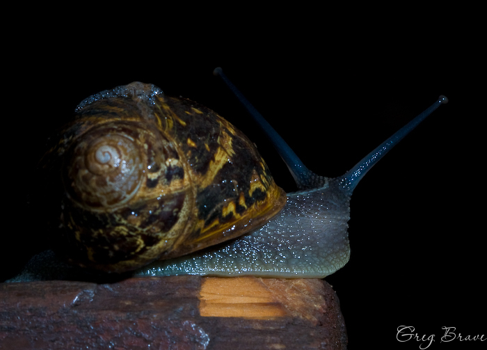
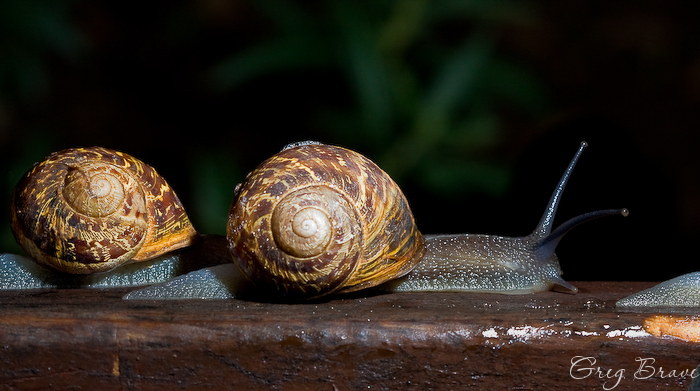
Photographs by Greg Brave. Click on the photo to enlarge.
That’s it for today. I hope you liked my photos. Any comments or suggestions, technical, artistic, or other are always welcome!
Till the next time, take care.
Greg.
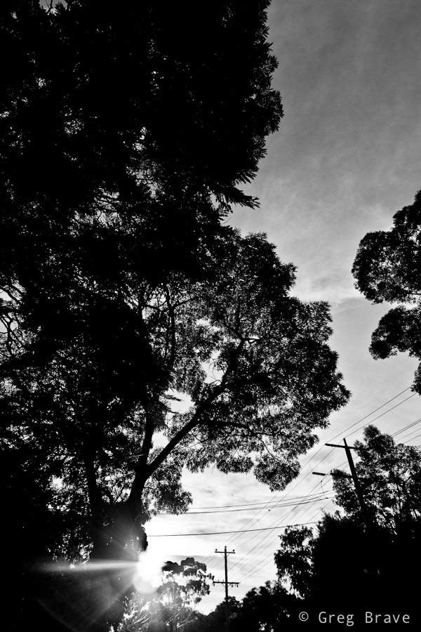
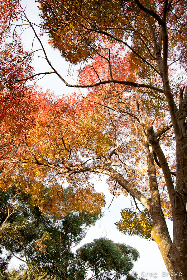