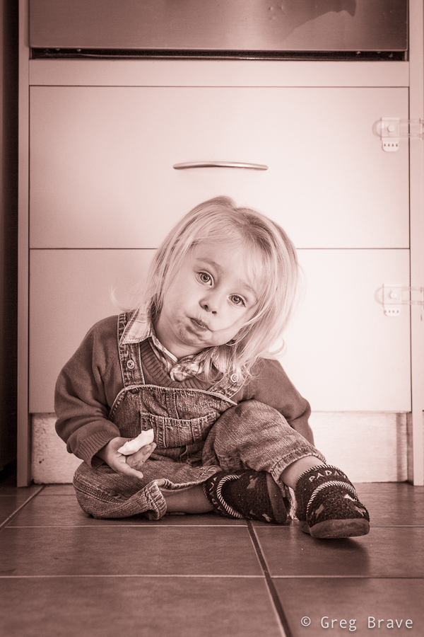
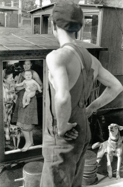
A couple of weeks ago I’ve got another family photoshoot. It was a very nice couple and a cutest little boy Leon who just recently turned 2 so they wanted some photos to remember this age. Parents wanted photos to be taken in the boys’ natural environment – their home and backyard. Therefore for me it was an “on location” photo shoot and I had to bring my lighting equipment.
Click on the photo to enlarge.
When shooting kids in studio you have time to set up all the lighting equipment before the session, but when you come to a family home, chances are you won’t have that luxury. There also might not be enough space for your light stands and stuff, which was exactly the case in this shoot. Lucky for me there was a large window with white curtains that provided a great light source. I also mounted a Canon 430ex speedlight on my camera and used it as additional light source, bouncing the light from the walls and ceiling.
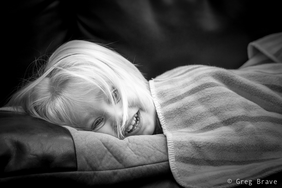
For example, in the photo below I pointed the flash at the ceiling to get Leons’ beautiful long hair to be lit from above.
Click on the photo to enlarge.
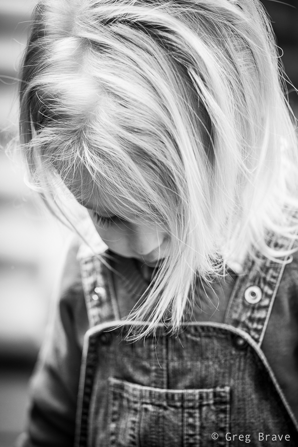
With little kids most of the times you have first to earn their trust by playing with them and smiling a lot :), and then you have to react to their movements and catch those brief moments in which they forget about your presence and act naturally. I was also looking to capture various emotions and moods of the child.
Click on the photo to enlarge.
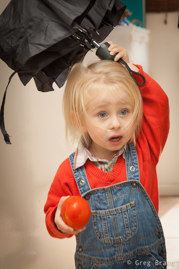
Another good idea is to give a kid something to play with. When Leon saw my large shoot-through umbrella, his eyes lit up with interest and he started to play with it, but it turned out to be too big for him. However his parents found a solution – they gave him a smaller umbrella, which kept him (and me) occupied for a while.
Click on the photo to enlarge.
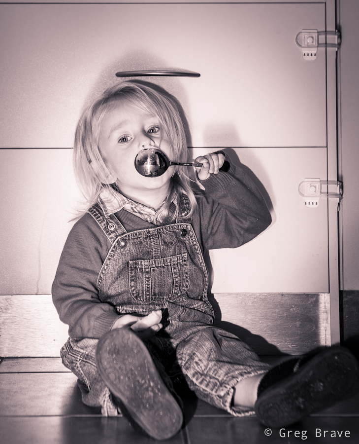
At some point during the shoot Leon got so comfortable with me and my camera that he started intentionally posing for me. When kids pose for camera it is nothing like when adults do it. Kids are natural, they can’t look “posing for camera” by definition, and I can prove it to you. In the next two photos Leon was intentionally posing for me.
Click on the photo to enlarge.
Could you tell that he was intentionally posing?
Click on the photo to enlarge.
I didn’t think so!
Click on the photo to enlarge.
I enjoyed this photoshoot very much and most importantly – the parents loved my work!
In this post I’d like to talk about composing photographs “after the fact”. Wait, don’t jump to any conclusions just yet, let me explain what I mean.
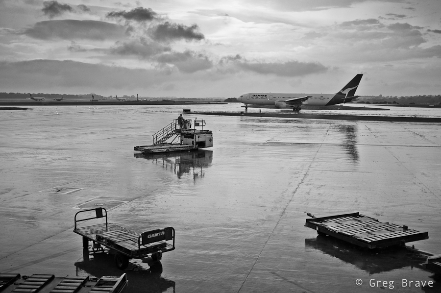
About a month ago I had to fly to Sydney for work but got stuck at the airport due to bad weather. I spent about two hours sitting in front of the large viewing glass looking at the runways. The weather was indeed stormy, it was dark from all the clouds, and there was nothing to photograph.
But when the weather started to get better, clouds began to clear, and airport started to come back to life, I finally took my camera out and started to stock my prey. I wanted to capture this feeling of the “airport awakening” when the planes begin to approach the runways, and workers move to and fro. Unfortunately no matter how hard I tried or how long I waited, I couldn’t capture the picture I had in mind… at least not in a single frame. Needless to say that I was very disappointed.
Later, when I returned home and went over those photos, my imagination switched gears – I saw details in different photographs, that put together would be able to create that image I had in my mind while shooting. Since I know my way around Photoshop, I decided to go ahead and try to do that.
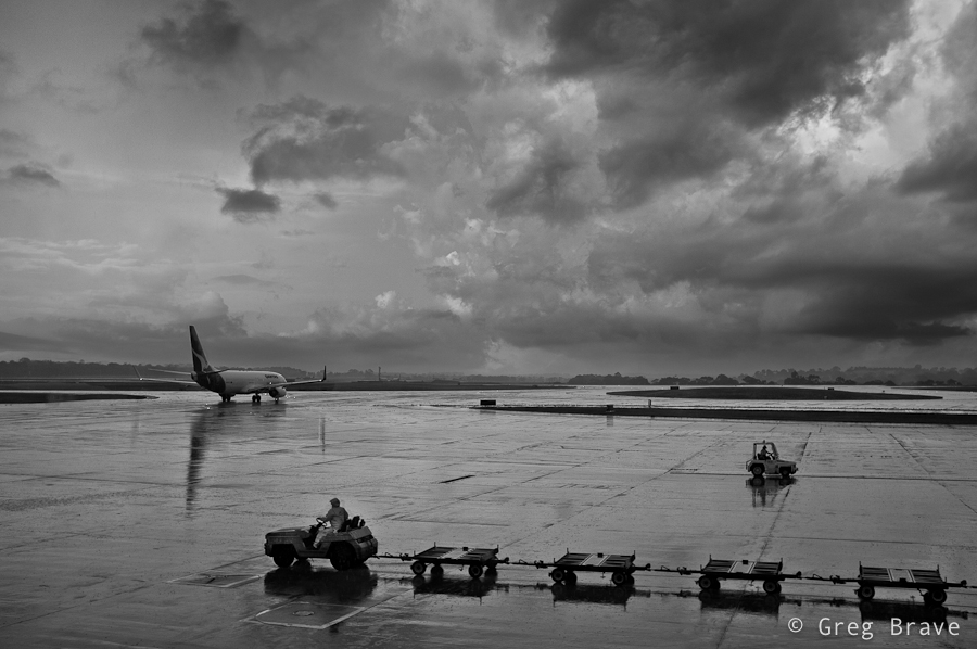
I ended up with two images which both have two things in common – both of them I would call “airport awakening” because they portray the clearing of the storm, and resuming operations of the airport. The second thing is the way in which I created this sense of awakening – with directions. I’ll explain this in more detail by going over the images.
In this first image I have three different “directions”, which go in zig-zag shape leading the viewer’s eye from one element of composition to the next. First is the direction of the two trolleys, which goes from lower right to somewhere in the middle left side of the image, next is the direction of the moving utility vehicle which catches the eye on its way to the left and redirects it towards the upper right corner, and finally the eye reaches the plane and again changes direction to the left ending up on the airplanes in the distance. The floor is still wet from the rain, but the sun starts to shine through, giving the feeling that storm has ended…
Click on the photo to enlarge.
The second image is darker, as if there is still the danger of the storm, but the moving vehicles hint of a hope for good weather. And again, we have the directions theme – from right to left, then from left to right, and finally the plane takes us into the depths of the image.
Click on the photo to enlarge.
The main thing that made the compositing easy was that I shot all the photos from approximately the same location and also I was using the same focal length.
As always your thoughts, suggestions, and critiques are welcome in the comments section below.
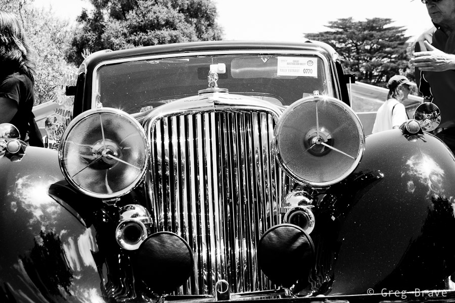
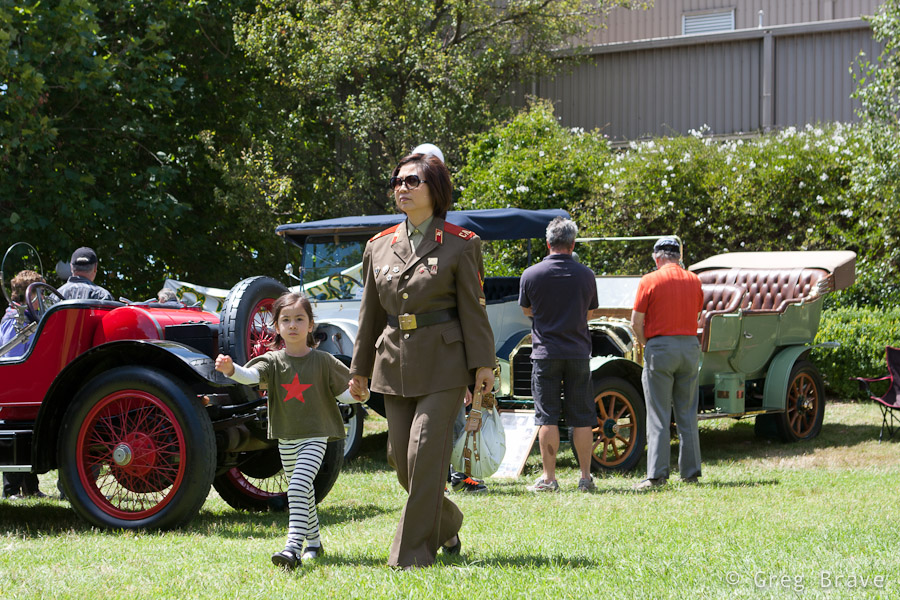
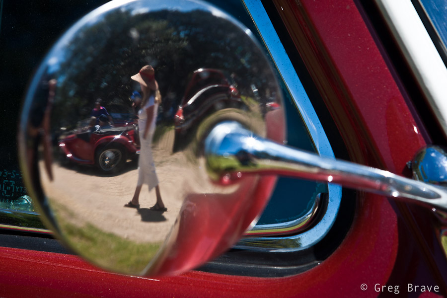
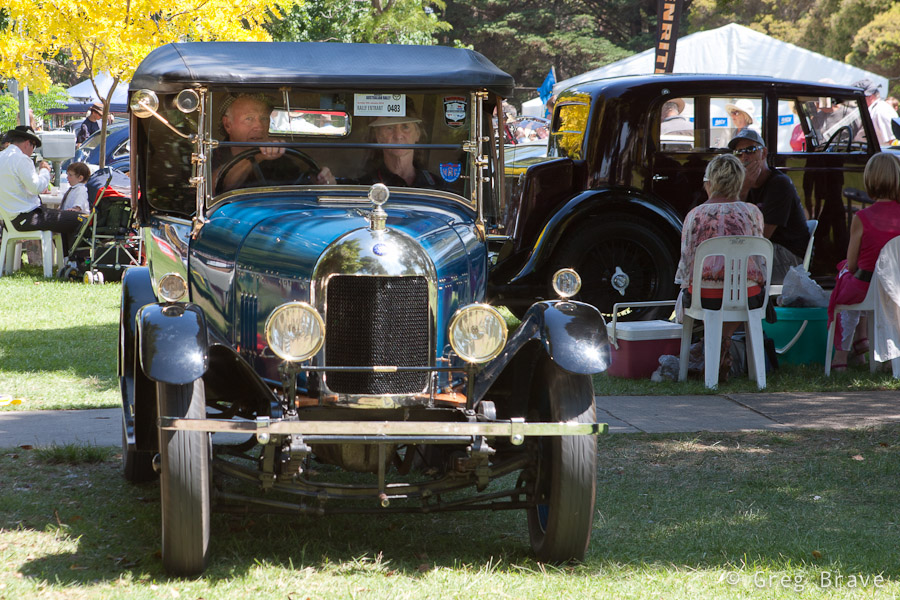
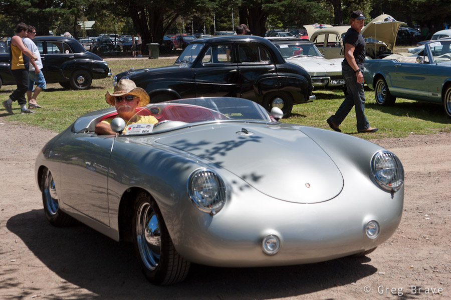
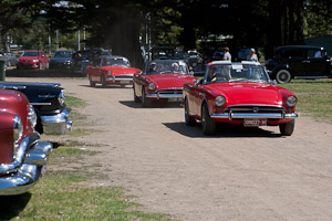
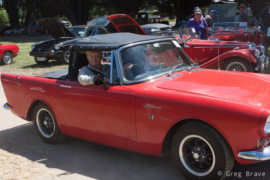
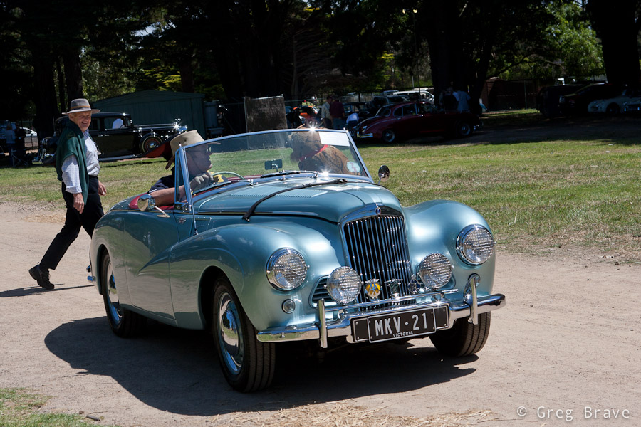
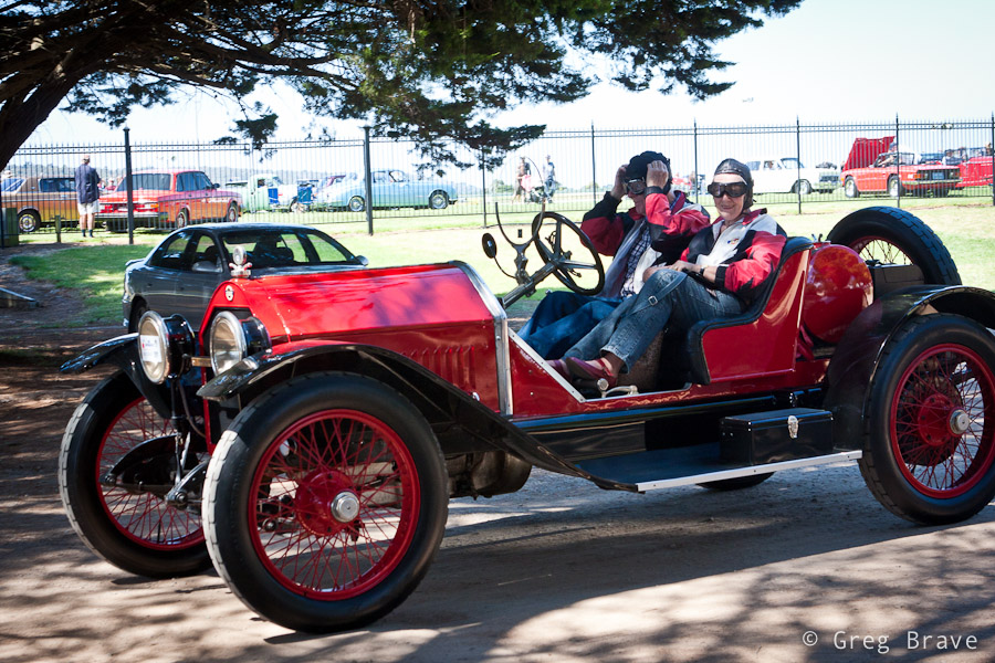
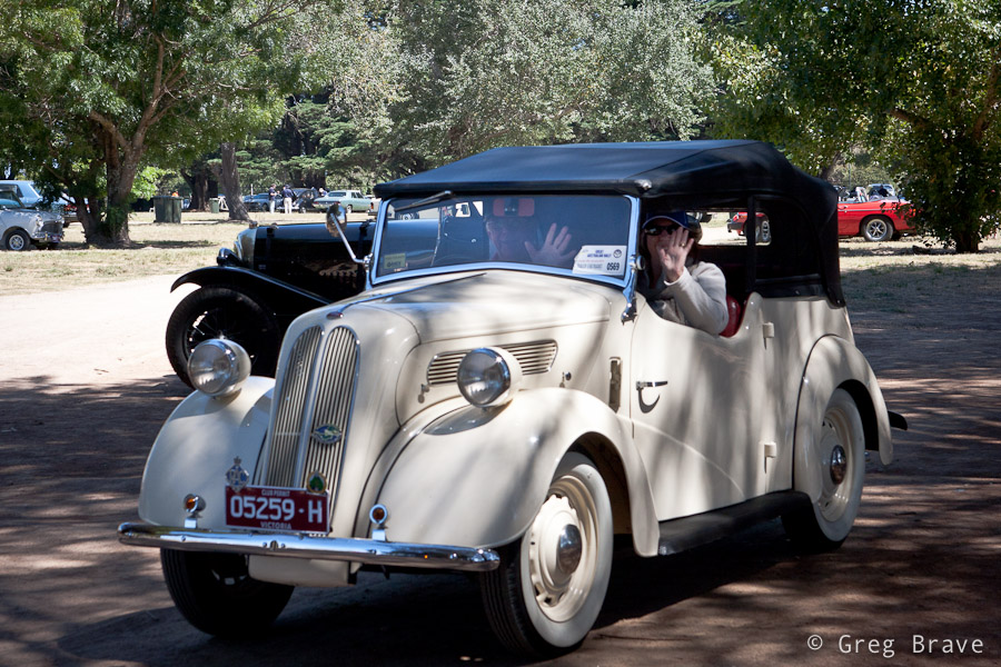
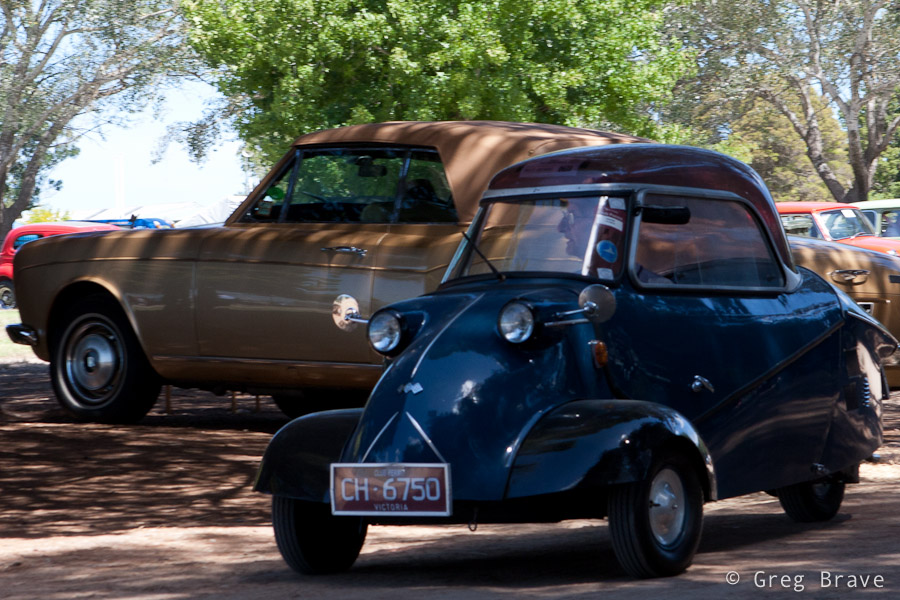
A couple of weeks ago Ira and I visited a collectible cars show at the Mornington’s racecourse. There were lots of beautiful old cars and we had lots of fun.There were also quite a few photographers taking shots of these beauties. But from my photographic perspective, I didn’t want to simply photograph the cars as I am sure there are already many photos of each model that was showcased there.
So instead I tried to look at the event not as “this is a car show, so I am going to photograph cars” but more as “this is a social event featuring nice cars, so there will be people interacting with them, and I want to capture this interaction”. And even when I photographed only the cars I tried to convey how I see them. For example when shooting the b&w Jaguar in the photo above I tried to show the “facial expression” of that car which was kind of “right in your face” 🙂
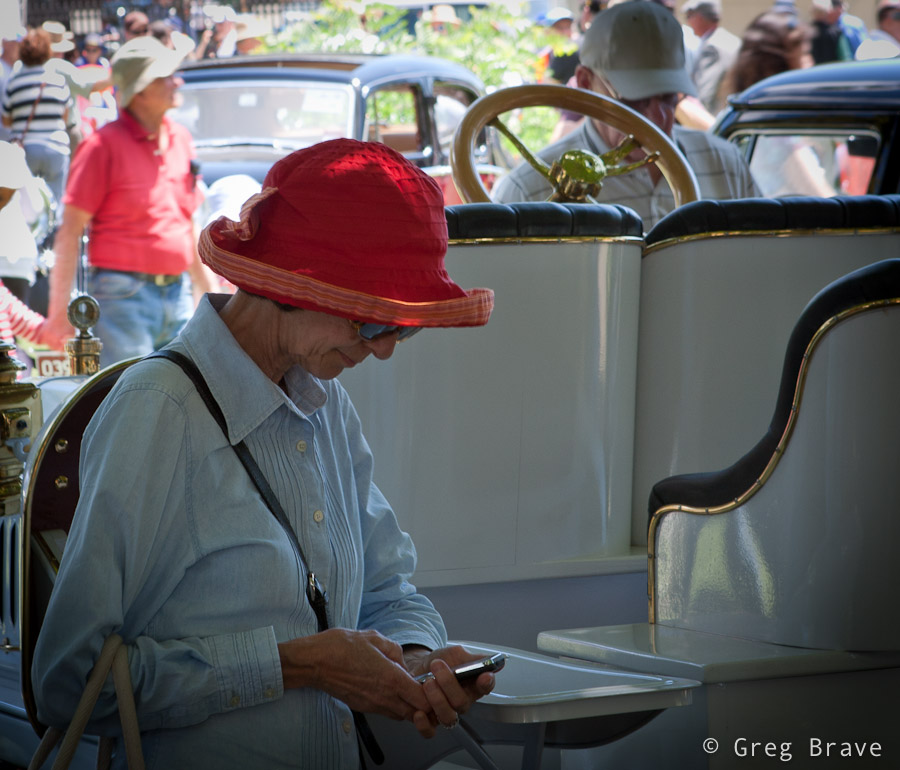
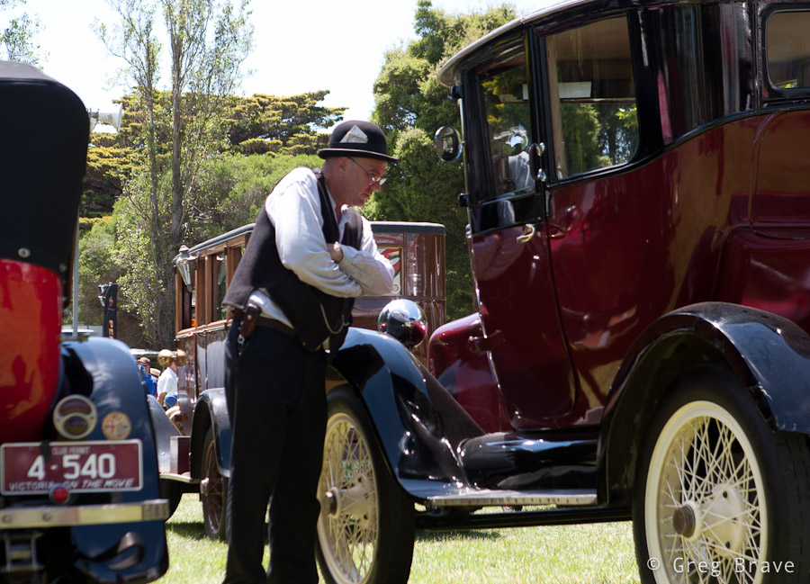
We spent about one and a half hours at the show, and just when I thought that I’m done photographing, the car owners began starting up their cars and drive away – it was the end of that day. During the show the cars were standing unattended, while their owners were sitting somewhere in the shadow chatting and drinking coffee, so now it was a great opportunity for me to capture the cars together with their owners, and I tried to make the most of it.
From the technical side the biggest problem was the harsh sunlight, which created deep shadows and sharp transitions from light to shadow, so it was difficult to capture both the car and its surroundings and the driver sitting inside the car in the shadow. My solution to that problem was to shoot in RAW and slightly overexpose my photographs. This way in post processing I could lighten up the shadows and darken the highlights (the RAW format gives you a bit of freedom in correcting your exposure).
When a person looks at a photo, he (or she) can almost immediately say whether he likes it or not. In rare cases it can take a while, but eventually you can either like the photo, not like it, or stay indifferent to it.
But have you ever tried to ask yourself exactly why do you like or don’t like the photograph? It is much more difficult to pinpoint the reasons for which you feel about the photo the way you do.
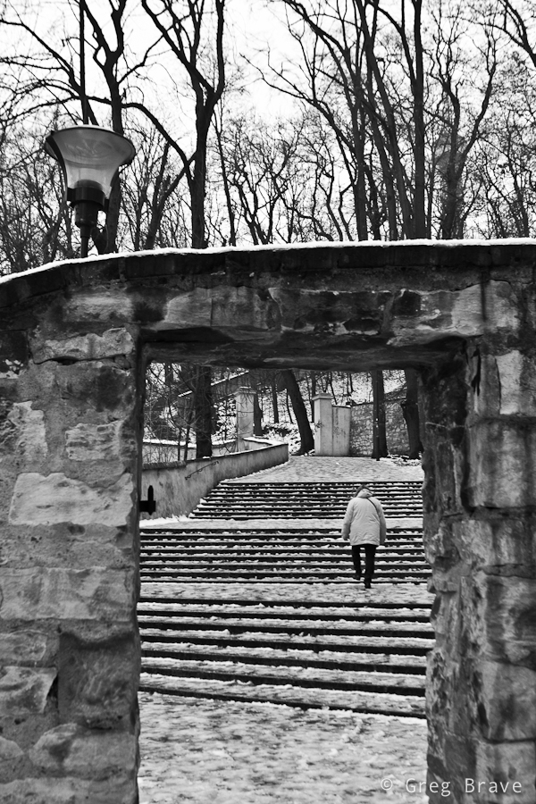
In this post I am going to present three photos that I made during one of my visits to Prague, and try to explain why I like them. It will be a good exercise for me, and also a good experience for you, my readers. You might agree with my observations, or might not, but in any case I hope to help you to be more conscious not only when looking at images, but also when creating them.
Click on the photo to enlarge.
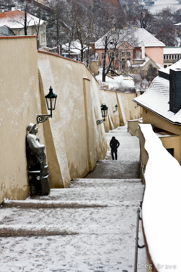
I like the photo above for several reasons. Main reason being that it creates a winter-cold feeling, and gets me in the wintery mood. How it does that? Well, first of all the B&W helps – it emphasizes the lack of colors on a typical overcast winter day. The lonely figure also adds to the mood. Imagine for a moment that instead of lonely figure there would be bunch of kids playing with snowballs – would that add to the mood that I’m talking about? Of course not. Considering everything else in the photograph would remain the same, they would create a contradiction by adding playful joy and “bright colors” into pale surroundings. This is why lonely figure is much more appropriate for this photo’s aim. What else? The bare trees and the snow on the ground of course. In addition there is also a three-dimensional feeling to this photo created by the narrow gate at the front leading the eye to the stairs and further on into the photo – different planes create a feeling of space, and the small human figure looks even lonelier in this space.
Click on the photo to enlarge.
Here is another photo of a snowy winter day, and also with a lonely human figure 🙂 What can I say, these photos were taken in the winter, it was cold and I was in THAT mood. I didn’t convert this photo to black and white because I didn’t feel that it was needed. On the contrary, I wanted the snow on the wall to be distinguishable, and the wall being colored helped that. There are several rhythms in this photo – the rhythm of the street lights, the rhythm of the columns on the wall, and the rhythm of the stairs, all creating a sense of harmony. The human figure has strong visual connection with the statue and the viewer’s eye travels between the two. This connection also prompts us to “humanize” the statue, to think of it as if it was a human figure standing there. These two figures are located in the frame in a way that creates compositional balance. The statue in front “tilts” the balance to the left, but the human figure “counterweights” it by being in the center. The statue is bigger, but because it has snow on it, it is brighter, and bright colored objects are perceived as light by the human eye, while human figure is smaller but it is much darker and thus perceived as “heavier”.
Click on the photo to enlarge.
This last photo is my favorite. By the way, it almost didn’t need the conversion to B&W – the colors were missing from the world that day…
The arched walking path and the bare trees standing on its sideways create a sense of swirling motion around the city buildings with St. Vitus Cathedral rising in the middle and being steady as a rock. The horizontal lines in the middle background also add to the motion feel. It is almost a scene from fairytale with a mystical castle and enchanted trees.
Actually, besides what I wrote in the paragraph above, I find it hard to explain why this photo has such a strong impact on me, and maybe you can help me out here. How do you feel about the photos presented in this post, and this last photo in particular? And more importantly why do you feel that way?
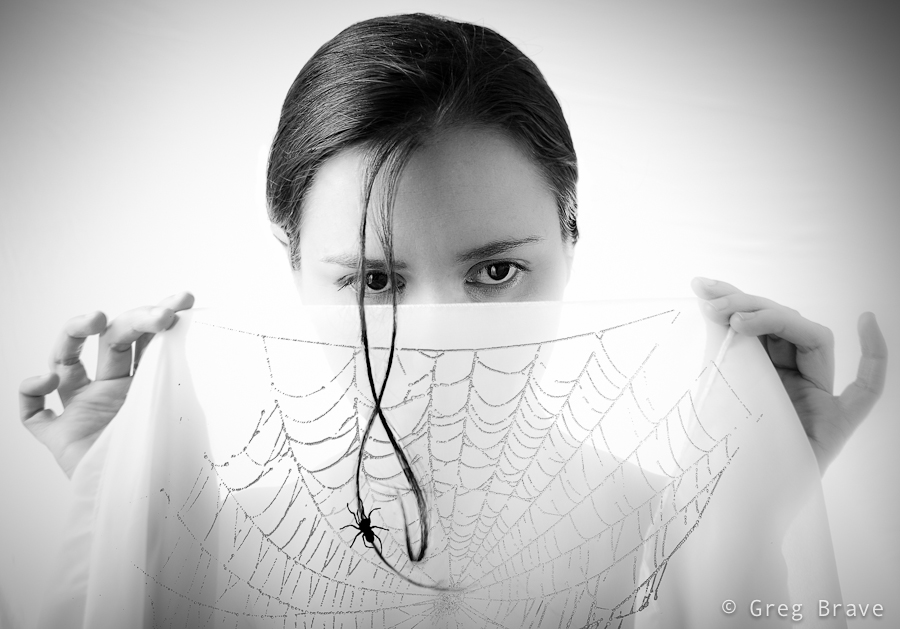
Thinking of it, maybe I should’ve titled this post “story of an idea” because I will be talking about creation of one particular image. But I eventually I decided on the current title because the way this creation emerged from the depths of my imagination is one of the most common ways.
A few weeks ago I had a photo session with Ira, in which my primary goal was to try some new lighting techniques that I thought of. In that shoot I decided to focus on close up portraits (chest line and up). I experimented with different backgrounds and asked Ira to put on a few different shirts.
At first nothing was working for me. The lighting was bad, and I didn’t get any interesting results… but then again, I didn’t start this shoot with a specific idea in mind – it’s like that phrase from Alice in wonderland:
– In which direction should I go?
– It depends on where do you want to arrive
But I felt inspired that day and just kept on shooting and trying to get some nice shots. At one point Ira suggested adding an accessory – a piece of white semi transparent white fabric that she had, and I agreed to try it – it is a good idea to listen to your model, especially when you are out of ideas 🙂
Trying different variations we came up with this photograph:
Click on the photo to enlarge.
I liked it, but quite frankly it lacks an idea behind it. I looked at this photo and thought “nice photo! but what am I trying to tell with it?”. And I couldn’t find an answer. So I forgot about this photo for a while and focused on other tasks.
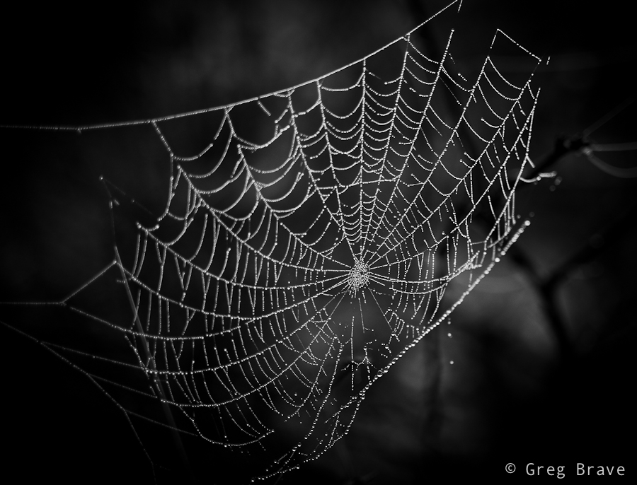
After a while (a few days have passed since the shoot), when I was watching a Phlearn Pro photoshop tutorial (which by the way was magnificent!), suddenly an idea emerged in my mind. I remembered this photo of a spider’s web that I took:
Click on the photo to enlarge.
And it suddenly got layered, in my mind, onto that photo of Ira holding white fabric, as if she was holding the web itself. I rushed into photoshop to try it, to see how it looks in reality. It was nice but still something was missing… what was it? The spider of course. So I searched the net for images of spiders and chose the one I liked the most. Then I brought it as a layer into my working file, and converted the spider to be pure black.
Now I needed to find a meaningful placement for the spider. I tried different variations before I came up with the final result, which you can see below. I call this image “The Way Up” :
Click on the photo to enlarge.
By describing my creative process on one particular image I wanted to show one of the many ways creative ideas come to life – they are not always pre-conceived, and sometimes, as it was in this case, they develop step by step over time, graduating slowly towards the end result.
What do you think about the final image? Your thoughts, comments, and suggestions are always appreciated!
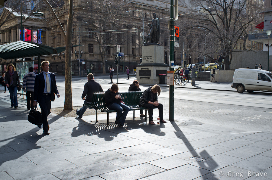
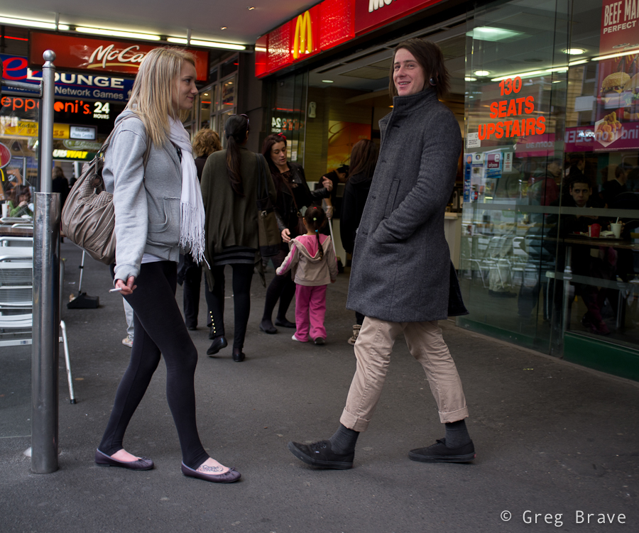
Recently I had a chance to walk around Melbourne’s CBD, and I got fascinated with the wealth of photographic opportunities! You just have to keep your eyes open. I think such walk with a camera could also be a great exercise for any photographer. I have to admit, I just did it for fun… and I loved it!
Ok, let’s see what I’ve got for you this time:
Click on the photo to enlarge.
The photo above is one of my favorites from that walk. There are several compositional connections in it, and while not all were intentional, nevertheless they all contribute to the composition. The most emphasized being the people sitting on the benches, three of them using their mobile devices and the fourth person might or might not use his device, and this fact creates additional interest. Another connection is between the walking man on the foreground left, and the walking woman on the background – these figures are connected with a virtual diagonal line. Third compositional connection is between two standing figures in the background. There is also an additional connection which I won’t mention here – think for yourself what is it and write your conclusion in the comments below.
Overall, I think, this photo creates a pretty good picture of “urban life”.
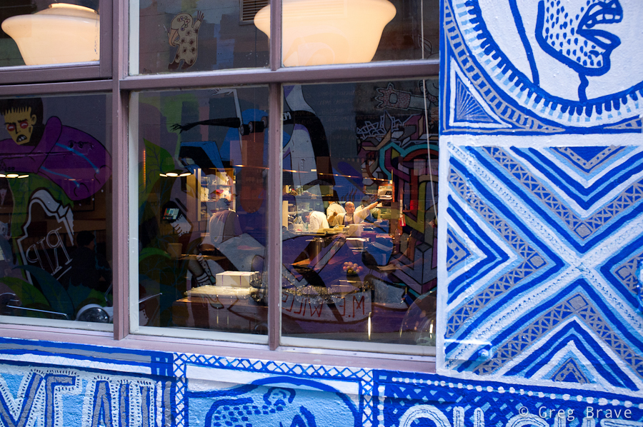
I took the next photo in one of the alleys. The restaurant wasn’t open just yet, but in the kitchen it was business as usual as they were preparing for opening. You must see this photo in a bigger size (just click on it). Walking through that alley first I was fascinated by the graffiti on the walls and then I saw the kitchen staff working inside, and immediately noticed the contrast of the inside/outside. I took a position in which the reflections of the graffiti on the opposite wall would be most visible in the windows to give a better idea to the viewer regarding the outside world, and waited for the one of the workers to make any articulate move. The result you can see below.
Click on the photo to enlarge.
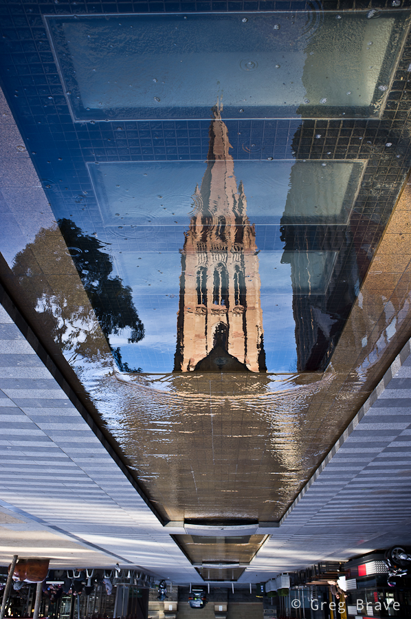
The photo below… yes, I know, photographing reflections and turning the photo upside down had become a corny trick, but in this case I just couldn’t help myself.
Click on the photo to enlarge.
The next photo shows a true moment of interaction between two people (my opinion of course), and this is why I like it so much. Catching such moments is not as easy as it might seem (people are interacting all the time after all!), and I got lucky with this one.
Click on the photo to enlarge.
Here is another little urban story… I wonder if all the cups belong to this girl 🙂
Click on the photo to enlarge.
Next photo is an interesting one as there is a compositional conflict of directions… I just made this term up! Here’s what I mean – the group of teenagers are all looking left, also the “one way” arrow points to the left – all making the viewer wonder what’s there, and then you have the man standing in the center of the composition facing straight to the right, and even though I used the word “conflict” in my description of the photo, I still think that it is compositionally balanced because the compositional weight of the group of teenagers and the arrow is balanced by the weight of the man, though he is a single person opposed to the group, but he is in the center and his “sense of direction” is stronger.
Click on the photo to enlarge.
I have mixed feelings about the last photo, but I still decided to present it here. What I like about it is that it is a collage without any photoshop, and also a slight surrealistic feel that it communicates. What do you think? I would appreciate any thoughts on this one.
Everyone following my blog must’ve noticed that lately I am getting into more serious study of photography as form of artistic expression. In Photopathway it all started with my post “Wisdom Of Photography” where I wrote about my exploration of an old book about art of photography. Next came the post “About the Attitude Toward One’s Own Artistic Endeavours” , in which I tell about wonderful Czech photography magazine “Revue Fotografie” from the 1960s. In that post I also presented my translation of one of the articles I liked the most in that magazine.
In this post I continue in the same direction but with a slightly different approach – I created a photo album (in PDF file) containing most of the photographs from the 3/1961 issue of “Revue Fotografie”, which I would like to share with as many aspiring photographers as possible by making this PDF file available for free download.
In the photo album I also wrote a foreword article outlining my reasons for creating it. Let me share parts of the foreword here, and make sure you download the album by clicking on the banners above or below.
“… I strongly believe that in order to advance in photographic vision and skills, one has to learn from the masters. Not to copy their work, but to understand what actually good photography is. Looking at good photographs one can begin to understand what do the words ‘photographic vision’ mean, and also to learn how to powerfully express thoughts, feelings, and emotions through a photograph.
Nowadays, one of the most serious problems lying on the path of any aspiring photographer, is the enormous amount of mediocre photographs presented everywhere, making it hard, especially for the beginner, to distinguish between real works of art and a ‘nice wrapping without the stuffing’.
So what am I presenting in this photographic album?
To explain that, first I have to tell you about a photographic magazine “revue Photographie” that was published four times a year in Czechoslovakia between 1950s and 1990s in several languages. Don’t even try to compare it to most of currently published photography magazines, which are filled with advertisement and “shoot like a pro” articles!
In its early years “revue Photographie” was considered one of the (if not THE) best photo magazines in the world. Founder and editor-in-chief of the magazine during 1950s and 1960s was Václav Jírů, a very talented photographer himself, whose photographs are now being displayed in museums and sold on auctions.
Václav Jírů selected and approved most of the photographs, making the magazine a true work of art. In today’s terms it would be comparable to 1x.com. Of course photographs weren’t the only asset of the revue. The articles too were very educational and informative, dealing not only with questions of photographic techniques but also with more important issues such as: – Photography as form of art – Moral obligations of the photographer – Place of photography among other art forms and many more.
Even during the time it was published, “revue Photographie” was very sought after, and not easy to acquire, not to say about nowadays.
I got very lucky to lay my hands on one of the issues. It is the third issue of the year 1961, published in Russian. I happen to know Russian so I had an enormous pleasure reading it. One of the articles was simply too good to not share it, so I translated it to English and you will find it on the next page. The photographs, on the other hand, don’t require my translation, and are there for everybody to look at, learn, and appreciate.
In this photographic album I arranged most of the photos from the 3/1961 issue of the revue. I hope that many aspiring photographers will get to see this album, enjoy, and learn from the photographs presented in it.
I will continue my search for other issues of “revue Photographie”, translate its best articles, and put up its photos here, on the pages of my blog… “
Feel free to share this album with anyone who you think can benefit from it, and I would appreciate any feedback regarding this album in the comments section below this post or to my email – greg at photopathway dot com.
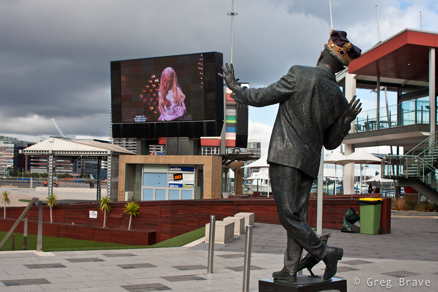
Yesterday I visited Melbourne’s CBD, and had a chance to take a few photos in Docklands area. Afterwards, when I was going through them on my computer (most of them weren’t anything special 🙂 ) , one photo grabbed my attention.
Here it is:
Click on the photo to enlarge.
When I was making it, I simply thought it would be a good idea to capture the singer on the big screen in an interesting pose so that I would have both, statue and singer ‘posing for the camera’.
But when I was looking at the photo later, on my computer screen, I’ve noticed that it has very ‘dynamic’ feel. I could feel the movement of the statue, as if it was a live person. So I started thinking – why is that happening? Why is the statue, which didn’t look that much ‘alive’ in reality, came to life in my photograph?
And here is my conclusion: it is because I created Interaction between the statue and the singer. It looks like the statue ‘responds’ to the movement of the singer, and since we all have no doubts that the singer is a live person, that feeling also ‘spills’ onto the statue.
It is very interesting effect, which can be used when photographing other situations. Even with this same statue – if instead of singer a real person would be somehow interacting with the statue, it would also make the statue come to life. For example imagine a bunch of kids dancing around it.
As always your thoughts and comments are highly appreciated!
My fellow readers, I am glad to meet you here on my blog and in this article in particular! I have to warn you though – the article that you are going to read is by far the most serious and in-depth piece of text I’ve ever written in this blog. So if you don’t feel like going deep into some photography related subjects, feel free to browse my other articles, which are “lighter” and have nice photos to go with the text.
These days I’m reading a book named “The Poetry of Photography”. It is a book by two russian authors Mikhalkovich and Stigneev published in 1989. It talks about different aspects of photography as form of Art, comparing it to pictorial art, and trying to explain various definitions found in photography such as various genres in photography, composition, use and qualities of space in photographs and much much more.
I have to say that I’m really learning so much from it, but it is also very demanding, meaning that I have to think hard about the material presented in the book in order to fully take it in.
While reading, I write down aside the key sentences and concepts offered in the book and continue to think about them. In this article I would like to share some of these concepts. I really tried to translate them from Russian as precise as I could, and I will also provide more explanation for each saying.
Take a deep breath and let’s begin.
1. “Picture is a visual statement. Every statement possesses in itself three kinds of relations. Firstly it relates to the “speaker” (the one who makes the statement), secondly it relates to the depicted subject, and finally it relates to the ones who take it in.”
Basically it means that when you take a photo, first of all it means something to you, since you have a certain idea as to why you took this photo the way it is. Then this photo shows something, a portrait, landscape, still life, as if to say that when you take the photo you see a certain scene (object, person) through your own “filter” of consciousness, but the photo still shows a piece of reality which has a quality of its own. And thirdly this photograph looks “differently” to the viewer because he looks at it through his own “filter”.
To me this is a really profound thought, and having this in mind when photographing helps me to create more meaningful photographs.
2. “The impact of the photograph, the impression of it, lies not within the photograph itself, but within us, the viewers.”
This is a kind of elaboration to a third part of the previous saying. While seeming pretty straight forward, I find it to be deeply profound. You can also look at it this way – the same exact photograph can be very meaningful to one person, while being completely indifferent to another. I think that the best photographs out there are very meaningful to large groups of people.
3. This one is a saying by Siegfried Kracauer (1889-1966, a German-Jewish writer, journalist, sociologist, cultural critic, and film theorist). I tried to translate it as precisely as I could:
“Taking in the material “frozen” and presented by the photograph, the viewer sometimes “hears” the tiny voice of true reality – the “whisper of existence”.”
Here, I think, Kracauer tried to put into words what we feel when we look at a certain photograph and think “This is it! I can feel this! I understand what this photograph is telling me”. Such a photograph can be considered a successful one as it does a good job of depicting a certain piece of reality.
4. Continuing with Kracauer’s sayings:
“And while the reproducing quality of photography has grown to be very accurate, this accuracy itself will not allow the viewer to hear the “whisper of existence”. For this, photograph needs to have figurativeness.”
Basically Kracauer says here that simply snapping a photo of what you see is not enough for the photograph to be expressive, to be “good”. This is still true in our times when photographs are sharp, crisp, with precise colours. You, as a photographer, still have to put in thought and effort when creating a photograph, so it will make an impact on the viewers.
5. “If the subject retains its uniqueness, e.g. the full spectrum of its qualities, when presented in a photograph, then it equals to the real thing.”
This is also a deep thought. I’ll elaborate on it a little. When you take, for example, still life photo. Let’s say a flower in a vase, you have endless possibilities as to how you do it. The lighting, the angle, the background, the vase – everything can be altered. Depending on how you do it you can either create totally “indifferent” photo of just “a flower in a vase”, which won’t reveal any qualities of your subject, and it won’t matter which kind of flower it is, and what vase you used. But you can also create a photo that will vividly present the qualities of this particular flower, which can be accentuated by your choice of lighting (colour, angle etc.), by your choice of vase, and the background. You can add additional elements to the photo to further increase the impact, such as fallen petals. When the viewer looks at such expressive photo, he perceives it as THIS flower, “the real thing”, and not merely an illustration of flower.
I encourage you to think about these sayings and relate them to your photographic experience as it will help you in your PhotoPathway.
As always your thoughts, comments, and suggestions are highly appreciated!
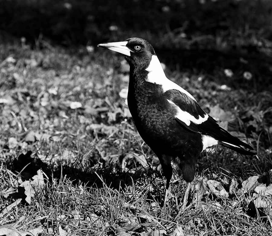
Sassafras is a small village located in Dandenong Ranges. The area was named Sassafras Gully, after the trees which grew in the area. Sassafras is a tourist destination with some antique shops, boutiques, and nurseries.
While most of the tourists visit Sassafras on their way driving the Dandenong Tourist Road through to other destinations, Ira and I came here specifically. We wanted to visit the “Tea Leaves” store, which has over 300 teas and herbs. But then again, we are not tourists – we live within 40 minutes drive from here.
As you probably guessed I wouldn’t write this post if I didn’t have some photographs to share along with it. The tea store was really nice, but it was too small and crowded to photograph. After we finished our tea-shopping, we decided to explore the surroundings.
I always liked the Australian Magpies. I think that they are very interesting birds, and I also like their singing – Australian Magpies are considered to be among Australia’s most accomplished songbirds. There were plenty of these birds in Sassafras, so I could take a few photos, and here is one.
Click on the photo to enlarge.
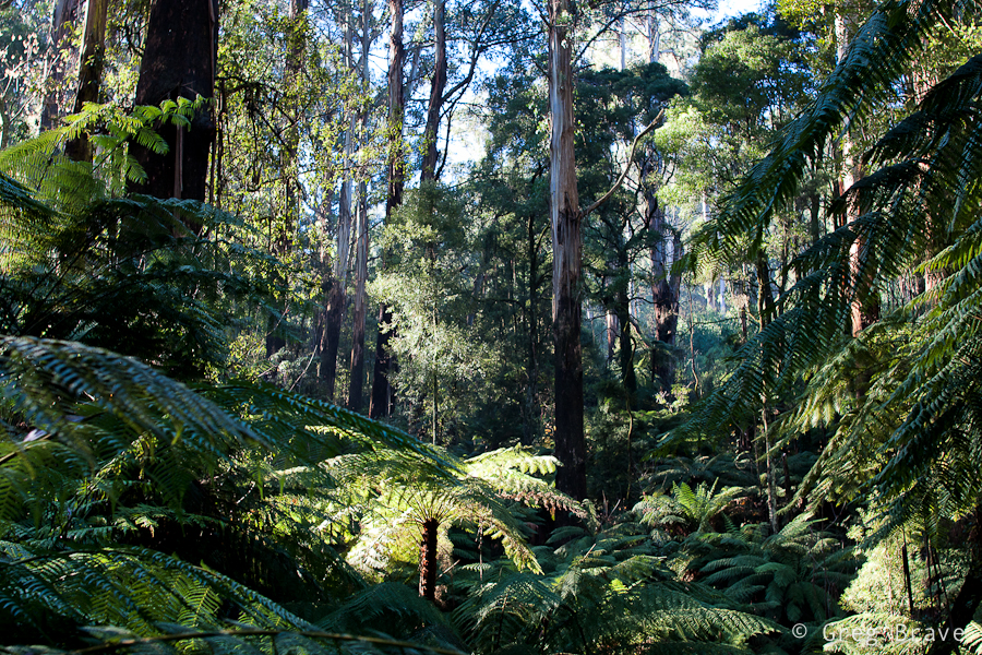
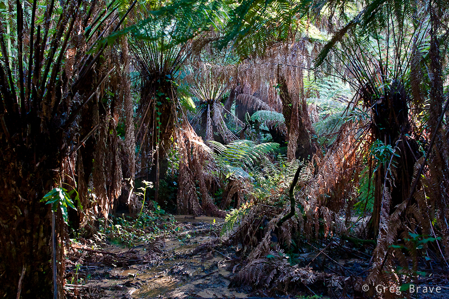
Dandenong Ranges is a beautiful place, and Sassafras is surrounded with eucalyptus and fern-tree forests with kilometres of walking trails. Ira and I came across one of the trails and went into the woods. It was such a beautiful walk! I can still feel the cold fresh air filled with smells of nature…
Click on the photo to enlarge.
The forest was magical. It was around three o’clock in the afternoon, and the sun was already setting (the sunset time is currently around five o’clock) so the light was beautiful. I was fascinated with the rays of light breaking through the foliage.
The biggest problem when photographing forests is to find distinction. What I mean is when you walk in the forest and you simply like what you see and take a picture, most of the chances that the resulting photo won’t be interesting. It will be very cluttered with leaves, tree trunks, and branches. One of the keys here is to find some kind of order in the forest and reflect it in your photograph.
The photo above is a bit too cluttered to my taste, but I still like it – I found an opening in the forest, saw this fern lit by the sun, and decided to make it a main point of interest in the photograph. Rays of light in the background add another dimension to the photo making it… airy?
Click on the photo to enlarge.
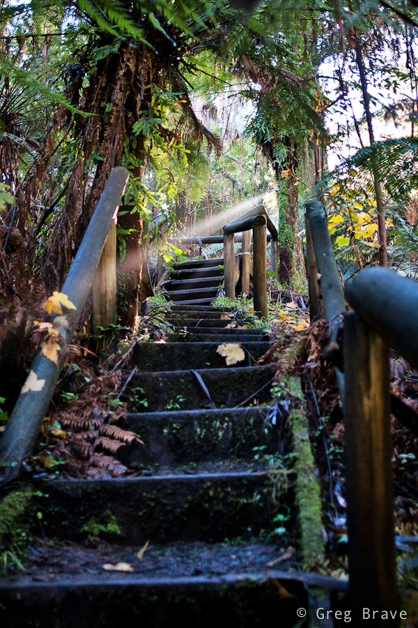
Walking down the trail we came across wooden stairs, and saw this “unreal” ray of light shining through. I just couldn’t pass the opportunity ☺. Though I am bothered a little by the wooden rail on the foreground right, overall I like this photo. The stairs lead the eye into the photo, and them being not straight enhances the feel of space, while ray of light helps creating magical forest atmosphere.
Click on the photo to enlarge.
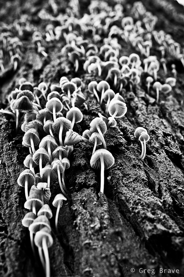
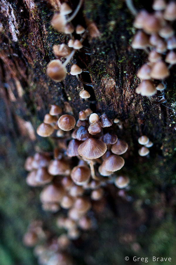
At one point I saw a huge eucalyptus and just stood there admiring this nature creation, then Ira said – “look! There are lots of tiny mushrooms growing from the trunk of this tree!” And only then I saw them. The tree trunk was so big, and the mushrooms were so tiny that I didn’t notice them even though there were so many. I really liked this “crowd” and spent a good 15 minutes trying to find an interesting angle.
Click on the photo to enlarge.
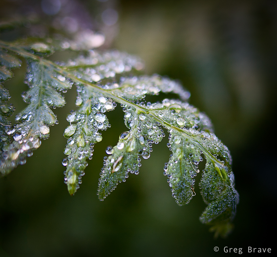
As in most of my walks in the nature, I couldn’t resist taking a few macro shots. I didn’t have a tripod with me (what a rookie mistake! ), so this photo might not be tack sharp, but it is sharp enough to show all the diversity of the water drops. I really like the tenderness and fragility in this photograph… one careless move and this beauty will disappear.
And finally I’d like to present my best photo from that walk in Dandenong Ranges.
Click on the photo to enlarge.
I feel that in this photo I succeeded to create order from the forest’s chaos. I found a pattern made by the standing ferns, and a space in between, and the light was just right. I tend to think that in nature photography great photo is created when two factors come together – pure luck (the light, weather conditions) and the photographer’s vision. Sure, if there is no vision, there won’t be any great photos, but when you have the vision you still need the nature to play along with it.
I hope that you enjoyed this journey into the Dandenong ranges, a beautiful place in Australia, and I’ll see you next time right here, on my photo pathway.
There are a lot of great photographs and talented photographers out there, but there are a few that stand out. To me at least. And I don’t judge by the publicity of their names, only by the impact their work has on me. You all must know guys like Joe McNally, David Hobby, and David DuChemin – they are all over the place, and don’t understand me wrong, I read their blogs, check out their photographs, and learn from them, but there are photographers out there, who are not nearly as famous as these guys, but whose work is at least at the same level, and even better. Of course it is only my opinion, but then again – it is my blog 🙂
I would like to introduce you to one such photographer. His name is Alexander Petrosyan, and he lives in St. Petersburg, Russia. He is a street photographer mostly photographing in St. Petersburg. I don’t have to say much about his work – his photographs do it perfectly. His work reminds me of the famous Henri Cartier-Bresson. The situations that Alexander freezes in his photos tell their stories so vividly and so impressive.
Unfortunately most of his work displayed on Russian web sites, hence the titles of his photographs are in Russian, and in many cases the title adds an important bit of information to Alexander’s photos.
I don’t have Alexander permission to display his work on my blog, so I am just going to give you links to his work. If you would like to understand more about any specific photograph but struggle with the language barrier :), feel free to ask me in the comments to this post, and I’ll do my best to explain.
Here are the only two links to English resources with Alexander’s photos
Link 1 (Alexander is also known as Yan Petros, so don’t be surprised to see this name here)
You can also see Alexander’s photos on his LiveJournal stream, where he adds new photos as they come, and also on Nonstop Photos website. These two last resources are in Russian, but everyone understands the visual language of photography.
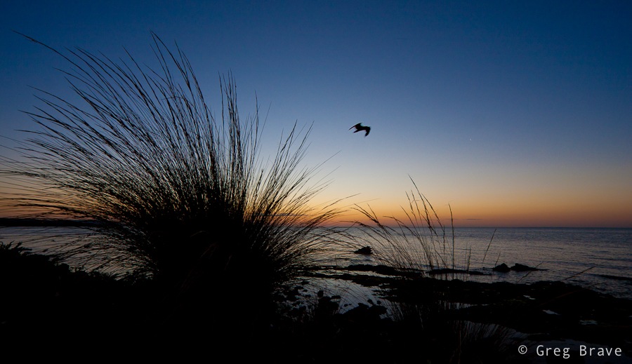
If you think about it, in many landscape photographs there are these often small compositional elements that create the overall mood of the photograph. The whole photograph can show a magnificent landscape, but still what makes all the mood (or sometimes adds the final but vital touch) are these elements. And once you thought about this, you can try and consciously add them to your photographs. Just like I did.
This photo would be nice even without the bird, but it would be empty and lifeless. Having the bird in the photograph adds life, motion, and mood to it. Yes, the bird is not sharp ( due to the rather long exposure), and there are not many details of the bird visible, but it is not important. The most important thing is that it is there.
Click on the photo to enlarge.
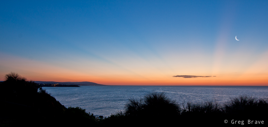
Can you guess what is the “mood” element in the photo below? It is the moon. Without it the photo would still be nice, with the beautiful rays of sun reaching the sky from below the horizon, but moon adds a final touch to the composition. In my opinion photo wouldn’t be complete without it. And also, I think it is important that it is a young moon and not a full moon. It has to do with our stigmas and perceptions – full moon associates with dark night, bright moon light, and in my opinion would be inappropriate in this image, while the young moon associates with evening or morning sky and fairy-tales.
Click on the photo to enlarge.
As you can see in my two examples important mood elements are small in dimensions, compared to other parts of the image, but are very important and vital when composing the shot.
I hope that having this in mind will help you create more striking and meaningful images.
Here’s to your next photo! Go out there, and don’t forget to have fun!
One of the compositional tools that photographers use to draw the eye of the viewer into the photograph is lines, which lead the viewer through the photograph. And by lines I don’t mean pencil drawn lines or anything like that. These “lines” can be represented by various contours of elements in the image.
Here is an example of leading lines in the image:
Click on the photo to enlarge.
As you can see there are several such lines in this photo. One of them is the line of the wooden fence. The “line” can be broken and not straight, as is the case here, but nevertheless it still does the job. Another line is formed by tops of the bush, and finally the third imaginary line appears when your eye connects between the three tree tops.
All three lines converge at the lower left part of the photograph leading the eye from right to left. However there is one more line, which “breaks” this pattern. It is the stripe of bright sky protruding through the clouds. While other lines are relatively easy to control because they are stationary , this line could be caught only during a short period.
Lines can be a very strong compositional element when used wisely and in place, for example you can use such lines leading the viewer’s eye to the main subject of your photograph.
What are your examples of leading lines? You can share your photos in the comment section to this post.
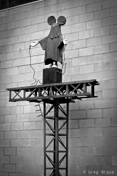
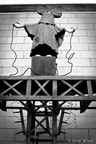
I found a nice place in Frankston named McClelland Sculpture park. It is a pretty large outdoor area with grass and trees and even a little lake. All through this area many sculptures from different artists are placed. Some of them I liked more, some of them less, but there was one sculpture that puzzled me the most:
Click on the photo to enlarge.
I don’t know what exactly artist who made it wanted to express, but in me it evoked a feeling of horror because there were two things that don’t go together – children and torture. Mickey Mouse represents happiness, happy childhood, great toys and movies, and seeing him on this “electric” torture pedestal creates disharmony in your perceptions.
I think artist wanted to warn everybody that the happy childhood of our future generations is in danger. I am not arts expert, so it is only my opinion here, but while this sculpture may represent a “wake up call” for the adults, I certainly would not show it to children, because seeing their beloved character like that may cause them nightmares or other negative reactions.
And now I’ll switch to a completely different topic – photographing this work of art. You can, of course, take a documentary photo of it, which is just presenting it as it is without any additional concerns, but when I photographed it, I tried to convey the impression that I’ve got from it through my photographs. My tools were composition, which is the angle of the shot and decision what details have to be included in the shot (or left out), and post processing.
Click on the photo to enlarge.
I am presenting here two photos with different composition. I can’t decide which conveys my impression the best, because each of these two photos contributes to it.
In the post processing I converted the photos to black and white, enhancing the ominous feel, which reminds me of the horrible photos from concentration camps of WWII, and added vignetting to further “darken” the look and concentrate the viewer on the subject.
I’d really like to hear what do you have to say about this work of art, and how I captured it, and which photo do you like more. Your opinion is highly appreciated, and
Remember, you only have to enter your name to leave me a comment!
Lately I came across something I didn’t realize existed – collection of Henri Cartier-Bresson’s quotes, and they fascinated me! I learned from them so much about Bresson’s vision of photography, and I also could understand better his photographs. I have also enriched my understanding and feeling of photography from Bresson’s quotes, and I think any evolving photographer would benefit greatly from reading them.
One thing to remember though is that Henri Cartier-Bresson was a photojournalist (he is actually considered a father of modern photojournalism), and many of his sayings result from this type of photography.
In this article I am going to present you my favorite Bresson’s sayings “bundled” with his photographs for better impact on you 🙂
” To photograph is to hold one’s breath, when all faculties converge to capture fleeting reality. It’s at that precise moment that mastering an image becomes a great physical and intellectual joy. “
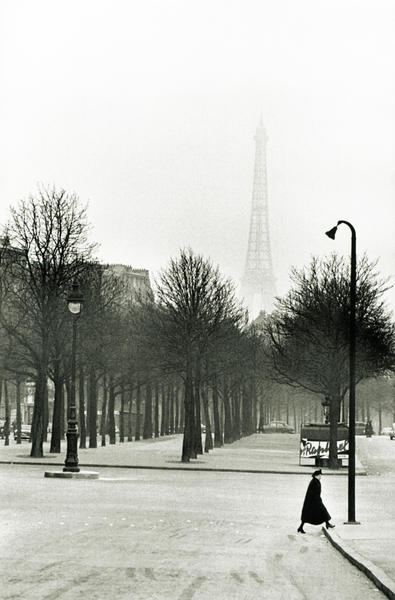
The photograph below is a great visualization of this idea. The captured moment was there only for a brief moment with no chance of repeating itself.
“To take photographs means to recognize – simultaneously and within a fraction of a second – both the fact itself and the rigorous organization of visually perceived forms that give it meaning. It is putting one’s head, one’s eye and one’s heart on the same axis.”
Again, the photo below illustrates this saying perfectly. All the elements in it had to be there to get final result. There is nothing redundant in it, all the elements contribute to it creating the final impression.
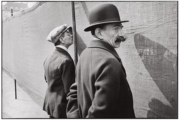
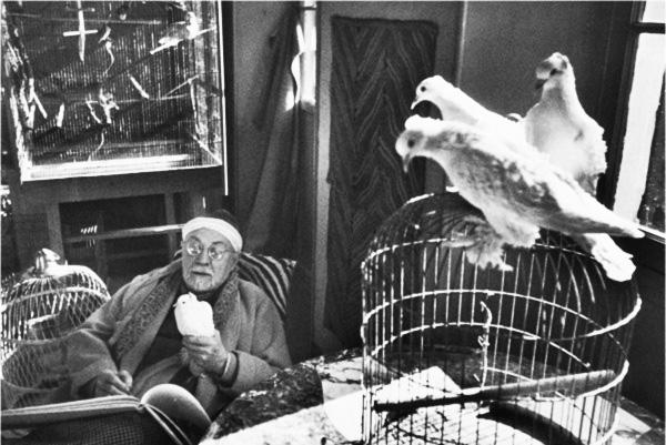
“The most difficult thing for me is a portrait. You have to try and put your camera between the skin of a person and his shirt.”
The photo below is a portrait of Henri Matisse shot by Cartier-Bresson, in which you can see two of his (Matisse’s) greatest passions – painting and pigeons. Actually I found an article about Henri Matisse in Wikipedia, but there wasn’t a word about Matisse’s pigeons. Nevertheless I was sure that they must play an important role in his life if Bresson included them in the photograph. So I kept looking for a more elaborate biography of Matisse just to make sure that these pigeons weren’t just a one-time subject of Matisse’s painting. And guess what, I found it – Marguette Bouvier in interview said about Matisse: “Henri-Matisse has a passion for birds. He considers a bird cage as indispensable as a bed in a bedroom…”. In the Matisse’s portrait there are also three bird cages, and now you know why they are there. As you can see there is no meaningless objects in Bresson’s photos.
“Photography is nothing – it’s life that interests me.”
It is also something to be thought of. Photography by itself is nothing really, you don’t photograph just for photography’s sake (at least I don’t). You photograph to express yourself, to show something that caught your attention…
“You are asking me what makes a good picture. For me, it is the harmony between subject and form that leads each one of those elements to its maximum of expression and vigor.”
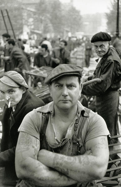
I don’t know about you, but for me this photo is powerful, and it is such not only due to the look and posture of man on the foreground but also because of the second figure behind him on the right. There is a certain similarity in the way how they look at the camera. One of the thoughts that went through my mind when looking at this photo is that maybe the person behind is the father. Or even in general looking at these two men made me think that when you are young, you are strong, and with age your body looses it’s toughness but your gaze stays the same…
“This recognition, in real life, of a rhythm of surfaces, lines, and values is for me the essence of photography; composition should be a constant of preoccupation, being a simultaneous coalition – an organic coordination of visual elements.”
If you didn’t understand the “rhythm of surfaces, lines … ” part, take a look at the rhythm of trees in the photo below.
“You are asking me what makes a good picture. For me, it is the harmony between subject and form that leads each one of those elements to its maximum of expression and vigor.”
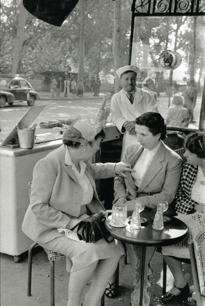
Take a minute to look at the photo below, not just flick through it, and you will see many interesting little details (the gaze of the man standing behind, the little handbag…).
“To me, photography is the simultaneous recognition, in a fraction of a second, of the significance of an event.”
“I believe that, through the act of living, the discovery of oneself is made concurrently with the discovery of the world around us.”
“Thinking should be done before and after, not during photographing. Success depends on the extent of one’s general culture. one’s set of values, one’s clarity of mind one’s vivacity. The thing to be feared most is the artificially contrived, the contrary to life.”
This is a powerful thought. In photojournalism and street photography you have to learn to anticipate how the situation will evolve in order to be in the right place at the right time.
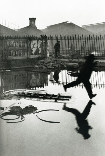
“We photographers deal in things which are continually vanishing, and when they have vanished there is no contrivance on earth can make them come back again. We cannot develop and print a memory.”
Here is another wonderful example of a fleeting moment caught just at the right fraction of a second.
And here is the last quote.
“Photography appears to be an easy activity; in fact it is a varied and ambiguous process in which the only common denominator among its practitioners is in the instrument.”
The more I photograph, go over my photos, and think about photography, the more I understand how difficult good photography really is.
I hope you learned something from Henry Cartier-Bresson’s sayings, and enjoyed the photos I chose to present here.
Any comments as always are much appreciated and,
Remember, you only have to enter your name to leave a comment!
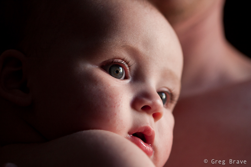
Recently my good friend asked me to photograph his baby son Eric. I gladly accepted because I don’t usually get to photograph babies and wanted to give it a try. The only problem was that my friend’s house didn’t have any suitable place to make a little studio out of, every place I looked at was too cluttered with stuff, which could distract the viewer’s attention from Eric. Finally I found a few places but knew in advance that the resulting photographs won’t be the way I’d like them to be.
Still I wanted to make at least a few photographs that would stand out and satisfy my artistic demands 🙂 The only solution I could come up with was to shoot close-up shots of Eric so that background wouldn’t matter much. Three of those shots I chose to present here.
The key aspect of the following photographs is the light. It is different in all three of them, but in each photo it plays very important role.
For the following photograph I used a 100mm Canon macro lens at f2.8. I had a flash with me and tried to use it, bouncing from the ceiling or walls and varying its power, but I didn’t like the results – the light was too harsh and too white for my taste. Yes I could use a 1/4 CTO gel to warm up the light a little bit, but I choose a different approach instead – I asked my friend to take Eric and come closer to the window.
It was about 5 o’clock in the afternoon and sun light was still pretty strong, but was already getting warmer as sun got lower and lower. After positioning the happy couple the way that there were no significant shadows on Eric’s face I started to shoot, and the photo below was the winner of that batch. I like it because of the intimacy it transmits to the viewer, the closeness between the child and his parent. Because the light coming from the window was much stronger than the light in the room I could set the exposure so that the background remained completely black.
In the next photo I took Eric to another window in the house, with transparent white curtains to serve as background. I intentionally went for the high contrast in lighting in order to create a little drama. But nevertheless as you can see there are no harsh shadows on Eric’s face, that would be unaesthetic for my taste. I like the way his eyes are emphasized in this photograph as if they were eyes of an adult but on a cute baby face.
Click on the photo to enlarge.
I also included the photo below in this article to demonstrate use of reflected light. In this photograph my friend hold’s Eric close to his body, and the light from the window reflects from his body and lights Eric’s face with soft warm light. So in order to create warm light you don’t always need gels and flashes… sometimes human skin can do the job just fine! 🙂
Click on the photo to enlarge.
What additional tips can you share regarding photographing babies? Did you like the photographs presented here?
As always comments are highly appreciated, and
Remember, you only have to enter your name to leave a comment!
This is a very interesting question you know. I am sure that anyone who takes interest in photography at times thinks about it. In my head sometimes these thoughts sound like “I’d really like to make a great photograph… yeah… but what should I shoot?… what should I create?… ”
If you really want to create something, especially if you are not sure yet what it is, you have to allocate a certain amount of time to thinking about it. I mean that you have to tell yourself – “today between 10:00 and 11:00 I am thinking about creating an interesting (also can be beautiful, romantic, breathtaking, sad… anything you prefer) photograph”.
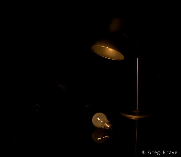
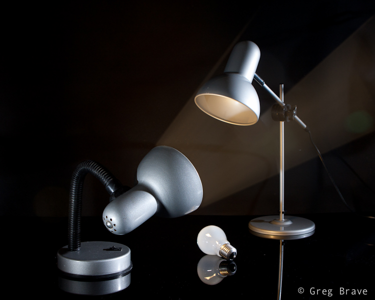
I want to demonstrate this from my own experience. A few days ago I felt this urge to photograph something at my tiny home studio. I didn’t have any idea what it would be, but I just had this desire to create. So I made myself sit down for about 45 minutes, come up with ideas, and briefly sketch them on piece of paper.
My first problem was that not ANY idea that came to my mind was possible to shoot because I was limited to the objects that I had in my apartment. Having realized that fact, instead of just thinking of any idea for photograph, I started looking around my home at different objects and thinking how can I use them creatively?
While looking I saw my table lamp. Actually it was always standing on my table, but until I made myself to think creatively, I never thought about this lamp as a subject for my photographs. And then, while looking at this lamp I remembered of some TV program I saw as a kid that had these two lamps jumping around like live beings, and I decided to try and create something in that direction.
I still had no idea what would come out of it, and I didn’t have any definite final result. So I just started sketching this lamp standing on the table in different poses and thinking what can be done with that. No, I can’t draw, and it doesn’t matter, because you need sketching only to help your thinking process.
One of the ideas that came to my mind was to photograph this small lamp with it’s light bulb lying beneath it, while the lamp “sadly looking” at the bulb. And so I did as you can see in the image below.
Photograph by Greg Brave. Click on the photo to enlarge.
In this image of lonely lamp looking at its light bulb I used only one flash from the left side with 1/2 CTO gel on it (this gel makes the white flash light to be warmer). I wanted a warm lighting here. Looking at the result I felt that it is not enough for an interesting image… I felt that it doesn’t conveys the “stare” of the lamp at the light bulb.
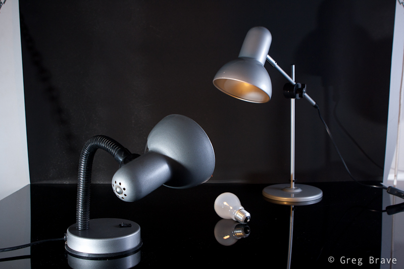
And then suddenly it hit me – I need another lamp to make this more interesting! And luckily my life partner Ira had one on her table. I took that lamp and started playing with two lamps. Finally great idea came to me – to make the second lamp “look” inside the first lamp as if to see “what happened? why you lost your bulb?” and so you can see my compositional setup in the photo below.
Photograph by Greg Brave. Click on the photo to enlarge.
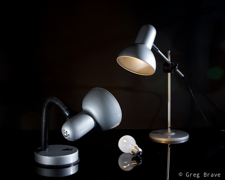
Now, having the final idea of a shot in place I started thinking of little details. I wanted to emphasize the fact that the second lamp did have its bulb. How would I do that? Well, I decided that I would light the whole scene with white light, but I would also have yellow (warm) light coming out of the second lamp towards the first lamp. And you can see in the photo below that the down-looking lamp is warm-lit.
The final photograph below I accomplished using three strobes. Two strobes without any gels from left and right sides (I had to play with their powers to achieve the desired lighting), and the third strobe with 1/2 CTO gel on it I held in my hand and pointed inside the first lamp.
Photograph by Greg Brave. Click on the photo to enlarge.
After getting the final image above, I felt that there is not enough emphasis on the light that comes out of the second lamp. I wanted those rays of light to actually be seen. And here is a point that I am sure not all of you thought about. Rays of light are invisible unless they reflect off of something and hit our eyes. So in order to make these rays of light to be actually visible I had to have them reflect off of something – for example dust, or smoke. So if I would fill up the whole area with smoke then the rays of light would be seen. But then the rays of my two other flashes would also be seen, and the whole image wouldn’t be clear and crisp.
So I decided to take this work to Photoshop, and artificially add the rays of light, using the original light warmth that 1/2 CTO gel gave me (just used eyedropper tool in photoshop to sample that color). To give you an idea how I did it – think of Radial Blur filter in Photoshop. If you have additional questions regarding how I did it feel free to ask me in the comments. And for all the people who are against “Photoshop manipulation” – in the case of this photograph my goal was not to show reality, but to convey an idea of mine, therefore I am totally cool with using Photoshop here.
Here is the final result, which I am pretty happy to come up with.
Photograph by Greg Brave. Click on the photo to enlarge.
In conclusion – the main idea of this article is to show that in order to come up with interesting photographs, you have to allocate time for thinking – what you want to do and how you are going to do it. Even if you don’t have any specific idea in mind, just make yourself sit down and think for half an hour or so, and I am sure that you’ll come up with something interesting!
As always your thoughts and comments are welcome.
Do you agree with this article? If you don’t then why? Can you suggest additional steps towards being more creative?
Remember, you only have to enter your name to leave a comment!
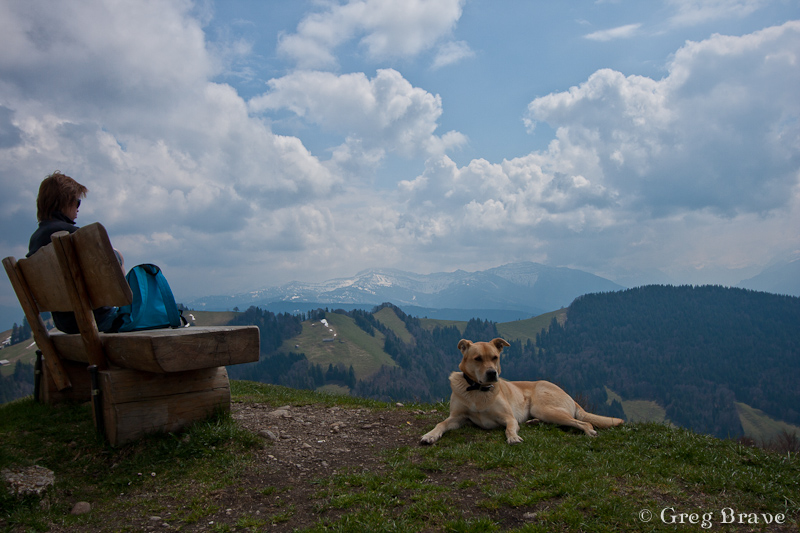
Good day everybody! It has been a while since my last post. I had some pretty cardinal changes in my personal life, and was so caught up that couldn’t free my mind to write anything. But I continued to take photos and have some new stuff to share.
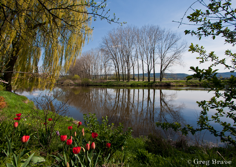
In addition to the changes, during this time me and Ira also went on an 8 day trip mainly to Switzerland but with short, 2 day stop in Prague. Actually one out of these two days we weren’t in Prague but in a small village named Černošice. It is located about 20 minutes by train from Prague, and it is so beautiful!
Černošice lies on the Berounka river, so we stepped off the train and went to the river right away. There is a nice walking trail along the river, and in the photos below you can see some of the views that we saw while walking there.
I saw these naked trees on the shore and their beautiful reflections in the water. I wanted to photograph them but thought that only the trees with their reflections were not enough to make interesting photograph, so I was looking for an additional element for my photograph. These red tulips were it.
Photograph by Greg Brave. Click on the photo to enlarge.
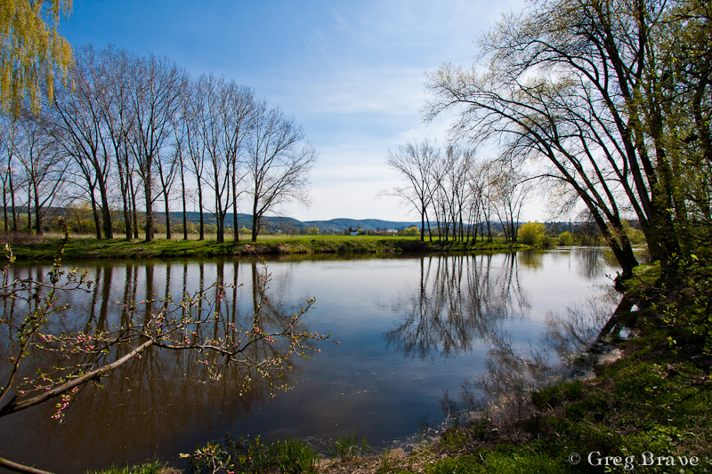
The photograph above was not enough for me and I was looking for additional ways to photograph these trees and their reflections and as a result I got the photo below. The additional element was the tree branch from the left. As you can assume I have much more photos of these trees in my collection, but I chose these two to show here because I think they are most successful composition-wise.
Photograph by Greg Brave. Click on the photo to enlarge.
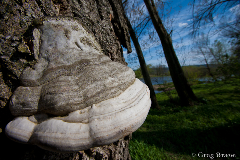
While walking, I saw this horse’s hoof fungus. Well, it is not an unusual sight, at least not in Europe, but I just got this idea to photograph it, but as always I looked for somewhat different way of doing it. I decided to use a wide angle lens to emphasize its form and at the same time to hint about where it grows.
Photograph by Greg Brave. Click on the photo to enlarge.
When I took the photo below I was almost certain that it won’t be something I’d share. The sun was harsh creating a very high contrast between the sky and the earth, but the clouds looked so interesting that I couldn’t resist giving it a try. And I am glad I did! I like this photo because it is pretty simple, but at the same time it conveys movement and a feel of space.
Actually this photo didn’t look exactly like this when I opened it in Lightroom. The lower half of it was almost completely dark. But here comes the magic of shooting raw – using the “fill light” slider I was able to recover many details. In general, I use the “fill light” adjustment slider when I am forced to shoot in harsh afternoon light, and there are some strong shadows. The fill light adjustment helps make these shadows much less disturbing.
Photograph by Greg Brave. Click on the photo to enlarge.
Next photo is pretty ordinary, I mean there are many photos like it out there, but I still liked it for being so bright, happy, and colorful, and couldn’t resist sharing it.
Photograph by Greg Brave. Click on the photo to enlarge.
I am not presenting here photos I made in Prague, since not long ago I had a more substantial trip to Prague and already posted photos from it. You can find my articles about Prague here and here.
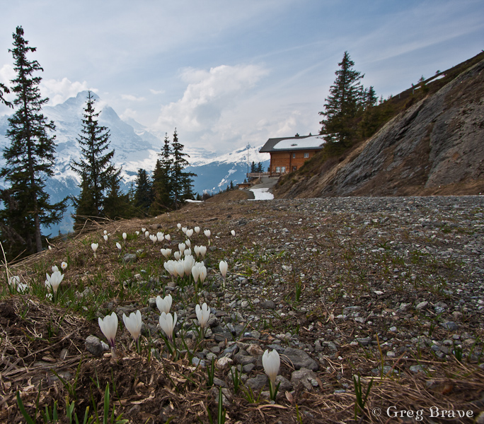
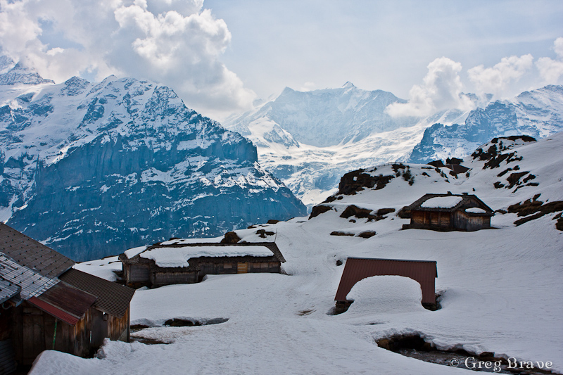
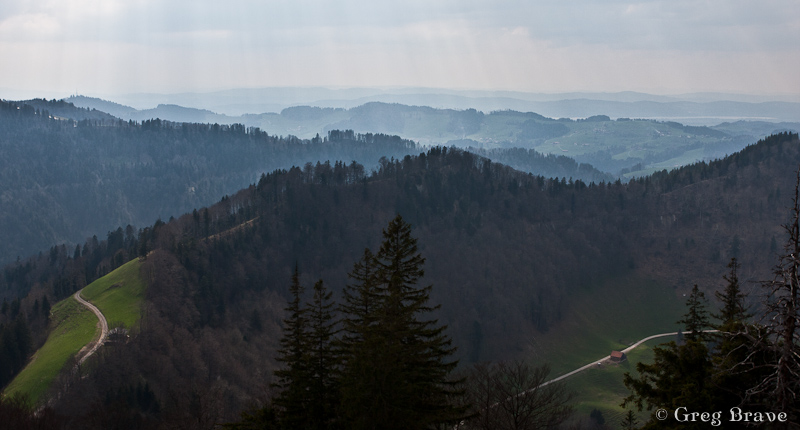
After short stop in Prague we continued to our main destination – Switzerland. I always wanted to see whether this country is as beautiful as photographs show. Believe me – it is!
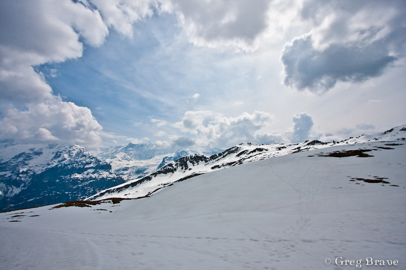
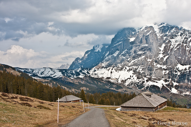
Our first destination was small town named Grindelwald. It is located in a very beautiful and mountainous area, which was exactly what we wanted. We camped in Grindelwald and went for a long hikes up the mountains from there. Since late April is still pretty cold, there weren’t much tourists (the ski season was over, and the summer hiking season didn’t begin yet), and we mostly hiked alone.
In the photographs below I will show some of the stunning views we saw on our hikes.
Photographs by Greg Brave. Click on the photo to enlarge.
I was looking for interesting shapes, patterns and angles to create interesting photographs, that would stand out. Whether I succeeded or not is for you to decide.
On one of our hikes we went so high up the mountains that we reached areas where snow didn’t melt yet and the wooden houses, which are restaurants and resorts in the summer, were completely covered with snow! There is one catch in photographing snow under bright sunlight (just in case that you are not familiar with it) – because the snow is so white it reflects the light very good, and the light meter in the camera perceives the scene to be very bright thus underexposing the photograph. So you have to set your exposure compensation to about +1 stop. It is not an exact science so just try and see for yourself.
Photographs by Greg Brave. Click on the photo to enlarge.
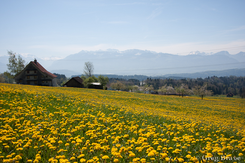
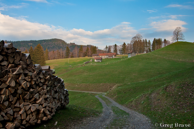
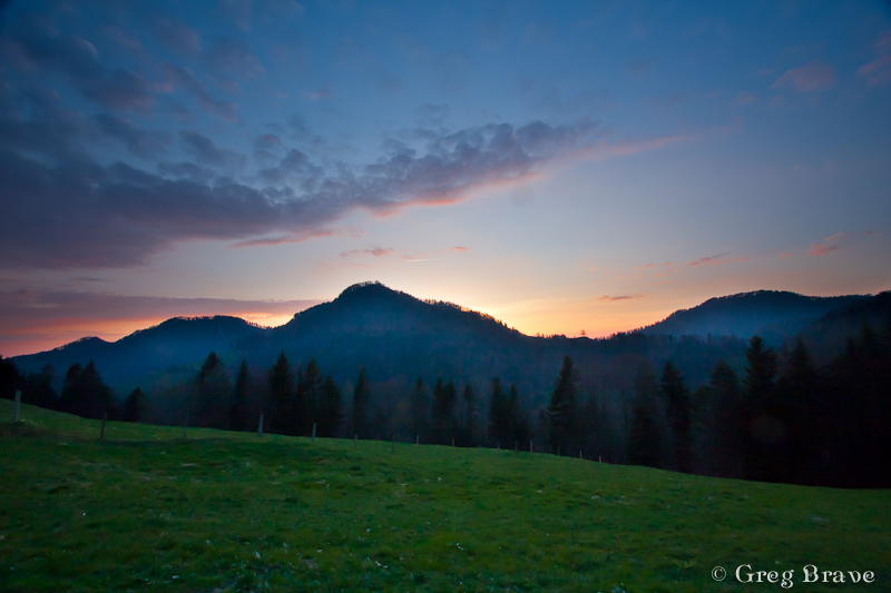
After two days in Grindelwald area we went to another area near town named Hintergoldingen, also with mountains but they were lower so there was almost no snow there. The next photo is from that area. The wast green fields are breathtaking! At the end of this article I will put some more photos from here.
Photograph by Greg Brave. Click on the photo to enlarge.
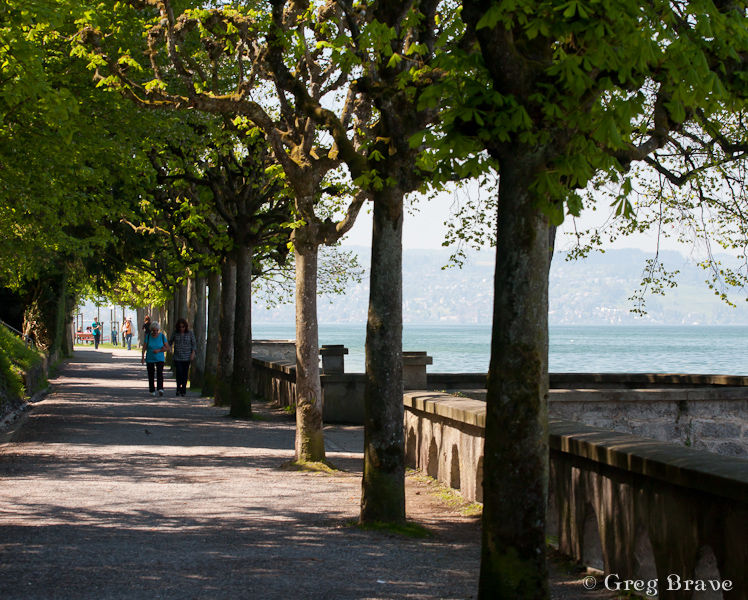
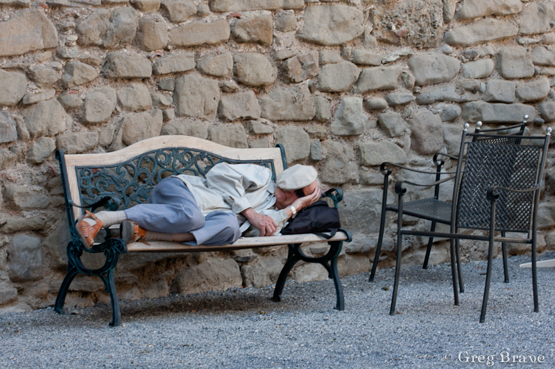
And finally on our last day, on the way to the Zurich airport, we stopped in Rapperswill – a small town located near Zurich lake. This tree caught my attention as light was hitting its leaves making them shine beautifully.
Photograph by Greg Brave. Click on the photo to enlarge.
I also tried to capture the slow pace of this place, where locals and tourists relax and don’t hurry anywhere.
Photographs by Greg Brave. Click on the photo to enlarge.
Photographs by Greg Brave. Click on the photo to enlarge.
We had a great time on our trip and I hope I succeeded in showing it in my photographs. I bought a backpack for my photographic equipment especially for this trip, it was a “CompuRover” from Lowepro. I was very satisfied with it and I am planning to write a detailed review on it in the near future, so stay tuned if you are interested!
This is it for now, and until next time take care!
I think that one of the most important aspects of photography is about joy of creation, expressing yourself and enjoying every minute of it. I always try to be creative, and though I don’t always get the desired results from my experiments I just continue trying. For me there is no other way. I try to put my heart and soul into my work mixed with feeling and emotions.
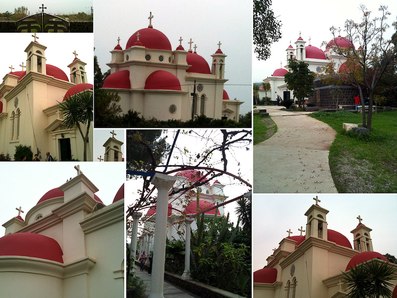
Today I’d like to share with you one of my attempts at creativity. It was a nice autumn weekend in Israel when me and Ira went to the Upper Galilee region to do a walking track near the Sea of Galilee. On our way back we stopped to visit the Greek Church of the 12 Apostles. This church always attracted me when I was driving by with its’ red roofs but I never had the chance to actually get inside.
This time we had about an hour, so we decided to finally give this church a closer look. I was so tired from our trip that I left my Canon DSLR in the car. I just didn’t have any mental mood for photography. But the closer we got to the church the stronger grew my desire to photograph it. Eventually I decided to photograph it with my iPhone.
This Greek church is very beautiful and is also located in a beautiful place. When we returned to our car I was surprised to find out that I took about fifty photographs of the church and its surroundings from variety of different sides and angles.
Another important aspect of photography (again, in my opinion) is to know how to choose your best photos, and to be brave enough to delete most of the rest. Otherwise you’ll end up with tons of photographs, which are very similar to each other (a tiny difference in a crop here, and in viewing angle there).
Thus on our way back (Ira drove the car) I went over all the photos of the Greek church that I took and deleted about 90% leaving only the ones I though were most successful. After that I started thinking – what would be the best way to present these photos in a way that would show the Greek Church of the 12 Apostles in all its beauty and also reveal some of the architectural details.
Eventually I decided to create a photo-collage of all the best photos. During the following months I was busy with other projects (including trip to Prague) and only recently got the time to put the idea of a photo-collage to test. It took me quite some time to do that as I had to change sizes, crops and other things in order to create what I had in mind.
Here is the collage of the Greek Church of the 12 Apostles. Remember that all the photos here were taken with my iPhone, and don’t judge the quality too harsh 🙂
And as always feel free to leave comments!
Cheers,
Greg.
Greek Church of the 12 Apostles. Photograph by Greg Brave. Click on the photo to enlarge.
The Autumn is finally here. Even though it is warmer than I’d like it to bee, I definitely can feel the end of this year coming… You might say that December is a winter month, but not here, not in Israel! We barely have an Autumn and then it is Spring and Summer all over again. This is why this time of the year is very precious to me, I won’t be able to smell the wet earth and get this melancholic Autumn feeling for much longer… a couple of months, that’s all I’ve got.
Last Friday it was heavily raining all morning, but in the afternoon rain stopped and me and my life partner Ira went out for a walk in the park, and of course, I took my camera with me. It turned out to be a nice photo session. I would like to share some of the photos that I liked, and since I am learning photography, I will also discuss some “photographic” aspects of the photos. So here we go:
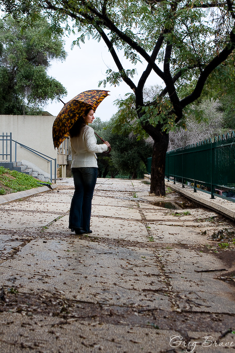
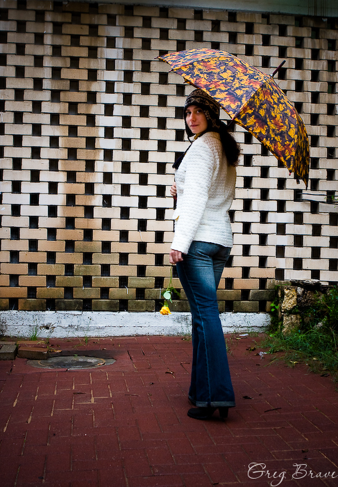
I like this photograph probably the most. The lines on the floor lead the eye towards the first subject – Ira, and then continue to lead towards the second subject – the tree. I like this tree so much, its branches curve so beautifully.
Photograph by Greg Brave. Click on the photo to enlarge.
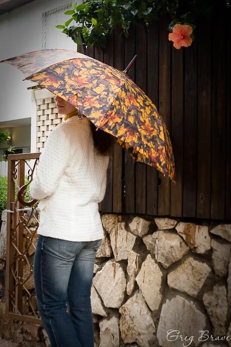
This image could be pretty casual but, in my opinion, the red flower on the wooden fence adds a lot to it. There are also some disturbing elements in this photo that I’d like not to be there – the whole left part of the photo, in front of Ira. I wish it was simpler… much less cluttered. I also like the lower part of the fence, which is made of stone.
Photograph by Greg Brave. Click on the photo to enlarge.
Here I found a nice brick wall for the background, and we experimented with different poses for a while, but nothing worked. Then I just asked Irina to walk from me towards the wall and at some point called her name. She turned around and I made this shot! So I guess it was somewhat spontaneous.
Photograph by Greg Brave. Click on the photo to enlarge.
This next photo is a bit disappointing for me. I found this great fence for the background, but after seeing the final image, I realized that I didn’t use its full potential. I could at least made this photo horizontal, to emphasize the horizontal lines of the fence. I can see this picture in my mind now – Ira standing on the right side of the horizontal photograph, and the horizontal lines of the fence lead the eye from her to the interesting statue that stood there a few meters to the left. I wonder now how I didn’t see this at the time of the shoot? Well, I guess this is how you learn stuff 🙂
Photograph by Greg Brave. Click on the photo to enlarge.
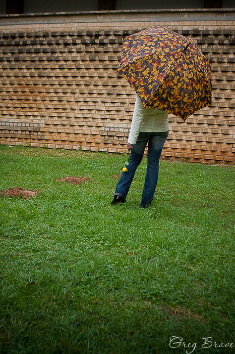
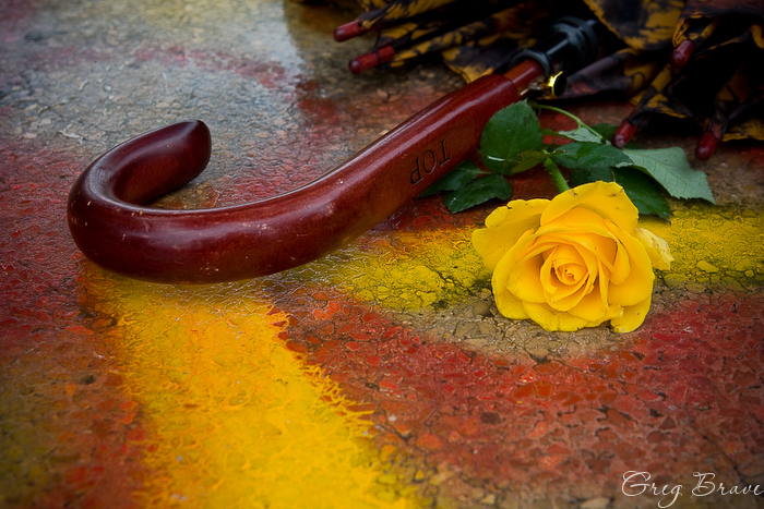
I absolutely love this photograph! Almost as much as the first one. As we were walking in the park I saw some garden tables and decided to take a closer look at them. When we came near we saw that one of the tables was painted with graffiti, the main colors being vivid yellow and red. I looked at these colors, then I looked at the yellow rose that Ira was holding, then at the umbrella handle, and then I saw this picture in my mind. It took me about ten attempts to get it just the way I wanted though…
Photograph by Greg Brave. Click on the photo to enlarge.
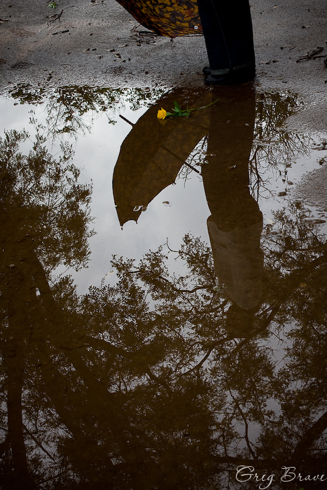
Everybody makes reflection shots, and I am not an exception. But I always look to create something different, something with my personal touch. Usually you can see either the full scene together with its reflection, or only the reflection, but here I included just a little bit of the scene to complement the reflection. I find this shot a little bit unbalanced due to the placement of the rose, but still I like it a lot.
Photograph by Greg Brave. Click on the photo to enlarge.
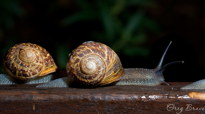
The following images were a nice and unexpected bonus. While we were walking in the park we were amazed to see this – after the rain dozens of snails came out of nowhere and occupied a lonely wooden bench. There were maybe a hundred snails or more. They were crawling one on top of the other and pretty much… mingling 🙂 I can’t find a better word to describe what was happening there. I was lucky to have my macro lens with me, and I was even luckier to have an external flash with remote trigger! So I asked Ira to hold it for me and made a couple of shots. Here you can see an example of the shots I got.
Photographs by Greg Brave. Click on the photo to enlarge.
That’s it for today. I hope you liked my photos. Any comments or suggestions, technical, artistic, or other are always welcome!
Katerina has a unique style in photography and she is a winner of many international photographic competitions. I was very lucky to have a chance to interview her, and she also turned out to be a very nice person.
It is my pleasure to present you Katerina Lomonosov!
Click on the photo to enlarge.
First of all please tell us a little about yourself. When did you start getting interested in photography? Which stages of your development as photographer were the most important?
I was born in 1975, in Ukraine. As a child I liked drawing and graphics. In 1997 I moved to permanent residence in Israel, where I live now. From the year 2000 I am working as graphic-designer in an advertisement company.
I got interested in photography back in 2005. It so happened that at that time, a certain kind of emptiness appeared in my life. I wanted to fill that emptiness with something interesting, beautiful, bright… That “something” turned out to be photography…
I grow and evolve with my every new work, I’m a painter, I live, think and feel with my creations… Creative photography has become a crucial part of my life… I take part in various projects in the field of documentary and art photography, and I plan to grow and develop further in this area.
Photograph by Katerina Lomonosov. Click on the photo to enlarge.
Where are you drawing inspiration and ideas for your works?
Inspiration and ideas for my works come in different ways… Sometimes idea just pops up from the subconsciousness, and some things come from pictures of other authors on the Internet. Some of my works are inspired by paintings of famous artists. There are also ideas on a particular subject, which are literally “nursed” in my head for a long time before they find their way out to be captured in a photograph.
Who are your models? Are they your relatives, acquaintances, or maybe professional photo models? How do you choose them?
My first models were my children – my son, who was then five years old, and a daughter, she was thirteen back then. Later, some of my friends and acquaintances were added to my arsenal, and also friends of my daughter. Nowadays many professional photo models would be honored to participate in my photographic work.
The most important thing for me when I choose a model is not the professionalism of the model but his/her natural body language and an expressive face, especially the eyes.
For me it is important to show in my photographs not only the beauty of lines, and location of light-spots, but also something from the depths of human nature, you may call it the “soul”. In my work I always strive to give depth of meaning to my photographs, so that they would make people think and try to understand what I wanted to express. I want my photographs to reach for the person’s deepest feelings and emotions.
Photograph by Katerina Lomonosov. Click on the photo to enlarge.
How do you find and choose locations?
Most of my photographs are a created at my house’s living room. I just move the furniture aside and make a small “studio”, but it is more like a simple corner. Occasionally I get out with my friends to take pictures outside. When shooting outside I prefer abandoned houses, but with walls and windows still intact , so even outside I seek places that look like my familiar environment at home.
How much time in your weekly routine is given to photography?
In good times, every Friday is all about photography. One day a week. Sometimes I also shoot on Saturdays. But I also have busy periods, when I have to sacrifice my hobby for other matters, and several weeks can pass without me creating a single photograph.
* * *
This is the end of Part I of my interview with Katerina Lomonosov. Click here for Part II.
If you liked Katerina’s works, you can visit her Gallery.
You can also contact Katerina regarding purchasing her work through her email: lomonosov.katerina at gmail.com
Recently I have built a photographic table in order to improve my photographic skills, and now I am studying light and compositions. By studying I mean reading some books, looking at many photographs from a good photographers, and, of course trying to shoot myself.
In this photo session I was trying to create a repeatable pattern from some cups that I have. I saw that I could arrange them in some interesting ways but something was missing from the overall composition. After a long hard thinking and trying I finally came up with the idea of grapes. When I added grapes to the composition, I felt that they contributed a lot and I tried to arrange them in various shapes. By the way, I had to wash these grapes pretty hard in order to get rid of any dirt and fertilizer remnants.
In the first two photographs you can see two of the most successful patterns I could come up with.
However I had one more problem during my shoot – the Light. I had only one flash and it was without any diffuser, so I had to find a right place for it, so that the final lighting would be satisfactory.
I finally placed the flash on a stand on the right side of the composition, about a meter above, and not facing directly to the subjects but pointed “above” them, hitting a white wall behind.
You can see that the shadows inside the cups in the second photo are going rather steeply down as a result of flash placement. I also had to shoot my composition at such an angle that these shadows (inside the cup) wouldn’t be too harsh and too visible.
Another important thing composition-wise was to make the reflections remain in the frame, which gives additional dimension to the final photograph.
In the third photograph I tried to create another interesting form. Originally this photograph isn’t as tightly cropped, but putting it in this slideshow somehow cropped it. I am still new to making slideshows like that, and I will have to figure out why it happened.
Will be glad to hear any opinions and to answer any questions regarding these photos.