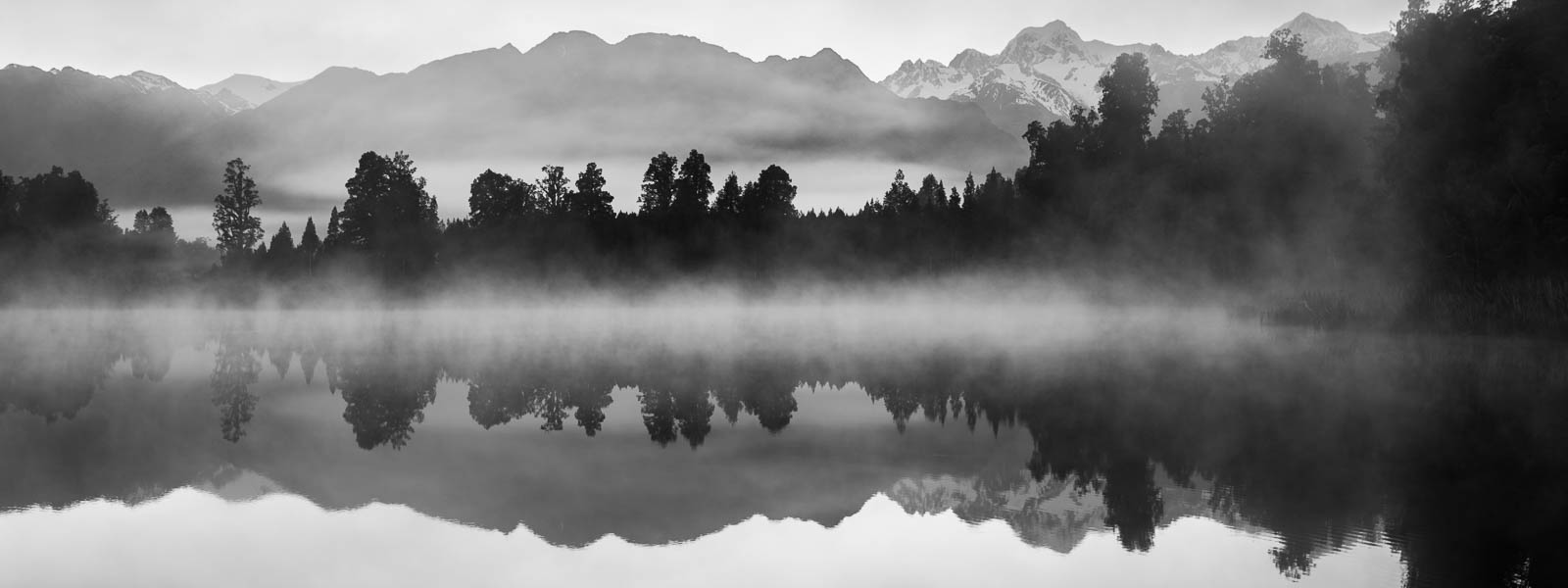
In one of my previous articles I wrote about shooting with intention for B&W (tip number 6), and not merely looking at your photos and trying to convert them to B&W to see if that looks good. Now I would like to add the concept “seeing in black and white”. It comes to you when you shoot a lot of b&w images – you then gain the ability to look at your composition and in your mind see how it would look in b&w. Sometimes, the weather is such that you don’t need this ability – the colors are simply black (dark gray) and white (light gray), but on other occasions the sky may be blue with white clouds and everything around you so colorful that imagining how it would look in b&w would be difficult. This is when the “seeing in black and white” skill comes handy.
Click on the photo to enlarge.
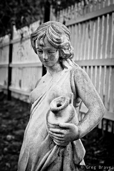
Sometimes the scene itself calls for b&w, as it was with this garden statue. This woman was standing in this garden for a long time and her skin turned from pearl white to muddy gray, the same happened to the color of the fence, and in any case the emphasis here is not on the color.
Click on the photo to enlarge.
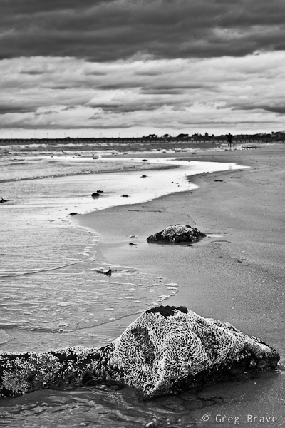
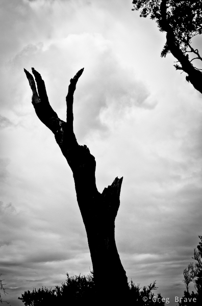
Black and white in photography often helps to convey mood, and emphasize shapes and textures.
Click on the photo to enlarge.
Here is another example of emphasizing shapes by shooting in black ans white.
Click on the photo to enlarge.
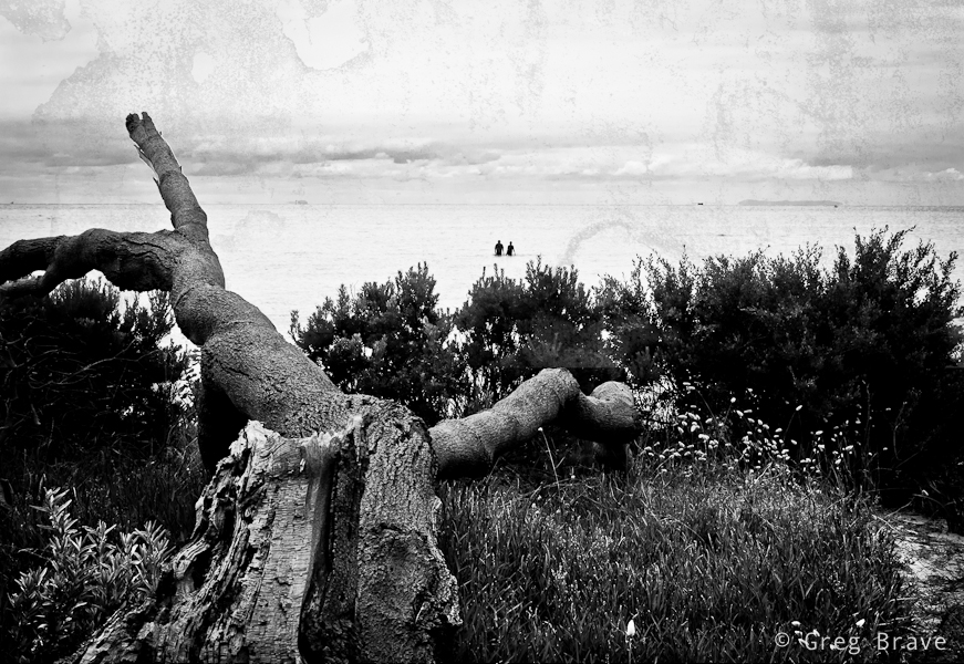
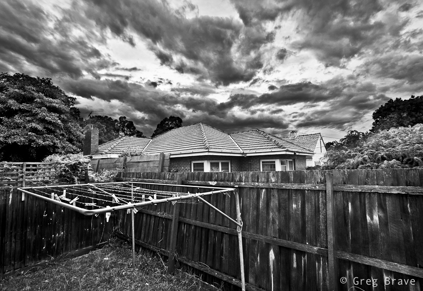
Did I mention mood already? I just love it when the sky looks like it is going to rain any minute, and light is dim. These minutes before the rain are great for capturing photos such as this one. I wish there would be a bird sitting on the hanger at the foreground though…
Click on the photo to enlarge.
I hope you liked the photographs, and I’ll see you next time!
As always your comments, thoughts, and experiences are highly appreciated.
From time to time we all encounter black and white (B&W) images that look very dramatic. Many times I’ve seen B&W images that simply took my breath away, but somehow most of the times when I tried to convert some of my most beautiful images to B&W (which I thought would look great in B&W), I was disappointed. I tried to increase contrast but it didn’t help a lot. And then I discovered (by myself! 🙂 ) the way of manipulating B&W images in Lightroom to significantly improve their visual impact, and I want to share it with you here.
I mostly shoot RAW, so my images are always in color even if I shot them with BW intentions. In order to turn them into B&W in Lightroom I go to the develop module and choose B&W. But only converting to B&W most of the times doesn’t deliver good results, and image often looks dull and uninteresting. Even if you try to adjust the color version of the image (vibrance, contrast, etc.) before converting to B&W, still the B&W version lots of times won’t be satisfying.
Here’s what I do. In the develop module of Lightroom there is the following section:
When your image is in color then the “Color” is highlighted, and if you click on the “B&W” it is automatically converted to black and white, below it appears caption “Black & White Mix” and 8 sliders (from Red to Magenta).
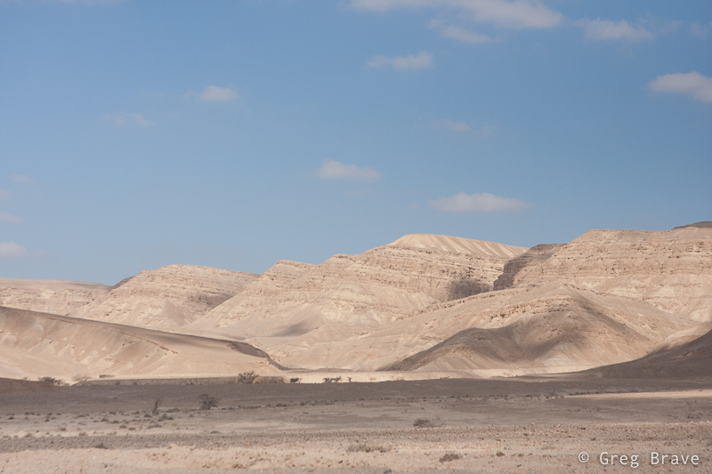
Below you can see an example of colored photograph before I clicked on the B&W, and immediately after. As you can see the B&W image is not that good.
Click on the photo to enlarge.
Now I’ll show you how the black and white version of the above image can be improved.
After I converted the above image to black and white by clicking on “B&W” button, here is what the Black and White Mix looked like:
Each slider in the mix is responsible for a different color, but since the image is in BW, when you drag the slider, what changes is the brightness of that color in the B&W image. So for example if I want to darken the sky, I drag the blue slider to the left side. In this manner I adjust all the sliders, so that my final image looks just as I envisioned it in the first place.
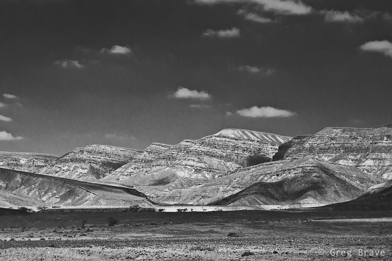
Back to my example. Here is the final image after adjusting the sliders:
Click on the photo to enlarge.
And here is how the sliders of the final image are positioned:
Blue slider is moved to the left in order to darken the sky and make the white clouds stand out. Yellow slider is moved to the right to make the hills brighter. Some other sliders are also adjusted but not all of them. For example I didn’t change the position of the red slider, because there is almost no red tones in the image, so dragging it doesn’t change much.
Of course you can use this technique with any image and not only landscape shots.
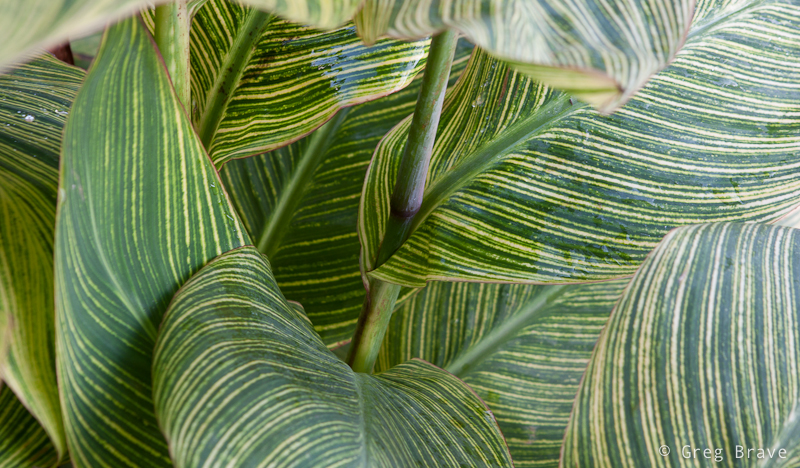
Here is another example. I shot these green leaves with intention to later convert them to B&W for a more graphic representation.
Click on the photo to enlarge.
This is what the sliders looked like before I played with them:
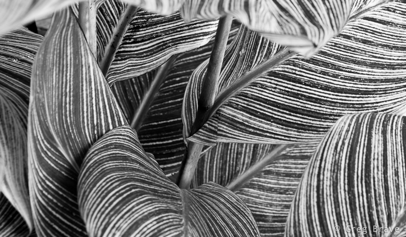
And this is the final version of the image just the way I imagined it in the first place. Below it you can see the final positions of the sliders.
Click on the photo to enlarge.
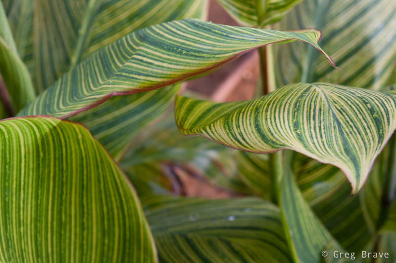
Converting just to black and white is not the limit. In this final example you can see another shot of the same leaves, but with two versions of creative editing.
Click on the photo to enlarge.
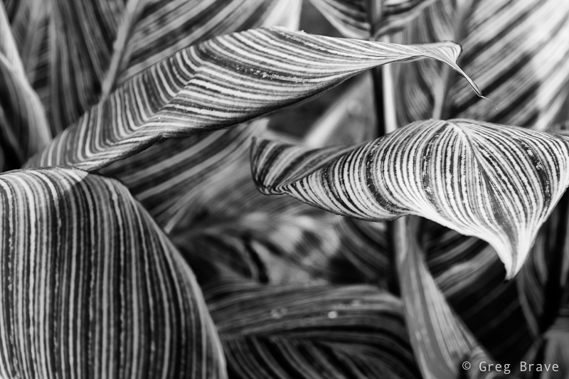
The first is the black and white version, but then I tried to add a sepia tint and vignetting and ended up liking this second version even more than the B&W one, but it only became possible after creating the B&W version using technique that I showed.
Click on the photo to enlarge.
If you have your own techniques for converting to B&W you are most welcome to share them here, and Remember, you only have to enter your name to leave a comment!